# Table of Contents
- [Welcome to Glide Data Grid | Glide Data Grid](#welcome-to-glide-data-grid-glide-data-grid)
- [Extended QuickStart Guide | Glide Data Grid](#extended-quickstart-guide-glide-data-grid)
- [Working with selections | Glide Data Grid](#working-with-selections-glide-data-grid)
- [Editing Data | Glide Data Grid](#editing-data-glide-data-grid)
- [Required Props | Glide Data Grid](#required-props-glide-data-grid)
- [Copy and paste support | Glide Data Grid](#copy-and-paste-support-glide-data-grid)
- [FAQ | Glide Data Grid](#faq-glide-data-grid)
- [API | Glide Data Grid](#api-glide-data-grid)
- [Grid Columns | Glide Data Grid](#grid-columns-glide-data-grid)
- [Important Props | Glide Data Grid](#important-props-glide-data-grid)
- [Drag and Drop | Glide Data Grid](#drag-and-drop-glide-data-grid)
- [UriCell | Glide Data Grid](#uricell-glide-data-grid)
- [BooleanCell | Glide Data Grid](#booleancell-glide-data-grid)
- [ProtectedCell | Glide Data Grid](#protectedcell-glide-data-grid)
- [Search | Glide Data Grid](#search-glide-data-grid)
- [RowIDCell | Glide Data Grid](#rowidcell-glide-data-grid)
- [TextCell | Glide Data Grid](#textcell-glide-data-grid)
- [MarkdownCell | Glide Data Grid](#markdowncell-glide-data-grid)
- [DataEditorCore | Glide Data Grid](#dataeditorcore-glide-data-grid)
- [Styling | Glide Data Grid](#styling-glide-data-grid)
- [Row Markers | Glide Data Grid](#row-markers-glide-data-grid)
- [BubbleCell | Glide Data Grid](#bubblecell-glide-data-grid)
- [Cells | Glide Data Grid](#cells-glide-data-grid)
- [Custom Cells | Glide Data Grid](#custom-cells-glide-data-grid)
- [NumberCell | Glide Data Grid](#numbercell-glide-data-grid)
- [LoadingCell | Glide Data Grid](#loadingcell-glide-data-grid)
- [ImageCell | Glide Data Grid](#imagecell-glide-data-grid)
- [DrilldownCell | Glide Data Grid](#drilldowncell-glide-data-grid)
- [BaseGridCell | Glide Data Grid](#basegridcell-glide-data-grid)
- [Selection Handling | Glide Data Grid](#selection-handling-glide-data-grid)
- [Input Interaction | Glide Data Grid](#input-interaction-glide-data-grid)
- [Editing | Glide Data Grid](#editing-glide-data-grid)
- [DataEditorRef | Glide Data Grid](#dataeditorref-glide-data-grid)
- [Implementing Custom Cells | Glide Data Grid](#implementing-custom-cells-glide-data-grid)
- [Common Types | Glide Data Grid](#common-types-glide-data-grid)
- [DataEditor | Glide Data Grid](#dataeditor-glide-data-grid)
---
# Welcome to Glide Data Grid | Glide Data Grid
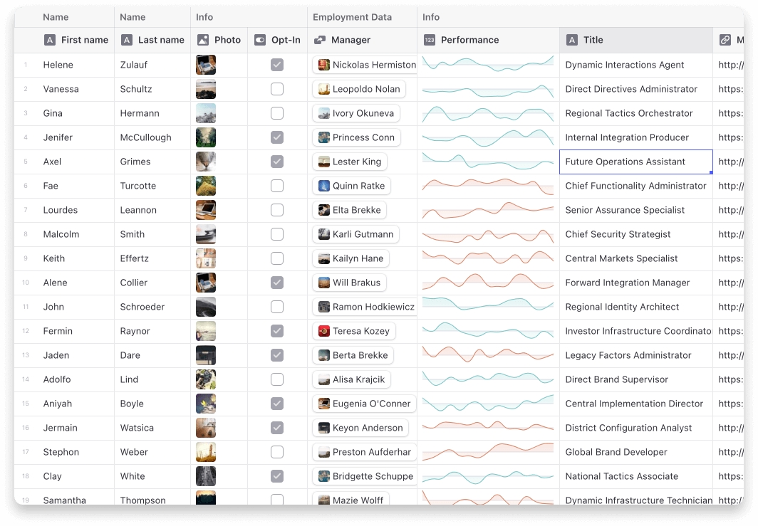
Welcome to the official documentation for Glide Data Grid, the powerful, flexible, and efficient data grid designed for modern web applications. Whether you're a seasoned developer or just starting out, our documentation will guide you through the features and functionalities of Glide Data Grid, helping you to integrate and leverage its capabilities in your projects.
[](https://github.com/glideapps/glide-data-grid/releases)
[](https://reactjs.org/)
[](https://coveralls.io/github/glideapps/glide-data-grid)
[](https://bundlephobia.com/package/@glideapps/glide-data-grid)
[](https://github.com/glideapps/glide-data-grid/blob/main/LICENSE)
[](https://www.glideapps.com/jobs)
Lots of fun examples are in our [Storybook](https://glideapps.github.io/glide-data-grid)
.
You can also visit our [main site](https://grid.glideapps.com/)
.
[](https://docs.grid.glideapps.com/#features-at-a-glance)
👩💻 Features at a Glance
-----------------------------------------------------------------------------------------
* **It scales to millions of rows**. Cells are rendered lazily on demand for memory efficiency.
* **Scrolling is extremely fast**. Native scrolling keeps everything buttery smooth.
* **Supports multiple types of cells**. Numbers, text, markdown, bubble, image, drilldown, uri
* **Fully Free & Open Source**. MIT licensed, so you can use Grid in commercial projects.
* **Editing is built in**.
* **Resizable and movable columns**.
* **Variable sized rows**.
* **Merged cells**.
* **Single and multi-select rows, cells, and columns**.
* **Cell rendering can be fully customized**.
* **Much much more...**
[](https://docs.grid.glideapps.com/#quick-start)
⚡ Quick Start
-------------------------------------------------------------------
First make sure you are using React 16 or greater. Then install the data grid:
Copy
npm i @glideapps/glide-data-grid
You may also need to install the peer dependencies if you don't have them already:
Copy
npm i lodash marked react-responsive-carousel
Create a new `DataEditor` wherever you need to display lots and lots of data
Copy
({
columns: CompactSelection.empty(),
rows: CompactSelection.empty(),
});
return ;
readonly rangeStack: readonly Readonly[];
};
readonly columns: CompactSelection;
readonly rows: CompactSelection;
}
The `current` part of the selection contains the selected `cell`. This is the item which will be drawn with a focus ring. The `range` represents the selected region around the cell that may be edited by certain commands such as delete. Finally, the `rangeStack` are additional ranges that the user has selected when [`multi-rect`](https://docs.grid.glideapps.com/api/dataeditor/selection-handling#column-range-rowselect)
selection mode is enabled.
`rows` and `columns` are both a `CompactSelection`. A compact selection is a sparse array designed to efficiently hold spans of selected elements. They have the following interface:
Copy
export class CompactSelection
static empty(): CompactSelection;
static fromSingleSelection(selection: number | Slice): CompactSelection;
public offset(amount: number): CompactSelection;
public add(selection: number | Slice): CompactSelection;
public remove(selection: number | Slice): CompactSelection;
public first(): number | undefined;
public last(): number | undefined;
public hasIndex(index: number): boolean;
public hasAll(index: Slice): boolean;
public some(predicate: (index: number) => boolean): boolean;
public equals(other: CompactSelection): boolean;
public toArray(): number[];
get length(): number;
*[Symbol.iterator]()
}
In general, it is advisable not to call `toArray`. Iterating over the `CompactSelection` using a `for ... of` loop is significantly more efficient.
[PreviousEditing Data](https://docs.grid.glideapps.com/extended-quickstart-guide/editing-data)
[NextGrid Columns](https://docs.grid.glideapps.com/extended-quickstart-guide/grid-columns)
Last updated 1 year ago
Was this helpful?
---
# Editing Data | Glide Data Grid
Editing data is handled via callbacks. Taking the getting started example as a starting point, the `getContent` callback can be modified to allow editing.
Copy
const getCellContent = React.useCallback((cell: Item): GridCell => {
const [col, row] = cell;
const dataRow = data[row];
const indexes: (keyof DummyItem)[] = ["name", "company", "email", "phone"];
const d = dataRow[indexes[col]];
return {
kind: GridCellKind.Text,
allowOverlay: true,
readonly: false,
displayData: d,
data: d,
};
}, []);
> 💡 Where your data comes from does not matter. The `getCellContent` callback is a data fetcher. This is a fundamental difference from other libraries that expect you to pass data in a format they expect.
`allowOverlay` has been set to true. This allows the overlay to come up. For explanatory purposes the `readonly` field is being set to false. This is the default value, setting it to true would allow the overlay to come up but not allow editing.
Implementing the `onCellEdited` callback allows responding to cell edit events. Edit events pass back a mutated version of the original `GridCell` returned from `getContent`.
Copy
const onCellEdited = React.useCallback((cell: Item, newValue: EditableGridCell) => {
if (newValue.kind !== GridCellKind.Text) {
// we only have text cells, might as well just die here.
return;
}
const indexes: (keyof DummyItem)[] = ["name", "company", "email", "phone"];
const [col, row] = cell;
const key = indexes[col];
data[row][key] = newValue.data;
}, []);

The editor now works
[PreviousExtended QuickStart Guide](https://docs.grid.glideapps.com/extended-quickstart-guide)
[NextWorking with selections](https://docs.grid.glideapps.com/extended-quickstart-guide/working-with-selections)
Last updated 1 year ago
Was this helpful?
---
# Required Props | Glide Data Grid
Copy
interface DataEditorProps {
// ... other props
columns: readonly GridColumn[];
getCellContent: ((cell) => GridCell);
rows: number;
// ... other props
}
* * *
###
[](https://docs.grid.glideapps.com/api/dataeditor/required-props#columns)
columns
Copy
columns: readonly GridColumn[];
`columns` is an array of objects of type `GridColumn` describing the column headers. The length of the array is the number of columns to display.
> 💡 This value should be memoized so as to avoid extraneous rerendering.
* * *
###
[](https://docs.grid.glideapps.com/api/dataeditor/required-props#rows)
rows
Copy
rows: number;
`rows` is the number of rows to display.
* * *
###
[](https://docs.grid.glideapps.com/api/dataeditor/required-props#getcellcontent)
getCellContent
Copy
getCellContent: (cell: Item) => GridCell;
`getCellContent` returns an object of type `GridCell` describing the contents for the cell at the given coordinates.
> 💡 This value should be memoized so as to avoid extraneous rerendering. This is usually done using `React.useCallback`. Failure to ensure proper memoization will result in slow path rendering at all times.
[PreviousDataEditor](https://docs.grid.glideapps.com/api/dataeditor)
[NextImportant Props](https://docs.grid.glideapps.com/api/dataeditor/important-props)
Last updated 1 year ago
Was this helpful?
---
# Copy and paste support | Glide Data Grid
Copy and Paste support is built in to Glide Data Grid. It is not enabled by default to ensure developers are expecting its behavior.
###
[](https://docs.grid.glideapps.com/extended-quickstart-guide/copy-and-paste-support#copy)
Copy
By default copy is not enabled, to enabled copy implement the `getCellsForSelection` callback. The callback returns results as row-major ordering.
> `getCellsForSelection` is used instead of `getCellContent` to allow optimization when fetching large amounts of data outside of the visible region.
This example uses the built in generic function which simply calls `getContent`, which is inefficient but fine for a local data source.
Copy
return {
window.alert(JSON.stringify({ target, value }));
return false;
}}
/>
Paste, like copy, has an efficiency gain to be had. Instead of listening to `onCellEdited` an implementor may choose to implement `onCellsEdited`. This receives the entire paste buffer at once for all cells pasted and allows more efficient writes to the backend without having to manually handle paste buffer parsing.
[PreviousGrid Columns](https://docs.grid.glideapps.com/extended-quickstart-guide/grid-columns)
[NextFAQ](https://docs.grid.glideapps.com/faq)
Last updated 1 year ago
Was this helpful?
---
# FAQ | Glide Data Grid
**Nothing shows up!**
Please read the Prerequisites section in the docs.
**It crashes when I try to edit a cell!**
Please read the Prerequisites section in the docs.
**Does it work with screen readers and other a11y tools?**
Yes. Unfortunately none of the primary developers are accessibility users so there are likely flaws in the implementation we are not aware of. Bug reports welcome!
**Does it support my data source?**
Yes.
Data Grid is agnostic about the way you load/store/generate/mutate your data. What it requires is that you tell it which columns you have, how many rows, and to give it a function it can call to get the data for a cell in a specific row and column.
**Does it do sorting, searching, and filtering?**
Search is included. You provide the trigger, we do the search. [Example](https://quicktype.github.io/glide-data-grid/?path=/story/glide-data-grid-docs--search)
in our storybook.
Filtering and sorting are something you would have to implement with your data source. There are hooks for adding column header menus if you want that.
The reason we don't add filtering/sorting in by default is that these are usually very application-specific, and can often also be implemented more efficiently in the data source, via a database query, for example.
**Can it do frozen columns?**
Yes!
**Can I render my own cells?**
Yes, but the renderer has to use HTML Canvas. [Simple example](https://quicktype.github.io/glide-data-grid/?path=/story/glide-data-grid-dataeditor-demos--draw-custom-cells)
in our Storybook.
**Why does Data Grid use HTML Canvas?**
Originally we had implemented our Grid using virtualized rendering. We virtualized both in the horizontal and vertical direction using [react-virtualized](https://github.com/bvaughn/react-virtualized)
. The problem is simply scrolling performance. Once you need to load/unload hundreds of DOM elements per frame nothing can save you.
There are some hacks you can do like setting timers and entering into a "low fidelity" rendering mode where you only render a single element per cell. This works okay until you want to show hundreds of cells and you are right back to choppy scrolling. It also doesn't really look or feel great.
**I want to use this with Next.js / Vercel, but I'm getting weird errors**
The easiest way to use the grid with Next is to create a component which wraps up your grid and then import it as a dynamic.
home.tsx
Copy
import type { NextPage } from "next";
import dynamic from "next/dynamic";
import styles from "../styles/Home.module.css";
const Grid = dynamic(
() => {
return import("../components/Grid");
},
{ ssr: false }
);
export const Home: NextPage = () => {
return (
Hi
);
};
grid.tsx
Copy
import React from "react";
import DataEditor from "@glideapps/glide-data-grid";
export default function Grid() {
return ;
rowHeight?: number | ((index) => number);
smoothScrollX?: boolean;
smoothScrollY?: boolean;
width?: string | number;
// ...other props
}
* * *
###
[](https://docs.grid.glideapps.com/api/dataeditor/important-props#fixedshadow)
fixedShadow
Copy
fixedShadowX?: boolean;
fixedShadowY?: boolean;
Controls shadows behind fixed columns and header rows. Defaults to `true`. This can make freeze columns hard to read if vertical borders are also disabled.
* * *
###
[](https://docs.grid.glideapps.com/api/dataeditor/important-props#freezecolumns)
freezeColumns
Copy
freezeColumns?: number;
Set to a positive number to freeze columns on the left side of the grid during horizontal scrolling.
* * *
###
[](https://docs.grid.glideapps.com/api/dataeditor/important-props#freezetrailingrows)
freezeTrailingRows
Set to a positive number to freeze rows on the bottom of the grid during vertical scrolling.
* * *
###
[](https://docs.grid.glideapps.com/api/dataeditor/important-props#getcellsforselection)
getCellsForSelection
Copy
type CellArray = readonly (readonly GridCell[])[];
type GetCellsThunk = () => Promise;
getCellsForSelection?: true | (selection: Rectangle) => CellArray | GetCellsThunk;
`getCellsForSelection` is called when the user copies a selection to the clipboard or the data editor needs to inspect data which may be outside the curently visible range. It must return a two-dimensional array (an array of rows, where each row is an array of cells) of the cells in the selection's rectangle. Note that the rectangle can include cells that are not currently visible.
If `true` is passed instead of a callback, the data grid will internally use the `getCellContent` callback to provide a basic implementation of `getCellsForSelection`. This can make it easier to light up more data grid functionality, but may have negative side effects if your data source is not able to handle being queried for data outside the normal window.
If `getCellsForSelection` returns a thunk, the data may be loaded asynchronously, however the data grid may be unable to properly react to column spans when performing range selections. Copying large amounts of data out of the grid will depend on the performance of the thunk as well.
* * *
###
[](https://docs.grid.glideapps.com/api/dataeditor/important-props#markdowndivcreatenode)
markdownDivCreateNode
Copy
markdownDivCreateNode?: (content: string) => DocumentFragment;
If `markdownDivCreateNode` is specified, then it will be used to render Markdown, instead of the default Markdown renderer used by the Grid. You'll want to use this if you need to process your Markdown for security purposes, or if you want to use a renderer with different Markdown features.
* * *
###
[](https://docs.grid.glideapps.com/api/dataeditor/important-props#onvisibleregionchanged)
onVisibleRegionChanged
Copy
onVisibleRegionChanged?: (
range: Rectangle,
tx: number,
ty: number,
extras: { selected?: Item; freezeRegion?: Rectangle };
) => void;
`onVisibleRegionChanged` is called whenever the visible region changed. The new visible region is passed as a `Rectangle`. The x and y transforms of the cell region are passed as `tx` and `ty`. The current selection and frozen region are passed in the `extras` object.
* * *
###
[](https://docs.grid.glideapps.com/api/dataeditor/important-props#provideeditor)
provideEditor
Copy
export type ProvideEditorComponent = React.FunctionComponent<{
readonly onChange: (newValue: T) => void;
readonly onFinishedEditing: (newValue?: T, movement?: readonly [-1 | 0 | 1, -1 | 0 | 1]) => void;
readonly isHighlighted: boolean;
readonly value: T;
readonly initialValue?: string;
readonly validatedSelection?: SelectionRange;
readonly imageEditorOverride?: ImageEditorType;
readonly markdownDivCreateNode?: (content: string) => DocumentFragment;
readonly target: Rectangle;
readonly forceEditMode: boolean;
readonly isValid?: boolean;
}>;
export type ProvideEditorCallbackResult =
| (ProvideEditorComponent & {
disablePadding?: boolean;
disableStyling?: boolean;
})
| ObjectEditorCallbackResult
| undefined;
export type ProvideEditorCallback = (cell: T) => ProvideEditorCallbackResult;
provideEditor?: ProvideEditorCallback;
When provided the `provideEditor` callbacks job is to be a constructor for functional components which have the correct properties to be used by the data grid as an editor. The editor must implement `onChange` and `onFinishedEditing` callbacks as well support the `isHighlighted` flag which tells the editor to begin with any editable text pre-selected so typing will immediately begin to overwrite it.
* * *
###
[](https://docs.grid.glideapps.com/api/dataeditor/important-props#rowheight)
rowHeight
Copy
rowHeight: number | ((index: number) => number);
`rowHeight` is the height of a row in the table. It defaults to `34`. By passing a function instead of a number you can give different heights to each row. The `index` is the zero-based absolute row index.
* * *
###
[](https://docs.grid.glideapps.com/api/dataeditor/important-props#smoothscroll)
smoothScroll
Copy
smoothScrollX?: boolean;
smoothScrollY?: boolean;
Controls smooth scrolling in the data grid. Defaults to `false`. If smooth scrolling is not enabled the grid will always be cell aligned in the non-smooth scrolling axis.
* * *
###
[](https://docs.grid.glideapps.com/api/dataeditor/important-props#width-height)
width/height
Copy
width?: string | number;
height?: string | number;
`width` and `height` override the default size of the grid. These accept any valid width/height string. If a number is provided it is interpreted as pixels.
[PreviousRequired Props](https://docs.grid.glideapps.com/api/dataeditor/required-props)
[NextRow Markers](https://docs.grid.glideapps.com/api/dataeditor/row-markers)
Last updated 1 year ago
Was this helpful?
---
# Drag and Drop | Glide Data Grid
Copy
interface DataEditorProps {
onDragLeave?: (() => void);
onDragOverCell?: ((cell: Item, dataTransfer: DataTransfer | null) => void);
onDrop?: ((cell: Item, dataTransfer: DataTransfer | null) => void);
}
* * *
###
[](https://docs.grid.glideapps.com/api/dataeditor/drag-and-drop#ondragleave)
onDragLeave
Copy
onDragLeave?: (() => void);
Emitted when the external drag event leaves the data editor.
* * *
###
[](https://docs.grid.glideapps.com/api/dataeditor/drag-and-drop#ondragovercell)
onDragOverCell
Copy
onDragOverCell?: ((cell: Item, dataTransfer: DataTransfer | null) => void);
Emitted when the external drag event enters a new cell in the grid.
* * *
###
[](https://docs.grid.glideapps.com/api/dataeditor/drag-and-drop#ondrop)
onDrop
Copy
onDrop?: ((cell: Item, dataTransfer: DataTransfer | null) => void);
Emitted when the external drag is dropped onto a valid target inside of the grid.
* * *
[PreviousCustom Cells](https://docs.grid.glideapps.com/api/dataeditor/custom-cells)
[NextSearch](https://docs.grid.glideapps.com/api/dataeditor/search)
Last updated 1 year ago
Was this helpful?
---
# UriCell | Glide Data Grid
Renders URIs (usually urls) with the optional direct interaction.
Copy
export interface UriCell extends BaseGridCell {
readonly kind: GridCellKind.Uri;
readonly data: string;
readonly displayData?: string;
readonly readonly?: boolean;
readonly onClickUri?: (args: BaseGridMouseEventArgs & { readonly preventDefault: () => void }) => void;
readonly hoverEffect?: boolean;
}
###
[](https://docs.grid.glideapps.com/api/cells/uricell#displaydata)
displayData
A formated version of the uri as a string.
###
[](https://docs.grid.glideapps.com/api/cells/uricell#data)
data
The uri
###
[](https://docs.grid.glideapps.com/api/cells/uricell#readonly)
readonly
Determines if the cell will accept edit events.
###
[](https://docs.grid.glideapps.com/api/cells/uricell#hovereffect)
hoverEffect
If set to true the uri will underline when hovered and receive a pointer cursor.
###
[](https://docs.grid.glideapps.com/api/cells/uricell#onclickuri)
onClickUri
If provided this will be called whenever the actual text of the uri cell is clicked. This can be used to open a url.
[PreviousNumberCell](https://docs.grid.glideapps.com/api/cells/numbercell)
[NextProtectedCell](https://docs.grid.glideapps.com/api/cells/protectedcell)
Last updated 1 year ago
Was this helpful?
---
# BooleanCell | Glide Data Grid
Renders a quad-state checkbox.
Copy
export interface BooleanCell extends BaseGridCell {
readonly kind: GridCellKind.Boolean;
readonly data: boolean | BooleanEmpty | BooleanIndeterminate;
readonly readonly?: boolean;
readonly allowOverlay: false;
readonly maxSize?: number;
}
###
[](https://docs.grid.glideapps.com/api/cells/booleancell#data)
data
Determines if the boolean cell is checked, unchecked, or empty.
###
[](https://docs.grid.glideapps.com/api/cells/booleancell#readonly)
readonly
Determines if the cell will accept edit events.
###
[](https://docs.grid.glideapps.com/api/cells/booleancell#maxsize)
maxSize
Controls the maximum size the checkbox will become. So long as this is smaller that the cell size this will also represent the final size of the checkbox.
[PreviousTextCell](https://docs.grid.glideapps.com/api/cells/textcell)
[NextNumberCell](https://docs.grid.glideapps.com/api/cells/numbercell)
Last updated 1 year ago
Was this helpful?
---
# ProtectedCell | Glide Data Grid
Protected cells are for rendering content that is obscured from the user. They have no additional properties.
Copy
export interface ProtectedCell extends BaseGridCell {
readonly kind: GridCellKind.Protected;
}
[PreviousUriCell](https://docs.grid.glideapps.com/api/cells/uricell)
[NextRowIDCell](https://docs.grid.glideapps.com/api/cells/rowidcell)
Last updated 1 year ago
Was this helpful?
---
# Search | Glide Data Grid
Copy
interface DataEditorProps {
// ...other props
onSearchClose?: (() => void);
onSearchResultsChanged?: ((results, navIndex) => void);
onSearchValueChange?: ((newVal) => void);
searchResults?: readonly Item[];
searchValue?: string;
showSearch?: boolean;
// ...other props
}
* * *
###
[](https://docs.grid.glideapps.com/api/dataeditor/search#onsearchclose)
onSearchClose
Copy
onSearchClose?: () => void;
If `onSearchClose` is not provided and `showSearch` is set to true, the search box will be shown but there will be no close button. Providing an `onSearchClose` callback enables the close button and the event will emit when it is clicked.
* * *
###
[](https://docs.grid.glideapps.com/api/dataeditor/search#onsearchresultschanged)
onSearchResultsChanged
Copy
readonly onSearchResultsChanged?: (results: readonly Item[], navIndex: number) => void;
This event handler is called when there is a change in the search results of the data grid's search field. It provides two parameters: `results` and `navIndex`. The `results` parameter is an array of `Item` objects, each representing a cell or row that matches the current search query. The `navIndex` parameter is the index of the currently selected or highlighted search result within the `results` array.
* * *
###
[](https://docs.grid.glideapps.com/api/dataeditor/search#onsearchvaluechange)
onSearchValueChange
Copy
readonly onSearchValueChange?: (newVal: string) => void;
This event is emitted whenever the search value in the data grid changes. The handler `onSearchValueChange` is provided with a single argument `newVal`, which is the updated string value entered in the search field. Implementing this event allows you to execute custom actions in response to changes in the search input. This can include triggering search operations based on the new value, updating the user interface elements to reflect the change, or any other related functionality that needs to respond to updates in the search term within your data grid.
* * *
###
[](https://docs.grid.glideapps.com/api/dataeditor/search#searchresults)
searchResults
Copy
readonly searchResults?: readonly Item[];
This property allows you to specify the search results to be displayed in the data grid. If `searchResults` is not provided, the grid will use its internal search provider to determine and display search results. By setting the `searchResults` property, you can override the default search behavior and supply a custom array of `Item` objects as the search results. These `Item` objects typically refer to the cells or rows in the grid that match a custom search criterion. This is particularly useful if you need to implement a specialized search functionality that differs from the built-in search capabilities of the grid.
* * *
###
[](https://docs.grid.glideapps.com/api/dataeditor/search#searchvalue)
searchValue
Copy
readonly searchValue?: string;
This property is used to set the current search value in the data grid. It accepts a string that represents the term or phrase to be used for searching within the grid. By setting `searchValue`, you can programmatically control the search value.
* * *
###
[](https://docs.grid.glideapps.com/api/dataeditor/search#showsearch)
showSearch
Copy
showSearch?: boolean;
`showSearch` causes the search box built into the data grid to become visible. The data grid does not provide an in-built way to show the search box, so it is suggested to hook into the ctrl/cmd+f accelerator or add a button to your apps chrome.
[PreviousDrag and Drop](https://docs.grid.glideapps.com/api/dataeditor/drag-and-drop)
[NextStyling](https://docs.grid.glideapps.com/api/dataeditor/styling)
Last updated 1 year ago
Was this helpful?
---
# RowIDCell | Glide Data Grid
Renders a faded out text representation of a RowID
Copy
export interface RowIDCell extends BaseGridCell {
readonly kind: GridCellKind.RowID;
readonly data: string;
readonly readonly?: boolean;
}
###
[](https://docs.grid.glideapps.com/api/cells/rowidcell#data)
data
The string representation of the RowID
###
[](https://docs.grid.glideapps.com/api/cells/rowidcell#readonly)
readonly
Determines if the cell will accept edit events.
[PreviousProtectedCell](https://docs.grid.glideapps.com/api/cells/protectedcell)
[NextLoadingCell](https://docs.grid.glideapps.com/api/cells/loadingcell)
Last updated 1 year ago
Was this helpful?
---
# TextCell | Glide Data Grid
The text cell renders text. It can also render multiple lines of text.
Copy
export interface TextCell extends BaseGridCell {
readonly kind: GridCellKind.Text;
readonly displayData: string;
readonly data: string;
readonly readonly?: boolean;
readonly allowWrapping?: boolean;
}
###
[](https://docs.grid.glideapps.com/api/cells/textcell#displaydata)
displayData
The text to display to the user when the overlay editor is closed. Usually the same as `data` unless formatting is needed.
###
[](https://docs.grid.glideapps.com/api/cells/textcell#data)
data
The text to display to the user when the overlay editor is open.
###
[](https://docs.grid.glideapps.com/api/cells/textcell#readonly)
readonly
Determines if the cell will accept edit events.
###
[](https://docs.grid.glideapps.com/api/cells/textcell#allowwrapping)
allowWrapping
If enabled the cell will render with text top aligned and will allow for rendering multiple lines of text. By default the text cell only renders a single line of text.
[PreviousBaseGridCell](https://docs.grid.glideapps.com/api/cells/basegridcell)
[NextBooleanCell](https://docs.grid.glideapps.com/api/cells/booleancell)
Last updated 1 year ago
Was this helpful?
---
# MarkdownCell | Glide Data Grid
Renders markdown in the overlay editor.
Copy
export interface MarkdownCell extends BaseGridCell {
readonly kind: GridCellKind.Markdown;
readonly data: string;
readonly readonly?: boolean;
}
###
[](https://docs.grid.glideapps.com/api/cells/markdowncell#data)
data
Markdown.
###
[](https://docs.grid.glideapps.com/api/cells/markdowncell#readonly)
readonly
Determines if the cell will accept edit events.
[PreviousImageCell](https://docs.grid.glideapps.com/api/cells/imagecell)
[NextBubbleCell](https://docs.grid.glideapps.com/api/cells/bubblecell)
Last updated 1 year ago
Was this helpful?
---
# DataEditorCore | Glide Data Grid
DataEditorCore is a stripped down version of the DataEditor that allows for greater tree shaking and smaller package sizes. The primary differences between DataEditorCore and DataEditor are:
* No built in `headerIcons`
* No built in renderers. All desired core renderers must be provided via the `renderers` prop.
* No built in `imageWindowLoader`. This must be provided as well.
[PreviousStyling](https://docs.grid.glideapps.com/api/dataeditor/styling)
[NextCells](https://docs.grid.glideapps.com/api/cells)
Last updated 1 year ago
Was this helpful?
---
# Styling | Glide Data Grid
Copy
interface DataEditorProps {
// ...other props
getGroupDetails?: GroupDetailsCallback;
getRowThemeOverride?: GetRowThemeCallback;
groupHeaderHeight?: number;
headerHeight?: number;
headerIcons?: SpriteMap;
overscrollX?: number;
overscrollY?: number;
rightElement?: ReactNode;
rightElementProps?: {
fill?: boolean;
sticky?: boolean;
};
scaleToRem?: boolean;
verticalBorder?: boolean | ((col) => boolean);
// ...other props
}
* * *
###
[](https://docs.grid.glideapps.com/api/dataeditor/styling#getgroupdetails)
getGroupDetails
Copy
getGroupDetails?: (groupName: string) => ({
name: string;
icon?: string;
overrideTheme?: Partial;
actions?: {
title: string;
onClick: (e: GridMouseGroupHeaderEventArgs) => void;
icon: GridColumnIcon | string;
}[];
});
`getGroupDetails` is invoked whenever a group header is rendered. The group details are used to provide a name override for the group as well as an icon, a list of actions which can be activated by the user, and an overrideTheme which will impact the rendering of all child cells of the group and all column headers in the group.
* * *
###
[](https://docs.grid.glideapps.com/api/dataeditor/styling#getrowthemeoverride)
getRowThemeOverride
Copy
getRowThemeOverride?: (row: number) => Partial | undefined;
Whenever a row is rendered the row theme override is fetched if provided. This function should aim to be extremely fast as it may be invoked many times per render. All cells in the row have this theme merged into their theme prior to rendering.
* * *
###
[](https://docs.grid.glideapps.com/api/dataeditor/styling#groupheaderheight)
groupHeaderHeight
Copy
groupHeaderHeight?: number;
The height of the group headers in the data grid. If not provided this will default to the `headerHeight` value.
* * *
###
[](https://docs.grid.glideapps.com/api/dataeditor/styling#headerheight)
headerHeight
Copy
headerHeight: number;
`headerHeight` is the height of the table header. It defaults to `36`.
* * *
###
[](https://docs.grid.glideapps.com/api/dataeditor/styling#headericons)
headerIcons
Copy
headerIcons?: Record string>;
Providing custom header icons to the data grid must be done with a somewhat non-standard mechanism to allow theming and scaling. The `headerIcons` property takes a dictionary which maps icon names to functions which can take a foreground and background color and returns back a string representation of an svg. The svg should contain a header similar to this `` and interpolate the fg/bg colors into the string.
We recognize this process is not fantastic from a graphics workflow standpoint, improvements are very welcome here.
* * *
###
[](https://docs.grid.glideapps.com/api/dataeditor/styling#overscroll)
overscroll
Copy
overscrollX?: number;
overscrollY?: number;
The overscroll properties are used to allow the grid to scroll past the logical end of the content by a fixed number of pixels. This is useful particularly on the X axis if you allow for resizing columns as it can make resizing the final column significantly easier.
* * *
###
[](https://docs.grid.glideapps.com/api/dataeditor/styling#rightelement)
rightElement
Copy
rightElementProps?: {
readonly sticky?: boolean;
readonly fill?: boolean;
};
rightElement?: React.ReactNode;
The right element is a DOM node which can be inserted at the end of the horizontal scroll region. This can be used to create a right handle panel, make a big add button, or display messages. If `rightElementProps.sticky` is set to true the right element will be visible at all times, otherwise the user will need to scroll to the end to reveal it.
If `rightElementProps.fill` is set, the right elements container will fill to consume all remaining space (if any) at the end of the grid. This does not play nice with growing columns.
* * *
###
[](https://docs.grid.glideapps.com/api/dataeditor/styling#scaletorem)
scaleToRem
Copy
readonly scaleToRem?: boolean;
This property is a boolean flag that enables automatic scaling of most elements in the data grid's theme to match the REM (Root EM) scaling. When set to `true`, it adjusts the sizing of various elements like fonts, paddings, and other dimensions to align with the REM units defined in your application's styles. This ensures that the data grid's appearance is consistent with the overall scaling and typography of your application, especially in responsive designs or when dealing with accessibility requirements. The default value of this property is `false`, meaning that without explicit activation, the grid's elements will not automatically scale based on REM units.
* * *
###
[](https://docs.grid.glideapps.com/api/dataeditor/styling#verticalborder)
verticalBorder
Copy
verticalBorder?: ((col: number) => boolean) | boolean;
Controls the drawing of the left hand vertical border of a column. If set to a boolean value it controls all borders. Defaults to `true`.
[PreviousSearch](https://docs.grid.glideapps.com/api/dataeditor/search)
[NextDataEditorCore](https://docs.grid.glideapps.com/api/dataeditorcore)
Last updated 1 year ago
Was this helpful?
---
# Row Markers | Glide Data Grid
Row markers display the current index of the row as well as provide a means to select and reorder rows when configured. Rows markers are always marked as freeze columns and will always display regardless of horizontal scroll position.

Row markers in action
Copy
interface DataEditorProps {
// ...other props
rowMarkers?: "number" | "none" | "checkbox" | "both" | "checkbox-visible" | "clickable-number";
rowMarkerStartIndex?: number;
rowMarkerTheme?: Partial;
rowMarkerWidth?: number;
// ...other props
}
* * *
###
[](https://docs.grid.glideapps.com/api/dataeditor/row-markers#rowmarkers)
rowMarkers
Copy
rowMarkers?: "checkbox" | "number" | "both" | "none";
`rowMarkers` determines whether to display the marker column on the very left. It defaults to `none`. Note that this column doesn't count as a table column, i.e. it has no index, and doesn't change column indexes.
* * *
###
[](https://docs.grid.glideapps.com/api/dataeditor/row-markers#rowmarkerstartindex)
rowMarkerStartIndex
Copy
rowMarkerStartIndex?: number;
This property is used to set the starting index for row markers in a React component. The `rowMarkerStartIndex` accepts a numerical value that specifies the initial index from which the row markers in the data grid will begin counting. By default, this value is set to `1`. This property is particularly useful when you need the row numbering to start from a specific value other than the default, such as when displaying paginated data or aligning with an external data set's indexing.
* * *
###
[](https://docs.grid.glideapps.com/api/dataeditor/row-markers#rowmarkertheme)
rowMarkerTheme
Copy
rowMarkerTheme?: Partial;
The `rowMarkerTheme` overrides the theme used for the row marker column. This is commonly used to tint the background of the row marker row and sometimes to fade them out a bit.
* * *
###
[](https://docs.grid.glideapps.com/api/dataeditor/row-markers#rowmarkerwidth)
rowMarkerWidth
Copy
rowMarkerWidth?: number;
`rowMarkerWidth` is the width of the marker column on the very left. By default, it adapts based on the number of rows in your data set.
[PreviousImportant Props](https://docs.grid.glideapps.com/api/dataeditor/important-props)
[NextEditing](https://docs.grid.glideapps.com/api/dataeditor/editing)
Last updated 1 year ago
Was this helpful?
---
# BubbleCell | Glide Data Grid
Renders text in bubbles. Always read only.
Copy
export interface BubbleCell extends BaseGridCell {
readonly kind: GridCellKind.Bubble;
readonly data: string[];
}
###
[](https://docs.grid.glideapps.com/api/cells/bubblecell#data)
data
The text to display in bubbles.
[PreviousMarkdownCell](https://docs.grid.glideapps.com/api/cells/markdowncell)
[NextDrilldownCell](https://docs.grid.glideapps.com/api/cells/drilldowncell)
Last updated 1 year ago
Was this helpful?
---
# Cells | Glide Data Grid
By default Glide Data Grid comes with the following cells:
Cell Type
Screenshot
[TextCell](https://docs.grid.glideapps.com/api/cells/textcell)

[NumberCell](https://docs.grid.glideapps.com/api/cells/numbercell)

[RowIDCell](https://docs.grid.glideapps.com/api/cells/rowidcell)

[ProtectedCell](https://docs.grid.glideapps.com/api/cells/protectedcell)

[BooleanCell](https://docs.grid.glideapps.com/api/cells/booleancell)

[ImageCell](https://docs.grid.glideapps.com/api/cells/imagecell)

[UriCell](https://docs.grid.glideapps.com/api/cells/uricell)

[MarkdownCell](https://docs.grid.glideapps.com/api/cells/markdowncell)

[BubbleCell](https://docs.grid.glideapps.com/api/cells/bubblecell)

[DrilldownCell](https://docs.grid.glideapps.com/api/cells/drilldowncell)

[LoadingCell](https://docs.grid.glideapps.com/api/cells/loadingcell)

[PreviousDataEditorCore](https://docs.grid.glideapps.com/api/dataeditorcore)
[NextBaseGridCell](https://docs.grid.glideapps.com/api/cells/basegridcell)
Last updated 1 year ago
Was this helpful?
---
# Custom Cells | Glide Data Grid
Copy
interface DataEditorProps {
// ...other props
customRenderers?: readonly CustomRenderer[];
drawCell?: DrawCellCallback;
drawHeader?: DrawHeaderCallback;
// ...other props
}
* * *
###
[](https://docs.grid.glideapps.com/api/dataeditor/custom-cells#customrenderers)
customRenderers
Copy
customRenderers?: readonly CustomRenderer[];
Adds custom renderers to the `DataEditor`. Each renderer provides its own drawing functionality and editor. See [Implementing Custom Cells](https://docs.grid.glideapps.com/guides/implementing-custom-cells)
for more information.
[Implementing Custom Cells](https://docs.grid.glideapps.com/guides/implementing-custom-cells)
###
[](https://docs.grid.glideapps.com/api/dataeditor/custom-cells#drawcell)
drawCell
Copy
drawCell?: (
args: {
ctx: CanvasRenderingContext2D;
cell: GridCell;
theme: Theme;
rect: Rectangle;
col: number;
row: number;
hoverAmount: number;
hoverX: number | undefined;
hoverY: number | undefined;
highlighted: boolean;
imageLoader: ImageWindowLoader;
},
drawContent: () => void
) => void;
The `drawCell` property enables custom rendering of cells in the Grid. This function is called for each cell during the rendering process and is provided with a comprehensive set of parameters. These parameters include the drawing context (`ctx`), cell data (`cell`), theming details (`theme`), the cell's rectangle (`rect`), column and row indices (`col`, `row`), hover state information (`hoverAmount`, `hoverX`, `hoverY`), a highlight flag (`highlighted`), and an image loader (`imageLoader`).
Additionally, `drawCell` provides a `drawContent` method, which, when called, immediately draws the default content of the cell onto the canvas. This design offers flexibility in how you render each cell. For instance, you can first draw a custom background, then call `drawContent` to render the cell's standard contents, and finally add an overlay or additional embellishments. This approach allows for layered rendering, where you can seamlessly integrate custom graphics or styles with the grid's inherent rendering logic.
* * *
###
[](https://docs.grid.glideapps.com/api/dataeditor/custom-cells#drawheader)
drawHeader
Copy
drawHeader?: (args: {
ctx: CanvasRenderingContext2D;
column: GridColumn;
columnIndex: number;
theme: Theme;
rect: Rectangle;
hoverAmount: number;
isSelected: boolean;
isHovered: boolean;
hasSelectedCell: boolean;
spriteManager: SpriteManager;
menuBounds: Rectangle;
},
drawContent: () => void
) => void;
`drawHeader` may be specified to override the rendering of a header. The grid will call this for every header it needs to render. Header rendering is not as well optimized because they do not redraw as often, but very heavy drawing methods can negatively impact horizontal scrolling performance.
[PreviousSelection Handling](https://docs.grid.glideapps.com/api/dataeditor/selection-handling)
[NextDrag and Drop](https://docs.grid.glideapps.com/api/dataeditor/drag-and-drop)
Last updated 1 year ago
Was this helpful?
---
# NumberCell | Glide Data Grid
The number cell renders numbers and has a specialized editor for inputing numerical values.
Copy
export interface NumberCell extends BaseGridCell {
readonly kind: GridCellKind.Number;
readonly displayData: string;
readonly data: number | undefined;
readonly readonly?: boolean;
readonly fixedDecimals?: number;
readonly allowNegative?: boolean;
readonly thousandSeparator?: boolean | string;
readonly decimalSeparator?: string;
}
###
[](https://docs.grid.glideapps.com/api/cells/numbercell#displaydata)
displayData
A formated version of the number as a string.
###
[](https://docs.grid.glideapps.com/api/cells/numbercell#data)
data
The number value of the cell
###
[](https://docs.grid.glideapps.com/api/cells/numbercell#readonly)
readonly
Determines if the cell will accept edit events.
###
[](https://docs.grid.glideapps.com/api/cells/numbercell#fixeddecimals)
fixedDecimals
When provided, fixes the number of decimals used in the overlay editor to the number provided.
###
[](https://docs.grid.glideapps.com/api/cells/numbercell#allownegative)
allowNegative
When set to `false` negative numbers are not allowed to be entered.
###
[](https://docs.grid.glideapps.com/api/cells/numbercell#thousandsseparator)
thousandsSeparator
Allows overiding or disabling of the thousands separator. False disables, true enables, and a string overrides it.
###
[](https://docs.grid.glideapps.com/api/cells/numbercell#decimalseparator)
decimalSeparator
Allows overiding the decimal separator, normally passing either "," or "."
[PreviousBooleanCell](https://docs.grid.glideapps.com/api/cells/booleancell)
[NextUriCell](https://docs.grid.glideapps.com/api/cells/uricell)
Last updated 1 year ago
Was this helpful?
---
# LoadingCell | Glide Data Grid
Loading cells are for rendering content that is still loading from the server. They have no additional properties.
Copy
export interface LoadingCell extends BaseGridCell {
readonly kind: GridCellKind.Loading;
readonly skeletonWidth?: number;
readonly skeletonHeight?: number;
readonly skeletonWidthVariability?: number;
}
###
[](https://docs.grid.glideapps.com/api/cells/loadingcell#skeletonwidth)
skeletonWidth
Determines the width in pixels of the skeleton to be drawn. If set to 0 no skeleton will draw.
###
[](https://docs.grid.glideapps.com/api/cells/loadingcell#skeletonheight)
skeletonHeight
Determines the height in pixels of the skeleton to be drawn. If set to 0 no skeleton will draw.
###
[](https://docs.grid.glideapps.com/api/cells/loadingcell#skeletonwidthvariability)
skeletonWidthVariability
The skeleton variability is a width in pixels that is multiplied by a random number between 0 and 1 and added to the skeleton width to produce the final skeleton width.
[PreviousRowIDCell](https://docs.grid.glideapps.com/api/cells/rowidcell)
[NextImageCell](https://docs.grid.glideapps.com/api/cells/imagecell)
Last updated 1 year ago
Was this helpful?
---
# ImageCell | Glide Data Grid
Renders one or more images.
Copy
export interface ImageCell extends BaseGridCell {
readonly kind: GridCellKind.Image;
readonly data: string[];
readonly rounding?: number;
readonly displayData?: string[];
readonly readonly?: boolean;
}
###
[](https://docs.grid.glideapps.com/api/cells/imagecell#displaydata)
displayData
Reduced size image URLs for display in the grid. It is advisable to pass pre-scaled images to the grid to reduce scrolling and network overhead.
###
[](https://docs.grid.glideapps.com/api/cells/imagecell#data)
data
Full size image URLs.
###
[](https://docs.grid.glideapps.com/api/cells/imagecell#readonly)
readonly
Determines if the cell will accept new images.
###
[](https://docs.grid.glideapps.com/api/cells/imagecell#rounding)
rounding
Controls the amount of rounding applied to the images. If set to 0, no rounding will be applied.
[PreviousLoadingCell](https://docs.grid.glideapps.com/api/cells/loadingcell)
[NextMarkdownCell](https://docs.grid.glideapps.com/api/cells/markdowncell)
Last updated 1 year ago
Was this helpful?
---
# DrilldownCell | Glide Data Grid
Renders text and images in rounded rectangles. Always read only.
Copy
export interface DrilldownCellData {
readonly text: string;
readonly img?: string;
}
export interface DrilldownCell extends BaseGridCell {
readonly kind: GridCellKind.Drilldown;
readonly data: readonly DrilldownCellData[];
}
###
[](https://docs.grid.glideapps.com/api/cells/drilldowncell#data)
data
A collection of text/image tuples.
[PreviousBubbleCell](https://docs.grid.glideapps.com/api/cells/bubblecell)
[NextCommon Types](https://docs.grid.glideapps.com/api/common-types)
Last updated 1 year ago
Was this helpful?
---
# BaseGridCell | Glide Data Grid
The `BaseGridCell` represents the common set of items all cells have. A cell is that which is generated from the [`getCellContent`](https://docs.grid.glideapps.com/api/dataeditor/required-props#getcellcontent)
callback and is the common language of communication in the `DataEditor`.
Copy
export interface BaseGridCell {
readonly allowOverlay: boolean;
readonly lastUpdated?: number;
readonly style?: "normal" | "faded";
readonly themeOverride?: Partial;
readonly span?: readonly [start: number, end: number];
readonly contentAlign?: "left" | "right" | "center";
readonly cursor?: CSSProperties["cursor"];
readonly copyData?: string;
}
###
[](https://docs.grid.glideapps.com/api/cells/basegridcell#allowoverlay)
allowOverlay
This enables or disables the overlay popup normally triggered by double clicking a cell. Disabling this does not prevent editing. Many cells have a `readonly` property for that.
###
[](https://docs.grid.glideapps.com/api/cells/basegridcell#lastupdated)
lastUpdated
A `performance.now()` relative timestamp that indicates when the cell was last updated. This triggers the `DataEditor` to render a flash of the cells background color indicating an update has happened.
###
[](https://docs.grid.glideapps.com/api/cells/basegridcell#themeoverride)
themeOverride
Overrides the theme of the cell. It is advisable to set your theme overries as high as possible in the tree. Overriding the cell theme is more expensive than a row theme, which is more expensive than a column theme.
###
[](https://docs.grid.glideapps.com/api/cells/basegridcell#style)
style
`faded` causes the cell to render with a slight transparency.
###
[](https://docs.grid.glideapps.com/api/cells/basegridcell#contentalign)
contentAlign
A hint to the cell on where to align content. Not all cells respect this yet.
###
[](https://docs.grid.glideapps.com/api/cells/basegridcell#cursor)
cursor
An override of the cursor when the mouse is over the cell.
###
[](https://docs.grid.glideapps.com/api/cells/basegridcell#copydata)
copyData
Overrides the data the cell will copy into the paste buffer when the user tries to copy the cell.
###
[](https://docs.grid.glideapps.com/api/cells/basegridcell#undefined)
[PreviousCells](https://docs.grid.glideapps.com/api/cells)
[NextTextCell](https://docs.grid.glideapps.com/api/cells/textcell)
Last updated 1 year ago
Was this helpful?
---
# Selection Handling | Glide Data Grid
Copy
interface DataEditorProps {
// ...other props
columnSelect?: "none" | "single" | "multi";
columnSelectionBlending?: SelectionBlending;
drawFocusRing?: boolean;
fillHandle?: boolean;
gridSelection?: GridSelection;
highlightRegions?: readonly Highlight[];
onGridSelectionChange?: ((newSelection) => void);
onSelectionCleared?: (() => void);
rangeSelect?: "rect" | "none" | "cell" | "multi-cell" | "multi-rect";
rangeSelectionBlending?: SelectionBlending;
rowSelect?: "none" | "single" | "multi";
rowSelectionBlending?: SelectionBlending;
spanRangeBehavior?: "default" | "allowPartial";
// ...other props
}
* * *
###
[](https://docs.grid.glideapps.com/api/dataeditor/selection-handling#column-range-rowselect)
column/range/rowSelect
Copy
rangeSelect?: "none" | "cell" | "rect" | "multi-cell" | "multi-rect"; // default rect
columnSelect?: "none" | "single" | "multi"; // default multi
rowSelect?: "none" | "single" | "multi"; // default multi
Controls if multi-selection is allowed. If disabled, shift/ctrl/command clicking will work as if no modifiers are pressed.
When range select is set to cell, only one cell may be selected at a time. When set to rect one one rect at a time. The multi variants allow for multiples of the rect or cell to be selected.
* * *
###
[](https://docs.grid.glideapps.com/api/dataeditor/selection-handling#column-range-rowselectionblending)
column/range/rowSelectionBlending
Copy
rangeSelectionBlending?: "exclusive" | "mixed"; // default exclusive
columnSelectionBlending?: "exclusive" | "mixed"; // default exclusive
rowSelectionBlending?: "exclusive" | "mixed"; // default exclusive
Controls which types of selections can exist at the same time in the grid. If selection blending is set to exclusive, the grid will clear other types of selections when the exclusive selection is made. By default row, column, and range selections are exclusive.
* * *
###
[](https://docs.grid.glideapps.com/api/dataeditor/selection-handling#drawfocusring)
drawFocusRing
Copy
drawFocusRing?: boolean;
Controls drawing of the focus ring. If disabled the user will not easily see the selection.
* * *
###
[](https://docs.grid.glideapps.com/api/dataeditor/selection-handling#highlightregions)
highlightRegions
Copy
interface Highlight {
readonly color: string;
readonly range: Rectangle;
}
highlightRegions?: readonly Highlight[];
Highlight regions are regions on the grid which get drawn with a background color and a dashed line around the region. The color string must be css parseable and the opacity will be removed for the drawing of the dashed line. Opacity should be used to allow overlapping selections to properly blend in background colors.
* * *
###
[](https://docs.grid.glideapps.com/api/dataeditor/selection-handling#fillhandle)
fillHandle
Copy
fillHandle?: boolean;
Controls the visibility of the fill handle used for filling cells with the mouse.
* * *
###
[](https://docs.grid.glideapps.com/api/dataeditor/selection-handling#gridselection)
gridSelection
`GridSelection` is the most basic representation of the selected cells, rows, and columns in the data grid. The `current` property accounts for the selected cell and the range of cells selected as well. It is the selection which is modified by keyboard and mouse interaction when clicking on the cells themselves.
The `rows` and `columns` properties both account for the columns or rows which have been explicitly selected by the user. Selecting a range which encompases the entire set of cells within a column/row does not implicitly set it into this part of the collection. This allows for distinguishing between cases when the user wishes to delete all contents of a row/column and delete the row/column itself.
Copy
interface GridSelection {
readonly current?: {
readonly cell: Item;
readonly range: Readonly;
readonly rangeStack: readonly Readonly[];
};
readonly columns: CompactSelection;
readonly rows: CompactSelection;
}
The `cell` is the \[col, row\] formatted cell which will have the focus ring drawn around it. The `range` should always include the `cell` and represents additional cells which can be edited via copy, delete and other events. The `range` may or may not include partial spans depending on the [`spanRangeBehavior`](https://docs.grid.glideapps.com/api/dataeditor/selection-handling#spanrangebehavior)
set.
* * *
###
[](https://docs.grid.glideapps.com/api/dataeditor/selection-handling#ongridselectionchange)
onGridSelectionChange
Copy
onGridSelectionChange?: ((newSelection) => void);
Emitted whenever the grid selection changes. This value must be passed back as the new [`gridSelection`](https://docs.grid.glideapps.com/api/dataeditor/selection-handling#gridselection)
for the change to have any effect.
* * *
###
[](https://docs.grid.glideapps.com/api/dataeditor/selection-handling#onselectioncleared)
onSelectionCleared
Copy
onSelectionCleared?: () => void;
Emitted when the current selection is cleared, usually when the user presses "Escape". `rowSelection`, `columnSelection`, and `gridSelection` should all be empty when this event is emitted. This event only emits when the user explicitly attempts to clear the selection.
* * *
###
[](https://docs.grid.glideapps.com/api/dataeditor/selection-handling#spanrangebehavior)
spanRangeBehavior
Copy
spanRangeBehavior?: "default" | "allowPartial";
If set to `default` the [`gridSelection`](https://docs.grid.glideapps.com/api/dataeditor/selection-handling#gridselection)
will always be expanded to fully include any spans within it. This means in some cases the `range` of the selection may be inflated to the size of the entire sheet, however the user will be unable to highlight partial spans.
If `allowPartial` is set no inflation behavior will be enforced.
[PreviousInput Interaction](https://docs.grid.glideapps.com/api/dataeditor/input-interaction)
[NextCustom Cells](https://docs.grid.glideapps.com/api/dataeditor/custom-cells)
Last updated 1 year ago
Was this helpful?
---
# Input Interaction | Glide Data Grid
Copy
interface DataEditorProps {
// ...other props
keybindings?: Partial;
maxColumnAutoWidth?: number;
maxColumnWidth?: number;
minColumnWidth?: number;
onCellActivated?: ((cell) => void);
onCellClicked?: ((cell, event) => void);
onCellContextMenu?: ((cell, event) => void);
onColumnMoved?: ((startIndex, endIndex) => void);
onColumnResize?: ((column, newSize, colIndex, newSizeWithGrow) => void);
onColumnResizeEnd?: ((column, newSize, colIndex, newSizeWithGrow) => void);
onColumnResizeStart?: ((column, newSize, colIndex, newSizeWithGrow) => void);
onGroupHeaderClicked?: ((colIndex, event) => void);
onGroupHeaderContextMenu?: ((colIndex, event) => void);
onGroupHeaderRenamed?: ((groupName, newVal) => void);
onHeaderClicked?: ((colIndex, event) => void);
onHeaderContextMenu?: ((colIndex, event) => void);
onHeaderMenuClick?: ((col, screenPosition) => void);
onItemHovered?: ((args) => void);
onKeyDown?: ((event) => void);
onKeyUp?: ((event) => void);
onMouseMove?: ((args) => void);
onRowMoved?: ((startIndex, endIndex) => void);
preventDiagonalScrolling?: boolean;
rowSelectionMode?: "auto" | "multi";
// ...other props
}
* * *
###
[](https://docs.grid.glideapps.com/api/dataeditor/input-interaction#keybindings)
keybindings
Copy
keybindings?: Partial<{
// Legacy deprecated flags
readonly pageUp: boolean;
readonly pageDown: boolean;
readonly first: boolean;
readonly last: boolean;
// Non-rebindable
readonly copy: boolean;
readonly cut: boolean;
readonly paste: boolean;
readonly downFill: boolean | string;
readonly rightFill: boolean | string;
readonly clear: boolean | string;
readonly closeOverlay: boolean | string;
readonly acceptOverlayDown: boolean | string;
readonly acceptOverlayUp: boolean | string;
readonly acceptOverlayLeft: boolean | string;
readonly acceptOverlayRight: boolean | string;
readonly search: boolean | string;
readonly delete: boolean | string;
readonly activateCell: boolean | string;
readonly scrollToSelectedCell: boolean | string;
// Navigation
readonly goToFirstColumn: boolean | string;
readonly goToLastColumn: boolean | string;
readonly goToFirstCell: boolean | string;
readonly goToLastCell: boolean | string;
readonly goToFirstRow: boolean | string;
readonly goToLastRow: boolean | string;
readonly goToNextPage: boolean | string;
readonly goToPreviousPage: boolean | string;
readonly goUpCell: boolean | string;
readonly goDownCell: boolean | string;
readonly goLeftCell: boolean | string;
readonly goRightCell: boolean | string;
readonly goUpCellRetainSelection: boolean | string;
readonly goDownCellRetainSelection: boolean | string;
readonly goLeftCellRetainSelection: boolean | string;
readonly goRightCellRetainSelection: boolean | string;
// Selectiona
readonly selectToFirstColumn: boolean | string;
readonly selectToLastColumn: boolean | string;
readonly selectToFirstCell: boolean | string;
readonly selectToLastCell: boolean | string;
readonly selectToFirstRow: boolean | string;
readonly selectToLastRow: boolean | string;
readonly selectGrowUp: boolean | string;
readonly selectGrowDown: boolean | string;
readonly selectGrowLeft: boolean | string;
readonly selectGrowRight: boolean | string;
readonly selectAll: boolean | string;
readonly selectRow: boolean | string;
readonly selectColumn: boolean | string;
}>;
Key Combo
Default
Flag
Description
Arrow
✔️
N/A
Moves the currently selected cell and clears other selections
Shift + Arrow
✔️
N/A
Extends the current selection range in the direction pressed.
Alt + Arrow
✔️
N/A
Moves the currently selected cell and retains the current selection
Ctrl/Cmd + Arrow | Home/End
✔️
N/A
Move the selection as far as possible in the direction pressed.
Ctrl/Cmd + Shift + Arrow
✔️
N/A
Extends the selection as far as possible in the direction pressed.
Shift + Home/End
✔️
N/A
Extends the selection as far as possible in the direction pressed.
Ctrl/Cmd + A
✔️
`selectAll`
Selects all cells.
Shift + Space
✔️
`selectRow`
Selecs the current row.
Ctrl + Space
✔️
`selectCol`
Selects the current col.
PageUp/PageDown
✔️
`pageUp`/`pageDown`
Moves the current selection up/down by one page.
Escape
✔️
`clear`
Clear the current selection.
Ctrl/Cmd + D
❌
`downFill`
Data from the first row of the range will be down filled into the rows below it
Ctrl/Cmd + R
❌
`rightFill`
Data from the first column of the range will be right filled into the columns next to it
Ctrl/Cmd + C
✔️
`copy`
Copies the current selection.
Ctrl/Cmd + V
✔️
`paste`
Pastes the current buffer into the grid.
Ctrl/Cmd + F
❌
`search`
Opens the search interface.
Ctrl/Cmd + Home/End
✔️
`first`/`last`
Move the selection to the first/last cell in the data grid.
Ctrl/Cmd + Shift + Home/End
✔️
`first`/`last`
Extend the selection to the first/last cell in the data grid.
* * *
###
[](https://docs.grid.glideapps.com/api/dataeditor/input-interaction#maxcolumnwidth)
maxColumnWidth
Copy
maxColumnWidth?: number;
minColumnWidth?: number;
If `maxColumnWidth` is set with a value greater than 50, then columns will have a maximum size of that many pixels. If the value is less than 50, it will be increased to 50. If it isn't set, the default value will be 500.
* * *
###
[](https://docs.grid.glideapps.com/api/dataeditor/input-interaction#maxcolumnautowidth)
maxColumnAutoWidth
Copy
maxColumnAutoWidth?: number;
Sets the maximum width that a column can be auto-sized to. Defaults to [`maxColumnWidth`](https://docs.grid.glideapps.com/api/dataeditor/input-interaction#maxcolumnwidth)
.
* * *
###
[](https://docs.grid.glideapps.com/api/dataeditor/input-interaction#oncellclicked)
onCellClicked
Copy
onCellClicked?: (cell: Item) => void;
`onCellClicked` is called whenever the user clicks a cell in the grid.
* * *
###
[](https://docs.grid.glideapps.com/api/dataeditor/input-interaction#oncellactivated)
onCellActivated
Copy
onCellActivated?: (cell: Item) => void;
`onCellActivated` is called whenever the user double clicks, taps Enter, or taps Space on a cell in the grid.
* * *
###
[](https://docs.grid.glideapps.com/api/dataeditor/input-interaction#oncellcontextmenu)
onCellContextMenu
* * *
###
[](https://docs.grid.glideapps.com/api/dataeditor/input-interaction#oncolumnmoved)
onColumnMoved
Copy
onColumnMoved?: (startIndex: number, endIndex: number) => void;
`onColumnMoved` is called when the user finishes moving a column. `startIndex` is the index of the column that was moved, and `endIndex` is the index at which it should end up. Note that you have to effect the move of the column, and pass the reordered columns back in the `columns` property.
* * *
###
[](https://docs.grid.glideapps.com/api/dataeditor/input-interaction#oncolumnresize)
onColumnResize
Copy
onColumnResize?: (column: GridColumn, newSize: number, columnIndex: number) => void;
onColumnResizeEnd?: (column: GridColumn, newSize: number, columnIndex: number) => void;
`onColumnResize` is called when the user is resizing a column. `newSize` is the new size of the column. Note that you have change the size of the column in the `GridColumn` and pass it back to the grid in the `columns` property. `onColumnReizeEnd` is called with the same arguments, but only once the user ceases interaction with the resize handle.
###
[](https://docs.grid.glideapps.com/api/dataeditor/input-interaction#oncolumnresizestart)
onColumnResizeStart
Copy
onColumnResizeStart?: (column: GridColumn, newSize: number, columnIndex: number) => void;
`onColumnResizeStart` is called when the user starts resizing a column. `newSize` is the new size of the column.
###
[](https://docs.grid.glideapps.com/api/dataeditor/input-interaction#oncolumnresizeend)
onColumnResizeEnd
Copy
onColumnResizeEnd?: (column: GridColumn, newSize: number, columnIndex: number) => void;
`onColumnResize` is called when the user ends resizing a column. `newSize` is the new size of the column.
* * *
###
[](https://docs.grid.glideapps.com/api/dataeditor/input-interaction#ongroupheaderclicked)
onGroupHeaderClicked
Copy
onGroupHeaderClicked?: (colIndex: number, event: GroupHeaderClickedEventArgs) => void;
Emitted whenever a group header is clicked.
* * *
###
[](https://docs.grid.glideapps.com/api/dataeditor/input-interaction#ongroupheadercontextmenu)
onGroupHeaderContextMenu
Copy
onGroupHeaderContextMenu?: (colIndex: number, event: GroupHeaderClickedEventArgs) => void
Emitted whenever a group header's context menu should be presented, usually right click.
* * *
###
[](https://docs.grid.glideapps.com/api/dataeditor/input-interaction#onheaderclicked)
onHeaderClicked
Copy
onHeaderClicked?: (colIndex: number, event: HeaderClickedEventArgs) => void;
Emitted whenever a header is clicked.
* * *
###
[](https://docs.grid.glideapps.com/api/dataeditor/input-interaction#onheadercontextmenu)
onHeaderContextMenu
Copy
onHeaderContextMenu?: (colIndex: number, event: HeaderClickedEventArgs) => void;
Emitted whenever a column header's context menu should be presented, usually right click.
* * *
###
[](https://docs.grid.glideapps.com/api/dataeditor/input-interaction#onheadermenuclick)
onHeaderMenuClick
Copy
onHeaderMenuClick?: (col: number, screenPosition: Rectangle) => void;
`onHeaderMenuClick` is called when the user clicks the menu button on a column header. `col` is the column index, and `screenPosition` is the bounds of the column header. You are responsible for drawing and handling the menu.
* * *
###
[](https://docs.grid.glideapps.com/api/dataeditor/input-interaction#onitemhovered)
onItemHovered
Copy
onItemHovered?: (args: GridMouseEventArgs) => void;
`onItemHovered` is called when the user hovers over a cell, a header, or outside the grid.
* * *
###
[](https://docs.grid.glideapps.com/api/dataeditor/input-interaction#onmousemove)
onMouseMove
Copy
onMouseMove?: (args: GridMouseEventArgs) => void;
Emitted any time the mouse moves. Most behaviors relying on this should be debounced for performance reasons.
* * *
###
[](https://docs.grid.glideapps.com/api/dataeditor/input-interaction#onrowmoved)
onRowMoved
Copy
onRowMoved?: (startIndex: number, endIndex: number) => void;
Called whenever a row re-order operation is completed. Setting the callback enables re-ordering by dragging the first column of a row.
* * *
###
[](https://docs.grid.glideapps.com/api/dataeditor/input-interaction#preventdiagonalscrolling)
preventDiagonalScrolling
Copy
preventDiagonalScrolling?: booling;
Set to true to prevent any diagonal scrolling.
* * *
###
[](https://docs.grid.glideapps.com/api/dataeditor/input-interaction#rowselectionmode)
rowSelectionMode
Copy
rowSelectionMode?: "auto" | "multi";
`rowSelectionMode` changes how selecting a row marker behaves. In auto mode it adapts to touch or mouse environments automatically, in multi-mode it always acts as if the multi key (Ctrl) is pressed.
* * *
###
[](https://docs.grid.glideapps.com/api/dataeditor/input-interaction#validatecell)
validateCell
Copy
readonly validateCell?: (cell: Item, newValue: EditableGridCell) => boolean | EditableGridCell;
When returns false indicates to the user the value will not be accepted. When returns a new GridCell the value is coerced to match.
[PreviousEditing](https://docs.grid.glideapps.com/api/dataeditor/editing)
[NextSelection Handling](https://docs.grid.glideapps.com/api/dataeditor/selection-handling)
Last updated 1 year ago
Was this helpful?
---
# Editing | Glide Data Grid
In general editing in the `DataEditor` is handled by listening to the `onCellEdited` or `onCellsEdited` events and updating your data source. Once an edit is complete the `DataEditor` will automatically re-render those cells. If the edits to the data source are synchronous, meaning subsequent calls to `getCellContent` return the edited values, the `DataEditor` will automatically reflect the new values.
Additional events are available for specialty purposes.
Copy
interface DataEditorProps {
// ...other props
coercePasteValue?: ((val, cell) => undefined | GridCell);
imageEditorOverride?: ImageEditorType;
onCellEdited?: ((cell, newValue) => void);
onCellsEdited?: ((newValues) => boolean | void);
onDelete?: ((selection) => boolean | GridSelection);
onFillPattern?: ((event) => void);
onFinishedEditing?: ((newValue, movement) => void);
onGroupHeaderRenamed?: ((groupName, newVal) => void);
onPaste?: boolean | ((target, values) => boolean);
onRowAppended?: (() => void | Promise);
trailingRowOptions?: {
addIcon?: string;
hint?: string;
sticky?: boolean;
targetColumn?: number | GridColumn;
tint?: boolean;
};
validateCell?: ((cell, newValue, prevValue) => boolean | ValidatedGridCell);
// ...other props
}
###
[](https://docs.grid.glideapps.com/api/dataeditor/editing#ondelete)
onDelete
Copy
onDelete?: (selection: GridSelection) => GridSelection | boolean;
`onDelete` is called when the user deletes one or more rows. `gridSelection` is current selection. If the callback returns false, deletion will not happen. If it returns true, all cells inside all selected rows, columns and ranges will be deleted. If the callback returns a GridSelection, the newly returned selection will be deleted instead.
* * *
###
[](https://docs.grid.glideapps.com/api/dataeditor/editing#imageeditoroverride)
imageEditorOverride
Copy
imageEditorOverride?: ImageEditorType;
If `imageEditorOverride` is specified, then it will be used instead of the default image editor overlay, which is what the user sees when they double-click on an image cell.
* * *
###
[](https://docs.grid.glideapps.com/api/dataeditor/editing#oncelledited)
onCellEdited
Copy
onCellEdited?: (cell: Item, newValue: EditableGridCell) => void;
onCellsEdited?: (newValues: readonly { location: Item; value: EditableGridCell }[]) => boolean | void;
`onCellEdited` is called when the user finishes editing a cell. Note that you are responsible for setting the new value of the cell.
`onCellsEdited` is called whenever a batch of cells is about to be edited. If the callback returns `true`, `onCellEdited` will not be called for an cells in the event.
* * *
###
[](https://docs.grid.glideapps.com/api/dataeditor/editing#ondeleterows)
onDeleteRows
Copy
onDeleteRows?: (rows: readonly number[]) => void;
`onDeleteRows` is called when the user deletes one or more rows. `rows` is an array with the absolute indexes of the deletes rows. Note that it is on you to actually effect the deletion of those rows.
* * *
###
[](https://docs.grid.glideapps.com/api/dataeditor/editing#onfillpattern)
onFillPattern
Copy
interface FillPatternEventArgs extends PreventableEvent {
patternSource: Rectangle;
fillDestination: Rectangle;
}
onFillPattern?: ((event: FillPatternEventArgs ) => void);
Emitted whenever the user uses the `fillHandle` to fill other cells with data. The `patternSource` represents the selection from which the fill started, and the `fillDestination` represents the region to be filled using the pattern as a template. `event.preventDefault()` may be called in order to prevent the standard fill behavior from happening.
* * *
###
[](https://docs.grid.glideapps.com/api/dataeditor/editing#onfinishedediting)
onFinishedEditing
Copy
onFinishedEditing?: (newValue: GridCell | undefined, movement: Item) => void;
Emitted whenever the data grid exits edit mode. The movement indicates which direction the user requested the selection move towards. `-1` is left/up, `1` is right/down.
* * *
###
[](https://docs.grid.glideapps.com/api/dataeditor/editing#ongroupheaderrenamed)
onGroupHeaderRenamed
Copy
onGroupHeaderRenamed?: (groupName: string, newVal: string) => void
If provided group headers will have an icon allowing users to rename them. When a user renames a group header this event will be emitted. It is up to the developer to actually rename the header.
* * *
###
[](https://docs.grid.glideapps.com/api/dataeditor/editing#onpaste)
onPaste
Copy
onPaste?: ((target: Item, values: readonly (readonly string[])[]) => boolean) | boolean;
`onPaste` is called when data is pasted into the grid. If left undefined, the `DataEditor` will operate in a fallback mode and attempt to paste the text buffer into the current cell assuming the current cell is not readonly and can accept the data type. If `onPaste` is set to false or the function returns false, the grid will simply ignore paste. If `onPaste` evaluates to true the grid will attempt to split the data by tabs and newlines and paste into available cells.
The grid will not attempt to add additional rows if more data is pasted then can fit. In that case it is advisable to simply return false from onPaste and handle the paste manually.
* * *
###
[](https://docs.grid.glideapps.com/api/dataeditor/editing#coercepastevalue)
coercePasteValue
Copy
coercePasteValue?: (val: string, cell: GridCell) => GridCell | undefined;
This callback allows coercion of pasted values before they are passed to edit functions. `val` contains the pasted value and `cell` is the target of the paste. Returning `undefined` will accept the default behavior of the grid, or a `GridCell` may be returned which will be used for paste instead.
* * *
###
[](https://docs.grid.glideapps.com/api/dataeditor/editing#trailingrowoptions)
trailingRowOptions
Copy
trailingRowOptions?: {
readonly tint?: boolean; // DataEditor level only
readonly sticky?: boolean; // DataEditor level only
readonly hint?: string;
readonly addIcon?: string;
readonly targetColumn?: number | GridColumn;
readonly themeOverride?: Partial; // GridColumn only
readonly disabled?: boolean; // GridColumn only
}
onRowAppended?: () => void;
`onRowAppended` controls adding new rows at the bottom of the Grid. If `onRowAppended` is defined, an empty row will display at the bottom. When the user clicks on one of its cells, `onRowAppended` is called, which is responsible for appending the new row. The appearance of the blank row can be configured using `trailingRowOptions`.
* * *
###
[](https://docs.grid.glideapps.com/api/dataeditor/editing#validatecell)
validateCell
Copy
readonly validateCell?: (cell: Item, newValue: EditableGridCell) => boolean | EditableGridCell;
When returns false indicates to the user the value will not be accepted. When returns a new GridCell the value is coerced to match.
[PreviousRow Markers](https://docs.grid.glideapps.com/api/dataeditor/row-markers)
[NextInput Interaction](https://docs.grid.glideapps.com/api/dataeditor/input-interaction)
Last updated 1 year ago
Was this helpful?
---
# DataEditorRef | Glide Data Grid
Copy
export interface DataEditorRef {
appendRow: (col: number, openOverlay?: boolean) => Promise;
updateCells: (cells: DamageUpdateList) => void;
getBounds: (col?: number, row?: number) => Rectangle | undefined;
focus: () => void;
emit: (eventName: EmitEvents) => Promise;
scrollTo: (
col: number | { amount: number; unit: "cell" | "px" },
row: number | { amount: number; unit: "cell" | "px" },
dir?: "horizontal" | "vertical" | "both",
paddingX?: number,
paddingY?: number,
options?: {
hAlign?: "start" | "center" | "end";
vAlign?: "start" | "center" | "end";
}
) => void;
remeasureColumns: (cols: CompactSelection) => void;
}
###
[](https://docs.grid.glideapps.com/api/dataeditorref#appendrow)
appendRow
Copy
appendRow: (col: number, openOverlay: boolean = true) => Promise;
Appends a row to the data grid.
* * *
###
[](https://docs.grid.glideapps.com/api/dataeditorref#emit)
emit
Copy
type EmitEvents = "copy" | "paste" | "delete" | "fill-right" | "fill-down";
emit: (eventName: EmitEvents) => Promise;
Emits the event into the data grid as if the user had pressed the keyboard shortcut.
* * *
###
[](https://docs.grid.glideapps.com/api/dataeditorref#focus)
focus
Copy
focus: () => void;
Causes the data grid to become focused.
* * *
###
[](https://docs.grid.glideapps.com/api/dataeditorref#getbounds)
getBounds
Copy
getBounds: (col?: number, row?: number) => Rectangle | undefined;
`getBounds` returns the current bounding box of a cell. This does not need to be a currently rendered cell. If called with `col` and `row` as undefined, the bounding box of the entire data grid scroll area is returned.
* * *
###
[](https://docs.grid.glideapps.com/api/dataeditorref#remeasurecolumns)
remeasureColumns
Copy
remeasureColumns: (cols: CompactSelection) => void;
`remeasureColumns` causes the columns in the selection to have their natural sizes recomputed and re-emitted as a resize event. This is useful if data has changed and it is desireable to force auto-columns to recompute their sizes.
> 💡 This is fairly expensive and will cause slowdowns if called frequently.
* * *
###
[](https://docs.grid.glideapps.com/api/dataeditorref#scrollto)
scrollTo
Copy
scrollTo: (
col: number,
row: number,
dir?: "horizontal" | "vertical" | "both",
paddingX?: number,
paddingY?: number
) => void;
Requests the data grid to scroll to a particular location. If only one direction is requested it will get as close as it can without scrolling the off axis. Padding can be applied to inset the cell by a certain amount.
* * *
###
[](https://docs.grid.glideapps.com/api/dataeditorref#updatecells)
updateCells
Example usage:
Copy
dataGridRef.current.updateCells([{ cell: [10, 10] }, { cell: [11, 10] }, { cell: [12, 10] }]);
Causes the data grid to rerender these specific cells. Rerendering a single cell is significantly faster than invalidating the `getCellContent` callback as in the latter case all cells must be redrawn.
[PreviousCommon Types](https://docs.grid.glideapps.com/api/common-types)
[NextImplementing Custom Cells](https://docs.grid.glideapps.com/guides/implementing-custom-cells)
Last updated 1 year ago
Was this helpful?
---
# Implementing Custom Cells | Glide Data Grid
Coming soon. For now enjoy this custom cell which kind of explains the process.
Copy
import {
type CustomCell,
measureTextCached,
type CustomRenderer,
getMiddleCenterBias,
GridCellKind,
} from "@glideapps/glide-data-grid";
import * as React from "react";
import { roundedRect } from "../draw-fns.js";
interface RangeCellProps {
readonly kind: "range-cell";
readonly value: number;
readonly min: number;
readonly max: number;
readonly step: number;
readonly label?: string;
readonly measureLabel?: string;
readonly readonly?: boolean;
}
export type RangeCell = CustomCell;
const RANGE_HEIGHT = 6;
const inputStyle: React.CSSProperties = {
marginRight: 8,
};
const wrapperStyle: React.CSSProperties = {
display: "flex",
alignItems: "center",
flexGrow: 1,
};
const renderer: CustomRenderer = {
kind: GridCellKind.Custom,
isMatch: (c): c is RangeCell => (c.data as any).kind === "range-cell",
draw: (args, cell) => {
const { ctx, theme, rect } = args;
const { min, max, value, label, measureLabel } = cell.data;
const x = rect.x + theme.cellHorizontalPadding;
const yMid = rect.y + rect.height / 2;
const rangeSize = max - min;
const fillRatio = (value - min) / rangeSize;
ctx.save();
let labelWidth = 0;
if (label !== undefined) {
ctx.font = `12px ${theme.fontFamily}`; // fixme this is slow
labelWidth =
measureTextCached(measureLabel ?? label, ctx, `12px ${theme.fontFamily}`).width +
theme.cellHorizontalPadding;
}
const rangeWidth = rect.width - theme.cellHorizontalPadding * 2 - labelWidth;
if (rangeWidth >= RANGE_HEIGHT) {
const gradient = ctx.createLinearGradient(x, yMid, x + rangeWidth, yMid);
gradient.addColorStop(0, theme.accentColor);
gradient.addColorStop(fillRatio, theme.accentColor);
gradient.addColorStop(fillRatio, theme.bgBubble);
gradient.addColorStop(1, theme.bgBubble);
ctx.beginPath();
ctx.fillStyle = gradient;
roundedRect(ctx, x, yMid - RANGE_HEIGHT / 2, rangeWidth, RANGE_HEIGHT, RANGE_HEIGHT / 2);
ctx.fill();
ctx.beginPath();
roundedRect(
ctx,
x + 0.5,
yMid - RANGE_HEIGHT / 2 + 0.5,
rangeWidth - 1,
RANGE_HEIGHT - 1,
(RANGE_HEIGHT - 1) / 2
);
ctx.strokeStyle = theme.accentLight;
ctx.lineWidth = 1;
ctx.stroke();
}
if (label !== undefined) {
ctx.textAlign = "right";
ctx.fillStyle = theme.textDark;
ctx.fillText(
label,
rect.x + rect.width - theme.cellHorizontalPadding,
yMid + getMiddleCenterBias(ctx, `12px ${theme.fontFamily}`)
);
}
ctx.restore();
return true;
},
provideEditor: () => {
// eslint-disable-next-line react/display-name
return p => {
const { data } = p.value;
const strValue = data.value.toString();
const strMin = data.min.toString();
const strMax = data.max.toString();
const strStep = data.step.toString();
const onChange = (e: React.ChangeEvent) => {
p.onChange({
...p.value,
data: {
...data,
value: Number(e.target.value),
},
});
};
return (
);
};
},
onPaste: (v, d) => {
let num = Number.parseFloat(v);
num = Number.isNaN(num) ? d.value : Math.max(d.min, Math.min(d.max, num));
return {
...d,
value: num,
};
},
};
export default renderer;
[PreviousDataEditorRef](https://docs.grid.glideapps.com/api/dataeditorref)
Last updated 1 year ago
Was this helpful?
---
# Common Types | Glide Data Grid
Name
Description
[GridColumn](https://docs.grid.glideapps.com/api/common-types#gridcolumn)
A column description. Passed to the `columns` property.
[GridCell](https://docs.grid.glideapps.com/api/common-types#gridcell)
The basic interface for defining a cell
[GridSelection](https://docs.grid.glideapps.com/api/common-types#gridselection)
The most basic representation of the selected cells in the data grid.
[Theme](https://docs.grid.glideapps.com/api/common-types#theme)
The theme used by the data grid to get all color and font information
###
[](https://docs.grid.glideapps.com/api/common-types#gridcolumn)
GridColumn
Grid columns are the basic horizontal building block of the data grid. At their most basic level a `GridColumn` is just an object which contains a `title` and a `width` or `id`. Their type looks like:
Copy
interface BaseGridColumn {
readonly title: string;
readonly group?: string;
readonly icon?: GridColumnIcon | string;
readonly overlayIcon?: GridColumnIcon | string;
readonly hasMenu?: boolean;
readonly style?: "normal" | "highlight";
readonly grow?: number;
readonly themeOverride?: Partial;
readonly trailingRowOptions?: {
readonly hint?: string;
readonly addIcon?: string;
readonly targetColumn?: number | GridColumn;
readonly themeOverride?: Partial;
readonly disabled?: boolean;
};
}
interface SizedGridColumn extends BaseGridColumn {
readonly width: number;
readonly id?: string;
}
interface AutoGridColumn extends BaseGridColumn {
readonly id: string;
}
export type GridColumn = SizedGridColumn | AutoGridColumn;
Property
Description
title
The title of the column
group
The name of the group the column belongs to
icon
The icon the column belongs to. The icon must be either one of the predefined icons or an icon passed to the `headerIcons` prop
overlayIcon
An icon which is painted on top offset bottom right of the `icon`. Must be a predefined icon or an icon passed to the `headerIcons` prop
hasMenu
Enables/disables the menu dropdown indicator. If not enabled, `onHeaderMenuClick` will not be emitted.
style
Makes the column use the highlighted theming from the `Theme`. `themeOverride` can be used to perform the same effect.
grow
When set to a number > 0 the column will grow to consume extra available space according to the weight of its grow property.
themeOverride
A `Partial` which can be used to override the theming of the header as well as all cells within the column.
trailingRowOptions
Overrides the `DataEditor` level prop for `trailingRowOptions` for this column
* * *
###
[](https://docs.grid.glideapps.com/api/common-types#gridcell)
GridCell
`GridCell` is the basic content building block of a data grid. There are many types of cells available out of the box and more available in additional packages.
Cell Kind
Description
Uri
Displays uris. Can be edited.
Text
Displays arbitrary text.
Image
Displays one or more images.
RowID
Designed to show primary keys in data sources.
Number
Displays numbers with formatting options and better editing support.
Bubble
Displays lists of data in little bubbles.
Boolean
Displays a checkbox which can be directly edited if desired.
Loading
Useful for when data is loading. Rendering is basically free.
Markdown
Displays markdown when opened.
Drilldown
Similar to a bubble cell, but allows embedding text and images with each cell.
Protected
Displays stars instead of data. Useful for indicating that hidden data is present but unavailable to the user.
Custom
Has no rendering by default and must be provided via a custom renderer
All grid cells support the following properties
Copy
interface BaseGridCell {
readonly allowOverlay: boolean;
readonly lastUpdated?: number;
readonly style?: "normal" | "faded";
readonly themeOverride?: Partial;
readonly span?: readonly [number, number];
readonly contentAlign?: "left" | "right" | "center";
readonly cursor?: CSSProperties["cursor"];
}
Property
Description
allowOverlay
Determins if an overlay editor or previewer should be shown when activating this cell.
lastUpdated
If set, the grid will render this cell with a highlighted background which fades out. Uses performance.now() instead of Date.now().
style
If set to `faded` the cell will draw with a transparent appearance.
themeOverride
A partial theme override to use when drawing this cell.
span
If set the `span` controls which horizontal span a cell belongs to. Spans are inclusive and must be correctly reported for all cells in the span range.
contentAlign
Changes the default text alignment for the cell.
cursor
An override for the cell cursor when hovered.
* * *
###
[](https://docs.grid.glideapps.com/api/common-types#gridselection)
GridSelection
`GridSelection` is the most basic representation of the selected cells, rows, and columns in the data grid. The `current` property accounts for the selected cell and the range of cells selected as well. It is the selection which is modified by keyboard and mouse interaction when clicking on the cells themselves.
The `rows` and `columns` properties both account for the columns or rows which have been explicitly selected by the user. Selecting a range which encompases the entire set of cells within a column/row does not implicitly set it into this part of the collection. This allows for distinguishing between cases when the user wishes to delete all contents of a row/column and delete the row/column itself.
Copy
interface GridSelection {
readonly current?: {
readonly cell: Item;
readonly range: Readonly;
readonly rangeStack: readonly Readonly[];
};
readonly columns: CompactSelection;
readonly rows: CompactSelection;
}
The `cell` is the \[col, row\] formatted cell which will have the focus ring drawn around it. The `range` should always include the `cell` and represents additional cells which can be edited via copy, delete and other events. The `range` may or may not include partial spans depending on the `spanRangeBehavior` set.
* * *
###
[](https://docs.grid.glideapps.com/api/common-types#theme)
Theme
The data grid uses the `Theme` provided to the DataEditer in the `theme` prop. This is used to style editors as well as the grid itself. The theme interface is flat. The data grid comes with a built in theme which it will use to fill in any missing values.
Property
Type
CSS Variable
Description
accentColor
string
\--gdg-accent-color
The primary accent color of the grid. This will show up in focus rings and selected rows/headers.
accentFg
string
\--gdg-accent-fg
A foreground color which works well on top of the accent color.
accentLight
string
\--gdg-accent-light
A lighter version of the accent color used to hint selection.
textDark
string
\--gdg-text-dark
The standard text color.
textMedium
string
\--gdg-text-medium
A lighter text color used for non-editable data in some cases.
textLight
string
\--gdg-text-light
An even lighter text color
textBubble
string
\--gdg-text-bubble
The text color used in bubbles
bgIconHeader
string
\--gdg-bg-icon-header
The background color for header icons
fgIconHeader
string
\--gdg-fg-icon-header
The foreground color for header icons
textHeader
string
\--gdg-text-header
The header text color
textGroupHeader
string | undefined
\--gdg-text-group-header
The group header text color, if none provided the `textHeader` is used instead.
textHeaderSelected
string
\--gdg-text-header-selected
The text color used for selected headers
bgCell
string
\--gdg-bg-cell
The primary background color of the data grid.
bgCellMedium
string
\--gdg-bg-cell-medium
Used for disabled or otherwise off colored cells.
bgHeader
string
\--gdg-bg-header
The header background color
bgHeaderHasFocus
string
\--gdg-bg-header-has
The header background color when its column contains the selected cell
bgHeaderHovered
string
\--gdg-bg-header-hovered
The header background color when it is hovered
bgBubble
string
\--gdg-bg-bubble
The background color used in bubbles
bgBubbleSelected
string
\--gdg-bg-bubble-selected
The background color used in bubbles when the cell is selected
bgSearchResult
string
\--gdg-bg-search-result
The background color used for cells which match the search string
borderColor
string
\--gdg-border-color
The color of all vertical borders and horizontal borders if a horizontal override is not provided
horizontalBorderColor
string | undefined
\--gdg-horizontal-border-color
The horizontal border color override
drilldownBorder
string
\--gdg-drilldown-border
The ring color of a drilldown cell
linkColor
string
\--gdg-link-color
What color to render links
cellHorizontalPadding
number
\--gdg-cell-horizontal-padding
The internal horizontal padding size of a cell.
cellVerticalPadding
number
\--gdg-cell-vertical-padding
The internal vertical padding size of a cell.
headerFontStyle
string
\--gdg-header-font-style
The font style of the header. e.g. `bold 15px`
baseFontStyle
string
\--gdg-base-font-style
The font style used for cells by default, e.g. `13px`
fontFamily
string
\--gdg-font-family
The font family used by the data grid.
editorFontSize
string
\--gdg-editor-font-size
The font size used by overlay editors.
lineHeight
number
None
A unitless scaler which defines the height of a line of text relative to the ink size.
[PreviousDrilldownCell](https://docs.grid.glideapps.com/api/cells/drilldowncell)
[NextDataEditorRef](https://docs.grid.glideapps.com/api/dataeditorref)
Last updated 1 year ago
Was this helpful?
---
# DataEditor | Glide Data Grid
[](https://docs.grid.glideapps.com/api/dataeditor#basic-usage)
Basic Usage
-------------------------------------------------------------------------------
###
[](https://docs.grid.glideapps.com/api/dataeditor#html-css-prerequisites)
HTML/CSS Prerequisites
Currently the Grid depends on there being a root level "portal" div in your HTML. Insert this snippet as the last child of your `` tag:
Copy
Once you've got that done, the easiest way to use the Data Grid is to give it a fixed size:
Copy
[];
drawCell?: DrawCellCallback;
drawFocusRing?: boolean;
drawHeader?: DrawHeaderCallback;
experimental?: {
disableAccessibilityTree?: boolean;
disableMinimumCellWidth?: boolean;
enableFirefoxRescaling?: boolean;
hyperWrapping?: boolean;
isSubGrid?: boolean;
kineticScrollPerfHack?: boolean;
paddingBottom?: number;
paddingRight?: number;
renderStrategy?: "single-buffer" | "double-buffer" | "direct";
scrollbarWidthOverride?: number;
strict?: boolean;
};
fillHandle?: boolean;
fixedShadowX?: boolean;
fixedShadowY?: boolean;
freezeColumns?: number;
freezeTrailingRows?: number;
getCellContent: ((cell) => GridCell);
getCellsForSelection?: true | ((selection, abortSignal) => GetCellsThunk | CellArray);
getGroupDetails?: GroupDetailsCallback;
getRowThemeOverride?: GetRowThemeCallback;
gridSelection?: GridSelection;
groupHeaderHeight?: number;
headerHeight?: number;
headerIcons?: SpriteMap;
height?: string | number;
highlightRegions?: readonly Highlight[];
imageEditorOverride?: ImageEditorType;
imageWindowLoader?: ImageWindowLoader;
initialSize?: readonly [number, number];
isDraggable?: boolean | "header" | "cell";
isOutsideClick?: ((e) => boolean);
keybindings?: Partial;
markdownDivCreateNode?: ((content) => DocumentFragment);
maxColumnAutoWidth?: number;
maxColumnWidth?: number;
minColumnWidth?: number;
onCellActivated?: ((cell) => void);
onCellClicked?: ((cell, event) => void);
onCellContextMenu?: ((cell, event) => void);
onCellEdited?: ((cell, newValue) => void);
onCellsEdited?: ((newValues) => boolean | void);
onColumnMoved?: ((startIndex, endIndex) => void);
onColumnResize?: ((column, newSize, colIndex, newSizeWithGrow) => void);
onColumnResizeEnd?: ((column, newSize, colIndex, newSizeWithGrow) => void);
onColumnResizeStart?: ((column, newSize, colIndex, newSizeWithGrow) => void);
onDelete?: ((selection) => boolean | GridSelection);
onDragLeave?: (() => void);
onDragOverCell?: ((cell, dataTransfer) => void);
onDragStart?: ((args) => void);
onDrop?: ((cell, dataTransfer) => void);
onFillPattern?: ((event) => void);
onFinishedEditing?: ((newValue, movement) => void);
onGridSelectionChange?: ((newSelection) => void);
onGroupHeaderClicked?: ((colIndex, event) => void);
onGroupHeaderContextMenu?: ((colIndex, event) => void);
onGroupHeaderRenamed?: ((groupName, newVal) => void);
onHeaderClicked?: ((colIndex, event) => void);
onHeaderContextMenu?: ((colIndex, event) => void);
onHeaderMenuClick?: ((col, screenPosition) => void);
onItemHovered?: ((args) => void);
onKeyDown?: ((event) => void);
onKeyUp?: ((event) => void);
onMouseMove?: ((args) => void);
onPaste?: boolean | ((target, values) => boolean);
onRowAppended?: (() => void | Promise);
onRowMoved?: ((startIndex, endIndex) => void);
onSearchClose?: (() => void);
onSearchResultsChanged?: ((results, navIndex) => void);
onSearchValueChange?: ((newVal) => void);
onSelectionCleared?: (() => void);
onVisibleRegionChanged?: ((range, tx, ty, extras) => void);
overscrollX?: number;
overscrollY?: number;
preventDiagonalScrolling?: boolean;
provideEditor?: ProvideEditorCallback;
rangeSelect?: "rect" | "none" | "cell" | "multi-cell" | "multi-rect";
rangeSelectionBlending?: SelectionBlending;
rightElement?: ReactNode;
rightElementProps?: {
fill?: boolean;
sticky?: boolean;
};
rowHeight?: number | ((index) => number);
rowMarkerStartIndex?: number;
rowMarkerTheme?: Partial;
rowMarkerWidth?: number;
rowMarkers?: "number" | "none" | "checkbox" | "both" | "checkbox-visible" | "clickable-number";
rowSelect?: "none" | "single" | "multi";
rowSelectionBlending?: SelectionBlending;
rowSelectionMode?: "auto" | "multi";
rows: number;
scaleToRem?: boolean;
scrollOffsetX?: number;
scrollOffsetY?: number;
searchResults?: readonly Item[];
searchValue?: string;
showSearch?: boolean;
smoothScrollX?: boolean;
smoothScrollY?: boolean;
spanRangeBehavior?: "default" | "allowPartial";
theme?: Partial;
trailingRowOptions?: {
addIcon?: string;
hint?: string;
sticky?: boolean;
targetColumn?: number | GridColumn;
tint?: boolean;
};
validateCell?: ((cell, newValue, prevValue) => boolean | ValidatedGridCell);
verticalBorder?: boolean | ((col) => boolean);
width?: string | number;
}
###
[](https://docs.grid.glideapps.com/api/dataeditor#required-props)
Required Props
All data grids must set these props. These props are the bare minimum required to set up a functional data grid. Not all features will function with only these props but basic functionality will be present.
Name
Description
[columns](https://docs.grid.glideapps.com/api/dataeditor/required-props#columns)
All columns in the data grid.
[getCellContent](https://docs.grid.glideapps.com/api/dataeditor/required-props#getcellcontent)
A callback to get the content of a given cell location.
[rows](https://docs.grid.glideapps.com/api/dataeditor/required-props#rows)
The number of rows in the data-grid.
###
[](https://docs.grid.glideapps.com/api/dataeditor#important-props)
Important Props
Most data grids will want to set the majority of these props one way or another.
Name
Description
[fixedShadowX](https://docs.grid.glideapps.com/api/dataeditor/important-props#fixedshadow)
Enable/disable a shadow behind fixed columns on the X axis.
[fixedShadowY](https://docs.grid.glideapps.com/api/dataeditor/important-props#fixedshadow)
Enable/disable a shadow behind the header(s) on the Y axis.
[freezeColumns](https://docs.grid.glideapps.com/api/dataeditor/important-props#freezecolumns)
The number of columns which should remain in place when scrolling horizontally. The row marker column, if enabled is always frozen and is not included in this count.
[freezeTrailingRows](https://docs.grid.glideapps.com/api/dataeditor/important-props#freezetrailingrows)
The number of rows which should remain in place at the bottom of the grid when scrolling.
[getCellsForSelection](https://docs.grid.glideapps.com/api/dataeditor/important-props#getcellsforselection)
Used to fetch large amounts of cells at once. Used for copy/paste, if unset copy will not work.
height
Overrides the height of the grid.
[markdownDivCreateNode](https://docs.grid.glideapps.com/api/dataeditor/important-props#markdowndivcreatenode)
If specified, it will be used to render Markdown, instead of the default Markdown renderer used by the Grid. You'll want to use this if you need to process your Markdown for security purposes, or if you want to use a renderer with different Markdown features.
[onVisibleRegionChanged](https://docs.grid.glideapps.com/api/dataeditor/important-props#onvisibleregionchanged)
Emits whenever the visible rows/columns changes.
[provideEditor](https://docs.grid.glideapps.com/api/dataeditor/important-props#provideeditor)
Callback for providing a custom editor for a cell.
[rowHeight](https://docs.grid.glideapps.com/api/dataeditor/important-props#rowheight)
Callback or number used to specify the height of a given row.
[smoothScrollX](https://docs.grid.glideapps.com/api/dataeditor/important-props#smoothscroll)
Enable/disable smooth scrolling on the X axis.
[smoothScrollY](https://docs.grid.glideapps.com/api/dataeditor/important-props#smoothscroll)
Enable/disable smooth scrolling on the Y axis.
width
Overrides the width of the grid.
###
[](https://docs.grid.glideapps.com/api/dataeditor#search)
Search
Name
Description
[onSearchClose](https://docs.grid.glideapps.com/api/dataeditor/search#onsearchclose)
Emitted when the search interface close button is clicked.
[onSearchResultsChanged](https://docs.grid.glideapps.com/api/dataeditor/search#onsearchresultschanged)
Emitted when the search results change.
[onSearchValueChange](https://docs.grid.glideapps.com/api/dataeditor/search#onsearchvaluechange)
Emitted when the user types a new value into the search box.
[searchResults](https://docs.grid.glideapps.com/api/dataeditor/search#searchresults)
Overrides the search results and highlights all items for the user to enumerate over.
[searchValue](https://docs.grid.glideapps.com/api/dataeditor/search#searchvalue)
Sets the search value for the search box.
[showSearch](https://docs.grid.glideapps.com/api/dataeditor/search#showsearch)
Show/hide the search interface.
###
[](https://docs.grid.glideapps.com/api/dataeditor#row-markers)
Row Markers
Name
Description
[rowMarkers](https://docs.grid.glideapps.com/api/dataeditor/row-markers#rowmarkers)
Enable/disable row marker column on the left. Can show row numbers, selection boxes, or both.
[rowMarkerStartIndex](https://docs.grid.glideapps.com/api/dataeditor/row-markers#rowmarkerstartindex)
The index of the first element in the grid
[rowMarkerTheme](https://docs.grid.glideapps.com/api/dataeditor/row-markers#rowmarkertheme)
Overrides the theme for row markers
[rowMarkerWidth](https://docs.grid.glideapps.com/api/dataeditor/row-markers#rowmarkerwidth)
The width of the row markers.
###
[](https://docs.grid.glideapps.com/api/dataeditor#styling)
Styling
Name
Description
[getGroupDetails](https://docs.grid.glideapps.com/api/dataeditor/styling#getgroupdetails)
Callback to provide additional details for group headers such as icons.
[getRowThemeOverride](https://docs.grid.glideapps.com/api/dataeditor/styling#getrowthemeoverride)
Callback to provide theme override for any row.
[groupHeaderHeight](https://docs.grid.glideapps.com/api/dataeditor/styling#groupheaderheight)
The height in pixels of the column group headers.
[headerHeight](https://docs.grid.glideapps.com/api/dataeditor/styling#headerheight)
The height in pixels of the column headers.
[headerIcons](https://docs.grid.glideapps.com/api/dataeditor/styling#headericons)
Additional header icons for use by `GridColumn`.
[overscrollX](https://docs.grid.glideapps.com/api/dataeditor/styling#overscroll)
Allows overscrolling the data grid horizontally by a set amount.
[overscrollY](https://docs.grid.glideapps.com/api/dataeditor/styling#overscroll)
Allows overscrolling the data grid vertically by a set amount.
[rightElement](https://docs.grid.glideapps.com/api/dataeditor/styling#rightelement)
A node which will be placed at the right edge of the data grid.
[rightElementProps](https://docs.grid.glideapps.com/api/dataeditor/styling#rightelement)
Changes how the right element renders.
[scaleToRem](https://docs.grid.glideapps.com/api/dataeditor/styling#scaletorem)
Scales most elements in the theme to match rem scaling automatically
[verticalBorder](https://docs.grid.glideapps.com/api/dataeditor/styling#verticalborder)
Enable/disable vertical borders for any `GridColumn`
###
[](https://docs.grid.glideapps.com/api/dataeditor#selection-handling)
Selection Handling
Name
Description
allowedFillDirections
Controls which directions fill is allowed in while using the fill handle.
[columnSelect](https://docs.grid.glideapps.com/api/dataeditor/selection-handling#column-range-rowselect)
Controls if multiple columns can be selected at once.
[columnSelectionBlending](https://docs.grid.glideapps.com/api/dataeditor/selection-handling#column-range-rowselectionblending)
Controls how column selections may be mixed with other selection types.
[drawFocusRing](https://docs.grid.glideapps.com/api/dataeditor/selection-handling#drawfocusring)
Determins if the focus ring should be drawn by the grid.
[fillHandle](https://docs.grid.glideapps.com/api/dataeditor/selection-handling#fillhandle)
Controls the presence of the fill indicator
[gridSelection](https://docs.grid.glideapps.com/api/dataeditor/selection-handling#gridselection)
The current selection active in the data grid. Includes both the selection cell and the selected range.
[highlightRegions](https://docs.grid.glideapps.com/api/dataeditor/selection-handling#highlightregions)
Adds additional highlights to the data grid for showing contextually important cells.
[onGridSelectionChange](https://docs.grid.glideapps.com/api/dataeditor/selection-handling#ongridselectionchange)
Emitted whenever the `gridSelection` should change.
[onSelectionCleared](https://docs.grid.glideapps.com/api/dataeditor/selection-handling#onselectioncleared)
Emitted when the selection is explicitly cleared.
[rangeSelect](https://docs.grid.glideapps.com/api/dataeditor/selection-handling#column-range-rowselect)
Controls if multiple ranges can be selected at once.
[rangeSelectionBlending](https://docs.grid.glideapps.com/api/dataeditor/selection-handling#column-range-rowselectionblending)
Controls how range selections may be mixed with other selection types.
[rowSelect](https://docs.grid.glideapps.com/api/dataeditor/selection-handling#column-range-rowselect)
Controls if multiple rows can be selected at aonce.
[rowSelectionBlending](https://docs.grid.glideapps.com/api/dataeditor/selection-handling#column-range-rowselectionblending)
Controls how row selections may be mixed with other selection types.
[spanRangeBehavior](https://docs.grid.glideapps.com/api/dataeditor/selection-handling#spanrangebehavior)
Determines if the `gridSelection` should allow partial spans or not.
###
[](https://docs.grid.glideapps.com/api/dataeditor#editing)
Editing
Name
Description
[coercePasteValue](https://docs.grid.glideapps.com/api/dataeditor/editing#coercepastevalue)
Allows coercion of pasted values.
[imageEditorOverride](https://docs.grid.glideapps.com/api/dataeditor/editing#imageeditoroverride)
Used to provide an override to the default image editor for the data grid. `provideEditor` may be a better choice for most people.
[onCellEdited](https://docs.grid.glideapps.com/api/dataeditor/editing#oncelledited)
Emitted whenever a cell edit is completed.
[onCellsEdited](https://docs.grid.glideapps.com/api/dataeditor/editing#oncelledited)
Emitted whenever a cell edit is completed and provides all edits inbound as a single batch.
[onDelete](https://docs.grid.glideapps.com/api/dataeditor/editing#ondelete)
Emitted whenever the user has requested the deletion of the selection.
[onFillPattern](https://docs.grid.glideapps.com/api/dataeditor/editing#onfillpattern)
Emitted when the fill handle is used to replace the contents of a region of the grid.
[onFinishedEditing](https://docs.grid.glideapps.com/api/dataeditor/editing#onfinishedediting)
Emitted when editing has finished, regardless of data changing or not.
[onGroupHeaderRenamed](https://docs.grid.glideapps.com/api/dataeditor/editing#ongroupheaderrenamed)
Emitted whe the user wishes to rename a group.
[onPaste](https://docs.grid.glideapps.com/api/dataeditor/editing#onpaste)
Emitted any time data is pasted to the grid. Allows controlling paste behavior.
[onRowAppended](https://docs.grid.glideapps.com/api/dataeditor/editing#trailingrowoptions)
Emitted whenever a row append operation is requested. Append location can be set in callback.
[trailingRowOptions](https://docs.grid.glideapps.com/api/dataeditor/editing#trailingrowoptions)
Controls the built in trailing row to allow appending new rows.
trapFocus
Setting to true will cause the grid to prevent focus leaving the grid during caret browsing or pressing tab.
[validateCell](https://docs.grid.glideapps.com/api/dataeditor/editing#validatecell)
When returns false indicates to the user the value will not be accepted. When returns a new GridCell the value is coerced to match.
###
[](https://docs.grid.glideapps.com/api/dataeditor#input-interaction)
Input Interaction
Name
Description
[keybindings](https://docs.grid.glideapps.com/api/dataeditor/input-interaction#keybindings)
Controls which keybindings are enabled while the grid is selected.
[maxColumnAutoWidth](https://docs.grid.glideapps.com/api/dataeditor/input-interaction#maxcolumnautowidth)
Sets the maximum width a column can be auto-sized to.
[maxColumnWidth](https://docs.grid.glideapps.com/api/dataeditor/input-interaction#maxcolumnwidth)
Sets the maximum width the user can resize a column to.
[minColumnWidth](https://docs.grid.glideapps.com/api/dataeditor/input-interaction#maxcolumnwidth)
Sets the minimum width the user can resize a column to.
[onCellActivated](https://docs.grid.glideapps.com/api/dataeditor/input-interaction#oncellactivated)
Emitted when a cell is activated, by pressing Enter, Space or double clicking it.
[onCellClicked](https://docs.grid.glideapps.com/api/dataeditor/input-interaction#oncellclicked)
Emitted when a cell is clicked.
[onCellContextMenu](https://docs.grid.glideapps.com/api/dataeditor/input-interaction#oncellcontextmenu)
Emitted when a cell should show a context menu. Usually right click.
[onColumnMoved](https://docs.grid.glideapps.com/api/dataeditor/input-interaction#oncolumnmoved)
Emitted when a column has been dragged to a new location.
onColumnProposeMove
Called when the user is dragging a column and proposes to move it to a new location. Return `false` to prevent
[onColumnResize](https://docs.grid.glideapps.com/api/dataeditor/input-interaction#oncolumnresize)
Emitted when a column has been resized to a new size.
[onColumnResizeEnd](https://docs.grid.glideapps.com/api/dataeditor/input-interaction#oncolumnresizeend)
Emitted when a column has been resized to a new size and the user has stopped interacting wtih the resize handle.
[onColumnResizeStart](https://docs.grid.glideapps.com/api/dataeditor/input-interaction#oncolumnresizestart)
Emitted when a column resize operation begins.
[onGroupHeaderClicked](https://docs.grid.glideapps.com/api/dataeditor/input-interaction#ongroupheaderclicked)
Emitted when a group header is clicked.
[onGroupHeaderContextMenu](https://docs.grid.glideapps.com/api/dataeditor/input-interaction#ongroupheadercontextmenu)
Emitted when a group header should show a context menu. Usually right click.
[onHeaderClicked](https://docs.grid.glideapps.com/api/dataeditor/input-interaction#onheaderclicked)
Emitted when a column header is clicked.
[onHeaderContextMenu](https://docs.grid.glideapps.com/api/dataeditor/input-interaction#onheadercontextmenu)
Emitted when a column header should show a context menu. Usually right click.
[onHeaderMenuClick](https://docs.grid.glideapps.com/api/dataeditor/input-interaction#onheadermenuclick)
Emitted when the menu dropdown arrow on a column header is clicked.
[onItemHovered](https://docs.grid.glideapps.com/api/dataeditor/input-interaction#onitemhovered)
Emitted when the hovered item changes.
onKeyDown
Emitted when a key is pressed.
onKeyUp
Emitted when a key is released.
[onMouseMove](https://docs.grid.glideapps.com/api/dataeditor/input-interaction#onmousemove)
Emitted whenever the mouse moves. Be careful, can cause performance issues.
[onRowMoved](https://docs.grid.glideapps.com/api/dataeditor/input-interaction#onrowmoved)
Emitted when a row has been dragged to a new location.
[preventDiagonalScrolling](https://docs.grid.glideapps.com/api/dataeditor/input-interaction#preventdiagonalscrolling)
Prevents diagonal scrolling
[rowSelectionMode](https://docs.grid.glideapps.com/api/dataeditor/input-interaction#rowselectionmode)
Determines if row selection requires a modifier key to enable multi-selection or not.
###
[](https://docs.grid.glideapps.com/api/dataeditor#drag-and-drop)
Drag and Drop
Name
Description
[onDragLeave](https://docs.grid.glideapps.com/api/dataeditor/drag-and-drop#ondragleave)
Emitted when an external drag event exits the drop region.
[onDragOverCell](https://docs.grid.glideapps.com/api/dataeditor/drag-and-drop#ondragovercell)
Emitted when an external drag event is started over a cell.
[onDrop](https://docs.grid.glideapps.com/api/dataeditor/drag-and-drop#ondrop)
Emitted when an external drag event is completed on the grid.
###
[](https://docs.grid.glideapps.com/api/dataeditor#custom-cells)
Custom Cells
Name
Description
[customRenderers](https://docs.grid.glideapps.com/api/dataeditor/custom-cells#customrenderers)
FIXME
[drawCell](https://docs.grid.glideapps.com/api/dataeditor/custom-cells#drawcell)
Callback used to override the rendering of any cell.
[drawHeader](https://docs.grid.glideapps.com/api/dataeditor/custom-cells#drawheader)
Callback used to override the rendering of any header.
###
[](https://docs.grid.glideapps.com/api/dataeditor#rarely-used)
Rarely Used
Name
Description
experimental
Contains experimental flags. Nothing in here is considered stable API and is mostly used for features that are not yet settled.
imageWindowLoader
Replaces the default image window loader with an externally provided one. Useful for cases where images need to be loaded in a non-standard method.
initialSize
Passing this enables the grid to optimize its first paint and avoid a flicker. Only useful if the grid size is known ahead of time.
isDraggable
Makes the grid as a whole draggable. Disables many interactions.
isOutsideClick
Allows bypassing the default outside click handler for overlay editors.
onDragStart
Emitted when a drag starts and `isDraggable` is true.
scrollOffsetX
Sets the initial scroll offset in the x direction.
scrollOffsetY
Sets the initial scroll offset in the y direction.
[PreviousAPI](https://docs.grid.glideapps.com/api)
[NextRequired Props](https://docs.grid.glideapps.com/api/dataeditor/required-props)
Last updated 1 year ago
Was this helpful?
---