# Table of Contents - [Gantt Overview | React gantt Documentation](#gantt-overview-react-gantt-documentation) - [SVAR UI Components - Documentation](#svar-ui-components-documentation) - [SVAR React Gantt Component - Demos](#svar-react-gantt-component-demos) - [Getting started | React gantt Documentation](#getting-started-react-gantt-documentation) - [What's new | React gantt Documentation](#what-s-new-react-gantt-documentation) - [Guides | React gantt Documentation](#guides-react-gantt-documentation) - [Hello from React gantt Documentation | React gantt Documentation](#hello-from-react-gantt-documentation-react-gantt-documentation) - [React DataGrid Overview | React Grid Documentation](#react-datagrid-overview-react-grid-documentation) - [Editor overview | React Editor Documentation](#editor-overview-react-editor-documentation) - [Working with server | React gantt Documentation](#working-with-server-react-gantt-documentation) - [Helpers | React gantt Documentation](#helpers-react-gantt-documentation) - [API Overview | React gantt Documentation](#api-overview-react-gantt-documentation) - [Svelte Grid Documentation](#svelte-grid-documentation) - [Svelte File Manager Documentation](#svelte-file-manager-documentation) - [Svelte Gantt Documentation](#svelte-gantt-documentation) - [Svelte Core Documentation](#svelte-core-documentation) - [Svelte Editor Documentation](#svelte-editor-documentation) - [React Core Documentation](#react-core-documentation) - [Svelte Filter Documentation](#svelte-filter-documentation) - [React Filter Documentation](#react-filter-documentation) - [Installation and initialization | React gantt Documentation](#installation-and-initialization-react-gantt-documentation) - [Loading data | React gantt Documentation](#loading-data-react-gantt-documentation) - [Migration guide | React gantt Documentation](#migration-guide-react-gantt-documentation) - [Gantt user interface overview | React gantt Documentation](#gantt-user-interface-overview-react-gantt-documentation) - [Fullscreen mode | React gantt Documentation](#fullscreen-mode-react-gantt-documentation) - [Read-only mode | React gantt Documentation](#read-only-mode-react-gantt-documentation) - [Changelog | React gantt Documentation](#changelog-react-gantt-documentation) - [Configuration | React gantt Documentation](#configuration-react-gantt-documentation) - [Editor Widget | React Editor Documentation](#editor-widget-react-editor-documentation) - [Styling | React gantt Documentation](#styling-react-gantt-documentation) - [Getting started | React Grid Documentation](#getting-started-react-grid-documentation) - [Localization | React gantt Documentation](#localization-react-gantt-documentation) - [What's new | React Grid Documentation](#what-s-new-react-grid-documentation) - [How to access Gantt API | React gantt Documentation](#how-to-access-gantt-api-react-gantt-documentation) - [What's new | React Editor Documentation](#what-s-new-react-editor-documentation) - [Editor API | React Editor Documentation](#editor-api-react-editor-documentation) - [Methods overview | React gantt Documentation](#methods-overview-react-gantt-documentation) - [RestDataProvider API | React gantt Documentation](#restdataprovider-api-react-gantt-documentation) - [getData() | React gantt Documentation](#getdata-react-gantt-documentation) - [Hello from React Editor Documentation | React Editor Documentation](#hello-from-react-editor-documentation-react-editor-documentation) - [Guides | React Editor Documentation](#guides-react-editor-documentation) - [ContextMenu | React gantt Documentation](#contextmenu-react-gantt-documentation) - [send() | React gantt Documentation](#send-react-gantt-documentation) - [Properties overview | React gantt Documentation](#properties-overview-react-gantt-documentation) - [Guides | React Grid Documentation](#guides-react-grid-documentation) - [autoScale | React gantt Documentation](#autoscale-react-gantt-documentation) - [Hello from React Grid Documentation | React Grid Documentation](#hello-from-react-grid-documentation-react-grid-documentation) - [Hello from React Core Documentation | React Core Documentation](#hello-from-react-core-documentation-react-core-documentation) - [Working with server | React Grid Documentation](#working-with-server-react-grid-documentation) - [Helpers | React Editor Documentation](#helpers-react-editor-documentation) - [Fullscreen | React gantt Documentation](#fullscreen-react-gantt-documentation) - [HeaderMenu | React gantt Documentation](#headermenu-react-gantt-documentation) - [Editor | React gantt Documentation](#editor-react-gantt-documentation) - [POST /{batchURL} | React gantt Documentation](#post-batchurl-react-gantt-documentation) - [activeTask | React gantt Documentation](#activetask-react-gantt-documentation) - [api.intercept() | React gantt Documentation](#api-intercept-react-gantt-documentation) - [api.setNext() | React gantt Documentation](#api-setnext-react-gantt-documentation) - [api.getStores() | React gantt Documentation](#api-getstores-react-gantt-documentation) - [api.exec() | React gantt Documentation](#api-exec-react-gantt-documentation) - [api.on() | React gantt Documentation](#api-on-react-gantt-documentation) - [api.getState() | React gantt Documentation](#api-getstate-react-gantt-documentation) - [api.getReactiveState() | React gantt Documentation](#api-getreactivestate-react-gantt-documentation) - [api.detach() | React gantt Documentation](#api-detach-react-gantt-documentation) - [registerEditorItem | React gantt Documentation](#registereditoritem-react-gantt-documentation) - [defaultColumns | React gantt Documentation](#defaultcolumns-react-gantt-documentation) - [defaultMenuOptions | React gantt Documentation](#defaultmenuoptions-react-gantt-documentation) - [Toolbar | React gantt Documentation](#toolbar-react-gantt-documentation) - [defaultEditorItems | React gantt Documentation](#defaulteditoritems-react-gantt-documentation) - [defaultToolbarButtons | React gantt Documentation](#defaulttoolbarbuttons-react-gantt-documentation) - [api.getTask(id) | React gantt Documentation](#api-gettask-id-react-gantt-documentation) - [defaultTaskTypes | React gantt Documentation](#defaulttasktypes-react-gantt-documentation) - [Tooltip | React gantt Documentation](#tooltip-react-gantt-documentation) - [registerScaleUnit | React gantt Documentation](#registerscaleunit-react-gantt-documentation) - [Actions overview | React gantt Documentation](#actions-overview-react-gantt-documentation) - [cellWidth | React gantt Documentation](#cellwidth-react-gantt-documentation) - [cellHeight | React gantt Documentation](#cellheight-react-gantt-documentation) - [cellBorders | React gantt Documentation](#cellborders-react-gantt-documentation) - [lengthUnit | React gantt Documentation](#lengthunit-react-gantt-documentation) - [end | React gantt Documentation](#end-react-gantt-documentation) - [selected | React gantt Documentation](#selected-react-gantt-documentation) - [highlightTime | React gantt Documentation](#highlighttime-react-gantt-documentation) - [tasks | React gantt Documentation](#tasks-react-gantt-documentation) - [request-data | React gantt Documentation](#request-data-react-gantt-documentation) - [zoom-scale | React gantt Documentation](#zoom-scale-react-gantt-documentation) - [scaleHeight | React gantt Documentation](#scaleheight-react-gantt-documentation) - [start | React gantt Documentation](#start-react-gantt-documentation) - [links | React gantt Documentation](#links-react-gantt-documentation) - [durationUnit | React gantt Documentation](#durationunit-react-gantt-documentation) - [readonly | React gantt Documentation](#readonly-react-gantt-documentation) - [tasks | React gantt Documentation](#tasks-react-gantt-documentation) - [taskTemplate | React gantt Documentation](#tasktemplate-react-gantt-documentation) - [open-task | React gantt Documentation](#open-task-react-gantt-documentation) - [expand-scale | React gantt Documentation](#expand-scale-react-gantt-documentation) - [indent-task | React gantt Documentation](#indent-task-react-gantt-documentation) - [Helpers | React Grid Documentation](#helpers-react-grid-documentation) - [add-link | React gantt Documentation](#add-link-react-gantt-documentation) - [show-editor | React gantt Documentation](#show-editor-react-gantt-documentation) - [scales | React gantt Documentation](#scales-react-gantt-documentation) - [scroll-chart | React gantt Documentation](#scroll-chart-react-gantt-documentation) - [delete-link | React gantt Documentation](#delete-link-react-gantt-documentation) - [drag-task | React gantt Documentation](#drag-task-react-gantt-documentation) - [zoom | React gantt Documentation](#zoom-react-gantt-documentation) - [Hello from Svelte Grid Documentation | Svelte Grid Documentation](#hello-from-svelte-grid-documentation-svelte-grid-documentation) - [update-task | React gantt Documentation](#update-task-react-gantt-documentation) - [copy-task | React gantt Documentation](#copy-task-react-gantt-documentation) - [delete-task | React gantt Documentation](#delete-task-react-gantt-documentation) - [render-data | React gantt Documentation](#render-data-react-gantt-documentation) - [select-task | React gantt Documentation](#select-task-react-gantt-documentation) - [hotkey | React gantt Documentation](#hotkey-react-gantt-documentation) - [update-link | React gantt Documentation](#update-link-react-gantt-documentation) - [provide-data | React gantt Documentation](#provide-data-react-gantt-documentation) - [sort-tasks | React gantt Documentation](#sort-tasks-react-gantt-documentation) - [move-task | React gantt Documentation](#move-task-react-gantt-documentation) - [add-task | React gantt Documentation](#add-task-react-gantt-documentation) - [columns | React gantt Documentation](#columns-react-gantt-documentation) - [Editor overview | Svelte Editor Documentation](#editor-overview-svelte-editor-documentation) - [What's new | Svelte Grid Documentation](#what-s-new-svelte-grid-documentation) - [Getting started | Svelte Grid Documentation](#getting-started-svelte-grid-documentation) - [Working with server | Svelte Grid Documentation](#working-with-server-svelte-grid-documentation) - [Helpers | Svelte Grid Documentation](#helpers-svelte-grid-documentation) - [Guides | Svelte Grid Documentation](#guides-svelte-grid-documentation) - [API Overview | React Grid Documentation](#api-overview-react-grid-documentation) - [API Overview | Svelte Grid Documentation](#api-overview-svelte-grid-documentation) - [Hello from Svelte File Manager Documentation | Svelte File Manager Documentation](#hello-from-svelte-file-manager-documentation-svelte-file-manager-documentation) - [What's new | Svelte File Manager Documentation](#what-s-new-svelte-file-manager-documentation) - [Getting started | Svelte File Manager Documentation](#getting-started-svelte-file-manager-documentation) - [Working with server | Svelte File Manager Documentation](#working-with-server-svelte-file-manager-documentation) - [Guides | Svelte File Manager Documentation](#guides-svelte-file-manager-documentation) - [Hello from Svelte Gantt Documentation | Svelte Gantt Documentation](#hello-from-svelte-gantt-documentation-svelte-gantt-documentation) - [Hello from Svelte Core Documentation | Svelte Core Documentation](#hello-from-svelte-core-documentation-svelte-core-documentation) - [Hello from Svelte Editor Documentation | Svelte Editor Documentation](#hello-from-svelte-editor-documentation-svelte-editor-documentation) - [Editor API | Svelte Editor Documentation](#editor-api-svelte-editor-documentation) - [What's new | Svelte Gantt Documentation](#what-s-new-svelte-gantt-documentation) - [Hello from Svelte Filter Documentation | Svelte Filter Documentation](#hello-from-svelte-filter-documentation-svelte-filter-documentation) - [Helpers | Svelte File Manager Documentation](#helpers-svelte-file-manager-documentation) - [Helpers | Svelte Editor Documentation](#helpers-svelte-editor-documentation) - [What's new | React Core Documentation](#what-s-new-react-core-documentation) - [Getting started | Svelte Gantt Documentation](#getting-started-svelte-gantt-documentation) - [What's new | Svelte Core Documentation](#what-s-new-svelte-core-documentation) - [What's new | Svelte Editor Documentation](#what-s-new-svelte-editor-documentation) - [Getting started | React Core Documentation](#getting-started-react-core-documentation) - [Getting started | Svelte Core Documentation](#getting-started-svelte-core-documentation) - [Guides | Svelte Gantt Documentation](#guides-svelte-gantt-documentation) - [Guides | React Core Documentation](#guides-react-core-documentation) - [Hello from React Filter Documentation | React Filter Documentation](#hello-from-react-filter-documentation-react-filter-documentation) - [Guides | Svelte Core Documentation](#guides-svelte-core-documentation) - [Widgets | React Core Documentation](#widgets-react-core-documentation) - [API | React Core Documentation](#api-react-core-documentation) - [Guides | Svelte Editor Documentation](#guides-svelte-editor-documentation) - [Widgets | Svelte Core Documentation](#widgets-svelte-core-documentation) - [API | Svelte Core Documentation](#api-svelte-core-documentation) - [What's new | Svelte Filter Documentation](#what-s-new-svelte-filter-documentation) - [Helpers | Svelte Gantt Documentation](#helpers-svelte-gantt-documentation) - [Helpers overview | Svelte Filter Documentation](#helpers-overview-svelte-filter-documentation) - [Working with server | Svelte Gantt Documentation](#working-with-server-svelte-gantt-documentation) - [Components | Svelte Filter Documentation](#components-svelte-filter-documentation) - [Installation and initialization | Svelte Editor Documentation](#installation-and-initialization-svelte-editor-documentation) - [Guides | Svelte Filter Documentation](#guides-svelte-filter-documentation) - [What's new | React Filter Documentation](#what-s-new-react-filter-documentation) - [Getting started | Svelte Filter Documentation](#getting-started-svelte-filter-documentation) - [Components | React Filter Documentation](#components-react-filter-documentation) - [Getting started | React Filter Documentation](#getting-started-react-filter-documentation) - [Guides | React Filter Documentation](#guides-react-filter-documentation) - [Helpers overview | React Filter Documentation](#helpers-overview-react-filter-documentation) - [Filter API overview | Svelte Filter Documentation](#filter-api-overview-svelte-filter-documentation) - [API Overview | Svelte File Manager Documentation](#api-overview-svelte-file-manager-documentation) - [Filter API overview | React Filter Documentation](#filter-api-overview-react-filter-documentation) - [API Overview | Svelte Gantt Documentation](#api-overview-svelte-gantt-documentation) - [Zooming | React gantt Documentation](#zooming-react-gantt-documentation) - [Configuring the task editor | React gantt Documentation](#configuring-the-task-editor-react-gantt-documentation) - [Adding a custom dialog | React gantt Documentation](#adding-a-custom-dialog-react-gantt-documentation) - [Adding tooltips | React gantt Documentation](#adding-tooltips-react-gantt-documentation) - [Configuring the context menu | React gantt Documentation](#configuring-the-context-menu-react-gantt-documentation) - [Adding a custom task type | React gantt Documentation](#adding-a-custom-task-type-react-gantt-documentation) - [Configuring summary tasks | React gantt Documentation](#configuring-summary-tasks-react-gantt-documentation) - [Configuring chart sizes | React gantt Documentation](#configuring-chart-sizes-react-gantt-documentation) - [Configuring scales | React gantt Documentation](#configuring-scales-react-gantt-documentation) - [Configuring toolbar | React gantt Documentation](#configuring-toolbar-react-gantt-documentation) - [Configuring the grid area | React gantt Documentation](#configuring-the-grid-area-react-gantt-documentation) - [Changelog | React Grid Documentation](#changelog-react-grid-documentation) - [Installation and initialization | React Grid Documentation](#installation-and-initialization-react-grid-documentation) - [Migration guide | React Grid Documentation](#migration-guide-react-grid-documentation) - [Installation and initialization | React Editor Documentation](#installation-and-initialization-react-editor-documentation) - [Changelog | React Editor Documentation](#changelog-react-editor-documentation) - [Loading data | React Grid Documentation](#loading-data-react-grid-documentation) - [Styling | React Editor Documentation](#styling-react-editor-documentation) - [REST methods overview | React gantt Documentation](#rest-methods-overview-react-gantt-documentation) - [REST routes overview | React gantt Documentation](#rest-routes-overview-react-gantt-documentation) - [Localization | React Core Documentation](#localization-react-core-documentation) - [Configuration | React Editor Documentation](#configuration-react-editor-documentation) - [DataGrid User Interface Overview | React Grid Documentation](#datagrid-user-interface-overview-react-grid-documentation) - [Localization | React Editor Documentation](#localization-react-editor-documentation) - [Localization | React Grid Documentation](#localization-react-grid-documentation) - [Filtering data | React Grid Documentation](#filtering-data-react-grid-documentation) - [Data handling | React Editor Documentation](#data-handling-react-editor-documentation) - [What's New | React Core Documentation](#what-s-new-react-core-documentation) - [Configuration | React Grid Documentation](#configuration-react-grid-documentation) - [Styling | React Grid Documentation](#styling-react-grid-documentation) - [RestDataProvider API | React Grid Documentation](#restdataprovider-api-react-grid-documentation) - [Sorting data | React Grid Documentation](#sorting-data-react-grid-documentation) - [Integration with Editor | React Grid Documentation](#integration-with-editor-react-grid-documentation) - [api.setNext() | React Grid Documentation](#api-setnext-react-grid-documentation) - [How to access Grid API | React Grid Documentation](#how-to-access-grid-api-react-grid-documentation) - [PUT /tasks/{taskId} | React gantt Documentation](#put-tasks-taskid-react-gantt-documentation) - [DELETE /links/{linkId} | React gantt Documentation](#delete-links-linkid-react-gantt-documentation) - [DELETE /tasks/{taskId} | React gantt Documentation](#delete-tasks-taskid-react-gantt-documentation) - [GET /links/{taskId} | React gantt Documentation](#get-links-taskid-react-gantt-documentation) - [GET /links | React gantt Documentation](#get-links-react-gantt-documentation) - [GET /tasks | React gantt Documentation](#get-tasks-react-gantt-documentation) - [POST /links | React gantt Documentation](#post-links-react-gantt-documentation) - [PUT /links/{linkId} | React gantt Documentation](#put-links-linkid-react-gantt-documentation) - [POST /tasks | React gantt Documentation](#post-tasks-react-gantt-documentation) - [Methods overview | React Grid Documentation](#methods-overview-react-grid-documentation) - [ContextMenu | React Grid Documentation](#contextmenu-react-grid-documentation) - [Properties overview | React Grid Documentation](#properties-overview-react-grid-documentation) - [HeaderMenu | React Grid Documentation](#headermenu-react-grid-documentation) - [defaultMenuOptions | React Grid Documentation](#defaultmenuoptions-react-grid-documentation) - [Actions overview | React Grid Documentation](#actions-overview-react-grid-documentation) - [getEditorConfig | React Grid Documentation](#geteditorconfig-react-grid-documentation) - [autoConfig | React Grid Documentation](#autoconfig-react-grid-documentation) - [update-row | React Grid Documentation](#update-row-react-grid-documentation) - [Changelog | Svelte Grid Documentation](#changelog-svelte-grid-documentation) - [autoRowHeight | React Grid Documentation](#autorowheight-react-grid-documentation) - [Methods overview | Svelte Grid Documentation](#methods-overview-svelte-grid-documentation) - [HeaderMenu | Svelte Grid Documentation](#headermenu-svelte-grid-documentation) - [defaultMenuOptions | Svelte Grid Documentation](#defaultmenuoptions-svelte-grid-documentation) - [api.setNext() | Svelte Grid Documentation](#api-setnext-svelte-grid-documentation) - [RestDataProvider API | Svelte Grid Documentation](#restdataprovider-api-svelte-grid-documentation) - [columnStyle | React Grid Documentation](#columnstyle-react-grid-documentation) - [Configuration | Svelte Grid Documentation](#configuration-svelte-grid-documentation) - [Loading data | Svelte Grid Documentation](#loading-data-svelte-grid-documentation) - [data | React Grid Documentation](#data-react-grid-documentation) - [dynamic | React Grid Documentation](#dynamic-react-grid-documentation) - [Properties overview | Svelte Grid Documentation](#properties-overview-svelte-grid-documentation) - [DataGrid User Interface Overview | Svelte Grid Documentation](#datagrid-user-interface-overview-svelte-grid-documentation) - [columns | Svelte Grid Documentation](#columns-svelte-grid-documentation) - [Styling | Svelte Grid Documentation](#styling-svelte-grid-documentation) - [ContextMenu | Svelte Grid Documentation](#contextmenu-svelte-grid-documentation) - [Migration guide | Svelte Grid Documentation](#migration-guide-svelte-grid-documentation) - [Actions overview | Svelte Grid Documentation](#actions-overview-svelte-grid-documentation) - [Installation and initialization | Svelte Grid Documentation](#installation-and-initialization-svelte-grid-documentation) - [data | Svelte Grid Documentation](#data-svelte-grid-documentation) - [columns | React Grid Documentation](#columns-react-grid-documentation) - [How to access Grid API | Svelte Grid Documentation](#how-to-access-grid-api-svelte-grid-documentation) - [cellStyle | React Grid Documentation](#cellstyle-react-grid-documentation) --- # Gantt Overview | React gantt Documentation [Skip to main content](https://docs.svar.dev/react/gantt/overview/#__docusaurus_skipToContent_fallback) On this page [SVAR React Gantt](https://svar.dev/react/gantt/) is a ready-to-use component that integrates natively into [React](https://react.dev/) applications and offers rich functionality for project management. It helps users plan, monitor, and track project progress through clean, visual timelines. Users can add, edit, and delete numerous tasks, set different types of tasks and add dependencies between them. The component also provides **TypeScript support** with built-in type definitions. **License**: GNU GPLv3 - [contact us](mailto:support@svar.dev) if you'd like to use SVAR React Gantt in a non-open source project. The image below illustrates a Gantt chart with some customizations made using the available API: ![Good look](https://docs.svar.dev/react/gantt/assets/images/gantt-9e5aaa8bb494ebf453a394696fd9fbea.png) Key features[​](https://docs.svar.dev/react/gantt/overview/#key-features "Direct link to Key features") -------------------------------------------------------------------------------------------------------- Here is the list of the most required features supported by **SVAR React Gantt**: ### Project planning[​](https://docs.svar.dev/react/gantt/overview/#project-planning "Direct link to Project planning") * Summary tasks and milestones * Task dependencies: end-to-start, start-to-start, end-to-end, start-to-end * Hierarchical view of sub-tasks ### Task management[​](https://docs.svar.dev/react/gantt/overview/#task-management "Direct link to Task management") * Dragging and resizing tasks on the chart * Dragging tasks to reorder * Adding tasks via an action column * Editing task dependencies and progress on the chart * Editing tasks using inline editors or standalone form * Context menu and toolbar with common operations * Sorting tasks by clicking column headers ### User experience[​](https://docs.svar.dev/react/gantt/overview/#user-experience "Direct link to User experience") * Task tooltips * Zooming (default and custom levels) * Hotkeys * Resizing, hiding and showing Gantt parts (chart, grid) * Compact mode for smaller screens ### Configuration[​](https://docs.svar.dev/react/gantt/overview/#configuration "Direct link to Configuration") * Setting scale width, height, borders * Custom scale lines and units * Fixed or flexible scale boundaries * Duration units: hour, day * Length units from minute to year * Highlighting weekends and holidays * Templates for grid cells and task bars * Fullscreen mode * Readonly mode * Light and dark themes * Styling with CSS variables * Localization ### Data handling & performance[​](https://docs.svar.dev/react/gantt/overview/#data-handling--performance "Direct link to Data handling & performance") * Fast performance with large data sets * Dynamic loading of sub-tasks * API to listen, intercept and execute data operations * `RestDataProvider` for backend data binding Next steps[​](https://docs.svar.dev/react/gantt/overview/#next-steps "Direct link to Next steps") -------------------------------------------------------------------------------------------------- * Read [getting started guide](https://docs.svar.dev/react/gantt/getting_started/) * Browse [API documentation](https://docs.svar.dev/react/gantt/api/overview/api_overview/) * Explore [Gantt demos](https://docs.svar.dev/react/gantt/samples) with code examples references on GitHub * [Key features](https://docs.svar.dev/react/gantt/overview/#key-features) * [Project planning](https://docs.svar.dev/react/gantt/overview/#project-planning) * [Task management](https://docs.svar.dev/react/gantt/overview/#task-management) * [User experience](https://docs.svar.dev/react/gantt/overview/#user-experience) * [Configuration](https://docs.svar.dev/react/gantt/overview/#configuration) * [Data handling & performance](https://docs.svar.dev/react/gantt/overview/#data-handling--performance) * [Next steps](https://docs.svar.dev/react/gantt/overview/#next-steps) --- # SVAR UI Components - Documentation SVAR Documentation ================== Welcome to SVAR components documentation. Here you'll find comprehensive guides and API references for our Svelte, React, and Vue UI components. ![](https://docs.svar.dev/images/icons/svelte-icon.svg) Svelte Feature-rich, advanced UI widgets that natively integrate in your Svelte projects. [DataGrid](https://docs.svar.dev/svelte/grid/overview/) [File manager](https://docs.svar.dev/svelte/filemanager/overview/) [Gantt](https://docs.svar.dev/svelte/gantt/overview/) [Core](https://docs.svar.dev/svelte/core/overview/) [Editor](https://docs.svar.dev/svelte/editor/getting_started/) [Filter](https://docs.svar.dev/svelte/filter/filter-main-overview) ![](https://docs.svar.dev/images/icons/react.svg) React We're actively developing high-quality React components for your web applications. Stay tuned! [DataGrid](https://docs.svar.dev/react/grid/overview/) [Gantt](https://docs.svar.dev/react/gantt/overview/) [Core](https://docs.svar.dev/react/core/overview/) [Editor](https://docs.svar.dev/react/editor/overview/) [Filter](https://docs.svar.dev/react/filter/filter-main-overview) ![](https://docs.svar.dev/images/icons/vue-icon.svg) Vue We plan to expand our SVAR product family with Vue widgets in the future. Other Resources --------------- [![](https://docs.svar.dev/images/icons/setting.svg)\ \ ### GitHub Repositories](https://github.com/svar-widgets) [![](https://docs.svar.dev/images/icons/blog.svg)\ \ ### SVAR Blog](https://svar.dev/blog/) [![](https://docs.svar.dev/images/icons/forum.svg)\ \ ### Community Forum](https://forum.svar.dev/) --- # SVAR React Gantt Component - Demos Basic Gantt WillowDark [![GitHub icon](data:image/svg+xml,%3csvg%20width='18'%20height='17'%20viewBox='0%200%2018%2017'%20fill='none'%20xmlns='http://www.w3.org/2000/svg'%3e%3cpath%20d='M8.99935%200.666748C7.905%200.666748%206.82137%200.882296%205.81032%201.30109C4.79927%201.71987%203.88061%202.3337%203.10679%203.10752C1.54399%204.67033%200.666016%206.78994%200.666016%209.00008C0.666016%2012.6834%203.05768%2015.8084%206.36602%2016.9167C6.78268%2016.9834%206.91602%2016.7251%206.91602%2016.5001C6.91602%2016.3084%206.91602%2015.7834%206.91602%2015.0917C4.60768%2015.5917%204.11602%2013.9751%204.11602%2013.9751C3.73268%2013.0084%203.19102%2012.7501%203.19102%2012.7501C2.43268%2012.2334%203.24935%2012.2501%203.24935%2012.2501C4.08268%2012.3084%204.52435%2013.1084%204.52435%2013.1084C5.24935%2014.3751%206.47435%2014.0001%206.94935%2013.8001C7.02435%2013.2584%207.24102%2012.8917%207.47435%2012.6834C5.62435%2012.4751%203.68268%2011.7584%203.68268%208.58342C3.68268%207.65841%203.99935%206.91675%204.54102%206.32508C4.45768%206.11675%204.16602%205.25008%204.62435%204.12508C4.62435%204.12508%205.32435%203.90008%206.91602%204.97508C7.57435%204.79175%208.29102%204.70008%208.99935%204.70008C9.70768%204.70008%2010.4243%204.79175%2011.0827%204.97508C12.6743%203.90008%2013.3743%204.12508%2013.3743%204.12508C13.8327%205.25008%2013.541%206.11675%2013.4577%206.32508C13.9993%206.91675%2014.316%207.65841%2014.316%208.58342C14.316%2011.7667%2012.366%2012.4667%2010.5077%2012.6751C10.8077%2012.9334%2011.0827%2013.4417%2011.0827%2014.2167C11.0827%2015.3334%2011.0827%2016.2334%2011.0827%2016.5001C11.0827%2016.7251%2011.216%2016.9917%2011.641%2016.9167C14.9493%2015.8001%2017.3327%2012.6834%2017.3327%209.00008C17.3327%207.90573%2017.1171%206.8221%2016.6983%205.81105C16.2796%204.80001%2015.6657%203.88135%2014.8919%203.10752C14.1181%202.3337%2013.1994%201.71987%2012.1884%201.30109C11.1773%200.882296%2010.0937%200.666748%208.99935%200.666748Z'%20fill='%2342454D'/%3e%3c/svg%3e)See code on GitHub](https://github.com/svar-widgets/react-gantt/tree/main/demos/cases/BasicInit.jsx) Task name Start date Duration Project planning 02-04-2024 15 Marketing analysis 02-04-2024 3 April 2024 May 2024 1 2 3 4 5 6 7 8 9 10 11 12 13 14 15 16 17 18 19 20 21 22 23 24 25 26 27 28 29 30 1 2 3 4 5 6 7 8 9 10 11 12 13 14 15 16 17 18 19 20 21 22 23 24 25 30 Project planning 100 Marketing analysis 100 Discussions Approval of strategy 10 Project management 10 Resource planning 10 Getting approval 0 Team introduction 10 Resource management 30 Development 3 Prototyping 0 Basic functionality 0 Finalizing MVA 3 Testing 3 Testing prototype 0 Testing basic features 0 Testing MVA 0 Beta testing Release 1.0.0 --- # Getting started | React gantt Documentation [Skip to main content](https://docs.svar.dev/react/gantt/getting_started#__docusaurus_skipToContent_fallback) On this page This page describes how to start with the SVAR React Gantt component in your React application. Step 1. Install the package[​](https://docs.svar.dev/react/gantt/getting_started#step-1-install-the-package "Direct link to Step 1. Install the package") ---------------------------------------------------------------------------------------------------------------------------------------------------------- SVAR Gantt is an open-source library distributed under the GPLv3 license. [Install package from NPM](https://docs.svar.dev/react/gantt/guides/installation_initialization) . npm install @svar-ui/react-gantt Step 2. Create and initialize the Gantt chart[​](https://docs.svar.dev/react/gantt/getting_started#step-2-create-and-initialize-the-gantt-chart "Direct link to Step 2. Create and initialize the Gantt chart") ---------------------------------------------------------------------------------------------------------------------------------------------------------------------------------------------------------------- Import the **Gantt** component to your project: import { Gantt } from "@svar-ui/react-gantt";import "@svar-ui/react-gantt/all.css"; Initialize Gantt. `tasks`, `links`, `scales`, `columns` are the main Gantt elements but they are not required for the initialization stage. The example below will create an empty chart with the timescale and the area for tasks tree: import { Gantt } from "@svar-ui/react-gantt";import "@svar-ui/react-gantt/all.css";export default function App() { return ;} The next example shows how to create a simple chart with one summary task and one task in it, and two separate tasks and one dependency link between them. The minimum scales unit is "day". You do not need to add the **columns** array for the grid area, four columns will be displayed by default: "Task name", "Start Date", "Duration", and the action button for adding tasks. import { Gantt } from "@svar-ui/react-gantt";import "@svar-ui/react-gantt/all.css";const tasks = [ { id: 20, text: "New Task", start: new Date(2024, 5, 11), end: new Date(2024, 6, 12), duration: 1, progress: 2, type: "task", lazy: false, }, { id: 47, text: "[1] Master project", start: new Date(2024, 5, 12), end: new Date(2024, 7, 12), duration: 8, progress: 0, parent: 0, type: "summary", }, { id: 22, text: "Task", start: new Date(2024, 7, 11), end: new Date(2024, 8, 12), duration: 8, progress: 0, parent: 47, type: "task", }, { id: 21, text: "New Task 2", start: new Date(2024, 7, 10), end: new Date(2024, 8, 12), duration: 3, progress: 0, type: "task", lazy: false, },];const links = [{ id: 1, source: 20, target: 21, type: "e2e" }];const scales = [ { unit: "month", step: 1, format: "MMMM yyy" }, { unit: "day", step: 1, format: "d" },];export default function App() { return ;} More instructions about loading data you can see here [Loading data](https://docs.svar.dev/react/gantt/guides/loading_data) . Step 3. Apply a theme[​](https://docs.svar.dev/react/gantt/getting_started#step-3-apply-a-theme "Direct link to Step 3. Apply a theme") ---------------------------------------------------------------------------------------------------------------------------------------- To add look and feel to the application, import one of the predefined themes, which will also make all elements display correctly: * Willow * WillowDark Apply the desired theme by wrapping **Gantt** into the required theme component: import { getData } from "./common/data";import { Gantt, Willow } from "@svar-ui/react-gantt"; //import theme and componentimport "@svar-ui/react-gantt/all.css"; //import css file from the packageconst data = getData();export default function App() { return ( );} What's next[​](https://docs.svar.dev/react/gantt/getting_started#whats-next "Direct link to What's next") ---------------------------------------------------------------------------------------------------------- Now you can dive deeper into the Gantt API and get down to configuring it to your needs: * [Guides](https://docs.svar.dev/react/gantt/category/guides) pages provide instructions about installation, loading data, styling, and other helpful tips to go smoothly with the Gantt configuration * [Gantt API](https://docs.svar.dev/react/gantt/api/overview/api_overview) reference gives description of the Gantt functionality * [Helpers](https://docs.svar.dev/react/gantt/category/helpers) pages describe the ready-made helpers that will make the process of working with the widget easy and enjoyable; the Gantt widget provides even a ready-to-use independent service for working with backend. * [Step 1. Install the package](https://docs.svar.dev/react/gantt/getting_started#step-1-install-the-package) * [Step 2. Create and initialize the Gantt chart](https://docs.svar.dev/react/gantt/getting_started#step-2-create-and-initialize-the-gantt-chart) * [Step 3. Apply a theme](https://docs.svar.dev/react/gantt/getting_started#step-3-apply-a-theme) * [What's next](https://docs.svar.dev/react/gantt/getting_started#whats-next) --- # What's new | React gantt Documentation [Skip to main content](https://docs.svar.dev/react/gantt/category/whats-new#__docusaurus_skipToContent_fallback) [📄️ Changelog\ -------------\ \ Version 2.3.3](https://docs.svar.dev/react/gantt/whats_new) [📄️ Migration guide\ -------------------\ \ 1.3 -> 2.3](https://docs.svar.dev/react/gantt/migration_guide) --- # Guides | React gantt Documentation [Skip to main content](https://docs.svar.dev/react/gantt/category/guides#__docusaurus_skipToContent_fallback) [📄️ User interface overview\ ---------------------------\ \ Main UI elements](https://docs.svar.dev/react/gantt/guides/user-interface) [📄️ Installation and initialization\ -----------------------------------\ \ How to init the Gantt widget](https://docs.svar.dev/react/gantt/guides/installation_initialization) [🗃️ Configuration\ -----------------\ \ 11 items](https://docs.svar.dev/react/gantt/category/configuration) [📄️ Loading data\ ----------------\ \ How to load data into the Gantt widget](https://docs.svar.dev/react/gantt/guides/loading_data) [📄️ Fullscreen mode\ -------------------\ \ How to enable the fullscreen mode and assign hotkeys](https://docs.svar.dev/react/gantt/guides/fullscreen) [📄️ Read-only mode\ ------------------\ \ How to enable the readonly mode](https://docs.svar.dev/react/gantt/guides/read_only_mode) [📄️ Localization\ ----------------\ \ Localization instructions](https://docs.svar.dev/react/gantt/guides/localization) [📄️ Styling\ -----------\ \ How to add look and feel to the Gantt chart](https://docs.svar.dev/react/gantt/guides/styling) --- # Hello from React gantt Documentation | React gantt Documentation [Skip to main content](https://docs.svar.dev/react/gantt/#__docusaurus_skipToContent_fallback) ### Guides Start with helpful tips to go smoothly with the Gantt configuration [Learn more](https://docs.svar.dev/react/gantt/category/guides/) ### API Reference Gantt full functionality description can be found here [Learn more](https://docs.svar.dev/react/gantt/api/overview/api_overview) ### Backend Read about communication with the backend [Learn more](https://docs.svar.dev/react/gantt/guides/working_with_server/) --- # React DataGrid Overview | React Grid Documentation [Skip to main content](https://docs.svar.dev/react/grid/overview/#__docusaurus_skipToContent_fallback) On this page [SVAR React DataGrid](https://svar.dev/react/datagrid/) is designed to be part of your [React](https://reactjs.org/) application for displaying data in a powerful table with rows and columns. Data sorting, advanced filtering and editing options, pagination and dynamic data loading are only a few of the various possibilities provided by the DataGrid API. The component also offers **TypeScript support** with built-in type definitions. **License**: MIT The image below shows DataGrid with custom styles applied: ![Good look](https://docs.svar.dev/react/grid/assets/images/image-datagrid-c97a14cdbc2aec4b68ec107334719cb2.png) Key features[​](https://docs.svar.dev/react/grid/overview/#key-features "Direct link to Key features") ------------------------------------------------------------------------------------------------------- SVAR React DataGrid provides a set of advanced features, making it suitable for complex, data-heavy UIs. ### Data operations[​](https://docs.svar.dev/react/grid/overview/#data-operations "Direct link to Data operations") * In-cell editing with built-in editors * Integration with [Editor](https://svar.dev/react/editor/) * Filtering via filters in column headers * Advanced filtering with [Filter](https://svar.dev/react/filter/) integration * Single and multi-column sorting * Single and multiple row selection * Row reordering * Context menu for common actions * Undo/redo * API to listen, intercept and execute data operations ### Data presentation[​](https://docs.svar.dev/react/grid/overview/#data-presentation "Direct link to Data presentation") * Cell templates * Custom HTML content in cells * Tooltips * Tree data * Pagination * Overlay for empty / loaded data ### Configuration & layout[​](https://docs.svar.dev/react/grid/overview/#configuration--layout "Direct link to Configuration & layout") * Colspans and rowspans in header and footer * Collapsible column groups * Pinned columns (to the left) * Hide/show columns * Column resizing with drag-and-drop * Auto-sizing of columns to header or cell content * Auto-sizing of rows to content * Responsive mode * Localization * Light and dark themes * Styling with CSS variables ### Backend and export[​](https://docs.svar.dev/react/grid/overview/#backend-and-export "Direct link to Backend and export") * Export to CSV * Print API * RestDataProvider to integrate with backend ### Performance[​](https://docs.svar.dev/react/grid/overview/#performance "Direct link to Performance") * Virtual scrolling for rows and columns * Dynamic loading of data while scrolling ### Accessibility[​](https://docs.svar.dev/react/grid/overview/#accessibility "Direct link to Accessibility") * [WAI-ARIA](https://www.w3.org/TR/wai-aria/) compliance * Keyboard navigation ### Next steps[​](https://docs.svar.dev/react/grid/overview/#next-steps "Direct link to Next steps") * Read [getting started guide](https://docs.svar.dev/react/grid/getting_started/) * Browse [API documentation](https://docs.svar.dev/react/grid/api/overview/api_overview/) * Explore [DataGrid demos](https://docs.svar.dev/react/grid/samples/#/base/willow) with code examples references on GitHub * [Key features](https://docs.svar.dev/react/grid/overview/#key-features) * [Data operations](https://docs.svar.dev/react/grid/overview/#data-operations) * [Data presentation](https://docs.svar.dev/react/grid/overview/#data-presentation) * [Configuration & layout](https://docs.svar.dev/react/grid/overview/#configuration--layout) * [Backend and export](https://docs.svar.dev/react/grid/overview/#backend-and-export) * [Performance](https://docs.svar.dev/react/grid/overview/#performance) * [Accessibility](https://docs.svar.dev/react/grid/overview/#accessibility) * [Next steps](https://docs.svar.dev/react/grid/overview/#next-steps) --- # Editor overview | React Editor Documentation [Skip to main content](https://docs.svar.dev/react/editor/overview/#__docusaurus_skipToContent_fallback) On this page [SVAR React Editor](https://docs.svar.dev/react/editor/) component allows the implementation of an editor form as a standalone widget or as part of a sidebar panel. It supports easy integration of all [SVAR React Core](https://docs.svar.dev/react/core/) form controls, including Comments and Tasklist components. You can integrate the Editor as an edit form for any structured data, attaching it to any UI element on a page and configuring it to your application needs. Key use cases include: * Edit structured data with multiple field types (user profiles, info cards, product details, table rows) * Provide inline editing without page navigation * Create contextual edit forms that appear as sidebars or popups * Integrate editing capabilities into existing UI workflows **License:** MIT The image below demonstrates one of the possible ways you can configure the Editor component using its API: ![main_editor](https://docs.svar.dev/react/editor/assets/images/image-editor-9a487d47d3aac18e118cfbd202c81079.png) Key features[​](https://docs.svar.dev/react/editor/overview/#key-features "Direct link to Key features") --------------------------------------------------------------------------------------------------------- ### Configuration[​](https://docs.svar.dev/react/editor/overview/#configuration "Direct link to Configuration") * Popup, sidebar, or inline display modes * Integration with SVAR React Core Controls (text input, checkboxes, date picker, etc.) * Configurable toolbar positioning (top or bottom) * One or two columns layout * Splitting form fields into separate batches * Collapsible form sections * Accordion-style sections * Modal-style sections * Light and dark themes * Localization ### Form behavior[​](https://docs.svar.dev/react/editor/overview/#form-behavior "Direct link to Form behavior") * Customizable form validation * Required fields support * Saving changes automatically or on user action Next steps[​](https://docs.svar.dev/react/editor/overview/#next-steps "Direct link to Next steps") --------------------------------------------------------------------------------------------------- * Read [getting started guide](https://docs.svar.dev/react/editor/getting_started) * Browse [API documentation](https://docs.svar.dev/react/editor/api/editor) * Explore [Editor demos](https://docs.svar.dev/react/editor/samples) with code examples references on GitHub * [Key features](https://docs.svar.dev/react/editor/overview/#key-features) * [Configuration](https://docs.svar.dev/react/editor/overview/#configuration) * [Form behavior](https://docs.svar.dev/react/editor/overview/#form-behavior) * [Next steps](https://docs.svar.dev/react/editor/overview/#next-steps) --- # Working with server | React gantt Documentation [Skip to main content](https://docs.svar.dev/react/gantt/guides/working_with_server#__docusaurus_skipToContent_fallback) On this page The Gantt library allows working both with the client and server data. The widget doesn't impose any special requirements on the backend. It can be easily connected with any backend platform. You are free to create your custom server script or if you want to use the ready-made built-in backend, you can find the needed script in the following repository: [Go backend](https://github.com/svar-widgets/gantt-backend-go) ### RestDataProvider[​](https://docs.svar.dev/react/gantt/guides/working_with_server#restdataprovider "Direct link to RestDataProvider") To automate the process of working with the server, you can use the ready-made helper which is the [**RestDataProvider**](https://docs.svar.dev/react/gantt/helpers/restdataprovider_api) service. The **RestDataProvider** service: * listens to the following actions and sends REST requests (via its [`send()`](https://docs.svar.dev/react/gantt/helpers/rest_methods/send_method) method) to perform the corresponding data operations on the backend: * **"add-task"** * **"update-task"** * **"delete-task"** * **"add-link"** * **"update-link"** * **"delete-link"** * **"move-task"** * **"copy-task"** * provides a special method for loading data: [`getData()`](https://docs.svar.dev/react/gantt/helpers/rest_methods/getdata_method) gets a promise with tasks and links data * offers the debounce functionality to avoid excessive server requests ### Connecting RestDataProvider to the backend[​](https://docs.svar.dev/react/gantt/guides/working_with_server#connecting-restdataprovider-to-the-backend "Direct link to Connecting RestDataProvider to the backend") To connect **RestDataProvider** to the backend, you need to import the **RestDataProvider** component from _@svar-ui/gantt-data-provider_, and then create an instance by providing the path to your server in the constructor. You should also include **RestDataProvider** into the **Event Bus** order via the [`api.setNext()`](https://docs.svar.dev/react/gantt/api/methods/setnext) method to send the corresponding requests to the server. To load data, apply the [`getData`](https://docs.svar.dev/react/gantt/helpers/rest_methods/getdata_method) method. import { useState, useEffect, useRef, useCallback } from "react";import { Gantt } from "@svar-ui/react-gantt";import { RestDataProvider } from "@svar-ui/gantt-data-provider";const url = "https://some_backend_url";const server = new RestDataProvider(url);function App() { const [tasks, setTasks] = useState([]); const [links, setLinks] = useState([]); useEffect(() => { server.getData().then(data => { setTasks(data.tasks); setLinks(data.links); }); }, []); const init = useCallback((api) => { api.intercept("update-task", (data) => { data.custom = "custom event"; }); api.setNext(server); }, []); return ( );} ### Enabling the batch mode[​](https://docs.svar.dev/react/gantt/guides/working_with_server#enabling-the-batch-mode "Direct link to Enabling the batch mode") RestDataProvider also supports **batching** that allows putting multiple API calls into one HTTP request using a single batch request. It's possible to send requests of different types in one batch ("PUT"|"POST"|"DELETE"). RestDataProvider will combine all individual requests into one batch request. Please, refer to [batchURL](https://docs.svar.dev/react/gantt/helpers/rest_routes/post_batch) . To switch to the batch mode, in the constructor define the _batchURL_ that will be applied to send multiple combined requests (e.g., `POST https://master--svar-gantt-go-project.io/batch`). new RestDataProvider( "https://master--svar-gantt-go-project.io", { batchURL: "batch" }); The example below demonstrates how to enable the batch mode for updating data on tasks and links in case mass editing takes place. import { useState, useEffect, useRef, useCallback } from "react";import { RestDataProvider } from "@svar-ui/gantt-data-provider";import { Gantt, ContextMenu } from "@svar-ui/react-gantt";const restProvider = new RestDataProvider( "https://master--svar-gantt-go--myproject.io", { batchURL: "batch" });function App() { const [tasks, setTasks] = useState([]); const [links, setLinks] = useState([]); const [api, setApi] = useState(null); useEffect(() => { restProvider.getData().then(({ tasks: t, links: l }) => { setTasks(t); setLinks(l); }); }, []); const init = useCallback((api) => { api.setNext(restProvider); api.on("request-data", (ev) => { restProvider.getData(ev.id).then(({ tasks, links }) => { api.exec("provide-data", { id: ev.id, data: { tasks, links, }, }); }); }); }, []); return ( );} * * * **Related articles**: * [api.intercept()](https://docs.svar.dev/react/gantt/api/methods/intercept) * [api.setNext()](https://docs.svar.dev/react/gantt/api/methods/setnext) * [getData()](https://docs.svar.dev/react/gantt/helpers/rest_methods/getdata_method) * [batchURL](https://docs.svar.dev/react/gantt/helpers/rest_routes/post_batch) * [provide-data](https://docs.svar.dev/react/gantt/api/actions/provide-data) * [request-data](https://docs.svar.dev/react/gantt/api/actions/request-data) * [send()](https://docs.svar.dev/react/gantt/helpers/rest_methods/send_method) * [How to access Gantt API](https://docs.svar.dev/react/gantt/api/how_to_access_api) * [RestDataProvider](https://docs.svar.dev/react/gantt/guides/working_with_server#restdataprovider) * [Connecting RestDataProvider to the backend](https://docs.svar.dev/react/gantt/guides/working_with_server#connecting-restdataprovider-to-the-backend) * [Enabling the batch mode](https://docs.svar.dev/react/gantt/guides/working_with_server#enabling-the-batch-mode) --- # Helpers | React gantt Documentation [Skip to main content](https://docs.svar.dev/react/gantt/category/helpers#__docusaurus_skipToContent_fallback) [🗃️ RestDataProvider\ --------------------\ \ 2 items](https://docs.svar.dev/react/gantt/helpers/restdataprovider_api) [📄️ ContextMenu\ ---------------\ \ ContextMenu helper](https://docs.svar.dev/react/gantt/helpers/context_menu) [📄️ Editor\ ----------\ \ Editor helper](https://docs.svar.dev/react/gantt/helpers/editor) [📄️ Fullscreen\ --------------\ \ Fullscreen helper](https://docs.svar.dev/react/gantt/helpers/fullscreen_component) [📄️ HeadertMenu\ ---------------\ \ HeaderMenu helper](https://docs.svar.dev/react/gantt/helpers/header_menu) [📄️ Toolbar\ -----------\ \ Toolbar helper](https://docs.svar.dev/react/gantt/helpers/toolbar_component) [📄️ Tooltip\ -----------\ \ Tooltip helper](https://docs.svar.dev/react/gantt/helpers/tooltip_component) [📄️ defaultColumns\ ------------------\ \ An array of objects with default configuration parameters for the Gantt columns in the grid area](https://docs.svar.dev/react/gantt/helpers/defaultcolumns) [📄️ defaultEditorItems\ ----------------------\ \ An array of objects with the default configuration for the Editor component](https://docs.svar.dev/react/gantt/helpers/defaulteditoritems) [📄️ defaultMenuOptions\ ----------------------\ \ An array of objects with default configuration parameters for context menu items](https://docs.svar.dev/react/gantt/helpers/defaultmenuoptions) [📄️ defaultTaskTypes\ --------------------\ \ An array of default task types](https://docs.svar.dev/react/gantt/helpers/defaulttasktypes) [📄️ defaultToolbarButtons\ -------------------------\ \ An array of objects with default configuration parameters for the Toolbar buttons](https://docs.svar.dev/react/gantt/helpers/defaulttoolbarbuttons) [📄️ registerEditorItem\ ----------------------\ \ Registers a custom UI component for use as a field in the Editor](https://docs.svar.dev/react/gantt/helpers/registereditoritem) [📄️ registerScaleUnit\ ---------------------\ \ Allows adding a custom scale unit](https://docs.svar.dev/react/gantt/helpers/registerscaleunit) --- # API Overview | React gantt Documentation [Skip to main content](https://docs.svar.dev/react/gantt/api/overview/api_overview#__docusaurus_skipToContent_fallback) On this page Gantt properties[​](https://docs.svar.dev/react/gantt/api/overview/api_overview#gantt-properties "Direct link to Gantt properties") ------------------------------------------------------------------------------------------------------------------------------------ | | | | --- | --- | | [activeTask](https://docs.svar.dev/react/gantt/api/properties/activetask) | Optional.Defines an active task for which the Editor dialog is opened | | [autoScale](https://docs.svar.dev/react/gantt/api/properties/autoscale) | Optional. Allows the timescale to change dynamically its start/end dates | | [cellBorders](https://docs.svar.dev/react/gantt/api/properties/cellborders) | Optional. Defines borders style in the Gantt chart | | [cellHeight](https://docs.svar.dev/react/gantt/api/properties/cellheight) | Optional. Defines the height of a cell in pixels | | [cellWidth](https://docs.svar.dev/react/gantt/api/properties/cellwidth) | Optional. Defines the width of a cell in pixels | | [columns](https://docs.svar.dev/react/gantt/api/properties/columns) | Optional. An array of objects with configuration parameters for columns in the grid area | | [durationUnit](https://docs.svar.dev/react/gantt/api/properties/durationunit) | Optional. Defines duration unit for tasks | | [end](https://docs.svar.dev/react/gantt/api/properties/end) | Optional. Sets the end date of the timescale | | [highlightTime](https://docs.svar.dev/react/gantt/api/properties/highlighttime) | Optional. Highlights specific time areas in the chart | | [lengthUnit](https://docs.svar.dev/react/gantt/api/properties/lengthunit) | Optional. Defines the minimal unit for task bars (the task length) in a chart | | [links](https://docs.svar.dev/react/gantt/api/properties/links) | Optional. Defines links between tasks in Gantt | | [readonly](https://docs.svar.dev/react/gantt/api/properties/readonly) | Optional. Prevents making changes to the data in Gantt | | [scaleHeight](https://docs.svar.dev/react/gantt/api/properties/scaleheight) | Optional. Defines the height of the header cell in pixels | | [scales](https://docs.svar.dev/react/gantt/api/properties/scales) | Optional. Defines the timescale of Gantt | | [selected](https://docs.svar.dev/react/gantt/api/properties/selected) | Optional. Marks tasks as selected | | [start](https://docs.svar.dev/react/gantt/api/properties/start) | Optional. Sets the start date of the timescale | | [tasks](https://docs.svar.dev/react/gantt/api/properties/tasks) | Optional. Defines tasks in Gantt | | [taskTemplate](https://docs.svar.dev/react/gantt/api/properties/tasktemplate) | Optional. Defines your own template for tasks bars | | [tasks](https://docs.svar.dev/react/gantt/api/properties/tasktypes) | Optional. An array of objects containing the tasks types data | | [zoom](https://docs.svar.dev/react/gantt/api/properties/zoom) | Enables zooming in Gantt | Gantt actions[​](https://docs.svar.dev/react/gantt/api/overview/api_overview#gantt-actions "Direct link to Gantt actions") --------------------------------------------------------------------------------------------------------------------------- | | | | --- | --- | | [add-link](https://docs.svar.dev/react/gantt/api/actions/add-link) | Fires when adding a link | | [add-task](https://docs.svar.dev/react/gantt/api/actions/add-task) | Fires when adding a new task | | [copy-task](https://docs.svar.dev/react/gantt/api/actions/copy-task) | Fires when copying a task | | [delete-link](https://docs.svar.dev/react/gantt/api/actions/delete-link) | Fires when deleting a link | | [delete-task](https://docs.svar.dev/react/gantt/api/actions/delete-task) | Fires when deleting a task | | [drag-task](https://docs.svar.dev/react/gantt/api/actions/drag-task) | Fires when dragging a task | | [expand-scale](https://docs.svar.dev/react/gantt/api/actions/expand-scale) | Fires when the scale does not fill all free space in the chart and it's required to expand scale boundaries | | [hotkey](https://docs.svar.dev/react/gantt/api/actions/hotkey) | Fires when applying a hotkey | | [indent-task](https://docs.svar.dev/react/gantt/api/actions/indent-task) | Fires when indenting a task | | [move-task](https://docs.svar.dev/react/gantt/api/actions/move-task) | Fires when moving a task | | [open-task](https://docs.svar.dev/react/gantt/api/actions/open-task) | Fires when expanding a branch of tasks | | [provide-data](https://docs.svar.dev/react/gantt/api/actions/provide-data) | Provides new data for a branch | | [render-data](https://docs.svar.dev/react/gantt/api/actions/render-data) | Fires when data is rendered when scrolling | | [request-data](https://docs.svar.dev/react/gantt/api/actions/request-data) | Fires when data for a task branch is requested | | [scroll-chart](https://docs.svar.dev/react/gantt/api/actions/scroll-chart) | Fires when a chart is scrolled | | [select-task](https://docs.svar.dev/react/gantt/api/actions/select-task) | Fires when selecting a task | | [show-editor](https://docs.svar.dev/react/gantt/api/actions/show-editor) | Fires when opening the Editor dialog for a task | | [sort-tasks](https://docs.svar.dev/react/gantt/api/actions/sort-tasks) | Fires when sorting tasks | | [update-link](https://docs.svar.dev/react/gantt/api/actions/update-link) | Fires when updating a link | | [update-task](https://docs.svar.dev/react/gantt/api/actions/update-task) | Fires when updating a task | | [zoom-scale](https://docs.svar.dev/react/gantt/api/actions/zoom-scale) | Fires when zooming a chart | Gantt methods[​](https://docs.svar.dev/react/gantt/api/overview/api_overview#gantt-methods "Direct link to Gantt methods") --------------------------------------------------------------------------------------------------------------------------- | | | | --- | --- | | [api.detach()](https://docs.svar.dev/react/gantt/api/methods/detach) | Allows removing/detaching action handlers | | [api.exec()](https://docs.svar.dev/react/gantt/api/methods/exec) | Allows triggering Gantt actions | | [api.getReactiveState()](https://docs.svar.dev/react/gantt/api/methods/getreactivestate) | Gets the state object with the reactive properties of Gantt | | [api.getState()](https://docs.svar.dev/react/gantt/api/methods/getstate) | Gets the state object that stores current values of most Gantt properties | | [api.getStores()](https://docs.svar.dev/react/gantt/api/methods/getstores) | Gets an object with the DataStore properties of Gantt | | [api.getTask(id)](https://docs.svar.dev/react/gantt/api/methods/gettask) | Gets an object with the task configuration | | [api.intercept()](https://docs.svar.dev/react/gantt/api/methods/intercept) | Allows intercepting and blocking/modifying actions | | [api.on()](https://docs.svar.dev/react/gantt/api/methods/on) | Allows attaching a handler to the inner events | | [api.setNext()](https://docs.svar.dev/react/gantt/api/methods/setnext) | Allows adding some action into the Event Bus order | * [Gantt properties](https://docs.svar.dev/react/gantt/api/overview/api_overview#gantt-properties) * [Gantt actions](https://docs.svar.dev/react/gantt/api/overview/api_overview#gantt-actions) * [Gantt methods](https://docs.svar.dev/react/gantt/api/overview/api_overview#gantt-methods) --- # Svelte Grid Documentation [Skip to main content](https://docs.svar.dev/svelte/grid/overview/#__docusaurus_skipToContent_fallback) On this page [SVAR Svelte DataGrid](https://svar.dev/svelte/datagrid/) is designed to be part of your [Svelte](https://svelte.dev/) application for displaying data in a powerful table with rows and columns. Data sorting, advanced filtering and editing options, pagination and dynamic data loading are only a few of the various possibilities provided by the DataGrid API. The component also offers **TypeScript support** with built-in type definitions. **License**: MIT The image below shows DataGrid with custom styles applied: ![Good look](https://docs.svar.dev/svelte/grid/assets/images/image-datagrid-c97a14cdbc2aec4b68ec107334719cb2.png) Key features[​](https://docs.svar.dev/svelte/grid/overview/#key-features "Direct link to Key features") -------------------------------------------------------------------------------------------------------- SVAR Svelte DataGrid provides a set of advanced features, making it suitable for complex, data-heavy UIs. ### Data operations[​](https://docs.svar.dev/svelte/grid/overview/#data-operations "Direct link to Data operations") * In-cell editing with built-in editors * Integration with [Editor](https://svar.dev/svelte/editor/) * Filtering via filters in column headers * Advanced filtering with [Filter](https://svar.dev/svelte/filter/) integration * Single and multi-column sorting * Single and multiple row selection * Row reordering * Context menu for common actions * Undo/redo * API to listen, intercept and execute data operations ### Data presentation[​](https://docs.svar.dev/svelte/grid/overview/#data-presentation "Direct link to Data presentation") * Cell templates * Custom HTML content in cells * Tooltips * Tree data * Pagination * Overlay for empty / loaded data ### Configuration & layout[​](https://docs.svar.dev/svelte/grid/overview/#configuration--layout "Direct link to Configuration & layout") * Colspans and rowspans in header and footer * Collapsible column groups * Pinned columns (to the left) * Hide/show columns * Column resizing with drag-and-drop * Auto-sizing of columns to header or cell content * Auto-sizing of rows to content * Responsive mode * Localization * Light and dark themes * Styling with CSS variables ### Backend and export[​](https://docs.svar.dev/svelte/grid/overview/#backend-and-export "Direct link to Backend and export") * Export to CSV * Print API * RestDataProvider to integrate with backend ### Performance[​](https://docs.svar.dev/svelte/grid/overview/#performance "Direct link to Performance") * Virtual scrolling for rows and columns * Dynamic loading of data while scrolling ### Accessibility[​](https://docs.svar.dev/svelte/grid/overview/#accessibility "Direct link to Accessibility") * [WAI-ARIA](https://www.w3.org/TR/wai-aria/) compliance * Keyboard navigation ### Next steps[​](https://docs.svar.dev/svelte/grid/overview/#next-steps "Direct link to Next steps") * Read [getting started guide](https://docs.svar.dev/svelte/grid/getting_started/) * Browse [API documentation](https://docs.svar.dev/svelte/grid/api/overview/api_overview/) * Explore [DataGrid demos](https://docs.svar.dev/svelte/grid/samples/#/base/willow) with code examples references on GitHub * [Key features](https://docs.svar.dev/svelte/grid/overview/#key-features) * [Data operations](https://docs.svar.dev/svelte/grid/overview/#data-operations) * [Data presentation](https://docs.svar.dev/svelte/grid/overview/#data-presentation) * [Configuration & layout](https://docs.svar.dev/svelte/grid/overview/#configuration--layout) * [Backend and export](https://docs.svar.dev/svelte/grid/overview/#backend-and-export) * [Performance](https://docs.svar.dev/svelte/grid/overview/#performance) * [Accessibility](https://docs.svar.dev/svelte/grid/overview/#accessibility) * [Next steps](https://docs.svar.dev/svelte/grid/overview/#next-steps) --- # Svelte File Manager Documentation [Skip to main content](https://docs.svar.dev/svelte/filemanager/overview/#__docusaurus_skipToContent_fallback) On this page [SVAR Svelte File Manager](https://svar.dev/svelte/filemanager/) is a ready-to-use UI component that brings familiar file explorer functionality to your [Svelte](https://svelte.dev/) applications. It provides a frontend interface layer that displays the file system data and allows end users to manage files of any format by organizing and previewing, uploading and downloading, searching and copying them, and more. The component also offers **TypeScript support** with built-in type definitions. **License**: MIT The image below shows File Manager with some customizations made using the available API: ![Good look](https://docs.svar.dev/svelte/filemanager/assets/images/main-d07c97a7f2d31cd6dbbb0be7a619f14c.png) Key features ============ Here is the list of the most required features supported by **SVAR Svelte File Manager**: File operations[​](https://docs.svar.dev/svelte/filemanager/overview/#file-operations "Direct link to File operations") ------------------------------------------------------------------------------------------------------------------------ * Basic file operations: create, delete, copy, rename, cut, paste * File upload and download * File preview pane with detailed file information User interface[​](https://docs.svar.dev/svelte/filemanager/overview/#user-interface "Direct link to User interface") --------------------------------------------------------------------------------------------------------------------- * Files tree view for navigation * List and tiles views * Split view to manage files across different locations simultaneously * Used storage information display * Customizable light and dark themes * Localization User experience[​](https://docs.svar.dev/svelte/filemanager/overview/#user-experience "Direct link to User experience") ------------------------------------------------------------------------------------------------------------------------ * Built-in search box * Sorting options in list view (by name, size, type, or date) * Context menu for quick file operations * Keyboard navigation * Responsive design for smaller screens Data handling & performance[​](https://docs.svar.dev/svelte/filemanager/overview/#data-handling--performance "Direct link to Data handling & performance") ----------------------------------------------------------------------------------------------------------------------------------------------------------- * Optimized for handling large numbers of files efficiently * Dynamic loading of directory content * API to listen, intercept and execute data operations * `RestDataProvider` for backend data binding Next steps[​](https://docs.svar.dev/svelte/filemanager/overview/#next-steps "Direct link to Next steps") --------------------------------------------------------------------------------------------------------- * Read [getting started guide](https://docs.svar.dev/svelte/filemanager/getting_started/) * Browse [API documentation](https://docs.svar.dev/svelte/filemanager/api/overview/api_overview/) * Explore [File Manager demos](https://docs.svar.dev/svelte/filemanager/samples/) with code examples on GitHub * [File operations](https://docs.svar.dev/svelte/filemanager/overview/#file-operations) * [User interface](https://docs.svar.dev/svelte/filemanager/overview/#user-interface) * [User experience](https://docs.svar.dev/svelte/filemanager/overview/#user-experience) * [Data handling & performance](https://docs.svar.dev/svelte/filemanager/overview/#data-handling--performance) * [Next steps](https://docs.svar.dev/svelte/filemanager/overview/#next-steps) --- # Svelte Gantt Documentation [Skip to main content](https://docs.svar.dev/svelte/gantt/overview/#__docusaurus_skipToContent_fallback) On this page [SVAR Svelte Gantt](https://svar.dev/svelte/gantt/) is a ready-to-use component that integrates natively into [Svelte](https://svelte.dev/) applications and offers rich functionality for project management. It helps users plan, monitor, and track project progress through clean, visual timelines. Users can add, edit, and delete numerous tasks, set different types of tasks and add dependencies between them. The component also provides **TypeScript support** with built-in type definitions. **License**: GNU GPLv3 – [contact us](mailto:info@svar.dev) if you'd like to use SVAR Svelte Gantt in a non–open source project. The image below illustrates a Gantt chart with some customizations made using the available API: ![Good look](https://docs.svar.dev/svelte/gantt/assets/images/gantt-9e5aaa8bb494ebf453a394696fd9fbea.png) Key features[​](https://docs.svar.dev/svelte/gantt/overview/#key-features "Direct link to Key features") --------------------------------------------------------------------------------------------------------- Here is the list of the most required features supported by **SVAR Svelte Gantt**: ### Project planning[​](https://docs.svar.dev/svelte/gantt/overview/#project-planning "Direct link to Project planning") * Summary tasks and milestones * Task dependencies: end-to-start, start-to-start, end-to-end, start-to-end * Hierarchical view of sub-tasks ### Task management[​](https://docs.svar.dev/svelte/gantt/overview/#task-management "Direct link to Task management") * Dragging and resizing tasks on the chart * Dragging tasks to reorder * Adding tasks via an action column * Editing task dependencies and progress on the chart * Editing tasks using inline editors or standalone form * Context menu and toolbar with common operations * Sorting tasks by clicking column headers ### User experience[​](https://docs.svar.dev/svelte/gantt/overview/#user-experience "Direct link to User experience") * Task tooltips * Zooming (default and custom levels) * Hotkeys * Resizing, hiding and showing Gantt parts (chart, grid) * Compact mode for smaller screens ### Configuration[​](https://docs.svar.dev/svelte/gantt/overview/#configuration "Direct link to Configuration") * Setting scale width, height, borders * Custom scale lines and units * Fixed or flexible scale boundaries * Duration units: hour, day * Length units from minute to year * Highlighting weekends and holidays * Templates for grid cells and task bars * Fullscreen mode * Readonly mode * Light and dark themes * Styling with CSS variables * Localization ### Data handling & performance[​](https://docs.svar.dev/svelte/gantt/overview/#data-handling--performance "Direct link to Data handling & performance") * Fast performance with large data sets * Dynamic loading of sub-tasks * API to listen, intercept and execute data operations * `RestDataProvider` for backend data binding Next steps[​](https://docs.svar.dev/svelte/gantt/overview/#next-steps "Direct link to Next steps") --------------------------------------------------------------------------------------------------- * Read [getting started guide](https://docs.svar.dev/svelte/gantt/getting_started/) * Browse [API documentation](https://docs.svar.dev/svelte/gantt/api/overview/api_overview/) * Explore [Gantt demos](https://docs.svar.dev/svelte/gantt/samples) with code examples references on GitHub * [Key features](https://docs.svar.dev/svelte/gantt/overview/#key-features) * [Project planning](https://docs.svar.dev/svelte/gantt/overview/#project-planning) * [Task management](https://docs.svar.dev/svelte/gantt/overview/#task-management) * [User experience](https://docs.svar.dev/svelte/gantt/overview/#user-experience) * [Configuration](https://docs.svar.dev/svelte/gantt/overview/#configuration) * [Data handling & performance](https://docs.svar.dev/svelte/gantt/overview/#data-handling--performance) * [Next steps](https://docs.svar.dev/svelte/gantt/overview/#next-steps) --- # Svelte Core Documentation [Skip to main content](https://docs.svar.dev/svelte/core/overview/#__docusaurus_skipToContent_fallback) On this page Welcome to the starting point of the documentation for [SVAR Core](https://svar.dev/svelte/core/) , a Svelte UI components library. Together, SVAR Core and the [Svelte framework](https://svelte.dev/) provide a powerful foundation for creating high-quality, data-driven user interfaces. The library also offers **TypeScript support** with built-in type definitions. **What's included in SVAR Svelte Core**: * Form controls: button, checkbox, radio button, select, and more * Calendar (datepicker) * Tabs, segmented buttons * Messages and popups * Sidebar panel. **Additional components (installed separately)**: * Menu * Toolbar * Comments * Tasklist. **License**: SVAR Svelte Core is free to use under the MIT license. Documentation map[​](https://docs.svar.dev/svelte/core/overview/#documentation-map "Direct link to Documentation map") ----------------------------------------------------------------------------------------------------------------------- * [How to Start](https://docs.svar.dev/svelte/core/getting_started) * [API Reference](https://docs.svar.dev/svelte/core/category/api) * [Widgets Quick Start Instructions](https://docs.svar.dev/svelte/core/category/widgets) * [Guides](https://docs.svar.dev/svelte/core/category/guides) * [Samples](https://docs.svar.dev/svelte/core/samples/#/base/willow) * [Documentation map](https://docs.svar.dev/svelte/core/overview/#documentation-map) --- # Svelte Editor Documentation [Skip to main content](https://docs.svar.dev/svelte/editor/getting_started/#__docusaurus_skipToContent_fallback) On this page First steps[​](https://docs.svar.dev/svelte/editor/getting_started/#first-steps "Direct link to First steps") -------------------------------------------------------------------------------------------------------------- To start with the widget, add the necessary packages to the project. npm install @svar-ui/svelte-corenpm install @svar-ui/svelte-editor or yarn add @svar-ui/svelte-coreyarn add @svar-ui/svelte-editor note The package migrated from `wx-svelte-editor` to `@svar-ui/svelte-editor`. We continue publishing `wx-svelte-editor` until the Svelte SVAR 3.0 update Import the widget into the project. The `Willow` component acts as a default theme wrapper that adds necessary styles for all SVAR widgets. The `Editor` component can function without it, but it will lack styles, requiring manual style addition. It is recommended to include the `Willow` tag at the top level of the application. Full init code[​](https://docs.svar.dev/svelte/editor/getting_started/#full-init-code "Direct link to Full init code") ----------------------------------------------------------------------------------------------------------------------- To see the widget in action, add some items to the widget. note To ensure correct initialization, it's recommended to apply a theme at the top level of your application. If you use the Editor component standalone, do not forget to wrap it into a theme (the Willow theme is applied in the example above). * * * **Related articles**: * [Installation and initialization](https://docs.svar.dev/svelte/editor/guides/initialization) * [First steps](https://docs.svar.dev/svelte/editor/getting_started/#first-steps) * [Full init code](https://docs.svar.dev/svelte/editor/getting_started/#full-init-code) --- # React Core Documentation [Skip to main content](https://docs.svar.dev/react/core/overview/#__docusaurus_skipToContent_fallback) On this page Welcome to the starting point of the documentation for [SVAR Core](https://svar.dev/react/core/) , a React UI components library. Together, SVAR Core and the [React framework](https://react.dev/) provide a powerful foundation for creating high-quality, data-driven user interfaces. **What's included in SVAR React Core**: * Form controls: button, checkbox, radio button, select, and more * Calendar (datepicker) * Tabs, segmented buttons * Messages and popups * Sidebar panel. **Additional components (installed separately)**: * Menu * Toolbar * Comments * Tasklist. **License**: SVAR React Core is free to use under the MIT license. Documentation map[​](https://docs.svar.dev/react/core/overview/#documentation-map "Direct link to Documentation map") ---------------------------------------------------------------------------------------------------------------------- * [How to Start](https://docs.svar.dev/react/core/getting_started) * [API Reference](https://docs.svar.dev/react/core/category/api) * [Widgets Quick Start Instructions](https://docs.svar.dev/react/core/category/widgets) * [Guides](https://docs.svar.dev/react/core/category/guides) * [Samples](https://docs.svar.dev/react/core/samples/#/base/willow) * [Documentation map](https://docs.svar.dev/react/core/overview/#documentation-map) --- # Svelte Filter Documentation [Skip to main content](https://docs.svar.dev/svelte/filter/filter-main-overview#__docusaurus_skipToContent_fallback) On this page **SVAR Svelte Filter library** is designed for building intuitive and flexible filtering systems in data-driven applications. The package contains three main components: **FilterBuilder**, **FilterEditor**, and **FilterBar**. Each component is tailored to different levels of filtering complexity. Together, they provide a comprehensive filtering toolkit that scales from simple inputs to advanced multi-field query builders. The library also offers **TypeScript support** with built-in type definitions. **License:** MIT When to use each component?[​](https://docs.svar.dev/svelte/filter/filter-main-overview#when-to-use-each-component "Direct link to When to use each component?") ----------------------------------------------------------------------------------------------------------------------------------------------------------------- SVAR Svelte Filter library provides three main components: * **FilterBuilder** – an advanced logic builder for complex queries * **FilterEditor** – a standalone filter from the FilterBuilder * **FilterBar** – a simple toolbar with inputs empowered by query building logic ### FilterBuilder[​](https://docs.svar.dev/svelte/filter/filter-main-overview#filterbuilder "Direct link to FilterBuilder") The core component. It is a full-featured visual query builder for constructing complex logic trees (**AND/OR groups, nested rules**) ideal for advanced user interfaces. Use it when you need complex logic building, e.g. for admin dashboards with advanced query building or apps that require nested AND/OR conditions and full control over filter rules. ### FilterEditor[​](https://docs.svar.dev/svelte/filter/filter-main-overview#filtereditor "Direct link to FilterEditor") A standalone filter from FilterBuilder. Designed for editing a filtering rule for a single field. Best for interfaces that already have their own controls for combining filters. ### FilterBar[​](https://docs.svar.dev/svelte/filter/filter-main-overview#filterbar "Direct link to FilterBar") A compact, inline search tool designed for quick filtering, often used above data tables or dashboards. Use it if you want a lightweight interface but still need powerful filtering abilities behind it. Key features[​](https://docs.svar.dev/svelte/filter/filter-main-overview#key-features "Direct link to Key features") --------------------------------------------------------------------------------------------------------------------- ### Filtering logic[​](https://docs.svar.dev/svelte/filter/filter-main-overview#filtering-logic "Direct link to Filtering logic") * Multi-field rules * Groups of filters * Nested filters * AND/OR logic * Multiple data types: text, number, and date filtering * Type-specific operations: equal, not equal, begins with, contains, and more ### User interface[​](https://docs.svar.dev/svelte/filter/filter-main-overview#user-interface "Direct link to User interface") * Vertical or horizontal layout * Compact filter bar mode * Localization * Light and dark themes ### Data handling[​](https://docs.svar.dev/svelte/filter/filter-main-overview#data-handling "Direct link to Data handling") * Dynamic loading of filter options * Ready-made Go backend to transform output into SQL queries Next steps[​](https://docs.svar.dev/svelte/filter/filter-main-overview#next-steps "Direct link to Next steps") --------------------------------------------------------------------------------------------------------------- * Read [getting started guide](https://docs.svar.dev/svelte/filter/getting_started) * Browse [API documentation](https://docs.svar.dev/svelte/filter/api/overview/api_overview) * Explore [Filter demos](https://docs.svar.dev/svelte/filter/samples/) with code examples references on GitHub * [When to use each component?](https://docs.svar.dev/svelte/filter/filter-main-overview#when-to-use-each-component) * [FilterBuilder](https://docs.svar.dev/svelte/filter/filter-main-overview#filterbuilder) * [FilterEditor](https://docs.svar.dev/svelte/filter/filter-main-overview#filtereditor) * [FilterBar](https://docs.svar.dev/svelte/filter/filter-main-overview#filterbar) * [Key features](https://docs.svar.dev/svelte/filter/filter-main-overview#key-features) * [Filtering logic](https://docs.svar.dev/svelte/filter/filter-main-overview#filtering-logic) * [User interface](https://docs.svar.dev/svelte/filter/filter-main-overview#user-interface) * [Data handling](https://docs.svar.dev/svelte/filter/filter-main-overview#data-handling) * [Next steps](https://docs.svar.dev/svelte/filter/filter-main-overview#next-steps) --- # React Filter Documentation [Skip to main content](https://docs.svar.dev/react/filter/filter-main-overview#__docusaurus_skipToContent_fallback) On this page **SVAR React Filter library** is designed for building intuitive and flexible filtering systems in data-driven applications. The package contains three main components: **FilterBuilder**, **FilterEditor**, and **FilterBar**. Each component is tailored to different levels of filtering complexity. Together, they provide a comprehensive filtering toolkit that scales from simple inputs to advanced multi-field query builders. **License:** MIT When to use each component?[​](https://docs.svar.dev/react/filter/filter-main-overview#when-to-use-each-component "Direct link to When to use each component?") ---------------------------------------------------------------------------------------------------------------------------------------------------------------- SVAR React Filter library provides three main components: * **FilterBuilder** - an advanced logic builder for complex queries * **FilterEditor** - a standalone filter from the FilterBuilder * **FilterBar** - a simple toolbar with inputs empowered by query building logic ### FilterBuilder[​](https://docs.svar.dev/react/filter/filter-main-overview#filterbuilder "Direct link to FilterBuilder") The core component. It is a full-featured visual query builder for constructing complex logic trees (**AND/OR groups, nested rules**) ideal for advanced user interfaces. Use it when you need complex logic building, e.g. for admin dashboards with advanced query building or apps that require nested AND/OR conditions and full control over filter rules. ### FilterEditor[​](https://docs.svar.dev/react/filter/filter-main-overview#filtereditor "Direct link to FilterEditor") A standalone filter from FilterBuilder. Designed for editing a filtering rule for a single field. Best for interfaces that already have their own controls for combining filters. ### FilterBar[​](https://docs.svar.dev/react/filter/filter-main-overview#filterbar "Direct link to FilterBar") A compact, inline search tool designed for quick filtering, often used above data tables or dashboards. Use it if you want a lightweight interface but still need powerful filtering abilities behind it. Key features[​](https://docs.svar.dev/react/filter/filter-main-overview#key-features "Direct link to Key features") -------------------------------------------------------------------------------------------------------------------- ### Filtering logic[​](https://docs.svar.dev/react/filter/filter-main-overview#filtering-logic "Direct link to Filtering logic") * Multi-field rules * Groups of filters * Nested filters * AND/OR logic * Multiple data types: text, number, and date filtering * Type-specific operations: equal, not equal, begins with, contains, and more ### User interface[​](https://docs.svar.dev/react/filter/filter-main-overview#user-interface "Direct link to User interface") * Vertical or horizontal layout * Compact filter bar mode * Localization * Light and dark themes ### Data handling[​](https://docs.svar.dev/react/filter/filter-main-overview#data-handling "Direct link to Data handling") * Dynamic loading of filter options * Ready-made Go backend to transform output into SQL queries Next steps[​](https://docs.svar.dev/react/filter/filter-main-overview#next-steps "Direct link to Next steps") -------------------------------------------------------------------------------------------------------------- * Read [getting started guide](https://docs.svar.dev/react/filter/getting_started) * Browse [API documentation](https://docs.svar.dev/react/filter/api/overview/api_overview) * Explore [Filter demos](https://docs.svar.dev/react/filter/samples) with code examples references on GitHub * [When to use each component?](https://docs.svar.dev/react/filter/filter-main-overview#when-to-use-each-component) * [FilterBuilder](https://docs.svar.dev/react/filter/filter-main-overview#filterbuilder) * [FilterEditor](https://docs.svar.dev/react/filter/filter-main-overview#filtereditor) * [FilterBar](https://docs.svar.dev/react/filter/filter-main-overview#filterbar) * [Key features](https://docs.svar.dev/react/filter/filter-main-overview#key-features) * [Filtering logic](https://docs.svar.dev/react/filter/filter-main-overview#filtering-logic) * [User interface](https://docs.svar.dev/react/filter/filter-main-overview#user-interface) * [Data handling](https://docs.svar.dev/react/filter/filter-main-overview#data-handling) * [Next steps](https://docs.svar.dev/react/filter/filter-main-overview#next-steps) --- # Installation and initialization | React gantt Documentation [Skip to main content](https://docs.svar.dev/react/gantt/guides/installation_initialization/#__docusaurus_skipToContent_fallback) On this page SVAR Gantt is an open-source library distributed under the GPLv3 license. Installing Gantt[​](https://docs.svar.dev/react/gantt/guides/installation_initialization/#installing-gantt "Direct link to Installing Gantt") ---------------------------------------------------------------------------------------------------------------------------------------------- To install the React Gantt library, you should run the following command: //npmnpm install @svar-ui/react-gantt//yarnyarn add @svar-ui/react-gantt ### Working with older React toolkits[​](https://docs.svar.dev/react/gantt/guides/installation_initialization/#working-with-older-react-toolkits "Direct link to Working with older React toolkits") If you want to use the library with an older version of the React toolkit, you can do so by using the 1.x version of the widget npm install @svar-ui/react-gantt@1.2.0 Initializing[​](https://docs.svar.dev/react/gantt/guides/installation_initialization/#initializing "Direct link to Initializing") ---------------------------------------------------------------------------------------------------------------------------------- Import the **Gantt** component. import { Gantt } from "@svar-ui/react-gantt"; Initialize Gantt. Such properties as `tasks`, `links`, `scales`, `columns` are core elements of the Gantt chart but they are not required for the initialization stage. The example below will create an empty chart with the timescale and the area for tasks tree: import { Gantt } from "@svar-ui/react-gantt";export default function App() { return ;} The next example shows how to create a simple chart one summary task and one task in it, and two separate tasks and one dependency link between them. The minimum scales unit is "day". import { Gantt } from "@svar-ui/react-gantt";export default function App() { const tasks = [ { id: 20, text: "New Task", start: new Date(2024, 5, 11), end: new Date(2024, 6, 12), duration: 1, progress: 2, type: "task", lazy: false, }, { id: 47, text: "[1] Master project", start: new Date(2024, 5, 12), end: new Date(2024, 7, 12), duration: 8, progress: 0, parent: 0, type: "summary", }, { id: 22, text: "Task", start: new Date(2024, 7, 11), end: new Date(2024, 8, 12), duration: 8, progress: 0, parent: 47, type: "task", }, { id: 21, text: "New Task 2", start: new Date(2024, 7, 10), end: new Date(2024, 8, 12), duration: 3, progress: 0, type: "task", lazy: false, }, ]; const links = [{ id: 1, source: 20, target: 21, type: "e2e" }]; const scales = [ { unit: "month", step: 1, format: "MMMM yyy" }, { unit: "day", step: 1, format: "d" }, ]; return ;} Now you can move forward and load data. See [Loading data](https://docs.svar.dev/react/gantt/guides/loading_data) . * [Installing Gantt](https://docs.svar.dev/react/gantt/guides/installation_initialization/#installing-gantt) * [Working with older React toolkits](https://docs.svar.dev/react/gantt/guides/installation_initialization/#working-with-older-react-toolkits) * [Initializing](https://docs.svar.dev/react/gantt/guides/installation_initialization/#initializing) --- # Loading data | React gantt Documentation [Skip to main content](https://docs.svar.dev/react/gantt/guides/loading_data/#__docusaurus_skipToContent_fallback) On this page ### Preparing data[​](https://docs.svar.dev/react/gantt/guides/loading_data/#preparing-data "Direct link to Preparing data") The following types of information can be loaded into Gantt: * [`tasks`](https://docs.svar.dev/react/gantt/api/properties/tasks) - an array of objects with data on tasks const tasks = [ { id: 1, open: true, start: new Date(2023, 11, 6), duration: 8, text: "React Gantt Widget", progress: 60, type: "summary" }, { id: 2, parent: 1, start: new Date(2023, 11, 6), duration: 4, text: "Lib-Gantt", progress: 80 }, { id: 3, parent: 1, start: new Date(2023, 11, 11), duration: 4, text: "UI Layer", progress: 30 }, { id: 4, start: new Date(2023, 11, 12), duration: 8, text: "Documentation", progress: 10, type: "summary" }, { id: 5, parent: 4, start: new Date(2023, 11, 10), duration: 1, text: "Overview", progress: 30 }, { id: 6, parent: 4, start: new Date(2023, 12, 11), duration: 8, text: "API reference", progress: 0 }]; * [`columns`](https://docs.svar.dev/react/gantt/api/properties/columns) - an array of objects with data on columns for the table part (grid area with tasks tree) const columns = [ { id: "text", header: "Task name", flexgrow: 2 }, { id: "start", header: "Start date", flexgrow: 1, align: "center", }, { id: "duration", header: "Duration", align: "center", flexgrow: 1, }, { id: "add-task", header: "", width: 50, align: "center", },]; * [`links`](https://docs.svar.dev/react/gantt/api/properties/links) - an array of objects with data for links (dependencies between items) const links = [ { id: 1, source: 3, target: 4, type: "e2s" }, { id: 2, source: 1, target: 2, type: "e2s" }, { id: 21, source: 8, target: 1, type: "s2s" }, { id: 22, source: 1, target: 6, type: "s2s" },]; * [`scales`](https://docs.svar.dev/react/gantt/api/properties/scales) - an array of objects with data for time scales const scales = [ { unit: "month", step: 1, format: "MMMM yyy" }, { unit: "day", step: 1, format: "d", css: dayStyle },]; To pass tasks, columns, links, and scales to Gantt, import data and initialize the component: import { getData } from "./common/data";import { Gantt } from "@svar-ui/react-gantt";const data = getData(); ### Loading data from a local source[​](https://docs.svar.dev/react/gantt/guides/loading_data/#loading-data-from-a-local-source "Direct link to Loading data from a local source") You can load predefined data from a separate file at the initialization stage. First, include the data file and import the **Gantt** component: import { getData } from "./common/data";import { Gantt } from "@svar-ui/react-gantt"; Then pass the loaded data to Gantt: const data = getData(); ### Loading data from the server[​](https://docs.svar.dev/react/gantt/guides/loading_data/#loading-data-from-the-server "Direct link to Loading data from the server") You can also load server data. Fetch data from the server and pass it to Gantt via the same props. Example using the native fetch API and React state/hooks: import { useState, useEffect } from "react";import { Gantt } from "@svar-ui/react-gantt";const server = "https://some-backend-url";function Example() { const [tasks, setTasks] = useState([]); const [links, setLinks] = useState([]); useEffect(() => { Promise.all([ fetch(server + "/tasks").then(res => res.json()), fetch(server + "/links").then(res => res.json()), ]).then(([t, l]) => { setTasks(t); setLinks(l); }); }, []); return ;} Alternatively, use the ready-made **RestDataProvider** service and connect it to the backend. Import it and apply the [`getData`](https://docs.svar.dev/react/gantt/helpers/rest_methods/getdata_method) method. See: [Working with server](https://docs.svar.dev/react/gantt/guides/working_with_server/#connecting-restdataprovider-to-the-backend) . Example with RestDataProvider: import { useState, useEffect } from "react";import { Gantt } from "@svar-ui/react-gantt";import { RestDataProvider } from "@svar-ui/gantt-data-provider";const server = new RestDataProvider("https://some_backend_url");function Example() { const [tasks, setTasks] = useState([]); const [links, setLinks] = useState([]); useEffect(() => { server.getData().then(data => { setTasks(data.tasks); setLinks(data.links); }); }, []); const init = api => { api.setNext(server); }; return ;} ### Dynamic data loading[​](https://docs.svar.dev/react/gantt/guides/loading_data/#dynamic-data-loading "Direct link to Dynamic data loading") The widget also allows loading data dynamically. To enable it, in the [`tasks`](https://docs.svar.dev/react/gantt/api/properties/tasks) array set the **lazy** field to **true** for task branches whose child tasks you want to load dynamically. Configure your server so the content of these child tasks is not loaded during the initial load. Example of the tasks array: const tasks = [ { id: 1, open: false, start: new Date(2020, 11, 6), duration: 8, text: "React Gantt Widget", progress: 60, type: "summary", lazy: true }, { id: 3, open: false, start: new Date(2020, 11, 7), duration: 8, text: "React Gantt Widget", progress: 68, type: "summary", lazy: true },]; When such task branches are opened in the UI, Gantt will issue the [`request-data`](https://docs.svar.dev/react/gantt/api/actions/request-data) action with the folder id as a parameter. Listen to this action with the [`api.on()`](https://docs.svar.dev/react/gantt/api/methods/on) method, fetch the branch data from the server and return it to the component by calling the [`provide-data`](https://docs.svar.dev/react/gantt/api/actions/provide-data) action. Example showing how to handle dynamic loading in React: import { useState, useEffect } from "react";import { Gantt } from "@svar-ui/react-gantt";const server = "https://some-backend-url";function Example() { const [tasks, setTasks] = useState([]); const [links, setLinks] = useState([]); useEffect(() => { Promise.all([ fetch(server + "/tasks").then(res => res.json()), fetch(server + "/links").then(res => res.json()), ]).then(([t, l]) => { setTasks(t); setLinks(l); }); }, []); const init = api => { api.on("request-data", ev => { Promise.all([ fetch(server + `/tasks/${ev.id}`).then(res => res.json()), fetch(server + `/links/${ev.id}`).then(res => res.json()), ]).then(([tasksBranch, linksBranch]) => { api.exec("provide-data", { id: ev.id, data: { tasks: tasksBranch, links: linksBranch, }, }); }); }); }; return ;} * [Preparing data](https://docs.svar.dev/react/gantt/guides/loading_data/#preparing-data) * [Loading data from a local source](https://docs.svar.dev/react/gantt/guides/loading_data/#loading-data-from-a-local-source) * [Loading data from the server](https://docs.svar.dev/react/gantt/guides/loading_data/#loading-data-from-the-server) * [Dynamic data loading](https://docs.svar.dev/react/gantt/guides/loading_data/#dynamic-data-loading) --- # Migration guide | React gantt Documentation [Skip to main content](https://docs.svar.dev/react/gantt/migration_guide/#__docusaurus_skipToContent_fallback) On this page 1.3 -> 2.3[​](https://docs.svar.dev/react/gantt/migration_guide/#13---23 "Direct link to 1.3 -> 2.3") ------------------------------------------------------------------------------------------------------ * The package migrated from `wx-react-gantt` to `@svar-ui/react-gantt` * [1.3 -> 2.3](https://docs.svar.dev/react/gantt/migration_guide/#13---23) --- # Gantt user interface overview | React gantt Documentation [Skip to main content](https://docs.svar.dev/react/gantt/guides/user-interface/#__docusaurus_skipToContent_fallback) On this page Main UI elements[​](https://docs.svar.dev/react/gantt/guides/user-interface/#main-ui-elements "Direct link to Main UI elements") --------------------------------------------------------------------------------------------------------------------------------- The Gantt chart illustrates a timeline of a project with its tasks. Its main view consists of the following elements: `
` * the **Tasks tree** or **Grid** area is used for quick navigation and shows each task start date, duration, and has the button control to add a task. * the **Gantt** chart where: * the **timescale** shows tasks and other activities by days * **task bars** represent such **task types** as projects, tasks, and milestones. Different colors are applied to differentiate between the types. * **milestones** illustrate tasks with zero duration that are used to mark important dates of the project * **links** show dependencies between tasks * the **context menu** that opens on the right-click ![Gantt chart main view](https://docs.svar.dev/react/gantt/assets/images/mainview-f5ca09d1dfb9c1f618c43cd84ac48726.png) To open the context menu for a task, right click the required task in the **Tasks** tree or **Gantt chart** panel. The menu will open as in the image below: ![Gantt chart context menu](https://docs.svar.dev/react/gantt/assets/images/menu-37e25220e4dee7bc4eb435287e5477be.png) Task types[​](https://docs.svar.dev/react/gantt/guides/user-interface/#task-types "Direct link to Task types") --------------------------------------------------------------------------------------------------------------- There are three types of tasks in Gantt chart by default: * [Task](https://docs.svar.dev/react/gantt/guides/user-interface/#task) * [Milestone](https://docs.svar.dev/react/gantt/guides/user-interface/#milestone) * [Summary task](https://docs.svar.dev/react/gantt/guides/user-interface/#summary-task) The color of the bar indicates the task type. ![Gantt chart task types](https://docs.svar.dev/react/gantt/assets/images/act_types-b5577c555b748554152967facdc2c43d.png) And you can also add a [custom type](https://docs.svar.dev/react/gantt/guides/user-interface/#custom-type) . ### Task[​](https://docs.svar.dev/react/gantt/guides/user-interface/#task "Direct link to Task") A task is a common task. It has a rectangular shape and a blue color and it is usually included into a summary task. ### Milestone[​](https://docs.svar.dev/react/gantt/guides/user-interface/#milestone "Direct link to Milestone") A milestone is a diamond-shaped marker that defines an important point in the workflow. Milestones do not have duration or progress, so you can only specify the start date for them. ### Summary task[​](https://docs.svar.dev/react/gantt/guides/user-interface/#summary-task "Direct link to Summary task") A summary task is a group of tasks, milestones and other summary tasks (or other custom items created by a user). It is marked green. info The description of a summary task's default functionality you can find in the sections below on this page and/or [here with instructions about configuring default settings](https://docs.svar.dev/react/gantt/guides/configuration/configure_summary) ### Custom type[​](https://docs.svar.dev/react/gantt/guides/user-interface/#custom-type "Direct link to Custom type") A user can create a custom task type. Please, refer to [`taskTypes`](https://docs.svar.dev/react/gantt/api/properties/tasktypes) Managing tasks[​](https://docs.svar.dev/react/gantt/guides/user-interface/#managing-tasks "Direct link to Managing tasks") --------------------------------------------------------------------------------------------------------------------------- Gantt chart allows adding tasks, editing and deleting summary tasks, tasks, and milestones as well as converting one task type into another. ### Add a task[​](https://docs.svar.dev/react/gantt/guides/user-interface/#add-a-task "Direct link to Add a task") To add a task: 1. Click the **Add** button in the **Tasks tree** area OR In the context menu hover **Add** and select **Child task**, **Task above** or **Task below**. ![Gantt chart add task](https://docs.svar.dev/react/gantt/assets/images/add_taskmenu-7285e1aa38b0d9ee20ea77a8d711acf8.png) 2. In the right sidebar modal that appears, fill in the fields about a task. 3. Click **Save**. ![Gantt chart add task](https://docs.svar.dev/react/gantt/assets/images/add_task-3a55953aa278db607c5983da9bb42d90.png) ### Convert one task type into another[​](https://docs.svar.dev/react/gantt/guides/user-interface/#convert-one-task-type-into-another "Direct link to Convert one task type into another") To convert one task type into another, use the context menu (Option 1) or the **Edit** modal (Option 2). info Tasks with subtasks are not converted into a summary task by default but you can modify it via the component API (refer to [Configuring summary tasks](https://docs.svar.dev/react/gantt/guides/configuration/configure_summary) ). Option 1: `
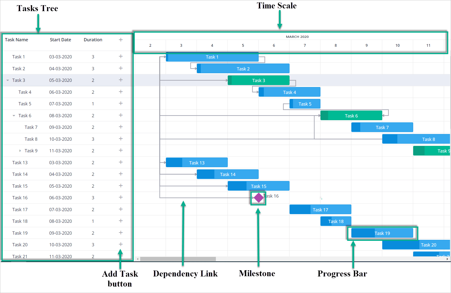
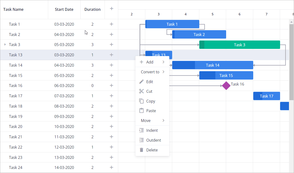
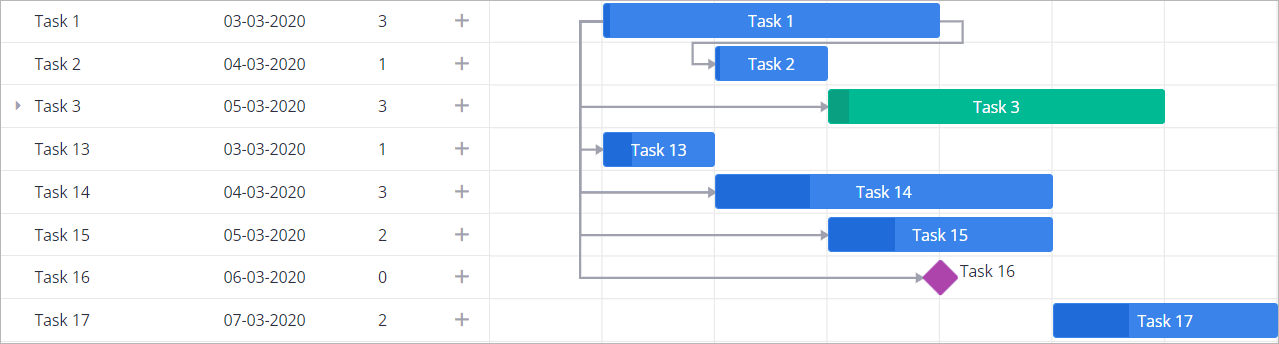
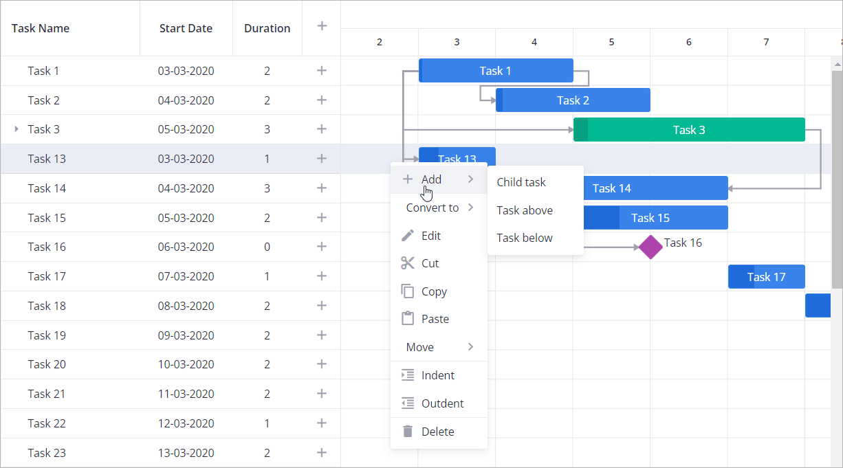
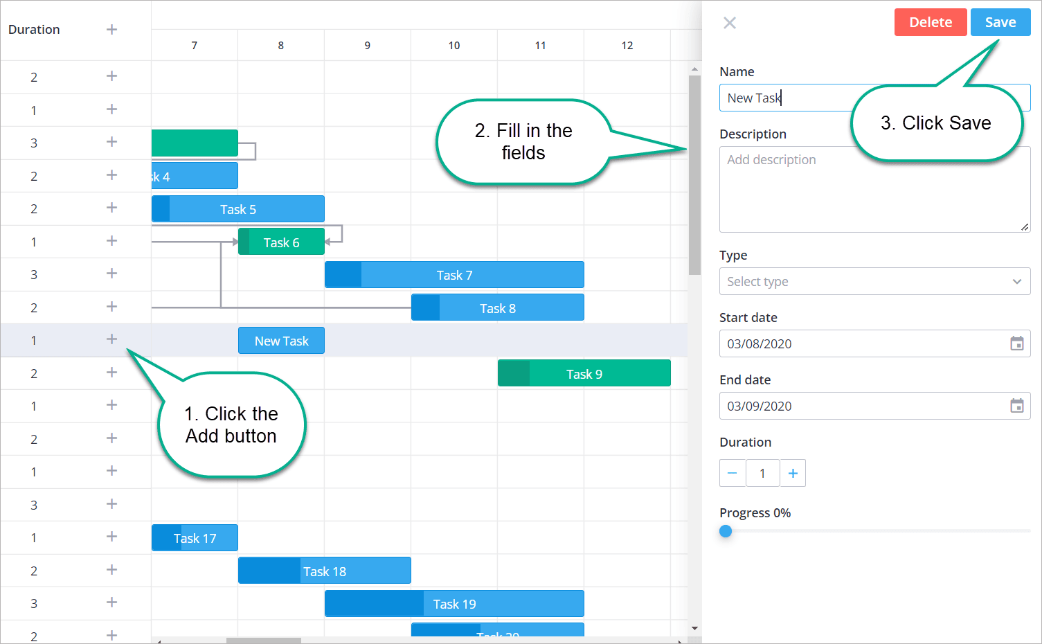
` 1. Right click the desired task in the **Tasks** tree or **Gantt chart** panel. 2. In the context menu hover **Convert**, and in the submenu, select the type to convert to. ![Gantt chart change task type](https://docs.svar.dev/react/gantt/assets/images/convertnew-11ff5c30bf6c3dd5566cf569d01dd6ca.png) Option 2: `
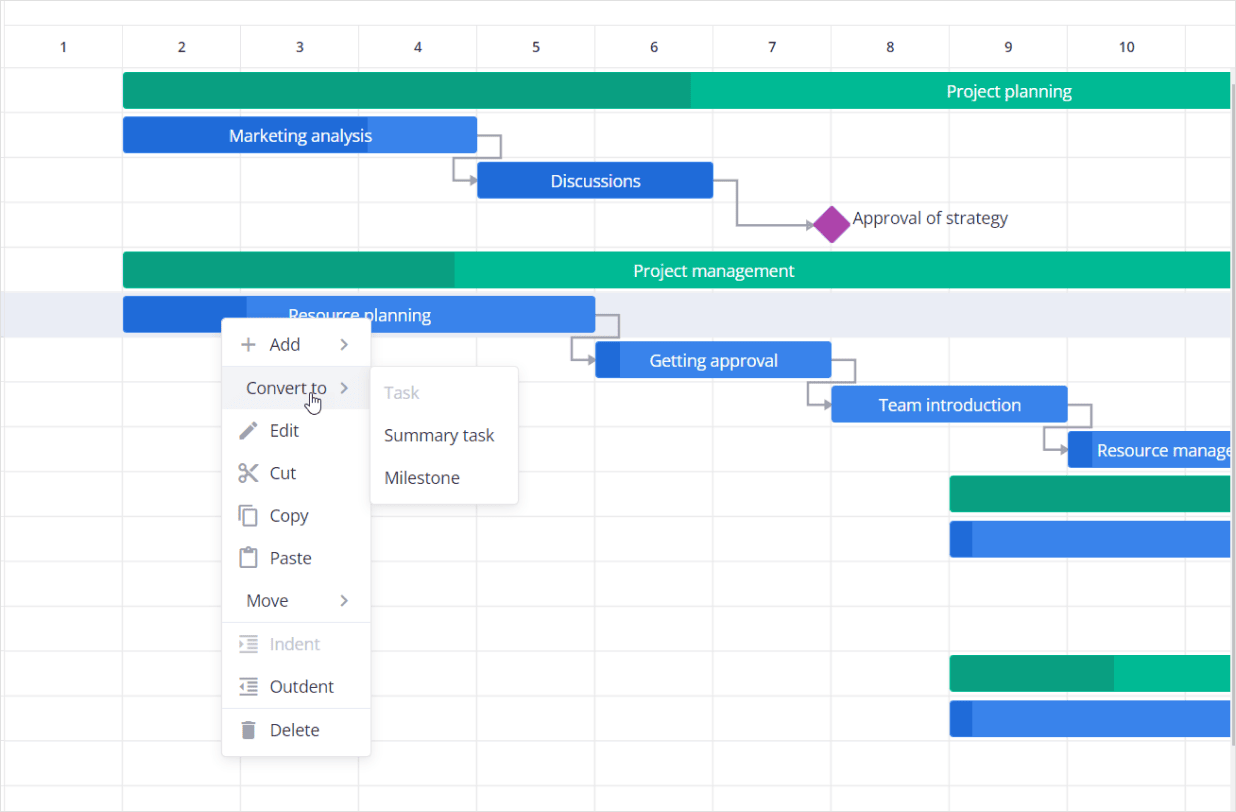
` 1. Double-click the desired task in the **Tasks** tree or **Gantt chart** panel. 2. In the sidebar modal that opens, in the **Type** drop-down list, select the type: ![Gantt chart change task type](https://docs.svar.dev/react/gantt/assets/images/act_type_form-f0747945a3a9185da991e773a018caf3.png) ### Edit a task[​](https://docs.svar.dev/react/gantt/guides/user-interface/#edit-a-task "Direct link to Edit a task") To edit a task/summary task/milestone: 1. Double-click the desired task in the **Tasks** tree or **Gantt chart** panel. OR In the context menu for the desired task, click **Edit**. 2. In the right sidebar modal that appears, edit the fields about the task. 3. Click **Save**. ![Gantt chart change task type](https://docs.svar.dev/react/gantt/assets/images/edit_task-a5b96e1b6353058031e2719be6d7b639.png) ### Delete a task[​](https://docs.svar.dev/react/gantt/guides/user-interface/#delete-a-task "Direct link to Delete a task") To delete a task/summary task/milestone: To delete a task, follow one of the procedures below: Option 1: In the context menu for the desired task, click **Delete**. Option 2: 1. Double-click the desired task in the **Tasks** tree or **Gantt chart** panel. 2. In the right sidebar modal that appears, click **Delete**. ![Gantt chart delete task](https://docs.svar.dev/react/gantt/assets/images/delete_task-6563da528982c07849aa6e81388b573d.png) ### Drag-n-drop progress bars (change task dates)[​](https://docs.svar.dev/react/gantt/guides/user-interface/#drag-n-drop-progress-bars-change-task-dates "Direct link to Drag-n-drop progress bars (change task dates)") To change the start date of a task, move it by the cental part along the horizontal scale. ![move](data:image/png;base64,iVBORw0KGgoAAAANSUhEUgAAARMAAAA+CAMAAAA/Mg/WAAAACXBIWXMAABJ0AAASdAHeZh94AAAAh1BMVEUd6bbj4+T8/Pz39/cd6LUB0ZpEiv////+4trbw8PBdYGHu7u+boqYUGCmpr64xvJhFxLBAX17LzdEd6KGTm5pcmJ4fxYWRkZJncoDZ2dkV3J/W1tdag4xK7sYsoHPAwcNFcGAr3bQj5bQzh2g9TFRTq6JwsaAyOkis9+T19fXU+/GY9d431LYczFzQAAADf0lEQVR42u2aa3OqMBCGpcaDJAEUUREQkHu1///3dQOoAY+t/UBia96hDB2cgX1mL2Gzk7nSUJP5P5lyiN7pXXvTpan3cGBy547U11JMFJPfxWQq87We5+E9Jm9E4ms9z8NV7Kh8opgoJqMzOZ72kz+u/en4Eyb1Hvn+bDb781jqR5kc9ykD8gJMgMrxISb1pCPyCkzQpH6AyQldkLwAE9DpCyaB5W631FrMZq/FZGFRsHse3DIJqOVohGiO5dqvxGThnu2mwYBJTHdGpx0tXodJydsd95jEFjEuIlbxKkxK3m7DijkmDuVvGYTacphs8EJs4AztDq5M3J3R084djclqiTuF3zFBmwTj9WFEJjd20wuTwDIGsuyxmCAbtAzhtPiOSYTXtp146YgV58bu4Mxk7gxuEaccM3ZWy/X3sYPaX40ZTuXQbsOZn5lQbXhPc0Uw2WQQQSw2fLjwFh2AGV43ruFHH81vi/FC59Zu2jDRNG1LhvfIVgCTDQ7b2Fglnm1nwIMx8ZOwixaE4M8f0U/+Z3fDhFIqhwnKwi42GvdYJSG78BOPz6p+NmI+uc+kpK6k2Jk0flBAtBTpOZ9kHBIUQUiNWHe+iB1i3eYaETm2qbW5WUXM9tBOEYJowmt0FqQWFlsHKTn2phaT8WoxxyTCxeFQxfMcIR/SCV4AEw9c5cqE+dG9GjVyLRa5ZrsygTMYbr5NzcMBLiC3IgYkwh8tkllbd7JQyppNn4td2/eY6LoZYQYla5mwusOQpCzTQJId0U+Ga3uDX9s7ltBvwC52MlinZoyJj6EWQyQ1TOBUtI7SrmPxh6hvQNL7BnwX2yvomKQstTImy2WS516BWibAokkpaQpA2jWdlF6BlJ5S4wyMiUWXeZXZ9rXi8GlWWk/p3Ht0S1tY7/HCBI6pZlZVhgYS0zAo3Tu9x3OPukZSmMDxrpkSiIDqJ+rbD5jAIYXJ6Zn2dzgmlTwm9VPtA0JpaZhoum7oeiyFyYP7gML2i6PczFKT294XzuTx/WJRcwV5bHimPCY/nCsQoxzCJa54Jmomx6qIrhPFpKdtPu1NZD4hE/Ejqp7H/6dVaj6WQaF8LGE1H8uaFOaOy7mOyidMtDIul56aBW29dls53YUZKCYdFGp6ThC7uaepmeFr0nfzKvccNUetZssVE8VEMVFMBMpQTJSfKCa/n4nSUJ8flFVavYfx8wAAAABJRU5ErkJggg==) To change the start or end date of a task, move its rightmost and leftmost part (the area is marked with the resizer cursor). ![Resize task](data:image/png;base64,iVBORw0KGgoAAAANSUhEUgAAAUIAAAAwCAMAAABT7oPQAAAACXBIWXMAABJ0AAASdAHeZh94AAAAq1BMVEVEiv/f39/i4uLY2NiHpLzq6uoGr4////+4trbw8PDh6O79/f1Ch/n28/f+///Hx8f7+vs5c9P4+Pk1a8adtMg8euE/gOzU1dXKzM/c3Nzv7++5dAC+vr7d5euCn7ZKz/9+mLCx0f+SlJji/v+lp6qcnqBdqP/g1P8QEBDPvv+vsLHe4OJgjf9hjdaz5//x4v+Slf/T8P91kb5Uf8a0t/+HiY0nb91Qc616fH5AzHZTAAAEg0lEQVRo3u3ai3KaQBQGYFikaBZQaZJdcU0EAa0xGi9p+/5P1rMgCiiIymWG+jPTONJI/eYcOGwR2o/cGaGtPHJXHoQPwjuiZ+Q6QvH/zOBCcn8QEEoZGUg1psyDE0J+ZEYieT8KCFF6RBHVlxIPzmtQukDIyzDXhwGhnB4kyvWl1IMjNMgmJAjl/Cgg7KRHFs1ObSnx4CYYcsJuSmAXBUEz1z8ACLX0mKhzeD3aeQuhKVHV1xdw+hlLf7t5Zn64riibHS1PgNBITweFryxPaFBA8Ayhr9hirN2GXUyUO5qRJ0DYSw8Q+j9HDSrAsAj75wgh2/mB0DB6OQKEOD0aMvgPS2hYooT9ZH62eCOzgawZPXx5w5cI4a/0GicYIez3X8IMYYMA4hvsanNCnCdAmH6XQ+aubbvO5+/GEgLga5ghbBBA/AO7/n47tIf1HMm4RybunCLTRNSxPxtKCDX4+qruM4SNX2e2f7/9eYc5LrlvmYE5Ujj5SO6moYQRwT2hurEZnwu7RJSJw+4hZPPIXGk6m6YSqmr45hA2Qdg4AxISyuac3U5InNhkbro19fK7Mi2fcHgk/HTlWYTQdMjNhK4Uv4uR7PKYJuFBe1+XCa3Jr6IJhxFCm8iz2ZEQzmG3EpJ58k7QKa8MLchE438uLhB6S6zoRRPuBX3CT0eWxdnsSNiZkxsJ2zRJSMelNuxEy9PIS0VbKgUTDoMEhOOZnwghbd9I6KIkIbKrILSgqY0dr7c19PV0ERC+Yy1ocesL3iizCm2UrELk5iJ8Pol9ssxjVkH4rkM/TzAYTvDUWisrn9Cb7E+Sql+WZZ4LbVOOnwvhez+d5BxhK5maCNe82rha0L9ABy883/TY2YUTCglCEic8wclJWFMj86/3jqH49NVXeC5cRwVLIUw0cowQ5SZMNLJb0+XEMhQF6yt+4VC0qV+ShqItKiMcU1kexAjpPNHF6YQ1DjVHwqWy2u0sqEI+v6wVzDsaW/q0MkJ/qIkRJoea3ISVjtZHwgkvON7I3g5eeMG5UIjNMeUS8tE6RngyWucnrPoGL0oIF+JAbR0QHq7IFRDCDZ6YeYOXn7DqZYawkTUYZfgsgyNDDb+4LMonDHJpmeEKwooXuwJCb8kna16LfLTGq/1oDbTTqggvLXZdQ1jHkqta52JXuGv7nbXkehUhvy7zhf/xtrEL/z6hGt8Duw4L//rdhIqGsKJYQsMJE3nxdzFR1gog1H1Cpbn/g5eRdjGEQRU20LA6wn0Vwu819GmGbEKjwCrkheg1jnD/FE0822faZazNGBNNo8gq9H/Xak4pRgjjzyQBIEwzfpBp4EKrEDxxxU+TRw9e8HPq2OjIEg2sEo8Wsm7wJkOdIgj18r5Fju9Z4sFxT5ORRPdq9LB1D2/RLn+kpuAqrDylEkIZogFJzUCicCo8d/xrCY0KCJ/SMiKjp7IyGn1IhFAoNno2hHY/RucPfyVhz6yAsFVL3t7exhmB3am/emUV9ppKyA0z0yqGsIpzIe+Ms/kosZH9Xs7KB804+AnhI3fmHxyFY1FMAWuwAAAAAElFTkSuQmCC) info **The summary task's bar cannot be resized. Its start and end dates cannot be changed separately**. And you can drag a summary task only with its child tasks, namely, if you shift a summary task, all its child tasks will be also moved. If a child task is rescheduled to start before the start date of a summary task, the summary task's start date changes. If a child task is rescheduled to end after a summary task's end date, the summary task's end date changes. You can also change the task dates in the **Edit** modal: see [Edit a task](https://docs.svar.dev/react/gantt/guides/user-interface/#edit-a-task) above. ### Change task progress[​](https://docs.svar.dev/react/gantt/guides/user-interface/#change-task-progress "Direct link to Change task progress") The progress control in bars is shown for tasks and summary tasks (not for milestones). You can change the progress by dragging the progress handler in a bar or follow the instructions below: 1. Open the **Edit task** modal by double-clicking a task or selecting **Edit** in the context menu. See [Edit a task](https://docs.svar.dev/react/gantt/guides/user-interface/#edit-a-task) above. 2. In the modal, in the **Progress** field, move the cursor. ![Gantt chart change task progress](https://docs.svar.dev/react/gantt/assets/images/change_progress_bar-653233db6aba33fc3ace952e8ba6460b.png) ### Copy&paste tasks[​](https://docs.svar.dev/react/gantt/guides/user-interface/#copypaste-tasks "Direct link to Copy&paste tasks") To copy and paste a task: 1. Select a task by clicking it and then in the context menu, click **Copy**. 2. Click the task after which you want to paste the copied task, and then in the context menu click **Paste**. ![Copy and paste](https://docs.svar.dev/react/gantt/assets/images/copypaste-f5015dde7ad7b130000cd3e9101583e4.png) ### Move and reorder tasks[​](https://docs.svar.dev/react/gantt/guides/user-interface/#move-and-reorder-tasks "Direct link to Move and reorder tasks") To move a task up and place it before the previous task, select a task and in the context menu, click **Move -> Up** To move a task up and place it after the next task, select a task and in the context menu, click **Move -> Down** ![Move](https://docs.svar.dev/react/gantt/assets/images/move-f4458d65795fc2f98633c76e234dcb07.png) To reorder tasks, in the **Tasks** tree, select a task, and drag-and-drop it to the required place in the tree. ### Indent and outdent tasks[​](https://docs.svar.dev/react/gantt/guides/user-interface/#indent-and-outdent-tasks "Direct link to Indent and outdent tasks") To demote a task to the lower nesting level, select it, and then in the context menu click **Indent**. To increase the task nesting level, select a task, and then in the context menu click **Outdent**. ![Indent](https://docs.svar.dev/react/gantt/assets/images/indent-6702e75be89d53731525d2a89e871652.png) ### Sort tasks[​](https://docs.svar.dev/react/gantt/guides/user-interface/#sort-tasks "Direct link to Sort tasks") Gantt allows users to sort tasks by clicking on a column header of the grid. When a single column header is clicked, tasks are sorted based on that column's values. For multi-sorting, users can hold the **Ctrl** key while clicking additional column headers. This preserves the existing sorting order and applies a secondary (or further) sorting level. The sorting priority is determined by the order in which the columns were selected, meaning the first clicked column has the highest priority. **How to use multi-sorting:** * Single sorting: click a column header to sort the data by that column * Multi-sorting: hold **Ctrl** and click another column header to add sorting without resetting the previous sorting * Sorting priority: sorting is applied in the order the columns were clicked, with earlier selections taking precedence * Removing sorting: click the column header again to toggle the sort direction or reset multi-sorting. Adding dependency links[​](https://docs.svar.dev/react/gantt/guides/user-interface/#adding-dependency-links "Direct link to Adding dependency links") ------------------------------------------------------------------------------------------------------------------------------------------------------ There are 4 types of links between activities: * End to Start * Start to Start * End to End * Start to End To create links, click the round marker at the edge of the source task bar and then click the marker of the target task bar. ![Gantt chart change task progress](https://docs.svar.dev/react/gantt/assets/images/add_links-1bf7d89ffadd0d9e7f63514ac589ca36.png) To edit the existing links, open the **Edit** modal for the desired task (see [Edit a task](https://docs.svar.dev/react/gantt/guides/user-interface/#edit-a-task) ), and in the **Predecessors** and/or **Successors** fields, change the link type. To delete a link, in the **Edit** modal, click the remove button next to the link type. ![edit link](https://docs.svar.dev/react/gantt/assets/images/edit_link-1f870eb05a6102cabf3d74fb81b3fb3b.png) Resizing grid and chart[​](https://docs.svar.dev/react/gantt/guides/user-interface/#resizing-grid-and-chart "Direct link to Resizing grid and chart") ------------------------------------------------------------------------------------------------------------------------------------------------------ You can expand/collapse the grid (tasks tree) and chart areas manually using the resizing button: ![Resizer](data:image/png;base64,iVBORw0KGgoAAAANSUhEUgAAAcQAAAEbCAYAAABEN/TlAAAACXBIWXMAABJ0AAASdAHeZh94AAAAB3RJTUUH6QcPCTAljE/1lwAAAAd0RVh0QXV0aG9yAKmuzEgAAAAMdEVYdERlc2NyaXB0aW9uABMJISMAAAAKdEVYdENvcHlyaWdodACsD8w6AAAADnRFWHRDcmVhdGlvbiB0aW1lADX3DwkAAAAJdEVYdFNvZnR3YXJlAF1w/zoAAAALdEVYdERpc2NsYWltZXIAt8C0jwAAAAh0RVh0V2FybmluZwDAG+aHAAAAB3RFWHRTb3VyY2UA9f+D6wAAAAh0RVh0Q29tbWVudAD2zJa/AAAABnRFWHRUaXRsZQCo7tInAAAZkElEQVR4nO3dcXSU5aHn8e9kkgnBBEnA0MBahJrT4hVt8YhVSimCe1hN9V7bor31FrcuvT24XJcuV1rLKacsdbXtKVfbutdWu2KxqPVge0+8cAzWy4UtsV2oXVq1jTfaiyGFQApMsMw7mcz+ERInMCJaZt5k3u/nHE5g3ieTX3xP8vN53mfmjW3fvj2LJEkRVxZ2AEmShoPygb/MmjUrzBxSUXV2dg7+vawsTl9f5pTjGxoaCh1JIUqlUiSTPdTWjiUej4cdR0WQe85bW1sBZ4iSJAEWoiRJgIUoSRJgIUqSBFiIkiQBObtMJb25VCoVdgQVULq3l2w2SxAElJU5T4iC3HM+YLAQ9+3bH0ooaSRIJnvCjqACymaz9JGlp+cosVgs7DgqgtxzPmCwECdMqA8llBSG3Nchno7a2rEFSqLhIAgCenqOUls71kKMiNxzPsAlU+k0+GLt0lZWVkYsFiMWi3muIyL3nA8+FmIeSZKGDQtRkiRcMpWkIR75w+94cn87z3Z30J0+FnYcFcH20e8HLERJGvTDfW18+jfPED8WUJ78E1WpXnCPTelr7P9gIUrScT/ueoX4sYDEwWT/A5ZhpHgNUZKO+5c/7qU8+aewYygkFqIkHdedPkZZqjfsGAqJhShJuVwmjSwLUZIkLERJkgALUZIkwEKUJAmwECVJAnxhvkLW/kwzrV3QcFETcy8IO42kKLMQFaogSBMEEGTCTiIp6qK5ZHpoB3f+1Wym3/AoHXkHBLT/ZDU3fWQe098/m+mXLeS/fGMrB/ylLUklK3KFmHp5I0s+fjstyeo3HdOx/nNct2onYxau4SdbHufxNVeR2LyST6zaQbKIWSVJxROpQkxuX8vCG77DkZvXs/rDPfkHZXZw79o2Jt3yDe5bcjlTxzcw7arF3Pf166F5LQ/9triZJUnFEalC7Pq3TiZ96fusv2kyBG8yaMe/8s+ZRj75l41DH/9AE9dP7OSpp9sKnlOSVHyR2lQzddHXuO8txnT822+B85h67olHGpl2MXz3lVdJ0UhlYSKWqL3s2txGd54jycP9Hw+2b2VLvgu6dY3MnzmxkOEkCYhYIZ6OVG8A55/HpDzHKuNAx0EOQN7jejNJuvZ303mKEcHhbl7LdyDrVVtJxWEhnqDjld9DPOEM8Iyq4Zz6OuJ5jiQPdXM4gMTZddTn+49eV1PocJIEWIgnmTRlMrwUkAo7SEmZyIwF+Zc9X9r0JK1dMG7qHOZPL3IsScoRqU01p6OyMgEvv5r39YmpDDCm2tmjJJUgC/EEk/5iOjW8SvueE4+08eKvoOb88xgfRjBJUkFZiCe6aA5NNW1s+PEJL6/4RTMb9lbTdOWF4eSSJBWUhXii+AyW3jGHjgeXs+S+rby4t5MXW77Hki9uJHnprXz20rADSpIKwU01edT8pzU8W7mW/7Z6NQu/G0BlNRdft4ZnV8xxufQMSyQqSCQgkW8LqiQVUWz79u1ZgFmzZoWdRSqazs43XhVZVhanr+/U79ze0NBQ6EgKUSqVIpns4ZxfPkpVx8Gw46jIWhrnAS6ZSpIEWIiSJAEWoiRJgIUoSRJgIUqSBFiIkiQBFqIkSYCFKElDZcMOoLBYiJIEHO3r5d2jauir9A28ospClCTgrLJyLjirlt6aqrCjKCQWoiQd9/H6qdRU1xCMq6EvUe7yacS4NiBJx93c8D7GJkbxYMeLbDrw+7DjqMgsREnK8bH69/Cx+veEHUMFNvCG7rW1Y2ltbQVcMpUkCbAQJUkCcpZM9+3bH2YOaVg7dOhw2BFUQH3ZPjLZPo4cSRKLxcKOoyLIPecDBgtxwoT6UEJJYci9QfDpKC/3cnspy2Qy9JKhoqIcsBCjYOg57+dPuXQaqqvPCjuCCiiVSpFOp6mqqiIej4cdR0WQe84HeA1RkiQsREmSAJdMJWmI/9MW8IOfvc7u13rJ+k41EfBHvj63/28WoiQd97OX06z4UQ/HUgE9PccI0r1hR3rHJr6rLuwII46FKEnHrd/xJ46lArr/2BN2FIXAa4iSdNyvOzL09BwLO4ZCYiFK0nHZLCN6mVR/HgtRkiQsREmSAAtRkiTAQpQkCbAQJUkCLERJkgALUZIkwHeqUcjan2mmtQsaLmpi7gVhp5EUZRaiQhUEaYIAgkzYSSRFnUumJ0huXc3c989m4bq3d0d1SdLIZiHmSm5lzcodpGrCDiJJKjYLcVAP/7xqJT9vupWbJ4adRZJUbBbicQc2fokV/6+J1UsvoTLsMJKkonNTDcCeR1ny1Vf55AP3MHt0J+1h5yk5e9m1uY3uPEeSh/s/HmzfypaOPAPqGpk/0ym7pMKzEDO/Z92K73Dk5u9zxwfCDlOqknTt7+ZU25SCw928lu9ANlmgTJI0VOQLsX39V/hGZjE/WdIYdpQSVsM59XXE8xxJHurmcACJs+uoz7dWXecOJ0nFEe1CfOVhvnAvLH/i00zN99taZ8hEZizIv+z50qYnae2CcVPnMH96kWNJUo7oFmKmjW/93fdov/TTnPPyVra8PHDgIC8k4chLO9jSMo6a8y/nsimJMJNKkooguoW4dyfb9kBqz8OsaM13fC3LNsG0ZY/z+JSGoseTJBVXdAvx3Bt5/Pkb8xzoZN0NC3nq6sd5fJFFKElR4esQJUkiyjNEDQuJRAWJBCTc1CQpZBbiSRpY9Ng2FoUdIyKmzmtiatghJAmXTCVJAixESZIAC1GSJMBClCQJsBAlSQIsREmSAAtRkiTAQpSkQbEYJCp8eXZUWYiSdNyFk+JUV48KO4ZCYiFK0nE3XV7FqMoEdbXVzhQjyDMuScddcX4FX79hDD/42evsfi1BNht2IhWThShJOWY1JpjV6E3BS10qlSKZ7KG2diytx++J65KpJElYiJIkAS6ZSqcllUqFHUEFlO7tJZvNEgQBZWXOE6Ig95wPGCzEffv2hxJKGgmSyZ6wI6iAstksfWTp6TlKLBYLO46KIPecDxgsxAkT6kMJJYWhs7PzbY2vrR1boCQaDoIgoKfnKLW1Yy3EiMg95wNcMpVOQzweDzuCCqisrIxYLEYsFvNcR0TuOR98LMQ8kiQNGxaiJElYiJIkARaiJEmAhShJEmAhSpIEWIiSJAEWoiRJgIUoSRJgIUqSBFiIkiQBFqIkSYCFKEkS4N0uFLL2Z5pp7YKGi5qYe0HYaSRFmYWoUAVBmiCAIBN2EklRF/lCTO3ZwaP3P8z9Lb8mmQJqJnPZdYu5a9kcxntbNEmKjEhfQ0z9Yi0LPno7D+27kKXfXs+zW9bzwNLpdG1YydzPNXMg7ICSpKKJ9Ayx8tLFrH9yMZOmVA8+Nn7hCtZXHuSKVRt5ak8Ti84NMaAkqWgiPUOE6iFlOKBmxgym0cYL7SFEkiSFItIzxDfV9jtepJFrGsMOUir2smtzG915jiQP93882L6VLR15BtQ1Mn/mxEKGkyTAQsyjm40bWuDSFVzj7+EzJEnX/m46TzEiONzNa/kOZJMFyiRJQ1mIJ2hft5xVuxpZ/kQT48MOUzJqOKe+jnybdpOHujkcQOLsOuor8wyoqyl0OEkCLMQhDmxayS1rD3L1PY+waErYaUrJRGYsyD/dfmnTk7R2wbipc5g/vcixJClHxDfVvCH509V84ou7mfnNR7h7zskbbSRJpc1CpL8Mr/38zv4yvNIylKQoinwhJrdahpKkiF9DTG5dzbW3tTCmaRlzMjvZ0nLCgJrzmP3ByeTb6yFJKi2RLsTnW1o4ABxoXsuK5jwD3nsrmx+bzKRiB4uQRKKCRAISvm+spJBFuhBnr9nG7jVhp4i2qfOamBp2CEnCa4iSJAEWoiRJgIUoSRJgIUqSBFiIkiQBFqIkSYCFqIh57uc7mTf/Whbe8J/JZrOn/Wfe/GuZN/9anvv5zrC/BUkFEunXISpanvv5Tu644ys8s+WfiMXGvK3P/ekz/8KhQ3u5/mN/zZ13ruKymZcUKKWksDhDVCTkluE7dfbZ1Tz+2DruuOMrzhSlEuQMUSUvXxl+aPYV3HDjZ077Oa6c9xEAxo2r5YePPMhff+oWZ4pSibEQVfLyzQy3/evmd/x8EyacM1iKf86MU9LwYiGq5N155yrmzb92SHnN/vCCt/UciURi8PP37esanCFKKh0WokreZTMvOakUt2/7GR0dLwFQVhanry9zyueYNOl9wNAydLlUKi1uqlEk5JbiO2UZSqXNQlRk5Jbih2Zf8bY+98p5H7EMpRIX2759exbg/PMbw84iFUQ2mz3psdwl0tNZMq2qGv2Ov34sFnvHn6vi6Mv2ke7tJVFe4fmKiNxz/sILvwFyriFOmFAfWjCp2Pbu3fu2xpeXv/PL7f6CHf4ymQy9ZKioKAc8X1Ew9Jz3c1ONdBpqaqrDjqACSqVSpNNpqqqqiMfjYcdREeSe8wFeQ5QkCQtRkiTAQpQkCbAQJUkCLERJkgALUZIkwEKUJAmwECVJAixESZIAC1GSJMBClCQJsBAlSQIsREmSAAtRkiTA2z8pZO3PNNPaBQ0XNTH3grDTSIoyC1GhCoI0QQDBqW9YL0kFF/lCTO3ZwaP3P8z9Lb8mmQJqJnPZdYu5a9kcxnufUEmKjEhfQ0z9Yi0LPno7D+27kKXfXs+zW9bzwNLpdG1YydzPNXMg7ICSpKKJ9Ayx8tLFrH9yMZOmVA8+Nn7hCtZXHuSKVRt5ak8Ti84NMaAkqWgiPUOE6iFlOKBmxgym0cYL7SFEkiSFItIzxDfV9jtepJFrGsMOUir2smtzG915jiQP93882L6VLR15BtQ1Mn/mxDOeKBaLDfl77r8lRZOFeJJuNm5ogUtXcM2Z/z0cUUm69nfTeYoRweFuXst3IJssUCZJGspCPEH7uuWs2tXI8ieaGB92mJJRwzn1deTbtJs81M3hABJn11FfmWdAXU2hw0kSYCEOcWDTSm5Ze5Cr73mERVPCTlNKJjJjQf7p9kubnqS1C8ZNncP86UWOJUk5Ir6p5g3Jn67mE1/czcxvPsLdc07eaCNJKm0WIv1leO3nd/aX4ZWWoSRFUeQLMbnVMpQkRfwaYnLraq69rYUxTcuYk9nJlpYTBtScx+wPTibfXg9JUmmJdCE+39LCAeBA81pWNOcZ8N5b2fzYZCYVO1iEJBIVJBKQ8H1jJYUs0oU4e802dq8JO0W0TZ3XxNSwQ0gSXkOUJAmwECVJAixESZIAC1GSJMBClCQJsBAlSQIsREmSAAtRkiTAQpQkCbAQJUkCLERJkgALUZIkwEKUJAmwECVJAiJ++yfpdKVSqbAjqIDSvb1ks1mCIKCszHlCFOSe8wGDhbhv3/5QQkkjQTLZE3YEFVA2m6WPLD09R4nFYmHHURHknvMBg4U4YUJ9KKGkMHR2dr6t8bW1YwuURMNBEAT09ByltnashRgRued8gEum0mmIx+NhR1ABlZWVEYvFiMVinuuIyD3ng4+FmEeSpGHDQpQkCQtRkiTAQpQkCbAQJUkCLERJkgALUZIkwEKUJAmwECVJAixESZIAC1ERFYvFyGazAGSzfW85PpPJFDqSpJD5XqaKhHQ6TTqdJpVKkU6nyWazg+9hOFCMp7J//37i8TgVFRVUVlZSUVFBRUVFoWNLKiILUSUnm82STqcJgmDwz+mU3lvJZDJkMhmOHTsG9M8yE4nE4J+KigrvlCCNYBaiQtX+TDOtXdBwURNzLzj9z8ud4fX19REEwZASLIZsNksqlRpy8+DcckwkEpSVlQ3JKmn4shAVqiBIEwQQnOYluoECGijA4SZfIcdiMcrKyhg1ahRVVVUutUrDVOQLMbVnB4/e/zD3t/yaZAqomcxl1y3mrmVzGO9t0YaVVCpFMpkclkV4Ktlslkwmw9GjR0mlUowZM4bKysqwY0k6QaR3maZ+sZYFH72dh/ZdyNJvr+fZLet5YOl0ujasZO7nmjkQdkAN6u3t5fXXXx9xZXiige+jr++td7ZKKq5IzxArL13M+icXM2lK9eBj4xeuYH3lQa5YtZGn9jSx6NwQA2pQb2/v4GaWke7YsWOMHj3aWaI0zER6hgjVQ8pwQM2MGUyjjRfaQ4ikvHp7e8OOcEaN9JmuVIoiPUN8U22/40UauaYx7CClYi+7NrfRnedI8nD/x4PtW9nSkWdAXSPzZ048Iy+bGE5K7fuRSoGFeJJuNm5ogUtXcM3EsLOUiiRd+7vpPMWI4HA3r+U7kE0WKJMkDWUhnqB93XJW7Wpk+RNNjA87TMmo4Zz6OvJt2k0e6uZwAImz66jPd0mtrqbQ4SQJsBCHOLBpJbesPcjV9zzCoilhpyklE5mxIP90+6VNT9LaBeOmzmH+9CLHkqQcEd9U84bkT1fziS/uZuY3H+HuOSdvtNHIdLTtVf5QwOd/ue3VAj67pGKyEOkvw2s/v7O/DK+0DEvF0efu5ZZ/2F3Qr9H9k9tZ8kS+3UCSRprIF2Jyq2VYio4+94/c8j+2593Zeqa9/OAyS1EqAZG+hpjcupprb2thTNMy5mR2sqXlhAE15zH7g5Px5dMjS38Z/pTuIt7C8OUHl7GEtdz38UnF+6KSzqhIF+LzLS0cAA40r2VFc54B772VzY9Nxl9xhZNIVJBIQOIMvW/s0V99n9uKXIYDLEVpZIt0Ic5es43da8JOEW1T5zUx9Uw9WbCLe7+8mX8P8eb2Lz94O//z3If44mXe0UIaaSJ/DVElJDGDv7vres4P8S4l59/yNctQGqEsRJWUs6bdyNe/uoB3F70UK5j2WZdLpZHMQlTJOeviz3BPUUuxgmmf/Rr3/JVlKI1kFqJKUvFKcSwzb7MMpVIQ6U01Km1nXfwZ7vn7DlIF/BrvvmEVa861DKVSYCGqpJ117iTOKuDzv8sylEqGS6aSJGEhSpIEWIiSJAEWoiRJgIWoESIWi4Ud4Ywqte9HKgUWokaE8vLS2hBdUeHbu0nDjYWoEaG8vJxRo0aFHeOMGDVqlIUoDUMWokaE8vJyRo8ePeKLZOD7KCvzR08abkprHUolrbKy/1bNqVSKIAhIp9MhJzo9sViMeDxOZWUlVVVVI77UpVI1WIj79u0PM4f0tsViZWSzWSBb8K/1Tmd0sViMsrI4sViMvr4sR4++foaT6Uzoy/aRyfZx5EjSDU8RkXvOBwwW4oQJ9aGEkv5cfX19gzPGIAgIgqAgX+N0xONx4vFy4vEy4vFyf7mOEJlMhl4yVFSUA56zKBh6zvu5ZKoRr6ysjFGjRg1uuslms0PKMQiC4zPJMysWi5FIJAb/VFRUWIAjVCqVIp1OU1VVRTwe4h2mVTS553yAhaiSk1tUA9LpNOl0evCHIJPJvO3njcfjVFRUUFlZSUVFhdcCpRJjISoSBgps9OjRAPzhD3+gr6+PWCxGLBZ7yxlkfX29MwepxLn3W5GUzWYHlzdjsbf+MbAMpdJnIUqShIUoSRJgIUqSBFiIkiQBFqIkSYCFKEkSYCFKkgRYiJIkARaiJEmAhShJEmAhSpIE+ObeCln7M820dkHDRU3MvSDsNJKizEJUqIIgTRBA8PbvxiRJZ1SECjGgY/tG7v3uBrb9pptkBqis5uKrFvP3K67n4po841u+x6r7m3n+5R5SAJXX88Bzy7is6NklSYUWmUJMNq9kwardTPvYYu7+wuVMq4euXzbzrbvXctPfBmz+4Y1MGhzdw7aVn2LJJph9y+f5zl2X8J6xkNqfpDLE70GSVDiRKcSapjX83ysTVI5+47HxVy3mvrE9XLF4Het+eSN3fKD/8QMbv8SSTeNY/sT3WTQl50nG1xU1sySpeCJTiDC0DAe9q4H/QA+Hjww80MaG/72LSTf9r6FlKEkqaREqxPzan36aF+Nz+Oylxx94ZQdb9lTz4Y9cGGqu0rKXXZvb6M5zJHm4/+PB9q1s6cgzoK6R+TMnFjKcJAERLMRUsptkCo68spNtP1nHt1pg0T9+gfkDs8d/f5V2LuFvJ/6adZ+/i/u3/p5kBmqmzOCT//2rLP1Qdaj5R6YkXfu76TzFiOBwN6/lO5BNFiiTJA0VuUL8+d3XsaT5+D/GN3L1TddzTeMbJdfx6qsAPPSFu5j2l6v40R3jqCTJ8/d9iWX/9VMc+PaP+MqHEsUPPqLVcE59HfE8R5KHujkcQOLsOurz7ViqO2n7ryQVROQKcfaabexeA2QCkq/s5KF/uIuF8zaesIGmkyl/8yO+cuVAUdYx/8v3cscr13HnuqdZ+qEmxocTf4SayIwF+Zc9X9r0JK1dMG7qHOZPL3IsScoR3bduiyeoOf9ylt6zik+ObuMbP9gBQGVNDXA5TVeeuDRax4c/0ggdnXQVPawkqdCiW4gD4g1MmggE/f8cP+U8aniV9j0nDz1ypAdqahhTzHySpKKwEPftoOW3MGni8UXQDzTxyXPb2PDjtqHjMm1seboTGifnvIBfklQqInMNcdudC1nXez3XX3kJF79vHJXBQV7c/jT3f/dRfjX+Ku77m8bjIxu5eflVbLztc1yXXMZdN1/BmEO72XjfN/nu3kaW33d5qN+HJKkwIlOI0666nnHf2siap75DMtX/WOXYyby/aQ2bl85hUs4Ox5o5X+afHt7Imru+w8Kr74Z4NeP/4j+y9se3Mv/ccPKXqkSigkQCEvm2oEpSEcW2b9+eBZg1a1bYWaSi6ex841WRZWVx+vpOfbuNhoaGQkdSiFKpFMlkD7W1Y4nH/b+zKMg9562trYDXECVJAixESZKAnCVTSZKizBmiJEnA/wfAo5ZNguq6BwAAAABJRU5ErkJggg==) Hotkeys[​](https://docs.svar.dev/react/gantt/guides/user-interface/#hotkeys "Direct link to Hotkeys") ------------------------------------------------------------------------------------------------------ Gantt supports the following keyboard shortcuts to navigate and interact with data faster: * Navigation * Arrow Up / Arrow Down - move selection vertically between rows (keys "arrowup"/"arrowdown") * Arrow Left / Arrow Right - move focus horizontally between grid cells within the same row * Copy, Cut, and Paste * Ctrl + C - copy the selected tasks (action key: "ctrl+c") * Ctrl + X - cut the selected tasks (action key: "ctrl+x") * Ctrl + V - paste next to the selected task (action key: "ctrl+v") * Delete * Ctrl + D / Backspace - delete the selected tasks (action keys: "ctrl+d"/"backspace") * Execute grid cell action * Enter - trigger the action associated with the current cell. For example, "open-task" action for "Task name" cells and "add-task" for the "+" cells. * [Main UI elements](https://docs.svar.dev/react/gantt/guides/user-interface/#main-ui-elements) * [Task types](https://docs.svar.dev/react/gantt/guides/user-interface/#task-types) * [Task](https://docs.svar.dev/react/gantt/guides/user-interface/#task) * [Milestone](https://docs.svar.dev/react/gantt/guides/user-interface/#milestone) * [Summary task](https://docs.svar.dev/react/gantt/guides/user-interface/#summary-task) * [Custom type](https://docs.svar.dev/react/gantt/guides/user-interface/#custom-type) * [Managing tasks](https://docs.svar.dev/react/gantt/guides/user-interface/#managing-tasks) * [Add a task](https://docs.svar.dev/react/gantt/guides/user-interface/#add-a-task) * [Convert one task type into another](https://docs.svar.dev/react/gantt/guides/user-interface/#convert-one-task-type-into-another) * [Edit a task](https://docs.svar.dev/react/gantt/guides/user-interface/#edit-a-task) * [Delete a task](https://docs.svar.dev/react/gantt/guides/user-interface/#delete-a-task) * [Drag-n-drop progress bars (change task dates)](https://docs.svar.dev/react/gantt/guides/user-interface/#drag-n-drop-progress-bars-change-task-dates) * [Change task progress](https://docs.svar.dev/react/gantt/guides/user-interface/#change-task-progress) * [Copy&paste tasks](https://docs.svar.dev/react/gantt/guides/user-interface/#copypaste-tasks) * [Move and reorder tasks](https://docs.svar.dev/react/gantt/guides/user-interface/#move-and-reorder-tasks) * [Indent and outdent tasks](https://docs.svar.dev/react/gantt/guides/user-interface/#indent-and-outdent-tasks) * [Sort tasks](https://docs.svar.dev/react/gantt/guides/user-interface/#sort-tasks) * [Adding dependency links](https://docs.svar.dev/react/gantt/guides/user-interface/#adding-dependency-links) * [Resizing grid and chart](https://docs.svar.dev/react/gantt/guides/user-interface/#resizing-grid-and-chart) * [Hotkeys](https://docs.svar.dev/react/gantt/guides/user-interface/#hotkeys) --- # Fullscreen mode | React gantt Documentation [Skip to main content](https://docs.svar.dev/react/gantt/guides/fullscreen/#__docusaurus_skipToContent_fallback) On this page ### Enabling the fullscreen mode[​](https://docs.svar.dev/react/gantt/guides/fullscreen/#enabling-the-fullscreen-mode "Direct link to Enabling the fullscreen mode") To enable the fullscreen mode, import the [**Fullscreen**](https://docs.svar.dev/react/gantt/helpers/fullscreen_component) component and wrap the **Gantt** component with the **Fullscreen** component. Example: import { getData } from "../data";import { Gantt, Fullscreen } from "@svar-ui/react-gantt";const data = getData();export default function Demo() { return (
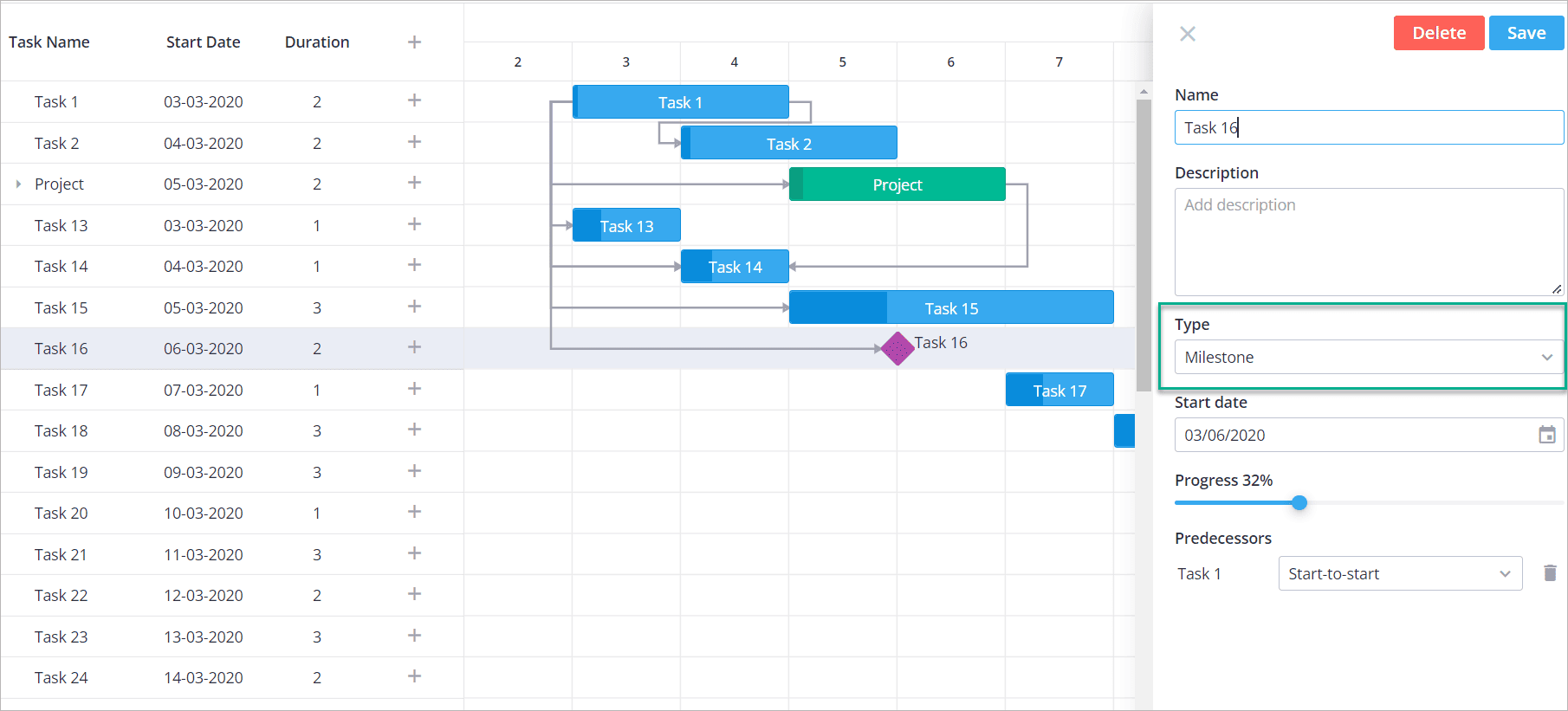
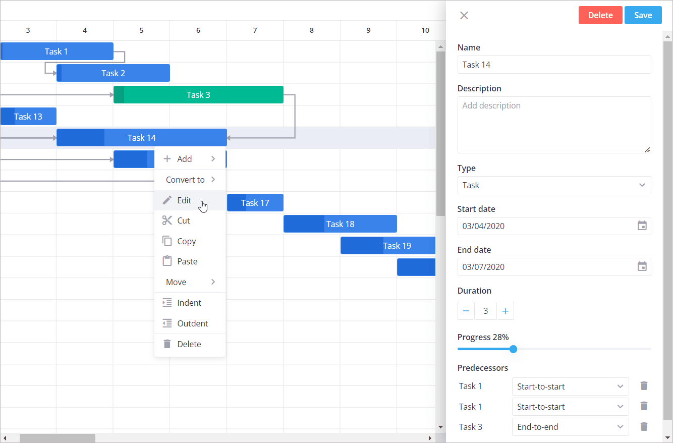
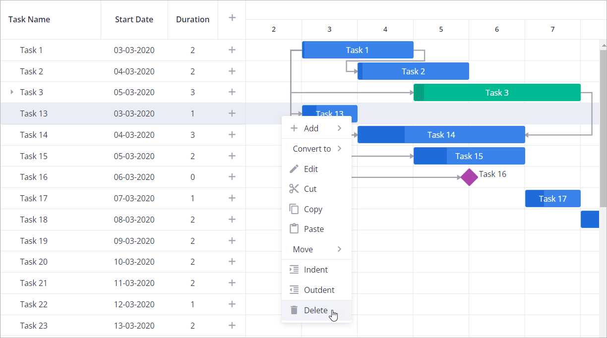
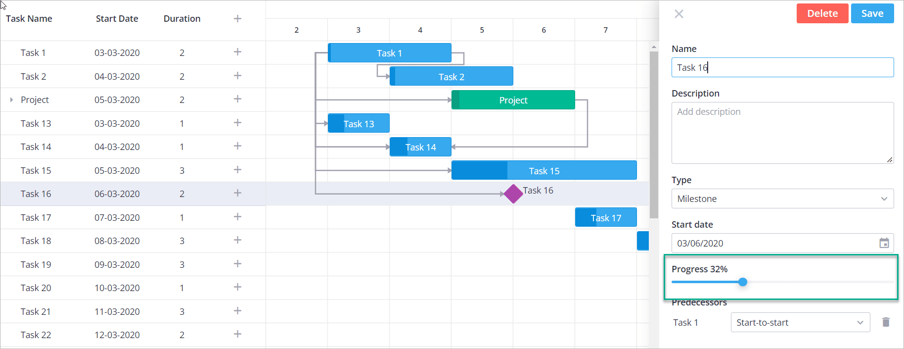
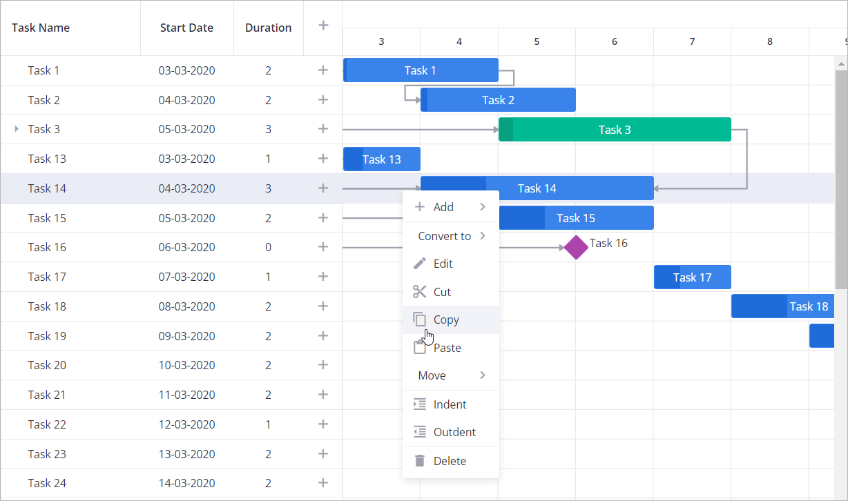
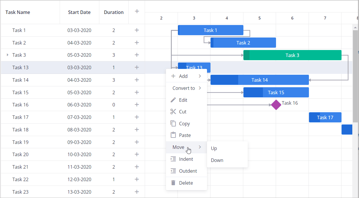
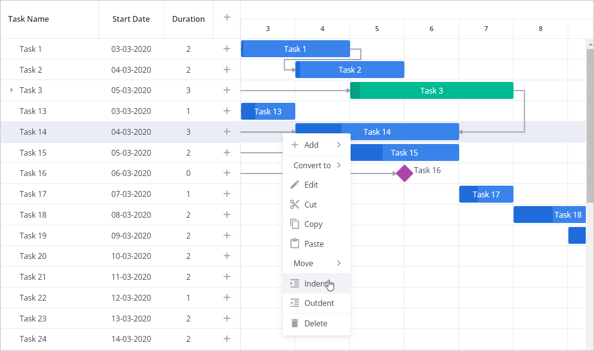
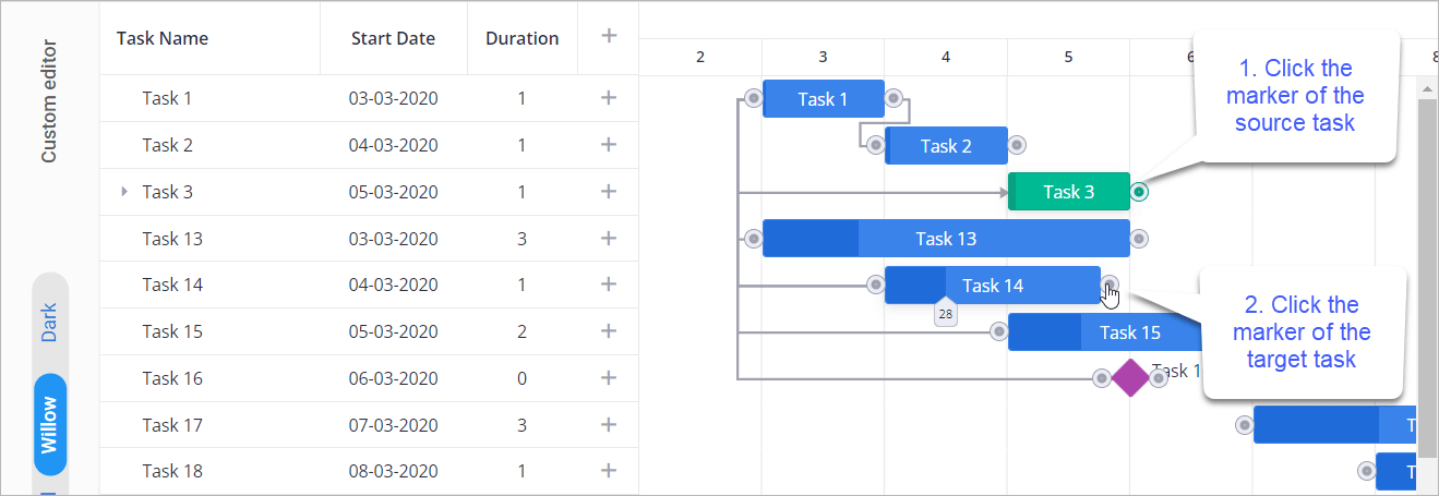
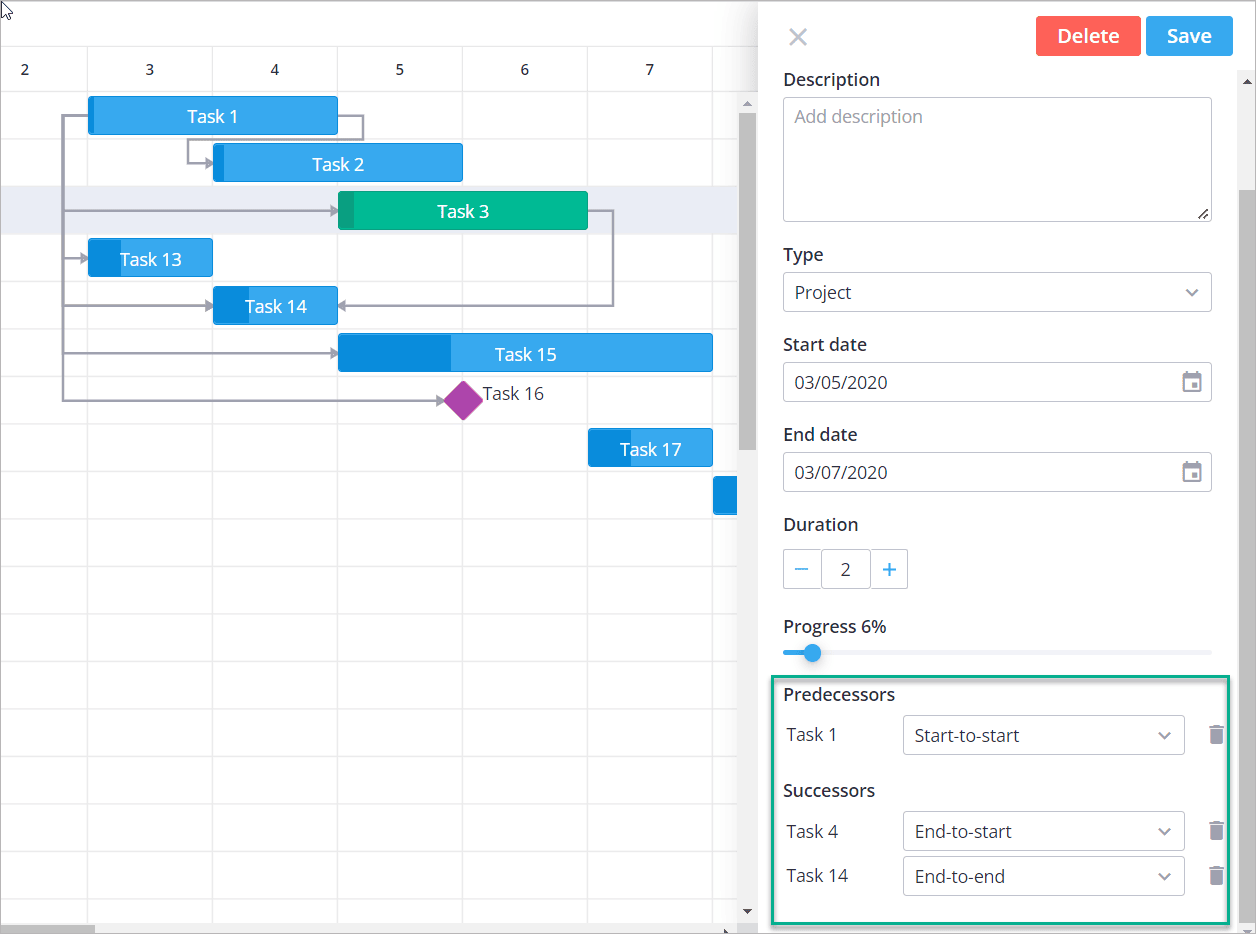
Click the "expand" icon

);} CSS: .demo { display: flex; flex-direction: column; gap: 10px; height: 100%;}.gtcell { overflow: hidden; border: var(--wx-gantt-border);} ### Assigning hotkeys[​](https://docs.svar.dev/react/gantt/guides/fullscreen/#assigning-hotkeys "Direct link to Assigning hotkeys") You can also assign hotkeys for enabling the fullscreen mode. Add the value to the **hotkey** prop of the **Fullscreen** component: Example: import { getData } from "../data";import { Gantt, Fullscreen } from "@svar-ui/react-gantt";const data = getData();export default function HotkeyExample() { return ( );} * [Enabling the fullscreen mode](https://docs.svar.dev/react/gantt/guides/fullscreen/#enabling-the-fullscreen-mode) * [Assigning hotkeys](https://docs.svar.dev/react/gantt/guides/fullscreen/#assigning-hotkeys) --- # Read-only mode | React gantt Documentation [Skip to main content](https://docs.svar.dev/react/gantt/guides/read_only_mode/#__docusaurus_skipToContent_fallback) info In this mode you cannot create and edit tasks and links, and drag task bars. To make the entire Gantt read-only, set the [`readonly`](https://docs.svar.dev/react/gantt/api/properties/readonly) property to **true** and define it inside the **Gantt** tag. import { useState } from "react";import { getData } from "./data";import { Gantt } from "@svar-ui/react-gantt";const data = getData();export default function App() { const [readonly, setReadonly] = useState(true); return ;} --- # Changelog | React gantt Documentation [Skip to main content](https://docs.svar.dev/react/gantt/whats_new/#__docusaurus_skipToContent_fallback) On this page Version 2.3.3[​](https://docs.svar.dev/react/gantt/whats_new/#version-233 "Direct link to Version 2.3.3") ---------------------------------------------------------------------------------------------------------- Released on October 28, 2025 ### Fixes[​](https://docs.svar.dev/react/gantt/whats_new/#fixes "Direct link to Fixes") * Fullscreen `hotkey` property should be optional * Incorrect handling of themes * ContextMenu custom class name cannot be set Version 2.3.2[​](https://docs.svar.dev/react/gantt/whats_new/#version-232 "Direct link to Version 2.3.2") ---------------------------------------------------------------------------------------------------------- Released on October 23, 2025 ### Fixes[​](https://docs.svar.dev/react/gantt/whats_new/#fixes-1 "Direct link to Fixes") * Tooltips for bars are not visible Version 2.3[​](https://docs.svar.dev/react/gantt/whats_new/#version-23 "Direct link to Version 2.3") ----------------------------------------------------------------------------------------------------- Released on October 22, 2025 ### New features[​](https://docs.svar.dev/react/gantt/whats_new/#new-features "Direct link to New features") * TypeScript definitions * Ability to define "hour" [duration unit](https://docs.svar.dev/react/gantt/api/properties/durationunit) * Ability to define "minute" [length unit](https://docs.svar.dev/react/gantt/api/properties/lengthunit) * Ability to [create custom scale units](https://docs.svar.dev/react/gantt/guides/configuration/configure_scales/#adding-a-custom-scale-unit) * [autoScale](https://docs.svar.dev/react/gantt/api/properties/autoscale) property to configure start/end scale behaviour * Standalone sidebar and modal [Editor](https://docs.svar.dev/react/gantt/guides/configuration/configure_editor) * Ability to validate fields in the [Editor](https://docs.svar.dev/react/editor/api/editor/) * [Hotkeys](https://docs.svar.dev/react/gantt/guides/user-interface/#hotkeys) for common actions and navigation * Multi-sorting for table columns via the [sort-tasks](https://docs.svar.dev/react/gantt/api/actions/sort-tasks) action * [Headermenu](https://docs.svar.dev/react/gantt/guides/configuration/configure_grid/#adding-a-header-menu) to hide table columns * [Inline editors for table cells](https://docs.svar.dev/react/gantt/guides/configuration/configure_grid/#applying-in-built-inline-editors) * Ability to [expand/collapse table and chart via buttons](https://docs.svar.dev/react/gantt/guides/user-interface/#resizing-grid-and-chart) ### Breaking changes[​](https://docs.svar.dev/react/gantt/whats_new/#breaking-changes "Direct link to Breaking changes") * The package migrated from `wx-react-gantt` to `@svar-ui/react-gantt` Version 1.3.1[​](https://docs.svar.dev/react/gantt/whats_new/#version-131 "Direct link to Version 1.3.1") ---------------------------------------------------------------------------------------------------------- ### Fixes[​](https://docs.svar.dev/react/gantt/whats_new/#fixes-2 "Direct link to Fixes") * Rendering issues Version 1.3[​](https://docs.svar.dev/react/gantt/whats_new/#version-13 "Direct link to Version 1.3") ----------------------------------------------------------------------------------------------------- * Released under GPLv3 Version 1.1[​](https://docs.svar.dev/react/gantt/whats_new/#version-11 "Direct link to Version 1.1") ----------------------------------------------------------------------------------------------------- ### New functionality[​](https://docs.svar.dev/react/gantt/whats_new/#new-functionality "Direct link to New functionality") * [Summary](https://docs.svar.dev/react/gantt/guides/configuration/configure_summary) tasks * [Sorting](https://docs.svar.dev/react/gantt/api/actions/sort-tasks) Grid columns * [Batch mode](https://docs.svar.dev/react/gantt/guides/working_with_server#enabling-the-batch-mode) for RestDataProvider to handle mass operations ### New API[​](https://docs.svar.dev/react/gantt/whats_new/#new-api "Direct link to New API") * New [sort-tasks](https://docs.svar.dev/react/gantt/api/actions/sort-tasks) action is added * [`batchURL`](https://docs.svar.dev/react/gantt/helpers/rest_routes/post_batch) is added * The [`columns`](https://docs.svar.dev/react/gantt/api/properties/columns) property is extended with the `sort` parameter * The `minCellWidth` and `maxCellWidth` settings are added to the [`zoom`](https://docs.svar.dev/react/gantt/api/properties/zoom) property * The [update-task](https://docs.svar.dev/react/gantt/api/actions/update-task) and [copy-task](https://docs.svar.dev/react/gantt/api/actions/copy-task) actions are extended with the `eventSource` parameter * The `source` parameter is added to the [`move-task`](https://docs.svar.dev/react/gantt/api/actions/move-task) and [`delete-task`](https://docs.svar.dev/react/gantt/api/actions/delete-task) actions * RestDataProvider config has the [`batchUrl`](https://docs.svar.dev/react/gantt/helpers/rest_routes/post_batch) property * New parameters (`source` and `lazy`) are added to the [`copy-task`](https://docs.svar.dev/react/gantt/api/actions/copy-task) action ### Updates[​](https://docs.svar.dev/react/gantt/whats_new/#updates "Direct link to Updates") * Common minCellwidth and maxCellWidth for zoom levels * Skipping meaningless actions in Context Menu and Toolbar ### Fixes[​](https://docs.svar.dev/react/gantt/whats_new/#fixes-3 "Direct link to Fixes") * Scroll in Grid is not smooth * Impossible to resize chart bars on the left more than for one cell * When a branch is removed, only links of the parent task are removed * Unstable move down behaviour: tasks are inserted in wrong positions * Resizing columns: horizontal scrollbar does not appear * Text of tasks is higher than a dragged bar during reordering * Last task is misplaced after reordering when there are few tasks * Reordering of tasks with child tasks is broken * Impossible to define cellWidth if default zoom is enabled * Data is removed from the task object after the "update-task" operation * Outdenting does not work for the 3rd-level tasks * Auto scale is calculated incorrectly if the last task is a milestone * Parent task is not always opened after adding a new task * Task start date is not set according to the top-level target task * Zooming in and out between levels does not work correctly Version 1.0[​](https://docs.svar.dev/react/gantt/whats_new/#version-10 "Direct link to Version 1.0") ----------------------------------------------------------------------------------------------------- ### Initial functionality[​](https://docs.svar.dev/react/gantt/whats_new/#initial-functionality "Direct link to Initial functionality") * Fast behavior and clear API * Configurable Grid columns * Configurable Chart scales and cell sizes * Task types: "project", "task", "milestone" and custom * Baselines * Holiday and custom markers in the Chart area * Configurable Editor panel * Configurable Context Menu and Toolbar * Tooltips for tasks in the Chart area * Readonly mode * Fullscreen mode * Mouse-wheel zooming in the Chart area * Responsive behaviour of the Grid area * Localization of labels and dates * Ready-made DataProvider to integrate with server * [Version 2.3.3](https://docs.svar.dev/react/gantt/whats_new/#version-233) * [Fixes](https://docs.svar.dev/react/gantt/whats_new/#fixes) * [Version 2.3.2](https://docs.svar.dev/react/gantt/whats_new/#version-232) * [Fixes](https://docs.svar.dev/react/gantt/whats_new/#fixes-1) * [Version 2.3](https://docs.svar.dev/react/gantt/whats_new/#version-23) * [New features](https://docs.svar.dev/react/gantt/whats_new/#new-features) * [Breaking changes](https://docs.svar.dev/react/gantt/whats_new/#breaking-changes) * [Version 1.3.1](https://docs.svar.dev/react/gantt/whats_new/#version-131) * [Fixes](https://docs.svar.dev/react/gantt/whats_new/#fixes-2) * [Version 1.3](https://docs.svar.dev/react/gantt/whats_new/#version-13) * [Version 1.1](https://docs.svar.dev/react/gantt/whats_new/#version-11) * [New functionality](https://docs.svar.dev/react/gantt/whats_new/#new-functionality) * [New API](https://docs.svar.dev/react/gantt/whats_new/#new-api) * [Updates](https://docs.svar.dev/react/gantt/whats_new/#updates) * [Fixes](https://docs.svar.dev/react/gantt/whats_new/#fixes-3) * [Version 1.0](https://docs.svar.dev/react/gantt/whats_new/#version-10) * [Initial functionality](https://docs.svar.dev/react/gantt/whats_new/#initial-functionality) --- # Configuration | React gantt Documentation [Skip to main content](https://docs.svar.dev/react/gantt/category/configuration/#__docusaurus_skipToContent_fallback) [📄️ Adding custom dialog\ ------------------------\ \ How to add a custom editor dialog](https://docs.svar.dev/react/gantt/guides/configuration/adding_custom_dialog) [📄️ Adding custom task type\ ---------------------------\ \ How to add a custom task type](https://docs.svar.dev/react/gantt/guides/configuration/add_custom_task) [📄️ Adding tooltips\ -------------------\ \ How to add tooltips](https://docs.svar.dev/react/gantt/guides/configuration/add_tooltip) [📄️ Configuring context menu\ ----------------------------\ \ How to add and configure the context menu](https://docs.svar.dev/react/gantt/guides/configuration/configuring_context_menu) [📄️ Configuring chart sizes\ ---------------------------\ \ How to configure the sizes of the Gantt chart](https://docs.svar.dev/react/gantt/guides/configuration/configure_chart_sizes) [📄️ Configuring task editor\ ---------------------------\ \ How to configure the task editor dialog](https://docs.svar.dev/react/gantt/guides/configuration/configure_editor) [📄️ Configuring scales\ ----------------------\ \ How to configure timescales in Gantt](https://docs.svar.dev/react/gantt/guides/configuration/configure_scales) [📄️ Configuring summary tasks\ -----------------------------\ \ How to configure default settings of summary tasks](https://docs.svar.dev/react/gantt/guides/configuration/configure_summary) [📄️ Configuring grid area\ -------------------------\ \ How to configure the grid area with tasks tree](https://docs.svar.dev/react/gantt/guides/configuration/configure_grid) [📄️ Configuring toolbar\ -----------------------\ \ How to add and configure the toolbar in Gantt](https://docs.svar.dev/react/gantt/guides/configuration/toolbar) [📄️ Zooming\ -----------\ \ How to enable zooming in Gantt](https://docs.svar.dev/react/gantt/guides/configuration/zooming) --- # Editor Widget | React Editor Documentation [Skip to main content](https://docs.svar.dev/react/editor/getting_started/#__docusaurus_skipToContent_fallback) On this page ### First steps[​](https://docs.svar.dev/react/editor/getting_started/#first-steps "Direct link to First steps") To start with the widget, add the necessary packages to the project. npm install @svar-ui/react-corenpm install @svar-ui/react-editor or yarn add @svar-ui/react-coreyarn add @svar-ui/react-editor Import the widget into the project. import { Willow } from '@svar-ui/react-core';import { Editor } from '@svar-ui/react-editor';import "@svar-ui/react-editor/all.css";export default function App() { return ( );} The `Willow` component acts as a default theme wrapper that adds necessary styles for all SVAR widgets. The `Editor` component can function without it, but it will lack styles, requiring manual style addition. It is recommended to include the `Willow` tag at the top level of the application. ### Full init code[​](https://docs.svar.dev/react/editor/getting_started/#full-init-code "Direct link to Full init code") To see the widget in action, add some items to the widget. import { Willow } from '@svar-ui/react-core';import { Editor } from '@svar-ui/react-editor';import "@svar-ui/react-editor/all.css";const items = [ { comp: "text", key: "name", label: "Name" }, { comp: "text", key: "descr", label: "Description" }, { comp: "text", key: "role", label: "Role" }];const values = { name: "John Doe", descr: "Lorem ipsum dolor sit amet", role: "admin"};export default function App() { return ( );} note To ensure correct initialization, it's recommended to apply a theme at the top level of your application. If you use the Editor component standalone, do not forget to wrap it into a theme (Willow is applied in the example above). * * * **Related articles**: * [Installation and initialization](https://docs.svar.dev/react/editor/guides/initialization) * [First steps](https://docs.svar.dev/react/editor/getting_started/#first-steps) * [Full init code](https://docs.svar.dev/react/editor/getting_started/#full-init-code) --- # Styling | React gantt Documentation [Skip to main content](https://docs.svar.dev/react/gantt/guides/styling/#__docusaurus_skipToContent_fallback) On this page You can customize styles of the Gantt interface to meet your project requirements. The library provides a wide range of css variables with the next built-in themes: * Willow * WillowDark ### Theme settings[​](https://docs.svar.dev/react/gantt/guides/styling/#theme-settings "Direct link to Theme settings") Willow theme settings: .wx-willow-theme { --wx-gantt-border: 1px solid #1d1e261a; --wx-gantt-form-header-border: none; --wx-gantt-icon-color: #9fa1ae; /* bars */ --wx-gantt-bar-font: var(--wx-font-weight) var(--wx-font-size) var(--wx-font-family); --wx-gantt-bar-border-radius: 3px; --wx-gantt-milestone-border-radius: 3px; --wx-gantt-task-color: #3983eb; --wx-gantt-task-font-color: #fff; --wx-gantt-task-fill-color: #1f6bd9; --wx-gantt-task-border-color: #1f6bd9; --wx-gantt-task-border: 1px solid transparent; --wx-gantt-project-color: #00ba94; --wx-gantt-project-font-color: #ffffff; --wx-gantt-project-fill-color: #099f81; --wx-gantt-project-border-color: #099f81; --wx-gantt-project-border: 1px solid transparent; --wx-gantt-milestone-color: #ad44ab; --wx-gantt-select-color: #eaedf5; --wx-gantt-link-color: #9fa1ae; --wx-gantt-link-marker-background: #eaedf5; --wx-gantt-link-marker-color: #9fa1ae; --wx-gantt-bar-shadow: 0px 1px 2px rgba(44, 47, 60, 0.06), 0px 3px 10px rgba(44, 47, 60, 0.12); --wx-gantt-progress-marker-height: 26px; --wx-gantt-progress-border-color: #c0c3ce; --wx-gantt-baseline-border-radius: 2px; /* grid */ --wx-grid-header-font: var(--wx-font-weight-md) var(--wx-font-size) var(--wx-font-family); --wx-grid-header-font-color: var(--wx-color-font); --wx-grid-header-text-transform: capitalize; --wx-grid-header-shadow: none; --wx-grid-body-font: var(--wx-font-weight) var(--wx-font-size) var(--wx-font-family); --wx-grid-body-font-color: var(--wx-color-font); --wx-grid-body-row-border: var(--wx-gantt-border); --wx-grid-body-cell-border: 1px solid transparent; /* timescale */ --wx-timescale-font: var(--wx-font-weight-md) var(--wx-font-size-sm) var(--wx-font-family); --wx-timescale-font-color: var(--wx-color-font); --wx-timescale-text-transform: uppercase; --wx-timescale-shadow: none; --wx-timescale-border: var(--wx-gantt-border); /* grid and timescale */ --wx-gantt-holiday-background: #f0f6fa; --wx-gantt-holiday-color: #9fa1ae; /* markers */ --wx-gantt-marker-font: var(--wx-font-weight-md) var(--wx-font-size-sm) var(--wx-font-family); --wx-gantt-marker-font-color: #fff; --wx-gantt-marker-color: rgba(6, 189, 248, 0.77); /* tooltips */ --wx-tooltip-font: var(--wx-font-weight) var(--wx-font-size) var(--wx-font-family); --wx-tooltip-font-color: #e6e6e6; --wx-tooltip-background: #4f525a; /* sidebar */ --wx-sidebar-close-icon: #c0c3ce;} WillowDark theme settings: .wx-willow-dark-theme { color-scheme: dark; --wx-gantt-border: var(--wx-border); --wx-gantt-form-header-border: none; --wx-gantt-icon-color: #9fa1ae; /* bars */ --wx-gantt-bar-font: var(--wx-font-weight) var(--wx-font-size) var(--wx-font-family); --wx-gantt-bar-border-radius: 3px; --wx-gantt-milestone-border-radius: 3px; --wx-gantt-task-color: #37a9ef; --wx-gantt-task-font-color: #ffffffe5; --wx-gantt-task-fill-color: #098cdc; --wx-gantt-task-border-color: #098cdc; --wx-gantt-task-border: 1px solid transparent; --wx-gantt-project-color: #00ba94; --wx-gantt-project-font-color: #ffffffe5; --wx-gantt-project-fill-color: #099f81; --wx-gantt-project-border-color: #099f81; --wx-gantt-project-border: 1px solid transparent; --wx-gantt-progress-marker-height: 26px; --wx-gantt-progress-border-color: #4b5359; /* temp*/ --wx-gantt-bar-shadow: 0px 1px 2px rgba(44, 47, 60, 0.06), 0px 3px 10px rgba(44, 47, 60, 0.12); --wx-gantt-milestone-color: #ad44ab; --wx-gantt-select-color: #384047; --wx-gantt-link-color: #9fa1ae; --wx-gantt-link-marker-background: #384047; --wx-gantt-link-marker-color: #9fa1ae; /* grid */ --wx-grid-header-font: var(--wx-font-weight-md) var(--wx-font-size) var(--wx-font-family); --wx-grid-header-font-color: var(--wx-color-font); --wx-grid-header-text-transform: capitalize; --wx-grid-header-shadow: none; --wx-grid-body-font: var(--wx-font-weight) var(--wx-font-size) var(--wx-font-family); --wx-grid-body-font-color: var(--wx-color-font); --wx-grid-body-row-border: var(--wx-border); --wx-grid-body-cell-border: 1px solid transparent; /* timescale */ --wx-timescale-font: var(--wx-font-weight-md) var(--wx-font-size-sm) var(--wx-font-family); --wx-timescale-font-color: var(--wx-color-font); --wx-timescale-text-transform: uppercase; --wx-timescale-shadow: none; --wx-timescale-border: var(--wx-border); /* grid and timescale */ --wx-gantt-holiday-background: #303539; --wx-gantt-holiday-color: #878994; /* markers */ --wx-gantt-marker-font: var(--wx-font-weight-md) var(--wx-font-size-sm) var(--wx-font-family); --wx-gantt-marker-font-color: #fff; --wx-gantt-marker-color: rgba(6, 189, 248, 0.77); /* tooltips */ --wx-tooltip-font: var(--wx-font-weight) var(--wx-font-size) var(--wx-font-family); --wx-tooltip-font-color: #e6e6e6; --wx-tooltip-background: #4f525a; /* sidebar */ --wx-sidebar-close-icon: #384047; } ### Applying a theme[​](https://docs.svar.dev/react/gantt/guides/styling/#applying-a-theme "Direct link to Applying a theme") Apply the desired theme by importing the theme and wrapping Gantt in the theme component: import { getData } from "./common/data";import { Gantt, Willow } from "@svar-ui/react-gantt"; //import theme and componentimport "@svar-ui/react-gantt/all.css"; //import css file from the packageconst data = getData();export default function App() { return ( );} If you need to apply different themes to multiple charts, wrap each Gantt element in its required theme component: import { getData, simpleColumns } from "./common/data";import { Gantt, Willow, WillowDark } from "@svar-ui/react-gantt";import "@svar-ui/react-gantt/all.css";const data = getData();export default function App() { return ( <> );} ### Customizing theme settings[​](https://docs.svar.dev/react/gantt/guides/styling/#customizing-theme-settings "Direct link to Customizing theme settings") To change theme settings, create or modify a CSS class that changes the desired CSS variables and apply that class to the container that wraps Gantt: import { getData } from "../data";import { Gantt } from "@svar-ui/react-gantt";import "@svar-ui/react-gantt/all.css";const data = getData();function Demo() { return (
);} .demo { --wx-gantt-border: 1px solid #a8ae69; --wx-gantt-form-header-border: solid; --wx-gantt-icon-color: #9d95bc; --wx-gantt-task-color: #9d95bc;} info You can also style cells of the timescale: [Styling cells](https://docs.svar.dev/react/gantt/guides/configuration/configure_scales/#styling-cells) Disabling fonts[​](https://docs.svar.dev/react/gantt/guides/styling/#disabling-fonts "Direct link to Disabling fonts") ----------------------------------------------------------------------------------------------------------------------- Whenever you need to disable the fonts used in a theme, you can make use of the `fonts` property of the theme component and set it to `false`: import { Gantt, Willow } from "@svar-ui/react-gantt";import "@svar-ui/react-gantt/all.css";export default function App() { return (
);} Pay attention Please note that if you switch the default fonts off, you will have to include the fonts you need by yourself. * [Theme settings](https://docs.svar.dev/react/gantt/guides/styling/#theme-settings) * [Applying a theme](https://docs.svar.dev/react/gantt/guides/styling/#applying-a-theme) * [Customizing theme settings](https://docs.svar.dev/react/gantt/guides/styling/#customizing-theme-settings) * [Disabling fonts](https://docs.svar.dev/react/gantt/guides/styling/#disabling-fonts) --- # Getting started | React Grid Documentation [Skip to main content](https://docs.svar.dev/react/grid/getting_started/#__docusaurus_skipToContent_fallback) On this page This page describes how to start with the SVAR React DataGrid component by adding a simple table to your React application. Step 1. Install the package[​](https://docs.svar.dev/react/grid/getting_started/#step-1-install-the-package "Direct link to Step 1. Install the package") ---------------------------------------------------------------------------------------------------------------------------------------------------------- SVAR DataGrid is an open-source library distributed under the MIT license. [Install package from NPM](https://docs.svar.dev/react/grid/guides/installation_initialization) . npm install @svar-ui/react-grid Step 2. Create and initialize the Grid[​](https://docs.svar.dev/react/grid/getting_started/#step-2-create-and-initialize-the-grid "Direct link to Step 2. Create and initialize the Grid") ------------------------------------------------------------------------------------------------------------------------------------------------------------------------------------------- Import the **Grid** component to your project: import { Grid } from "@svar-ui/react-grid";import "@svar-ui/react-grid/all.css"; Initialize the Grid properties. The example below shows how to create a simple table with six columns and two rows. The `data` array holds data to be displayed in the table and the `columns` array includes the table columns. It's possible to provide components as children of the **Grid** tag (React children). import { Grid } from "@svar-ui/react-grid";import "@svar-ui/react-grid/all.css";const data = [ { id: 1, city: "Amieshire", email: "Leora13@yahoo.com", firstName: "Ernest", lastName: "Schuppe", companyName: "Lebsack - Nicolas", }, { id: 2, city: "Gust", email: "Mose_Gerhold51@yahoo.com", firstName: "Janis", lastName: "Vandervort", companyName: "Glover - Hermiston", },];const columns = [ { id: "id", width: 50 }, { id: "city", width: 100, header: "City", footer: "City" }, { id: "firstName", header: "First Name", footer: "First Name", width: 150 }, { id: "lastName", header: "Last Name", footer: "Last Name", width: 150 }, { id: "email", header: "Email", footer: "Email" }, { id: "companyName", header: "Company", footer: "Company" },];export default function App() { return ;} More instructions about loading data you can see here [Loading data](https://docs.svar.dev/react/grid/guides/loading_data) . Step 3. Apply a theme[​](https://docs.svar.dev/react/grid/getting_started/#step-3-apply-a-theme "Direct link to Step 3. Apply a theme") ---------------------------------------------------------------------------------------------------------------------------------------- To add look and feel to the application, import one of the predefined themes, which will also make all elements display correctly: * Willow * WillowDark import { getData } from "./common/data";import { Grid, Willow } from "@svar-ui/react-grid";import "@svar-ui/react-grid/all.css";const data = getData();const columns = [ /* ... */ ];export default function App() { return ( );} Apply the desired theme by wrapping **Grid** into the required theme component: import { getData } from "./common/data";import { Grid, Willow } from "@svar-ui/react-grid";import "@svar-ui/react-grid/all.css";const data = getData();const columns = [ /* ... */ ];export default function App() { return ( );} Step 4. Run the sample locally[​](https://docs.svar.dev/react/grid/getting_started/#step-4-run-the-sample-locally "Direct link to Step 4. Run the sample locally") ------------------------------------------------------------------------------------------------------------------------------------------------------------------- To run your React application with the installed package on a local machine, navigate to the react-grid folder, install the necessary dependencies and start the development server: # navigate to the root foldercd react-grid# install dependenciesnpm install# start dev servernpm run dev What's next[​](https://docs.svar.dev/react/grid/getting_started/#whats-next "Direct link to What's next") ---------------------------------------------------------------------------------------------------------- Dive deeper into the Grid API and get down to configuring it to your needs: * [Guides](https://docs.svar.dev/react/grid/category/guides) pages provide instructions about installation, loading data, styling, and other helpful tips to go smoothly with the DataGrid configuration * [DataGrid API](https://docs.svar.dev/react/grid/api/overview/api_overview) reference gives description of the DataGrid functionality * [Helpers](https://docs.svar.dev/react/grid/category/helpers) pages describe how to use RestDataProvider that will make the process of working with backend easy and enjoyable * [Step 1. Install the package](https://docs.svar.dev/react/grid/getting_started/#step-1-install-the-package) * [Step 2. Create and initialize the Grid](https://docs.svar.dev/react/grid/getting_started/#step-2-create-and-initialize-the-grid) * [Step 3. Apply a theme](https://docs.svar.dev/react/grid/getting_started/#step-3-apply-a-theme) * [Step 4. Run the sample locally](https://docs.svar.dev/react/grid/getting_started/#step-4-run-the-sample-locally) * [What's next](https://docs.svar.dev/react/grid/getting_started/#whats-next) --- # Localization | React gantt Documentation [Skip to main content](https://docs.svar.dev/react/gantt/guides/localization/#__docusaurus_skipToContent_fallback) On this page The library provides two built-in locales: * English * Chinese You can also apply a custom locale. Default locale[​](https://docs.svar.dev/react/gantt/guides/localization/#default-locale "Direct link to Default locale") ------------------------------------------------------------------------------------------------------------------------- The English locale is applied by default: const en = { //calendar calendar: { monthFull: [ "January", "February", "March", "April", "May", "June", "July", "August", "September", "October", "November", "December", ], monthShort: [ "Jan", "Feb", "Mar", "Apr", "May", "Jun", "Jul", "Aug", "Sep", "Oct", "Nov", "Dec", ], dayFull: [ "Sunday", "Monday", "Tuesday", "Wednesday", "Thursday", "Friday", "Saturday", ], dayShort: ["Sun", "Mon", "Tue", "Wed", "Thu", "Fri", "Sat"], hours: "Hours", minutes: "Minutes", done: "Done", clear: "Clear", today: "Today", am: ["am", "AM"], pm: ["pm", "PM"], weekStart: 7, clockFormat: 24 }, //core core: { ok:"OK", cancel:"Cancel", select: "Select", "No data": "No data" }, //formats formats: { dateFormat: "%d.%m.%Y", timeFormat: "%H:%i" }, lang: "en-US", //Gantt gantt: { // Header / sidebar "Task name": "Task name", "Start date": "Start date", Duration: "Duration", Task: "Task", Milestone: "Milestone", "Summary task": "Summary task", // Sidebar Save: "Save", Delete: "Delete", Name: "Name", Description: "Description", "Select type": "Select type", Type: "Type", "End date": "End date", Progress: "Progress", Predecessors: "Predecessors", Successors: "Successors", "Add task name": "Add task name", "Add description": "Add description", "Select link type": "Select link type", "End-to-start": "End-to-start", "Start-to-start": "Start-to-start", "End-to-end": "End-to-end", "Start-to-end": "Start-to-end", // Context menu / toolbar Add: "Add", "Child task": "Child task", "Task above": "Task above", "Task below": "Task below", "Convert to": "Convert to", Edit: "Edit", Cut: "Cut", Copy: "Copy", Paste: "Paste", Move: "Move", Up: "Up", Down: "Down", Indent: "Indent", Outdent: "Outdent", "Split task": "Split task", // Toolbar "New task": "New task", "Move up": "Move up", "Move down": "Move down", },}; Applying locales[​](https://docs.svar.dev/react/gantt/guides/localization/#applying-locales "Direct link to Applying locales") ------------------------------------------------------------------------------------------------------------------------------- To apply a built-in locale, import the Locale component from "@svar-ui/react-core", the locale package from "@svar-ui/core-locales", and a built-in locale from "@svar-ui/gantt-locales", and then add the words prop for the required language to the Locale component. Example: import { Locale } from "@svar-ui/react-core";import { cn } from "@svar-ui/gantt-locales";import { cn as cnCore } from "@svar-ui/core-locales"; {/* your app */} To apply a custom locale, you need to create an object for the custom locale (or modify the existing one) and provide translations for all Gantt text labels (it can be any language you need). You also need to add labels from the core and calendar components ("@svar-ui/core-locales"). Refer to [Core localization](https://docs.svar.dev/react/core/guides/localization) for more details. Example for the Korean language: const ko = { gantt: { // Header / sidebar "Task name": "이름", "Start date": "시작일", Duration: "지속", // other }, core:{ ... }, calendar: { ... }}; * [Default locale](https://docs.svar.dev/react/gantt/guides/localization/#default-locale) * [Applying locales](https://docs.svar.dev/react/gantt/guides/localization/#applying-locales) --- # What's new | React Grid Documentation [Skip to main content](https://docs.svar.dev/react/grid/category/whats-new/#__docusaurus_skipToContent_fallback) [📄️ Changelog\ -------------\ \ Version 2.3.2](https://docs.svar.dev/react/grid/whats_new) [📄️ Migration guide\ -------------------\ \ 2.3](https://docs.svar.dev/react/grid/migration_guide) --- # How to access Gantt API | React gantt Documentation [Skip to main content](https://docs.svar.dev/react/gantt/api/how_to_access_api/#__docusaurus_skipToContent_fallback) On this page You can use either of the two ways below to get access to the Gantt API: * apply the **init** handler function with **api** as the parameter * use a React ref to store the **api** object Apply the init handler[​](https://docs.svar.dev/react/gantt/api/how_to_access_api/#apply-the-init-handler "Direct link to Apply the init handler") --------------------------------------------------------------------------------------------------------------------------------------------------- You can access Gantt API using the **init** handler function that takes **api** as the parameter. The example below shows how to use the `init` function and output to the console the current zoom level by listening to the [`zoom-scale`](https://docs.svar.dev/react/gantt/api/actions/zoom-scale) action with the help of the [`api.on()`](https://docs.svar.dev/react/gantt/api/methods/on) method and getting the state of the zoom level via the [`api.getState()`](https://docs.svar.dev/react/gantt/api/methods/getstate) method. Example: import { getData } from "../data";import { Gantt } from "@svar-ui/react-gantt";const data = getData();export const ExampleWithInit = () => { const init = (api) => { api.on("zoom-scale", () => { console.log("The current zoom level is", api.getState().zoom); }); }; return ( <>

Point over Gantt chart, then hold Ctrl and use mouse wheel to zoom

);}; Bind to api[​](https://docs.svar.dev/react/gantt/api/how_to_access_api/#bind-to-api "Direct link to Bind to api") ------------------------------------------------------------------------------------------------------------------ You can access Gantt API via the **api** gateway object by using a React ref. Create a ref with `useRef`, pass it to the Gantt component via `ref={apiRef}`, and then use `apiRef.current` (or store it in state). import { useRef } from "react";import { getData } from "./common/data";import { Gantt, Toolbar } from "@svar-ui/react-gantt";export const ExampleBindApi = () => { const data = getData(); // ref that will receive the Gantt API instance const apiRef = useRef(null); return ( <> {/* Gantt assigns its API instance to the ref */} );}; api methods[​](https://docs.svar.dev/react/gantt/api/how_to_access_api/#api-methods "Direct link to api methods") ------------------------------------------------------------------------------------------------------------------ * [`api.detach()`](https://docs.svar.dev/react/gantt/api/methods/detach) * [`api.exec()`](https://docs.svar.dev/react/gantt/api/methods/exec) * [`api.getReactiveState()`](https://docs.svar.dev/react/gantt/api/methods/getreactivestate) * [`api.getState()`](https://docs.svar.dev/react/gantt/api/methods/getstate) * [`api.getStores()`](https://docs.svar.dev/react/gantt/api/methods/getstores) * [`api.getTask(id)`](https://docs.svar.dev/react/gantt/api/methods/gettask) * [`api.intercept()`](https://docs.svar.dev/react/gantt/api/methods/intercept) * [`api.on()`](https://docs.svar.dev/react/gantt/api/methods/on) * [`api.setNext()`](https://docs.svar.dev/react/gantt/api/methods/setnext) See each method description in the next sections. * [Apply the init handler](https://docs.svar.dev/react/gantt/api/how_to_access_api/#apply-the-init-handler) * [Bind to api](https://docs.svar.dev/react/gantt/api/how_to_access_api/#bind-to-api) * [api methods](https://docs.svar.dev/react/gantt/api/how_to_access_api/#api-methods) --- # What's new | React Editor Documentation [Skip to main content](https://docs.svar.dev/react/editor/category/whats-new/#__docusaurus_skipToContent_fallback) [📄️ Changelog\ -------------\ \ Version 2.3](https://docs.svar.dev/react/editor/whats_new) --- # Editor API | React Editor Documentation [Skip to main content](https://docs.svar.dev/react/editor/api/editor/#__docusaurus_skipToContent_fallback) On this page Initialization[​](https://docs.svar.dev/react/editor/api/editor/#initialization "Direct link to Initialization") ----------------------------------------------------------------------------------------------------------------- interface EditorConfig { // Configuration for the editor items items: Array>; // Automatically apply changes to the data object autoSave?: boolean; // Define the current active batch for the editor activeBatch?: string; // Configuration for the top toolbar topBar?: { // Array of items for the toolbar items: Array>; }; // Configuration for the bottom toolbar bottomBar?: { // Array of items for the toolbar items: Array>; }; // Additional CSS class for the editor's box css?: string; // Initial values for the editor fields values?: Record; // Placement of the editor (inline, modal, sidebar) placement?: "inline" | "modal" | "sidebar"; // Set the editor to readonly mode readonly?: boolean; // Define layout for the editor layout?: "columns" | "default"; // Function to handle action events onAction?: (ev: OnActionResult) => void; // Function to handle change events onChange?: (ev: OnChangeResult) => void; // Function to handle save events onSave?: (ev: OnSaveResult) => void; // Function to handle validation events onValidation?: (ev: OnValidationResult) => void;} Properties[​](https://docs.svar.dev/react/editor/api/editor/#properties "Direct link to Properties") ----------------------------------------------------------------------------------------------------- | | | | --- | --- | | [activeBatch](https://docs.svar.dev/react/editor/api/editor/props/activebatch) | Optional. Controls which batch of inputs is currently active in the editor | | [autoSave](https://docs.svar.dev/react/editor/api/editor/props/autosave) | Optional. Controls the automatic saving of data in the editor | | [bottomBar](https://docs.svar.dev/react/editor/api/editor/props/bottombar) | Optional. Controls the configuration of the bottom toolbar in the editor | | [css](https://docs.svar.dev/react/editor/api/editor/props/css) | Optional. Defines a CSS class for the editor's box | | [focus](https://docs.svar.dev/react/editor/api/editor/props/focus) | Optional. Controls whether the editor widget should automatically gain focus when it is rendered | | [items](https://docs.svar.dev/react/editor/api/editor/props/items) | Optional. Defines the components to be rendered in the editor | | [layout](https://docs.svar.dev/react/editor/api/editor/props/layout) | Optional. Controls the layout of editor components | | [placement](https://docs.svar.dev/react/editor/api/editor/props/placement) | Optional. Controls the placement of editor components | | [readonly](https://docs.svar.dev/react/editor/api/editor/props/readonly) | Optional. Controls whether the editor is in read-only mode | | [topBar](https://docs.svar.dev/react/editor/api/editor/props/topbar) | Optional. Controls the configuration of the top toolbar in the editor | | [values](https://docs.svar.dev/react/editor/api/editor/props/values) | Optional. Defines the initial values for the editor fields | Events[​](https://docs.svar.dev/react/editor/api/editor/#events "Direct link to Events") ----------------------------------------------------------------------------------------- | | | | --- | --- | | [action](https://docs.svar.dev/react/editor/api/editor/events/onaction) | Fires when a change occurs in any field of the editor | | [change](https://docs.svar.dev/react/editor/api/editor/events/onchange) | Fires when a change occurs in any field of the editor | | [save](https://docs.svar.dev/react/editor/api/editor/events/onsave) | Fires when a user requests to save data in the editor | | [validation](https://docs.svar.dev/react/editor/api/editor/events/onvalidation) | Fires when the validation process is completed | Helpers[​](https://docs.svar.dev/react/editor/api/editor/#helpers "Direct link to Helpers") -------------------------------------------------------------------------------------------- * * * * [`registerEditorItem`](https://docs.svar.dev/react/editor/api/editor/helpers/registereditoritem) - register external controls as editor items Related resources[​](https://docs.svar.dev/react/editor/api/editor/#related-resources "Direct link to Related resources") -------------------------------------------------------------------------------------------------------------------------- * Visit the [Features Guide](https://docs.svar.dev/react/editor/getting_started) to learn more about the widget's functionality. * Explore the [samples](https://docs.svar.dev/react/core/samples/#/base/willow) to visualize the available features. * [Initialization](https://docs.svar.dev/react/editor/api/editor/#initialization) * [Properties](https://docs.svar.dev/react/editor/api/editor/#properties) * [Events](https://docs.svar.dev/react/editor/api/editor/#events) * [Helpers](https://docs.svar.dev/react/editor/api/editor/#helpers) * [Related resources](https://docs.svar.dev/react/editor/api/editor/#related-resources) --- # Methods overview | React gantt Documentation [Skip to main content](https://docs.svar.dev/react/gantt/api/overview/methods_overview/#__docusaurus_skipToContent_fallback) On this page | | | | --- | --- | | [api.detach()](https://docs.svar.dev/react/gantt/api/methods/detach) | Allows removing/detaching action handlers | | [api.exec()](https://docs.svar.dev/react/gantt/api/methods/exec) | Allows triggering Gantt actions | | [api.getReactiveState()](https://docs.svar.dev/react/gantt/api/methods/getreactivestate) | Gets the state object with the reactive properties of Gantt | | [api.getState()](https://docs.svar.dev/react/gantt/api/methods/getstate) | Gets the state object that stores current values of most Gantt properties | | [api.getStores()](https://docs.svar.dev/react/gantt/api/methods/getstores) | Gets an object with the DataStore properties of Gantt | | [api.getTask(id)](https://docs.svar.dev/react/gantt/api/methods/gettask) | Gets an object with the task configuration | | [api.intercept()](https://docs.svar.dev/react/gantt/api/methods/intercept) | Allows intercepting and blocking/modifying actions | | [api.on()](https://docs.svar.dev/react/gantt/api/methods/on) | Allows attaching a handler to the inner events | | [api.setNext()](https://docs.svar.dev/react/gantt/api/methods/setnext) | Allows adding some action into the Event Bus order | --- # RestDataProvider API | React gantt Documentation [Skip to main content](https://docs.svar.dev/react/gantt/helpers/restdataprovider_api/#__docusaurus_skipToContent_fallback) React Gantt doesn't impose any specific requirements on the backend, which means that you can connect it to any backend platform. To integrate with the server side easily, you can use a ready-made independent service which is the **RestDataProvider** service. * * * More information about **RestDataProvider** see in the next sections: * [About RestDataProvider](https://docs.svar.dev/react/gantt/guides/working_with_server) * [Interacting with backend](https://docs.svar.dev/react/gantt/guides/working_with_server/#connecting-restdataprovider-to-the-backend) * [REST methods](https://docs.svar.dev/react/gantt/api/overview/restmethods_overview) * [REST routes](https://docs.svar.dev/react/gantt/api/overview/restroutes_overview) --- # getData() | React gantt Documentation [Skip to main content](https://docs.svar.dev/react/gantt/helpers/rest_methods/getdata_method/#__docusaurus_skipToContent_fallback) On this page ### Description[​](https://docs.svar.dev/react/gantt/helpers/rest_methods/getdata_method/#description "Direct link to Description") Gets a promise with an array of tasks and links objects info The **getData()** method is a part of the **RestDataProvider** service intended for working with a server ### Usage[​](https://docs.svar.dev/react/gantt/helpers/rest_methods/getdata_method/#usage "Direct link to Usage") getData(): Promise<[]> ### Response[​](https://docs.svar.dev/react/gantt/helpers/rest_methods/getdata_method/#response "Direct link to Response") The **getData()** method sends a request to the server by the **GET** method and returns **a promise** with data on links and tasks. For the examples of returned objects, see [tasks](https://docs.svar.dev/react/gantt/api/properties/tasks) and [links](https://docs.svar.dev/react/gantt/api/properties/links) . ### Examples[​](https://docs.svar.dev/react/gantt/helpers/rest_methods/getdata_method/#examples "Direct link to Examples") import { useState, useEffect } from "react";import { Gantt } from "@svar-ui/react-gantt";import { RestDataProvider } from "@svar-ui/gantt-data-provider";const url = "https://some_backend_url";const server = new RestDataProvider(url);function MyGantt() { const [tasks, setTasks] = useState([]); const [links, setLinks] = useState([]); useEffect(() => { server.getData().then(data => { setTasks(data.tasks); setLinks(data.links); }); }, []); return ;} ### parseDates() method[​](https://docs.svar.dev/react/gantt/helpers/rest_methods/getdata_method/#parsedates-method "Direct link to parseDates() method") **Description**: `getData()` applies the `parseDates()` method to parse dates (start, end, base\_start, base\_end from [tasks](https://docs.svar.dev/react/gantt/api/properties/tasks) ) to Date object (as _new Date(string)_). **Usage**: parseDates(task) => task If you need to change the parsing method, you can redefine it as in the example below: create a new class that extends RestDataProvider, override the `parseDates()` method, and then use an instance of this class as the provider. class MyProvider extends RestDataProvider { parseDates(task) { // parse dates by the method you prefer return task; }}const restProvider = new MyProvider(serverUrl); * * * **Related articles**: * [Working with server](https://docs.svar.dev/react/gantt/guides/working_with_server) * [api.intercept()](https://docs.svar.dev/react/gantt/api/methods/intercept) * [api.setNext()](https://docs.svar.dev/react/gantt/api/methods/setnext) * [How to access Gantt API](https://docs.svar.dev/react/gantt/api/how_to_access_api) * [Description](https://docs.svar.dev/react/gantt/helpers/rest_methods/getdata_method/#description) * [Usage](https://docs.svar.dev/react/gantt/helpers/rest_methods/getdata_method/#usage) * [Response](https://docs.svar.dev/react/gantt/helpers/rest_methods/getdata_method/#response) * [Examples](https://docs.svar.dev/react/gantt/helpers/rest_methods/getdata_method/#examples) * [parseDates() method](https://docs.svar.dev/react/gantt/helpers/rest_methods/getdata_method/#parsedates-method) --- # Hello from React Editor Documentation | React Editor Documentation [Skip to main content](https://docs.svar.dev/react/editor/#__docusaurus_skipToContent_fallback) ### Guides Start with instructions to go smoothly with toolkit configuration [Learn more](https://docs.svar.dev/react/editor/getting_started) ### API Reference Properties and Events of each widget can be checked here [Learn more](https://docs.svar.dev/react/editor/api/editor) --- # Guides | React Editor Documentation [Skip to main content](https://docs.svar.dev/react/editor/category/guides/#__docusaurus_skipToContent_fallback) [📄️ Installation and initialization\ -----------------------------------\ \ How to init the Editor widget](https://docs.svar.dev/react/editor/guides/initialization) [🗃️ Configuration\ -----------------\ \ 4 items](https://docs.svar.dev/react/editor/category/configuration) [📄️ Data handling\ -----------------\ \ How to save data, detect changes, and handle other actions with data](https://docs.svar.dev/react/editor/guides/data-handling) [📄️ Localization\ ----------------\ \ Localization instructions](https://docs.svar.dev/react/editor/guides/localization) [📄️ Styling\ -----------\ \ How to change look and feel of Editor](https://docs.svar.dev/react/editor/guides/styling) --- # ContextMenu | React gantt Documentation [Skip to main content](https://docs.svar.dev/react/gantt/helpers/context_menu/#__docusaurus_skipToContent_fallback) On this page ### Description[​](https://docs.svar.dev/react/gantt/helpers/context_menu/#description "Direct link to Description") ContextMenu helper ### Usage[​](https://docs.svar.dev/react/gantt/helpers/context_menu/#usage "Direct link to Usage") You can import the component from _@svar-ui/react-gantt_ . ### Parameters[​](https://docs.svar.dev/react/gantt/helpers/context_menu/#parameters "Direct link to Parameters") All parameters description you can find here: [ContextMenu](https://docs.svar.dev/react/core/menu/contextmenu/api/#properties) ### Example[​](https://docs.svar.dev/react/gantt/helpers/context_menu/#example "Direct link to Example") In the example below we hide the "Delete" menu option for the project type. You should also pass the `api` object to **ContextMenu** (for more details, refer to [How to access Gantt API](https://docs.svar.dev/react/gantt/api/how_to_access_api) ). Other usage examples see here: [Configuring Context Menu](https://docs.svar.dev/react/gantt/guides/configuration/configuring_context_menu) . import { useState, useCallback } from "react";import { getData } from "../data";import { Gantt, ContextMenu } from "@svar-ui/react-gantt";export default function Example() { // expose the Gantt instance as `api` for ContextMenu const [api, setApi] = useState(null); const data = getData(); const filterMenu = (option, task) => { // hide the "delete" item for projects const type = task.type; if (option.id === "delete-task" && type === "project") return false; return true; }; return ( );} * * * **Related articles**: * [How to access Gantt API](https://docs.svar.dev/react/gantt/api/how_to_access_api) * [Configuring Context Menu](https://docs.svar.dev/react/gantt/guides/configuration/configuring_context_menu) * [defaultMenuOptions](https://docs.svar.dev/react/gantt/helpers/defaultmenuoptions) * [Description](https://docs.svar.dev/react/gantt/helpers/context_menu/#description) * [Usage](https://docs.svar.dev/react/gantt/helpers/context_menu/#usage) * [Parameters](https://docs.svar.dev/react/gantt/helpers/context_menu/#parameters) * [Example](https://docs.svar.dev/react/gantt/helpers/context_menu/#example) --- # send() | React gantt Documentation [Skip to main content](https://docs.svar.dev/react/gantt/helpers/rest_methods/send_method/#__docusaurus_skipToContent_fallback) On this page ### Description[​](https://docs.svar.dev/react/gantt/helpers/rest_methods/send_method/#description "Direct link to Description") Sends a necessary HTTP request to the server and returns a promise with or without data depending on the request All requests to the server are made with the **send()** method which is a part of the [**RestDataProvider**](https://docs.svar.dev/react/gantt/guides/working_with_server/#restdataprovider) service. ### Usage[​](https://docs.svar.dev/react/gantt/helpers/rest_methods/send_method/#usage "Direct link to Usage") send( url: string, method: "GET" | "POST" | "PUT" | "DELETE" | string, data?: object, headers?: object,): Promise ### Parameters[​](https://docs.svar.dev/react/gantt/helpers/rest_methods/send_method/#parameters "Direct link to Parameters") | Name | Type | Description | | --- | --- | --- | | `url` | string | _Required_. A path to the server where a request is sent to. | | `method` | string | _Required_. An HTTP method type (Get, Post, Put, Delete) | | `data` | object | _Optional_. Parameters that are sent to the server. By default, parameters of the fired event are sent. But you are free to add additional parameters with the custom object. See the examples below. | | `headers` | object | _Optional_. A default header is the **Content-Type** header set to _application/json_. More optional headers can be added with the **customHeaders** parameter. See the examples below. | ### Response[​](https://docs.svar.dev/react/gantt/helpers/rest_methods/send_method/#response "Direct link to Response") The method returns the promise object with or without data depending on the request. A promise is returned in response to the success request status. In case of the failed request (response.status == 500), an exception with an error text is thrown. ### Examples[​](https://docs.svar.dev/react/gantt/helpers/rest_methods/send_method/#examples "Direct link to Examples") The following examples demonstrate how to add more headers to the **send()** method. const customHeaders = { "Authorization": "Bearer", "Custom header": "some value",};api.intercept("add-task", obj => { restDataProvider.send("tasks", "POST", obj, customHeaders);}); Or you can add headers by redefining RestDataProvider, which can give you more control of the data you send to the server: import { useState, useEffect, useMemo } from "react";import { Gantt } from "@svar-ui/react-gantt";import { RestDataProvider } from "@svar-ui/gantt-data-provider";const url = "https://some_backend_url";class MyDataProvider extends RestDataProvider { send(url, method, data, headers) { headers = { ...headers, SomeToken: "abc" }; return super.send(url, method, data, headers); }}export default function App() { const [tasks, setTasks] = useState([]); const [links, setLinks] = useState([]); const server = useMemo(() => new MyDataProvider(url), []); useEffect(() => { server.getData().then(data => { setTasks(data.tasks); setLinks(data.links); }); }, [server]); function init(api) { api.setNext(server); } return ;} The example below shows how to add additional parameters to the request. You don't need to call the `send()` method manually here as it's called via the [`api.setNext()`](https://docs.svar.dev/react/gantt/api/methods/setnext) method. import { useState, useEffect } from "react";import { Gantt } from "@svar-ui/react-gantt";import { RestDataProvider } from "@svar-ui/gantt-data-provider";const url = "https://some_backend_url";const server = new RestDataProvider(url);export default function App() { const [tasks, setTasks] = useState([]); const [links, setLinks] = useState([]); useEffect(() => { server.getData().then(data => { setTasks(data.tasks); setLinks(data.links); }); }, []); function init(api) { api.intercept("update-task", data => { data.custom = "custom event"; }); api.setNext(server); } return ;} If you send an arbitrary request that is not managed by the Gantt API, you can pass the parameters object into the `send()` method of the RestDataProvider manually: const customEndpoint = `projects/1`;const params = { lastModified: Date.now()};restProvider.send(customEndpoint, "PUT", params).then(data => { // handle response}); ### formatDate() method[​](https://docs.svar.dev/react/gantt/helpers/rest_methods/send_method/#formatdate-method "Direct link to formatDate() method") **Description**: when data is sent via the `send()` method, the Date objects are formatted to strings: "yyyy-MM-dd HH:mm:ss". **Usage**: formatDate(date) => string If you need to format dates to a different format, you can redefine it as in the example below: create a new class for RestDataProvider, set the required format with the `formatDate()` method, and then apply this new class for RestDataProvider. class MyProvider extends RestDataProvider { formatDate(date) { const string = /* convert date to string */; return string; }}const restProvider = new MyProvider(serverUrl); * * * **Related articles**: * [Working with server](https://docs.svar.dev/react/gantt/guides/working_with_server) * [api.intercept()](https://docs.svar.dev/react/gantt/api/methods/intercept) * [api.setNext()](https://docs.svar.dev/react/gantt/api/methods/setnext) * [How to access Gantt API](https://docs.svar.dev/react/gantt/api/how_to_access_api) * [Description](https://docs.svar.dev/react/gantt/helpers/rest_methods/send_method/#description) * [Usage](https://docs.svar.dev/react/gantt/helpers/rest_methods/send_method/#usage) * [Parameters](https://docs.svar.dev/react/gantt/helpers/rest_methods/send_method/#parameters) * [Response](https://docs.svar.dev/react/gantt/helpers/rest_methods/send_method/#response) * [Examples](https://docs.svar.dev/react/gantt/helpers/rest_methods/send_method/#examples) * [formatDate() method](https://docs.svar.dev/react/gantt/helpers/rest_methods/send_method/#formatdate-method) --- # Properties overview | React gantt Documentation [Skip to main content](https://docs.svar.dev/react/gantt/api/overview/properties_overview/#__docusaurus_skipToContent_fallback) On this page | | | | --- | --- | | [activeTask](https://docs.svar.dev/react/gantt/api/properties/activetask) | Optional.Defines an active task for which the Editor dialog is opened | | [autoScale](https://docs.svar.dev/react/gantt/api/properties/autoscale) | Optional. Allows the timescale to change dynamically its start/end dates | | [cellBorders](https://docs.svar.dev/react/gantt/api/properties/cellborders) | Optional. Defines borders style in the Gantt chart | | [cellHeight](https://docs.svar.dev/react/gantt/api/properties/cellheight) | Optional. Defines the height of a cell in pixels | | [cellWidth](https://docs.svar.dev/react/gantt/api/properties/cellwidth) | Optional. Defines the width of a cell in pixels | | [columns](https://docs.svar.dev/react/gantt/api/properties/columns) | Optional. An array of objects with configuration parameters for columns in the grid area | | [durationUnit](https://docs.svar.dev/react/gantt/api/properties/durationunit) | Optional. Defines duration unit for tasks | | [end](https://docs.svar.dev/react/gantt/api/properties/end) | Optional. Sets the end date of the timescale | | [highlightTime](https://docs.svar.dev/react/gantt/api/properties/highlighttime) | Optional. Highlights specific time areas in the chart | | [lengthUnit](https://docs.svar.dev/react/gantt/api/properties/lengthunit) | Optional. Defines the minimal unit for task bars (the task length) in a chart | | [links](https://docs.svar.dev/react/gantt/api/properties/links) | Optional. Defines links between tasks in Gantt | | [readonly](https://docs.svar.dev/react/gantt/api/properties/readonly) | Optional. Prevents making changes to the data in Gantt | | [scaleHeight](https://docs.svar.dev/react/gantt/api/properties/scaleheight) | Optional. Defines the height of the header cell in pixels | | [scales](https://docs.svar.dev/react/gantt/api/properties/scales) | Optional. Defines the timescale of Gantt | | [selected](https://docs.svar.dev/react/gantt/api/properties/selected) | Optional. Marks tasks as selected | | [start](https://docs.svar.dev/react/gantt/api/properties/start) | Optional. Sets the start date of the timescale | | [tasks](https://docs.svar.dev/react/gantt/api/properties/tasks) | Optional. Defines tasks in Gantt | | [taskTemplate](https://docs.svar.dev/react/gantt/api/properties/tasktemplate) | Optional. Defines your own template for tasks bars | | [tasks](https://docs.svar.dev/react/gantt/api/properties/tasktypes) | Optional. An array of objects containing the tasks types data | | [zoom](https://docs.svar.dev/react/gantt/api/properties/zoom) | Enables zooming in Gantt | --- # Guides | React Grid Documentation [Skip to main content](https://docs.svar.dev/react/grid/category/guides/#__docusaurus_skipToContent_fallback) [📄️ User interface overview\ ---------------------------\ \ Main UI elements](https://docs.svar.dev/react/grid/guides/user_interface) [📄️ Installation and initialization\ -----------------------------------\ \ How to init the DataGrid widget](https://docs.svar.dev/react/grid/guides/installation_initialization) [🗃️ Configuration\ -----------------\ \ 16 items](https://docs.svar.dev/react/grid/category/configuration) [📄️ Loading data\ ----------------\ \ How to load data into the DataGrid widget](https://docs.svar.dev/react/grid/guides/loading_data) [📄️ Filtering data\ ------------------\ \ How to apply filters to DataGrid](https://docs.svar.dev/react/grid/guides/filtering_data) [📄️ Sorting data\ ----------------\ \ How to sort data in the DataGrid widget](https://docs.svar.dev/react/grid/guides/sorting_data) [📄️ Integration with Editor\ ---------------------------\ \ How to integrate Editor into DataGrid](https://docs.svar.dev/react/grid/guides/integration_with_editor) [📄️ Localization\ ----------------\ \ Localization instructions](https://docs.svar.dev/react/grid/guides/localization) [📄️ Styling\ -----------\ \ How to change look and feel of the DataGrid widget](https://docs.svar.dev/react/grid/guides/styling) --- # autoScale | React gantt Documentation [Skip to main content](https://docs.svar.dev/react/gantt/api/properties/autoscale/#__docusaurus_skipToContent_fallback) On this page ### Description[​](https://docs.svar.dev/react/gantt/api/properties/autoscale/#description "Direct link to Description") Optional. Allows the timescale to change dynamically its start/end dates ### Usage[​](https://docs.svar.dev/react/gantt/api/properties/autoscale/#usage "Direct link to Usage") autoScale?: boolean; ### Parameters[​](https://docs.svar.dev/react/gantt/api/properties/autoscale/#parameters "Direct link to Parameters") * `true` (default) - scale can change dynamically when data is added, it may change when data is modified. Tasks can be moved out via drag and drop. The initial behaviour depends on data: * no initial data: [`start`](https://docs.svar.dev/react/gantt/api/properties/start) and [`end`](https://docs.svar.dev/react/gantt/api/properties/end) define the initial visible range of the timescale * some initial data: start and end are taken from data, but the scale cannot be smaller than the defined start and end * `false` - start and end define a fixed, unchangeable range of the scale that does not react on data changed. Tasks cannot be moved outside of this range via drag and drop If the `start` or/and `end` are not provided, the scale defaults to a range from the current date plus one month. ### Example[​](https://docs.svar.dev/react/gantt/api/properties/autoscale/#example "Direct link to Example") import { getData } from "../data";import { Gantt } from "@svar-ui/react-gantt";const tasks = getData();export default function App() { return ( );} **Related articles**: [Configuring timescale](https://docs.svar.dev/react/gantt/guides/configuration/configure_scales) * [Description](https://docs.svar.dev/react/gantt/api/properties/autoscale/#description) * [Usage](https://docs.svar.dev/react/gantt/api/properties/autoscale/#usage) * [Parameters](https://docs.svar.dev/react/gantt/api/properties/autoscale/#parameters) * [Example](https://docs.svar.dev/react/gantt/api/properties/autoscale/#example) --- # Hello from React Grid Documentation | React Grid Documentation [Skip to main content](https://docs.svar.dev/react/grid/#__docusaurus_skipToContent_fallback) ### Guides Start with helpful tips to go smoothly with the DataGrid configuration [Learn more](https://docs.svar.dev/react/grid/category/guides/) ### API Reference DataGrid full functionality description can be found here [Learn more](https://docs.svar.dev/react/grid/api/overview/api_overview) ### Backend Read about communication with the backend [Learn more](https://docs.svar.dev/react/grid/guides/working_with_server/) --- # Hello from React Core Documentation | React Core Documentation [Skip to main content](https://docs.svar.dev/react/core/#__docusaurus_skipToContent_fallback) ### Guides Start with instructions to go smoothly with toolkit configuration [Learn more](https://docs.svar.dev/react/core/category/guides) ### Widgets Check list of widgets, included in the toolkit [Learn more](https://docs.svar.dev/react/core/category/widgets) ### API Reference Properties and Events of each widget can be checked here [Learn more](https://docs.svar.dev/react/core/category/api) --- # Working with server | React Grid Documentation [Skip to main content](https://docs.svar.dev/react/grid/guides/working_with_server/#__docusaurus_skipToContent_fallback) On this page The DataGrid library allows working both with the client and server data. The widget doesn't impose any special requirements on the backend. It can be easily connected with any backend platform. You are free to create your custom server script or if you want to use the ready-made built-in backend, you can find the needed script in the following repository: [Go backend](https://github.com/svar-widgets/grid-backend-go) RestDataProvider[​](https://docs.svar.dev/react/grid/guides/working_with_server/#restdataprovider "Direct link to RestDataProvider") ------------------------------------------------------------------------------------------------------------------------------------- To automate the process of working with the server, you can use the ready-made helper which is the [**RestDataProvider**](https://docs.svar.dev/react/grid/helpers/restdataprovider) service. The **RestDataProvider** service: * listens to the following actions and sends REST requests (via its [`send()`](https://docs.svar.dev/react/grid/helpers/restdataprovider/rest_methods/send) method) to perform the corresponding data operations on the backend: * **"add-row"** * **"update-row"** * **"delete-row"** * **"update-cell"** * provides a special method for loading data: [`getData()`](https://docs.svar.dev/react/grid/helpers/restdataprovider/rest_methods/getdata_method) gets a promise with data * offers the debounce functionality to avoid excessive server requests Connecting RestDataProvider to the backend[​](https://docs.svar.dev/react/grid/guides/working_with_server/#connecting-restdataprovider-to-the-backend "Direct link to Connecting RestDataProvider to the backend") ------------------------------------------------------------------------------------------------------------------------------------------------------------------------------------------------------------------- To connect **RestDataProvider** to the backend, you need to import the **RestDataProvider** component from _@svar-ui/grid-data-provider_, and then create an instance by providing the path to your server in constructor. You should also include **RestDataProvider** into the **Event Bus** order via the [`api.setNext()`](https://docs.svar.dev/react/grid/api/methods/setnext) method to send the corresponding requests to the server. To load data, apply the [`getData`](https://docs.svar.dev/react/grid/helpers/restdataprovider/rest_methods/getdata_method) method. Example: import { useState, useEffect, useMemo } from "react";import { RestDataProvider } from "@svar-ui/grid-data-provider";import { Grid } from "@svar-ui/react-grid";function App() { const columns = [ { id: "name", header: "Title", flexgrow: 1, sort: true, editor: "text", }, { id: "year", header: "Year", width: 100, sort: true, editor: "text", }, { id: "votes", header: "Votes", width: 100, sort: true, editor: "text", }, ]; const [data, setData] = useState([]); const provider = useMemo( () => new RestDataProvider("https://some-backend-url"), [] ); useEffect(() => { provider.getData().then((v) => setData(v)); }, [provider]); const init = (api) => { api.setNext(provider); }; return ;} Optionally, you can define a normalizer function as a second parameter to prepare the loaded/added data before parsing it to the Grid widget: const provider = new RestDataProvider("https://some-backend-url", (obj) => { obj.year = obj.year * 1; obj.votes = obj.votes * 1;}); * * * **Related articles:** [How to access Grid API](https://docs.svar.dev/react/grid/api/how_to_access_api) * [RestDataProvider](https://docs.svar.dev/react/grid/guides/working_with_server/#restdataprovider) * [Connecting RestDataProvider to the backend](https://docs.svar.dev/react/grid/guides/working_with_server/#connecting-restdataprovider-to-the-backend) --- # Helpers | React Editor Documentation [Skip to main content](https://docs.svar.dev/react/editor/category/helpers/#__docusaurus_skipToContent_fallback) [📄️ registerEditorItem\ ----------------------\ \ Registers external controls as editor items](https://docs.svar.dev/react/editor/api/editor/helpers/registereditoritem) --- # Fullscreen | React gantt Documentation [Skip to main content](https://docs.svar.dev/react/gantt/helpers/fullscreen_component/#__docusaurus_skipToContent_fallback) On this page ### Description[​](https://docs.svar.dev/react/gantt/helpers/fullscreen_component/#description "Direct link to Description") Fullscreen helper ### Usage[​](https://docs.svar.dev/react/gantt/helpers/fullscreen_component/#usage "Direct link to Usage") How to import the component to the Gantt chart and enable the fullscreen mode with other usage examples see here: [Fullscreen mode](https://docs.svar.dev/react/gantt/guides/fullscreen) ### Parameters[​](https://docs.svar.dev/react/gantt/helpers/fullscreen_component/#parameters "Direct link to Parameters") * `hotkey` - a string with the combination of hotkeys for enabling the fullscreen mode ### Example[​](https://docs.svar.dev/react/gantt/helpers/fullscreen_component/#example "Direct link to Example") import { getData } from "../data";import { Gantt, Fullscreen } from "@svar-ui/react-gantt";const data = getData();export default function Example() { return ( );} * [Description](https://docs.svar.dev/react/gantt/helpers/fullscreen_component/#description) * [Usage](https://docs.svar.dev/react/gantt/helpers/fullscreen_component/#usage) * [Parameters](https://docs.svar.dev/react/gantt/helpers/fullscreen_component/#parameters) * [Example](https://docs.svar.dev/react/gantt/helpers/fullscreen_component/#example) --- # HeaderMenu | React gantt Documentation [Skip to main content](https://docs.svar.dev/react/gantt/helpers/header_menu/#__docusaurus_skipToContent_fallback) On this page ### Description[​](https://docs.svar.dev/react/gantt/helpers/header_menu/#description "Direct link to Description") HeaderMenu helper Adds a header menu to columns in the grid area to dynamically hide and show them. ### Usage[​](https://docs.svar.dev/react/gantt/helpers/header_menu/#usage "Direct link to Usage") You can import the component from _@svar-ui/react-gantt_ . ### Parameters[​](https://docs.svar.dev/react/gantt/helpers/header_menu/#parameters "Direct link to Parameters") * `api` - (required) Gantt API object * `columns` - (optional) allows adding the menu for specific columns; an object with columns IDs where each value is set to **true** (to show the menu for a column) or **false** (hide the column menu); **true** is set by default. If not provided, HeaderMenu options will include all Gantt columns ### Example[​](https://docs.svar.dev/react/gantt/helpers/header_menu/#example "Direct link to Example") The example below shows how to add a header menu to the grid columns and make possible to hide the "start" and "duration" columns: import { useState, useRef, useEffect } from "react";import { getData } from "../data";import { Gantt, HeaderMenu } from "@svar-ui/react-gantt";export default function Example() { const data = getData(); const columns = { start: true, duration: true }; // api holds the Gantt instance (API) and is passed to HeaderMenu const [api, setApi] = useState(null); const ganttRef = useRef(null); // When the Gantt component mounts, its ref is available; set api to the instance useEffect(() => { setApi(ganttRef.current); }, []); return ( );} * * * **Related articles**: * [How to access Gantt API](https://docs.svar.dev/react/gantt/api/how_to_access_api) * [Configuring the grid](https://docs.svar.dev/react/gantt/guides/configuration/configure_grid) * [Description](https://docs.svar.dev/react/gantt/helpers/header_menu/#description) * [Usage](https://docs.svar.dev/react/gantt/helpers/header_menu/#usage) * [Parameters](https://docs.svar.dev/react/gantt/helpers/header_menu/#parameters) * [Example](https://docs.svar.dev/react/gantt/helpers/header_menu/#example) --- # Editor | React gantt Documentation [Skip to main content](https://docs.svar.dev/react/gantt/helpers/editor/#__docusaurus_skipToContent_fallback) On this page ### Description[​](https://docs.svar.dev/react/gantt/helpers/editor/#description "Direct link to Description") Editor helper A standalone Editor component based on [SVAR Editor](https://docs.svar.dev/react/editor/api/editor/) that allows adding [task editor dialog](https://docs.svar.dev/react/gantt/guides/user-interface/#edit-a-task) with a set of fields (controls) for viewing and editing task data. You can import the component from `@svar-ui/react-gantt`. ### Usage[​](https://docs.svar.dev/react/gantt/helpers/editor/#usage "Direct link to Usage") interface EditorConfig { // Configuration for the editor items items: Array>; // Automatically apply changes to the data object autoSave?: boolean; // Define the current active batch for the editor activeBatch?: string; // Configuration for the top toolbar topBar?: { // Array of items for the toolbar items: Array>; }; // Configuration for the bottom toolbar bottomBar?: { // Array of items for the toolbar items: Array>; }; // Additional CSS class for the editor's box css?: string; // Initial values for the editor fields values?: Record; // Placement of the editor (inline, modal, sidebar) placement?: "inline" | "modal" | "sidebar"; // Set the editor to readonly mode readonly?: boolean; // Define layout for the editor layout?: "columns" | "default"; // Function to handle action events onaction?: (ev: OnActionResult) => void; // Function to handle change events onchange?: (ev: OnChangeResult) => void; // Function to handle save events onsave?: (ev: OnSaveResult) => void; // Function to handle validation events onvalidation?: (ev: OnValidationResult) => void;} ### Parameters[​](https://docs.svar.dev/react/gantt/helpers/editor/#parameters "Direct link to Parameters") Gantt Editor has the same API as Basic SVAR Editor. Its API is described here: [Editor API](https://docs.svar.dev/react/editor/api/editor/) ### Example[​](https://docs.svar.dev/react/gantt/helpers/editor/#example "Direct link to Example") The example below shows how to remove the "Description" field (which uses the key "details") from the editor: import { useEffect, useRef, useState } from "react";import { Gantt, Editor, defaultEditorItems } from "@svar-ui/react-gantt";export default function Example() { const [api, setApi] = useState(null); const items = defaultEditorItems.filter(item => item.key !== "details"); return ( <> );} * * * **Related articles**: * [How to access Gantt API](https://docs.svar.dev/react/gantt/api/how_to_access_api) * [Configuring editor](https://docs.svar.dev/react/gantt/guides/configuration/configure_editor) * [defaultEditorItems](https://docs.svar.dev/react/gantt/helpers/defaulteditoritems) * [Description](https://docs.svar.dev/react/gantt/helpers/editor/#description) * [Usage](https://docs.svar.dev/react/gantt/helpers/editor/#usage) * [Parameters](https://docs.svar.dev/react/gantt/helpers/editor/#parameters) * [Example](https://docs.svar.dev/react/gantt/helpers/editor/#example) --- # POST /{batchURL} | React gantt Documentation [Skip to main content](https://docs.svar.dev/react/gantt/helpers/rest_routes/post_batch/#__docusaurus_skipToContent_fallback) On this page ### Description[​](https://docs.svar.dev/react/gantt/helpers/rest_routes/post_batch/#description "Direct link to Description") Sends multiple requests grouped into one batch request RestDataProvider supports batching that allows putting multiple API calls into one HTTP request using a single batch request. See the instructions about switching to the batch mode here: [Enabling the batch mode](https://docs.svar.dev/react/gantt/guides/working_with_server#enabling-the-batch-mode) ### Parameters[​](https://docs.svar.dev/react/gantt/helpers/rest_routes/post_batch/#parameters "Direct link to Parameters") The route handles `POST` request made to the `/{batchUrl}` path For example, `POST https://master--svar-gantt-go--dev.project.io/batch` ### Payload[​](https://docs.svar.dev/react/gantt/helpers/rest_routes/post_batch/#payload "Direct link to Payload") The server needs to receive a JSON array with data for each request: [ { "data": {...}, "method":"PUT"|"POST"|"DELETE", "url":"path" }] * `data` - data for a single request * `method` - REST method to be applied to this request as if it was a single request * `url` - url that should be used as if it was a single request (relative path without the server name) Example: [ { "data": { "text": "New Task", "parent": 20, "start": "2024-06-21 00:00:00", "duration": 1, "end": "2024-06-22 00:00:00", "id": "temp://1710851071459", "progress": 0, "type": "task" }, "method": "POST", "url": "tasks" }, { "data": { "id": "temp://1710929724740", "source": 69, "target": 70, "type": "s2s" }, "method": "POST", "url": "links" }] ### Response[​](https://docs.svar.dev/react/gantt/helpers/rest_routes/post_batch/#response "Direct link to Response") The server returns a JSON array where each object is a response to each individual request in batch. The sequence of responses in the array corresponds to the sequence of requests in the array of the payload. Example: [{"id":13},{"id":17}] The HTTP status code shows whether the request succeeds (response.status == 200) or fails (response.status == 500). * * * **Related articles**: * [Working with server](https://docs.svar.dev/react/gantt/guides/working_with_server) * [Description](https://docs.svar.dev/react/gantt/helpers/rest_routes/post_batch/#description) * [Parameters](https://docs.svar.dev/react/gantt/helpers/rest_routes/post_batch/#parameters) * [Payload](https://docs.svar.dev/react/gantt/helpers/rest_routes/post_batch/#payload) * [Response](https://docs.svar.dev/react/gantt/helpers/rest_routes/post_batch/#response) --- # activeTask | React gantt Documentation [Skip to main content](https://docs.svar.dev/react/gantt/api/properties/activetask/#__docusaurus_skipToContent_fallback) On this page ### Description[​](https://docs.svar.dev/react/gantt/api/properties/activetask/#description "Direct link to Description") Optional.Defines an active task for which the Editor dialog is opened ### Usage[​](https://docs.svar.dev/react/gantt/api/properties/activetask/#usage "Direct link to Usage") activeTask?: number | string; ### Parameters[​](https://docs.svar.dev/react/gantt/api/properties/activetask/#parameters "Direct link to Parameters") * `activeTask` - the ID of an active task (for which the Editor dialog opens at the initialization) ### Example[​](https://docs.svar.dev/react/gantt/api/properties/activetask/#example "Direct link to Example") import { getData } from "../data";import { Gantt } from "@svar-ui/react-gantt";const data = getData();export default function Example() { return ;} * [Description](https://docs.svar.dev/react/gantt/api/properties/activetask/#description) * [Usage](https://docs.svar.dev/react/gantt/api/properties/activetask/#usage) * [Parameters](https://docs.svar.dev/react/gantt/api/properties/activetask/#parameters) * [Example](https://docs.svar.dev/react/gantt/api/properties/activetask/#example) --- # api.intercept() | React gantt Documentation [Skip to main content](https://docs.svar.dev/react/gantt/api/methods/intercept/#__docusaurus_skipToContent_fallback) On this page Description[​](https://docs.svar.dev/react/gantt/api/methods/intercept/#description "Direct link to Description") ------------------------------------------------------------------------------------------------------------------ Allows intercepting and blocking/modifying actions Usage[​](https://docs.svar.dev/react/gantt/api/methods/intercept/#usage "Direct link to Usage") ------------------------------------------------------------------------------------------------ api.intercept( action: string, callback: function): void; Parameters[​](https://docs.svar.dev/react/gantt/api/methods/intercept/#parameters "Direct link to Parameters") --------------------------------------------------------------------------------------------------------------- * `action` - (required) an action to be fired * `callback` - (required) a callback to be performed (the callback arguments will depend on the action to be fired) info The full list of actions can be found [**here**](https://docs.svar.dev/react/gantt/api/overview/actions_overview) . Use the [`api.on()`](https://docs.svar.dev/react/gantt/api/methods/on) method if you want to listen to the actions without modifying them. To make changes to the actions, apply the `api.intercept()` method. Example[​](https://docs.svar.dev/react/gantt/api/methods/intercept/#example "Direct link to Example") ------------------------------------------------------------------------------------------------------ In the example below we use `api.intercept()` to hide the default Editor by returning **false**. import { getData } from "./common/data";import { Gantt } from "@svar-ui/react-gantt";const data = getData();function init(api) { api.intercept("show-editor", data => { return false; });} **Related articles:** * [Working with server](https://docs.svar.dev/react/gantt/guides/working_with_server) * [How to access Gantt API](https://docs.svar.dev/react/gantt/api/how_to_access_api) * [Description](https://docs.svar.dev/react/gantt/api/methods/intercept/#description) * [Usage](https://docs.svar.dev/react/gantt/api/methods/intercept/#usage) * [Parameters](https://docs.svar.dev/react/gantt/api/methods/intercept/#parameters) * [Example](https://docs.svar.dev/react/gantt/api/methods/intercept/#example) --- # api.setNext() | React gantt Documentation [Skip to main content](https://docs.svar.dev/react/gantt/api/methods/setnext/#__docusaurus_skipToContent_fallback) On this page Description[​](https://docs.svar.dev/react/gantt/api/methods/setnext/#description "Direct link to Description") ---------------------------------------------------------------------------------------------------------------- Allows adding some action into the Event Bus order Usage[​](https://docs.svar.dev/react/gantt/api/methods/setnext/#usage "Direct link to Usage") ---------------------------------------------------------------------------------------------- api.setNext(next: any): void; Parameters[​](https://docs.svar.dev/react/gantt/api/methods/setnext/#parameters "Direct link to Parameters") ------------------------------------------------------------------------------------------------------------- * `next` - (required) the action to be included into the **Event Bus** order Example[​](https://docs.svar.dev/react/gantt/api/methods/setnext/#example "Direct link to Example") ---------------------------------------------------------------------------------------------------- You need to include **RestDataProvider** into the **Event Bus** order to perform operations with tasks and send the corresponding requests to the server. Example: import { useState, useEffect } from "react";import { Gantt } from "@svar-ui/react-gantt";import { RestDataProvider } from "@svar-ui/gantt-data-provider";import { getData } from "./common/data";const url = "https://some_backend_url";const server = new RestDataProvider(url);export const App = () => { const [tasks, setTasks] = useState([]); const [links, setLinks] = useState([]); useEffect(() => { server.getData().then(data => { setTasks(data.tasks); setLinks(data.links); }); }, []); const init = (api) => { api.setNext(server); }; return ( );}; **Related articles:** * [Working with server](https://docs.svar.dev/react/gantt/guides/working_with_server) * [How to access Gantt API](https://docs.svar.dev/react/gantt/api/how_to_access_api) * [Description](https://docs.svar.dev/react/gantt/api/methods/setnext/#description) * [Usage](https://docs.svar.dev/react/gantt/api/methods/setnext/#usage) * [Parameters](https://docs.svar.dev/react/gantt/api/methods/setnext/#parameters) * [Example](https://docs.svar.dev/react/gantt/api/methods/setnext/#example) --- # api.getStores() | React gantt Documentation [Skip to main content](https://docs.svar.dev/react/gantt/api/methods/getstores/#__docusaurus_skipToContent_fallback) On this page Description[​](https://docs.svar.dev/react/gantt/api/methods/getstores/#description "Direct link to Description") ------------------------------------------------------------------------------------------------------------------ Gets an object with the DataStore properties of Gantt Usage[​](https://docs.svar.dev/react/gantt/api/methods/getstores/#usage "Direct link to Usage") ------------------------------------------------------------------------------------------------ api.getStores(): object; Returns[​](https://docs.svar.dev/react/gantt/api/methods/getstores/#returns "Direct link to Returns") ------------------------------------------------------------------------------------------------------ The method returns an object with the DataStore parameters: { data: DataStore // ( object of parameters )} Example[​](https://docs.svar.dev/react/gantt/api/methods/getstores/#example "Direct link to Example") ------------------------------------------------------------------------------------------------------ The example below shows how to output DataStore to the console: import { Gantt } from "@svar-ui/react-gantt";import { getData } from "./common/data";export default function Example() { const data = getData(); function init(api) { const stores = api.getStores(); console.log("DataStore:", stores); } return ;} * * * **Related articles:** * [Working with server](https://docs.svar.dev/react/gantt/guides/working_with_server) * [How to access Gantt API](https://docs.svar.dev/react/gantt/api/how_to_access_api) * [Description](https://docs.svar.dev/react/gantt/api/methods/getstores/#description) * [Usage](https://docs.svar.dev/react/gantt/api/methods/getstores/#usage) * [Returns](https://docs.svar.dev/react/gantt/api/methods/getstores/#returns) * [Example](https://docs.svar.dev/react/gantt/api/methods/getstores/#example) --- # api.exec() | React gantt Documentation [Skip to main content](https://docs.svar.dev/react/gantt/api/methods/exec/#__docusaurus_skipToContent_fallback) On this page Description[​](https://docs.svar.dev/react/gantt/api/methods/exec/#description "Direct link to Description") ------------------------------------------------------------------------------------------------------------- Allows triggering Gantt actions Usage[​](https://docs.svar.dev/react/gantt/api/methods/exec/#usage "Direct link to Usage") ------------------------------------------------------------------------------------------- api.exec( action: string, config: object): void; Parameters[​](https://docs.svar.dev/react/gantt/api/methods/exec/#parameters "Direct link to Parameters") ---------------------------------------------------------------------------------------------------------- * `action` - (required) an action to be fired * `config` - (required) the config object with parameters (see the action to be fired) Actions[​](https://docs.svar.dev/react/gantt/api/methods/exec/#actions "Direct link to Actions") ------------------------------------------------------------------------------------------------- info The full list of the Gantt actions can be found [**here**](https://docs.svar.dev/react/gantt/api/overview/actions_overview) Example[​](https://docs.svar.dev/react/gantt/api/methods/exec/#example "Direct link to Example") ------------------------------------------------------------------------------------------------- The example below shows how to clear the task text when opening the Editor dialog for it. import { useRef } from "react";import { getData } from "./common/data";import { Gantt } from "@svar-ui/react-gantt";const data = getData();export default function Example() { const apiRef = useRef(null); function clearTaskText() { apiRef.current?.exec("update-task", { id: 3, task: { text: "" } }); } return ( );} **Related articles:** * [Working with server](https://docs.svar.dev/react/gantt/guides/working_with_server) * [How to access Gantt API](https://docs.svar.dev/react/gantt/api/how_to_access_api) * [Description](https://docs.svar.dev/react/gantt/api/methods/exec/#description) * [Usage](https://docs.svar.dev/react/gantt/api/methods/exec/#usage) * [Parameters](https://docs.svar.dev/react/gantt/api/methods/exec/#parameters) * [Actions](https://docs.svar.dev/react/gantt/api/methods/exec/#actions) * [Example](https://docs.svar.dev/react/gantt/api/methods/exec/#example) --- # api.on() | React gantt Documentation [Skip to main content](https://docs.svar.dev/react/gantt/api/methods/on/#__docusaurus_skipToContent_fallback) On this page Description[​](https://docs.svar.dev/react/gantt/api/methods/on/#description "Direct link to Description") ----------------------------------------------------------------------------------------------------------- Allows attaching a handler to the inner events Usage[​](https://docs.svar.dev/react/gantt/api/methods/on/#usage "Direct link to Usage") ----------------------------------------------------------------------------------------- api.on( event: string, handler: function): void; Parameters[​](https://docs.svar.dev/react/gantt/api/methods/on/#parameters "Direct link to Parameters") -------------------------------------------------------------------------------------------------------- * `event` - (required) an event to be fired * `handler` - (required) a handler to be attached (the handler arguments will depend on the event to be fired) info The full list of actions can be found [**here**](https://docs.svar.dev/react/gantt/api/overview/actions_overview) . Use the `api.on()` method if you want to listen to the actions without modifying them. To make changes to the actions, apply the `api.intercept()` method. Example[​](https://docs.svar.dev/react/gantt/api/methods/on/#example "Direct link to Example") ----------------------------------------------------------------------------------------------- import { getData } from "./common/data";import { Gantt } from "@svar-ui/react-gantt";const data = getData();function init(api) { api.on("delete-link", ev => { console.log("The id of the deleted link:", ev.id); });} * * * **Related articles:** * [Working with server](https://docs.svar.dev/react/gantt/guides/working_with_server) * [How to access Gantt API](https://docs.svar.dev/react/gantt/api/how_to_access_api) * [Description](https://docs.svar.dev/react/gantt/api/methods/on/#description) * [Usage](https://docs.svar.dev/react/gantt/api/methods/on/#usage) * [Parameters](https://docs.svar.dev/react/gantt/api/methods/on/#parameters) * [Example](https://docs.svar.dev/react/gantt/api/methods/on/#example) --- # api.getState() | React gantt Documentation [Skip to main content](https://docs.svar.dev/react/gantt/api/methods/getstate/#__docusaurus_skipToContent_fallback) On this page Description[​](https://docs.svar.dev/react/gantt/api/methods/getstate/#description "Direct link to Description") ----------------------------------------------------------------------------------------------------------------- Gets the state object that stores current values of most Gantt properties You can apply the method to get the state of tasks, links, columns, scales, etc. See the parameters of the returned object below. Usage[​](https://docs.svar.dev/react/gantt/api/methods/getstate/#usage "Direct link to Usage") ----------------------------------------------------------------------------------------------- api.getState(): object; Returns[​](https://docs.svar.dev/react/gantt/api/methods/getstate/#returns "Direct link to Returns") ----------------------------------------------------------------------------------------------------- The method returns an object with the following parameters: { tasks, links, start, columns, end, lengthUnit, cellWidth, cellHeight, scaleHeight, scales, taskTypes, zoom, selected,} Example[​](https://docs.svar.dev/react/gantt/api/methods/getstate/#example "Direct link to Example") ----------------------------------------------------------------------------------------------------- import { getData } from "./common/data";import { Gantt } from "@svar-ui/react-gantt";const data = getData();export default function App() { function init(api) { const { tasks, links } = api.getState(); console.log(tasks); // output the state of tasks console.log(links); // output the state of links } return ;} * * * **Related articles:** * [Working with server](https://docs.svar.dev/react/gantt/guides/working_with_server) * [How to access Gantt API](https://docs.svar.dev/react/gantt/api/how_to_access_api) * [Description](https://docs.svar.dev/react/gantt/api/methods/getstate/#description) * [Usage](https://docs.svar.dev/react/gantt/api/methods/getstate/#usage) * [Returns](https://docs.svar.dev/react/gantt/api/methods/getstate/#returns) * [Example](https://docs.svar.dev/react/gantt/api/methods/getstate/#example) --- # api.getReactiveState() | React gantt Documentation [Skip to main content](https://docs.svar.dev/react/gantt/api/methods/getreactivestate/#__docusaurus_skipToContent_fallback) On this page Description[​](https://docs.svar.dev/react/gantt/api/methods/getreactivestate/#description "Direct link to Description") ------------------------------------------------------------------------------------------------------------------------- Gets the state object with the reactive properties of Gantt This method allows you to subscribe to the returned properties in the same way as actions. Usage[​](https://docs.svar.dev/react/gantt/api/methods/getreactivestate/#usage "Direct link to Usage") ------------------------------------------------------------------------------------------------------- api.getReactiveState(): object; Returns[​](https://docs.svar.dev/react/gantt/api/methods/getreactivestate/#returns "Direct link to Returns") ------------------------------------------------------------------------------------------------------------- The method returns an object with the following reactive properties: { tasks, links, start, columns, end, lengthUnit, cellWidth, cellHeight, scaleHeight, scales, taskTypes, zoom, selected, activeTask,}; Example[​](https://docs.svar.dev/react/gantt/api/methods/getreactivestate/#example "Direct link to Example") ------------------------------------------------------------------------------------------------------------- In the example below we subscribe to the **selected** property in order to show toolbar buttons for the selected task. import { useState } from "react";import { useStoreLater } from "@svar-ui/lib-react";import { Gantt, Toolbar } from "@svar-ui/react-gantt";import { Button } from "@svar-ui/react-core";import { getData } from "./common/data";export default function Example() { const data = getData(); const [api, setApi] = useState(null); const selected = useStoreLater(api, "selected"); function handleDelete() { api.exec("delete-task", { id: selected }); } return ( <> {selected && } );} **Related articles:** * [Working with server](https://docs.svar.dev/react/gantt/guides/working_with_server) * [How to access Gantt API](https://docs.svar.dev/react/gantt/api/how_to_access_api) * [Description](https://docs.svar.dev/react/gantt/api/methods/getreactivestate/#description) * [Usage](https://docs.svar.dev/react/gantt/api/methods/getreactivestate/#usage) * [Returns](https://docs.svar.dev/react/gantt/api/methods/getreactivestate/#returns) * [Example](https://docs.svar.dev/react/gantt/api/methods/getreactivestate/#example) --- # api.detach() | React gantt Documentation [Skip to main content](https://docs.svar.dev/react/gantt/api/methods/detach/#__docusaurus_skipToContent_fallback) On this page Description[​](https://docs.svar.dev/react/gantt/api/methods/detach/#description "Direct link to Description") --------------------------------------------------------------------------------------------------------------- Allows removing/detaching action handlers Usage[​](https://docs.svar.dev/react/gantt/api/methods/detach/#usage "Direct link to Usage") --------------------------------------------------------------------------------------------- api.detach(tag: number | string ): void; Parameters[​](https://docs.svar.dev/react/gantt/api/methods/detach/#parameters "Direct link to Parameters") ------------------------------------------------------------------------------------------------------------ * `tag` - the name of the action tag Example[​](https://docs.svar.dev/react/gantt/api/methods/detach/#example "Direct link to Example") --------------------------------------------------------------------------------------------------- In the example below we add an object with the **tag** property to the [`api.on()`](https://docs.svar.dev/react/gantt/api/methods/on) handler, and then we use the `api.detach()` method to stop logging the `open-task` action. import { getData } from "./common/data";import { Gantt } from "@svar-ui/react-gantt";const data = getData();function App() { function init(api) { api.on( "open-task", ({ id }) => { console.log("Opened: " + id); }, { tag: "track" } ); } function stop() { api.detach("track"); } return (
);} * * * **Related articles:** [How to access Gantt API](https://docs.svar.dev/react/gantt/api/how_to_access_api) * [Description](https://docs.svar.dev/react/gantt/api/methods/detach/#description) * [Usage](https://docs.svar.dev/react/gantt/api/methods/detach/#usage) * [Parameters](https://docs.svar.dev/react/gantt/api/methods/detach/#parameters) * [Example](https://docs.svar.dev/react/gantt/api/methods/detach/#example) --- # registerEditorItem | React gantt Documentation [Skip to main content](https://docs.svar.dev/react/gantt/helpers/registereditoritem/#__docusaurus_skipToContent_fallback) On this page ### Description[​](https://docs.svar.dev/react/gantt/helpers/registereditoritem/#description "Direct link to Description") Registers a custom UI component for use as a field in the Editor It registers a custom React component to be used as an editor field (`comp`). The registered component must support the `value` property and `onChange` callback as in [Editor](https://docs.svar.dev/react/editor/api/editor/helpers/registereditoritem) . ### Usage[​](https://docs.svar.dev/react/gantt/helpers/registereditoritem/#usage "Direct link to Usage") registerEditorItem?: ( type: string, handler: React.ComponentType) => void; ### Parameters[​](https://docs.svar.dev/react/gantt/helpers/registereditoritem/#parameters "Direct link to Parameters") * `type` - (required) a unique identifier for the editor control * `control` - a React component that implements `value` property and `onChange` callback as in [Editor](https://docs.svar.dev/react/editor/api/editor/helpers/registereditoritem) . ### Example[​](https://docs.svar.dev/react/gantt/helpers/registereditoritem/#example "Direct link to Example") The example shows how to add a custom editor field using the radio button component: import { useState } from "react";import { Gantt, Editor, defaultEditorItems, registerEditorItem } from "@svar-ui/react-gantt";import { RadioButtonGroup } from "@svar-ui/react-core";registerEditorItem("radio", RadioButtonGroup);const items = [ ...defaultEditorItems, { key: "type", comp: "radio", label: "Type", options, // options for radio type: "inline", },];export default function Example() { const [api, setApi] = useState(null); return ( <> {api && } );} **Related articles**: * [How to access Gantt API](https://docs.svar.dev/react/gantt/api/how_to_access_api) * [Configuring editor](https://docs.svar.dev/react/gantt/guides/configuration/configure_editor) * [Description](https://docs.svar.dev/react/gantt/helpers/registereditoritem/#description) * [Usage](https://docs.svar.dev/react/gantt/helpers/registereditoritem/#usage) * [Parameters](https://docs.svar.dev/react/gantt/helpers/registereditoritem/#parameters) * [Example](https://docs.svar.dev/react/gantt/helpers/registereditoritem/#example) --- # defaultColumns | React gantt Documentation [Skip to main content](https://docs.svar.dev/react/gantt/helpers/defaultcolumns/#__docusaurus_skipToContent_fallback) On this page ### Description[​](https://docs.svar.dev/react/gantt/helpers/defaultcolumns/#description "Direct link to Description") An array of objects with default configuration parameters for the Gantt columns in the grid area ### Default config[​](https://docs.svar.dev/react/gantt/helpers/defaultcolumns/#default-config "Direct link to Default config") defaultColumns = [ { id: "text", header: "Task name", flexgrow: 1, sort: true }, { id: "start", header: "Start date", align: "center", sort: true }, { id: "duration", header: "Duration", width: 100, align: "center", sort: true, }, { id: "add-task", header: "Add task", width: 50, align: "center", sort: false, resize: false, },]; ### Parameters[​](https://docs.svar.dev/react/gantt/helpers/defaultcolumns/#parameters "Direct link to Parameters") The description of all parameters see here: [`columns`](https://docs.svar.dev/react/gantt/api/properties/columns) * [Description](https://docs.svar.dev/react/gantt/helpers/defaultcolumns/#description) * [Default config](https://docs.svar.dev/react/gantt/helpers/defaultcolumns/#default-config) * [Parameters](https://docs.svar.dev/react/gantt/helpers/defaultcolumns/#parameters) --- # defaultMenuOptions | React gantt Documentation [Skip to main content](https://docs.svar.dev/react/gantt/helpers/defaultmenuoptions/#__docusaurus_skipToContent_fallback) On this page ### Description[​](https://docs.svar.dev/react/gantt/helpers/defaultmenuoptions/#description "Direct link to Description") An array of objects with default configuration parameters for context menu items ### Default config[​](https://docs.svar.dev/react/gantt/helpers/defaultmenuoptions/#default-config "Direct link to Default config") defaultMenuOptions = [ { id: "add-task", text: "Add", icon: "wxi-plus", data: [ { id: "add-task:child", text: "Child task" }, { id: "add-task:before", text: "Task above" }, { id: "add-task:after", text: "Task below" }, ], }, { type: "separator" }, { id: "convert-task", text: "Convert to", icon: "wxi-swap-horizontal", dataFactory: type => { return { id: `convert-task:${type.id}`, text: `${type.label}`, check: exclude(type.id), }; }, }, { id: "edit-task", text: "Edit", icon: "wxi-edit", subtext: "Ctrl+E", }, { id: "cut-task", text: "Cut", icon: "wxi-content-cut", subtext: "Ctrl+X" }, { id: "copy-task", text: "Copy", icon: "wxi-content-copy", subtext: "Ctrl+C", }, { id: "paste-task", text: "Paste", icon: "wxi-content-paste", subtext: "Ctrl+V", }, { id: "move-task", text: "Move", icon: "wxi-swap-vertical", data: [ { id: "move-task:up", text: "Up" }, { id: "move-task:down", text: "Down" }, ], }, { type: "separator" }, { id: "indent-task:add", text: "Indent", icon: "wxi-indent" }, { id: "indent-task:remove", text: "Outdent", icon: "wxi-unindent" }, { type: "separator" }, { id: "delete-task", icon: "wxi-delete", text: "Delete", subtext: "Ctrl+D / BS", },]; ### Parameters[​](https://docs.svar.dev/react/gantt/helpers/defaultmenuoptions/#parameters "Direct link to Parameters") The array includes objects with the next parameters for each menu item: * `id` - the id of a menu item * `text` - the text for an item * `icon` - the name of an icon displayed before the text. In React this converts to adding `` before the text, so any icons with the wxi- prefix can be used here, e.g. _wxi-plus_ or any custom icons defined on the page. * `type` - the type of an item. It can be a "separator" or a custom type registered as a menu item (e.g. type:"button") * `data` - an array of sub items for a menu item. Used to create a tree-like menu structure * `check` - the function that checks if the menu should be shown for the specified task * * * **Related articles**: * [How to access Gantt API](https://docs.svar.dev/react/gantt/api/how_to_access_api) * [Configuring Context Menu](https://docs.svar.dev/react/gantt/guides/configuration/configuring_context_menu) * [ContextMenu](https://docs.svar.dev/react/gantt/helpers/context_menu) * [Description](https://docs.svar.dev/react/gantt/helpers/defaultmenuoptions/#description) * [Default config](https://docs.svar.dev/react/gantt/helpers/defaultmenuoptions/#default-config) * [Parameters](https://docs.svar.dev/react/gantt/helpers/defaultmenuoptions/#parameters) --- # Toolbar | React gantt Documentation [Skip to main content](https://docs.svar.dev/react/gantt/helpers/toolbar_component/#__docusaurus_skipToContent_fallback) On this page ### Description[​](https://docs.svar.dev/react/gantt/helpers/toolbar_component/#description "Direct link to Description") Toolbar helper ### Usage[​](https://docs.svar.dev/react/gantt/helpers/toolbar_component/#usage "Direct link to Usage") You can import the component from _@svar-ui/react-gantt_ . Items array: items?: { id?: string | number, comp?: string | Component, icon?: string, css?: string, handler?: (item: any, value?: any) => void, text?: string, menuText?: string, key?: string, spacer?: boolean, collapsed?: boolean, layout?: "column", items?: Array, [key: string]: any}[]; ### Parameters[​](https://docs.svar.dev/react/gantt/helpers/toolbar_component/#parameters "Direct link to Parameters") All parameters description see here: [Toolbar](https://docs.svar.dev/react/core/toolbar/api/props/items) ### Example[​](https://docs.svar.dev/react/gantt/helpers/toolbar_component/#example "Direct link to Example") To configure the toolbar (the set of buttons in the toolbar and/or their appearance), import the **Toolbar** component of Gantt and make necessary changes to the **items** array. Do not forget to add the **items** attribute to the **Toolbar** tag. It's also required to pass the `api` object to **Toolbar** (for more details, refer to [How to access Gantt API](https://docs.svar.dev/react/gantt/api/how_to_access_api) ). Other usage examples see here: [Configuring Toolbar](https://docs.svar.dev/react/gantt/guides/configuration/toolbar) import { useEffect, useRef, useState } from "react";import { getData } from "../data";import { Gantt, Toolbar } from "@svar-ui/react-gantt";export default function Example() { // Gantt exposes its API via ref (forwardRef). Hold a ref and copy to `api`. const [api, setApi] = useState(null); const data = getData(); const items = [ { id: "add-task", comp: "button", icon: "wxi-plus", text: "Add task", type: "primary", }, { id: "edit-task", comp: "button", icon: "wxi-edit", text: "edit", type: "link", }, ]; return ( <> );} * * * **Related articles**: * [How to access Gantt API](https://docs.svar.dev/react/gantt/api/how_to_access_api) * [Configuring Toolbar](https://docs.svar.dev/react/gantt/guides/configuration/toolbar) * [defaultToolbarButtons](https://docs.svar.dev/react/gantt/helpers/defaulttoolbarbuttons) * [Description](https://docs.svar.dev/react/gantt/helpers/toolbar_component/#description) * [Usage](https://docs.svar.dev/react/gantt/helpers/toolbar_component/#usage) * [Parameters](https://docs.svar.dev/react/gantt/helpers/toolbar_component/#parameters) * [Example](https://docs.svar.dev/react/gantt/helpers/toolbar_component/#example) --- # defaultEditorItems | React gantt Documentation [Skip to main content](https://docs.svar.dev/react/gantt/helpers/defaulteditoritems/#__docusaurus_skipToContent_fallback) On this page ### Description[​](https://docs.svar.dev/react/gantt/helpers/defaulteditoritems/#description "Direct link to Description") An array of objects with the default configuration for the Editor component This array defines the default set of fields (items) used in the task editor dialog. You can modify or extend it and pass it to the [Editor](https://docs.svar.dev/react/editor/api/editor/helpers/registereditoritem) component via the `items` property. ### Default config[​](https://docs.svar.dev/react/gantt/helpers/defaulteditoritems/#default-config "Direct link to Default config") defaultEditorItems = [ { key: "text", comp: "text", label: "Name", config: { placeholder: "Add task name", }, }, { key: "details", comp: "textarea", label: "Description", config: { placeholder: "Add description", }, }, { key: "type", comp: "select", label: "Type", }, { key: "start", comp: "date", label: "Start date", }, { key: "end", comp: "date", label: "End date", }, { key: "duration", comp: "counter", label: "Duration", config: { min: 1, }, }, { key: "unscheduled", comp: "twostate", label: "", config: { value: true, text: "Unschedule", textActive: "Schedule" }, }, { key: "progress", comp: "slider", label: "Progress", config: { min: 1, max: 100, }, }, { key: "links", comp: "links", label: "", },]; ### Parameters[​](https://docs.svar.dev/react/gantt/helpers/defaulteditoritems/#parameters "Direct link to Parameters") Each item follows the structure documented in the [Editor API](https://docs.svar.dev/react/editor/api/editor/props/items) . ### Example[​](https://docs.svar.dev/react/gantt/helpers/defaulteditoritems/#example "Direct link to Example") The example shows how to use the default fields, remove "details" (description), and pass the result to the Editor in React. import { useRef, useState, useEffect } from "react";import { Gantt, Editor, defaultEditorItems } from "@svar-ui/react-gantt";export default function App() { const ganttRef = useRef(null); const [api, setApi] = useState(null); // Remove the "Description" field const items = defaultEditorItems.filter(item => item.key !== "details"); // After mount, the Gantt instance should be available on ref.current useEffect(() => { if (ganttRef.current) { setApi(ganttRef.current); } }, [ganttRef.current]); return ( <> );} FIXME: The Gantt component must forward its instance via React refs (forwardRef). If the library does not forward refs, replace the ref usage with the library's provided method for obtaining the API (for example a callback prop like onReady or an explicit getApi function). * * * **Related articles**: * [How to access Gantt API](https://docs.svar.dev/react/gantt/api/how_to_access_api) * [Configuring editor](https://docs.svar.dev/react/gantt/guides/configuration/configure_editor) * [Description](https://docs.svar.dev/react/gantt/helpers/defaulteditoritems/#description) * [Default config](https://docs.svar.dev/react/gantt/helpers/defaulteditoritems/#default-config) * [Parameters](https://docs.svar.dev/react/gantt/helpers/defaulteditoritems/#parameters) * [Example](https://docs.svar.dev/react/gantt/helpers/defaulteditoritems/#example) --- # defaultToolbarButtons | React gantt Documentation [Skip to main content](https://docs.svar.dev/react/gantt/helpers/defaulttoolbarbuttons/#__docusaurus_skipToContent_fallback) On this page ### Description[​](https://docs.svar.dev/react/gantt/helpers/defaulttoolbarbuttons/#description "Direct link to Description") An array of objects with default configuration parameters for the Toolbar buttons ### Default config[​](https://docs.svar.dev/react/gantt/helpers/defaulttoolbarbuttons/#default-config "Direct link to Default config") export const defaultToolbarButtons = [ { id: "add-task", comp: "button", icon: "wxi-plus", text: "New task", type: "primary", }, { id: "edit-task", comp: "icon", icon: "wxi-edit", menuText: "Edit", text: "Ctrl+E", }, { id: "delete-task", comp: "icon", icon: "wxi-delete", menuText: "Delete", text: "Ctrl+D, Backspace", }, { comp: "separator" }, { id: "move-task:up", comp: "icon", icon: "wxi-angle-up", menuText: "Move up", }, { id: "move-task:down", comp: "icon", icon: "wxi-angle-down", menuText: "Move down", }, { comp: "separator" }, { id: "copy-task", comp: "icon", icon: "wxi-content-copy", menuText: "Copy", text: "Ctrl+V", }, { id: "cut-task", comp: "icon", icon: "wxi-content-cut", menuText: "Cut", text: "Ctrl+X", }, { id: "paste-task", comp: "icon", icon: "wxi-content-paste", menuText: "Paste", text: "Ctrl+V", }, { comp: "separator" }, { id: "indent-task:add", comp: "icon", icon: "wxi-indent", menuText: "Indent", }, { id: "indent-task:remove", comp: "icon", icon: "wxi-unindent", menuText: "Outdent", },]; ### Parameters[​](https://docs.svar.dev/react/gantt/helpers/defaulttoolbarbuttons/#parameters "Direct link to Parameters") The array includes objects with the next parameters for each button: * `id` - (optional) the id of a button * `comp` - (required) specifies the type of the button item that can be one of the following: button, separator, spacer, label, icon * `text` - (optional) the text for a button * `icon` - (optional) sets the icon for a button, and the 'css' property applies a CSS class to the item * `type` - (optional) the following types of buttons are available: 'default', 'primary', 'secondary', 'danger', 'link' * `menuText` - (optional) the text for the option in the dropdown menu that appears when the screen size is small **Related articles**: * [How to access Gantt API](https://docs.svar.dev/react/gantt/api/how_to_access_api) * [Configuring Toolbar](https://docs.svar.dev/react/gantt/guides/configuration/toolbar) * [Toolbar](https://docs.svar.dev/react/gantt/helpers/toolbar_component) * [Description](https://docs.svar.dev/react/gantt/helpers/defaulttoolbarbuttons/#description) * [Default config](https://docs.svar.dev/react/gantt/helpers/defaulttoolbarbuttons/#default-config) * [Parameters](https://docs.svar.dev/react/gantt/helpers/defaulttoolbarbuttons/#parameters) --- # api.getTask(id) | React gantt Documentation [Skip to main content](https://docs.svar.dev/react/gantt/api/methods/gettask/#__docusaurus_skipToContent_fallback) On this page Description[​](https://docs.svar.dev/react/gantt/api/methods/gettask/#description "Direct link to Description") ---------------------------------------------------------------------------------------------------------------- Gets an object with the task configuration Usage[​](https://docs.svar.dev/react/gantt/api/methods/gettask/#usage "Direct link to Usage") ---------------------------------------------------------------------------------------------- api.getTask(id): ITask; Parameters[​](https://docs.svar.dev/react/gantt/api/methods/gettask/#parameters "Direct link to Parameters") ------------------------------------------------------------------------------------------------------------- * `id` - the id of a task Returns[​](https://docs.svar.dev/react/gantt/api/methods/gettask/#returns "Direct link to Returns") ---------------------------------------------------------------------------------------------------- The method returns an object with the [tasks](https://docs.svar.dev/react/gantt/api/properties/tasks) parameters. Example of the object that is returned: { id: 3, start: Thu Mar 05 2020 00:00:00 GMT+0300 (Moscow Standard Time), end: Sat Mar 07 2020 00:00:00 GMT+0300 (Moscow Standard Time), text: 'Task 3', progress: 6, type: "summary", duration: 2, parent: 0} Example[​](https://docs.svar.dev/react/gantt/api/methods/gettask/#example "Direct link to Example") ---------------------------------------------------------------------------------------------------- The example shows how to output to console data on the task with "id:3". import { getData } from "../data";import { Gantt } from "@svar-ui/react-gantt";const data = getData();function App() { function init(api) { const task = api.getTask(3); console.log("Task:", task); } return ( );}export default App; * * * **Related articles:** * [Working with server](https://docs.svar.dev/react/gantt/guides/working_with_server) * [How to access Gantt API](https://docs.svar.dev/react/gantt/api/how_to_access_api) * [Description](https://docs.svar.dev/react/gantt/api/methods/gettask/#description) * [Usage](https://docs.svar.dev/react/gantt/api/methods/gettask/#usage) * [Parameters](https://docs.svar.dev/react/gantt/api/methods/gettask/#parameters) * [Returns](https://docs.svar.dev/react/gantt/api/methods/gettask/#returns) * [Example](https://docs.svar.dev/react/gantt/api/methods/gettask/#example) --- # defaultTaskTypes | React gantt Documentation [Skip to main content](https://docs.svar.dev/react/gantt/helpers/defaulttasktypes/#__docusaurus_skipToContent_fallback) On this page ### Description[​](https://docs.svar.dev/react/gantt/helpers/defaulttasktypes/#description "Direct link to Description") An array of default task types ### Default config[​](https://docs.svar.dev/react/gantt/helpers/defaulttasktypes/#default-config "Direct link to Default config") defaultTaskTypes = [ { id: "task", label: "Task" }, { id: "summary", label: "Summary task" }, { id: "milestone", label: "Milestone" },]; ### Example[​](https://docs.svar.dev/react/gantt/helpers/defaulttasktypes/#example "Direct link to Example") To modify default task types, import `defaultTaskTypes`, and then apply the [`taskTypes`](https://docs.svar.dev/react/gantt/api/properties/tasktypes) property to make changes to task types. import { useState } from "react";import { Gantt, Editor, defaultTaskTypes } from "@svar-ui/react-gantt";const taskTypes = [ ...defaultTaskTypes, { id: "urgent", label: "Urgent" }, { id: "narrow", label: "Narrow" }, { id: "progress", label: "Progress" }, { id: "round", label: "Rounded" },];function App() { const [api, setApi] = useState(null); return ( <> );} **Related articles**: * [How to access Gantt API](https://docs.svar.dev/react/gantt/api/how_to_access_api) * [Configuring editor](https://docs.svar.dev/react/gantt/guides/configuration/configure_editor) * [Description](https://docs.svar.dev/react/gantt/helpers/defaulttasktypes/#description) * [Default config](https://docs.svar.dev/react/gantt/helpers/defaulttasktypes/#default-config) * [Example](https://docs.svar.dev/react/gantt/helpers/defaulttasktypes/#example) --- # Tooltip | React gantt Documentation [Skip to main content](https://docs.svar.dev/react/gantt/helpers/tooltip_component/#__docusaurus_skipToContent_fallback) On this page ### Description[​](https://docs.svar.dev/react/gantt/helpers/tooltip_component/#description "Direct link to Description") Tooltip helper ### Usage[​](https://docs.svar.dev/react/gantt/helpers/tooltip_component/#usage "Direct link to Usage") Tooltip: Component<{ content?: Component<{ data: ITask }>; api?: IApi; () => any }>; You can import the component from "@svar-ui/react-gantt". ### Parameters[​](https://docs.svar.dev/react/gantt/helpers/tooltip_component/#parameters "Direct link to Parameters") * `content` - (optional) the React component that receives props: * `data` - (required) the [tasks](https://docs.svar.dev/react/gantt/api/properties/tasks) object * `api` - (required) the API gateway object for interacting with Gantt API If the attribute is not added, then the tooltip will display the task name. ### Example[​](https://docs.svar.dev/react/gantt/helpers/tooltip_component/#example "Direct link to Example") The example below shows how to add the default tooltip. Do not forget to pass the `api` object to **Tooltip** (for more details, refer to [How to access Gantt API](https://docs.svar.dev/react/gantt/api/how_to_access_api) ). Other usage examples see here: [Adding tooltips](https://docs.svar.dev/react/gantt/guides/configuration/add_tooltip) import { useState, useRef, useCallback } from "react";import { getData } from "../data";import { Gantt, Tooltip } from "@svar-ui/react-gantt";const data = getData();export default function Example() { // Hold the Gantt API instance const [api, setApi] = useState(null); // Use a callback ref to obtain the Gantt instance and set api state const setApiRef = useCallback((node: any) => { // node will be the Gantt instance when mounted setApi(node); }, []); return ( );} * * * **Related articles**: * [How to access Gantt API](https://docs.svar.dev/react/gantt/api/how_to_access_api) * [Adding tooltips](https://docs.svar.dev/react/gantt/guides/configuration/add_tooltip) * [Description](https://docs.svar.dev/react/gantt/helpers/tooltip_component/#description) * [Usage](https://docs.svar.dev/react/gantt/helpers/tooltip_component/#usage) * [Parameters](https://docs.svar.dev/react/gantt/helpers/tooltip_component/#parameters) * [Example](https://docs.svar.dev/react/gantt/helpers/tooltip_component/#example) --- # registerScaleUnit | React gantt Documentation [Skip to main content](https://docs.svar.dev/react/gantt/helpers/registerscaleunit/#__docusaurus_skipToContent_fallback) On this page ### Description[​](https://docs.svar.dev/react/gantt/helpers/registerscaleunit/#description "Direct link to Description") Allows adding a custom scale unit ### Usage[​](https://docs.svar.dev/react/gantt/helpers/registerscaleunit/#usage "Direct link to Usage") registerScaleUnit( unit: string, config: { start: (date: Date) => Date, end: (date: Date) => Date, isSame: (date1: Date, date2: Date) => boolean, add: (date: Date, num: number) => Date,diff?: (date1: Date, date2: Date) => number, smallerCount?: { [key: TLengthUnit]: number | ((date: Date) => number), }, biggerCount?: { [key: TLengthUnit]: number | ((date: Date) => number), };},): void; ### Parameters[​](https://docs.svar.dev/react/gantt/helpers/registerscaleunit/#parameters "Direct link to Parameters") * `unitName` - (required) the name of a new unit * `config` - (required) an object that contains date handlers for a new unit. These handlers are: * `start` - (required) gets a start unit date (Date) and returns Date. For example, if date is 5 Apr 2025, "start" for the "month" unit should return 1 Apr 2025 for this date. * `end` - (required) gets an end unit date (Date) and returns Date. For example, if date is 5 Apr 2025, "end" for the "month" unit should return 30 Apr 2025 for this date. * `isSame` - (required) gets two Dates and returns _true_ if both dates belong to the same unit. Usage: `isSame(date1: Date, date2: Date): boolean`. For example, if dates are 10 Apr 2025 and 20 Apr 2025, "isSame" should return true for "month" unit. * `add` - (required) adds a certain amount of units to a date and returns the new date. Usage: `add(date: Date, amount: number): Date`. For example, if date is 1 Apr 2025 and amount 2, the "add" method should return 1 Jun 2025 for "month" unit. * `diff` - (optional) calculates the number of units between end and start dates. Usage: `diff(endDate: Date, startDate: Date): number`. For example, for "week" scale unit `diff` returns a difference in weeks for two dates. * `smallerCount` (object) - (optional) defines a structured representation for smaller time units and contains respective calculations. A unit can be a number or a function that takes Date and returns the number of units for it. For example, smallerCount for "year" unit is as follows: { quarter: 4, month: 12, week: getISOWeeksInYear, day: (date?: Date): number { if (date) return getDaysInYear(date); return 365; }, hour: (date: Date): number { if (date) return getDaysInYear(date) * 24; return 365*24; }}, * `biggerCount` (object) - (optional) defines a structured representation for bigger time units and contains respective calculations for number of custom units in bigger units. For example, biggerCount for "month" unit is as follows: { year: 12, quarter: 3,} Only first 4 handlers should be defined for any new unit. If a unit is not planned as the last scale unit, it can be registered without "diff", "smallerCount" and "biggerCount" properties. ### Example[​](https://docs.svar.dev/react/gantt/helpers/registerscaleunit/#example "Direct link to Example") Let's consider an example of adding "sprint" unit that splits months in half and groups days. The top level scale is "month", the second one is "sprint" and the minimal is "day" unit. import { Gantt, registerScaleUnit } from "@svar-ui/react-gantt";import { differenceInDays, startOfMonth, endOfMonth, format } from "date-fns";function getMidDate(date) { const m = date.getMonth(); return m === 1 ? 15 : 16;}const sprintStart = d => { const monthStart = startOfMonth(d); const midDate = getMidDate(d); if (d.getDate() >= midDate) monthStart.setDate(midDate); return monthStart;};const sprintEnd = d => { const end = endOfMonth(d); const midDate = getMidDate(d); if (d.getDate() < midDate) end.setDate(midDate); return end;};registerScaleUnit("sprint", { start: sprintStart, end: sprintEnd, isSame: (a, b) => { // check whether both dates are from the same sprint const sa = sprintStart(a); const sb = sprintStart(b); return sa.getFullYear() === sb.getFullYear() && sa.getMonth() === sb.getMonth() && sa.getDate() === sb.getDate(); }, add: (d, amount) => { // add a certain amount of sprints to a date const base = new Date(d); const sign = amount >= 0 ? 1 : -1; let remaining = Math.abs(amount); while (remaining > 0) { const currentEnd = sprintEnd(base); if (sign > 0) { base.setDate(currentEnd.getDate() + 1); } else { const currentStart = sprintStart(base); base.setDate(currentStart.getDate() - 1); } remaining--; } return base; }, diff: (endDate, startDate) => { return Math.floor(differenceInDays(endDate, startDate) / 15); }, smallerCount: { day: d => { if (!d) return 15; const start = sprintStart(d).getDate(); const end = sprintEnd(d).getDate(); return end - start + 1; }, }, biggerCount: { year: 24, quarter: 6, month: 2, },});const scale = [ { unit: "month", step: 2, format: "MMMM yyy" }, { unit: "sprint", step: 1, format: d => { const monthStr = format(d, "MMMM"); const start = d.getDate(); const end = sprintEnd(d).getDate(); return `${monthStr} ${start} - ${end}`; }, }, { unit: "day", step: 1, format: "d" },];export default function MyGantt() { return ;} * * * **Related articles**: * [How to access Gantt API](https://docs.svar.dev/react/gantt/api/how_to_access_api) * [Configuring timescale](https://docs.svar.dev/react/gantt/guides/configuration/configure_scales) * [Description](https://docs.svar.dev/react/gantt/helpers/registerscaleunit/#description) * [Usage](https://docs.svar.dev/react/gantt/helpers/registerscaleunit/#usage) * [Parameters](https://docs.svar.dev/react/gantt/helpers/registerscaleunit/#parameters) * [Example](https://docs.svar.dev/react/gantt/helpers/registerscaleunit/#example) --- # Actions overview | React gantt Documentation [Skip to main content](https://docs.svar.dev/react/gantt/api/overview/actions_overview/#__docusaurus_skipToContent_fallback) On this page | | | | --- | --- | | [add-link](https://docs.svar.dev/react/gantt/api/actions/add-link) | Fires when adding a link | | [add-task](https://docs.svar.dev/react/gantt/api/actions/add-task) | Fires when adding a new task | | [copy-task](https://docs.svar.dev/react/gantt/api/actions/copy-task) | Fires when copying a task | | [delete-link](https://docs.svar.dev/react/gantt/api/actions/delete-link) | Fires when deleting a link | | [delete-task](https://docs.svar.dev/react/gantt/api/actions/delete-task) | Fires when deleting a task | | [drag-task](https://docs.svar.dev/react/gantt/api/actions/drag-task) | Fires when dragging a task | | [expand-scale](https://docs.svar.dev/react/gantt/api/actions/expand-scale) | Fires when the scale does not fill all free space in the chart and it's required to expand scale boundaries | | [hotkey](https://docs.svar.dev/react/gantt/api/actions/hotkey) | Fires when applying a hotkey | | [indent-task](https://docs.svar.dev/react/gantt/api/actions/indent-task) | Fires when indenting a task | | [move-task](https://docs.svar.dev/react/gantt/api/actions/move-task) | Fires when moving a task | | [open-task](https://docs.svar.dev/react/gantt/api/actions/open-task) | Fires when expanding a branch of tasks | | [provide-data](https://docs.svar.dev/react/gantt/api/actions/provide-data) | Provides new data for a branch | | [render-data](https://docs.svar.dev/react/gantt/api/actions/render-data) | Fires when data is rendered when scrolling | | [request-data](https://docs.svar.dev/react/gantt/api/actions/request-data) | Fires when data for a task branch is requested | | [scroll-chart](https://docs.svar.dev/react/gantt/api/actions/scroll-chart) | Fires when a chart is scrolled | | [select-task](https://docs.svar.dev/react/gantt/api/actions/select-task) | Fires when selecting a task | | [show-editor](https://docs.svar.dev/react/gantt/api/actions/show-editor) | Fires when opening the Editor dialog for a task | | [sort-tasks](https://docs.svar.dev/react/gantt/api/actions/sort-tasks) | Fires when sorting tasks | | [update-link](https://docs.svar.dev/react/gantt/api/actions/update-link) | Fires when updating a link | | [update-task](https://docs.svar.dev/react/gantt/api/actions/update-task) | Fires when updating a task | | [zoom-scale](https://docs.svar.dev/react/gantt/api/actions/zoom-scale) | Fires when zooming a chart | --- # cellWidth | React gantt Documentation [Skip to main content](https://docs.svar.dev/react/gantt/api/properties/cellwidth/#__docusaurus_skipToContent_fallback) On this page ### Description[​](https://docs.svar.dev/react/gantt/api/properties/cellwidth/#description "Direct link to Description") Optional. Defines the width of a cell in pixels ### Usage[​](https://docs.svar.dev/react/gantt/api/properties/cellwidth/#usage "Direct link to Usage") cellWidth?: number; ### Parameters[​](https://docs.svar.dev/react/gantt/api/properties/cellwidth/#parameters "Direct link to Parameters") * `cellWidth` - the width of a cell in pixels; _100_ is set by default ### Example[​](https://docs.svar.dev/react/gantt/api/properties/cellwidth/#example "Direct link to Example") import { getData } from "./common/data";import { Gantt } from "@svar-ui/react-gantt";const data = getData();export default function App() { return ;} * [Description](https://docs.svar.dev/react/gantt/api/properties/cellwidth/#description) * [Usage](https://docs.svar.dev/react/gantt/api/properties/cellwidth/#usage) * [Parameters](https://docs.svar.dev/react/gantt/api/properties/cellwidth/#parameters) * [Example](https://docs.svar.dev/react/gantt/api/properties/cellwidth/#example) --- # cellHeight | React gantt Documentation [Skip to main content](https://docs.svar.dev/react/gantt/api/properties/cellheight/#__docusaurus_skipToContent_fallback) On this page ### Description[​](https://docs.svar.dev/react/gantt/api/properties/cellheight/#description "Direct link to Description") Optional. Defines the height of a cell in pixels ### Usage[​](https://docs.svar.dev/react/gantt/api/properties/cellheight/#usage "Direct link to Usage") cellHeight?: number; ### Example[​](https://docs.svar.dev/react/gantt/api/properties/cellheight/#example "Direct link to Example") The default value is 38px. import { getData } from "./common/data";import { Gantt } from "@svar-ui/react-gantt";const data = getData();export default function App() { return ;} * [Description](https://docs.svar.dev/react/gantt/api/properties/cellheight/#description) * [Usage](https://docs.svar.dev/react/gantt/api/properties/cellheight/#usage) * [Example](https://docs.svar.dev/react/gantt/api/properties/cellheight/#example) --- # cellBorders | React gantt Documentation [Skip to main content](https://docs.svar.dev/react/gantt/api/properties/cellborders/#__docusaurus_skipToContent_fallback) On this page ### Description[​](https://docs.svar.dev/react/gantt/api/properties/cellborders/#description "Direct link to Description") Optional. Defines borders style in the Gantt chart ### Usage[​](https://docs.svar.dev/react/gantt/api/properties/cellborders/#usage "Direct link to Usage") cellBorders?: "column" | "full"; ### Parameters[​](https://docs.svar.dev/react/gantt/api/properties/cellborders/#parameters "Direct link to Parameters") * `cellBorders` - to show all lines in the grid (horizontal and vertical), set the borders value to "full". To hide horizontal lines, set the value to "columns". FIXME: The allowed values in Usage ("column" | "full") and the example/description ("columns") are inconsistent. Please standardize to either "column" or "columns". ### Example[​](https://docs.svar.dev/react/gantt/api/properties/cellborders/#example "Direct link to Example") import { useState } from "react";import { getData, simpleColumns } from "./common/data";import { Gantt } from "@svar-ui/react-gantt";const data = getData();export default function App() { const [cellBorders, setCellBorders] = useState("columns"); return ( );} * [Description](https://docs.svar.dev/react/gantt/api/properties/cellborders/#description) * [Usage](https://docs.svar.dev/react/gantt/api/properties/cellborders/#usage) * [Parameters](https://docs.svar.dev/react/gantt/api/properties/cellborders/#parameters) * [Example](https://docs.svar.dev/react/gantt/api/properties/cellborders/#example) --- # lengthUnit | React gantt Documentation [Skip to main content](https://docs.svar.dev/react/gantt/api/properties/lengthunit/#__docusaurus_skipToContent_fallback) On this page ### Description[​](https://docs.svar.dev/react/gantt/api/properties/lengthunit/#description "Direct link to Description") Optional. Defines the minimal unit for task bars (the task length) in a chart ### Usage[​](https://docs.svar.dev/react/gantt/api/properties/lengthunit/#usage "Direct link to Usage") lengthUnit?: "minute" | "hour" | "day" | "week" | "month" | "quarter" | "year"; ### Parameters[​](https://docs.svar.dev/react/gantt/api/properties/lengthunit/#parameters "Direct link to Parameters") * `lengthUnit` - the minimal unit of the task bars (task length) in a chart. It should be equal to or smaller than the [`scales`](https://docs.svar.dev/react/gantt/api/properties/scales) unit. Possible values: "minute" | "hour" | "day" | "week" | "month" | "quarter" | "year". ### Example[​](https://docs.svar.dev/react/gantt/api/properties/lengthunit/#example "Direct link to Example") import { useState } from "react";import { getData } from "./data";import { Gantt } from "@svar-ui/react-gantt";const data = getData();export default function Example() { const [lengthUnit, setLengthUnit] = useState("week"); return ( );} * [Description](https://docs.svar.dev/react/gantt/api/properties/lengthunit/#description) * [Usage](https://docs.svar.dev/react/gantt/api/properties/lengthunit/#usage) * [Parameters](https://docs.svar.dev/react/gantt/api/properties/lengthunit/#parameters) * [Example](https://docs.svar.dev/react/gantt/api/properties/lengthunit/#example) --- # end | React gantt Documentation [Skip to main content](https://docs.svar.dev/react/gantt/api/properties/end/#__docusaurus_skipToContent_fallback) On this page ### Description[​](https://docs.svar.dev/react/gantt/api/properties/end/#description "Direct link to Description") Optional. Sets the end date of the timescale ### Usage[​](https://docs.svar.dev/react/gantt/api/properties/end/#usage "Direct link to Usage") end?: Date; ### Example[​](https://docs.svar.dev/react/gantt/api/properties/end/#example "Direct link to Example") import { getData } from "./common/data";import { Gantt } from "@svar-ui/react-gantt";const data = getData();export default function App() { return ( );} * [Description](https://docs.svar.dev/react/gantt/api/properties/end/#description) * [Usage](https://docs.svar.dev/react/gantt/api/properties/end/#usage) * [Example](https://docs.svar.dev/react/gantt/api/properties/end/#example) --- # selected | React gantt Documentation [Skip to main content](https://docs.svar.dev/react/gantt/api/properties/selected/#__docusaurus_skipToContent_fallback) On this page ### Description[​](https://docs.svar.dev/react/gantt/api/properties/selected/#description "Direct link to Description") Optional. Marks tasks as selected ### Usage[​](https://docs.svar.dev/react/gantt/api/properties/selected/#usage "Direct link to Usage") selected?: number | string; ### Parameters[​](https://docs.svar.dev/react/gantt/api/properties/selected/#parameters "Direct link to Parameters") * `selected` - an array of tasks IDs ### Example[​](https://docs.svar.dev/react/gantt/api/properties/selected/#example "Direct link to Example") import { getData } from "./common/data";import { Gantt } from "@svar-ui/react-gantt";const data = getData();export default function App() { return ( );} * [Description](https://docs.svar.dev/react/gantt/api/properties/selected/#description) * [Usage](https://docs.svar.dev/react/gantt/api/properties/selected/#usage) * [Parameters](https://docs.svar.dev/react/gantt/api/properties/selected/#parameters) * [Example](https://docs.svar.dev/react/gantt/api/properties/selected/#example) --- # highlightTime | React gantt Documentation [Skip to main content](https://docs.svar.dev/react/gantt/api/properties/highlighttime/#__docusaurus_skipToContent_fallback) On this page ### Description[​](https://docs.svar.dev/react/gantt/api/properties/highlighttime/#description "Direct link to Description") Optional. Highlights specific time areas in the chart ### Usage[​](https://docs.svar.dev/react/gantt/api/properties/highlighttime/#usage "Direct link to Usage") highlightTime?: (date: Date, unit: "day" | "hour") => string; ### Parameters[​](https://docs.svar.dev/react/gantt/api/properties/highlighttime/#parameters "Direct link to Parameters") The function takes date and unit ("day" | "hour") as input parameters and it can return a custom css class to highlight units on the scale. A unit can be ""day"" or ""hour". If min.unit is day, the function will be called for each day. If min.unit is hour, then the function will be called for each hour. The function can also return the built-in "wx-weekend" class or custom one. ### Example[​](https://docs.svar.dev/react/gantt/api/properties/highlighttime/#example "Direct link to Example") The example below shows how to highlight days off: import { getData } from "../data";import { Gantt } from "@svar-ui/react-gantt";const data = getData();const scales = [ { unit: "year", step: 1, format: "yyyy" }, { unit: "month", step: 2, format: "MMMM yyy" }, { unit: "week", step: 1, format: "wo" }, { unit: "day", step: 1, format: "d, EEEE" }, { unit: "hour", step: 1, format: "HH:mm" },];function isDayOff(date) { const d = date.getDay(); return d === 0 || d === 6;}function isHourOff(date) { const h = date.getHours(); return h < 8 || h === 12 || h > 17;}function highlightTime(d, u) { if (u === "day" && isDayOff(d)) return "wx-weekend"; if (u === "hour" && (isDayOff(d) || isHourOff(d))) return "wx-weekend"; return "";}export default function App() { return ( );} * [Description](https://docs.svar.dev/react/gantt/api/properties/highlighttime/#description) * [Usage](https://docs.svar.dev/react/gantt/api/properties/highlighttime/#usage) * [Parameters](https://docs.svar.dev/react/gantt/api/properties/highlighttime/#parameters) * [Example](https://docs.svar.dev/react/gantt/api/properties/highlighttime/#example) --- # tasks | React gantt Documentation [Skip to main content](https://docs.svar.dev/react/gantt/api/properties/tasks/#__docusaurus_skipToContent_fallback) On this page ### Description[​](https://docs.svar.dev/react/gantt/api/properties/tasks/#description "Direct link to Description") Optional. Defines tasks in Gantt ### Usage[​](https://docs.svar.dev/react/gantt/api/properties/tasks/#usage "Direct link to Usage") tasks?: { id?: string | number, // start is mandatory in incoming data; end or duration is optional - but one of them must be start?: Date, end?: Date, duration?:number, data?: ITask[], open?: boolean, text?: string, details?: string, progress?: number, type?: "task" | "summary" | "milestone" | string, parent?: string | number, [key: string]: any }[]; ### Parameters[​](https://docs.svar.dev/react/gantt/api/properties/tasks/#parameters "Direct link to Parameters") Each task object in the array of tasks has the following parameters: * `id` - (optional) the task ID * `start` - (optional) the start date of a task * `end` - (optional) the end date of a task; you should specify either the end date or duration not both * `duration` - (optional) task duration in days * `open` - (optional) if **true**, in case a task has subtasks, the branch is open at initialization; if **false**, then it's closed. * `lazy` - (optional) if **true**, enables dynamic loading of child tasks (when the task branch is opened, the request for tasks data is sent to the backend), which means their content will not be loaded during the initial loading; if **false**, all tasks data is loaded at the initialization * `text` - (optional) a task name; in case of no text name, set to "" * `progress` - (optional) task progress which is the percentage value from 0 to 100 * `parent` - (optional) the parent task ID; in case of no parent, set to 0 * `type` - (optional) the task type which can be one of the following: "task", "summary", "milestone" or a custom one * `key` - (optional) allows defining additional custom fields for each task object. info The date format should be one of the supported by [date-fns](https://date-fns.org/) ### Example[​](https://docs.svar.dev/react/gantt/api/properties/tasks/#example "Direct link to Example") import { getData } from "./common/data";import { Gantt } from "@svar-ui/react-gantt";const { links, scales, columns } = getData();const tasks = [ { id: 1, open: true, start: new Date(2020, 11, 6), duration: 8, text: "React Gantt Widget", progress: 60, type: "summary" }, { id: 2, parent: 1, start: new Date(2020, 11, 6), duration: 4, text: "Lib-Gantt", progress: 80 },];export default function App() { return ;} * [Description](https://docs.svar.dev/react/gantt/api/properties/tasks/#description) * [Usage](https://docs.svar.dev/react/gantt/api/properties/tasks/#usage) * [Parameters](https://docs.svar.dev/react/gantt/api/properties/tasks/#parameters) * [Example](https://docs.svar.dev/react/gantt/api/properties/tasks/#example) --- # request-data | React gantt Documentation [Skip to main content](https://docs.svar.dev/react/gantt/api/actions/request-data/#__docusaurus_skipToContent_fallback) On this page ### Description[​](https://docs.svar.dev/react/gantt/api/actions/request-data/#description "Direct link to Description") Fires when data for a task branch is requested ### Usage[​](https://docs.svar.dev/react/gantt/api/actions/request-data/#usage "Direct link to Usage") "request-data": ({ id: string | number}) => boolean | void; ### Parameters[​](https://docs.svar.dev/react/gantt/api/actions/request-data/#parameters "Direct link to Parameters") The callback of the **request-data** event can take an object with the following parameters: * `id` - (required) the task ID for which data is requested info For handling the actions you can use the [Event Bus methods](https://docs.svar.dev/react/gantt/api/overview/methods_overview) ### Example[​](https://docs.svar.dev/react/gantt/api/actions/request-data/#example "Direct link to Example") import { useEffect } from "react";import { getData } from "./common/data";import { Gantt } from "@svar-ui/react-gantt";const data = getData();export default function App() { function init(api) { api.on("request-data", ({ id }) => { console.log("Data request for: " + id); }); } return ;} * * * **Related articles**: [How to access Gantt API](https://docs.svar.dev/react/gantt/api/how_to_access_api) * [Description](https://docs.svar.dev/react/gantt/api/actions/request-data/#description) * [Usage](https://docs.svar.dev/react/gantt/api/actions/request-data/#usage) * [Parameters](https://docs.svar.dev/react/gantt/api/actions/request-data/#parameters) * [Example](https://docs.svar.dev/react/gantt/api/actions/request-data/#example) --- # zoom-scale | React gantt Documentation [Skip to main content](https://docs.svar.dev/react/gantt/api/actions/zoom-scale/#__docusaurus_skipToContent_fallback) On this page ### Description[​](https://docs.svar.dev/react/gantt/api/actions/zoom-scale/#description "Direct link to Description") Fires when zooming a chart ### Usage[​](https://docs.svar.dev/react/gantt/api/actions/zoom-scale/#usage "Direct link to Usage") "zoom-scale": ({ dir: number, date: Date, offset?: number,}) => boolean | void; ### Parameters[​](https://docs.svar.dev/react/gantt/api/actions/zoom-scale/#parameters "Direct link to Parameters") The callback of the **zoom-scale** action can take an object with the following parameters: * `dir` - (required) direction of zooming: 1 (zoom in) or -1 (zoom out) * `date` - (required) the date applied as the center of the zoomed area. The date format should be of the one supported by [date-fns](https://date-fns.org/) * `offset` - (optional) the cursor location in the x-axis on a page in pixels info For handling the actions you can use the [Event Bus methods](https://docs.svar.dev/react/gantt/api/overview/methods_overview) ### Example[​](https://docs.svar.dev/react/gantt/api/actions/zoom-scale/#example "Direct link to Example") import { getData } from "./common/data";import { Gantt } from "@svar-ui/react-gantt";const data = getData();function init(api) { api.on("zoom-scale", ev => { console.log("The chart was zoomed"); });}export default function App() { return ;} * * * **Related articles**: [How to access Gantt API](https://docs.svar.dev/react/gantt/api/how_to_access_api) * [Description](https://docs.svar.dev/react/gantt/api/actions/zoom-scale/#description) * [Usage](https://docs.svar.dev/react/gantt/api/actions/zoom-scale/#usage) * [Parameters](https://docs.svar.dev/react/gantt/api/actions/zoom-scale/#parameters) * [Example](https://docs.svar.dev/react/gantt/api/actions/zoom-scale/#example) --- # scaleHeight | React gantt Documentation [Skip to main content](https://docs.svar.dev/react/gantt/api/properties/scaleheight/#__docusaurus_skipToContent_fallback) On this page ### Description[​](https://docs.svar.dev/react/gantt/api/properties/scaleheight/#description "Direct link to Description") Optional. Defines the height of the header cell in pixels ### Usage[​](https://docs.svar.dev/react/gantt/api/properties/scaleheight/#usage "Direct link to Usage") scaleHeight?: number; ### Parameters[​](https://docs.svar.dev/react/gantt/api/properties/scaleheight/#parameters "Direct link to Parameters") * `scaleHeight` - the height of the timescale in pixels; _36_ is set by default ### Example[​](https://docs.svar.dev/react/gantt/api/properties/scaleheight/#example "Direct link to Example") import { getData } from "./common/data";import { Gantt } from "@svar-ui/react-gantt";export default function App() { const data = getData(); return ;} * * * **Related articles**: * [How to access Gantt API](https://docs.svar.dev/react/gantt/api/how_to_access_api) * [Configuring timescale](https://docs.svar.dev/react/gantt/guides/configuration/configure_scales) * [Description](https://docs.svar.dev/react/gantt/api/properties/scaleheight/#description) * [Usage](https://docs.svar.dev/react/gantt/api/properties/scaleheight/#usage) * [Parameters](https://docs.svar.dev/react/gantt/api/properties/scaleheight/#parameters) * [Example](https://docs.svar.dev/react/gantt/api/properties/scaleheight/#example) --- # start | React gantt Documentation [Skip to main content](https://docs.svar.dev/react/gantt/api/properties/start/#__docusaurus_skipToContent_fallback) On this page ### Description[​](https://docs.svar.dev/react/gantt/api/properties/start/#description "Direct link to Description") Optional. Sets the start date of the timescale ### Usage[​](https://docs.svar.dev/react/gantt/api/properties/start/#usage "Direct link to Usage") start?: Date; ### Example[​](https://docs.svar.dev/react/gantt/api/properties/start/#example "Direct link to Example") import { getData } from "./common/data";import { Gantt } from "@svar-ui/react-gantt";const data = getData();export default function App() { return ( );} * [Description](https://docs.svar.dev/react/gantt/api/properties/start/#description) * [Usage](https://docs.svar.dev/react/gantt/api/properties/start/#usage) * [Example](https://docs.svar.dev/react/gantt/api/properties/start/#example) --- # links | React gantt Documentation [Skip to main content](https://docs.svar.dev/react/gantt/api/properties/links/#__docusaurus_skipToContent_fallback) On this page ### Description[​](https://docs.svar.dev/react/gantt/api/properties/links/#description "Direct link to Description") Optional. Defines links between tasks in Gantt An array of objects containing the links data ### Usage[​](https://docs.svar.dev/react/gantt/api/properties/links/#usage "Direct link to Usage") links?: { id?: string | number, source: string | number, target: string | number, type: "s2s" | "s2e" | "e2s" | "e2e" }[]; ### Parameters[​](https://docs.svar.dev/react/gantt/api/properties/links/#parameters "Direct link to Parameters") * `id` - (optional) the link ID * `source` - (required) the source task ID * `target` - (required) the target task ID * `type` - (required) the link type; possible link type values: * e2s - "End-to-start" * s2s - "Start-to-start" * e2e - "End-to-end" * s2e - "Start-to-end" ### Example[​](https://docs.svar.dev/react/gantt/api/properties/links/#example "Direct link to Example") import { getData } from "./common/data";import { Gantt } from "@svar-ui/react-gantt";const { tasks, scales, columns } = getData();const links = [ { id: 1, source: 3, target: 4, type: "e2s" }, { id: 2, source: 1, target: 2, type: "e2s" }, { id: 21, source: 8, target: 1, type: "s2s" }, { id: 22, source: 1, target: 6, type: "s2s" },];export default function App() { return ;} * [Description](https://docs.svar.dev/react/gantt/api/properties/links/#description) * [Usage](https://docs.svar.dev/react/gantt/api/properties/links/#usage) * [Parameters](https://docs.svar.dev/react/gantt/api/properties/links/#parameters) * [Example](https://docs.svar.dev/react/gantt/api/properties/links/#example) --- # durationUnit | React gantt Documentation [Skip to main content](https://docs.svar.dev/react/gantt/api/properties/durationunit/#__docusaurus_skipToContent_fallback) On this page ### Description[​](https://docs.svar.dev/react/gantt/api/properties/durationunit/#description "Direct link to Description") Optional. Defines duration unit for tasks ### Usage[​](https://docs.svar.dev/react/gantt/api/properties/durationunit/#usage "Direct link to Usage") durationUnit:"hour" | "day"; ### Parameters[​](https://docs.svar.dev/react/gantt/api/properties/durationunit/#parameters "Direct link to Parameters") * `hour` - sets the task duration to the hour unit, which allows users to select date and time * `day` (default) - the task duration will be measured in days ### Example[​](https://docs.svar.dev/react/gantt/api/properties/durationunit/#example "Direct link to Example") import { getData } from "./common/data";import { Gantt } from "@svar-ui/react-gantt";const data = getData(); info `durationUnit` change requires data reload. When dynamically changing the `durationUnit` (e.g., from "hour" to "day"), users must also recalculate and reload task data (start, end, and duration) to ensure correct rendering. Example: import { useState, useRef, useMemo } from "react";import { getData } from "../data";import { Gantt } from "@svar-ui/react-gantt";import { RadioButtonGroup } from "@svar-ui/react-core";export default function DurationUnitExample() { const { tasks: initialTasks, links: initialLinks } = useMemo(() => getData(), []); const [tasks, setTasks] = useState(initialTasks); const [links] = useState(initialLinks); const [durationUnit, setDurationUnit] = useState("hour"); const apiRef = useRef(); const options = [ { id: "hour", label: "Hour" }, { id: "day", label: "Day" }, ]; function handleUnitChange(v) { // v is expected to carry the new value as v.value const value = v.value; // here we use api.serialize() to get serialized tasks const sTasks = apiRef.current.serialize().map((task) => { // and then we recalculate task duration if (task.start && task.end) { const ms = 1000 * 60 * 60 * (value === "day" ? 24 : 1); const duration = Math.floor((task.end - task.start) / ms); return { ...task, duration }; } return task; }); setTasks(sTasks); setDurationUnit(value); } return (
);} * [Description](https://docs.svar.dev/react/gantt/api/properties/durationunit/#description) * [Usage](https://docs.svar.dev/react/gantt/api/properties/durationunit/#usage) * [Parameters](https://docs.svar.dev/react/gantt/api/properties/durationunit/#parameters) * [Example](https://docs.svar.dev/react/gantt/api/properties/durationunit/#example) --- # readonly | React gantt Documentation [Skip to main content](https://docs.svar.dev/react/gantt/api/properties/readonly/#__docusaurus_skipToContent_fallback) On this page ### Description[​](https://docs.svar.dev/react/gantt/api/properties/readonly/#description "Direct link to Description") Optional. Prevents making changes to the data in Gantt ### Usage[​](https://docs.svar.dev/react/gantt/api/properties/readonly/#usage "Direct link to Usage") readonly?: boolean; ### Parameters[​](https://docs.svar.dev/react/gantt/api/properties/readonly/#parameters "Direct link to Parameters") readonly - (optional) if it's set to _true_, it enables the readonly mode of Gantt; if _false_, the mode is disabled (default) ### Example[​](https://docs.svar.dev/react/gantt/api/properties/readonly/#example "Direct link to Example") import { useState } from "react";import { getData } from "./data";import { Gantt } from "@svar-ui/react-gantt";export const ReadonlyExample = () => { const { scales, tasks, links } = getData(); const [readonly, setReadonly] = useState(true); // readonly mode is enabled return ;}; * [Description](https://docs.svar.dev/react/gantt/api/properties/readonly/#description) * [Usage](https://docs.svar.dev/react/gantt/api/properties/readonly/#usage) * [Parameters](https://docs.svar.dev/react/gantt/api/properties/readonly/#parameters) * [Example](https://docs.svar.dev/react/gantt/api/properties/readonly/#example) --- # tasks | React gantt Documentation [Skip to main content](https://docs.svar.dev/react/gantt/api/properties/tasktypes/#__docusaurus_skipToContent_fallback) On this page ### Description[​](https://docs.svar.dev/react/gantt/api/properties/tasktypes/#description "Direct link to Description") Optional. An array of objects containing the tasks types data ### Usage[​](https://docs.svar.dev/react/gantt/api/properties/tasktypes/#usage "Direct link to Usage") taskTypes?: [ { id: string, label?: string }]; ### Parameters[​](https://docs.svar.dev/react/gantt/api/properties/tasktypes/#parameters "Direct link to Parameters") * `id` - (required) the task ID which can be one of the following: "task", "summary", "milestone" or any other custom task type * `label` - (optional) the task title ### Example[​](https://docs.svar.dev/react/gantt/api/properties/tasktypes/#example "Direct link to Example") import { getData } from "./common/data.jsx";import { Gantt } from "@svar-ui/react-gantt";const data = getData();const taskTypes = [ { id: "task", label: "Project Task" }, { id: "summary", label: "Project" },];export default function App() { return ;} info Instructions with an example of adding a new custom task type you can find here: [Adding a custom task type](https://docs.svar.dev/react/gantt/guides/configuration/add_custom_task) * [Description](https://docs.svar.dev/react/gantt/api/properties/tasktypes/#description) * [Usage](https://docs.svar.dev/react/gantt/api/properties/tasktypes/#usage) * [Parameters](https://docs.svar.dev/react/gantt/api/properties/tasktypes/#parameters) * [Example](https://docs.svar.dev/react/gantt/api/properties/tasktypes/#example) --- # taskTemplate | React gantt Documentation [Skip to main content](https://docs.svar.dev/react/gantt/api/properties/tasktemplate/#__docusaurus_skipToContent_fallback) On this page ### Description[​](https://docs.svar.dev/react/gantt/api/properties/tasktemplate/#description "Direct link to Description") Optional. Defines your own template for tasks bars ### Usage[​](https://docs.svar.dev/react/gantt/api/properties/tasktemplate/#usage "Direct link to Usage") taskTemplate?: Component<{ data: ITask; api: IApi; onaction: (ev: { action: string; data: { [key: string]: any }; }) => void;}>; `ITask` is the [tasks](https://docs.svar.dev/react/gantt/api/properties/tasks) object. ### Parameters[​](https://docs.svar.dev/react/gantt/api/properties/tasktemplate/#parameters "Direct link to Parameters") * `taskTemplate` - the React component to be applied as a template to the content of the task bar. The component will receive the following props: * `data` - (required) the [tasks](https://docs.svar.dev/react/gantt/api/properties/tasks) object * `api` - (required) the API gateway object for interacting with the Gantt API * `onaction` - (required) callback prop for handling custom actions triggered inside the task template: * `action` - (required) string representing the action name * `data` - (required) object with additional data related to the action Below is an example of a React component that calls the provided onaction prop to send the `custom-click` action to the Gantt container. // MyTaskContent.jsxexport default function MyTaskContent({ data, api, onaction }) { function doClick(ev) { // stop propagation so parent task selection/dragging is not triggered ev.stopPropagation(); onaction?.({ action: "custom-click", data: { clicked: !data.clicked, id: data.id, }, }); } if (data.type !== "milestone") { return (
{data.text || ""}
); } else { return (
{data.text || ""}
); }} CSS (optional; can be included in your stylesheet): .task-content button { font-size: 10px; position: relative; z-index: 2; /* use your project's variable or font settings */ font: var(--wx-gantt-bar-font); padding: 0 2px;}.text-right { left: 100%; top: -2px;}.text-left { right: 100%; top: -2px;}.text-right,.text-left,.task-content button { padding: 0 2px; font-size: 12px;} In the next example we import the component above and listen to the `custom-click` action that the template triggers. The Gantt React component exposes a prop event for that action (camel-cased to follow React conventions) which you can handle to call the Gantt API. We use a ref to obtain the Gantt API instance. import { getData } from "../data";import { Gantt } from "@svar-ui/react-gantt";import MyTaskContent from "../custom/MyTaskContent.jsx";import { useRef } from "react";const data = getData();export default function App() { const apiRef = useRef(); function doClick(ev) { // ev is the payload sent from the task template via onaction apiRef.current?.exec("update-task", { id: ev.id, task: { clicked: ev.clicked, }, }); } return ( );} * [Description](https://docs.svar.dev/react/gantt/api/properties/tasktemplate/#description) * [Usage](https://docs.svar.dev/react/gantt/api/properties/tasktemplate/#usage) * [Parameters](https://docs.svar.dev/react/gantt/api/properties/tasktemplate/#parameters) --- # open-task | React gantt Documentation [Skip to main content](https://docs.svar.dev/react/gantt/api/actions/open-task/#__docusaurus_skipToContent_fallback) On this page ### Description[​](https://docs.svar.dev/react/gantt/api/actions/open-task/#description "Direct link to Description") Fires when expanding a branch of tasks ### Usage[​](https://docs.svar.dev/react/gantt/api/actions/open-task/#usage "Direct link to Usage") "open-task": ({ id: string | number, mode: boolean }) => boolean|void; ### Parameters[​](https://docs.svar.dev/react/gantt/api/actions/open-task/#parameters "Direct link to Parameters") The callback of the action takes an object with the following parameters: * `id` - (required) the ID of a task * `mode` - (required) defines whether a branch of tasks is opened (**true**) or closed (**false**); it's closed by default info For handling the actions you can use the [Event Bus methods](https://docs.svar.dev/react/gantt/api/overview/methods_overview) ### Example[​](https://docs.svar.dev/react/gantt/api/actions/open-task/#example "Direct link to Example") import { getData } from "../data";import { Gantt } from "@svar-ui/react-gantt";const data = getData();function App() { function init(api) { api.exec("open-task", { id: 3, mode: true, }); } return ( );}export default App; * * * **Related articles**: [How to access Gantt API](https://docs.svar.dev/react/gantt/api/how_to_access_api) * [Description](https://docs.svar.dev/react/gantt/api/actions/open-task/#description) * [Usage](https://docs.svar.dev/react/gantt/api/actions/open-task/#usage) * [Parameters](https://docs.svar.dev/react/gantt/api/actions/open-task/#parameters) * [Example](https://docs.svar.dev/react/gantt/api/actions/open-task/#example) --- # expand-scale | React gantt Documentation [Skip to main content](https://docs.svar.dev/react/gantt/api/actions/expand-scale/#__docusaurus_skipToContent_fallback) On this page ### Description[​](https://docs.svar.dev/react/gantt/api/actions/expand-scale/#description "Direct link to Description") Fires when the scale does not fill all free space in the chart and it's required to expand scale boundaries ### Usage[​](https://docs.svar.dev/react/gantt/api/actions/expand-scale/#usage "Direct link to Usage") "expand-scale": ({ minWidth: number, date?: Date, offset?: number,}) => boolean|void; ### Parameters[​](https://docs.svar.dev/react/gantt/api/actions/expand-scale/#parameters "Direct link to Parameters") The callback of the action takes an object with the following parameters: * `minWidth` - (required) the minimum width of the scale in pixels * `date` - (optional) the date applied as the center of the zoomed area. The date format should be of the one supported by [date-fns](https://date-fns.org/) * `offset` - (optional) the cursor location in the x-axis on a page in pixels info For handling the actions you can use the [Event Bus methods](https://docs.svar.dev/react/gantt/api/overview/methods_overview) ### Example[​](https://docs.svar.dev/react/gantt/api/actions/expand-scale/#example "Direct link to Example") If the scale is less than than the viewport, the example below will output the minWidth value. import { getData } from "../data";import { Gantt } from "@svar-ui/react-gantt";const data = getData();export default function App() { const init = (api) => { api.on("expand-scale", (ev) => { console.log("Current scale minWidth", ev.minWidth); }); }; return ( );} * * * **Related articles**: [How to access Gantt API](https://docs.svar.dev/react/gantt/api/how_to_access_api) * [Description](https://docs.svar.dev/react/gantt/api/actions/expand-scale/#description) * [Usage](https://docs.svar.dev/react/gantt/api/actions/expand-scale/#usage) * [Parameters](https://docs.svar.dev/react/gantt/api/actions/expand-scale/#parameters) * [Example](https://docs.svar.dev/react/gantt/api/actions/expand-scale/#example) --- # indent-task | React gantt Documentation [Skip to main content](https://docs.svar.dev/react/gantt/api/actions/indent-task/#__docusaurus_skipToContent_fallback) On this page ### Description[​](https://docs.svar.dev/react/gantt/api/actions/indent-task/#description "Direct link to Description") Fires when indenting a task ### Usage[​](https://docs.svar.dev/react/gantt/api/actions/indent-task/#usage "Direct link to Usage") "indent-task": ({ id: string | number, mode: boolean}) => boolean|void; ### Parameters[​](https://docs.svar.dev/react/gantt/api/actions/indent-task/#parameters "Direct link to Parameters") The callback of the **indent-task** action can take an object with the following parameters: * `id` - (required) the ID of the indented task * `mode` - (boolean) if **true**, a task becomes a child of the task above info For handling the actions you can use the [Event Bus methods](https://docs.svar.dev/react/gantt/api/overview/methods_overview) ### Example[​](https://docs.svar.dev/react/gantt/api/actions/indent-task/#example "Direct link to Example") import { getData } from "./common/data";import { Gantt } from "@svar-ui/react-gantt";const data = getData();const init = (api) => { api.exec("indent-task", { id: 3, mode: true, });}; * * * **Related articles**: [How to access Gantt API](https://docs.svar.dev/react/gantt/api/how_to_access_api) * [Description](https://docs.svar.dev/react/gantt/api/actions/indent-task/#description) * [Usage](https://docs.svar.dev/react/gantt/api/actions/indent-task/#usage) * [Parameters](https://docs.svar.dev/react/gantt/api/actions/indent-task/#parameters) * [Example](https://docs.svar.dev/react/gantt/api/actions/indent-task/#example) --- # Helpers | React Grid Documentation [Skip to main content](https://docs.svar.dev/react/grid/category/helpers/#__docusaurus_skipToContent_fallback) [🗃️ RestDataProvider\ --------------------\ \ 2 items](https://docs.svar.dev/react/grid/helpers/restdataprovider/) [📄️ ContextMenu\ ---------------\ \ ContextMenu component](https://docs.svar.dev/react/grid/helpers/components/contextmenu) [📄️ HeaderMenu\ --------------\ \ HeaderMenu component that allows managing visibility of columns](https://docs.svar.dev/react/grid/helpers/components/headermenu) [📄️ defaultMenuOptions\ ----------------------\ \ An array of objects with default configuration parameters for context menu items](https://docs.svar.dev/react/grid/helpers/constants/defaultmenuoptions) [📄️ getEditorConfig\ -------------------\ \ A function that takes columns array as input and returns items for Editor](https://docs.svar.dev/react/grid/helpers/constants/geteditorconfig) --- # add-link | React gantt Documentation [Skip to main content](https://docs.svar.dev/react/gantt/api/actions/add-link/#__docusaurus_skipToContent_fallback) On this page ### Description[​](https://docs.svar.dev/react/gantt/api/actions/add-link/#description "Direct link to Description") Fires when adding a link ### Usage[​](https://docs.svar.dev/react/gantt/api/actions/add-link/#usage "Direct link to Usage") "add-link": (ev: { id?: string | number, link: { source: string | number, target: string | number, type: "e2s" | "s2s" | "e2e" | "s2e" };}) => boolean | void; ### Parameters[​](https://docs.svar.dev/react/gantt/api/actions/add-link/#parameters "Direct link to Parameters") The callback of the **add-link** action takes the next parameters: * `id` - (optional) the id of a link that is automatically generated * `link` - (required) the **link** object with the following parameters: * `source` - (required) the source task ID * `target` - (required) the target task ID * `type` - (required) the link type; possible link type values: * e2s - "End-to-start" * s2s - "Start-to-start" * e2e - "End-to-end" * s2e - "Start-to-end" info For handling the actions you can use the [Event Bus methods](https://docs.svar.dev/react/gantt/api/overview/methods_overview) ### Example[​](https://docs.svar.dev/react/gantt/api/actions/add-link/#example "Direct link to Example") In the example below we use the [`api.intercept()`](https://docs.svar.dev/react/gantt/api/methods/intercept) method to change the **link** variable value replacing it with the relevant data from the **add-link** action: import { useState } from "react";import { getData } from "./common/data";import { Gantt } from "@svar-ui/react-gantt";export default function Example() { const data = getData(); const [link, setLink] = useState(null); function init(api) { api.intercept("add-link", ev => { setLink(ev.link); }); } return ( );} * * * **Related articles**: [How to access Gantt API](https://docs.svar.dev/react/gantt/api/how_to_access_api) * [Description](https://docs.svar.dev/react/gantt/api/actions/add-link/#description) * [Usage](https://docs.svar.dev/react/gantt/api/actions/add-link/#usage) * [Parameters](https://docs.svar.dev/react/gantt/api/actions/add-link/#parameters) * [Example](https://docs.svar.dev/react/gantt/api/actions/add-link/#example) --- # show-editor | React gantt Documentation [Skip to main content](https://docs.svar.dev/react/gantt/api/actions/show-editor/#__docusaurus_skipToContent_fallback) On this page ### Description[​](https://docs.svar.dev/react/gantt/api/actions/show-editor/#description "Direct link to Description") Fires when opening the Editor dialog for a task ### Usage[​](https://docs.svar.dev/react/gantt/api/actions/show-editor/#usage "Direct link to Usage") "show-editor": ({ id: string | number}) => boolean|void; ### Parameters[​](https://docs.svar.dev/react/gantt/api/actions/show-editor/#parameters "Direct link to Parameters") The callback of the **show-editor** action can take an array where each object has the following parameters: * `id` - (required) the ID of the task for which the Editor dialog should be opened info For handling the actions you can use the [Event Bus methods](https://docs.svar.dev/react/gantt/api/overview/methods_overview) ### Example[​](https://docs.svar.dev/react/gantt/api/actions/show-editor/#example "Direct link to Example") In the example below we use [`api.intercept()`](https://docs.svar.dev/react/gantt/api/methods/intercept) to hide a default edit form by returning **false**. import { getData } from "./common/data";import { Gantt } from "@svar-ui/react-gantt";const data = getData();function App() { function init(api) { api.intercept("show-editor", (data) => { return false; }); } return ;} * * * **Related articles**: [How to access Gantt API](https://docs.svar.dev/react/gantt/api/how_to_access_api) * [Description](https://docs.svar.dev/react/gantt/api/actions/show-editor/#description) * [Usage](https://docs.svar.dev/react/gantt/api/actions/show-editor/#usage) * [Parameters](https://docs.svar.dev/react/gantt/api/actions/show-editor/#parameters) * [Example](https://docs.svar.dev/react/gantt/api/actions/show-editor/#example) --- # scales | React gantt Documentation [Skip to main content](https://docs.svar.dev/react/gantt/api/properties/scales/#__docusaurus_skipToContent_fallback) On this page ### Description[​](https://docs.svar.dev/react/gantt/api/properties/scales/#description "Direct link to Description") Optional. Defines the timescale of Gantt An array of objects containing the timescales data ### Usage[​](https://docs.svar.dev/react/gantt/api/properties/scales/#usage "Direct link to Usage") scales?: { unit: string, step: number, format?: (date: Date, next?: Date) => string | string, css?: (date: Date) => string}[]; ### Parameters[​](https://docs.svar.dev/react/gantt/api/properties/scales/#parameters "Direct link to Parameters") * `unit` - (required) scale unit ("minute" |"hour" | "day" | "week" | "month" | "quarter" | "year") or a custom one * `step` - (required) number of units per cell * `format` - (optional) defines the format for each scale unit; it can be defined as a string of the format supported by [date-fns](https://date-fns.org/v2.29.3/docs/format) and as a function for custom formatting. The function receives two parameters: the unit start and end dates. It should return the string with the formatted date. * `css` - (optional) css class for scales; it can be a string with the css class name or function; as a function it receives the date and should return the string with the css class name ### Example[​](https://docs.svar.dev/react/gantt/api/properties/scales/#example "Direct link to Example") import { getData } from "../data";import { Gantt } from "@svar-ui/react-gantt";export default function App({ skinSettings }) { const data = getData(); const dayStyle = a => { const day = a.getDay() === 5 || a.getDay() === 6; return day ? "sday" : ""; }; const complexScales = [ { unit: "year", step: 1, format: "yyyy" }, { unit: "month", step: 2, format: "MMMM yyy" }, { unit: "week", step: 1, format: "w" }, { unit: "day", step: 1, format: "d", css: dayStyle }, ]; return ( );} * * * **Related articles**: * [How to access Gantt API](https://docs.svar.dev/react/gantt/api/how_to_access_api) * [Configuring timescale](https://docs.svar.dev/react/gantt/guides/configuration/configure_scales) * [Description](https://docs.svar.dev/react/gantt/api/properties/scales/#description) * [Usage](https://docs.svar.dev/react/gantt/api/properties/scales/#usage) * [Parameters](https://docs.svar.dev/react/gantt/api/properties/scales/#parameters) * [Example](https://docs.svar.dev/react/gantt/api/properties/scales/#example) --- # scroll-chart | React gantt Documentation [Skip to main content](https://docs.svar.dev/react/gantt/api/actions/scroll-chart/#__docusaurus_skipToContent_fallback) On this page ### Description[​](https://docs.svar.dev/react/gantt/api/actions/scroll-chart/#description "Direct link to Description") Fires when a chart is scrolled ### Usage[​](https://docs.svar.dev/react/gantt/api/actions/scroll-chart/#usage "Direct link to Usage") "scroll-chart": ({ left?: number, top?: number}) => boolean | void; ### Parameters[​](https://docs.svar.dev/react/gantt/api/actions/scroll-chart/#parameters "Direct link to Parameters") The callback of the **scroll-chart** event can take an object with the following parameters: * `left` - (optional) specifies the number of pixels the chart is scrolled to the left * `top` - (optional) specifies the number of pixels the chart is scrolled to the top info For handling the events you can use the [Event Bus methods](https://docs.svar.dev/react/gantt/api/overview/methods_overview) ### Example[​](https://docs.svar.dev/react/gantt/api/actions/scroll-chart/#example "Direct link to Example") import { getData } from "./common/data";import { Gantt } from "@svar-ui/react-gantt";const data = getData();function init(api) { api.on("scroll-chart", ev => { console.log("The chart is scrolled"); });}export default function App() { return ;} * * * **Related articles**: [How to access Gantt API](https://docs.svar.dev/react/gantt/api/how_to_access_api) * [Description](https://docs.svar.dev/react/gantt/api/actions/scroll-chart/#description) * [Usage](https://docs.svar.dev/react/gantt/api/actions/scroll-chart/#usage) * [Parameters](https://docs.svar.dev/react/gantt/api/actions/scroll-chart/#parameters) * [Example](https://docs.svar.dev/react/gantt/api/actions/scroll-chart/#example) --- # delete-link | React gantt Documentation [Skip to main content](https://docs.svar.dev/react/gantt/api/actions/delete-link/#__docusaurus_skipToContent_fallback) On this page ### Description[​](https://docs.svar.dev/react/gantt/api/actions/delete-link/#description "Direct link to Description") Fires when deleting a link ### Usage[​](https://docs.svar.dev/react/gantt/api/actions/delete-link/#usage "Direct link to Usage") "delete-link": ({ id: string | number;}) => boolean|void; ### Parameters[​](https://docs.svar.dev/react/gantt/api/actions/delete-link/#parameters "Direct link to Parameters") The callback of the **delete-link** action can take an object with the following parameters: * `id` - (required) the ID of a link to be deleted info For handling the actions you can use the [Event Bus methods](https://docs.svar.dev/react/gantt/api/overview/methods_overview) ### Example[​](https://docs.svar.dev/react/gantt/api/actions/delete-link/#example "Direct link to Example") import { getData } from "./common/data";import { Gantt } from "@svar-ui/react-gantt";const data = getData();function init(api) { api.on("delete-link", ev => { console.log("The id of the deleted link:", ev.id); });}export default function App() { return ( );} * * * **Related articles**: [How to access Gantt API](https://docs.svar.dev/react/gantt/api/how_to_access_api) * [Description](https://docs.svar.dev/react/gantt/api/actions/delete-link/#description) * [Usage](https://docs.svar.dev/react/gantt/api/actions/delete-link/#usage) * [Parameters](https://docs.svar.dev/react/gantt/api/actions/delete-link/#parameters) * [Example](https://docs.svar.dev/react/gantt/api/actions/delete-link/#example) --- # drag-task | React gantt Documentation [Skip to main content](https://docs.svar.dev/react/gantt/api/actions/drag-task/#__docusaurus_skipToContent_fallback) On this page ### Description[​](https://docs.svar.dev/react/gantt/api/actions/drag-task/#description "Direct link to Description") Fires when dragging a task ### Usage[​](https://docs.svar.dev/react/gantt/api/actions/drag-task/#usage "Direct link to Usage") "drag-task": ({ id: string | number, width?: number, left?: number, top?: number, inProgress?: boolean}) => boolean|void; ### Parameters[​](https://docs.svar.dev/react/gantt/api/actions/drag-task/#parameters "Direct link to Parameters") The callback of the **drag-task** action takes an object with the following parameters: * `id` - (required) an ID of the task that is dragged * `width` - (optional) specifies the value (in pixels) by which the task width has changed during dragging * `left` - (optional) specifies the number of pixels the task was dragged to the left * `top` - (optional) specifies the number of pixels the task was dragged to the top * `inProgress` - (optional) **true** marks that the process of moving a task is still in progress (a task is being dragged by user); **false** specified that a user has released a mouse after after dragging a task. info For handling the actions you can use the [Event Bus methods](https://docs.svar.dev/react/gantt/api/overview/methods_overview) ### Example[​](https://docs.svar.dev/react/gantt/api/actions/drag-task/#example "Direct link to Example") import { getData } from "./common/data";import { Gantt } from "@svar-ui/react-gantt";const data = getData();function init(api) { api.on("drag-task", ev => { console.log("The id of the dragged task:", ev.id); });}export default function App() { return ( );} * * * **Related articles**: [How to access Gantt API](https://docs.svar.dev/react/gantt/api/how_to_access_api) * [Description](https://docs.svar.dev/react/gantt/api/actions/drag-task/#description) * [Usage](https://docs.svar.dev/react/gantt/api/actions/drag-task/#usage) * [Parameters](https://docs.svar.dev/react/gantt/api/actions/drag-task/#parameters) * [Example](https://docs.svar.dev/react/gantt/api/actions/drag-task/#example) --- # zoom | React gantt Documentation [Skip to main content](https://docs.svar.dev/react/gantt/api/properties/zoom/#__docusaurus_skipToContent_fallback) On this page ### Description[​](https://docs.svar.dev/react/gantt/api/properties/zoom/#description "Direct link to Description") Enables zooming in Gantt ### Usage[​](https://docs.svar.dev/react/gantt/api/properties/zoom/#usage "Direct link to Usage") zoom?: boolean | { level?: number, minCellWidth?: number, maxCellWidth?: number, levels?: { minCellWidth: number, maxCellWidth: number, scales: { unit: string, step: number, format?: ((date: Date, next?: Date) => string) | string, css?: (date: Date) => string, }[], }[];}; ### Parameters[​](https://docs.svar.dev/react/gantt/api/properties/zoom/#parameters "Direct link to Parameters") * `zoom` - enables/disables zooming: **true** (default) enables default zoom settings and **false** disables zooming It can also be an object with the next parameters: * `level` - (optional) initial zoom level (from 0 to 5 by default); the number of levels depends on the number of the levels objects in the levels array below * `minCellWidth` - (optional) minimum cell width that will be applied to all levels where the custom minCellWidth for a level is not set; if not set, the value of 50px is applied * `maxCellWidth` - (optional) maximum cell width that will be applied to all levels where the custom maxCellWidth for a level is not set; if not set, the value of 300px is applied * `levels` - (optional) an array of objects with the zoom data: * `minCellWidth` - (optional) minimum cell width for a level; if not set, the value from minCellWidth parameter for a default level is taken * `maxCellWidth` - (optional) maximum cell width for a level; if not set, maxCellWidth value for a default level is applied * `scales` - (required) an array of objects with the scales data: * `unit` - (required) the scale unit ("hour" | "day" | "week" | "month" | "quarter" | "year") * `step` - (required) number of units per cell * `format` - (required) defines the format for each scale unit; it can be defined as a string of the format supported by [date-fns](https://date-fns.org/v2.29.3/docs/format) and as a function for custom formatting. The function receives two parameters: the unit start and end dates. It should return the string with the formatted date * `css` - (optional) css class for scales; a function receives the date and should return the string with the css class name for this date ### Example[​](https://docs.svar.dev/react/gantt/api/properties/zoom/#example "Direct link to Example") import { getData } from "./common/data";import { Gantt } from "@svar-ui/react-gantt";import { format } from "date-fns";const data = getData();const dayStyle = a => { const day = a.getDay() === 5 || a.getDay() === 6; return day ? "sday" : "";};const hoursTemplate = (a, b) => `${format(a, "HH:mm")} - ${format(b, "HH:mm")}`;const zoomConfig = { level: 3, levels: [ { minCellWidth: 200, maxCellWidth: 400, scales: [{ unit: "year", step: 1, format: "yyyy" }], }, { minCellWidth: 150, maxCellWidth: 400, scales: [ { unit: "year", step: 1, format: "yyyy" }, { unit: "quarter", step: 1, format: "QQQQ" }, ], }, { minCellWidth: 250, maxCellWidth: 350, scales: [ { unit: "quarter", step: 1, format: "QQQQ" }, { unit: "month", step: 1, format: "MMMM yyy" }, ], }, { minCellWidth: 100, scales: [ { unit: "month", step: 1, format: "MMMM yyy" }, { unit: "week", step: 1, format: "'week' w" }, ], }, { maxCellWidth: 200, scales: [ { unit: "month", step: 1, format: "MMMM yyy" }, { unit: "day", step: 1, format: "d", css: dayStyle }, ], }, { minCellWidth: 25, maxCellWidth: 100, scales: [ { unit: "day", step: 1, format: "MMM d", css: dayStyle }, { unit: "hour", step: 6, format: hoursTemplate }, ], }, { maxCellWidth: 120, scales: [ { unit: "day", step: 1, format: "MMM d", css: dayStyle }, { unit: "hour", step: 1, format: "HH:mm" }, ], }, ],};export default function App() { return ( );} * [Description](https://docs.svar.dev/react/gantt/api/properties/zoom/#description) * [Usage](https://docs.svar.dev/react/gantt/api/properties/zoom/#usage) * [Parameters](https://docs.svar.dev/react/gantt/api/properties/zoom/#parameters) * [Example](https://docs.svar.dev/react/gantt/api/properties/zoom/#example) --- # Hello from Svelte Grid Documentation | Svelte Grid Documentation [Skip to main content](https://docs.svar.dev/svelte/grid/#__docusaurus_skipToContent_fallback) ### Guides Start with helpful tips to go smoothly with the DataGrid configuration [Learn more](https://docs.svar.dev/svelte/grid/category/guides/) ### API Reference DataGrid full functionality description can be found here [Learn more](https://docs.svar.dev/svelte/grid/api/overview/api_overview) ### Backend Read about communication with the backend [Learn more](https://docs.svar.dev/svelte/grid/guides/working_with_server/) --- # update-task | React gantt Documentation [Skip to main content](https://docs.svar.dev/react/gantt/api/actions/update-task/#__docusaurus_skipToContent_fallback) On this page ### Description[​](https://docs.svar.dev/react/gantt/api/actions/update-task/#description "Direct link to Description") Fires when updating a task ### Usage[​](https://docs.svar.dev/react/gantt/api/actions/update-task/#usage "Direct link to Usage") "update-task": ({ id: string | number, task: Partial, diff?: number, inProgress?: boolean, eventSource?: string}) => boolean | void; ### Parameters[​](https://docs.svar.dev/react/gantt/api/actions/update-task/#parameters "Direct link to Parameters") The callback of the **update-task** action can take an object with the following parameters: * `id` - (required) the task ID * `task` - (required) the [tasks](https://docs.svar.dev/react/gantt/api/properties/tasks) object * `diff` - (optional) the number of units for the **start** or/and **end** date values to be changed (in the [`tasks`](https://docs.svar.dev/react/gantt/api/properties/tasks) object) * `inProgress` - (optional) if **true**, marks that the task update is in progress * `eventSource` - (optional) the name of an action that triggered the update info For handling the actions you can use the [Event Bus methods](https://docs.svar.dev/react/gantt/api/overview/methods_overview) ### Example[​](https://docs.svar.dev/react/gantt/api/actions/update-task/#example "Direct link to Example") The example below shows how to clear the task text when opening the Editor dialog for it. import { useRef } from "react";import { getData } from "./common/data";import { Gantt } from "@svar-ui/react-gantt";const data = getData();export default function Example() { const apiRef = useRef(null); function clearTaskText() { if (apiRef.current) { apiRef.current.exec("update-task", { id: 3, task: { text: "" } }); } } return (
);} * * * **Related articles**: [How to access Gantt API](https://docs.svar.dev/react/gantt/api/how_to_access_api) * [Description](https://docs.svar.dev/react/gantt/api/actions/update-task/#description) * [Usage](https://docs.svar.dev/react/gantt/api/actions/update-task/#usage) * [Parameters](https://docs.svar.dev/react/gantt/api/actions/update-task/#parameters) * [Example](https://docs.svar.dev/react/gantt/api/actions/update-task/#example) --- # copy-task | React gantt Documentation [Skip to main content](https://docs.svar.dev/react/gantt/api/actions/copy-task/#__docusaurus_skipToContent_fallback) On this page ### Description[​](https://docs.svar.dev/react/gantt/api/actions/copy-task/#description "Direct link to Description") Fires when copying a task ### Usage[​](https://docs.svar.dev/react/gantt/api/actions/copy-task/#usage "Direct link to Usage") "copy-task": ({ id: string | number, target?: string | number, eventSource?: string, mode?: "before" | "after" | "child", source?: string | number, lazy?: boolean}) => boolean|void; ### Parameters[​](https://docs.svar.dev/react/gantt/api/actions/copy-task/#parameters "Direct link to Parameters") The callback of the **copy-task** action can take an object with the following parameters: * `id` - (required) the ID of a newly copied task * `target` - (optional) the task ID before or after which a new task will be copied to * `source` - (optional) the ID of a task that is copied * `eventSource` - (optional) the name of an action that triggered the "copy-task" action * `mode` - (optional) specifies where to place a task: **before** - before the task which id is specified or after it (**after**) * `lazy` - (optional) the parameter indicates if it's necessary to copy nested tasks on the backend; if a task that is copied is marked as "lazy" (see the _lazy_ parameter in the [`tasks`](https://docs.svar.dev/react/gantt/api/properties/tasks) property) and it has nested tasks that are not yet loaded from the backend, the value is set to **true**, which means that tasks should be copied on the backend; if there are nested tasks in the client data, the parameter is set to **false**, which means that tasks will be copied on the client by sending its "copy-task" actions info For handling the actions you can use the [Event Bus methods](https://docs.svar.dev/react/gantt/api/overview/methods_overview) ### Example[​](https://docs.svar.dev/react/gantt/api/actions/copy-task/#example "Direct link to Example") import { getData } from "./common/data";import { Gantt } from "@svar-ui/react-gantt";const data = getData();function init(api){ api.on("copy-task", ev => { console.log("The id of the copied task:", ev.id); });}export default function App() { return ( );} * * * **Related articles**: [How to access Gantt API](https://docs.svar.dev/react/gantt/api/how_to_access_api) * [Description](https://docs.svar.dev/react/gantt/api/actions/copy-task/#description) * [Usage](https://docs.svar.dev/react/gantt/api/actions/copy-task/#usage) * [Parameters](https://docs.svar.dev/react/gantt/api/actions/copy-task/#parameters) * [Example](https://docs.svar.dev/react/gantt/api/actions/copy-task/#example) --- # delete-task | React gantt Documentation [Skip to main content](https://docs.svar.dev/react/gantt/api/actions/delete-task/#__docusaurus_skipToContent_fallback) On this page ### Description[​](https://docs.svar.dev/react/gantt/api/actions/delete-task/#description "Direct link to Description") Fires when deleting a task ### Usage[​](https://docs.svar.dev/react/gantt/api/actions/delete-task/#usage "Direct link to Usage") "delete-task": ({ id: string | number, source?: string | number}) => boolean|void; ### Parameters[​](https://docs.svar.dev/react/gantt/api/actions/delete-task/#parameters "Direct link to Parameters") The callback of the **delete-task** action can take an object with the following parameters: * `id` - (required) the ID of a task to be deleted * `source` - (optional) the ID of a source task that is deleted info For handling the actions you can use the [Event Bus methods](https://docs.svar.dev/react/gantt/api/overview/methods_overview) ### Example[​](https://docs.svar.dev/react/gantt/api/actions/delete-task/#example "Direct link to Example") Use the [`api.exec`](https://docs.svar.dev/react/gantt/api/methods/exec) method to trigger the action: import { useState } from "react";import { getData } from "./common/data";import { Gantt } from "@svar-ui/react-gantt";import { Button } from "@svar-ui/react-core";const data = getData();export default function Example() { const [api, setApi] = useState(null); const [selected, setSelected] = useState(null); function handleDelete() { api?.exec("delete-task", { id: selected }); } return ( <> {selected && } );} * * * **Related articles**: [How to access Gantt API](https://docs.svar.dev/react/gantt/api/how_to_access_api) * [Description](https://docs.svar.dev/react/gantt/api/actions/delete-task/#description) * [Usage](https://docs.svar.dev/react/gantt/api/actions/delete-task/#usage) * [Parameters](https://docs.svar.dev/react/gantt/api/actions/delete-task/#parameters) * [Example](https://docs.svar.dev/react/gantt/api/actions/delete-task/#example) --- # render-data | React gantt Documentation [Skip to main content](https://docs.svar.dev/react/gantt/api/actions/render-data/#__docusaurus_skipToContent_fallback) On this page ### Description[​](https://docs.svar.dev/react/gantt/api/actions/render-data/#description "Direct link to Description") Fires when data is rendered when scrolling ### Usage[​](https://docs.svar.dev/react/gantt/api/actions/render-data/#usage "Direct link to Usage") onRenderData: ({ from: number, start: number, end: number}) => boolean | void; ### Parameters[​](https://docs.svar.dev/react/gantt/api/actions/render-data/#parameters "Direct link to Parameters") The callback of the event handler prop receives an object with the following parameters: * `from` - (required) the point in pixels where visible rows start * `start` - (required) the ID of the first visible row * `end` - (required) the ID of the last row within the visible area info For handling the events you can use the [Event Bus methods](https://docs.svar.dev/react/gantt/api/overview/methods_overview) ### Example[​](https://docs.svar.dev/react/gantt/api/actions/render-data/#example "Direct link to Example") import { getData } from "../data";import { Gantt } from "@svar-ui/react-gantt";const data = getData();function App() { const handleRenderData = (ev) => { console.log("The ID of the last visible row", ev.end); }; return ( );} * * * **Related articles**: [How to access Gantt API](https://docs.svar.dev/react/gantt/api/how_to_access_api) * [Description](https://docs.svar.dev/react/gantt/api/actions/render-data/#description) * [Usage](https://docs.svar.dev/react/gantt/api/actions/render-data/#usage) * [Parameters](https://docs.svar.dev/react/gantt/api/actions/render-data/#parameters) * [Example](https://docs.svar.dev/react/gantt/api/actions/render-data/#example) --- # select-task | React gantt Documentation [Skip to main content](https://docs.svar.dev/react/gantt/api/actions/select-task/#__docusaurus_skipToContent_fallback) On this page ### Description[​](https://docs.svar.dev/react/gantt/api/actions/select-task/#description "Direct link to Description") Fires when selecting a task ### Usage[​](https://docs.svar.dev/react/gantt/api/actions/select-task/#usage "Direct link to Usage") "select-task": ({ id: string | number, toggle?: boolean, range?: boolean, show?: "x" | "y" | "xy" | boolean}) => boolean|void; ### Parameters[​](https://docs.svar.dev/react/gantt/api/actions/select-task/#parameters "Direct link to Parameters") The callback of the **select-task** action can take an array where each object has the following parameters: * `id` - (required) the ID of the selected task * `toggle` - (optional) if set to **true**, enables the switching of the task state between selected and unselected. If one task is selected, in GUI holding `Ctrl` + left click unselects a task. * `range` - (optional) if set to **true**, enables selecting the range of tasks starting from the first selected task to the specified task id. In GUI holding `Shift` + left click will select the range of tasks. * `show` - (optional) defines whether to scroll to the selected task (**true** by default): * "x" - scroll horizontally * "y" - scroll vertically * "xy" - scroll both axes * true - scroll in both directions * false - do not scroll info For handling the actions you can use the [Event Bus methods](https://docs.svar.dev/react/gantt/api/overview/methods_overview) ### Example[​](https://docs.svar.dev/react/gantt/api/actions/select-task/#example "Direct link to Example") import { getData } from "./common/data";import { Gantt } from "@svar-ui/react-gantt";const data = getData();function App() { const init = (api) => { api.on("select-task", ev => { console.log("The id of the selected task:", ev.id); }); }; return ( );} * * * **Related articles**: [How to access Gantt API](https://docs.svar.dev/react/gantt/api/how_to_access_api) * [Description](https://docs.svar.dev/react/gantt/api/actions/select-task/#description) * [Usage](https://docs.svar.dev/react/gantt/api/actions/select-task/#usage) * [Parameters](https://docs.svar.dev/react/gantt/api/actions/select-task/#parameters) * [Example](https://docs.svar.dev/react/gantt/api/actions/select-task/#example) --- # hotkey | React gantt Documentation [Skip to main content](https://docs.svar.dev/react/gantt/api/actions/hotkey/#__docusaurus_skipToContent_fallback) On this page ### Description[​](https://docs.svar.dev/react/gantt/api/actions/hotkey/#description "Direct link to Description") Fires when applying a hotkey ### Usage[​](https://docs.svar.dev/react/gantt/api/actions/hotkey/#usage "Direct link to Usage") hotkey:({ key: string, event: object, eventSource?: string}) => void; ### Parameters[​](https://docs.svar.dev/react/gantt/api/actions/hotkey/#parameters "Direct link to Parameters") The callback of the action takes an object with the following parameters: * `key` - (required) a hotkey name, for the combination of hotkeys use "+", e.g. "shift+arrowup" * `event` - (required) keyboard event * `eventSource` - (optional) the source of the event call: it can be "grid" or "chart"; it\`s required for "arrowup"/"arrowdown" ### Example[​](https://docs.svar.dev/react/gantt/api/actions/hotkey/#example "Direct link to Example") import { Gantt } from "@svar-ui/react-gantt";import { getData } from "./common/data";const data = getData();const init = (api) => { api.on("hotkey", (ev) => console.log(ev.key));};export default function App() { return ;} * * * **Related articles**: * [Navigation keys](https://docs.svar.dev/react/gantt/guides/user-interface/#hotkeys) * [How to access Gantt API](https://docs.svar.dev/react/gantt/api/how_to_access_api) * [api.on()](https://docs.svar.dev/react/gantt/api/methods/on) * [Description](https://docs.svar.dev/react/gantt/api/actions/hotkey/#description) * [Usage](https://docs.svar.dev/react/gantt/api/actions/hotkey/#usage) * [Parameters](https://docs.svar.dev/react/gantt/api/actions/hotkey/#parameters) * [Example](https://docs.svar.dev/react/gantt/api/actions/hotkey/#example) --- # update-link | React gantt Documentation [Skip to main content](https://docs.svar.dev/react/gantt/api/actions/update-link/#__docusaurus_skipToContent_fallback) On this page ### Description[​](https://docs.svar.dev/react/gantt/api/actions/update-link/#description "Direct link to Description") Fires when updating a link ### Usage[​](https://docs.svar.dev/react/gantt/api/actions/update-link/#usage "Direct link to Usage") "update-link": ({ id: string | number, link: Partial}) => boolean | void; ### Parameters[​](https://docs.svar.dev/react/gantt/api/actions/update-link/#parameters "Direct link to Parameters") The callback of the **update-link** action can take an object with the following parameters: * `id` - (required) the id of a link * `link` - (required) the [links](https://docs.svar.dev/react/gantt/api/properties/links) object info For handling the actions you can use the [Event Bus methods](https://docs.svar.dev/react/gantt/api/overview/methods_overview) ### Example[​](https://docs.svar.dev/react/gantt/api/actions/update-link/#example "Direct link to Example") In the example below we apply the [`api.exec`](https://docs.svar.dev/react/gantt/api/methods/exec) method to trigger the action with a button click: import { useRef } from "react";import { getData } from "./common/data";import { Gantt } from "@svar-ui/react-gantt";import { Button } from "@svar-ui/react-core";export const Example = () => { const data = getData(); const apiRef = useRef(null); const updateLink = () => { // access the Gantt API via ref apiRef.current.exec("update-link", { id: 1, link: { type: 3 } }); }; return ( <> );}; * * * **Related articles**: [How to access Gantt API](https://docs.svar.dev/react/gantt/api/how_to_access_api) * [Description](https://docs.svar.dev/react/gantt/api/actions/update-link/#description) * [Usage](https://docs.svar.dev/react/gantt/api/actions/update-link/#usage) * [Parameters](https://docs.svar.dev/react/gantt/api/actions/update-link/#parameters) * [Example](https://docs.svar.dev/react/gantt/api/actions/update-link/#example) --- # provide-data | React gantt Documentation [Skip to main content](https://docs.svar.dev/react/gantt/api/actions/provide-data/#__docusaurus_skipToContent_fallback) On this page ### Description[​](https://docs.svar.dev/react/gantt/api/actions/provide-data/#description "Direct link to Description") Provides new data for a branch You should call this action to provide data for a branch. ### Usage[​](https://docs.svar.dev/react/gantt/api/actions/provide-data/#usage "Direct link to Usage") "provide-data": ({ id: string | number, data: { tasks?: ITask[], links?: ILInk[] };}) => boolean|void; ### Parameters[​](https://docs.svar.dev/react/gantt/api/actions/provide-data/#parameters "Direct link to Parameters") * `id` - (required) the ID of the task for which data should be provided * `data` - (required) new data provided for a branch (the [tasks](https://docs.svar.dev/react/gantt/api/properties/tasks) and [links](https://docs.svar.dev/react/gantt/api/properties/links) arrays) info For handling the actions you can use the [Event Bus methods](https://docs.svar.dev/react/gantt/api/overview/methods_overview) ### Example[​](https://docs.svar.dev/react/gantt/api/actions/provide-data/#example "Direct link to Example") In the example below we listen to the [`request-data`](https://docs.svar.dev/react/gantt/api/actions/request-data) action with the help of the [`api.on()`](https://docs.svar.dev/react/gantt/api/methods/on) method, fetch the tasks branch data from the server and pass it to the component by calling the `provide-data` action. import { useState, useEffect } from "react";import { Gantt } from "@svar-ui/react-gantt";const server = "https://some-server";export default function App() { const [tasks, setTasks] = useState([]); const [links, setLinks] = useState([]); useEffect(() => { Promise.all([ fetch(server + "/tasks").then(res => res.json()), fetch(server + "/links").then(res => res.json()), ]).then(([t, l]) => { setTasks(t); setLinks(l); }); }, []); function init(api) { api.on("request-data", ev => { Promise.all([ fetch(`${server}/tasks/${ev.id}`).then(res => res.json()), fetch(`${server}/links/${ev.id}`).then(res => res.json()), ]).then(([tasks, links]) => { api.exec("provide-data", { id: ev.id, data: { tasks, links, }, }); }); }); } return ;} * * * **Related articles**: [How to access Gantt API](https://docs.svar.dev/react/gantt/api/how_to_access_api) * [Description](https://docs.svar.dev/react/gantt/api/actions/provide-data/#description) * [Usage](https://docs.svar.dev/react/gantt/api/actions/provide-data/#usage) * [Parameters](https://docs.svar.dev/react/gantt/api/actions/provide-data/#parameters) * [Example](https://docs.svar.dev/react/gantt/api/actions/provide-data/#example) --- # sort-tasks | React gantt Documentation [Skip to main content](https://docs.svar.dev/react/gantt/api/actions/sort-tasks/#__docusaurus_skipToContent_fallback) On this page ### Description[​](https://docs.svar.dev/react/gantt/api/actions/sort-tasks/#description "Direct link to Description") Fires when sorting tasks ### Usage[​](https://docs.svar.dev/react/gantt/api/actions/sort-tasks/#usage "Direct link to Usage") "sort-tasks": ({ key:string, order:"asc"|"desc", add?: boolean,}) => boolean | void; ### Parameters[​](https://docs.svar.dev/react/gantt/api/actions/sort-tasks/#parameters "Direct link to Parameters") The callback of the **sort-tasks** action can take an object with the following parameters: * `key` - (required) data field name * `order` - (required) the sorting direction that can be "asc" or "desc" * `add` - (optional) enables/disables multi-sorting when a new sorting rule is added to an existing sorting order info Sorting is enabled by default for all columns except "add-task" (unless overridden in the columns config). ### Example[​](https://docs.svar.dev/react/gantt/api/actions/sort-tasks/#example "Direct link to Example") The example below shows how to disable sorting for all columns except the one with id: "text", which remains sortable. import { getData } from "./common/data";import { Gantt } from "@svar-ui/react-gantt";export default function App() { const data = getData(); const init = (api) => { api.intercept("sort-tasks", (config) => { return config.key === "text"; }); }; return ;} * * * **Related articles**: * [columns](https://docs.svar.dev/react/gantt/api/properties/columns) * [How to access Gantt API](https://docs.svar.dev/react/gantt/api/how_to_access_api) * [Sort tasks via UI](https://docs.svar.dev/react/gantt/guides/user-interface/#sort-tasks) * [Description](https://docs.svar.dev/react/gantt/api/actions/sort-tasks/#description) * [Usage](https://docs.svar.dev/react/gantt/api/actions/sort-tasks/#usage) * [Parameters](https://docs.svar.dev/react/gantt/api/actions/sort-tasks/#parameters) * [Example](https://docs.svar.dev/react/gantt/api/actions/sort-tasks/#example) --- # move-task | React gantt Documentation [Skip to main content](https://docs.svar.dev/react/gantt/api/actions/move-task/#__docusaurus_skipToContent_fallback) On this page ### Description[​](https://docs.svar.dev/react/gantt/api/actions/move-task/#description "Direct link to Description") Fires when moving a task ### Usage[​](https://docs.svar.dev/react/gantt/api/actions/move-task/#usage "Direct link to Usage") "move-task": ({ id: string | number, mode: "before" | "after" | "up" | "down" | "child", target?: string | number, source?: string | number, inProgress?: boolean}) => boolean|void; ### Parameters[​](https://docs.svar.dev/react/gantt/api/actions/move-task/#parameters "Direct link to Parameters") The callback of the **move-task** action can take an object with the following parameters: * `id` - (required) the task ID * `mode` - (required) specifies where to move a task with the next values: * **up** - move up * **down** - move down * **before** - move before the target task if the target task id is specified * **after** - move after the target task if the target task id is specified * **child** - move to a new parent * `target` - (optional) the id of a task before/after which to move the current task * `source` - (optional) the id of a source task that is moved * `inProgress` - (optional) **true** marks that the process of moving a task is still in progress (a task is being dragged by user); **false** specified that a user has released a mouse after after dragging a task. info For handling the actions you can use the [Event Bus methods](https://docs.svar.dev/react/gantt/api/overview/methods_overview) ### Example[​](https://docs.svar.dev/react/gantt/api/actions/move-task/#example "Direct link to Example") Use the [`api.exec()`](https://docs.svar.dev/react/gantt/api/methods/exec) method to trigger the action: import { useRef } from "react";import { getData } from "./common/data";import { Gantt } from "@svar-ui/react-gantt";import { Button } from "@svar-ui/react-core";export default function Example() { const data = getData(); const apiRef = useRef(null); function handleMove(mode) { const api = apiRef.current; if (!api) return; const selected = api.getState().selected; api.exec("move-task", { id: selected, mode }); } return ( <> );} * * * **Related articles**: [How to access Gantt API](https://docs.svar.dev/react/gantt/api/how_to_access_api) * [Description](https://docs.svar.dev/react/gantt/api/actions/move-task/#description) * [Usage](https://docs.svar.dev/react/gantt/api/actions/move-task/#usage) * [Parameters](https://docs.svar.dev/react/gantt/api/actions/move-task/#parameters) * [Example](https://docs.svar.dev/react/gantt/api/actions/move-task/#example) --- # add-task | React gantt Documentation [Skip to main content](https://docs.svar.dev/react/gantt/api/actions/add-task/#__docusaurus_skipToContent_fallback) On this page ### Description[​](https://docs.svar.dev/react/gantt/api/actions/add-task/#description "Direct link to Description") Fires when adding a new task ### Usage[​](https://docs.svar.dev/react/gantt/api/actions/add-task/#usage "Direct link to Usage") "add-task": (ev: { id?: string | number, task: Partial, target?: string | number, mode?: "before" | "after" | "child", show?: "x" | "y" | "xy" | boolean}) => boolean | void; info For handling the actions you can use the [Event Bus methods](https://docs.svar.dev/react/gantt/api/overview/methods_overview) ### Parameters[​](https://docs.svar.dev/react/gantt/api/actions/add-task/#parameters "Direct link to Parameters") The callback of the **add-task** action can take an object with the following parameters: * `id` - (optional) the id of a new task * `target` - (required) the task ID before or after which a new task will be added * `task` - (required) the task object. The list of parameters you can see here: [tasks](https://docs.svar.dev/react/gantt/api/properties/tasks) . * `mode` - (required) specifies where to place a task: **before** - before the task which id is specified, after it (**after**), or creates the child task for the target (**child**) * `show` - (optional) determines whether and how to scroll to the new task after creation: * "x" - scroll horizontally * "y" - scroll vertically * "xy" - scroll both axes * true - scroll in both directions * false - do not scroll ### Example[​](https://docs.svar.dev/react/gantt/api/actions/add-task/#example "Direct link to Example") Use the [`api.exec`](https://docs.svar.dev/react/gantt/api/methods/exec) method to trigger the action: import { useState } from "react";import { getData } from "./common/data";import { Gantt, Toolbar } from "@svar-ui/react-gantt";import { Button } from "@svar-ui/react-core";export default function App() { const data = getData(); const [api, setApi] = useState(null); function init(apiInstance) { // store Gantt API instance setApi(apiInstance); } function handleAdd() { // trigger the add-task action api?.exec("add-task", { task: {} }); } return ( <> );} In the example below we use the [`api.intercept()`](https://docs.svar.dev/react/gantt/api/methods/intercept) method to change the **task** variable value replacing it with the relevant data from the **add-task** action: import { useState } from "react";import { getData } from "./common/data";import { Gantt } from "@svar-ui/react-gantt";export default function App() { const data = getData(); const [task, setTask] = useState(null); function init(api) { api.intercept("add-task", data => { setTask(data.task); }); } return ( );} * * * **Related articles**: [How to access Gantt API](https://docs.svar.dev/react/gantt/api/how_to_access_api) * [Description](https://docs.svar.dev/react/gantt/api/actions/add-task/#description) * [Usage](https://docs.svar.dev/react/gantt/api/actions/add-task/#usage) * [Parameters](https://docs.svar.dev/react/gantt/api/actions/add-task/#parameters) * [Example](https://docs.svar.dev/react/gantt/api/actions/add-task/#example) --- # columns | React gantt Documentation [Skip to main content](https://docs.svar.dev/react/gantt/api/properties/columns/#__docusaurus_skipToContent_fallback) On this page ### Description[​](https://docs.svar.dev/react/gantt/api/properties/columns/#description "Direct link to Description") Optional. An array of objects with configuration parameters for columns in the grid area ### Usage[​](https://docs.svar.dev/react/gantt/api/properties/columns/#usage "Direct link to Usage") columns?: false | { id?: string; width?: number; align?: "left" | "right" | "center"; flexgrow?: number; resize?: boolean; sort?: boolean; header?: string | IHeaderCellConfig | (string | IHeaderCellConfig)[]; footer?: string | IHeaderCellConfig | (string | IHeaderCellConfig)[]; cell?: Component; template?: (value: any, row: IRow, col: IColumn) => string; editor?: TEditorType | IColumnEditorConfig | TEditorHandlerConfig; options?: IOption[];}[]; Expanded signature: columns?: false | { // column id id?: string; // width of the column width?: number | string; // CSS width (default "120px") // text alignment align?: "left" | "right" | "center"; // default "left" // flex grow factor flexgrow?: number; // enable/disable resize by drag handle resize?: boolean; // default true // enable/disable sorting sort?: boolean; // default true // header configuration header?: | string | { // IHeaderCellConfig id?: string; text?: string; cell?: any; css?: string; rowspan?: number; colspan?: number; collapsible?: boolean | "first" | "header"; collapsed?: boolean; } | (string | { id?: string; text?: string; cell?: any; css?: string; rowspan?: number; colspan?: number; collapsible?: boolean | "first" | "header"; collapsed?: boolean; })[]; // footer (same as header) footer?: | string | { id?: string; text?: string; cell?: any; css?: string; rowspan?: number; colspan?: number; collapsible?: boolean | "first" | "header"; collapsed?: boolean; } | (string | { id?: string; text?: string; cell?: any; css?: string; rowspan?: number; colspan?: number; collapsible?: boolean | "first" | "header"; collapsed?: boolean; })[]; // template function for cell rendering template?: (value: any, row: IRow, col: IColumn) => string; // custom React component for cell rendering cell?: React.ComponentType<{ api: IApi; row: IRow; column: IColumn; onAction: (ev: { action?: any; data?: { [key: string]: any } }) => void; }>; // editor configuration // IColumnEditorConfig | TEditorHandlerConfig | TEditorType editor?: | "text" | "combo" | "datepicker" | "richselect" | { type: "text" | "combo" | "datepicker" | "richselect"; config?: { template?: (v: any) => string; cell?: any | React.ComponentType<{ data: any; onAction: (ev: { action?: any; data?: { [key: string]: any }; }) => void; }>; options?: { id: string | number; label: string }[]; buttons?: ("clear" | "today")[]; }; } | (( row?: IRow, column?: IColumn ) => "text" | "combo" | "datepicker" | "richselect" | { type: "text" | "combo" | "datepicker" | "richselect"; config?: { template?: (v: any) => string; cell?: any | React.ComponentType<{ data: any; onAction: (ev: { action?: any; data?: { [key: string]: any }; }) => void; }>; options?: { id: string | number; label: string }[]; buttons?: ("clear" | "today")[]; }; } | null); // predefined options for editors (combo, richselect) // IOption options?: { id: string | number; label: string }[];}[]; ### Parameters[​](https://docs.svar.dev/react/gantt/api/properties/columns/#parameters "Direct link to Parameters") * `flexgrow` (optional) specifies how much space (width) relative to the grid width the column will take (it will take no effect on columns with the set width); the property is specified as a number (if `flexgrow` is set to 1 in one column only, the column will take the full available width) * `width` - (optional) the column width value from [here](https://developer.mozilla.org/en-US/docs/Web/CSS/width) ; the default value is "120px" * `align` - (optional) the text align value from [here](https://developer.mozilla.org/en-US/docs/Web/CSS/text-align) ; the default value is "left" * `resize` - (optional) enables ("true" - default) or disables ("false") a drag handle for column resizing * `header` - (optional) `IColumnHeader` object can be one of the following: * string - a plain text label for the column header * `IHeaderCell` - an object with the following parameters: * `id?: string` - identifier of the header cell (useful for referencing or merging) * `text?: string` - the text displayed in the header cell * `cell?: any` - a custom cell renderer or configuration object * `css?: string` - CSS class name(s) applied to the header cell * `rowspan?: number` - number of rows the header cell should span * `colspan?: number` - number of columns the header cell should span * `collapsible?: boolean | "first" | "header"` - whether the header group can be collapsed * `collapsed?: boolean` - defines whether the header is initially collapsed * `(string | IHeaderCell)[]` - an array of either plain strings or header cell objects, useful for creating multi-row headers * `sort` - (optional) if set to **true** (default), enables sorting in a column; if **false**, the sorting is disabled * `template?: (value: any, row: IRow, col: IColumn) => string;` - (optional) applies a template to a column; * `value` - the value of the current cell * `row` - the row object of type IRow * `col` - the column object of type [IColumn](https://docs.svar.dev/react/grid/api/properties/columns/) * `cell` - (optional) the name of a custom React component to be applied inside a cell; e.g., _cell: CheckboxCell_ * `editor` - (optional) enables inline editing in a grid column cell. It can be either: * a string with the editor type (one of: `"text" | "combo" | "datepicker" | "richselect"`), or * an object with the following parameters: * `type` (string) - the editor type * `config` (optional) - an object with editor configuration settings (for all editor types except `"text"`): * `cell` - (optional) a custom component used inside the editor * `template` - (optional) a function that takes an option value and returns a string to display: `template?: (v: any) => string;` * `options` - (optional) an array of selectable options for `"combo"` or `"richselect"` editors * `buttons` - (optional) an array of extra buttons, e.g. `["clear" | "today"]` (used in `"datepicker"`) * `options` - (optional) property provides the list of selectable values for editors like "combo" or "richselect". Each option object has the following structure: * `id: string|number` - unique identifier of the option * `label: string` - display text for the option The `columns` property can be set to **false** to hide the tasks tree area. ### Default config[​](https://docs.svar.dev/react/gantt/api/properties/columns/#default-config "Direct link to Default config") [ { id: "text", header: "Task name", flexgrow: 1, sort: true }, { id: "start", header: "Start date", align: "center", sort: true }, { id: "duration", header: "Duration", width: 90, align: "center", sort: true }, { id: "add-task", header: "", width: 50, align: "center" },]; ### Example[​](https://docs.svar.dev/react/gantt/api/properties/columns/#example "Direct link to Example") import { getData } from "./common/data";import { Gantt } from "@svar-ui/react-gantt";function Example() { const data = getData(); const columns = [ { id: "text", header: "Task name", flexgrow: 2 }, { id: "start", header: "Start date", flexgrow: 1, align: "center", }, { id: "duration", header: "Duration", align: "center", flexgrow: 1, }, { id: "add-task", header: "", width: 50, align: "center", }, ]; return ( );} In the next example the area with tasks tree is hidden by setting `columns` to **false**: import { getData } from "./common/data";import { Gantt } from "@svar-ui/react-gantt";function ExampleHidden() { const data = getData(); return ( );} * [Description](https://docs.svar.dev/react/gantt/api/properties/columns/#description) * [Usage](https://docs.svar.dev/react/gantt/api/properties/columns/#usage) * [Parameters](https://docs.svar.dev/react/gantt/api/properties/columns/#parameters) * [Default config](https://docs.svar.dev/react/gantt/api/properties/columns/#default-config) * [Example](https://docs.svar.dev/react/gantt/api/properties/columns/#example) --- # Editor overview | Svelte Editor Documentation [Skip to main content](https://docs.svar.dev/svelte/editor/overview/#__docusaurus_skipToContent_fallback) On this page [SVAR Svelte Editor](https://docs.svar.dev/svelte/editor/) component allows the implementation of an editor form as a standalone widget or as part of a sidebar panel. It supports easy integration of all [SVAR Svelte Core](https://docs.svar.dev/svelte/core/) form controls, including Comments and Tasklist components. The component also offers **TypeScript support** with built-in type definitions. You can integrate the Editor as an edit form for any structured data, attaching it to any UI element on a page and configuring it to your application needs. Key use cases include: * Edit structured data with multiple field types (user profiles, info cards, product details, table rows) * Provide inline editing without page navigation * Create contextual edit forms that appear as sidebars or popups * Integrate editing capabilities into existing UI workflows **License:** MIT The image below demonstrates one of the possible ways you can configure the Editor component using its API: ![main_editor](https://docs.svar.dev/svelte/editor/assets/images/image-editor-9a487d47d3aac18e118cfbd202c81079.png) Key features[​](https://docs.svar.dev/svelte/editor/overview/#key-features "Direct link to Key features") ---------------------------------------------------------------------------------------------------------- ### Configuration[​](https://docs.svar.dev/svelte/editor/overview/#configuration "Direct link to Configuration") * Popup, sidebar, or inline display modes * Integration with SVAR Core Controls (text input, checkboxes, date picker, etc.) * Configurable toolbar positioning (top or bottom) * One or two columns layout * Splitting form fields into separate batches * Collapsible form sections * Accordion-style sections * Modal-style sections * Light and dark themes * Localization ### Form behavior[​](https://docs.svar.dev/svelte/editor/overview/#form-behavior "Direct link to Form behavior") * Customizable form validation * Required fields support * Saving changes automatically or on user action Next steps[​](https://docs.svar.dev/svelte/editor/overview/#next-steps "Direct link to Next steps") ---------------------------------------------------------------------------------------------------- * Read [getting started guide](https://docs.svar.dev/svelte/editor/getting_started) * Browse [API documentation](https://docs.svar.dev/svelte/editor/api/editor) * Explore [Editor demos](https://docs.svar.dev/svelte/editor/samples) with code examples references on GitHub * [Key features](https://docs.svar.dev/svelte/editor/overview/#key-features) * [Configuration](https://docs.svar.dev/svelte/editor/overview/#configuration) * [Form behavior](https://docs.svar.dev/svelte/editor/overview/#form-behavior) * [Next steps](https://docs.svar.dev/svelte/editor/overview/#next-steps) --- # What's new | Svelte Grid Documentation [Skip to main content](https://docs.svar.dev/svelte/grid/category/whats-new/#__docusaurus_skipToContent_fallback) [📄️ Changelog\ -------------\ \ Version 2.3](https://docs.svar.dev/svelte/grid/whats_new) [📄️ Migration guide\ -------------------\ \ 2.3](https://docs.svar.dev/svelte/grid/migration_guide) --- # Getting started | Svelte Grid Documentation [Skip to main content](https://docs.svar.dev/svelte/grid/getting_started/#__docusaurus_skipToContent_fallback) On this page This page describes how to start with the SVAR Svelte DataGrid component by adding a simple table to your [Svelte](https://svelte.dev/) application. Step 1. Install the package[​](https://docs.svar.dev/svelte/grid/getting_started/#step-1-install-the-package "Direct link to Step 1. Install the package") ----------------------------------------------------------------------------------------------------------------------------------------------------------- SVAR DataGrid is an open-source library distributed under the MIT license. [Install package from NPM](https://docs.svar.dev/svelte/grid/guides/installation_initialization) . npm install @svar-ui/svelte-grid note The package migrated from `wx-svelte-grid` to `@svar-ui/svelte-grid`. We continue publishing `wx-svelte-grid` until the Svelte SVAR 3.0 update ### Working with Svelte 4.x[​](https://docs.svar.dev/svelte/grid/getting_started/#working-with-svelte-4x "Direct link to Working with Svelte 4.x") If you want to use the library with an older version of the Svelte toolkit, you can do so by using the 1.x version of the widget and `wx-svelte-grid`. npm install wx-svelte-grid@1.3.3 Step 2. Create and initialize the Grid[​](https://docs.svar.dev/svelte/grid/getting_started/#step-2-create-and-initialize-the-grid "Direct link to Step 2. Create and initialize the Grid") -------------------------------------------------------------------------------------------------------------------------------------------------------------------------------------------- Import the **Grid** component to your project: Initialize the Grid properties. The example below shows how to create a simple table with six columns and two rows. The [`data`](https://docs.svar.dev/svelte/grid/api/properties/data) array holds data to be displayed in the table and the [`columns`](https://docs.svar.dev/svelte/grid/api/properties/columns) array includes the table columns. It's necessary to define the components inside the **Grid** tag. More instructions about loading data you can see here [Loading data](https://docs.svar.dev/svelte/grid/guides/loading_data) . Step 3. Apply a theme[​](https://docs.svar.dev/svelte/grid/getting_started/#step-3-apply-a-theme "Direct link to Step 3. Apply a theme") ----------------------------------------------------------------------------------------------------------------------------------------- To add look and feel to the application, import one of the predefined themes, which will also make all elements display correctly: * Willow * WillowDark Apply the desired theme by wrapping **Grid** into the required theme tag: Step 4. Run the sample locally[​](https://docs.svar.dev/svelte/grid/getting_started/#step-4-run-the-sample-locally "Direct link to Step 4. Run the sample locally") -------------------------------------------------------------------------------------------------------------------------------------------------------------------- To run your svelte application with the installed package on a local machine, navigate to the svelte-grid folder, install the necessary dependencies and start the development server: // navigate to the root foldercd svelte-grid // install dependenciesyarn install //or npm install// start dev serveryarn dev //or npm run dev What's next[​](https://docs.svar.dev/svelte/grid/getting_started/#whats-next "Direct link to What's next") ----------------------------------------------------------------------------------------------------------- Now when you know how to create a simple data table with Svelte DataGrid, you can [follow our step-by-step tutorial](https://svar.dev/blog/create-svelte-table-with-svar-datagrid/) to build a table with richer functionality, such as sorting, paging, inline editing, and the ability to search users by name. And you are finally ready to dive deeper into the Grid API and get down to configuring it to your needs: * [Guides](https://docs.svar.dev/svelte/grid/category/guides) pages provide instructions about installation, loading data, styling, and other helpful tips to go smoothly with the DataGrid configuration * [DataGrid API](https://docs.svar.dev/svelte/grid/api/overview/api_overview) reference gives description of the DataGrid functionality * [Helpers](https://docs.svar.dev/svelte/grid/category/helpers) pages describe how to use RestDataProvider that will make the process of working with backend easy and enjoyable * [Step 1. Install the package](https://docs.svar.dev/svelte/grid/getting_started/#step-1-install-the-package) * [Working with Svelte 4.x](https://docs.svar.dev/svelte/grid/getting_started/#working-with-svelte-4x) * [Step 2. Create and initialize the Grid](https://docs.svar.dev/svelte/grid/getting_started/#step-2-create-and-initialize-the-grid) * [Step 3. Apply a theme](https://docs.svar.dev/svelte/grid/getting_started/#step-3-apply-a-theme) * [Step 4. Run the sample locally](https://docs.svar.dev/svelte/grid/getting_started/#step-4-run-the-sample-locally) * [What's next](https://docs.svar.dev/svelte/grid/getting_started/#whats-next) --- # Working with server | Svelte Grid Documentation [Skip to main content](https://docs.svar.dev/svelte/grid/guides/working_with_server/#__docusaurus_skipToContent_fallback) On this page The DataGrid library allows working both with the client and server data. The widget doesn't impose any special requirements on the backend. It can be easily connected with any backend platform. You are free to create your custom server script or if you want to use the ready-made built-in backend, you can find the needed script in the following repository: [Go backend](https://github.com/svar-widgets/grid-backend-go) RestDataProvider[​](https://docs.svar.dev/svelte/grid/guides/working_with_server/#restdataprovider "Direct link to RestDataProvider") -------------------------------------------------------------------------------------------------------------------------------------- To automate the process of working with the server, you can use the ready-made helper which is the [**RestDataProvider**](https://docs.svar.dev/svelte/grid/helpers/restdataprovider) service. The **RestDataProvider** service: * listens to the following actions and sends REST requests (via its [`send()`](https://docs.svar.dev/svelte/grid/helpers/restdataprovider/rest_methods/send) method) to perform the corresponding data operations on the backend: * **"add-row"** * **"update-row"** * **"delete-row"** * **"update-cell"** * provides a special method for loading data: [`getData()`](https://docs.svar.dev/svelte/grid/helpers/restdataprovider/rest_methods/getdata_method) gets a promise with data * offers the debounce functionality to avoid excessive server requests Connecting RestDataProvider to the backend[​](https://docs.svar.dev/svelte/grid/guides/working_with_server/#connecting-restdataprovider-to-the-backend "Direct link to Connecting RestDataProvider to the backend") -------------------------------------------------------------------------------------------------------------------------------------------------------------------------------------------------------------------- To connect **RestDataProvider** to the backend, you need to import the **RestDataProvider** component from _@svar-ui/grid-data-provider_, and then create an instance by providing the path to your server in constructor. You should also include **RestDataProvider** into the **Event Bus** order via the [`api.setNext()`](https://docs.svar.dev/svelte/grid/api/methods/setNext) method to send the corresponding requests to the server. To load data, apply the [`getData`](https://docs.svar.dev/svelte/grid/helpers/restdataprovider/rest_methods/getdata_method) method. Example: Optionally, you can define a normalizer function as a second parameter to prepare the loaded/added data before parsing it to the Grid widget: const provider = new RestDataProvider("https://some-backend-url", (obj) => { obj.year = obj.year * 1; obj.votes = obj.votes * 1;}); * * * **Related articles:** [How to access Grid API](https://docs.svar.dev/svelte/grid/api/how_to_access_api) * [RestDataProvider](https://docs.svar.dev/svelte/grid/guides/working_with_server/#restdataprovider) * [Connecting RestDataProvider to the backend](https://docs.svar.dev/svelte/grid/guides/working_with_server/#connecting-restdataprovider-to-the-backend) --- # Helpers | Svelte Grid Documentation [Skip to main content](https://docs.svar.dev/svelte/grid/category/helpers/#__docusaurus_skipToContent_fallback) [🗃️ RestDataProvider\ --------------------\ \ 2 items](https://docs.svar.dev/svelte/grid/helpers/restdataprovider/) [📄️ ContextMenu\ ---------------\ \ ContextMenu component](https://docs.svar.dev/svelte/grid/helpers/components/ContextMenu) [📄️ HeaderMenu\ --------------\ \ HeaderMenu component that allows managing visibility of columns](https://docs.svar.dev/svelte/grid/helpers/components/HeaderMenu) [📄️ defaultMenuOptions\ ----------------------\ \ An array of objects with default configuration parameters for context menu items](https://docs.svar.dev/svelte/grid/helpers/constants/defaultMenuOptions) [📄️ getEditorConfig\ -------------------\ \ A function that takes columns array as input and returns items for Editor](https://docs.svar.dev/svelte/grid/helpers/constants/getEditorConfig) --- # Guides | Svelte Grid Documentation [Skip to main content](https://docs.svar.dev/svelte/grid/category/guides/#__docusaurus_skipToContent_fallback) [📄️ User interface overview\ ---------------------------\ \ Main UI elements](https://docs.svar.dev/svelte/grid/guides/user_interface) [📄️ Installation and initialization\ -----------------------------------\ \ How to init the DataGrid widget](https://docs.svar.dev/svelte/grid/guides/installation_initialization) [🗃️ Configuration\ -----------------\ \ 16 items](https://docs.svar.dev/svelte/grid/category/configuration) [📄️ Loading data\ ----------------\ \ How to load data into the DataGrid widget](https://docs.svar.dev/svelte/grid/guides/loading_data) [📄️ Filtering data\ ------------------\ \ How to apply filters to DataGrid](https://docs.svar.dev/svelte/grid/guides/filtering_data) [📄️ Sorting data\ ----------------\ \ How to sort data in the DataGrid widget](https://docs.svar.dev/svelte/grid/guides/sorting_data) [📄️ Integration with Editor\ ---------------------------\ \ How to integrate Editor into DataGrid](https://docs.svar.dev/svelte/grid/guides/integration_with_editor) [📄️ Localization\ ----------------\ \ Localization instructions](https://docs.svar.dev/svelte/grid/guides/localization) [📄️ Styling\ -----------\ \ How to change look and feel of the DataGrid widget](https://docs.svar.dev/svelte/grid/guides/styling) --- # API Overview | React Grid Documentation [Skip to main content](https://docs.svar.dev/react/grid/api/overview/api_overview/#__docusaurus_skipToContent_fallback) On this page Grid properties[​](https://docs.svar.dev/react/grid/api/overview/api_overview/#grid-properties "Direct link to Grid properties") --------------------------------------------------------------------------------------------------------------------------------- | | | | --- | --- | | [autoConfig](https://docs.svar.dev/react/grid/api/properties/autoconfig) | Optional. Enables creating a table structure automatically with default or basic columns settings | | [autoRowHeight](https://docs.svar.dev/react/grid/api/properties/autorowheight) | Optional. Enables the autoheight of rows in the table | | [cellStyle](https://docs.svar.dev/react/grid/api/properties/cellstyle) | Optional. Defines the style of a cell in the table | | [columns](https://docs.svar.dev/react/grid/api/properties/columns) | Optional. An array of objects with columns settings | | [columnStyle](https://docs.svar.dev/react/grid/api/properties/columnstyle) | Optional. Defines the style of a column in the table | | [data](https://docs.svar.dev/react/grid/api/properties/data) | Optional. An array of objects with data for the Grid | | [dynamic](https://docs.svar.dev/react/grid/api/properties/dynamic) | Optional. Enables dynamic data loading | | [footer](https://docs.svar.dev/react/grid/api/properties/footer) | Optional. Enables a footer in the table | | [header](https://docs.svar.dev/react/grid/api/properties/header) | Optional. Enables a header in the table | | [multiselect](https://docs.svar.dev/react/grid/api/properties/multiselect) | Optional. Enables selecting multiple rows using SHIFT or CTRL with the button click | | [overlay](https://docs.svar.dev/react/grid/api/properties/overlay) | Optional. Shows an overlay when the table is empty or in the loading state | | [reorder](https://docs.svar.dev/react/grid/api/properties/reorder) | Optional. Enables row reordering via drag-n-drop | | [responsive](https://docs.svar.dev/react/grid/api/properties/responsive) | Optional. Allows adjusting Grid to different page sizes | | [rowStyle](https://docs.svar.dev/react/grid/api/properties/rowstyle) | Optional. Defines the style of a row in the table | | [select](https://docs.svar.dev/react/grid/api/properties/select) | Optional. Enables/disables the possibilty to select rows on click. | | [selectedRows](https://docs.svar.dev/react/grid/api/properties/selectedrows) | Optional. Marks rows as selected | | [sizes](https://docs.svar.dev/react/grid/api/properties/sizes) | Optional. An object with the table sizes settings (width and height) | | [sortMarks](https://docs.svar.dev/react/grid/api/properties/sortmarks) | Adds sort indicators to column headers | | [split](https://docs.svar.dev/react/grid/api/properties/split) | Optional. Allows freezing the leftmost columns while scrolling | | [tree](https://docs.svar.dev/react/grid/api/properties/tree) | Optional. Enables the tree structure in the table | | [undo](https://docs.svar.dev/react/grid/api/properties/undo) | Optional. Enables executing the undo and redo actions | Grid actions[​](https://docs.svar.dev/react/grid/api/overview/api_overview/#grid-actions "Direct link to Grid actions") ------------------------------------------------------------------------------------------------------------------------ | | | | --- | --- | | [add-row](https://docs.svar.dev/react/grid/api/actions/add-row) | Fires when adding a row | | [close-editor](https://docs.svar.dev/react/grid/api/actions/close-editor) | Fires when closing the inline editor | | [close-row](https://docs.svar.dev/react/grid/api/actions/close-row) | Fires when closing (collapsing) a row | | [collapse-column](https://docs.svar.dev/react/grid/api/actions/collapse-column) | Fires when collapsing/expanding a column | | [delete-row](https://docs.svar.dev/react/grid/api/actions/delete-row) | Fires when deleting a row | | [editor](https://docs.svar.dev/react/grid/api/actions/editor) | Fires when changing a value in the table via the inline editing | | [filter-rows](https://docs.svar.dev/react/grid/api/actions/filter-rows) | Fires when filtering data | | [focus-cell](https://docs.svar.dev/react/grid/api/actions/focus-cell) | Fires when a cell is given focus | | [hide-column](https://docs.svar.dev/react/grid/api/actions/hide-column) | Fires when hiding a column | | [hotkey](https://docs.svar.dev/react/grid/api/actions/hotkey) | Fires when applying a hotkey in the table | | [move-item](https://docs.svar.dev/react/grid/api/actions/move-item) | Fires when moving a row | | [open-editor](https://docs.svar.dev/react/grid/api/actions/open-editor) | Fires when opening the inline editor | | [open-row](https://docs.svar.dev/react/grid/api/actions/open-row) | Fires when opening (expanding) a row | | [print](https://docs.svar.dev/react/grid/api/actions/print) | Fires when printing the table | | [redo](https://docs.svar.dev/react/grid/api/actions/redo) | Allows performing steps forward in history | | [request-data](https://docs.svar.dev/react/grid/api/actions/request-data) | Fires while scrolling or at the initialization stage if dynamic data loading is enabled | | [resize-column](https://docs.svar.dev/react/grid/api/actions/resize-column) | Fires when resizing a column | | [scroll](https://docs.svar.dev/react/grid/api/actions/scroll) | Fires when scrolling | | [select-row](https://docs.svar.dev/react/grid/api/actions/select-row) | Fires when selecting a row | | [sort-rows](https://docs.svar.dev/react/grid/api/actions/sort-rows) | Fires when sorting data by clicking the table header | | [undo](https://docs.svar.dev/react/grid/api/actions/undo) | Allows performing steps back in history | | [update-cell](https://docs.svar.dev/react/grid/api/actions/update-cell) | Fires when updating a cell | | [update-row](https://docs.svar.dev/react/grid/api/actions/update-row) | Fires when updating a row | Grid methods[​](https://docs.svar.dev/react/grid/api/overview/api_overview/#grid-methods "Direct link to Grid methods") ------------------------------------------------------------------------------------------------------------------------ | | | | --- | --- | | [api.exec()](https://docs.svar.dev/react/grid/api/methods/exec) | Allows triggering the Grid actions | | [api.getColumn(id)](https://docs.svar.dev/react/grid/api/methods/getcolumn) | Gets an object with the column configuration | | [api.getReactiveState()](https://docs.svar.dev/react/grid/api/methods/getreactivestate) | Gets the state object with the reactive properties of the Grid | | [api.getRow(id)](https://docs.svar.dev/react/grid/api/methods/getrow) | Gets an object with the row configuration | | [api.getState()](https://docs.svar.dev/react/grid/api/methods/getstate) | Gets the state object that stores current state of most DataGrid properties | | [api.getStores()](https://docs.svar.dev/react/grid/api/methods/getstores) | Gets an object with the DataStore properties of the Grid | | [api.intercept()](https://docs.svar.dev/react/grid/api/methods/intercept) | Allows intercepting and blocking/modifying actions | | [api.on()](https://docs.svar.dev/react/grid/api/methods/on) | Allows attaching a handler to the inner events | | [api.setNext()](https://docs.svar.dev/react/grid/api/methods/setnext) | Allows adding some action into the Event Bus order | * [Grid properties](https://docs.svar.dev/react/grid/api/overview/api_overview/#grid-properties) * [Grid actions](https://docs.svar.dev/react/grid/api/overview/api_overview/#grid-actions) * [Grid methods](https://docs.svar.dev/react/grid/api/overview/api_overview/#grid-methods) --- # API Overview | Svelte Grid Documentation [Skip to main content](https://docs.svar.dev/svelte/grid/api/overview/api_overview/#__docusaurus_skipToContent_fallback) On this page Grid properties[​](https://docs.svar.dev/svelte/grid/api/overview/api_overview/#grid-properties "Direct link to Grid properties") ---------------------------------------------------------------------------------------------------------------------------------- | | | | --- | --- | | [autoConfig](https://docs.svar.dev/svelte/grid/api/properties/autoConfig) | Optional. Enables creating a table structure automatically with default or basic columns settings | | [autoRowHeight](https://docs.svar.dev/svelte/grid/api/properties/autoRowHeight) | Optional. Enables the autoheight of rows in the table | | [cellStyle](https://docs.svar.dev/svelte/grid/api/properties/cellStyle) | Optional. Defines the style of a cell in the table | | [columnStyle](https://docs.svar.dev/svelte/grid/api/properties/columnStyle) | Optional. Defines the style of a column in the table | | [columns](https://docs.svar.dev/svelte/grid/api/properties/columns) | Optional. An array of objects with columns settings | | [data](https://docs.svar.dev/svelte/grid/api/properties/data) | Optional. An array of objects with data for the Grid | | [dynamic](https://docs.svar.dev/svelte/grid/api/properties/dynamic) | Optional. Enables dynamic data loading | | [footer](https://docs.svar.dev/svelte/grid/api/properties/footer) | Optional. Enables a footer in the table | | [header](https://docs.svar.dev/svelte/grid/api/properties/header) | Optional. Enables a header in the table | | [multiselect](https://docs.svar.dev/svelte/grid/api/properties/multiselect) | Optional. Enables selecting multiple rows using SHIFT or CTRL with the button click | | [overlay](https://docs.svar.dev/svelte/grid/api/properties/overlay) | Optional. Shows an overlay when the table is empty or in the loading state | | [reorder](https://docs.svar.dev/svelte/grid/api/properties/reorder) | Optional. Enables row reordering via drag-n-drop | | [responsive](https://docs.svar.dev/svelte/grid/api/properties/responsive) | Optional. Allows adjusting Grid to different page sizes | | [rowStyle](https://docs.svar.dev/svelte/grid/api/properties/rowStyle) | Optional. Defines the style of a row in the table | | [select](https://docs.svar.dev/svelte/grid/api/properties/select) | Optional. Enables/disables the possibilty to select rows on click. | | [selectedRows](https://docs.svar.dev/svelte/grid/api/properties/selectedRows) | Optional. Marks rows as selected | | [sizes](https://docs.svar.dev/svelte/grid/api/properties/sizes) | Optional. An object with the table sizes settings (width and height) | | [sortMarks](https://docs.svar.dev/svelte/grid/api/properties/sortMarks) | Adds sort indicators to column headers | | [split](https://docs.svar.dev/svelte/grid/api/properties/split) | Optional. Allows freezing the leftmost columns while scrolling | | [tree](https://docs.svar.dev/svelte/grid/api/properties/tree) | Optional. Enables the tree structure in the table | | [undo](https://docs.svar.dev/svelte/grid/api/properties/undo) | Optional. Enables executing the undo and redo actions | Grid actions[​](https://docs.svar.dev/svelte/grid/api/overview/api_overview/#grid-actions "Direct link to Grid actions") ------------------------------------------------------------------------------------------------------------------------- | | | | --- | --- | | [add-row](https://docs.svar.dev/svelte/grid/api/actions/add-row) | Fires when adding a row | | [close-editor](https://docs.svar.dev/svelte/grid/api/actions/close-editor) | Fires when closing the inline editor | | [close-row](https://docs.svar.dev/svelte/grid/api/actions/close-row) | Fires when closing (collapsing) a row | | [collapse-column](https://docs.svar.dev/svelte/grid/api/actions/collapse-column) | Fires when collapsing/expanding a column | | [delete-row](https://docs.svar.dev/svelte/grid/api/actions/delete-row) | Fires when deleting a row | | [editor](https://docs.svar.dev/svelte/grid/api/actions/editor) | Fires when changing a value in the table via the inline editing | | [filter-rows](https://docs.svar.dev/svelte/grid/api/actions/filter-rows) | Fires when filtering data | | [focus-cell](https://docs.svar.dev/svelte/grid/api/actions/focus-cell) | Fires when a cell is given focus | | [hide-column](https://docs.svar.dev/svelte/grid/api/actions/hide-column) | Fires when hiding a column | | [hotkey](https://docs.svar.dev/svelte/grid/api/actions/hotkey) | Fires when applying a hotkey in the table | | [move-item](https://docs.svar.dev/svelte/grid/api/actions/move-item) | Fires when moving a row | | [open-editor](https://docs.svar.dev/svelte/grid/api/actions/open-editor) | Fires when opening the inline editor | | [open-row](https://docs.svar.dev/svelte/grid/api/actions/open-row) | Fires when opening (expanding) a row | | [print](https://docs.svar.dev/svelte/grid/api/actions/print) | Fires when printing the table | | [redo](https://docs.svar.dev/svelte/grid/api/actions/redo) | Allows performing steps forward in history | | [request-data](https://docs.svar.dev/svelte/grid/api/actions/request-data) | Fires while scrolling or at the initialization stage if dynamic data loading is enabled | | [resize-column](https://docs.svar.dev/svelte/grid/api/actions/resize-column) | Fires when resizing a column | | [scroll](https://docs.svar.dev/svelte/grid/api/actions/scroll) | Fires when scrolling | | [select-row](https://docs.svar.dev/svelte/grid/api/actions/select-row) | Fires when selecting a row | | [sort-rows](https://docs.svar.dev/svelte/grid/api/actions/sort-rows) | Fires when sorting data by clicking the table header | | [undo](https://docs.svar.dev/svelte/grid/api/actions/undo) | Allows performing steps back in history | | [update-cell](https://docs.svar.dev/svelte/grid/api/actions/update-cell) | Fires when updating a cell | | [update-row](https://docs.svar.dev/svelte/grid/api/actions/update-row) | Fires when updating a row | Grid methods[​](https://docs.svar.dev/svelte/grid/api/overview/api_overview/#grid-methods "Direct link to Grid methods") ------------------------------------------------------------------------------------------------------------------------- | | | | --- | --- | | [api.exec()](https://docs.svar.dev/svelte/grid/api/methods/exec) | Allows triggering the Grid actions | | [api.getColumn(id)](https://docs.svar.dev/svelte/grid/api/methods/getColumn) | Gets an object with the column configuration | | [api.getReactiveState()](https://docs.svar.dev/svelte/grid/api/methods/getReactiveState) | Gets the state object with the reactive properties of the Grid | | [api.getRow(id)](https://docs.svar.dev/svelte/grid/api/methods/getRow) | Gets an object with the row configuration | | [api.getState()](https://docs.svar.dev/svelte/grid/api/methods/getState) | Gets the state object that stores current state of most DataGrid properties | | [api.getStores()](https://docs.svar.dev/svelte/grid/api/methods/getStores) | Gets an object with the DataStore properties of the Grid | | [api.intercept()](https://docs.svar.dev/svelte/grid/api/methods/intercept) | Allows intercepting and blocking/modifying actions | | [api.on()](https://docs.svar.dev/svelte/grid/api/methods/on) | Allows attaching a handler to the inner events | | [api.setNext()](https://docs.svar.dev/svelte/grid/api/methods/setNext) | Allows adding some action into the Event Bus order | * [Grid properties](https://docs.svar.dev/svelte/grid/api/overview/api_overview/#grid-properties) * [Grid actions](https://docs.svar.dev/svelte/grid/api/overview/api_overview/#grid-actions) * [Grid methods](https://docs.svar.dev/svelte/grid/api/overview/api_overview/#grid-methods) --- # Hello from Svelte File Manager Documentation | Svelte File Manager Documentation [Skip to main content](https://docs.svar.dev/svelte/filemanager/#__docusaurus_skipToContent_fallback) ### Guides Start with helpful tips to go smoothly with the File Manager configuration [Learn more](https://docs.svar.dev/svelte/filemanager/category/guides/) ### API Reference File Manager full functionality description can be found here [Learn more](https://docs.svar.dev/svelte/filemanager/api/overview/api_overview) ### Backend Read about communication with the backend [Learn more](https://docs.svar.dev/svelte/filemanager/guides/working_with_server/) --- # What's new | Svelte File Manager Documentation [Skip to main content](https://docs.svar.dev/svelte/filemanager/category/whats-new/#__docusaurus_skipToContent_fallback) [📄️ Changelog\ -------------\ \ Version 2.3](https://docs.svar.dev/svelte/filemanager/whats_new) --- # Getting started | Svelte File Manager Documentation [Skip to main content](https://docs.svar.dev/svelte/filemanager/getting_started/#__docusaurus_skipToContent_fallback) On this page This page describes how to start with Svelte File Manager widget by adding File Manager to your [Svelte](https://svelte.dev/) application. Step 1. Install the package[​](https://docs.svar.dev/svelte/filemanager/getting_started/#step-1-install-the-package "Direct link to Step 1. Install the package") ------------------------------------------------------------------------------------------------------------------------------------------------------------------ SVAR FileManager is an open-source library distributed under the MIT license. [Install package from NPM](https://docs.svar.dev/svelte/filemanager/guides/installation_initialization) . npm install @svar-ui/svelte-filemanager note The package migrated from `wx-svelte-filemanager` to `@svar-ui/svelte-filemanager`. We continue publishing `wx-svelte-filemanager` until the Svelte SVAR 3.0 update ### Working with Svelte 4.x[​](https://docs.svar.dev/svelte/filemanager/getting_started/#working-with-svelte-4x "Direct link to Working with Svelte 4.x") If you want to use the library with an older version of the Svelte toolkit, you can do so by using the 1.x version of the widget npm install @svar-ui/svelte-filemanager@1.3.0 Step 2. Create and initialize Filemanager[​](https://docs.svar.dev/svelte/filemanager/getting_started/#step-2-create-and-initialize-filemanager "Direct link to Step 2. Create and initialize Filemanager") ------------------------------------------------------------------------------------------------------------------------------------------------------------------------------------------------------------ Import the Filemanager component to your project: Initialize the Filemanager properties. The example below creates the File Manager with two folders and three files. The [`data`](https://docs.svar.dev/svelte/filemanager/api/properties/data) array holds the files structure, paths to the items, creation dates and the sizes of items. Do not forget to define the data component inside the **Filemanager** tag. More instructions about loading data you can see here: [Loading data](https://docs.svar.dev/svelte/filemanager/guides/loading_data) . Step 3. Apply a theme[​](https://docs.svar.dev/svelte/filemanager/getting_started/#step-3-apply-a-theme "Direct link to Step 3. Apply a theme") ------------------------------------------------------------------------------------------------------------------------------------------------ To give some look and feel to the application, import one of the predefined themes, which will also make all elements display correctly: * Willow * WillowDark Apply the desired theme by wrapping Filemanager into the required theme tag: What's next[​](https://docs.svar.dev/svelte/filemanager/getting_started/#whats-next "Direct link to What's next") ------------------------------------------------------------------------------------------------------------------ Now you can dive deeper into the File Manager API and configure it to your needs: * [Guides](https://docs.svar.dev/svelte/filemanager/category/guides) pages where you can learn about styling, loading data, and other helpful tips to go smoothly with the File Manager configuration * [File Manager API](https://docs.svar.dev/svelte/filemanager/api/overview/api_overview) with the description of all functionality * [Helpers](https://docs.svar.dev/svelte/filemanager/category/helpers) such as RestDataProvider will make the process of working with backend easy and enjoyable * [Step 1. Install the package](https://docs.svar.dev/svelte/filemanager/getting_started/#step-1-install-the-package) * [Working with Svelte 4.x](https://docs.svar.dev/svelte/filemanager/getting_started/#working-with-svelte-4x) * [Step 2. Create and initialize Filemanager](https://docs.svar.dev/svelte/filemanager/getting_started/#step-2-create-and-initialize-filemanager) * [Step 3. Apply a theme](https://docs.svar.dev/svelte/filemanager/getting_started/#step-3-apply-a-theme) * [What's next](https://docs.svar.dev/svelte/filemanager/getting_started/#whats-next) --- # Working with server | Svelte File Manager Documentation [Skip to main content](https://docs.svar.dev/svelte/filemanager/guides/working_with_server/#__docusaurus_skipToContent_fallback) On this page Svelte File Manager widget allows working both with the client and server data. The widget doesn't impose any special requirements on the backend. It can be easily connected with any backend platform. You are free to create your custom server script or if you want to use the ready-made built-in backend, you can find the needed scripts in the following repository: [Go backend](https://github.com/svar-widgets/filemanager-backend-go) Loading and saving data[​](https://docs.svar.dev/svelte/filemanager/guides/working_with_server/#loading-and-saving-data "Direct link to Loading and saving data") ------------------------------------------------------------------------------------------------------------------------------------------------------------------ To load data from the server, you need to fetch data from it and then pass to Filemanager with the same data tag. All information about loading data see here: [Loading data](https://docs.svar.dev/svelte/filemanager/guides/loading_data) . Example: To save data to the backend, you need to subscribe to the data-related actions which results you want to save and send changes to the backend. Example: To automate the process of working with the server, you can use the ready-made helper which is the [**RestDataProvider**](https://docs.svar.dev/svelte/filemanager/api/helpers/restdataprovider) service. RestDataProvider[​](https://docs.svar.dev/svelte/filemanager/guides/working_with_server/#restdataprovider "Direct link to RestDataProvider") --------------------------------------------------------------------------------------------------------------------------------------------- The **RestDataProvider** service: * provides special methods for loading data: * [`loadFiles`](https://docs.svar.dev/svelte/filemanager/api/helpers/rest_methods/loadFiles) - sends the GET request to the server and returns a promise with the files objects * [`loadInfo`](https://docs.svar.dev/svelte/filemanager/api/helpers/rest_methods/loadInfo) - sends the GET request to the server and returns a promise with an object with information on the file system (total and used space) * listens to the following actions and sends REST requests (via its [`send()`](https://docs.svar.dev/svelte/filemanager/api/helpers/rest_methods/send) method) to perform the corresponding data operations on the backend: * **"create-file"** * **"rename-file"** * **"delete-files"** * **"copy-files"** * **"move-files"** * **"upload-file"** * offers the debounce functionality to avoid excessive server requests Loading and saving data with RestDataProvider[​](https://docs.svar.dev/svelte/filemanager/guides/working_with_server/#loading-and-saving-data-with-restdataprovider "Direct link to Loading and saving data with RestDataProvider") ------------------------------------------------------------------------------------------------------------------------------------------------------------------------------------------------------------------------------------ To connect **RestDataProvider** to the backend, you need to import the **RestDataProvider** component, and then create an instance by providing the path to your server in constructor. You should also include **RestDataProvider** into the **Event Bus** order via the [`api.setNext()`](https://docs.svar.dev/svelte/filemanager/api/methods/setNext) method to send the corresponding requests to the server. In the example below, to save data, we use the [`api.setNext`](https://docs.svar.dev/svelte/filemanager/api/methods/setNext) method and to load data, we apply [`loadFiles`](https://docs.svar.dev/svelte/filemanager/api/helpers/rest_methods/loadFiles) , [`loadInfo`](https://docs.svar.dev/svelte/filemanager/api/helpers/rest_methods/loadInfo) methods. * * * **Related articles:** [How to access File Manager API](https://docs.svar.dev/svelte/filemanager/api/how_to_access_api) **Related samples**: [Saving to backend](https://docs.svar.dev/svelte/filemanager/samples/#/data-provider/willow) * [Loading and saving data](https://docs.svar.dev/svelte/filemanager/guides/working_with_server/#loading-and-saving-data) * [RestDataProvider](https://docs.svar.dev/svelte/filemanager/guides/working_with_server/#restdataprovider) * [Loading and saving data with RestDataProvider](https://docs.svar.dev/svelte/filemanager/guides/working_with_server/#loading-and-saving-data-with-restdataprovider) --- # Guides | Svelte File Manager Documentation [Skip to main content](https://docs.svar.dev/svelte/filemanager/category/guides/#__docusaurus_skipToContent_fallback) [📄️ User interface overview\ ---------------------------\ \ Main UI elements](https://docs.svar.dev/svelte/filemanager/guides/user_interface) [📄️ Installation and initialization\ -----------------------------------\ \ How to init the File Manager widget](https://docs.svar.dev/svelte/filemanager/guides/installation_initialization) [🗃️ Configuration\ -----------------\ \ 5 items](https://docs.svar.dev/svelte/filemanager/category/configuration) [📄️ What's behind ID?\ ---------------------\ \ About IDs in the File Manager widget](https://docs.svar.dev/svelte/filemanager/guides/ids_info) [📄️ Loading data\ ----------------\ \ How to load data to the File Manager widget](https://docs.svar.dev/svelte/filemanager/guides/loading_data) [📄️ Downloading files\ ---------------------\ \ How to open and download files in File Manager](https://docs.svar.dev/svelte/filemanager/guides/open_download) [📄️ Filtering data on the backend\ ---------------------------------\ \ How to filter data on the backend](https://docs.svar.dev/svelte/filemanager/guides/server_side_filtering) [📄️ Read-only mode\ ------------------\ \ How to switch to the read-only mode](https://docs.svar.dev/svelte/filemanager/guides/read_only_mode) [📄️ Localization\ ----------------\ \ Localization instructions](https://docs.svar.dev/svelte/filemanager/guides/localization) [📄️ Styling\ -----------\ \ How to add look and feel to the File Manager interface](https://docs.svar.dev/svelte/filemanager/guides/styling) --- # Hello from Svelte Gantt Documentation | Svelte Gantt Documentation [Skip to main content](https://docs.svar.dev/svelte/gantt/#__docusaurus_skipToContent_fallback) ### Guides Start with helpful tips to go smoothly with the Gantt configuration [Learn more](https://docs.svar.dev/svelte/gantt/category/guides/) ### API Reference Gantt full functionality description can be found here [Learn more](https://docs.svar.dev/svelte/gantt/api/overview/api_overview) ### Backend Read about communication with the backend [Learn more](https://docs.svar.dev/svelte/gantt/guides/working_with_server/) --- # Hello from Svelte Core Documentation | Svelte Core Documentation [Skip to main content](https://docs.svar.dev/svelte/core/#__docusaurus_skipToContent_fallback) ### Guides Start with instructions to go smoothly with toolkit configuration [Learn more](https://docs.svar.dev/svelte/core/category/guides) ### Widgets Check list of widgets, included in the toolkit [Learn more](https://docs.svar.dev/svelte/core/category/widgets) ### API Reference Properties and Events of each widget can be checked here [Learn more](https://docs.svar.dev/svelte/core/category/api) --- # Hello from Svelte Editor Documentation | Svelte Editor Documentation [Skip to main content](https://docs.svar.dev/svelte/editor/#__docusaurus_skipToContent_fallback) ### Guides Start with helpful tips to go smoothly with the Editor configuration [Learn more](https://docs.svar.dev/svelte/editor/getting_started) ### API Reference Editor's functionality description can be found here [Learn more](https://docs.svar.dev/svelte/editor/api/editor) --- # Editor API | Svelte Editor Documentation [Skip to main content](https://docs.svar.dev/svelte/editor/api/editor/#__docusaurus_skipToContent_fallback) On this page Initialization[​](https://docs.svar.dev/svelte/editor/api/editor/#initialization "Direct link to Initialization") ------------------------------------------------------------------------------------------------------------------ interface EditorConfig { // Configuration for the editor items items: Array>; // Automatically apply changes to the data object autoSave?: boolean; // Define the current active batch for the editor activeBatch?: string; // Configuration for the top toolbar topBar?: { // Array of items for the toolbar items: Array>; }; // Configuration for the bottom toolbar bottomBar?: { // Array of items for the toolbar items: Array>; }; // Additional CSS class for the editor's box css?: string; // Initial values for the editor fields values?: Record; // Placement of the editor (inline, modal, sidebar) placement?: "inline" | "modal" | "sidebar"; // Set the editor to readonly mode readonly?: boolean; // Define layout for the editor layout?: "columns" | "default"; // Function to handle action events onaction?: (ev: OnActionResult) => void; // Function to handle change events onchange?: (ev: OnChangeResult) => void; // Function to handle save events onsave?: (ev: OnSaveResult) => void; // Function to handle validation events onvalidation?: (ev: OnValidationResult) => void;} Properties[​](https://docs.svar.dev/svelte/editor/api/editor/#properties "Direct link to Properties") ------------------------------------------------------------------------------------------------------ | | | | --- | --- | | [activeBatch](https://docs.svar.dev/svelte/editor/api/editor/props/activebatch) | Optional. Controls which batch of inputs is currently active in the editor | | [autoSave](https://docs.svar.dev/svelte/editor/api/editor/props/autosave) | Optional. Controls the automatic saving of data in the editor | | [bottomBar](https://docs.svar.dev/svelte/editor/api/editor/props/bottombar) | Optional. Controls the configuration of the bottom toolbar in the editor | | [css](https://docs.svar.dev/svelte/editor/api/editor/props/css) | Optional. Defines a CSS class for the editor's box | | [focus](https://docs.svar.dev/svelte/editor/api/editor/props/focus) | Optional. Controls whether the editor widget should automatically gain focus when it is rendered | | [items](https://docs.svar.dev/svelte/editor/api/editor/props/items) | Optional. Defines the components to be rendered in the editor | | [layout](https://docs.svar.dev/svelte/editor/api/editor/props/layout) | Optional. Controls the layout of editor components | | [placement](https://docs.svar.dev/svelte/editor/api/editor/props/placement) | Optional. Controls the placement of editor components | | [readonly](https://docs.svar.dev/svelte/editor/api/editor/props/readonly) | Optional. Controls whether the editor is in read-only mode | | [topBar](https://docs.svar.dev/svelte/editor/api/editor/props/topbar) | Optional. Controls the configuration of the top toolbar in the editor | | [values](https://docs.svar.dev/svelte/editor/api/editor/props/values) | Optional. Defines the initial values for the editor fields | Events[​](https://docs.svar.dev/svelte/editor/api/editor/#events "Direct link to Events") ------------------------------------------------------------------------------------------ | | | | --- | --- | | [action](https://docs.svar.dev/svelte/editor/api/editor/events/onaction) | Fires when a change occurs in any field of the editor | | [change](https://docs.svar.dev/svelte/editor/api/editor/events/onchange) | Fires when a change occurs in any field of the editor | | [save](https://docs.svar.dev/svelte/editor/api/editor/events/onsave) | Fires when a user requests to save data in the editor | | [validation](https://docs.svar.dev/svelte/editor/api/editor/events/onvalidation) | Fires when the validation process is completed | Helpers[​](https://docs.svar.dev/svelte/editor/api/editor/#helpers "Direct link to Helpers") --------------------------------------------------------------------------------------------- * * * * [`registerEditorItem`](https://docs.svar.dev/svelte/editor/api/editor/helpers/registereditoritem) - register external controls as editor items Related resources[​](https://docs.svar.dev/svelte/editor/api/editor/#related-resources "Direct link to Related resources") --------------------------------------------------------------------------------------------------------------------------- * Visit the [Features Guide](https://docs.svar.dev/svelte/editor/getting_started) to learn more about the widget's functionality. * Explore the [samples](https://docs.svar.dev/svelte/core/samples/#/base/willow) to visualize the available features. * [Initialization](https://docs.svar.dev/svelte/editor/api/editor/#initialization) * [Properties](https://docs.svar.dev/svelte/editor/api/editor/#properties) * [Events](https://docs.svar.dev/svelte/editor/api/editor/#events) * [Helpers](https://docs.svar.dev/svelte/editor/api/editor/#helpers) * [Related resources](https://docs.svar.dev/svelte/editor/api/editor/#related-resources) --- # What's new | Svelte Gantt Documentation [Skip to main content](https://docs.svar.dev/svelte/gantt/category/whats-new/#__docusaurus_skipToContent_fallback) [📄️ Changelog\ -------------\ \ Version 2.3](https://docs.svar.dev/svelte/gantt/whats_new) [📄️ Migration guide\ -------------------\ \ 2.3](https://docs.svar.dev/svelte/gantt/migration_guide) --- # Hello from Svelte Filter Documentation | Svelte Filter Documentation [Skip to main content](https://docs.svar.dev/svelte/filter/#__docusaurus_skipToContent_fallback) ### Guides Helpful tips to go smoothly with the Filter installation and configuration [Learn more](https://docs.svar.dev/svelte/filter/category/guides/) ### API Reference In-depth functionality and integration details [Learn more](https://docs.svar.dev/svelte/filter/api/overview/api_overview) ### Components Configuration guides on each component [Learn more](https://docs.svar.dev/svelte/filter/category/components) --- # Helpers | Svelte File Manager Documentation [Skip to main content](https://docs.svar.dev/svelte/filemanager/category/helpers/#__docusaurus_skipToContent_fallback) [🗃️ RestDataProvider\ --------------------\ \ 2 items](https://docs.svar.dev/svelte/filemanager/api/helpers/restdataprovider) [📄️ formatSize\ --------------\ \ Formats the number that indicates the file size](https://docs.svar.dev/svelte/filemanager/api/helpers/formatSize) [📄️ getMenuOptions\ ------------------\ \ Returns an array of default context menu options available for requested menu type](https://docs.svar.dev/svelte/filemanager/api/helpers/getMenuOptions) --- # Helpers | Svelte Editor Documentation [Skip to main content](https://docs.svar.dev/svelte/editor/category/helpers/#__docusaurus_skipToContent_fallback) [📄️ registerEditorItem\ ----------------------\ \ Registers external controls as editor items](https://docs.svar.dev/svelte/editor/api/editor/helpers/registereditoritem) --- # What's new | React Core Documentation [Skip to main content](https://docs.svar.dev/react/core/category/whats-new/#__docusaurus_skipToContent_fallback) [📄️ What's New\ --------------\ \ Version 2.3](https://docs.svar.dev/react/core/whats_new) --- # Getting started | Svelte Gantt Documentation [Skip to main content](https://docs.svar.dev/svelte/gantt/getting_started/#__docusaurus_skipToContent_fallback) On this page This page describes how to start with the [SVAR Svelte Gantt](https://svar.dev/svelte/gantt/) component in your [Svelte](https://svelte.dev/) application. Step 1. Install the package[​](https://docs.svar.dev/svelte/gantt/getting_started/#step-1-install-the-package "Direct link to Step 1. Install the package") ------------------------------------------------------------------------------------------------------------------------------------------------------------ SVAR Gantt is an open-source library distributed under the GPLv3 license. [Install package from NPM](https://docs.svar.dev/svelte/gantt/guides/installation_initialization) . npm install @svar-ui/svelte-gantt note The package migrated from `wx-svelte-gantt` to `@svar-ui/svelte-gantt`. We continue publishing `wx-svelte-gantt` until the Svelte SVAR 3.0 update ### Working with Svelte 4.x[​](https://docs.svar.dev/svelte/gantt/getting_started/#working-with-svelte-4x "Direct link to Working with Svelte 4.x") If you want to use the library with an older version of the Svelte toolkit, you can do so by using the 1.x version of the widget and `wx-svelte-gantt` package. npm install wx-svelte-gantt@1.2.0 Step 2. Create and initialize the Gantt chart[​](https://docs.svar.dev/svelte/gantt/getting_started/#step-2-create-and-initialize-the-gantt-chart "Direct link to Step 2. Create and initialize the Gantt chart") ------------------------------------------------------------------------------------------------------------------------------------------------------------------------------------------------------------------ Import the **Gantt** component to your project: Initialize Gantt. `tasks`, `links`, `scales`, `columns` are the main Gantt elements but they are not required for the initialization stage. The example below will create an empty chart with the timescale and the area for tasks tree: The next example shows how to create a simple chart with one summary task and one task in it, and two separate tasks and one dependency link between them. The minimum scales unit is "day". You do not need to add the **columns** array for the grid area, four columns will be displayed by default: "Task name", "Start Date", "Duration", and the action button for adding tasks. More instructions about loading data you can see here [Loading data](https://docs.svar.dev/svelte/gantt/guides/loading_data) . Step 3. Apply a theme[​](https://docs.svar.dev/svelte/gantt/getting_started/#step-3-apply-a-theme "Direct link to Step 3. Apply a theme") ------------------------------------------------------------------------------------------------------------------------------------------ To add look and feel to the application, import one of the predefined themes, which will also make all elements display correctly: * Willow * WillowDark Apply the desired theme by wrapping **Gantt** into the required theme tag: What's next[​](https://docs.svar.dev/svelte/gantt/getting_started/#whats-next "Direct link to What's next") ------------------------------------------------------------------------------------------------------------ Now you can dive deeper into the Gantt API and get down to configuring it to your needs: * [Guides](https://docs.svar.dev/svelte/gantt/category/guides) pages provide instructions about installation, loading data, styling, and other helpful tips to go smoothly with the Gantt configuration * [Gantt API](https://docs.svar.dev/svelte/gantt/api/overview/api_overview) reference gives description of the Gantt functionality * [Helpers](https://docs.svar.dev/svelte/gantt/category/helpers) pages describe the ready-made helpers that will make the process of working with the widget easy and enjoyable; the Gantt widget provides even a ready-to-use independent service for working with backend. * [Step 1. Install the package](https://docs.svar.dev/svelte/gantt/getting_started/#step-1-install-the-package) * [Working with Svelte 4.x](https://docs.svar.dev/svelte/gantt/getting_started/#working-with-svelte-4x) * [Step 2. Create and initialize the Gantt chart](https://docs.svar.dev/svelte/gantt/getting_started/#step-2-create-and-initialize-the-gantt-chart) * [Step 3. Apply a theme](https://docs.svar.dev/svelte/gantt/getting_started/#step-3-apply-a-theme) * [What's next](https://docs.svar.dev/svelte/gantt/getting_started/#whats-next) --- # What's new | Svelte Core Documentation [Skip to main content](https://docs.svar.dev/svelte/core/category/whats-new/#__docusaurus_skipToContent_fallback) [📄️ Changelog\ -------------\ \ Version 2.3.1](https://docs.svar.dev/svelte/core/whats_new) [📄️ Migration guide\ -------------------\ \ 2.3](https://docs.svar.dev/svelte/core/migration_guide) --- # What's new | Svelte Editor Documentation [Skip to main content](https://docs.svar.dev/svelte/editor/category/whats-new/#__docusaurus_skipToContent_fallback) [📄️ Changelog\ -------------\ \ Version 2.3](https://docs.svar.dev/svelte/editor/whats_new) [📄️ Migration guide\ -------------------\ \ 2.3](https://docs.svar.dev/svelte/editor/migration_guide) --- # Getting started | React Core Documentation [Skip to main content](https://docs.svar.dev/react/core/getting_started/#__docusaurus_skipToContent_fallback) On this page If you are here, it means only one thing - you are ready to start building a new app based on the [SVAR Core components](https://svar.dev/react/core/) and [React](https://reactjs.org/) . So let’s dive in and get you up and running right away. Step 1. Install library dependencies[​](https://docs.svar.dev/react/core/getting_started/#step-1-install-library-dependencies "Direct link to Step 1. Install library dependencies") ------------------------------------------------------------------------------------------------------------------------------------------------------------------------------------- SVAR Core library of controls is an open-source library distributed under the MIT license. It includes separate packages for Form controls, Menu, Toolbar, Comments, and Tasklist. You can install the necessary package via a package manager. For example, you can use [npm](https://www.npmjs.com/) and run the following commands: * for Form controls (the core library): npm install @svar-ui/react-core * for the Menu widget: npm install @svar-ui/react-menu * for the Toolbar widget: npm install @svar-ui/react-toolbar * for the Comments widget: npm install @svar-ui/react-comments * for the Tasklist widget: npm install @svar-ui/react-tasklist Step 2. Import components[​](https://docs.svar.dev/react/core/getting_started/#step-2-import-components "Direct link to Step 2. Import components") ---------------------------------------------------------------------------------------------------------------------------------------------------- To use the installed package in your application, import the corresponding components. Here's an example importing the Button control from the `@svar-ui/react-core` package: import { Button } from "@svar-ui/react-core"; Step 3. Initialize components[​](https://docs.svar.dev/react/core/getting_started/#step-3-initialize-components "Direct link to Step 3. Initialize components") ---------------------------------------------------------------------------------------------------------------------------------------------------------------- Use the corresponding JSX element to create the chosen control in your React component: import { Button } from "@svar-ui/react-core";export default function App() { return ;} Follow the [related Controls sections](https://docs.svar.dev/react/core/category/widgets) for more information on initialization and configuration. Step 4. Apply a skin[​](https://docs.svar.dev/react/core/getting_started/#step-4-apply-a-skin "Direct link to Step 4. Apply a skin") ------------------------------------------------------------------------------------------------------------------------------------- To ensure correct initialization and a visually pleasing appearance of the control, it's recommended to apply a skin at the top level of your application. The SVAR React library provides skins such as Willow and WillowDark. Each skin is available in the package you have already installed. To apply a skin to all the components in your application, import the desired skin component from the same package and wrap your application content with it. Here's an example: import { Button, Willow } from "@svar-ui/react-core";import "@svar-ui/react-core/style.css";export default function App() { return ( {/* Place your entire application code here */} );} By applying the skin at the top level, you don't need to wrap each individual component within the skin's tag. It simplifies your code structure and makes it more maintainable. Learn more about skins in the [Styling guide](https://docs.svar.dev/react/core/guides/styling) . Step 5. Next steps[​](https://docs.svar.dev/react/core/getting_started/#step-5-next-steps "Direct link to Step 5. Next steps") ------------------------------------------------------------------------------------------------------------------------------- The last step depends on what you want to do next. Here are the options: * Dive into the specificity of each control at the [Widgets](https://docs.svar.dev/react/core/category/widgets) section * Explore the [API Reference](https://docs.svar.dev/react/core/category/api) to get the full picture of the library functionality * Check the possibilities of localization, styling and user-app interaction in the [Guides](https://docs.svar.dev/react/core/category/guides) * Surf the [Samples](https://docs.svar.dev/react/core/samples/#/base/willow) to check all the available features * [Step 1. Install library dependencies](https://docs.svar.dev/react/core/getting_started/#step-1-install-library-dependencies) * [Step 2. Import components](https://docs.svar.dev/react/core/getting_started/#step-2-import-components) * [Step 3. Initialize components](https://docs.svar.dev/react/core/getting_started/#step-3-initialize-components) * [Step 4. Apply a skin](https://docs.svar.dev/react/core/getting_started/#step-4-apply-a-skin) * [Step 5. Next steps](https://docs.svar.dev/react/core/getting_started/#step-5-next-steps) --- # Getting started | Svelte Core Documentation [Skip to main content](https://docs.svar.dev/svelte/core/getting_started/#__docusaurus_skipToContent_fallback) On this page If you are here, it means only one thing - you are ready to start building a new app based on the [SVAR Core components](https://svar.dev/svelte/core/) and [Svelte](https://svelte.dev/) . So let’s dive in and get you up and running right away. Step 1. Install library dependencies[​](https://docs.svar.dev/svelte/core/getting_started/#step-1-install-library-dependencies "Direct link to Step 1. Install library dependencies") -------------------------------------------------------------------------------------------------------------------------------------------------------------------------------------- SVAR Core library of controls is an open-source library distributed under the MIT license. It includes separate packages for Form controls, Menu, Toolbar, Comments, and Tasklist. You can install the necessary package via a package manager. For example, you can use [npm](https://www.npmjs.com/) and run the following commands: * for Form controls (the core library): npm install @svar-ui/svelte-core * for the Menu widget: npm install @svar-ui/svelte-menu * for the Toolbar widget: npm install @svar-ui/svelte-toolbar * for the Comments widget: npm install @svar-ui/svelte-comments * for the Tasklist widget: npm install @svar-ui/svelte-tasklsit note Core packages migrated from `wx-svelte-*` to `@svar-ui` namespace. We continue publishing `wx-svelte-*` packages until Svelte SVAR 3.0 update. ### Working with Svelte 4.x[​](https://docs.svar.dev/svelte/core/getting_started/#working-with-svelte-4x "Direct link to Working with Svelte 4.x") If you want to use the library with an older version of the Svelte toolkit, you can do so by using the 1.x version of the widgets. npm install wx-svelte-core@1.3.0npm install wx-svelte-menu@1.3.0npm install wx-svelte-toolbar@1.3.0 Step 2. Import components[​](https://docs.svar.dev/svelte/core/getting_started/#step-2-import-components "Direct link to Step 2. Import components") ----------------------------------------------------------------------------------------------------------------------------------------------------- To use the installed package in your application, you need to import the corresponding components. Here's an example of importing the Button control from the `@svar-ui/svelte-core` package: Step 3. Initialize components[​](https://docs.svar.dev/svelte/core/getting_started/#step-3-initialize-components "Direct link to Step 3. Initialize components") ----------------------------------------------------------------------------------------------------------------------------------------------------------------- Use the corresponding tag to create the chosen control on a page: Follow the [related Controls sections](https://docs.svar.dev/svelte/core/category/widgets) for more information on initialization and configuration. Step 4. Apply a skin[​](https://docs.svar.dev/svelte/core/getting_started/#step-4-apply-a-skin "Direct link to Step 4. Apply a skin") -------------------------------------------------------------------------------------------------------------------------------------- To ensure correct initialization and a visually pleasing appearance of the control, it's recommended to apply a skin at the top level of your application. The SVAR Svelte library [provides three skins](https://docs.svar.dev/svelte/core/guides/styling) : Willow and WillowDark. Each skin is available in the package you have already installed. To apply a skin to all the components in your application, you can import the desired skin from the "@svar-ui/svelte-core" package and wrap your entire application within the skin's tag. Here's an example: In the above code, we've imported the Willow skin from `@svar-ui/svelte-core` and wrapped our entire application code within the `` tag. This ensures that all the components inside the `` tag will have the **Willow** skin applied. By applying the skin at the top level, you don't need to wrap each individual component within the skin's tag. It simplifies your code structure and makes it more maintainable. Learn more about skins in the [Styling guide](https://docs.svar.dev/svelte/core/guides/styling) . Step 5. Next steps[​](https://docs.svar.dev/svelte/core/getting_started/#step-5-next-steps "Direct link to Step 5. Next steps") -------------------------------------------------------------------------------------------------------------------------------- The last step depends on what you want to do next. Here are the options: * Dive into the specificity of each control at the [Widgets](https://docs.svar.dev/svelte/core/category/widgets) section * Explore the [API Reference](https://docs.svar.dev/svelte/core/category/api) to get the full picture of the library functionality * Check the possibilities of localization, styling and user-app interaction in the [Guides](https://docs.svar.dev/svelte/core/category/guides) * Surf the [Samples](https://docs.svar.dev/svelte/core/samples/#/base/willow) to check all the available features * [Step 1. Install library dependencies](https://docs.svar.dev/svelte/core/getting_started/#step-1-install-library-dependencies) * [Working with Svelte 4.x](https://docs.svar.dev/svelte/core/getting_started/#working-with-svelte-4x) * [Step 2. Import components](https://docs.svar.dev/svelte/core/getting_started/#step-2-import-components) * [Step 3. Initialize components](https://docs.svar.dev/svelte/core/getting_started/#step-3-initialize-components) * [Step 4. Apply a skin](https://docs.svar.dev/svelte/core/getting_started/#step-4-apply-a-skin) * [Step 5. Next steps](https://docs.svar.dev/svelte/core/getting_started/#step-5-next-steps) --- # Guides | Svelte Gantt Documentation [Skip to main content](https://docs.svar.dev/svelte/gantt/category/guides/#__docusaurus_skipToContent_fallback) [📄️ User interface overview\ ---------------------------\ \ Main UI elements](https://docs.svar.dev/svelte/gantt/guides/user-interface) [📄️ Installation and initialization\ -----------------------------------\ \ How to init the Gantt widget](https://docs.svar.dev/svelte/gantt/guides/installation_initialization) [🗃️ Configuration\ -----------------\ \ 11 items](https://docs.svar.dev/svelte/gantt/category/configuration) [📄️ Loading data\ ----------------\ \ How to load data into the Gantt widget](https://docs.svar.dev/svelte/gantt/guides/loading_data) [📄️ Fullscreen mode\ -------------------\ \ How to enable the fullscreen mode and assign hotkeys](https://docs.svar.dev/svelte/gantt/guides/fullscreen) [📄️ Read-only mode\ ------------------\ \ How to enable the readonly mode](https://docs.svar.dev/svelte/gantt/guides/read_only_mode) [📄️ Localization\ ----------------\ \ Localization instructions](https://docs.svar.dev/svelte/gantt/guides/localization) [📄️ Styling\ -----------\ \ How to add look and feel to the Gantt chart](https://docs.svar.dev/svelte/gantt/guides/styling) --- # Guides | React Core Documentation [Skip to main content](https://docs.svar.dev/react/core/category/guides/#__docusaurus_skipToContent_fallback) [📄️ Installation and initialization\ -----------------------------------\ \ How to init controls](https://docs.svar.dev/react/core/guides/initialization) [📄️ Localization\ ----------------\ \ How to apply a locale to SVAR controls](https://docs.svar.dev/react/core/guides/localization) [📄️ Styling\ -----------\ \ How to change styling of SVAR controls](https://docs.svar.dev/react/core/guides/styling) [📄️ Managing messages\ ---------------------\ \ How to provide interaction between a user and an app](https://docs.svar.dev/react/core/guides/messages) --- # Hello from React Filter Documentation | React Filter Documentation [Skip to main content](https://docs.svar.dev/react/filter/#__docusaurus_skipToContent_fallback) ### Guides Helpful tips to go smoothly with the Filter installation and configuration [Learn more](https://docs.svar.dev/react/filter/category/guides/) ### API Reference In-depth functionality and integration details [Learn more](https://docs.svar.dev/react/filter/api/overview/api_overview) ### Components Configuration guides on each component [Learn more](https://docs.svar.dev/react/filter/category/components) --- # Guides | Svelte Core Documentation [Skip to main content](https://docs.svar.dev/svelte/core/category/guides/#__docusaurus_skipToContent_fallback) [📄️ Installation and initialization\ -----------------------------------\ \ How to init controls](https://docs.svar.dev/svelte/core/guides/initialization) [📄️ Localization\ ----------------\ \ How to apply a locale to SVAR controls](https://docs.svar.dev/svelte/core/guides/localization) [📄️ Styling\ -----------\ \ How to change styling of SVAR controls](https://docs.svar.dev/svelte/core/guides/styling) [📄️ Managing messages\ ---------------------\ \ How to provide interaction between a user and an app](https://docs.svar.dev/svelte/core/guides/messages) --- # Widgets | React Core Documentation [Skip to main content](https://docs.svar.dev/react/core/category/widgets/#__docusaurus_skipToContent_fallback) [🗃️ Form controls\ -----------------\ \ 26 items](https://docs.svar.dev/react/core/category/form-controls) [📄️ Popups\ ----------\ \ Popups Guide](https://docs.svar.dev/react/core/guides/popups) [📄️ Toolbar\ -----------\ \ A component used for creating button and icon panels in web applications](https://docs.svar.dev/react/core/toolbar/) [🗃️ Menu\ --------\ \ 5 items](https://docs.svar.dev/react/core/category/menu) [📄️ Comments\ ------------\ \ A component that displays a stream of comments](https://docs.svar.dev/react/core/comments/) [📄️ Tasklist\ ------------\ \ A component that displays a list of tasks](https://docs.svar.dev/react/core/tasklist/) --- # API | React Core Documentation [Skip to main content](https://docs.svar.dev/react/core/category/api/#__docusaurus_skipToContent_fallback) [🗃️ Form controls API\ ---------------------\ \ 28 items](https://docs.svar.dev/react/core/category/form-controls-api) [🗃️ Popups API\ --------------\ \ 5 items](https://docs.svar.dev/react/core/category/popups-api) [🗃️ Toolbar API\ ---------------\ \ 3 items](https://docs.svar.dev/react/core/toolbar/api/) [🗃️ Menu API\ ------------\ \ 5 items](https://docs.svar.dev/react/core/category/menu-api) [🗃️ Comments API\ ----------------\ \ 2 items](https://docs.svar.dev/react/core/comments/api/) [🗃️ Icon API\ ------------\ \ 2 items](https://docs.svar.dev/react/core/icon/api/) [🗃️ Tasklist API\ ----------------\ \ 2 items](https://docs.svar.dev/react/core/tasklist/api/) --- # Guides | Svelte Editor Documentation [Skip to main content](https://docs.svar.dev/svelte/editor/category/guides/#__docusaurus_skipToContent_fallback) [📄️ Installation and initialization\ -----------------------------------\ \ How to init the Editor widget](https://docs.svar.dev/svelte/editor/guides/initialization) [🗃️ Configuration\ -----------------\ \ 4 items](https://docs.svar.dev/svelte/editor/category/configuration) [📄️ Data handling\ -----------------\ \ How to save data, detect changes, and handle other actions with data](https://docs.svar.dev/svelte/editor/guides/data-handling) [📄️ Localization\ ----------------\ \ Localization instructions](https://docs.svar.dev/svelte/editor/guides/localization) [📄️ Styling\ -----------\ \ How to change look and feel of Editor](https://docs.svar.dev/svelte/editor/guides/styling) --- # Widgets | Svelte Core Documentation [Skip to main content](https://docs.svar.dev/svelte/core/category/widgets/#__docusaurus_skipToContent_fallback) [🗃️ Form controls\ -----------------\ \ 26 items](https://docs.svar.dev/svelte/core/category/form-controls) [📄️ Popups\ ----------\ \ Popups Guide](https://docs.svar.dev/svelte/core/guides/popups) [📄️ Toolbar\ -----------\ \ A component used for creating button and icon panels in web applications](https://docs.svar.dev/svelte/core/toolbar/) [🗃️ Menu\ --------\ \ 5 items](https://docs.svar.dev/svelte/core/category/menu) [📄️ Comments\ ------------\ \ A component that displays a stream of comments](https://docs.svar.dev/svelte/core/comments/) [📄️ Tasklist\ ------------\ \ A component that displays a list of tasks](https://docs.svar.dev/svelte/core/tasklist/) --- # API | Svelte Core Documentation [Skip to main content](https://docs.svar.dev/svelte/core/category/api/#__docusaurus_skipToContent_fallback) [🗃️ Form controls API\ ---------------------\ \ 28 items](https://docs.svar.dev/svelte/core/category/form-controls-api) [🗃️ Popups API\ --------------\ \ 5 items](https://docs.svar.dev/svelte/core/category/popups-api) [🗃️ Toolbar API\ ---------------\ \ 3 items](https://docs.svar.dev/svelte/core/toolbar/api/) [🗃️ Menu API\ ------------\ \ 5 items](https://docs.svar.dev/svelte/core/category/menu-api) [🗃️ Comments API\ ----------------\ \ 2 items](https://docs.svar.dev/svelte/core/comments/api/) [🗃️ Icon API\ ------------\ \ 2 items](https://docs.svar.dev/svelte/core/icon/api/) [🗃️ Tasklist API\ ----------------\ \ 2 items](https://docs.svar.dev/svelte/core/tasklist/api/) --- # What's new | Svelte Filter Documentation [Skip to main content](https://docs.svar.dev/svelte/filter/category/whats-new/#__docusaurus_skipToContent_fallback) [📄️ Changelog\ -------------\ \ Version 2.3](https://docs.svar.dev/svelte/filter/whats_new) --- # Helpers | Svelte Gantt Documentation [Skip to main content](https://docs.svar.dev/svelte/gantt/category/helpers/#__docusaurus_skipToContent_fallback) [🗃️ RestDataProvider\ --------------------\ \ 2 items](https://docs.svar.dev/svelte/gantt/helpers/restdataprovider_api) [📄️ ContextMenu\ ---------------\ \ ContextMenu helper](https://docs.svar.dev/svelte/gantt/helpers/context_menu) [📄️ Editor\ ----------\ \ Editor helper](https://docs.svar.dev/svelte/gantt/helpers/editor) [📄️ Fullscreen\ --------------\ \ Fullscreen helper](https://docs.svar.dev/svelte/gantt/helpers/fullscreen_component) [📄️ HeadertMenu\ ---------------\ \ HeaderMenu helper](https://docs.svar.dev/svelte/gantt/helpers/header_menu) [📄️ Toolbar\ -----------\ \ Toolbar helper](https://docs.svar.dev/svelte/gantt/helpers/toolbar_component) [📄️ Tooltip\ -----------\ \ Tooltip helper](https://docs.svar.dev/svelte/gantt/helpers/tooltip_component) [📄️ defaultColumns\ ------------------\ \ An array of objects with default configuration parameters for the Gantt columns in the grid area](https://docs.svar.dev/svelte/gantt/helpers/defaultColumns) [📄️ defaultEditorItems\ ----------------------\ \ An array of objects with the default configuration for the Editor component](https://docs.svar.dev/svelte/gantt/helpers/defaultEditorItems) [📄️ defaultMenuOptions\ ----------------------\ \ An array of objects with default configuration parameters for context menu items](https://docs.svar.dev/svelte/gantt/helpers/defaultMenuOptions) [📄️ defaultTaskTypes\ --------------------\ \ An array of default task types](https://docs.svar.dev/svelte/gantt/helpers/defaultTaskTypes) [📄️ defaultToolbarButtons\ -------------------------\ \ An array of objects with default configuration parameters for the Toolbar buttons](https://docs.svar.dev/svelte/gantt/helpers/defaultToolbarButtons) [📄️ registerEditorItem\ ----------------------\ \ Registers a custom UI component for use as a field in the Editor](https://docs.svar.dev/svelte/gantt/helpers/registerEditorItem) [📄️ registerScaleUnit\ ---------------------\ \ Allows adding a custom scale unit](https://docs.svar.dev/svelte/gantt/helpers/registerScaleUnit) --- # Helpers overview | Svelte Filter Documentation [Skip to main content](https://docs.svar.dev/svelte/filter/api/overview/helpers_overview/#__docusaurus_skipToContent_fallback) On this page Filter helpers are ready-made functions that will make the process of creating filters easy and quick. These functions can be applied in all three components of the Svelte Filter Library. | | | | --- | --- | | [createArrayFilter](https://docs.svar.dev/svelte/filter/api/helpers/createarrayfilter-helper) | The function takes filter value as an input and returns a filtered array | | [createFilter](https://docs.svar.dev/svelte/filter/api/helpers/createfilter-helper) | The function takes filter settings as an input and creates a filter | | [createFilterRule](https://docs.svar.dev/svelte/filter/api/helpers/createfilterrule-helper) | Creates a common filtering rule for several input fields | | [getFilter](https://docs.svar.dev/svelte/filter/api/helpers/getfilter-helper) | The function retrieves a filter configuration object based on the provided filter id and type | | [getFilters](https://docs.svar.dev/svelte/filter/api/helpers/getfilters-helper) | Fetches a list of available filters | | [getOptions](https://docs.svar.dev/svelte/filter/api/helpers/getoptions-helper) | The function returns the list of options for a specified field | | [getOptionsMap](https://docs.svar.dev/svelte/filter/api/helpers/getoptionsmap-helper) | The function extracts filtering options for multiple fields at once | --- # Working with server | Svelte Gantt Documentation [Skip to main content](https://docs.svar.dev/svelte/gantt/guides/working_with_server/#__docusaurus_skipToContent_fallback) On this page The Gantt library allows working both with the client and server data. The widget doesn't impose any special requirements on the backend. It can be easily connected with any backend platform. You are free to create your custom server script or if you want to use the ready-made built-in backend, you can find the needed script in the following repository: [Go backend](https://github.com/svar-widgets/gantt-backend-go) ### RestDataProvider[​](https://docs.svar.dev/svelte/gantt/guides/working_with_server/#restdataprovider "Direct link to RestDataProvider") To automate the process of working with the server, you can use the ready-made helper which is the [**RestDataProvider**](https://docs.svar.dev/svelte/gantt/helpers/restdataprovider_api) service. The **RestDataProvider** service: * listens to the following actions and sends REST requests (via its [`send()`](https://docs.svar.dev/svelte/gantt/helpers/rest_methods/send_method) method) to perform the corresponding data operations on the backend: * **"add-task"** * **"update-task"** * **"delete-task"** * **"add-link"** * **"update-link"** * **"delete-link"** * **"move-task"** * **"copy-task"** * provides a special method for loading data: [`getData()`](https://docs.svar.dev/svelte/gantt/helpers/rest_methods/getdata_method) gets a promise with tasks and links data * offers the debounce functionality to avoid excessive server requests ### Connecting RestDataProvider to the backend[​](https://docs.svar.dev/svelte/gantt/guides/working_with_server/#connecting-restdataprovider-to-the-backend "Direct link to Connecting RestDataProvider to the backend") To connect **RestDataProvider** to the backend, you need to import the **RestDataProvider** component from _@svar-ui/gantt-data-provider_, and then create an instance by providing the path to your server in the constructor. You should also include **RestDataProvider** into the **Event Bus** order via the [`api.setNext()`](https://docs.svar.dev/svelte/gantt/api/methods/setNext) method to send the corresponding requests to the server. To load data, apply the [`getData`](https://docs.svar.dev/svelte/gantt/helpers/rest_methods/getdata_method) method. ### Enabling the batch mode[​](https://docs.svar.dev/svelte/gantt/guides/working_with_server/#enabling-the-batch-mode "Direct link to Enabling the batch mode") RestDataProvider also supports **batching** that allows putting multiple API calls into one HTTP request using a single batch request. It's possible to send requests of different types in one batch ("PUT"|"POST"|"DELETE"). RestDataProvider will combine all individual requests into one batch request. Please, refer to [batchURL](https://docs.svar.dev/svelte/gantt/helpers/rest_routes/post_batch) . To switch to the batch mode, in the constructor define the _batchURL_ that will be applied to send multiple combined requests (e.g., `POST https://master--svar-gantt-go-project.io/batch`). new RestDataProvider( "https://master--svar-gantt-go-project.io", { batchURL: "batch" } ); The example below demonstrates how to enable the batch mode for updating data on tasks and links in case mass editing takes place. * * * **Related articles**: * [api.intercept()](https://docs.svar.dev/svelte/gantt/api/methods/intercept) * [api.setNext()](https://docs.svar.dev/svelte/gantt/api/methods/setNext) * [getData()](https://docs.svar.dev/svelte/gantt/helpers/rest_methods/getdata_method) * [batchURL](https://docs.svar.dev/svelte/gantt/helpers/rest_routes/post_batch) * [provide-data](https://docs.svar.dev/svelte/gantt/api/actions/provide-data) * [request-data](https://docs.svar.dev/svelte/gantt/api/actions/request-data) * [send()](https://docs.svar.dev/svelte/gantt/helpers/rest_methods/send_method) * [How to access Gantt API](https://docs.svar.dev/svelte/gantt/api/how_to_access_api) * [RestDataProvider](https://docs.svar.dev/svelte/gantt/guides/working_with_server/#restdataprovider) * [Connecting RestDataProvider to the backend](https://docs.svar.dev/svelte/gantt/guides/working_with_server/#connecting-restdataprovider-to-the-backend) * [Enabling the batch mode](https://docs.svar.dev/svelte/gantt/guides/working_with_server/#enabling-the-batch-mode) --- # Components | Svelte Filter Documentation [Skip to main content](https://docs.svar.dev/svelte/filter/category/components/#__docusaurus_skipToContent_fallback) [📄️ FilterBuilder\ -----------------\ \ How to configure FilterBuilder](https://docs.svar.dev/svelte/filter/guides/filterbuilder-guide) [📄️ FilterEditor\ ----------------\ \ How to configure FilterEditor](https://docs.svar.dev/svelte/filter/guides/filtereditor-guide) [📄️ FilterBar\ -------------\ \ How to configure FilterBar](https://docs.svar.dev/svelte/filter/guides/filterbar-guide) --- # Installation and initialization | Svelte Editor Documentation [Skip to main content](https://docs.svar.dev/svelte/editor/guides/initialization/#__docusaurus_skipToContent_fallback) On this page Installation[​](https://docs.svar.dev/svelte/editor/guides/initialization/#installation "Direct link to Installation") ----------------------------------------------------------------------------------------------------------------------- To install the Svelte Editor library, you should run the following command: //npmnpm install @svar-ui/svelte-editor//yarnyarn add @svar-ui/svelte-editor note The package migrated from `wx-svelte-editor` to `@svar-ui/svelte-editor`. We continue publishing `wx-svelte-editor` until the Svelte SVAR 3.0 update If necessary, you should also add other packages to the project. npm install @svar-ui/svelte-corenpm install @svar-ui/svelte-editor or yarn add @svar-ui/svelte-coreyarn add @svar-ui/svelte-editor Initialization[​](https://docs.svar.dev/svelte/editor/guides/initialization/#initialization "Direct link to Initialization") ----------------------------------------------------------------------------------------------------------------------------- The editor widget provides flexible options for initialization, allowing developers to define input fields, prefill values, and set the widget in editable or read-only modes. It supports a wide variety of configurations to suit diverse use cases. ### Initializing the Editor widget[​](https://docs.svar.dev/svelte/editor/guides/initialization/#initializing-the-editor-widget "Direct link to Initializing the Editor widget") Editor has built-in controls which are "text", "textarea, "checkbox", "section" and "readonly". To use other controls, you need to import them from [@svar-ui/svelte-core](https://docs.svar.dev/svelte/core/getting_started/) library and register them as Editor items with the corresponding [registerEditorItem](https://docs.svar.dev/svelte/editor/api/editor/helpers/registereditoritem) helper: This example demonstrates how to initialize the editor widget with a list of input fields and their corresponding values. The `items` array defines the structure of the form, where each object specifies the input type (`comp`), a unique key (`key`), and a user-friendly label (`label`). The `values` object provides initial values for these inputs, matched by their keys. This setup is useful for creating a basic form with preloaded data, such as when editing an existing record. ### Initializing the Editor widget in read-only mode[​](https://docs.svar.dev/svelte/editor/guides/initialization/#initializing-the-editor-widget-in-read-only-mode "Direct link to Initializing the Editor widget in read-only mode") This example illustrates how to initialize the editor widget in read-only mode. The `readonly` property is set to `true`, which prevents users from modifying the input fields. The `items` array and `values` object are defined in the same way as in the editable mode. This configuration is ideal for scenarios where the form data needs to be displayed without allowing edits, such as in a review or audit interface. ![readonly](https://docs.svar.dev/svelte/editor/assets/images/readonly-a3723256e319f044172a6c8fc1dd3b71.png) ### Full init code[​](https://docs.svar.dev/svelte/editor/guides/initialization/#full-init-code "Direct link to Full init code") To see the widget in action, add some items to the widget. note To ensure correct initialization, it's recommended to apply a theme at the top level of your application. If you use the Editor component standalone, do not forget to wrap it into a theme (Willow is applied in the example above). Visual themes[​](https://docs.svar.dev/svelte/editor/guides/initialization/#visual-themes "Direct link to Visual themes") -------------------------------------------------------------------------------------------------------------------------- The widget is provided in two visual styles - Light and Dark, controlled by the theme tag. * [Installation](https://docs.svar.dev/svelte/editor/guides/initialization/#installation) * [Initialization](https://docs.svar.dev/svelte/editor/guides/initialization/#initialization) * [Initializing the Editor widget](https://docs.svar.dev/svelte/editor/guides/initialization/#initializing-the-editor-widget) * [Initializing the Editor widget in read-only mode](https://docs.svar.dev/svelte/editor/guides/initialization/#initializing-the-editor-widget-in-read-only-mode) * [Full init code](https://docs.svar.dev/svelte/editor/guides/initialization/#full-init-code) * [Visual themes](https://docs.svar.dev/svelte/editor/guides/initialization/#visual-themes) --- # Guides | Svelte Filter Documentation [Skip to main content](https://docs.svar.dev/svelte/filter/category/guides/#__docusaurus_skipToContent_fallback) [📄️ User interface overview\ ---------------------------\ \ FilterBuilder](https://docs.svar.dev/svelte/filter/guides/user-interface) [📄️ Installation and initialization\ -----------------------------------\ \ How to init the Filter widgets](https://docs.svar.dev/svelte/filter/guides/initialization-installation) [📄️ Configuration\ -----------------\ \ Configuration concepts across all Filter widgets](https://docs.svar.dev/svelte/filter/guides/configuration) [📄️ Localization\ ----------------\ \ Localization instructions](https://docs.svar.dev/svelte/filter/guides/localization) [📄️ Styling\ -----------\ \ How to change look and feel of the Filter widgets](https://docs.svar.dev/svelte/filter/guides/stylization) --- # What's new | React Filter Documentation [Skip to main content](https://docs.svar.dev/react/filter/category/whats-new/#__docusaurus_skipToContent_fallback) [📄️ What's new\ --------------\ \ Version 2.3.2](https://docs.svar.dev/react/filter/whats_new) --- # Getting started | Svelte Filter Documentation [Skip to main content](https://docs.svar.dev/svelte/filter/getting_started/#__docusaurus_skipToContent_fallback) On this page This page describes how to start with SVAR Svelte Filter widget by adding it to your [Svelte](https://svelte.dev/) application. Step 1. Install the package[​](https://docs.svar.dev/svelte/filter/getting_started/#step-1-install-the-package "Direct link to Step 1. Install the package") ------------------------------------------------------------------------------------------------------------------------------------------------------------- SVAR Svelte Filter is an open-source library distributed under the MIT license. npm install @svar-ui/svelte-filter note The package migrated from `wx-svelte-filter` to `@svar-ui/svelte-filter`. We continue publishing `wx-svelte-filter` until the Svelte SVAR 3.0 update See also [Installation instructions](https://docs.svar.dev/svelte/filter/guides/initialization-installation) . Step 2. Import components[​](https://docs.svar.dev/svelte/filter/getting_started/#step-2-import-components "Direct link to Step 2. Import components") ------------------------------------------------------------------------------------------------------------------------------------------------------- To use the installed package in your application, you need to import one of the corresponding components: FilterBuilder, FilterEditor or FilterBar. Since FilterBuilder is the main component, here's an example of importing it from the _@svar-ui/svelte-filter_ package: Step 3. Initialize components[​](https://docs.svar.dev/svelte/filter/getting_started/#step-3-initialize-components "Direct link to Step 3. Initialize components") ------------------------------------------------------------------------------------------------------------------------------------------------------------------- Use the corresponding tag to add the component to a page: Follow the related components sections for more information on initialization and configuration: [FilterBuilder](https://docs.svar.dev/svelte/filter/guides/filterbuilder-guide) , [FilterEditor](https://docs.svar.dev/svelte/filter/guides/filtereditor-guide) , [FilterBar](https://docs.svar.dev/svelte/filter/guides/filterbar-guide) . Step 4. Add data[​](https://docs.svar.dev/svelte/filter/getting_started/#step-4-add-data "Direct link to Step 4. Add data") ---------------------------------------------------------------------------------------------------------------------------- It's required to provide an array of fields and options for the components. Fields used in filtering can be defined via the `fields` property: * `id` - a unique identifier for the field (must match your data keys) * `label` - the human-readable label used in the UI * `type` - the type of the field ("text", "number", "date", "tuple") Options are set as an object where keys are field ids and values are the options for these fields: const fields = [ { id: "first_name", label: "Name", type: "text" }, { id: "age", label: "Age", type: "number" }, { id: "start", label: "Start Date", type: "date", format: "%m/%Y" }];const options = { first_name: [ "Alex", "Adam","John","Jane"], age: [ 17, 21, 35, 42] start: [ new Date(2025, 4, 7), new Date(2025, 4, 10)]}; Step 5. Basic setup[​](https://docs.svar.dev/svelte/filter/getting_started/#step-5-basic-setup "Direct link to Step 5. Basic setup") ------------------------------------------------------------------------------------------------------------------------------------- Now you are ready for a basic setup to get a feel for the widgets before wiring up data filtering logic and configure other settings. It's required to add the `fields` array and the `options` object and pass it to the FilterBuilder component: note The [FilterEditor](https://docs.svar.dev/svelte/filter/guides/filtereditor-guide) and [FilterBar](https://docs.svar.dev/svelte/filter/guides/filterbar-guide) component have slightly different API, so please have a look at their documentation or study the **[When to use each component](https://docs.svar.dev/svelte/filter/filter-main-overview) ** guide. Step 6. Apply a skin[​](https://docs.svar.dev/svelte/filter/getting_started/#step-6-apply-a-skin "Direct link to Step 6. Apply a skin") ---------------------------------------------------------------------------------------------------------------------------------------- To add look and feel to your application, apply a skin. The SVAR Svelte Filter library provides two themes: * Willow * WillowDark Apply the desired theme by wrapping your entire application within the skin tag. What's next[​](https://docs.svar.dev/svelte/filter/getting_started/#whats-next "Direct link to What's next") ------------------------------------------------------------------------------------------------------------- Now you are ready to configure the FilterBuilder widget to the needs of your application. * Head over to the [Components](https://docs.svar.dev/svelte/filter/category/components) section for detailed setup guides on each component * For in-depth functionality and integration details, check out the [API Reference](https://docs.svar.dev/svelte/filter/api/overview/api_overview) documentation Everything you need to start building powerful, customizable filters is just a click away. * [Step 1. Install the package](https://docs.svar.dev/svelte/filter/getting_started/#step-1-install-the-package) * [Step 2. Import components](https://docs.svar.dev/svelte/filter/getting_started/#step-2-import-components) * [Step 3. Initialize components](https://docs.svar.dev/svelte/filter/getting_started/#step-3-initialize-components) * [Step 4. Add data](https://docs.svar.dev/svelte/filter/getting_started/#step-4-add-data) * [Step 5. Basic setup](https://docs.svar.dev/svelte/filter/getting_started/#step-5-basic-setup) * [Step 6. Apply a skin](https://docs.svar.dev/svelte/filter/getting_started/#step-6-apply-a-skin) * [What's next](https://docs.svar.dev/svelte/filter/getting_started/#whats-next) --- # Components | React Filter Documentation [Skip to main content](https://docs.svar.dev/react/filter/category/components/#__docusaurus_skipToContent_fallback) [📄️ FilterBuilder\ -----------------\ \ How to configure FilterBuilder](https://docs.svar.dev/react/filter/guides/filterbuilder-guide) [📄️ FilterEditor\ ----------------\ \ How to configure FilterEditor](https://docs.svar.dev/react/filter/guides/filtereditor-guide) [📄️ FilterBar\ -------------\ \ How to configure FilterBar](https://docs.svar.dev/react/filter/guides/filterbar-guide) --- # Getting started | React Filter Documentation [Skip to main content](https://docs.svar.dev/react/filter/getting_started/#__docusaurus_skipToContent_fallback) On this page This page describes how to start with SVAR React Filter widget by adding it to your React application. Step 1. Install the package[​](https://docs.svar.dev/react/filter/getting_started/#step-1-install-the-package "Direct link to Step 1. Install the package") ------------------------------------------------------------------------------------------------------------------------------------------------------------ SVAR React Filter is an open-source library distributed under the MIT license. npm install @svar-ui/react-filter See also [Installation instructions](https://docs.svar.dev/react/filter/guides/initialization-installation) . Step 2. Import components[​](https://docs.svar.dev/react/filter/getting_started/#step-2-import-components "Direct link to Step 2. Import components") ------------------------------------------------------------------------------------------------------------------------------------------------------ To use the installed package in your application, you need to import one of the corresponding components: FilterBuilder, FilterEditor or FilterBar. Since FilterBuilder is the main component, here's an example of importing it from the _@svar-ui/react-filter_ package: import { FilterBuilder } from "@svar-ui/react-filter";import "@svar-ui/react-filter/all.css"; Step 3. Initialize components[​](https://docs.svar.dev/react/filter/getting_started/#step-3-initialize-components "Direct link to Step 3. Initialize components") ------------------------------------------------------------------------------------------------------------------------------------------------------------------ Use the corresponding component to add the widget to a page or application component: import { FilterBuilder } from "@svar-ui/react-filter";import "@svar-ui/react-filter/all.css";export default function App() { return ;} Follow the related components sections for more information on initialization and configuration: [FilterBuilder](https://docs.svar.dev/react/filter/guides/filterbuilder-guide) , [FilterEditor](https://docs.svar.dev/react/filter/guides/filtereditor-guide) , [FilterBar](https://docs.svar.dev/react/filter/guides/filterbar-guide) . Step 4. Add data[​](https://docs.svar.dev/react/filter/getting_started/#step-4-add-data "Direct link to Step 4. Add data") --------------------------------------------------------------------------------------------------------------------------- It's required to provide an array of fields and options for the components. Fields used in filtering can be defined via the `fields` property: * `id` - a unique identifier for the field (must match your data keys) * `label` - the human-readable label used in the UI * `type` - the type of the field ("text", "number", "date", "tuple") Options are set as an object where keys are field ids and values are the options for these fields: const fields = [ { id: "first_name", label: "Name", type: "text" }, { id: "age", label: "Age", type: "number" }, { id: "start", label: "Start Date", type: "date", format: "%m/%Y" }];const options = { first_name: ["Alex", "Adam", "John", "Jane"], age: [17, 21, 35, 42], start: [new Date(2025, 4, 7), new Date(2025, 4, 10)]}; Step 5. Basic setup[​](https://docs.svar.dev/react/filter/getting_started/#step-5-basic-setup "Direct link to Step 5. Basic setup") ------------------------------------------------------------------------------------------------------------------------------------ Now you are ready for a basic setup to get a feel for the widgets before wiring up data filtering logic and configuring other settings. It's required to add the `fields` array and the `options` object and pass them to the FilterBuilder component: import { FilterBuilder } from "@svar-ui/react-filter";import "@svar-ui/react-filter/all.css";const fields = [ { id: "first_name", label: "First Name", type: "text" }, { id: "age", label: "Age", type: "number" }, { id: "start", label: "Start Date", type: "date", format: "%y-%m-%d" }];const options = { first_name: ["Alex", "Adam", "John", "Jane"], age: [17, 21, 35, 42], start: [new Date(2025, 4, 7), new Date(2025, 4, 10)]};export default function App() { return ;} note The [FilterEditor](https://docs.svar.dev/react/filter/guides/filtereditor-guide) and [FilterBar](https://docs.svar.dev/react/filter/guides/filterbar-guide) components have slightly different API, so please have a look at their documentation or study the **[When to use each component](https://docs.svar.dev/react/filter/filter-main-overview) ** guide. Step 6. Apply a skin[​](https://docs.svar.dev/react/filter/getting_started/#step-6-apply-a-skin "Direct link to Step 6. Apply a skin") --------------------------------------------------------------------------------------------------------------------------------------- To add look and feel to your application, apply a skin. The SVAR React Filter library provides two themes: * Willow * WillowDark import { Willow } from "@svar-ui/react-filter"; Apply the desired theme by wrapping your application (or the part of it that uses the filter widgets) within the skin component. import { FilterBuilder, Willow } from "@svar-ui/react-filter";import "@svar-ui/react-filter/all.css";export default function App() { return ( );} What's next[​](https://docs.svar.dev/react/filter/getting_started/#whats-next "Direct link to What's next") ------------------------------------------------------------------------------------------------------------ Now you are ready to configure the FilterBuilder widget to the needs of your application. * Head over to the [Components](https://docs.svar.dev/react/filter/category/components) section for detailed setup guides on each component * For in-depth functionality and integration details, check out the [API Reference](https://docs.svar.dev/react/filter/api/overview/api_overview) documentation Everything you need to start building powerful, customizable filters is just a click away. * [Step 1. Install the package](https://docs.svar.dev/react/filter/getting_started/#step-1-install-the-package) * [Step 2. Import components](https://docs.svar.dev/react/filter/getting_started/#step-2-import-components) * [Step 3. Initialize components](https://docs.svar.dev/react/filter/getting_started/#step-3-initialize-components) * [Step 4. Add data](https://docs.svar.dev/react/filter/getting_started/#step-4-add-data) * [Step 5. Basic setup](https://docs.svar.dev/react/filter/getting_started/#step-5-basic-setup) * [Step 6. Apply a skin](https://docs.svar.dev/react/filter/getting_started/#step-6-apply-a-skin) * [What's next](https://docs.svar.dev/react/filter/getting_started/#whats-next) --- # Guides | React Filter Documentation [Skip to main content](https://docs.svar.dev/react/filter/category/guides/#__docusaurus_skipToContent_fallback) [📄️ User interface overview\ ---------------------------\ \ FilterBuilder](https://docs.svar.dev/react/filter/guides/user-interface) [📄️ Installation and initialization\ -----------------------------------\ \ How to init the Filter widgets](https://docs.svar.dev/react/filter/guides/initialization-installation) [📄️ Configuration\ -----------------\ \ Configuration concepts across all Filter widgets](https://docs.svar.dev/react/filter/guides/configuration) [📄️ Localization\ ----------------\ \ Localization instructions](https://docs.svar.dev/react/filter/guides/localization) [📄️ Styling\ -----------\ \ How to change look and feel of the Filter widgets](https://docs.svar.dev/react/filter/guides/stylization) --- # Helpers overview | React Filter Documentation [Skip to main content](https://docs.svar.dev/react/filter/api/overview/helpers_overview/#__docusaurus_skipToContent_fallback) On this page Filter helpers are ready-made functions that will make the process of creating filters easy and quick. These functions can be applied in all three components of the React Filter Library. | | | | --- | --- | | [createArrayFilter](https://docs.svar.dev/react/filter/api/helpers/createarrayfilter-helper) | The function takes filter value as an input and returns a filtered array | | [createFilter](https://docs.svar.dev/react/filter/api/helpers/createfilter-helper) | The function takes filter settings as an input and creates a filter | | [createFilterRule](https://docs.svar.dev/react/filter/api/helpers/createfilterrule-helper) | Creates a common filtering rule for several input fields | | [getFilter](https://docs.svar.dev/react/filter/api/helpers/getfilter-helper) | The function retrieves a filter configuration object based on the provided filter id and type | | [getFilters](https://docs.svar.dev/react/filter/api/helpers/getfilters-helper) | Fetches a list of available filters | | [getOptions](https://docs.svar.dev/react/filter/api/helpers/getoptions-helper) | The function returns the list of options for a specified field | | [getOptionsMap](https://docs.svar.dev/react/filter/api/helpers/getoptionsmap-helper) | The function extracts filtering options for multiple fields at once | --- # Filter API overview | Svelte Filter Documentation [Skip to main content](https://docs.svar.dev/svelte/filter/api/overview/api_overview/#__docusaurus_skipToContent_fallback) On this page FilterBuilder API overview[​](https://docs.svar.dev/svelte/filter/api/overview/api_overview/#filterbuilder-api-overview "Direct link to FilterBuilder API overview") --------------------------------------------------------------------------------------------------------------------------------------------------------------------- #### FilterBuilder properties overview[​](https://docs.svar.dev/svelte/filter/api/overview/api_overview/#filterbuilder-properties-overview "Direct link to FilterBuilder properties overview") | | | | --- | --- | | [fields](https://docs.svar.dev/svelte/filter/api/properties/filterbuilder-fields) | Required. An array of objects with fields data | | [options](https://docs.svar.dev/svelte/filter/api/properties/filterbuilder-options) | Required. An object with field options or a function that receives field id and returns options | | [type](https://docs.svar.dev/svelte/filter/api/properties/filterbuilder-type) | Optional. Defines the type of the FilterBuilder presentation | | [value](https://docs.svar.dev/svelte/filter/api/properties/filterbuilder-value) | Optional. An object with filtering rules | #### FilterBuilder actions overview[​](https://docs.svar.dev/svelte/filter/api/overview/api_overview/#filterbuilder-actions-overview "Direct link to FilterBuilder actions overview") | | | | --- | --- | | [add-group](https://docs.svar.dev/svelte/filter/api/actions/filterbuilder-add-group-action) | Fires when adding a nested group with a filtering rule in it | | [add-rule](https://docs.svar.dev/svelte/filter/api/actions/filterbuilder-add-rule-action) | Fires when adding a filtering rule | | [onchange](https://docs.svar.dev/svelte/filter/api/actions/filterbuilder-change-action) | Fires when changes are made and applied via the user interface | | [change-rule](https://docs.svar.dev/svelte/filter/api/actions/filterbuilder-change-rule-action) | Fires when changing a filtering rule | | [delete-rule](https://docs.svar.dev/svelte/filter/api/actions/filterbuilder-delete-rule-action) | Fires when deleting a filtering rule | | [edit-rule](https://docs.svar.dev/svelte/filter/api/actions/filterbuilder-edit-rule-action) | Fires when opening the filter editor form | | [toggle-glue](https://docs.svar.dev/svelte/filter/api/actions/filterbuilder-toggle-glue-action) | Fires when toggling the filtering logic | | [update-rule](https://docs.svar.dev/svelte/filter/api/actions/filterbuilder-update-rule-action) | Fires when finalizing changes made to a filtering rule | #### FilterBuilder methods overview[​](https://docs.svar.dev/svelte/filter/api/overview/api_overview/#filterbuilder-methods-overview "Direct link to FilterBuilder methods overview") | | | | --- | --- | | [api.on()](https://docs.svar.dev/svelte/filter/api/methods/filterbuilder-api-on-method) | Allows attaching a handler to the inner events | | [api.exec()](https://docs.svar.dev/svelte/filter/api/methods/filterbuilder-exec-method) | Allows triggering the FilterBuilder actions | | [api.getReactiveState()](https://docs.svar.dev/svelte/filter/api/methods/filterbuilder-getreactivestate-method) | Gets the state object that stores current values of most FilterBuilder properties | | [api.getState()](https://docs.svar.dev/svelte/filter/api/methods/filterbuilder-getstate-method) | Gets the state object that stores current values of most FilterBuilder properties | | [api.getValue()](https://docs.svar.dev/svelte/filter/api/methods/filterbuilder-getvalue-method) | Gets the filter configuration object | | [api.intercept()](https://docs.svar.dev/svelte/filter/api/methods/filterbuilder-intercept-method) | Allows intercepting and blocking/modifying actions | | [api.setNext()](https://docs.svar.dev/svelte/filter/api/methods/filterbuilder-setnext-method) | Allows adding some action into the Event Bus order | FilterEditor API overview[​](https://docs.svar.dev/svelte/filter/api/overview/api_overview/#filtereditor-api-overview "Direct link to FilterEditor API overview") ------------------------------------------------------------------------------------------------------------------------------------------------------------------ #### FilterEditor properties overview[​](https://docs.svar.dev/svelte/filter/api/overview/api_overview/#filtereditor-properties-overview "Direct link to FilterEditor properties overview") | | | | --- | --- | | [buttons](https://docs.svar.dev/svelte/filter/api/filter/properties/filtereditor-buttons) | Optional. Defines whether to display buttons | | [field](https://docs.svar.dev/svelte/filter/api/filter/properties/filtereditor-field) | Optional. Defines the field a filter should be applied to | | [fields](https://docs.svar.dev/svelte/filter/api/filter/properties/filtereditor-fields) | Required. An array with fields settings for FilterEditor | | [fieldsSelector](https://docs.svar.dev/svelte/filter/api/filter/properties/filtereditor-fieldsselector) | Optional. Specifies whether to display the dropdown with the list of fields to select from | | [filter](https://docs.svar.dev/svelte/filter/api/filter/properties/filtereditor-filter) | Optional. Defines the input UI and available comparison operators | | [format](https://docs.svar.dev/svelte/filter/api/filter/properties/filtereditor-format) | Optional. Defines how to format values for FilterEditor | | [includes](https://docs.svar.dev/svelte/filter/api/filter/properties/filtereditor-includes) | Optional. Defines selected options in the filter editor | | [options](https://docs.svar.dev/svelte/filter/api/filter/properties/filtereditor-options) | Optional. An array of options or a function that receives field id and returns options | | [predicate](https://docs.svar.dev/svelte/filter/api/filter/properties/filtereditor-predicate) | Optional. A date part extractor for date fields in FilterEditor | | [type](https://docs.svar.dev/svelte/filter/api/filter/properties/filtereditor-type) | Optional. Defines the type of filter | | [value](https://docs.svar.dev/svelte/filter/api/filter/properties/filtereditor-value) | Optional. Current input value | #### FilterEditor events overview[​](https://docs.svar.dev/svelte/filter/api/overview/api_overview/#filtereditor-events-overview "Direct link to FilterEditor events overview") | | | | --- | --- | | [onapply](https://docs.svar.dev/svelte/filter/api/filter/actions/filtereditor-apply-action) | Fires when filter changes are applied by clicking the Apply button | | [oncancel](https://docs.svar.dev/svelte/filter/api/filter/actions/filtereditor-cancel-action) | A function that is called on click of the Cancel button | | [onchange](https://docs.svar.dev/svelte/filter/api/filter/actions/filtereditor-change-action) | Fires when changes are made and applied via the user interface | FilterBar API overview[​](https://docs.svar.dev/svelte/filter/api/overview/api_overview/#filterbar-api-overview "Direct link to FilterBar API overview") --------------------------------------------------------------------------------------------------------------------------------------------------------- #### FilterBar properties overview[​](https://docs.svar.dev/svelte/filter/api/overview/api_overview/#filterbar-properties-overview "Direct link to FilterBar properties overview") | | | | --- | --- | | [debounce](https://docs.svar.dev/svelte/filter/api/filterbar/properties/filterbar-debounce) | Optional. A delay time of filtering set before the onchange event | | [fields](https://docs.svar.dev/svelte/filter/api/filterbar/properties/filterbar-fields) | Required. An array with fields settings for FilterBar | #### FilterBar events overview[​](https://docs.svar.dev/svelte/filter/api/overview/api_overview/#filterbar-events-overview "Direct link to FilterBar events overview") | | | | --- | --- | | [onchange](https://docs.svar.dev/svelte/filter/api/filterbar/actions/filterbar-change-action) | Fires when changes are made and applied via the user interface | * [FilterBuilder API overview](https://docs.svar.dev/svelte/filter/api/overview/api_overview/#filterbuilder-api-overview) * [FilterEditor API overview](https://docs.svar.dev/svelte/filter/api/overview/api_overview/#filtereditor-api-overview) * [FilterBar API overview](https://docs.svar.dev/svelte/filter/api/overview/api_overview/#filterbar-api-overview) --- # API Overview | Svelte File Manager Documentation [Skip to main content](https://docs.svar.dev/svelte/filemanager/api/overview/api_overview/#__docusaurus_skipToContent_fallback) On this page File Manager properties[​](https://docs.svar.dev/svelte/filemanager/api/overview/api_overview/#file-manager-properties "Direct link to File Manager properties") ----------------------------------------------------------------------------------------------------------------------------------------------------------------- | | | | --- | --- | | [activePanel](https://docs.svar.dev/svelte/filemanager/api/properties/activePanel) | Optional. Defines the active panel | | [data](https://docs.svar.dev/svelte/filemanager/api/properties/data) | Optional. An array of objects containing the files structure data | | [drive](https://docs.svar.dev/svelte/filemanager/api/properties/drive) | Optional. An object with the information about file system such as the total storage capacity and the used space | | [extraInfo](https://docs.svar.dev/svelte/filemanager/api/properties/extraInfo) | Optional. Adds additional information about files/folders to the preview panel | | [icons](https://docs.svar.dev/svelte/filemanager/api/properties/icons) | Optional. Defines the appearance of icons for files and folders | | [menuOptions](https://docs.svar.dev/svelte/filemanager/api/properties/menuOptions) | Optional. The function takes the context menu type name (and a file/folder data if necessary) as an input and returns customized context menu options | | [mode](https://docs.svar.dev/svelte/filemanager/api/properties/mode) | Optional. Defines a display mode of the File Manager | | [panels](https://docs.svar.dev/svelte/filemanager/api/properties/panels) | Optional. Defines initially opened folder and selected files/folders | | [previews](https://docs.svar.dev/svelte/filemanager/api/properties/previews) | Optional. Defines how previews are generated for a file | | [readonly](https://docs.svar.dev/svelte/filemanager/api/properties/readonly) | Optional. Enables/disables the readonly mode | File Manager actions[​](https://docs.svar.dev/svelte/filemanager/api/overview/api_overview/#file-manager-actions "Direct link to File Manager actions") -------------------------------------------------------------------------------------------------------------------------------------------------------- | | | | --- | --- | | [copy-files](https://docs.svar.dev/svelte/filemanager/api/actions/copy-files) | Fires when copying a file or folder within File Manager | | [create-file](https://docs.svar.dev/svelte/filemanager/api/actions/create-file) | Fires when creating a file | | [delete-files](https://docs.svar.dev/svelte/filemanager/api/actions/delete-files) | Fires when deleting a file or folder | | [download-file](https://docs.svar.dev/svelte/filemanager/api/actions/download-file) | Fires when downloading a file or folder | | [filter-files](https://docs.svar.dev/svelte/filemanager/api/actions/filter-files) | Fires when the filter state is changed | | [move-files](https://docs.svar.dev/svelte/filemanager/api/actions/move-files) | Fires when moving a file or folder (cutting and pasting it) | | [open-file](https://docs.svar.dev/svelte/filemanager/api/actions/open-file) | Fires when opening a file | | [open-tree-folder](https://docs.svar.dev/svelte/filemanager/api/actions/open-tree-folder) | Fires when opening or closing a folder that has child folders | | [provide-data](https://docs.svar.dev/svelte/filemanager/api/actions/provide-data) | Allows parsing data to the File Manager widget | | [rename-file](https://docs.svar.dev/svelte/filemanager/api/actions/rename-file) | Fires when renaming a file | | [request-data](https://docs.svar.dev/svelte/filemanager/api/actions/request-data) | Fires when folder data is requested | | [select-file](https://docs.svar.dev/svelte/filemanager/api/actions/select-file) | Fires when selecting a file | | [set-active-panel](https://docs.svar.dev/svelte/filemanager/api/actions/set-active-panel) | Fires when active panel is changed | | [set-mode](https://docs.svar.dev/svelte/filemanager/api/actions/set-mode) | Fires when the mode type is changed | | [set-path](https://docs.svar.dev/svelte/filemanager/api/actions/set-path) | Fires when a path is changed | | [show-preview](https://docs.svar.dev/svelte/filemanager/api/actions/show-preview) | Fires when the visibility of the Preview panel changes | | [sort-files](https://docs.svar.dev/svelte/filemanager/api/actions/sort-files) | Fires when sorting files | File Manager methods[​](https://docs.svar.dev/svelte/filemanager/api/overview/api_overview/#file-manager-methods "Direct link to File Manager methods") -------------------------------------------------------------------------------------------------------------------------------------------------------- | | | | --- | --- | | [api.detach()](https://docs.svar.dev/svelte/filemanager/api/methods/detach) | Allows removing/detaching action handlers | | [api.exec()](https://docs.svar.dev/svelte/filemanager/api/methods/exec) | Allows triggering the File Manager actions | | [api.getFile()](https://docs.svar.dev/svelte/filemanager/api/methods/getFile) | Allows getting data for a file or folder | | [api.getReactiveState()](https://docs.svar.dev/svelte/filemanager/api/methods/getReactiveState) | Gets an object with the reactive properties of File Manager | | [api.getState()](https://docs.svar.dev/svelte/filemanager/api/methods/getState) | Gets the state object that stores current values of most File Manager properties | | [api.getStores()](https://docs.svar.dev/svelte/filemanager/api/methods/getStores) | Gets an object with the DataStore properties of the Filemanager | | [api.intercept()](https://docs.svar.dev/svelte/filemanager/api/methods/intercept) | Allows intercepting and blocking/modifying actions | | [api.on()](https://docs.svar.dev/svelte/filemanager/api/methods/on) | Allows attaching a handler to the inner events | | [api.serialize()](https://docs.svar.dev/svelte/filemanager/api/methods/serialize) | Allows getting the current file structure as a plain array | | [api.setNext()](https://docs.svar.dev/svelte/filemanager/api/methods/setNext) | Allows adding some action into the Event Bus order | * [File Manager properties](https://docs.svar.dev/svelte/filemanager/api/overview/api_overview/#file-manager-properties) * [File Manager actions](https://docs.svar.dev/svelte/filemanager/api/overview/api_overview/#file-manager-actions) * [File Manager methods](https://docs.svar.dev/svelte/filemanager/api/overview/api_overview/#file-manager-methods) --- # Filter API overview | React Filter Documentation [Skip to main content](https://docs.svar.dev/react/filter/api/overview/api_overview/#__docusaurus_skipToContent_fallback) On this page FilterBuilder API overview[​](https://docs.svar.dev/react/filter/api/overview/api_overview/#filterbuilder-api-overview "Direct link to FilterBuilder API overview") -------------------------------------------------------------------------------------------------------------------------------------------------------------------- #### FilterBuilder properties overview[​](https://docs.svar.dev/react/filter/api/overview/api_overview/#filterbuilder-properties-overview "Direct link to FilterBuilder properties overview") | | | | --- | --- | | [fields](https://docs.svar.dev/react/filter/api/properties/filterbuilder-fields) | Required. An array of objects with fields data | | [options](https://docs.svar.dev/react/filter/api/properties/filterbuilder-options) | Required. An object with field options or a function that receives field id and returns options | | [type](https://docs.svar.dev/react/filter/api/properties/filterbuilder-type) | Optional. Defines the type of the FilterBuilder presentation | | [value](https://docs.svar.dev/react/filter/api/properties/filterbuilder-value) | Optional. An object with filtering rules | #### FilterBuilder actions overview[​](https://docs.svar.dev/react/filter/api/overview/api_overview/#filterbuilder-actions-overview "Direct link to FilterBuilder actions overview") | | | | --- | --- | | [add-group](https://docs.svar.dev/react/filter/api/actions/filterbuilder-add-group-action) | Fires when adding a nested group with a filtering rule in it | | [add-rule](https://docs.svar.dev/react/filter/api/actions/filterbuilder-add-rule-action) | Fires when adding a filtering rule | | [onChange](https://docs.svar.dev/react/filter/api/actions/filterbuilder-change-action) | Fires when changes are made and applied via the user interface | | [change-rule](https://docs.svar.dev/react/filter/api/actions/filterbuilder-change-rule-action) | Fires when changing a filtering rule | | [delete-rule](https://docs.svar.dev/react/filter/api/actions/filterbuilder-delete-rule-action) | Fires when deleting a filtering rule | | [edit-rule](https://docs.svar.dev/react/filter/api/actions/filterbuilder-edit-rule-action) | Fires when opening the filter editor form | | [toggle-glue](https://docs.svar.dev/react/filter/api/actions/filterbuilder-toggle-glue-action) | Fires when toggling the filtering logic | | [update-rule](https://docs.svar.dev/react/filter/api/actions/filterbuilder-update-rule-action) | Fires when finalizing changes made to a filtering rule | #### FilterBuilder methods overview[​](https://docs.svar.dev/react/filter/api/overview/api_overview/#filterbuilder-methods-overview "Direct link to FilterBuilder methods overview") | | | | --- | --- | | [api.on()](https://docs.svar.dev/react/filter/api/methods/filterbuilder-api-on-method) | Allows attaching a handler to the inner events | | [api.exec()](https://docs.svar.dev/react/filter/api/methods/filterbuilder-exec-method) | Allows triggering the FilterBuilder actions | | [api.getReactiveState()](https://docs.svar.dev/react/filter/api/methods/filterbuilder-getreactivestate-method) | Gets the state object that stores current values of most FilterBuilder properties | | [api.getState()](https://docs.svar.dev/react/filter/api/methods/filterbuilder-getstate-method) | Gets the state object that stores current values of most FilterBuilder properties | | [api.getValue()](https://docs.svar.dev/react/filter/api/methods/filterbuilder-getvalue-method) | Gets the filter configuration object | | [api.intercept()](https://docs.svar.dev/react/filter/api/methods/filterbuilder-intercept-method) | Allows intercepting and blocking/modifying actions | | [api.setNext()](https://docs.svar.dev/react/filter/api/methods/filterbuilder-setnext-method) | Allows adding some action into the Event Bus order | FilterEditor API overview[​](https://docs.svar.dev/react/filter/api/overview/api_overview/#filtereditor-api-overview "Direct link to FilterEditor API overview") ----------------------------------------------------------------------------------------------------------------------------------------------------------------- #### FilterEditor properties overview[​](https://docs.svar.dev/react/filter/api/overview/api_overview/#filtereditor-properties-overview "Direct link to FilterEditor properties overview") | | | | --- | --- | | [buttons](https://docs.svar.dev/react/filter/api/filter/properties/filtereditor-buttons) | Optional. Defines whether to display buttons | | [field](https://docs.svar.dev/react/filter/api/filter/properties/filtereditor-field) | Optional. Defines the field a filter should be applied to | | [fields](https://docs.svar.dev/react/filter/api/filter/properties/filtereditor-fields) | Required. An array with fields settings for FilterEditor | | [fieldsSelector](https://docs.svar.dev/react/filter/api/filter/properties/filtereditor-fieldsselector) | Optional. Specifies whether to display the dropdown with the list of fields to select from | | [filter](https://docs.svar.dev/react/filter/api/filter/properties/filtereditor-filter) | Optional. Defines the input UI and available comparison operators | | [format](https://docs.svar.dev/react/filter/api/filter/properties/filtereditor-format) | Optional. Defines how to format values for FilterEditor | | [includes](https://docs.svar.dev/react/filter/api/filter/properties/filtereditor-includes) | Optional. Defines selected options in the filter editor | | [options](https://docs.svar.dev/react/filter/api/filter/properties/filtereditor-options) | Optional. An array of options or a function that receives field id and returns options | | [predicate](https://docs.svar.dev/react/filter/api/filter/properties/filtereditor-predicate) | Optional. A date part extractor for date fields in FilterEditor | | [type](https://docs.svar.dev/react/filter/api/filter/properties/filtereditor-type) | Optional. Defines the type of filter | | [value](https://docs.svar.dev/react/filter/api/filter/properties/filtereditor-value) | Optional. Current input value | #### FilterEditor events overview[​](https://docs.svar.dev/react/filter/api/overview/api_overview/#filtereditor-events-overview "Direct link to FilterEditor events overview") | | | | --- | --- | | [onApply](https://docs.svar.dev/react/filter/api/filter/actions/filtereditor-apply-action) | Fires when filter changes are applied by clicking the Apply button | | [onCancel](https://docs.svar.dev/react/filter/api/filter/actions/filtereditor-cancel-action) | A function that is called on click of the Cancel button | | [onChange](https://docs.svar.dev/react/filter/api/filter/actions/filtereditor-change-action) | Fires when changes are made and applied via the user interface | FilterBar API overview[​](https://docs.svar.dev/react/filter/api/overview/api_overview/#filterbar-api-overview "Direct link to FilterBar API overview") -------------------------------------------------------------------------------------------------------------------------------------------------------- #### FilterBar properties overview[​](https://docs.svar.dev/react/filter/api/overview/api_overview/#filterbar-properties-overview "Direct link to FilterBar properties overview") | | | | --- | --- | | [debounce](https://docs.svar.dev/react/filter/api/filterbar/properties/filterbar-debounce) | Optional. A delay time of filtering set before the onChange event | | [fields](https://docs.svar.dev/react/filter/api/filterbar/properties/filterbar-fields) | Required. An array with fields settings for FilterBar | #### FilterBar events overview[​](https://docs.svar.dev/react/filter/api/overview/api_overview/#filterbar-events-overview "Direct link to FilterBar events overview") | | | | --- | --- | | [onChange](https://docs.svar.dev/react/filter/api/filterbar/actions/filterbar-change-action) | Fires when changes are made and applied via the user interface | * [FilterBuilder API overview](https://docs.svar.dev/react/filter/api/overview/api_overview/#filterbuilder-api-overview) * [FilterEditor API overview](https://docs.svar.dev/react/filter/api/overview/api_overview/#filtereditor-api-overview) * [FilterBar API overview](https://docs.svar.dev/react/filter/api/overview/api_overview/#filterbar-api-overview) --- # API Overview | Svelte Gantt Documentation [Skip to main content](https://docs.svar.dev/svelte/gantt/api/overview/api_overview/#__docusaurus_skipToContent_fallback) On this page Gantt properties[​](https://docs.svar.dev/svelte/gantt/api/overview/api_overview/#gantt-properties "Direct link to Gantt properties") -------------------------------------------------------------------------------------------------------------------------------------- | | | | --- | --- | | [activeTask](https://docs.svar.dev/svelte/gantt/api/properties/activeTask) | Optional.Defines an active task for which the Editor dialog is opened | | [autoScale](https://docs.svar.dev/svelte/gantt/api/properties/autoScale) | Optional. Allows the timescale to change dynamically its start/end dates | | [cellBorders](https://docs.svar.dev/svelte/gantt/api/properties/cellBorders) | Optional. Defines borders style in the Gantt chart | | [cellHeight](https://docs.svar.dev/svelte/gantt/api/properties/cellHeight) | Optional. Defines the height of a cell in pixels | | [cellWidth](https://docs.svar.dev/svelte/gantt/api/properties/cellWidth) | Optional. Defines the width of a cell in pixels | | [columns](https://docs.svar.dev/svelte/gantt/api/properties/columns) | Optional. An array of objects with configuration parameters for columns in the grid area | | [durationUnit](https://docs.svar.dev/svelte/gantt/api/properties/durationUnit) | Optional. Defines duration unit for tasks | | [end](https://docs.svar.dev/svelte/gantt/api/properties/end) | Optional. Sets the end date of the timescale | | [highlightTime](https://docs.svar.dev/svelte/gantt/api/properties/highlightTime) | Optional. Highlights specific time areas in the chart | | [lengthUnit](https://docs.svar.dev/svelte/gantt/api/properties/lengthUnit) | Optional. Defines the minimal unit for task bars (the task length) in a chart | | [links](https://docs.svar.dev/svelte/gantt/api/properties/links) | Optional. Defines links between tasks in Gantt | | [readonly](https://docs.svar.dev/svelte/gantt/api/properties/readonly) | Optional. Prevents making changes to the data in Gantt | | [scaleHeight](https://docs.svar.dev/svelte/gantt/api/properties/scaleHeight) | Optional. Defines the height of the header cell in pixels | | [scales](https://docs.svar.dev/svelte/gantt/api/properties/scales) | Optional. Defines the timescale of Gantt | | [selected](https://docs.svar.dev/svelte/gantt/api/properties/selected) | Optional. Marks tasks as selected | | [start](https://docs.svar.dev/svelte/gantt/api/properties/start) | Optional. Sets the start date of the timescale | | [taskTemplate](https://docs.svar.dev/svelte/gantt/api/properties/taskTemplate) | Optional. Defines your own template for tasks bars | | [tasks](https://docs.svar.dev/svelte/gantt/api/properties/taskTypes) | Optional. An array of objects containing the tasks types data | | [tasks](https://docs.svar.dev/svelte/gantt/api/properties/tasks) | Optional. Defines tasks in Gantt | | [zoom](https://docs.svar.dev/svelte/gantt/api/properties/zoom) | Enables zooming in Gantt | Gantt actions[​](https://docs.svar.dev/svelte/gantt/api/overview/api_overview/#gantt-actions "Direct link to Gantt actions") ----------------------------------------------------------------------------------------------------------------------------- | | | | --- | --- | | [add-link](https://docs.svar.dev/svelte/gantt/api/actions/add-link) | Fires when adding a link | | [add-task](https://docs.svar.dev/svelte/gantt/api/actions/add-task) | Fires when adding a new task | | [copy-task](https://docs.svar.dev/svelte/gantt/api/actions/copy-task) | Fires when copying a task | | [delete-link](https://docs.svar.dev/svelte/gantt/api/actions/delete-link) | Fires when deleting a link | | [delete-task](https://docs.svar.dev/svelte/gantt/api/actions/delete-task) | Fires when deleting a task | | [drag-task](https://docs.svar.dev/svelte/gantt/api/actions/drag-task) | Fires when dragging a task | | [expand-scale](https://docs.svar.dev/svelte/gantt/api/actions/expand-scale) | Fires when the scale does not fill all free space in the chart and it's required to expand scale boundaries | | [hotkey](https://docs.svar.dev/svelte/gantt/api/actions/hotkey) | Fires when applying a hotkey | | [indent-task](https://docs.svar.dev/svelte/gantt/api/actions/indent-task) | Fires when indenting a task | | [move-task](https://docs.svar.dev/svelte/gantt/api/actions/move-task) | Fires when moving a task | | [open-task](https://docs.svar.dev/svelte/gantt/api/actions/open-task) | Fires when expanding a branch of tasks | | [provide-data](https://docs.svar.dev/svelte/gantt/api/actions/provide-data) | Provides new data for a branch | | [render-data](https://docs.svar.dev/svelte/gantt/api/actions/render-data) | Fires when data is rendered when scrolling | | [request-data](https://docs.svar.dev/svelte/gantt/api/actions/request-data) | Fires when data for a task branch is requested | | [scroll-chart](https://docs.svar.dev/svelte/gantt/api/actions/scroll-chart) | Fires when a chart is scrolled | | [select-task](https://docs.svar.dev/svelte/gantt/api/actions/select-task) | Fires when selecting a task | | [show-editor](https://docs.svar.dev/svelte/gantt/api/actions/show-editor) | Fires when opening the Editor dialog for a task | | [sort-tasks](https://docs.svar.dev/svelte/gantt/api/actions/sort-tasks) | Fires when sorting tasks | | [update-link](https://docs.svar.dev/svelte/gantt/api/actions/update-link) | Fires when updating a link | | [update-task](https://docs.svar.dev/svelte/gantt/api/actions/update-task) | Fires when updating a task | | [zoom-scale](https://docs.svar.dev/svelte/gantt/api/actions/zoom-scale) | Fires when zooming a chart | Gantt methods[​](https://docs.svar.dev/svelte/gantt/api/overview/api_overview/#gantt-methods "Direct link to Gantt methods") ----------------------------------------------------------------------------------------------------------------------------- | | | | --- | --- | | [api.detach()](https://docs.svar.dev/svelte/gantt/api/methods/detach) | Allows removing/detaching action handlers | | [api.exec()](https://docs.svar.dev/svelte/gantt/api/methods/exec) | Allows triggering Gantt actions | | [api.getReactiveState()](https://docs.svar.dev/svelte/gantt/api/methods/getReactiveState) | Gets the state object with the reactive properties of Gantt | | [api.getState()](https://docs.svar.dev/svelte/gantt/api/methods/getState) | Gets the state object that stores current values of most Gantt properties | | [api.getStores()](https://docs.svar.dev/svelte/gantt/api/methods/getStores) | Gets an object with the DataStore properties of Gantt | | [api.getTask(id)](https://docs.svar.dev/svelte/gantt/api/methods/getTask) | Gets an object with the task configuration | | [api.intercept()](https://docs.svar.dev/svelte/gantt/api/methods/intercept) | Allows intercepting and blocking/modifying actions | | [api.on()](https://docs.svar.dev/svelte/gantt/api/methods/on) | Allows attaching a handler to the inner events | | [api.setNext()](https://docs.svar.dev/svelte/gantt/api/methods/setNext) | Allows adding some action into the Event Bus order | * [Gantt properties](https://docs.svar.dev/svelte/gantt/api/overview/api_overview/#gantt-properties) * [Gantt actions](https://docs.svar.dev/svelte/gantt/api/overview/api_overview/#gantt-actions) * [Gantt methods](https://docs.svar.dev/svelte/gantt/api/overview/api_overview/#gantt-methods) --- # Zooming | React gantt Documentation [Skip to main content](https://docs.svar.dev/react/gantt/guides/configuration/zooming/#__docusaurus_skipToContent_fallback) On this page ### Enabling default zoom settings[​](https://docs.svar.dev/react/gantt/guides/configuration/zooming/#enabling-default-zoom-settings "Direct link to Enabling default zoom settings") To enable default zooming, set the [`zoom`](https://docs.svar.dev/react/gantt/api/properties/zoom) property to **true**. Example: import { getData } from "./common/data";import { Gantt } from "@svar-ui/react-gantt";export default function App() { const data = getData(); return ;} ### Configuring zoom settings[​](https://docs.svar.dev/react/gantt/guides/configuration/zooming/#configuring-zoom-settings "Direct link to Configuring zoom settings") To configure zoom settings, change the required parameters of the [`zoom`](https://docs.svar.dev/react/gantt/api/properties/zoom) property. Example: import { getData } from "./common/data";import { Gantt } from "@svar-ui/react-gantt";export default function App() { const data = getData(); const dayStyle = (a) => { const day = a.getDay() === 5 || a.getDay() === 6; return day ? "sday" : ""; }; function hoursTemplate(a, b) { return `${format(a, "HH:mm")} - ${format(b, "HH:mm")}`; } const zoomConfig = { level: 3, levels: [ { minCellWidth: 200, maxCellWidth: 400, scales: [{ unit: "year", step: 1, format: "yyyy" }], }, { minCellWidth: 150, maxCellWidth: 400, scales: [ { unit: "year", step: 1, format: "yyyy" }, { unit: "quarter", step: 1, format: "QQQQ" }, ], }, { minCellWidth: 250, maxCellWidth: 350, scales: [ { unit: "quarter", step: 1, format: "QQQQ" }, { unit: "month", step: 1, format: "MMMM yyy" }, ], }, { minCellWidth: 100, scales: [ { unit: "month", step: 1, format: "MMMM yyy" }, { unit: "week", step: 1, format: "'week' w" }, ], }, { maxCellWidth: 200, scales: [ { unit: "month", step: 1, format: "MMMM yyy" }, { unit: "day", step: 1, format: "d", css: dayStyle }, ], }, { minCellWidth: 25, maxCellWidth: 100, scales: [ { unit: "day", step: 1, format: "MMM d", css: dayStyle }, { unit: "hour", step: 6, format: hoursTemplate }, ], }, { maxCellWidth: 120, scales: [ { unit: "day", step: 1, format: "MMM d", css: dayStyle }, { unit: "hour", step: 1, format: "HH:mm" }, ], }, ], }; return ;} * [Enabling default zoom settings](https://docs.svar.dev/react/gantt/guides/configuration/zooming/#enabling-default-zoom-settings) * [Configuring zoom settings](https://docs.svar.dev/react/gantt/guides/configuration/zooming/#configuring-zoom-settings) --- # Configuring the task editor | React gantt Documentation [Skip to main content](https://docs.svar.dev/react/gantt/guides/configuration/configure_editor/#__docusaurus_skipToContent_fallback) On this page Basic usage[​](https://docs.svar.dev/react/gantt/guides/configuration/configure_editor/#basic-usage "Direct link to Basic usage") ---------------------------------------------------------------------------------------------------------------------------------- To use the task editor in React, import both `Gantt` and a standalone `Editor` component (based on SVAR Editor) from `@svar-ui/react-gantt` and pass the `api` reference to both. In React you typically obtain the component's imperative API via a ref and expose it to the Editor via a prop. Example: import { useRef, useState, useEffect } from "react";import { Gantt, Editor } from "@svar-ui/react-gantt";export default function App() { const [api, setApi] = useState(null); return ( <> {api && } );} Configuring the Editor[​](https://docs.svar.dev/react/gantt/guides/configuration/configure_editor/#configuring-the-editor "Direct link to Configuring the Editor") ------------------------------------------------------------------------------------------------------------------------------------------------------------------- The task editor dialog allows you to configure a set of fields (controls) for viewing and editing task data. The task editor modal dialog consists of configurable fields (controls) for managing task data. To define the editor fields, use the `items` property of the standalone `Editor` component. Supported editor field types include: * text and textarea * date * slider * select * counter * links For example, to define a simple text input field, add its name to the `comp` field: import { useRef, useState, useEffect } from "react";import { Gantt, Editor } from "@svar-ui/react-gantt";export default function App() { const [api, setApi] = useState(null); const items = [ { key: "text", comp: "text", label: "Name", config: { placeholder: "Add task name", }, }, ]; return ( <> {api && } );} To configure the default editor fields, import the `defaultEditorItems` array, modify it as needed, and pass the updated array to the Editor component via the `items` prop. The example below shows how to remove the "Description" field (which uses the key `"details"`) from the editor: import { useRef, useState, useEffect } from "react";import { Gantt, Editor, defaultEditorItems } from "@svar-ui/react-gantt";export default function App() { const [api, setApi] = useState(null); const items = defaultEditorItems.filter((item) => item.key !== "details"); return ( <> {api && } );} The next example demonstrates how to selectively use specific fields from `defaultEditorItems` to configure a custom editor layout, and how to customize the editor's bottom toolbar with Save/Delete/Close buttons. import { useRef, useState, useEffect } from "react";import { getData } from "../data";import { Gantt, Editor, defaultEditorItems } from "@svar-ui/react-gantt";export default function App() { const data = getData(); const [api, setApi] = useState(null); // Define only the fields you want to include const keys = ["text", "type", "start", "end", "duration", "progress", "details"]; const items = keys.map((key) => defaultEditorItems.find((op) => op.key === key)); const bottomBar = { items: [ { comp: "button", type: "secondary", text: "Close", id: "close" }, { comp: "spacer" }, { comp: "button", type: "danger", text: "Delete", id: "delete" }, { comp: "button", type: "primary", text: "Save", id: "save" }, ], }; return ( <> {api && } );} The next example demonstrates how to enable the TimePicker for items with `comp: "date"`: import { useRef, useState, useEffect } from "react";import { Gantt, Editor, defaultEditorItems } from "@svar-ui/react-gantt";import { getData } from "../data";export default function App() { const { tasks, links } = getData(); const [api, setApi] = useState(null); const items = defaultEditorItems.map((ed) => ({ ...ed, ...(ed.comp === "date" && { config: { time: true } }), })); return ( <> {api && } );} * * * **Related articles**: * [Adding a custom editor dialog](https://docs.svar.dev/react/gantt/guides/configuration/adding_custom_dialog) * [defaultTaskTypes](https://docs.svar.dev/react/gantt/helpers/defaulttasktypes) * [Basic usage](https://docs.svar.dev/react/gantt/guides/configuration/configure_editor/#basic-usage) * [Configuring the Editor](https://docs.svar.dev/react/gantt/guides/configuration/configure_editor/#configuring-the-editor) --- # Adding a custom dialog | React gantt Documentation [Skip to main content](https://docs.svar.dev/react/gantt/guides/configuration/adding_custom_dialog/#__docusaurus_skipToContent_fallback) For the instructions about applying a default editor component, refer to [Configuring the task editor](https://docs.svar.dev/react/gantt/guides/configuration/configure_editor) . To add your custom editor, you should: * Import the custom **Form** component for adding/editing tasks * Use the `api.intercept`(/api/methods/intercept) method to disable opening the default editor by blocking the [`show-editor`](https://docs.svar.dev/react/gantt/api/actions/show-editor) action (return **false**) * Add the **Form** tag, define tasks and taskTypes, and add the action handler function that triggers the [`update-task`](https://docs.svar.dev/react/gantt/api/actions/update-task) or [`delete-task`](https://docs.svar.dev/react/gantt/api/actions/delete-task) action. import { useState, useRef } from "react";import { getData } from "../data";import { Gantt } from "@svar-ui/react-gantt";import { Form } from "../custom/Form.jsx";export default function CustomEditorExample() { const data = getData(); const taskTypes = [ { id: "task", label: "Task" }, { id: "milestone", label: "Milestone" }, { id: "summary", label: "Project" }, ]; // current selected task shown in custom Form const [task, setTask] = useState(null); // refs to hold api and store objects provided by Gantt const apiRef = useRef(null); const storeRef = useRef(null); // init is passed to and is called with the api instance function init(api) { apiRef.current = api; storeRef.current = api.getState().tasks; // intercept "show-editor" action to prevent default editor from opening // and show our custom Form instead api.intercept("show-editor", (data) => { setTask(storeRef.current.byId(data.id)); return false; // block default editor }); } // handler for actions emitted by the custom Form component function formAction(ev) { const { action, data } = ev; switch (action) { case "close-form": setTask(null); break; default: // forward the action to the Gantt API (e.g. "update-task", "delete-task") apiRef.current?.exec(action, data); break; } } return ( <> {task && (
)} );} --- # Adding tooltips | React gantt Documentation [Skip to main content](https://docs.svar.dev/react/gantt/guides/configuration/add_tooltip/#__docusaurus_skipToContent_fallback) On this page Adding a default tooltip[​](https://docs.svar.dev/react/gantt/guides/configuration/add_tooltip/#adding-a-default-tooltip "Direct link to Adding a default tooltip") -------------------------------------------------------------------------------------------------------------------------------------------------------------------- To add a default tooltip that displays the task name, do the following: * import the **Tooltip** component from Gantt * wrap the **Gantt** element inside the **Tooltip** element * pass the [**api**](https://docs.svar.dev/react/gantt/api/how_to_access_api) object (as a ref) to the **Tooltip** component Example: import { useState } from "react";import { getData } from "../data";import { Gantt, Tooltip } from "@svar-ui/react-gantt";const data = getData();export default function Example() { const [api, setApi] = useState(null); return ( );} Adding a custom tooltip[​](https://docs.svar.dev/react/gantt/guides/configuration/add_tooltip/#adding-a-custom-tooltip "Direct link to Adding a custom tooltip") ----------------------------------------------------------------------------------------------------------------------------------------------------------------- To add a custom template to a tooltip: * import the **Tooltip** component from Gantt * prepare your custom React template component * import your custom template * add the component as the value of the Tooltip **content** prop * wrap the **Gantt** element inside the **Tooltip** element * pass the [**api**](https://docs.svar.dev/react/gantt/api/how_to_access_api) object (as a ref) to the **Tooltip** component Example: import { useState } from "react";import { getData } from "../data";import { Gantt, Tooltip } from "@svar-ui/react-gantt";import MyTooltipContent from "../custom/MyTooltipContent.jsx";const data = getData();export default function ExampleCustom() { const [api, setApi] = useState(null); return ( );} Below is an example of the custom template component for a tooltip: import { format } from "date-fns";const mask = "yyyy.MM.dd";export default function MyTooltipContent({ data }) { if (!data) return null; return (
{data.type}: {data.text}
start: {format(data.start, mask)}
{data.end && (
end: {format(data.end, mask)}
)}
);} CSS for the custom tooltip (put in a CSS file and import it where appropriate): .data { white-space: nowrap; background-color: var(--wx-tooltip-background); padding: 3px 8px;}.text { font-family: var(--wx-font-family); color: var(--wx-color-primary-font); font-size: 13px; text-transform: capitalize; margin-bottom: 5px;}.text:last-child { margin-bottom: 0;}.caption { font-weight: 700;} * [Adding a default tooltip](https://docs.svar.dev/react/gantt/guides/configuration/add_tooltip/#adding-a-default-tooltip) * [Adding a custom tooltip](https://docs.svar.dev/react/gantt/guides/configuration/add_tooltip/#adding-a-custom-tooltip) --- # Configuring the context menu | React gantt Documentation [Skip to main content](https://docs.svar.dev/react/gantt/guides/configuration/configuring_context_menu/#__docusaurus_skipToContent_fallback) On this page info The description of the **ContextMenu** component see here: [**ContextMenu helper**](https://docs.svar.dev/react/gantt/helpers/context_menu) ### Adding default context menu[​](https://docs.svar.dev/react/gantt/guides/configuration/configuring_context_menu/#adding-default-context-menu "Direct link to Adding default context menu") To add a context menu with default menu options, import the **ContextMenu** component from "@svar-ui/react-gantt" and wrap the Gantt component with the **ContextMenu** component. You should also create an API ref (using React's useRef) and pass it to both **ContextMenu** (via the api prop) and **Gantt** (via ref) so the helper can access the Gantt API. Example: import { useState } from "react";import { getData } from "../data";import { Gantt, ContextMenu } from "@svar-ui/react-gantt";export default function Example() { const [api, setApi] = useState(null); const data = getData(); return ( );} ### Configuring menu options[​](https://docs.svar.dev/react/gantt/guides/configuration/configuring_context_menu/#configuring-menu-options "Direct link to Configuring menu options") To customize menu options, import the [**ContextMenu**](https://docs.svar.dev/react/gantt/helpers/context_menu) component and pass a custom options array to its options prop. To add subitems, add objects to the data array inside an option object. Example: import { useState } from "react";import { getData } from "../data";import { Gantt, ContextMenu } from "@svar-ui/react-gantt";export default function ExampleWithOptions() { const [api, setApi] = useState(null); const data = getData(); const options = [ { id: "add-task", text: "Add", icon: "wxi-plus", data: [{ id: "add-task:child", text: "Child task" }], }, { type: "separator" }, { id: "edit-task", text: "Edit", icon: "wxi-edit", }, { id: "cut-task", text: "Cut", icon: "wxi-content-cut" }, ]; return ( );} You can also import the ready-made [`defaultMenuOptions`](https://docs.svar.dev/react/gantt/helpers/defaultmenuoptions) array, modify the required parameters, and pass the modified array to the **ContextMenu**. ### Showing context menu for specific tasks[​](https://docs.svar.dev/react/gantt/guides/configuration/configuring_context_menu/#showing-context-menu-for-specific-tasks "Direct link to Showing context menu for specific tasks") The resolver property of the [**ContextMenu**](https://docs.svar.dev/react/gantt/helpers/context_menu) component allows you to define for which tasks the menu should be shown. The example below shows how to show the context menu only for tasks with an id > 2. import { useState } from "react";import { getData } from "../data";import { Gantt, ContextMenu } from "@svar-ui/react-gantt";export default function ExampleWithResolver() { const [api, setApi] = useState(null); const data = getData(); // show menu for certain tasks function resolver(id) { return id > 2; } return ( );} ### Filtering menu options[​](https://docs.svar.dev/react/gantt/guides/configuration/configuring_context_menu/#filtering-menu-options "Direct link to Filtering menu options") In the example below we hide the "Delete" menu option for the "summary" task type: import { getData } from "../data";import { Gantt, ContextMenu } from "@svar-ui/react-gantt";export default function ExampleWithFilter() { const [api, setApi] = useState(null); const data = getData(); const filterMenu = (option, task) => { const type = task.type; if (option.id === "delete-task" && type === "summary") return false; return true; }; return ( );} * [Adding default context menu](https://docs.svar.dev/react/gantt/guides/configuration/configuring_context_menu/#adding-default-context-menu) * [Configuring menu options](https://docs.svar.dev/react/gantt/guides/configuration/configuring_context_menu/#configuring-menu-options) * [Showing context menu for specific tasks](https://docs.svar.dev/react/gantt/guides/configuration/configuring_context_menu/#showing-context-menu-for-specific-tasks) * [Filtering menu options](https://docs.svar.dev/react/gantt/guides/configuration/configuring_context_menu/#filtering-menu-options) --- # Adding a custom task type | React gantt Documentation [Skip to main content](https://docs.svar.dev/react/gantt/guides/configuration/add_custom_task/#__docusaurus_skipToContent_fallback) On this page Default types[​](https://docs.svar.dev/react/gantt/guides/configuration/add_custom_task/#default-types "Direct link to Default types") --------------------------------------------------------------------------------------------------------------------------------------- Task types can be added via the [`taskTypes`](https://docs.svar.dev/react/gantt/api/properties/tasktypes) property. Default types are the following: * Task * Milestone * Summary task The description of each type you can find here: [Task types](https://docs.svar.dev/react/gantt/guides/user-interface/#task-types) . Adding a custom type[​](https://docs.svar.dev/react/gantt/guides/configuration/add_custom_task/#adding-a-custom-type "Direct link to Adding a custom type") ------------------------------------------------------------------------------------------------------------------------------------------------------------ To add a new task type, add a new object to the [`taskTypes`](https://docs.svar.dev/react/gantt/api/properties/tasktypes) array: Example: const taskTypes = [ { id: "task", label: "Task" }, { id: "summary", label: "Summary task" }, { id: "milestone", label: "Milestone" }, { id: "urgent", label: "Urgent" }, { id: "narrow", label: "Narrow" }, { id: "progress", label: "Progress" }, { id: "round", label: "Rounded" },]; You can also customize the look of a task type by adding CSS rules for each task type using its id. Example: import { getData } from "../data";import { Gantt } from "@svar-ui/react-gantt";export default function Demo() { const { links, scales, columns } = getData(); const tasks = [ { id: 1, start: new Date(2024, 3, 2), end: new Date(2024, 3, 17), text: "Project planning", progress: 30, parent: 0, type: "summary", open: true, details: "Outline the project's scope and resources.", }, { id: 10, start: new Date(2024, 3, 2), end: new Date(2024, 3, 5), text: "Marketing analysis", progress: 100, parent: 1, type: "task", details: "Analyze market trends and competitors.", }, { id: 11, start: new Date(2024, 3, 5), end: new Date(2024, 3, 7), text: "Discussions", progress: 100, parent: 1, type: "task", details: "Team discussions on project strategies.", }, { id: 110, start: new Date(2024, 3, 6), end: new Date(2024, 3, 9), text: "Initial design", progress: 60, parent: 11, type: "urgent", details: "Draft initial design concepts.", }, { id: 111, start: new Date(2024, 3, 9), text: "Presentation", progress: 0, parent: 11, type: "milestone", details: "Present initial designs to stakeholders.", }, { id: 112, start: new Date(2024, 3, 7), end: new Date(2024, 3, 12), text: "Prototyping", progress: 10, parent: 11, type: "narrow", }, { id: 113, start: new Date(2024, 3, 8), end: new Date(2024, 3, 17), text: "User testing", progress: 0, parent: 11, type: "progress", }, ]; const taskTypes = [ { id: "task", label: "Task" }, { id: "summary", label: "Summary task" }, { id: "milestone", label: "Milestone" }, { id: "urgent", label: "Urgent" }, { id: "narrow", label: "Narrow" }, { id: "progress", label: "Progress" }, ]; return (
);} CSS (place in a CSS/SCSS file imported by your component): .demo { overflow: hidden; height: 100%;}/* style rules for the "narrow" type */.demo .wx-gantt .wx-bar.wx-task.narrow { background-color: #676a81; color: transparent; height: 10px !important; margin-top: 10px; border: 1px solid #63667a;}.demo .wx-gantt .wx-bar.wx-task.narrow .wx-progress-percent { background-color: #1a2630;}.demo .wx-gantt .wx-bar.wx-task.narrow .wx-link { background-color: #384047; border-radius: 0px;}.demo .wx-gantt .wx-bar.wx-task.narrow .wx-link .wx-inner { border-radius: 0px;}.demo .wx-gantt .wx-progress-percent { background-color: #ffc107;}/* style rules for the "progress" type */.demo .wx-gantt .wx-bar.wx-task.progress { background-color: transparent; color: var(--wx-color-font); border-radius: 50px; border: 1px solid #00bcd4;}.demo .wx-gantt .wx-bar.wx-task.progress .wx-progress-percent { background-color: #00bcd4;}.demo .wx-gantt .wx-bar.wx-task.progress .wx-progress-wrapper { border-radius: 50px;}/* style rules for the "urgent" type */.demo .wx-gantt .wx-bar.wx-task.urgent { background-color: #f49a82; border: 1px solid #f45e36;}.demo .wx-gantt .wx-bar.wx-task.urgent .wx-progress-percent { background-color: #f45e36;} * [Default types](https://docs.svar.dev/react/gantt/guides/configuration/add_custom_task/#default-types) * [Adding a custom type](https://docs.svar.dev/react/gantt/guides/configuration/add_custom_task/#adding-a-custom-type) --- # Configuring summary tasks | React gantt Documentation [Skip to main content](https://docs.svar.dev/react/gantt/guides/configuration/configure_summary/#__docusaurus_skipToContent_fallback) On this page ### Default functionality[​](https://docs.svar.dev/react/gantt/guides/configuration/configure_summary/#default-functionality "Direct link to Default functionality") A summary task is a group of tasks, milestones and other summary tasks (or other custom items created by a user). A summary task has the next default settings: * The start and end dates of a summary task depend on child tasks. If a child task is rescheduled to start before the start date of a summary task, the summary task's start date changes. If a child task is rescheduled to end after a summary task's end date, the summary task's end date changes. * Its start and end dates cannot be changed separately. That's why a summary task's bar cannot be resized. A user can [drag a summary task only with its child tasks](https://docs.svar.dev/react/gantt/guides/user-interface/#drag-n-drop-progress-bars-change-task-dates) . If a summary task is shifted, all its child tasks will be moved too. * The progress of summary tasks is set manually in UI and does not depend on the progress of its child tasks (please, see [Change task progress](https://docs.svar.dev/react/gantt/guides/user-interface/#change-task-progress) ) * Tasks with child tasks are not converted into summary tasks automatically, a user can convert a task into another type manually ( see [convert one task type into another](https://docs.svar.dev/react/gantt/guides/user-interface/#convert-one-task-type-into-another) ) The Gantt API allows configuring this default behavior. ### Enabling the auto calculation of summary tasks' progress[​](https://docs.svar.dev/react/gantt/guides/configuration/configure_summary/#enabling-the-auto-calculation-of-summary-tasks-progress "Direct link to Enabling the auto calculation of summary tasks' progress") By default, a user can set the progress of tasks only manually. The example below demonstrates how to enable the auto calculation of summary tasks' progress that will be based on the progress of its child tasks. The formula that is applied for calculation is `∑d*p / ∑d` , where "d" is task duration in days and "p" is the task progress, and "∑" stands for a sum of all loaded tasks. import { useState, useRef } from "react";import { getData } from "./data";import { Gantt } from "@svar-ui/react-gantt";function ExampleAutoSummaryProgress() { const data = getData(); const [tasks] = useState(data.tasks); const gApi = useRef(null); const dayDiff = (next, prev) => { const d = (next - prev) / 1000 / 60 / 60 / 24; return Math.ceil(Math.abs(d)); }; function getSummaryProgress(id) { const [totalProgress, totalDuration] = collectProgressFromKids(id); const res = totalProgress / totalDuration; return isNaN(res) ? 0 : Math.round(res); } function collectProgressFromKids(id) { let totalProgress = 0, totalDuration = 0; const kids = gApi.current.getTask(id).data; kids?.forEach((kid) => { let duration = 0; if (kid.type !== "milestone" && kid.type !== "summary") { duration = kid.duration || dayDiff(kid.end, kid.start); totalDuration += duration; totalProgress += duration * kid.progress; } const [p, d] = collectProgressFromKids(kid.id); totalProgress += p; totalDuration += d; }); return [totalProgress, totalDuration]; } function recalcSummaryProgress(id, self) { const { tasks } = gApi.current.getState(); const task = gApi.current.getTask(id); if (task.type !== "milestone") { const summary = self && task.type === "summary" ? id : tasks.getSummaryId(id); if (summary) { const progress = getSummaryProgress(summary); gApi.current.exec("update-task", { id: summary, task: { progress }, }); } } } function init(api) { gApi.current = api; // provide valid progresses from start // will load data and then explicitly update summary tasks api.getState().tasks.forEach((task) => { recalcSummaryProgress(task.id, true); }); // auto progress calculations api.on("add-task", ({ id }) => { recalcSummaryProgress(id); }); api.on("update-task", ({ id }) => { recalcSummaryProgress(id); }); api.on("delete-task", ({ source }) => { recalcSummaryProgress(source, true); }); api.on("copy-task", ({ id }) => { recalcSummaryProgress(id); }); api.on("move-task", ({ id, source, inProgress }) => { if (inProgress) return; if (api.getTask(id).parent !== source) recalcSummaryProgress(source, true); recalcSummaryProgress(id); }); } return ( );} ### Making parent tasks auto convert into summary tasks[​](https://docs.svar.dev/react/gantt/guides/configuration/configure_summary/#making-parent-tasks-auto-convert-into-summary-tasks "Direct link to Making parent tasks auto convert into summary tasks") By default, a user can convert other tasks into a summary task only manually. The example below shows how to make all parent tasks automatically convert into a summary task and vice versa (from "summary" to "task" in case no child tasks found in a task). The [`getTask`](https://docs.svar.dev/react/gantt/api/methods/gettask) method is used to identify if it's a parent task. The [`api.exec()`](https://docs.svar.dev/react/gantt/api/methods/exec) method triggers the [`update-task`](https://docs.svar.dev/react/gantt/api/actions/update-task) action for a parent task and changes the task type to "summary". The same method is applied to change the task type into "task" in case the length of the data array is 0 (no child items found). The [`getState()`](https://docs.svar.dev/react/gantt/api/methods/getstate) method identifies the type of each task, and the [`api.on()`](https://docs.svar.dev/react/gantt/api/methods/on) method listens to the [`add-task`](https://docs.svar.dev/react/gantt/api/actions/add-task) , [`move-task`](https://docs.svar.dev/react/gantt/api/actions/move-task) , and [`delete-task`](https://docs.svar.dev/react/gantt/api/actions/delete-task) actions to convert parent tasks to summary tasks and explicitly update summary tasks while loading data. import { useRef } from "react";import { getData } from "./data";import { Gantt } from "@svar-ui/react-gantt";function ExampleAutoConvertSummary({ skinSettings }) { const data = getData(); const apiRef = useRef(null); function init(api) { apiRef.current = api; api.getState().tasks.forEach((task) => { if (task.data?.length) { toSummary(task.id, true); } }); api.on("add-task", (ev) => { if (ev.mode === "child") toSummary(ev.id); }); api.on("move-task", (ev) => { if (ev.inProgress) return; if (ev.mode === "child") toSummary(ev.id); else toTask(ev.source); }); api.on("delete-task", (ev) => { toTask(ev.source); }); } function toSummary(id, self) { const task = apiRef.current.getTask(id); if (!self) id = task.parent; if (id && task.type !== "summary") { apiRef.current.exec("update-task", { id, task: { type: "summary" }, }); } } function toTask(id) { const obj = apiRef.current.getTask(id); if (obj && !obj.data?.length) { apiRef.current.exec("update-task", { id, task: { type: "task" }, }); } } return ( );} ### Disabling the ability to drag the bar of a summary task[​](https://docs.svar.dev/react/gantt/guides/configuration/configure_summary/#disabling-the-ability-to-drag-the-bar-of-a-summary-task "Direct link to Disabling the ability to drag the bar of a summary task") To disable the ability to drag a summary task's bar in UI, in the example below we apply the [`api.intercept()`](https://docs.svar.dev/react/gantt/api/methods/intercept) method to modify the [`drag-task`](https://docs.svar.dev/react/gantt/api/actions/drag-task) action for the "summary" task type. To identify the task type, we apply the [`getTask`](https://docs.svar.dev/react/gantt/api/methods/gettask) method. import { useRef } from "react";import { getData } from "./data";import { Gantt } from "@svar-ui/react-gantt";function ExampleDisableSummaryDrag() { const data = getData(); const apiRef = useRef(null); function init(api) { apiRef.current = api; api.intercept("drag-task", ({ id, top }) => { return !(typeof top === "undefined" && api.getTask(id).type === "summary"); }); } return ( );} * [Default functionality](https://docs.svar.dev/react/gantt/guides/configuration/configure_summary/#default-functionality) * [Enabling the auto calculation of summary tasks' progress](https://docs.svar.dev/react/gantt/guides/configuration/configure_summary/#enabling-the-auto-calculation-of-summary-tasks-progress) * [Making parent tasks auto convert into summary tasks](https://docs.svar.dev/react/gantt/guides/configuration/configure_summary/#making-parent-tasks-auto-convert-into-summary-tasks) * [Disabling the ability to drag the bar of a summary task](https://docs.svar.dev/react/gantt/guides/configuration/configure_summary/#disabling-the-ability-to-drag-the-bar-of-a-summary-task) --- # Configuring chart sizes | React gantt Documentation [Skip to main content](https://docs.svar.dev/react/gantt/guides/configuration/configure_chart_sizes/#__docusaurus_skipToContent_fallback) On this page How to configure scales, see [Configuring scales](https://docs.svar.dev/react/gantt/guides/configuration/configure_scales) ### Setting the cell width and height[​](https://docs.svar.dev/react/gantt/guides/configuration/configure_chart_sizes/#setting-the-cell-width-and-height "Direct link to Setting the cell width and height") To set the cell width, use the [`cellWidth`](https://docs.svar.dev/react/gantt/api/properties/cellwidth) property. The default value is 100. import { useState } from "react";import { getData } from "./data";import { Gantt } from "@svar-ui/react-gantt";export default function CellWidthExample() { const data = getData(); const [cellWidth, setCellWidth] = useState(150); return ( );} To set the cell height, use the [`cellHeight`](https://docs.svar.dev/react/gantt/api/properties/cellheight) property. The default value is 38. import { useState } from "react";import { getData } from "./data";import { Gantt } from "@svar-ui/react-gantt";export default function CellHeightExample() { const data = getData(); const [cellHeight, setCellHeight] = useState(38); return ( );} ### Setting the task length unit[​](https://docs.svar.dev/react/gantt/guides/configuration/configure_chart_sizes/#setting-the-task-length-unit "Direct link to Setting the task length unit") You can use the [`lengthUnit`](https://docs.svar.dev/react/gantt/api/properties/lengthunit) property to set the minimal unit of task length displayed in a chart, which is _day_ by default. The **lengthUnit** should be equal to or smaller than the scales unit. Possible `lengthUnit` values: hour, day, week, month, quarter. Example: import { useState } from "react";import { getData } from "./data";import { Gantt } from "@svar-ui/react-gantt";export default function LengthUnitExample() { const data = getData(); const [lengthUnit, setLengthUnit] = useState("hour"); return ( );} * [Setting the cell width and height](https://docs.svar.dev/react/gantt/guides/configuration/configure_chart_sizes/#setting-the-cell-width-and-height) * [Setting the task length unit](https://docs.svar.dev/react/gantt/guides/configuration/configure_chart_sizes/#setting-the-task-length-unit) --- # Configuring scales | React gantt Documentation [Skip to main content](https://docs.svar.dev/react/gantt/guides/configuration/configure_scales/#__docusaurus_skipToContent_fallback) On this page Adding scales and changing main properties[​](https://docs.svar.dev/react/gantt/guides/configuration/configure_scales/#adding-scales-and-changing-main-properties "Direct link to Adding scales and changing main properties") ------------------------------------------------------------------------------------------------------------------------------------------------------------------------------------------------------------------------------- You can specify any number of scales by setting the scale objects in the scales array. To configure scales, change the [`scales`](https://docs.svar.dev/react/gantt/api/properties/scales) parameters values. import { getData } from "./common/data";import { Gantt } from "@svar-ui/react-gantt";const data = getData();const scales = [ { unit: "month", step: 1, format: "MMMM yyy" }, { unit: "day", step: 1, format: "d" },];export default function Example() { return ;} Setting the start and end dates of the timescale[​](https://docs.svar.dev/react/gantt/guides/configuration/configure_scales/#setting-the-start-and-end-dates-of-the-timescale "Direct link to Setting the start and end dates of the timescale") ------------------------------------------------------------------------------------------------------------------------------------------------------------------------------------------------------------------------------------------------- You can set the date range by using the [`start`](https://docs.svar.dev/react/gantt/api/properties/start) and [`end`](https://docs.svar.dev/react/gantt/api/properties/end) properties during initialization: import { getData } from "./data";import { Gantt } from "@svar-ui/react-gantt";const data = getData();const start = new Date(2022, 2, 5);const end = new Date(2023, 3, 1);export default function Example() { return ;} info If the date range is not set, Gantt uses the dates of the loaded tasks and adds offsets before the first and after the last task in the scale. The offset is equal to one minimal unit of the current scale. The timescale changes dynamically when the tasks' dates are changed. But if the `start` and `end` values are set, the date range is fixed. Styling cells[​](https://docs.svar.dev/react/gantt/guides/configuration/configure_scales/#styling-cells "Direct link to Styling cells") ---------------------------------------------------------------------------------------------------------------------------------------- To style the cells of the time scale, use the **css** attribute in the corresponding scale object. import { getData } from "../data";import { Gantt } from "@svar-ui/react-gantt";const data = getData();const dayStyle = (a) => { const day = a.getDay() === 5 || a.getDay() === 6; return day ? "sday" : "";};const complexScales = [ { unit: "year", step: 1, format: "yyyy" }, { unit: "month", step: 2, format: "MMMM yyy" }, { unit: "week", step: 1, format: "w" }, { unit: "day", step: 1, format: "d", css: dayStyle },];const skinSettings = {}; // replace with your skin settings if anyexport default function Example() { return ( );} Configuring the scale height[​](https://docs.svar.dev/react/gantt/guides/configuration/configure_scales/#configuring-the-scale-height "Direct link to Configuring the scale height") ------------------------------------------------------------------------------------------------------------------------------------------------------------------------------------- To configure the height of scales, apply the [`scaleHeight`](https://docs.svar.dev/react/gantt/api/properties/scaleheight) property and change its value in pixels: import { getData } from "./data";import { Gantt } from "@svar-ui/react-gantt";const data = getData();const scaleHeight = 50;export default function Example() { return ;} Setting autoScale[​](https://docs.svar.dev/react/gantt/guides/configuration/configure_scales/#setting-autoscale "Direct link to Setting autoScale") ---------------------------------------------------------------------------------------------------------------------------------------------------- [`autoScale`](https://docs.svar.dev/react/gantt/api/properties/autoscale) allows adjusting the timescale dynamically based on the provided [`start`](https://docs.svar.dev/react/gantt/api/properties/start) or/and [`end`](https://docs.svar.dev/react/gantt/api/properties/end) values. If you provide the start and/or end values and set the `autoScale` to true, the values will be used to define initial visible timescale range and the scale will change dynamically during interaction (for example, it will expand when tasks are added via drag and drop). In case the start and/or end values are set and the `autoScale` is set to false, the timescale is fixed and unchanged. If the `start` or/and `end` are not provided, the scale defaults to a range from the current date plus one month. import { getData } from "../data";import { Gantt } from "@svar-ui/react-gantt";const data = getData();export default function Example() { return ( );} Adding a custom scale unit[​](https://docs.svar.dev/react/gantt/guides/configuration/configure_scales/#adding-a-custom-scale-unit "Direct link to Adding a custom scale unit") ------------------------------------------------------------------------------------------------------------------------------------------------------------------------------- You can set your custom scale unit by applying the [`registerScaleUnit`](https://docs.svar.dev/react/gantt/helpers/registerscaleunit) helper. Example of custom halfYear unit: import { Gantt, registerScaleUnit } from "@svar-ui/react-gantt";import { getYear, addMonths, startOfMonth, endOfMonth,} from "date-fns";// Get the start date of the half-yearconst halfYearStart = (date) => { const d = new Date(date); const month = d.getMonth(); const startMonth = month < 6 ? 0 : 6; // January or July d.setMonth(startMonth); return startOfMonth(d);};// Get the end date of the half-yearconst halfYearEnd = (date) => { const d = new Date(date); const month = d.getMonth(); const endMonth = month < 6 ? 5 : 11; // June or December d.setMonth(endMonth); return endOfMonth(d);};// Add N half-years to a dateconst addHalfYears = (date, amount) => { const start = halfYearStart(date); return addMonths(start, amount * 6);};// Check if two dates are in the same half-yearconst isSameHalfYear = (a, b) => { const sa = halfYearStart(a); const sb = halfYearStart(b); return getYear(sa) === getYear(sb) && sa.getMonth() === sb.getMonth();};// Register the custom "halfYear" unitregisterScaleUnit("halfYear", { start: halfYearStart, end: halfYearEnd, isSame: isSameHalfYear, add: addHalfYears,});// Define the scale using the new unitconst scale = [ { unit: "year", step: 1, format: "yyyy" }, { unit: "halfYear", step: 1, format: (d) => (d.getMonth() < 6 ? "H1" : "H2"), }, { unit: "month", step: 1, format: "MMM" },];export default function Example() { return ;} * [Adding scales and changing main properties](https://docs.svar.dev/react/gantt/guides/configuration/configure_scales/#adding-scales-and-changing-main-properties) * [Setting the start and end dates of the timescale](https://docs.svar.dev/react/gantt/guides/configuration/configure_scales/#setting-the-start-and-end-dates-of-the-timescale) * [Styling cells](https://docs.svar.dev/react/gantt/guides/configuration/configure_scales/#styling-cells) * [Configuring the scale height](https://docs.svar.dev/react/gantt/guides/configuration/configure_scales/#configuring-the-scale-height) * [Setting autoScale](https://docs.svar.dev/react/gantt/guides/configuration/configure_scales/#setting-autoscale) * [Adding a custom scale unit](https://docs.svar.dev/react/gantt/guides/configuration/configure_scales/#adding-a-custom-scale-unit) --- # Configuring toolbar | React gantt Documentation [Skip to main content](https://docs.svar.dev/react/gantt/guides/configuration/toolbar/#__docusaurus_skipToContent_fallback) On this page The widget provides two possible ways to configure the Toolbar: * using the internal [**Toolbar**](https://docs.svar.dev/react/gantt/helpers/toolbar_component) component of Gantt (import from _@svar-ui/react-gantt_) and the [defaultToolbarButtons](https://docs.svar.dev/react/gantt/helpers/defaulttoolbarbuttons) array * using the external **Toolbar** component with configurable data (import from _@svar-ui/react-toolbar_) ### Adding the default toolbar[​](https://docs.svar.dev/react/gantt/guides/configuration/toolbar/#adding-the-default-toolbar "Direct link to Adding the default toolbar") To add a toolbar, import the **Toolbar** component of Gantt, and add the **Toolbar** tag. You should also use the [**api**](https://docs.svar.dev/react/gantt/api/how_to_access_api) object and pass it to the **Toolbar**. import { useState } from "react";import { getData } from "./common/data";import { Gantt, Toolbar } from "@svar-ui/react-gantt";export default function Example() { const data = getData(); // store the Gantt API instance const [api, setApi] = useState(null); return ( <> );} ### Configuring the set of buttons in the toolbar[​](https://docs.svar.dev/react/gantt/guides/configuration/toolbar/#configuring-the-set-of-buttons-in-the-toolbar "Direct link to Configuring the set of buttons in the toolbar") To configure the toolbar (the set of buttons in the toolbar and their appearance), import the **Toolbar** component of Gantt and make necessary changes to the **items** array. Do not forget to add the **items** attribute to the **Toolbar** tag. import { useState } from "react";import { getData } from "../data";import { Gantt, Toolbar } from "@svar-ui/react-gantt";export default function ToolbarCustomItems() { const data = getData(); const [api, setApi] = useState(null); const items = [ { id: "add-task", comp: "button", icon: "wxi-plus", text: "Add task", type: "primary", }, { id: "edit-task", comp: "button", icon: "wxi-edit", text: "edit", type: "link", }, ]; return ( <> );} You can also customize the Toolbar by importing and changing the [defaultToolbarButtons](https://docs.svar.dev/react/gantt/helpers/defaulttoolbarbuttons) array. import { useState } from "react";import { getData } from "../data";import { Gantt, Toolbar, defaultToolbarButtons,} from "@svar-ui/react-gantt";export default function ToolbarFilterDefault() { const data = getData(); const [api, setApi] = useState(null); // remove indentation buttons const items = defaultToolbarButtons.filter((b) => { return b.id?.indexOf("indent") === -1; }); return ( <> );} ### Adding a custom toolbar[​](https://docs.svar.dev/react/gantt/guides/configuration/toolbar/#adding-a-custom-toolbar "Direct link to Adding a custom toolbar") The example below shows how to add a custom toolbar by applying the external [**Toolbar**](https://docs.svar.dev/react/gantt/helpers/toolbar_component) component. We import the **Toolbar** component, add functions to handle the actions using the [`api.exec()`](https://docs.svar.dev/react/gantt/api/methods/exec) method, and modify the `items` array. import { useState } from "react";import { getData } from "../data";import { Gantt } from "@svar-ui/react-gantt";import { Toolbar } from "@svar-ui/react-toolbar";export default function CustomToolbarExample() { const data = getData(); const [api, setApi] = useState(null); const [selected, setSelected] = useStoreLater(api, "selected"); function handleAdd() { if (!api) return; api.exec("add-task", { task: { text: "New task", }, target: selected[0], mode: "after", }); } function handleDelete() { if (!api) return; const order = getActionOrder(true); order.forEach((id) => api.exec("delete-task", { id })); } function handleMove(mode) { if (!api) return; const changeDir = mode === "down"; const order = getActionOrder(changeDir); order.forEach((id) => api.exec("move-task", { id, mode })); } function getActionOrder(changeDir) { // sort by visible order and level const tasks = selected .map((id) => api.getTask(id)) .sort((a, b) => { return a.$level - b.$level || a.$y - b.$y; }); const idOrder = tasks.map((o) => o.id); // reverse for deleting/moving tasks down if (changeDir) return idOrder.reverse(); return idOrder; } const allItems = [ { comp: "button", type: "primary", text: "Add task", handler: handleAdd, }, { comp: "button", text: "Delete task", handler: handleDelete, }, { comp: "button", type: "primary", text: "Move task down", handler: () => handleMove("down"), }, { comp: "button", type: "primary", text: "Move task up", handler: () => handleMove("up"), }, ]; const items = useMemo(() => { return selected ? allItems : [allItems[0]]; }); return ( <>
);} * [Adding the default toolbar](https://docs.svar.dev/react/gantt/guides/configuration/toolbar/#adding-the-default-toolbar) * [Configuring the set of buttons in the toolbar](https://docs.svar.dev/react/gantt/guides/configuration/toolbar/#configuring-the-set-of-buttons-in-the-toolbar) * [Adding a custom toolbar](https://docs.svar.dev/react/gantt/guides/configuration/toolbar/#adding-a-custom-toolbar) --- # Configuring the grid area | React gantt Documentation [Skip to main content](https://docs.svar.dev/react/gantt/guides/configuration/configure_grid/#__docusaurus_skipToContent_fallback) On this page The grid with tasks tree can be used for quick navigation. By default, the tasks tree area contains 4 columns: * Task name * Start date * Duration * '+' column. A special column with the '+' button which allows users to add tasks Configuring columns[​](https://docs.svar.dev/react/gantt/guides/configuration/configure_grid/#configuring-columns "Direct link to Configuring columns") -------------------------------------------------------------------------------------------------------------------------------------------------------- Columns with default parameters are applied by default and you don't need to specify the columns objects. Default columns array you can see here: [columns](https://docs.svar.dev/react/gantt/api/properties/columns#default-config) . Adding a column[​](https://docs.svar.dev/react/gantt/guides/configuration/configure_grid/#adding-a-column "Direct link to Adding a column") -------------------------------------------------------------------------------------------------------------------------------------------- If you want to add a new column, add the columns object to the array and specify its **id** parameter in the **task** object. **id** is the mandatory parameter which defines the content of cells and the cell will take the value of the matching property from a task by default. import { Gantt } from "@svar-ui/react-gantt";const columns = [ { id: "holder", header: "Holder", width: 90, align: "center" }, //other columns];const tasks = [ { id: 1, start: new Date(2022, 2, 4), end: new Date(2023, 2, 4), progress: 20, parent: 1, type: "task", holder: "Nick", }, //other tasks]; Configuring columns width[​](https://docs.svar.dev/react/gantt/guides/configuration/configure_grid/#configuring-columns-width "Direct link to Configuring columns width") -------------------------------------------------------------------------------------------------------------------------------------------------------------------------- To add columns with the fixed width, set the **width** value, the default value is _120_. To make the width of columns flexible, apply the **flexgrow** parameter of the [`columns`](https://docs.svar.dev/react/gantt/api/properties/columns) property. It specifies how much space (width) relative to the grid width the column will take (it will take no effect on columns with the set width); the property is specified as a number and if `flexgrow` is set to 1 in one column only, the column will take the full available width. Example: import { getData } from "../data";import { Gantt } from "@svar-ui/react-gantt";const data = getData();const columns = [ { id: "text", header: "Task name", flexgrow: 2 }, { id: "start", header: "Start date", flexgrow: 1, align: "center", }, { id: "duration", header: "Duration", align: "center", flexgrow: 1, }, { id: "add-task", header: "", width: 50, align: "center", },]; Disabling the tasks reordering[​](https://docs.svar.dev/react/gantt/guides/configuration/configure_grid/#disabling-the-tasks-reordering "Direct link to Disabling the tasks reordering") ----------------------------------------------------------------------------------------------------------------------------------------------------------------------------------------- By default, a user can reorder tasks in the grid area with drag&drop. To disable the tasks ordering feature, you can apply the [`api.intercept()`](https://docs.svar.dev/react/gantt/api/methods/intercept) method to handle the [`drag-task`](https://docs.svar.dev/react/gantt/api/actions/drag-task) action. Example (React): import { useEffect, useRef } from "react";import { getData } from "./data";import { Gantt } from "@svar-ui/react-gantt";function MyGantt() { const data = getData(); const api = useRef(null); useEffect(() => { if (!api.current) return; // intercept returns false to prevent the action api.current.intercept("drag-task", (ev) => { if (typeof ev.top !== "undefined") return false; }); }, []); return ;} Another way to disable the feature is to switch to the [read-only](https://docs.svar.dev/react/gantt/guides/read_only_mode) mode. Hiding the grid area[​](https://docs.svar.dev/react/gantt/guides/configuration/configure_grid/#hiding-the-grid-area "Direct link to Hiding the grid area") ----------------------------------------------------------------------------------------------------------------------------------------------------------- To hide the area with tasks tree, set the [`columns`](https://docs.svar.dev/react/gantt/api/properties/columns) property to _false_: import { getData } from "./data";import { Gantt } from "@svar-ui/react-gantt";const data = getData();; Adding a header menu[​](https://docs.svar.dev/react/gantt/guides/configuration/configure_grid/#adding-a-header-menu "Direct link to Adding a header menu") ----------------------------------------------------------------------------------------------------------------------------------------------------------- You can add a header menu to columns in the grid area to dynamically hide and show them via the [HeaderMenu](https://docs.svar.dev/react/gantt/helpers/header_menu) . To add a header menu, import HeaderMenu from "@svar-ui/react-gantt" and then place the Gantt element inside the HeaderMenu component. Pass the same `api` reference to both components. import { useRef } from "react";import { Gantt, HeaderMenu } from "@svar-ui/react-gantt";function Page({ /* props */ }) { const api = useRef(null); // columns can be an object mapping column ids to boolean visibility const columns = { start: true, duration: true }; return ( );} The description of HeaderMenu properties you can see [here](https://docs.svar.dev/react/gantt/helpers/header_menu) . The example below shows how to add a header menu to the grid columns and make possible to hide the "start" and "duration" columns: import { useRef } from "react";import { getData } from "../data";import { Gantt, HeaderMenu } from "@svar-ui/react-gantt";function Page() { const data = getData(); const columns = { start: true, duration: true }; const api = useRef(null); return ( );} Adding custom HTML content to cells[​](https://docs.svar.dev/react/gantt/guides/configuration/configure_grid/#adding-custom-html-content-to-cells "Direct link to Adding custom HTML content to cells") -------------------------------------------------------------------------------------------------------------------------------------------------------------------------------------------------------- Gantt allows adding custom HTML to grid (tasks tree) cells. ### Adding components[​](https://docs.svar.dev/react/gantt/guides/configuration/configure_grid/#adding-components "Direct link to Adding components") Basically, what you need is four simple steps: * create a component (using HTML or ready-made components from the [_@svar-ui/react-core_](https://docs.svar.dev/react/core/getting_started#step-1-install-library-dependencies) library) * in the component, access Gantt grid properties via the function component props if needed * import the configured component to the application page with Gantt * add this component to the needed cell in Gantt grid ### Accessing Gantt grid properties in components[​](https://docs.svar.dev/react/gantt/guides/configuration/configure_grid/#accessing-gantt-grid-properties-in-components "Direct link to Accessing Gantt grid properties in components") Components in grid cells receive the following props: * `api` - [Grid API](https://docs.svar.dev/react/grid/api/overview/api_overview) , using which you can call actions or listen to them * `row` - task data object * `column` - column data (its id, dimensions, etc.) The example below demonstrates how to customize cells by adding images to them. File: custom/AvatarCell.jsx import { useMemo } from "react";import { users } from "../data/users"; // adjust import to your data sourceexport default function AvatarCell({ row }) { const url = "https://svar.dev/demos/grid/assets/avatars/"; const user = useMemo( () => users.find((u) => u.id === row.assigned), [row.assigned] ); const avatar = useMemo( () => (user ? `${url}${user.label.replace(" ", "_")}.png` : ""), [user] ); return (
{avatar && (
)}
{user?.label ?? ""}
);} CSS (separate file or global stylesheet): .container { display: flex; align-items: center; padding: 0 4px;}.avatar { width: 40px;}.user-avatar { width: 30px; height: 30px; border-radius: 50%; background-color: #dfe2e6; text-align: center;}.user-photo { display: block; width: 100%; height: 100%; border-radius: 50%; background-color: #dfe2e6;} Now you can import your component and apply it to a cell by adding its component reference to the `cell` property of a column: import { getData } from "../data";import { Gantt } from "@svar-ui/react-gantt";import AvatarCell from "../custom/AvatarCell.jsx";function Page({ skinSettings }) { const data = getData(); const columns = [ { id: "text", header: "Task name", width: 220 }, { id: "assigned", header: "Assigned", width: 160, cell: AvatarCell }, { id: "start", header: "Start Date", width: 100 }, ]; return ( );} Applying in-built inline editors[​](https://docs.svar.dev/react/gantt/guides/configuration/configure_grid/#applying-in-built-inline-editors "Direct link to Applying in-built inline editors") ----------------------------------------------------------------------------------------------------------------------------------------------------------------------------------------------- To apply the inline editor to column cells, set the `editor` parameter of the [`columns`](https://docs.svar.dev/react/gantt/api/properties/columns) property to the required value ("text" | "combo" | "datepicker" | "richselect"). Example: import { getData } from "../data";import { Gantt } from "@svar-ui/react-gantt";function Page({ skinSettings }) { const data = getData(); const columns = [ { id: "text", header: "Task name", width: 170, sort: true, editor: "text", }, { id: "start", header: "Start date", width: 120, align: "center", sort: true, editor: "datepicker", }, ]; return ( );} Customizing built-in editors[​](https://docs.svar.dev/react/gantt/guides/configuration/configure_grid/#customizing-built-in-editors "Direct link to Customizing built-in editors") ----------------------------------------------------------------------------------------------------------------------------------------------------------------------------------- You can apply a template and custom React component to the cell editor (except the "text" type editor). In this case, column `editor` should be an object with `type` and `config`. `config` allows to set a custom component in the `cell` property. Please note that for the "combo" editor, the cell component will be applied to dropdown options only, while for "datepicker" to the input field. First, you need to prepare a custom component file. Components used inside editor cells receive the `data` prop: * `data` - inline editor's data (for example, for combo and richselect it's an item from options, for datepicker - date value) Let's consider a custom component for values of inline editors in the "start" column. The component will show formatted date and a calendar icon. File: custom/DateCell.jsx export default function DateCell({ data }) { const options = { year: "numeric", month: "numeric", day: "numeric" }; if (!data) return null; return (
{data.toLocaleString("en-US", options)}
);} CSS (separate file or global stylesheet): .container { height: 100%; display: flex; align-items: center; justify-content: space-between;}.icon { display: inline-flex; align-items: center; font-size: 20px; color: #b5b5b5;} Apply this component in the `cell` property of an inline editor config: import { getData } from "../data";import { Gantt } from "@svar-ui/react-gantt";import DateCell from "../custom/DateCell.jsx";function Page() { const data = getData(); const columns = [ { id: "text", header: "Task name", flexgrow: 1 }, { id: "start", header: "Start date", width: 120, align: "center", editor: { type: "datepicker", config: { cell: DateCell, }, }, }, ]; return ( );} * [Configuring columns](https://docs.svar.dev/react/gantt/guides/configuration/configure_grid/#configuring-columns) * [Adding a column](https://docs.svar.dev/react/gantt/guides/configuration/configure_grid/#adding-a-column) * [Configuring columns width](https://docs.svar.dev/react/gantt/guides/configuration/configure_grid/#configuring-columns-width) * [Disabling the tasks reordering](https://docs.svar.dev/react/gantt/guides/configuration/configure_grid/#disabling-the-tasks-reordering) * [Hiding the grid area](https://docs.svar.dev/react/gantt/guides/configuration/configure_grid/#hiding-the-grid-area) * [Adding a header menu](https://docs.svar.dev/react/gantt/guides/configuration/configure_grid/#adding-a-header-menu) * [Adding custom HTML content to cells](https://docs.svar.dev/react/gantt/guides/configuration/configure_grid/#adding-custom-html-content-to-cells) * [Adding components](https://docs.svar.dev/react/gantt/guides/configuration/configure_grid/#adding-components) * [Accessing Gantt grid properties in components](https://docs.svar.dev/react/gantt/guides/configuration/configure_grid/#accessing-gantt-grid-properties-in-components) * [Applying in-built inline editors](https://docs.svar.dev/react/gantt/guides/configuration/configure_grid/#applying-in-built-inline-editors) * [Customizing built-in editors](https://docs.svar.dev/react/gantt/guides/configuration/configure_grid/#customizing-built-in-editors) --- # Changelog | React Grid Documentation [Skip to main content](https://docs.svar.dev/react/grid/whats_new/#__docusaurus_skipToContent_fallback) On this page Version 2.3.2[​](https://docs.svar.dev/react/grid/whats_new/#version-232 "Direct link to Version 2.3.2") --------------------------------------------------------------------------------------------------------- Released on October 28, 2025 ### Fixes[​](https://docs.svar.dev/react/grid/whats_new/#fixes "Direct link to Fixes") * Incorrect handling of themes Version 2.3[​](https://docs.svar.dev/react/grid/whats_new/#version-23 "Direct link to Version 2.3") ---------------------------------------------------------------------------------------------------- Released on October 14, 2025 ### New features[​](https://docs.svar.dev/react/grid/whats_new/#new-features "Direct link to New features") The features are synchronized with SVAR Svelte DaraGrid 2.3, including the following: * TypeScript definitions * [Undo](https://docs.svar.dev/react/grid/api/actions/undo) /[redo](https://docs.svar.dev/react/grid/api/actions/redo) for data and column actions * Ability to tune [responsive](https://docs.svar.dev/react/grid/api/properties/responsive) behaviour * [Dynamic inline editors](https://docs.svar.dev/react/grid/guides/configuration/inline_editors/#applying-dynamic-editors) for column cells * [Integration with SVAR Filter](https://docs.svar.dev/react/grid/guides/filtering_data/#advanced-filtering) * Accessibility: compatibility with [WAI-ARIA](https://www.w3.org/WAI/fundamentals/accessibility-intro/) standard * Built-in [filters](https://docs.svar.dev/react/grid/guides/filtering_data) in header * [Row reordering via drag-n-drop](https://docs.svar.dev/react/grid/api/properties/reorder) * [Print support](https://docs.svar.dev/react/grid/api/actions/print) * [Focus management API](https://docs.svar.dev/react/grid/api/actions/focus-cell) * [Custom content](https://docs.svar.dev/react/grid/guides/configuration/custom_components#embedding-html-to-headerfooter) for header and footer cells * Ability to [integrate an external Editor](https://docs.svar.dev/react/grid/guides/integration_with_editor) ### Breaking changes[​](https://docs.svar.dev/react/grid/whats_new/#breaking-changes "Direct link to Breaking changes") * The package migrated from `wx-react-grid` to `@svar-ui/react-grid` * `sort` [state property](https://docs.svar.dev/react/grid/api/methods/getstate) renamed to [`sortMarks`](https://docs.svar.dev/react/grid/api/properties/sortmarks) * `colWidth` parameter renamed to `columnWidth` for the [`sizes`](https://docs.svar.dev/react/grid/api/properties/sizes) property * `rowsCount` and `colsCount` parameters renamed to `rowCount` and `columnCount` for the [`dynamic`](https://docs.svar.dev/react/grid/api/properties/dynamic) property Version 1.2.0[​](https://docs.svar.dev/react/grid/whats_new/#version-120 "Direct link to Version 1.2.0") --------------------------------------------------------------------------------------------------------- Initial release of React DataGrid widget * [Version 2.3.2](https://docs.svar.dev/react/grid/whats_new/#version-232) * [Fixes](https://docs.svar.dev/react/grid/whats_new/#fixes) * [Version 2.3](https://docs.svar.dev/react/grid/whats_new/#version-23) * [New features](https://docs.svar.dev/react/grid/whats_new/#new-features) * [Breaking changes](https://docs.svar.dev/react/grid/whats_new/#breaking-changes) * [Version 1.2.0](https://docs.svar.dev/react/grid/whats_new/#version-120) --- # Installation and initialization | React Grid Documentation [Skip to main content](https://docs.svar.dev/react/grid/guides/installation_initialization/#__docusaurus_skipToContent_fallback) On this page SVAR DataGrid is an open-source library distributed under the MIT license. Installing DataGrid[​](https://docs.svar.dev/react/grid/guides/installation_initialization/#installing-datagrid "Direct link to Installing DataGrid") ------------------------------------------------------------------------------------------------------------------------------------------------------ To install the React DataGrid library, run the following command: # npmnpm install @svar-ui/react-grid# yarnyarn add @svar-ui/react-grid Initializing[​](https://docs.svar.dev/react/grid/guides/installation_initialization/#initializing "Direct link to Initializing") --------------------------------------------------------------------------------------------------------------------------------- Import the **Grid** component and initialize the Grid properties. The example below shows how to create a simple table with four columns and two rows. The [`data`](https://docs.svar.dev/react/grid/api/properties/data) array holds data to be displayed in the table and the [`columns`](https://docs.svar.dev/react/grid/api/properties/columns) array includes the table columns. It's necessary to define data and columns and pass them as props to the **Grid** component. import { Grid } from "@svar-ui/react-grid";import "@svar-ui/react-grid/all.css";const data = [ { id: 1, email: "Leora13@yahoo.com", firstName: "Ernest", lastName: "Schuppe", }, { id: 2, email: "Mose_Gerhold51@yahoo.com", firstName: "Janis", lastName: "Vandervort", },];const columns = [ { id: "id", width: 50, }, { id: "firstName", header: "First Name", footer: "First Name", width: 150, }, { id: "lastName", header: "Last Name", footer: "Last Name", width: 150, },];export default function App() { return ;} Now you can move forward and load data. See [Loading data](https://docs.svar.dev/react/grid/guides/loading_data) . * [Installing DataGrid](https://docs.svar.dev/react/grid/guides/installation_initialization/#installing-datagrid) * [Initializing](https://docs.svar.dev/react/grid/guides/installation_initialization/#initializing) --- # Migration guide | React Grid Documentation [Skip to main content](https://docs.svar.dev/react/grid/migration_guide/#__docusaurus_skipToContent_fallback) On this page 2.3[​](https://docs.svar.dev/react/grid/migration_guide/#23 "Direct link to 2.3") ---------------------------------------------------------------------------------- * The package migrated from `wx-react-grid` to `@svar-ui/react-grid` * `sort` [state property](https://docs.svar.dev/react/grid/api/methods/getstate) renamed to [`sortMarks`](https://docs.svar.dev/react/grid/api/properties/sortmarks) * `colWidth` parameter renamed to `columnWidth` for the [`sizes`](https://docs.svar.dev/react/grid/api/properties/sizes) property * `rowsCount` and `colsCount` parameters renamed to `rowCount` and `columnCount` for the [`dynamic`](https://docs.svar.dev/react/grid/api/properties/dynamic) property * [2.3](https://docs.svar.dev/react/grid/migration_guide/#23) --- # Installation and initialization | React Editor Documentation [Skip to main content](https://docs.svar.dev/react/editor/guides/initialization/#__docusaurus_skipToContent_fallback) On this page Installation[​](https://docs.svar.dev/react/editor/guides/initialization/#installation "Direct link to Installation") ---------------------------------------------------------------------------------------------------------------------- To install the React Editor library, you should run the following command: //npmnpm install @svar-ui/react-editor//yarnyarn add @svar-ui/react-editor Initialization[​](https://docs.svar.dev/react/editor/guides/initialization/#initialization "Direct link to Initialization") ---------------------------------------------------------------------------------------------------------------------------- The editor widget provides flexible options for initialization, allowing developers to define input fields, prefill values, and set the widget in editable or read-only modes. It supports a wide variety of configurations to suit diverse use cases. ### Initializing the Editor widget[​](https://docs.svar.dev/react/editor/guides/initialization/#initializing-the-editor-widget "Direct link to Initializing the Editor widget") Editor has built-in controls which are "text", "textarea, "checkbox", "section" and "readonly". To use other controls, you need to import them from [@svar-ui/react-core](https://docs.svar.dev/react/core/getting_started/) library and register them as Editor items with the corresponding [registerEditorItem](https://docs.svar.dev/react/editor/api/editor/helpers/registereditoritem) helper: import { Editor } from "@svar-ui/react-editor";const items = [ { comp: "text", key: "name", label: "Name" }, { comp: "textarea", key: "descr", label: "Description" }, { comp: "checkbox", key: "admin", label: "Is Admin" }];const values = { name: "John Doe", descr: "Lorem ipsum dolor sit amet", admin: true, role: "admin"};export default function Example() { return ;} This example demonstrates how to initialize the editor widget with a list of input fields and their corresponding values. The `items` array defines the structure of the form, where each object specifies the input type (`comp`), a unique key (`key`), and a user-friendly label (`label`). The `values` object provides initial values for these inputs, matched by their keys. This setup is useful for creating a basic form with preloaded data, such as when editing an existing record. ### Initializing the Editor widget in read-only mode[​](https://docs.svar.dev/react/editor/guides/initialization/#initializing-the-editor-widget-in-read-only-mode "Direct link to Initializing the Editor widget in read-only mode") import { Editor } from "@svar-ui/react-editor";const items = [ { comp: "text", key: "name", label: "Name" }, { comp: "textarea", key: "descr", label: "Description", }, { comp: "checkbox", key: "admin", label: "Is Admin" }];const values = { name: "John Doe", descr: "Lorem ipsum dolor sit amet", admin: true, role: "admin"};export default function ReadOnlyExample() { return ;} This example illustrates how to initialize the editor widget in read-only mode. The `readonly` property is set to `true`, which prevents users from modifying the input fields. The `items` array and `values` object are defined in the same way as in the editable mode. This configuration is ideal for scenarios where the form data needs to be displayed without allowing edits, such as in a review or audit interface. ![readonly](https://docs.svar.dev/react/editor/assets/images/readonly-a3723256e319f044172a6c8fc1dd3b71.png) ### Full init code[​](https://docs.svar.dev/react/editor/guides/initialization/#full-init-code "Direct link to Full init code") To see the widget in action, add some items to the widget. import { Editor } from "@svar-ui/react-editor";import { Willow } from "@svar-ui/react-core";const items = [ { comp: "text", key: "name", label: "Name" }, { comp: "text", key: "descr", label: "Description" }, { comp: "text", key: "role", label: "Role" }];const values = { name: "John Doe", descr: "Lorem ipsum dolor sit amet", role: "admin"};export default function App() { return ( );} note To ensure correct initialization, it's recommended to apply a theme at the top level of your application. If you use the Editor component standalone, do not forget to wrap it into a theme (Willow is applied in the example above). Visual themes[​](https://docs.svar.dev/react/editor/guides/initialization/#visual-themes "Direct link to Visual themes") ------------------------------------------------------------------------------------------------------------------------- The widget is provided in two visual styles - Light and Dark, controlled by the theme tag. import { Willow, WillowDark } from "@svar-ui/react-core";export function LightThemeExample() { return ( );}export function DarkThemeExample() { return ( );} * [Installation](https://docs.svar.dev/react/editor/guides/initialization/#installation) * [Initialization](https://docs.svar.dev/react/editor/guides/initialization/#initialization) * [Initializing the Editor widget](https://docs.svar.dev/react/editor/guides/initialization/#initializing-the-editor-widget) * [Initializing the Editor widget in read-only mode](https://docs.svar.dev/react/editor/guides/initialization/#initializing-the-editor-widget-in-read-only-mode) * [Full init code](https://docs.svar.dev/react/editor/guides/initialization/#full-init-code) * [Visual themes](https://docs.svar.dev/react/editor/guides/initialization/#visual-themes) --- # Changelog | React Editor Documentation [Skip to main content](https://docs.svar.dev/react/editor/whats_new/#__docusaurus_skipToContent_fallback) On this page Version 2.3[​](https://docs.svar.dev/react/editor/whats_new/#version-23 "Direct link to Version 2.3") ------------------------------------------------------------------------------------------------------ Released on September 26, 2025 ### New features[​](https://docs.svar.dev/react/editor/whats_new/#new-features "Direct link to New features") * React support * TypeScript definitions * Pre-built and custom editor fields * Comments and TaskList * Splitting into sections and columns * Sidebar, modal and inline placement * Validation * Light and Dark themes * [Version 2.3](https://docs.svar.dev/react/editor/whats_new/#version-23) * [New features](https://docs.svar.dev/react/editor/whats_new/#new-features) --- # Loading data | React Grid Documentation [Skip to main content](https://docs.svar.dev/react/grid/guides/loading_data/#__docusaurus_skipToContent_fallback) On this page Preparing data[​](https://docs.svar.dev/react/grid/guides/loading_data/#preparing-data "Direct link to Preparing data") ------------------------------------------------------------------------------------------------------------------------ The following types of information can be loaded into the Grid: * [`data`](https://docs.svar.dev/react/grid/api/properties/data) - data displayed in the table; it's an array of JSON objects where all properties are arbitrary. The **id** property is also arbitrary but it should be unique if used. Example: const data = [ { id: 1, city: "Amieshire", firstName: "Ernest", lastName: "Schuppe", }, { id: 2, city: "Gust", firstName: "Janis", lastName: "Vandervort", },]; * [`columns`](https://docs.svar.dev/react/grid/api/properties/columns) - the columns of the table; it's an array of JSON objects with a set of parameters for each object described here: [columns parameters](https://docs.svar.dev/react/grid/api/properties/columns#parameters) Example: const columns = [ { id: "id", width: 50 }, { id: "city", width: 100, header: "City" }, { id: "firstName", header: "First Name" }, { id: "lastName", header: "Last Name" },]; To pass data and columns to the table, provide above-mentioned data and columns during initialization: import { Grid } from "@svar-ui/react-grid";function Example() { const data = [ /* ... */ ]; const columns = [ /* ... */ ]; return ;} info It's also possible to create a table structure automatically with default or basic columns settings using the [`autoConfig`](https://docs.svar.dev/react/grid/api/properties/autoconfig) property. Loading data from a local source[​](https://docs.svar.dev/react/grid/guides/loading_data/#loading-data-from-a-local-source "Direct link to Loading data from a local source") ------------------------------------------------------------------------------------------------------------------------------------------------------------------------------ To load the client-side data (e.g., from a separate file), import that file/module in your component and pass its data to the Grid component: import { getData } from "./common/data";import { Grid } from "@svar-ui/react-grid";function Example() { const { data, columns } = getData(); return ;} Loading data from the server[​](https://docs.svar.dev/react/grid/guides/loading_data/#loading-data-from-the-server "Direct link to Loading data from the server") ------------------------------------------------------------------------------------------------------------------------------------------------------------------ To load data from the server, use React hooks to fetch the data and set the state, then pass the parsed JSON array to the Grid component: import { useEffect, useState } from "react";import { Grid } from "@svar-ui/react-grid";function Example() { const [data, setData] = useState([]); const [columns, setColumns] = useState([ /* optionally define columns */ ]); useEffect(() => { fetch("https://some-backend-url/data") .then(res => res.json()) .then(json => setData(json)) .catch(err => { // handle error console.error(err); }); }, []); return ;} Alternatively, you can use the built-in DataProvider helper that makes it easier to load and save data to the backend. All detailed instructions you can find here: [Working with server](https://docs.svar.dev/react/grid/guides/working_with_server/) . Loading data dynamically[​](https://docs.svar.dev/react/grid/guides/loading_data/#loading-data-dynamically "Direct link to Loading data dynamically") ------------------------------------------------------------------------------------------------------------------------------------------------------ Dynamic data loading allows loading data on request from the database, which improves performance in case of large datasets. Data will be dynamically loaded each time you scroll up and down the table. To enable dynamic data loading, use the [`dynamic`](https://docs.svar.dev/react/grid/api/properties/dynamic) property by specifying the number of all rows in a dataset. If `dynamic` is applied, the `request-data` action is triggered while scrolling and you need to add the event handler that receives the row.start and row.end values and loads data. Example: import { useState } from "react";import { Grid } from "@svar-ui/react-grid";import { getData } from "./common/data";function Example() { const { allData, columns } = getData(); const [rowCount, setRowCount] = useState(100); const [data, setData] = useState([]); function dataProvider(ev) { const { row } = ev; if (row) { setData(allData.slice(row.start, row.end)); } } return ( );} Note: the event prop name in React is onRequestData (camelCase) and the handler receives an object with a `row` property containing `start` and `end`. * [Preparing data](https://docs.svar.dev/react/grid/guides/loading_data/#preparing-data) * [Loading data from a local source](https://docs.svar.dev/react/grid/guides/loading_data/#loading-data-from-a-local-source) * [Loading data from the server](https://docs.svar.dev/react/grid/guides/loading_data/#loading-data-from-the-server) * [Loading data dynamically](https://docs.svar.dev/react/grid/guides/loading_data/#loading-data-dynamically) --- # Styling | React Editor Documentation [Skip to main content](https://docs.svar.dev/react/editor/guides/styling/#__docusaurus_skipToContent_fallback) On this page You can customize the appearance of the editor components by applying specific styles. ### Defining a CSS Class for the Editor's Box[​](https://docs.svar.dev/react/editor/guides/styling/#defining-a-css-class-for-the-editors-box "Direct link to Defining a CSS Class for the Editor's Box") import { Editor } from "@svar-ui/react-editor";import "@svar-ui/react-editor/all.css";function App() { return ;} This feature allows assigning a CSS class to the editor's main container element. The `css` prop can be used to apply custom styles to the editor box, enabling developers to modify its visual design to align with the application's theme or layout. In this example, the `myBox` CSS class should be predefined in the stylesheet. This is helpful when the editor needs to match the surrounding UI elements or have distinct visual characteristics, such as specific padding, borders, or background colors. Disabling fonts[​](https://docs.svar.dev/react/editor/guides/styling/#disabling-fonts "Direct link to Disabling fonts") ------------------------------------------------------------------------------------------------------------------------ Whenever you need to disable the fonts used in a theme, you can make use of the **`fonts`** property of the theme and set it to the `false` value: import { Willow } from "@svar-ui/react-core";import { Editor } from "@svar-ui/react-editor";import "@svar-ui/react-editor/all.css";function App() { return (
);} Pay attention Please note that if you switch the default fonts off, you will have to include the fonts you need by yourself. **Related articles:** [Visaul themes](https://docs.svar.dev/react/editor/guides/initialization/#visual-themes) * [Defining a CSS Class for the Editor's Box](https://docs.svar.dev/react/editor/guides/styling/#defining-a-css-class-for-the-editors-box) * [Disabling fonts](https://docs.svar.dev/react/editor/guides/styling/#disabling-fonts) --- # REST methods overview | React gantt Documentation [Skip to main content](https://docs.svar.dev/react/gantt/api/overview/restmethods_overview/#__docusaurus_skipToContent_fallback) On this page | | | | --- | --- | | [getData()](https://docs.svar.dev/react/gantt/helpers/rest_methods/getdata_method) | Gets a promise with an array of tasks and links objects | | [send()](https://docs.svar.dev/react/gantt/helpers/rest_methods/send_method) | Sends a necessary HTTP request to the server and returns a promise with or without data depending on the request | --- # REST routes overview | React gantt Documentation [Skip to main content](https://docs.svar.dev/react/gantt/api/overview/restroutes_overview/#__docusaurus_skipToContent_fallback) On this page | | | | --- | --- | | [DELETE /links/{linkId}](https://docs.svar.dev/react/gantt/helpers/rest_routes/delete_link) | Deletes data on a link | | [DELETE /tasks/{taskId}](https://docs.svar.dev/react/gantt/helpers/rest_routes/delete_task) | Deletes data on a task | | [GET /links](https://docs.svar.dev/react/gantt/helpers/rest_routes/get_links) | Gets data on links | | [GET /links/{taskId}](https://docs.svar.dev/react/gantt/helpers/rest_routes/get_links_id) | Gets data on links for a specified task | | [GET /tasks/{taskId}](https://docs.svar.dev/react/gantt/helpers/rest_routes/get_tasks%20id) | Gets data for a specified task | | [GET /tasks](https://docs.svar.dev/react/gantt/helpers/rest_routes/get_tasks) | Gets data on tasks | | [POST /{batchURL}](https://docs.svar.dev/react/gantt/helpers/rest_routes/post_batch) | Sends multiple requests grouped into one batch request | | [POST /links](https://docs.svar.dev/react/gantt/helpers/rest_routes/post_links) | Creates a new link | | [POST /tasks](https://docs.svar.dev/react/gantt/helpers/rest_routes/post_tasks) | Creates a new task | | [PUT /links/{linkId}](https://docs.svar.dev/react/gantt/helpers/rest_routes/put_links) | Updates data on a specified task | | [PUT /tasks/{taskId}](https://docs.svar.dev/react/gantt/helpers/rest_routes/put_tasks) | Updates data for a task, copies or moves a task | --- # Localization | React Core Documentation [Skip to main content](https://docs.svar.dev/react/core/guides/localization/#__docusaurus_skipToContent_fallback) On this page SVAR library provides the possibility to present interfaces of controls in different languages. It is possible to localize Calendar and controls that contain calendars: RangeCalendar, DatePicker and DateRangePicker, set time format for TimePicker and change the locale of buttons' labels in modal boxes. Locale component[​](https://docs.svar.dev/react/core/guides/localization/#locale-component "Direct link to Locale component") ------------------------------------------------------------------------------------------------------------------------------ Locale: Component<{ words?: any; optional?: boolean;}>; **Properties**: * `words` - a locale object that defines translations for calendar labels, button captions, and date/time formats (see the [default locale](https://docs.svar.dev/react/core/guides/localization/#default-locale) below) * `optional` - specifies how to handle keys from `words` when they already exist in the default locale: * false (default) - keys from `words` override existing keys in the default locale * true - keys from `words` are applied only if the key is missing in the default locale, i.e. existing translations are preserved See also [Handling duplicates](https://docs.svar.dev/react/core/guides/localization/#handling-duplicates-with-optional) Using in-built locales[​](https://docs.svar.dev/react/core/guides/localization/#using-in-built-locales "Direct link to Using in-built locales") ------------------------------------------------------------------------------------------------------------------------------------------------ There are 9 locales provided: * **en-EN** - American English - the default locale * **cn-CN** - Chinese * **de-DE** - German * **es-ES** - Spanish * **fr-FR** - French * **it-IT** - Italian * **ja-JA** - Japanese * **pt-PT** - Portuguese * **ru-RU** - Russian Default locale[​](https://docs.svar.dev/react/core/guides/localization/#default-locale "Direct link to Default locale") ------------------------------------------------------------------------------------------------------------------------ Locale packages are stored in a [separate repository](https://www.npmjs.com/package/@svar-ui/core-locales) . The default locale is English, it has the following structure: const en = { lang: "en-US", //calendar calendar: { monthFull: [ "January", "February", "March", "April", "May", "June", "July", "August", "September", "October", "November", "December", ], monthShort: [ "Jan", "Feb", "Mar", "Apr", "May", "Jun", "Jul", "Aug", "Sep", "Oct", "Nov", "Dec", ], dayFull: [ "Sunday", "Monday", "Tuesday", "Wednesday", "Thursday", "Friday", "Saturday", ], dayShort: ["Sun", "Mon", "Tue", "Wed", "Thu", "Fri", "Sat"], hours: "Hours", minutes: "Minutes", done: "Done", clear: "Clear", today: "Today", am: ["am", "AM"], pm: ["pm", "PM"], weekStart: 7, clockFormat: 24, }, //core core: { ok: "OK", cancel: "Cancel", select: "Select", "No data": "No data", }, //formats formats: { dateFormat: "%d.%m.%Y", timeFormat: "%H:%i", monthYearFormat: "%F %Y", yearFormat: "%Y", },}; To use a different locale, you need to include it on a page of your application together with the **Locale** component, e.g. the German locale is added like this: import { Locale } from "@svar-ui/react-core";import { de } from "@svar-ui/core-locales"; **Related sample**: [Locales](https://docs.svar.dev/react/core/samples/#/locales/willow) Changing locale of a control[​](https://docs.svar.dev/react/core/guides/localization/#changing-locale-of-a-control "Direct link to Changing locale of a control") ------------------------------------------------------------------------------------------------------------------------------------------------------------------ To apply a different locale to a control, you should: * import the control together with the **Locale** component: import { Calendar, Locale } from "@svar-ui/react-core"; * include the necessary locale package on a page. In the example below the German locale is applied to the calendar: import { Calendar, Locale } from "@svar-ui/react-core";import { de } from "@svar-ui/core-locales"; * wrap the control you want to localize in the `` tags and use the **`words`** prop to set the language: export default function App() { return ( );} ![Calendar in German](https://docs.svar.dev/react/core/assets/images/calendar_german-941946a07d203fc49ea633c4c1b124ea.png) **Related sample**: [Locales](https://docs.svar.dev/react/core/samples/#/locales/willow) [Read more on Calendar localization](https://docs.svar.dev/react/core/calendar#localizing-calendar) . Handling duplicates with `optional`[​](https://docs.svar.dev/react/core/guides/localization/#handling-duplicates-with-optional "Direct link to handling-duplicates-with-optional") ----------------------------------------------------------------------------------------------------------------------------------------------------------------------------------- The **Locale** component also provides the `optional` parameter, which controls how keys from `words` are applied when the same keys exist in the default locale. Example: import { Calendar, Locale } from "@svar-ui/react-core";const customWords = { calendar: { clear: "Reset", // won’t overwrite default if optional={true} done: "Finish" // won’t overwrite default if optional={true} }};export default function App() { return ( );} Using different locales for separate instances[​](https://docs.svar.dev/react/core/guides/localization/#using-different-locales-for-separate-instances "Direct link to Using different locales for separate instances") ------------------------------------------------------------------------------------------------------------------------------------------------------------------------------------------------------------------------ You may need to use several instances of a control with different locales. For this you need to: * include the necessary locale package on a page. In the example below German and Chinese locales are applied to calendars: import { Calendar, Locale } from "@svar-ui/react-core";import { de, cn } from "@svar-ui/core-locales"; * wrap the necessary control's instance in the `` tags and use the **`words`** prop to set the locale of choice: export default function App() { return ( <> );} ![Calendar localization](https://docs.svar.dev/react/core/assets/images/calendar_locales-855e58b2fb676e4db124c49a803af797.png) **Related sample**: [Calendar](https://docs.svar.dev/react/core/samples/#/calendar/willow) Setting time format for Timepicker[​](https://docs.svar.dev/react/core/guides/localization/#setting-time-format-for-timepicker "Direct link to Setting time format for Timepicker") ------------------------------------------------------------------------------------------------------------------------------------------------------------------------------------ You can localize the format of displaying time in the Timepicker input. [Check the details in the related guide](https://docs.svar.dev/react/core/timepicker#setting-the-time-format-from-the-locale) . Setting date format for DatePicker and DateRangePicker[​](https://docs.svar.dev/react/core/guides/localization/#setting-date-format-for-datepicker-and-daterangepicker "Direct link to Setting date format for DatePicker and DateRangePicker") ------------------------------------------------------------------------------------------------------------------------------------------------------------------------------------------------------------------------------------------------ You can localize the format of displaying dates in the inputs of DatePicker and DateRangePicker controls. Check the details in the related guides for [DatePicker](https://docs.svar.dev/react/core/datepicker#setting-the-date-format-from-the-locale) and [DateRangePicker](https://docs.svar.dev/react/core/daterangepicker#setting-the-date-format-from-the-locale) . Date and time format specification[​](https://docs.svar.dev/react/core/guides/localization/#date-and-time-format-specification "Direct link to Date and time format specification") ------------------------------------------------------------------------------------------------------------------------------------------------------------------------------------ The table below provides the characters used for setting date and time format in the SVAR Core components: | Character | Description | Example | | --- | --- | --- | | %d | the day as a number with the leading zero | from 01 to 31 | | %j | the day as a number | from 1 to 31 | | %D | the short name of the day | Su Mo Tu | | %l | the full name of the day | Sunday Monday Tuesday | | %m | the month as a number with the leading zero | from 01 to 12 | | %n | the month as a number | from 1 to 12 | | %M | the short name of the month | Jan Feb Mar | | %F | the full name of the month | January February March | | %y | the year as a number, 2 digits | 24 | | %Y | the year as a number, 4 digits | 2024 | | %h | the hour based on the 12-hour clock with the leading zero | from 01 to 12 | | %g | the hour based on the 12-hour clock | from 1 to 12 | | %H | the hour based on the 24-hour clock with leading zero | from 00 to 23 | | %G | the hour based on the 24-hour clock | from 0 to 23 | | %i | the minute as a number with the leading zero | from 01 to 59 | | %s | the second as a number with leading zero | from 01 to 59 | | %a | am or pm | am (for time from midnight till noon) and pm (for time from noon till midnight) | | %A | AM or PM | AM (for time from midnight till noon) and PM (for time from noon till midnight) | | %S | milliseconds | 137 | | %W | the week number with the leading zero | from 01 to 52/53 | | %c | date and time in the ISO-8601 date format | 2024-10-04T05:04:09 | For example, to set _the 1st of October, 2024 12:30_ as `2024-10-01 12:30`, you need to provide the following string: `"%Y-%m-%d-%H:%i"`. Changing locale of a modal box[​](https://docs.svar.dev/react/core/guides/localization/#changing-locale-of-a-modal-box "Direct link to Changing locale of a modal box") ------------------------------------------------------------------------------------------------------------------------------------------------------------------------ The built-in locales include the **core** object that allows you to localize the labels of buttons in modal boxes: en.js core: { ok: "OK", cancel: "Cancel", select: "Select", "No data": "No data",}; In German locale it looks like this: de.js core: { ok: "OK", cancel: "Abbrechen", select: "Auswählen", "No data": "Keine Daten",}; To apply a necessary locale to a modal box, you should: * include the Locale component on a page with a modal box and import the necessary locale package on a page. Dialog.jsx import { Modal, Locale, Text } from "@svar-ui/react-core";import { de } from "@svar-ui/core-locales"; * wrap the modal box you want to localize in the `` tag and use the `words` prop to set the necessary locale: Dialog.jsx export default function DialogExample() { return ( );} ![Prompt buttons in German](data:image/png;base64,iVBORw0KGgoAAAANSUhEUgAAARkAAACWCAYAAADqgfyuAAAACXBIWXMAABJ0AAASdAHeZh94AAAAB3RJTUUH5wMCDTEJnWUfhAAAHPtJREFUeJzt3XlcVPe9//HXjDDDvgkoIJuI4gKBEAOuWdwSpUk1qHFpbDRp1fSXn02aX9LE1txrf7c1aTRpbIyNuSZt2kS0GM1iJEZcGhCRiOCCYIngIDIoiziDDDDn/nGuYwhoonJEyOf5eMzj4Zzle77fMzNvv9/vmTPoTCaTghBCaMQJYN++fdx33324u7t3dX2EED2ExWKhrq4OnclkUnx8fCRghBCdrqKiAj0gASOE0Iy+qysghOjZJGSEEJqSkBFCaEpCRgihKQkZIYSmJGSEEJqSkBFCaEpCRgihKQkZIYSmJGSEEJqSkBFCaEpCRgihKQkZIYSmJGSEEJqSkBFCaEpCRgihKQkZIYSmJGSEEJpy6uoK9FQ2m43c3Fw+/vhjqqurMRgMJCUlMXnyZAICArq6ep3m5MmTvPXWW1RVVTmW6fV6oqKiGDVqFMOHD8doNHZhDUWXM5lMiuhcDQ0NyiuvvKIYDAYFaPO46667lAMHDih2u71TjvX1118rzz//vLJo0SJl165dSmtra6eU+30dPnxYSU5ObtfOS48lS5YoZrP5ptbp+7Lb7Up2drbyxBNPKM8884xSXFzc1VXqcUwmkyLDpU7W2trKZ599xooVK7DZbMybN4+3336bl19+mdjYWHbv3s3q1as5e/ZspxzPYrGwc+dO3nvvPaqqqlCUrvszWgsXLuTtt9/mzTffZNasWQC8+uqrbNy4kebm5i6r15UoisLZs2fZuHEjn332GQ0NDV1dpR5JhkudrK6ujm3btmE2m1mwYAF/+MMf8Pf3p7W1lbCwMBYtWkROTg7Hjx8nMzOTL774gsGDB/Poo4/i6enJjh07SE9PJyQkhIULF+Lj40N2djbp6enk5uYSFRXFuHHjSElJIS8vj7fffpuvvvoKm83G6tWrqaioYP78+djtdrZu3crnn3/O6dOnSUhIYNasWSQkJKDX68nPz+edd97BycmJfv36cfDgQUpLS5k0aRJTp07l4MGDbNq0CavVyoQJE5gzZw4hISFXbLenpyf33HMPDz30EL169SI1NRUPDw/eeust9u3bR0xMDFu2bAHAx8eH/fv3k5KSwoIFCzhz5gybNm1i9+7dKIrCiBEjmDNnDhEREVgsFt59913y8/MZMGAA9fX1ZGdn06dPH2bPnk1QUBBpaWns2rWLuLg4ZsyYwT333IPNZnPs179/f6qrqzl8+DADBw5kzpw5xMbG8v777/PBBx9gNpsxm80sX76c2bNn8+Mf/xhnZ+eb9Zbp+WS41Lm+OXxYv3690tLS4lhXVFSkPPXUU8rixYuVzMxMZcWKFQqgzJs3T6murlZaWlqU9evXK4AyefJk5euvv1b+8Y9/KH5+fu2GIU888YSyevXqdsvnzZunFBUVKQsXLmy3LigoSPnggw8Um82m7NixQwkPD7/iMOfbj6efflqpq6u7Yns9PT2VDRs2ONprtVqVpUuXKoAyffp0JS0trd3xli1bpuTl5Snjx49vd7zk5GQlJydHqa2tVRYtWvS96zl48GBlz549V90vOjpa2bp1q/LUU0+1W/fSSy8pFy9evGnvl55OhksaaGhooLa2lsDAQPz9/dHpdI51gwYN4pVXXuHPf/4zI0aMaLOuI/X19Wzbto2amhqeeeYZDhw4wOuvv46npyc7d+4kMjKS9PR0hg4dCsDLL7/Mc889R05ODn//+98JCgpizZo17N27lwULFlBZWcmbb75JSUlJm+MsXbqUXbt2sWTJEseyp59+mr179/L8888D8OWXX2Iymb7XOTCbzWRkZLB9+3YAgoODcXFxcawfM2YMK1euJDk5mY0bN7Jjxw6SkpLYvHkz27ZtY9y4cezbt49169ZRW1vbZr/NmzezYcMGbrvtNgASExNJS0tjy5YtJCcnc+zYMfbt24fNZnPsN3z4cNLS0ti8eTOjRo2ipKSEjz/+mEceecRxPqOjo9mwYQOzZ8/GYDB8r3aK70eGS51MURTsdjtGoxGj0fidQXI1er0eJyf1JTp06BB33HEHw4cPZ+3atdjtdoYMGYLFYsHT0xNPT0/CwsIIDAwkNzeXhoYG5s+fz6xZs/D29sbV1ZUDBw5w9OhRiouL8fDwACA2NpapU6eSkJCAzWbjn//8J15eXjz88MMkJiYCsHHjRmpra686Z9HQ0MDMmTPbLR86dCjTpk1zfOgHDx7MSy+9RFJSEl9//TWrVq0CYMGCBUyZMgW9Xs/58+fZv38/BQUFnDlzxlHWvffey6RJk7h48SJffPEFhw4d4r777iMlJYWWlhZ27drFvn37OHfuHK2trY79Jk+eTEpKCk5OTlRXV/Pll19SXFyMi4sLERERuLq64uLiwoABA646JBTXR3oynczZ2RmDwYDFYuHChQs3NBHr7e3N7NmzGTx4MBkZGcycOZPk5GTS0tKIiooiNDS03T4XL150TCqHhYU5ehABAQEEBQU55h/sdnu7ffV6fZsHQK9evQCw2+3X3JYFCxbw7rvvMnLkSEfYOjk5YTAY0Ol0nD9/nurqaoKCgggJCcHJyQm9Xk9wcDB9+/alurqaurq6Dut5qV6XQvibdW5paemwPk5OToSEhBAUFER9fT0Wi+Wa2iOuj4RMJ/P29qZv377U1NRQVlbmeMMrisLu3buJiooiODiYzz777Ds/tHq9nnHjxrF9+3bWrVvH1KlTAfjwww957rnnKCoq6nCfS5OWjY2NjmPYbDaampowGAy4urreUA+rI56enmzYsIGWlhYURUFRFNatW0diYqIjEL6tV69eGAwGmpqaaGpqctS1qakJm82G0WhsM8y6UYqiOI5lMBiuWC/RuSRkOlnfvn25/fbbAdi2bRvFxcUoikJjYyPZ2dmUlpYSFhZGWFiY42+Q19XV0djYSHNzc5tL2wUFBcTGxjJmzBgiIiLYtGkTWVlZDB06lOLiYsrKytDpdG0+LG5uboSHhwOQl5eH2WymtbWVI0eOUFRURHh4OOHh4Z0eMtejd+/ehIaGUlNTQ25uLhaLhYsXL5KXl0dZWRmRkZH4+/vf8HHq6uqw2WxYrVby8vKoqakhODgYPz+/Nr0ioQ2Zk+lkHh4epKamsmPHDjIyMhg5ciQTJkygurqavXv3AjBlyhSio6MpLy8nMDCQLVu2cP78eVxdXfn0008dZfXp04dhw4axYcMGXnjhBaZMmcKxY8c4cuQIsbGxBAQE4OHhgY+PDw0NDaxatYqSkhJGjRrF0KFD2bx5MyaTicjISHbt2oXZbGbRokUMGTKEQ4cOddUpcggMDOSBBx5g+/bt/P73vycvLw8XFxe2bt0KwP3330+fPn1u+DivvfaaY7L70vkdMWIE/v7+eHt74+XlRWFhIcuWLSM1NZWHH35YvqXciSRkOplOpyMxMZFXX32VpUuXsnfvXtLT0wEwGAy88MILLF68GA8PD8aMGcPcuXNZuXIlmZmZ7coKDAzk6aef5ty5c+zYsYOcnBwAwsPD+dWvfkVcXByKojBhwgQ++eQT9u3bR2hoKI888ggrVqzghRdeIDc3l9zcXABmzJjBkiVL8PPzu3kn5CqcnJyYOnUq9fX1LF++nIyMDMe6559/nlmzZjnmXG7UN8P7ySef5Cc/+Qmurq5ER0czduxYjh8/zscff0xiYmKH81Xi+ulMJpMiM+rasFqtFBUVUVxcjLu7O/Hx8fTr16/NUKWpqYljx45RXl5OREQEvr6+1NfXYzAYCA8Px2g0YrFYKCwspLS0lNDQUGJiYtrc/2Sz2Thy5AjHjx8nOjqa2NhYDAYDZ8+epbi4mMrKSgYNGsTAgQMdl2fr6+s5deoUvXr1IjQ0FA8Pjw6XNTQ0UF5eDqgTyZ6enu3aWFZWRmtrK3379r3i8Kajsi+x2+2YTCZKSkqwWCzExcURFhaGXq+ntbWVU6dO0dDQgI+PDyEhISiK0uEyk8lEfX093t7eeHp6snTpUtasWcOzzz5LamoqVVVVhISEMHDgQNzc3BzHb2hocAwtExISiIqKckwiixtTUVEhISN6pvr6en7961+zZs0ali1bxrPPPourq2tXV+sHp6KiQiZ+hRDakjkZ0SO5uLgwbdo0kpKSGDBgQKfN7YhrJ2de9EhGo5Hx48d3dTUE8j0ZIYTGJGSEEJqSkBFCaEpCRgihKQkZIYSmJGSEEJqSkBFCaEpCRgihKQkZIYSmJGSEEJqSkBFCaEpCRgihKQkZIYSmJGSEEJqSkBFCaEpCRgihKU1+tCo/P5+MjAysVqsWxQshNODm5sbEiROJj4/v1HI1CZmMjAxmzJhBRESEFsULITRw8uRJ0tLSOj1kNBkuWa1WCRghupmIiAhNRh8yJyOE0JSEjBBCUxIyQghNScgIITTVZX936Y7XuurI4lZ04P92dQ2EVqQnI4TQVLcOmYdi4cnR4Gbo6ppoa+EI2PEzmBzT8XqtzsPkGPW4C0d0brnih6XLQmbnz+HFiZefj+0PGY/DG9MuL0sIgU8XtF32TXf1hweGQFKo+jztJ+qju/vNeNiz6Mqh8m3fPg9C3Eq6bE6m/iKE+Vx+PqQPeBqhn7f676NVEO0PHgY4WdNxGU9uuTl1vdXJeRC3si4LmYrz0N9P7a0crICB/tDYAu4GGNZXDZkIX7ArUFStdtmnx0FFPcQEwkdHIchL3ebTIpgRd3m4sGcR/CFTXf7sPXD/IPAwwvkm2HQI3shuX5+REfDLMRDuqz4vr4PX/wW7S9Vyl4yBidFqOReaYNtxWJGpbvvGNDUcba3q/i2tkF0GNVa4LwaMTnDWAmuyYesRdZ8HhsJjd6ptaGmFnHL4r52weqp6XgD+cxIk9oNqC+h0MD4anh+nlldWCyv3QNZJ9fgRvrAsAwLc4amxcPgMxAWrwf3tY/8sCR5OUNfVWKGuUf33sgzIPdX+3MQEwM6FHZd1pXbc0U+tx6l6df+Dp2Fx+pW3Fz1Xlw2XTpwFF2cI9YEwX4j0g/wKaGpR35QAEX5qMJw4qz53c1Z7Nq/uhX8WXi4rpxzGroHSGvUxdo0aME+MVAPmwyMw9321/NQ4mDqsfX0WJqsBt/Qz9eHmDD9LVgPm50lqOZn/hhl/g6wyeHCoGkqX+Lur5f9sk/pBHR2pBtdre+E/MkBR1CAEdfnCZDh9Hn7yPrxzAG4LhsUj1fK3HAGrDX67HZbvuNz2MF912RtZ4O8GqbEdn1tDLxgUCGuy1GPruHzsiQPh4Xg4XQ+/+gg+PAx9PK78Ol2trKu149K+wV7w37mwPve7txc9U5f1ZP59Tn3DxgSoH0B3A+SfBh9XNVzCfCHIU/2f82iVOmfT2AIfHIK0Q99dvptBnasorVFDCdSwGdYXBveBzYfbbu/iDFUX4F8n1Q94X08I8FBDcES42rN5ebe67ndfqD2WEeGwNkfd//R5WLlXXR/qA/EhsP8UbCxQ108erPY2hofC+AHgpId/HIQis/pICrscrh1pbFHbvfOE+vz+GPUD3JEWBbYfb3/shBBIDgO9DjYcUntpu0shNkhdf61lXa0d+8vVfbcVwVv/e45+O/7a2y26vy4NmYYmNUwAmlvhmFn9cN/VX53E9DSqw45L7HZ1qPJ9DO2jDm36927/HYxeuvbbHzgFPx4GW3+qDs++KIG/5qmh4GFUA9BqU7e12qCqQR22De3zv3VTLq9vaQUUaLV3XLe+XuDnBit/1HZ56RXmnqDjtuuv0A+12+FiS/vlTnr12NZmONNw5WNdS1lXa8e3972edovur8tC5miV+r9/iJc6BKq6oA4z+nqqcw+J/dQP0cnaGzvOnlJ46qPv3u6lXfDFCfWKTkIw/L+7YUwkvJ/f8faGGzxzp8/Dc5+q56E7u1I7rnRl7Erby5fxeq4u/Z5M6TnwdlW7/QWV6rIvTqgTkYMD4WIzlJy9vrKrLkBjszqsCfvGUCCsg2FBbF91QjXYS50DmfZXdZ4nJhBcnNQeRLjv5YllNwP4uqrLj1xHSNRawcflci8IINDj5nzfx1Svtqm3242Xda3t6Mp2i67TpSFTVK12u5306tUQUIccJ85BiLfapT9Y8f3Lq7GCuzPcEwVOOjUogr3g/4xSy/tZEryVCo8Ob79vchjMu0OdZ0nsp25va4VzVnXIFuqtXmHq7wfP3q3OS2SXXR4iXYvdpdBih5nx6vHuiYI/T4X/uk9df84CCmog3hZ87eVfzYFTatnT49Rh6aIRMCTw+sr6rnbc6PaiZ+iy4RKoV43qGtUeS9Y35l6KzOoH4Erfj7mS/eUQkwj//371asbqLPUKx8RBsOWn6vxA5gl10vObCs/Am9nqpdXXHlQvF1eeh3X71W79yVp1Yvq+QTBtmNqD+aTo8qTvtcooBi8XmD8c/vRjdeK7yAx/+0pdn2uCcdGw4E51ovpSAHeGjGI1IB9OgD/+SA1ms0UdsnZmOzq6YnW17UdH3njbxK1JZzKZlJCQkE4t9MUXX+TFF1+86jZyg2TXCfOF8m/Mdf33DHVye8bfuq5OMidza/g+n91rUVFR0bU9GXHzpQyGJ0bB3q/h3QPqsGlgAOwo6eqaiZ5KQuYH5uNjaqikDFa/lNjcqg4z38jq6pqJnkpC5gdo5R71IcTN0GUhI2NwIX4YuvXvyQghbn0SMkIITUnICCE0JSEjhNCUhIwQQlOahIybmxtlZWXfvaEQ4pZRWlqKm1sn3Dn7LZpcwp44cSIbNmzQ5I93CyG04ebmxsSJE797w2ukyb1LQggB6r1LMicjhNCUhIwQQlMSMkIITUnICCE0JSEjhNCUhIwQQlMSMkIITUnICCE0JSEjhNCUhIwQQlMSMkIITUnICCE0JSEjhNCUJj/10NLSQnNzM4qiaFG80JBOp8PZ2Rknp+t7a2w5YOHVbfXUWuydXDOhNV93PUvu9+bBO9w7tVxNejISMN2Xoig0Nzdf9/4SMN1XrcXOq9vqO71cTUJGAqZ7u5HXTwKme9Pi9ZM5GSGEpiRkhBCakpARQmhKQkYIoSkJGSGEpiRkhBCa6pEhs2nTJn73u9/R0NDQbp3NZmPt2rWsXbsWm82meV2KiopITU2lqKhI82MJcSvS5Bu/N8OJEydYsWIFDzzwACkpKeh0uq6ukugB+nj34peTvRk72BU3g45WOxw/bWN1xnmyii8CsPaxAG6PNLB+VwNvfH4egOUz/JgS70Z1QyvL02v51/GLXdmMW0q37MkoikJ+fj61tbUUFBRw4cKFrq6S6AHcjTr+c7ofk+LcsFy0s+toI6XmZmKCDSx7yJfRg1w63O8Xk7yZGOeKpcnOup3nJWC+pVv2ZOrq6jh69Cjjxo2jpKSEkydPEhsb22abpqYmtm3bRmZmJq6urjz00EMkJyc71l+4cIH333+fzMxMQkNDmTFjBsOGDaO5uZn169dz4cIFfH19OX36NE8++SR6vZ6PPvqIPXv2AJCSksKECRMwGAwoikJeXh5btmzh2LFjJCUlMX36dCIiIhzHO3HiBB999BEFBQWMGjWK2bNn4+XlhaIoHD58mPT0dAoLC9vse/r0aVauXMnYsWM5ffo0X375JXFxccydO5egoKCbcq5/SKbc7k5smIHTtS38+oMaCsrV4fRr8/wZE+PClNvd2gXI9CR3Ziar9/ps2GdhY47lptf7VtctezInTpygsbGRKVOmMGjQIPLy8mhpaWmzzbFjx7BarSxcuJC4uDjeeecdjh8/7lifn5+Ph4cHv/zlL+nduzfvvvsulZWVjvXZ2dnU1tZy5513otPpSE9P58SJE8yfP5+5c+eSmZnJ559/jqIoFBQUsGbNGuLj4/nNb36Ds7Mzf/3rX6mtrXWUV1hYyN13382cOXPIy8sjNzcXUP/I+V/+8heGDRvGsmXLCAgIYN26dZjNZse+e/bsITY2loULF1JVVcX27dvbtVfcuMHBzrgZdBw22RwBA5BdcpGmZoVBQc5ttvdy1fPYvV64G/VkFDSyenvn3/fTE3S7nkxzczOFhYVER0cTFBREfHw8H374ITU1NQQGBjq2i4uLY9q0aXh5eREWFkZ5eTmHDx8mKioKgJEjR5KSkoLRaMTPz49XXnmFkpIS/P39ARgzZgyPP/44bm5ulJWVkZuby2OPPcZtt92GoihUVlZSUFDA6NGjOXjwIPHx8UyePBlXV1d8fHz44x//SFVVlaM+Dz74IEOGDMFqtXLkyBFOnTqFzWYjJyeHgQMHOvbt3bs3hw8fpqSkhMjISAB+9KMfMWrUKOx2O2VlZZSVldHU1HTdd0qLjgX7qufT2tT23q0LF+3YFfBw0XNnlBEAvU7H5AQ3vFz1lJxploC5im73Lj1z5gwFBQU8+uijODs7079/f/R6PYWFhYwbN86xnV6vd0wGu7u706dPH2prax13GH9zvY+PD/7+/lRXVzv2d3FxcXyIzWYzlZWVLF++vE1d4uPjsVqtmEwmYmJicHV1BSA8PJzXX38dwHFVSa9XO41OTk54eHjQ1NSE1WqlsrKS7Oxsdu/e3aZsu/3yjWqX9tXr9RgMBlpbW9usFzdfLz14uuhptUNkgBNzR3vwyicSNB3pdiFTXFyMyWRq94EPDg5m9OjRGI3GTj+mzWbD29ubJUuWtJln0ev1tLa2Xne5iqJgs9mYOHEi06dPb9MzMRqNnD179kaqLa6RuV59Ld2Mba9Uerjo0evUHs3+fzex4B5QFDhisrHjcCM/H+fFg3e48++qFj48IHMy39atQsZisfDVV18xadIkRo4c6VhuMpnYtGkTFRUV9O/fH1B7Apd+ssBisVBVVUVMTAzOzs7t1tfV1XH27FkCAgI6PG5QUBB6vR6z2eyYYG5ubsZut2M0GunXrx+VlZU0Njbi6upKTU0NWVlZJCYmXrU9RqORoKAgysvLAfD09ATAarU66ilunkKTjXGxrgzrZyAuzOCYlxkR7YLRWcfxysu/s9NiV8gqvsg7uxsY2NeZ++LdmD3Kg4JyG6Xm6/89np6oW4VMZWUlxcXF/OIXv2Do0KGO5UFBQWRlZXHkyBHHPEZBQQHp6ekkJCRw8OBBTp06RWpqqmOIlJWVRWBgIAMGDCAzMxMnJyeio6M7PG6/fv1ITk5my5Yt2O12AgMD2bNnD15eXsyePZuEhAT+9Kc/8emnnzJw4ED27t2L2WxuE4QdcXJyIjk5mZycHN577z3Gjh2L2WwmMzOT+fPn4+bm1klnTnwfn3xlYdxQV+6MMvLynN7klzUR1tuZgUHOVJ9v5ZOvrB3uty6zgQF9nRnQx5lH7/bkN2k1N7nmt7Zuc3XJbrdz4MABgoODCQ0NbbPOy8uLyMhIDh48SF1dHQB33XUXvr6+vPnmmxQUFPDTn/6UQYMGOfa59957aW5uZtWqVZw7d4558+Zd8bKwwWBg5syZjBgxgvT0dFatWoWHhwdTpkzB2dmZuLg4Fi1aRH5+Pi+99BKNjY08/vjj+Pn5fWe7Bg0axOLFi6mpqWH58uXs2bOHBx980BGW4uaxNCn8dmMN2wuseLrqmRTnxsAgZ46ftvEf/7zyF+xKzc1s3HcBS5Od8cNcmTfW8ybX/NamM5lMSkhISKcWarV2nPii+7jeXlT8c6ZOrom42fL/0K/TyqqoqOg+PRkhRPckISOE0JSEjBBCUxIyQghNScgIITQlISOE0JSEjBBCUxIyQghNScgIITSlScjI7+12bzfy+vm6y/9b3ZkWr58m7whnZ2cJmm5Kp9Pd0B3gS+73lqDppnzd9Sy537vTy9Xk3iUhhAC5d0kIcRNIyAghNCUhI4TQlISMEEJTEjJCCE1JyAghNCUhI4TQlISMEEJTEjJCCE1JyAghNCUhI4TQlISMEEJTEjJCCE3pAS5cuNDV9RBC9FB6gK1bt9LQ0NDVdRFC9CCXMkVnMpmULq6LEKIH+x/8J91pVCnSHQAAAABJRU5ErkJggg==) * [Locale component](https://docs.svar.dev/react/core/guides/localization/#locale-component) * [Using in-built locales](https://docs.svar.dev/react/core/guides/localization/#using-in-built-locales) * [Default locale](https://docs.svar.dev/react/core/guides/localization/#default-locale) * [Changing locale of a control](https://docs.svar.dev/react/core/guides/localization/#changing-locale-of-a-control) * [Handling duplicates with `optional`](https://docs.svar.dev/react/core/guides/localization/#handling-duplicates-with-optional) * [Using different locales for separate instances](https://docs.svar.dev/react/core/guides/localization/#using-different-locales-for-separate-instances) * [Setting time format for Timepicker](https://docs.svar.dev/react/core/guides/localization/#setting-time-format-for-timepicker) * [Setting date format for DatePicker and DateRangePicker](https://docs.svar.dev/react/core/guides/localization/#setting-date-format-for-datepicker-and-daterangepicker) * [Date and time format specification](https://docs.svar.dev/react/core/guides/localization/#date-and-time-format-specification) * [Changing locale of a modal box](https://docs.svar.dev/react/core/guides/localization/#changing-locale-of-a-modal-box) --- # Configuration | React Editor Documentation [Skip to main content](https://docs.svar.dev/react/editor/category/configuration/#__docusaurus_skipToContent_fallback) [📄️ Applying display modes\ --------------------------\ \ How to apply different display modes](https://docs.svar.dev/react/editor/guides/configuration/display-options) [📄️ Configuring toolbar\ -----------------------\ \ How to configure toolbar](https://docs.svar.dev/react/editor/guides/configuration/toolbar) [📄️ Organizing form layout\ --------------------------\ \ How to structure and organize the form layout](https://docs.svar.dev/react/editor/guides/configuration/layout) [📄️ Rendering input controls\ ----------------------------\ \ How to render various input controls](https://docs.svar.dev/react/editor/guides/configuration/input-controls) --- # DataGrid User Interface Overview | React Grid Documentation [Skip to main content](https://docs.svar.dev/react/grid/guides/user_interface/#__docusaurus_skipToContent_fallback) On this page Main UI elements[​](https://docs.svar.dev/react/grid/guides/user_interface/#main-ui-elements "Direct link to Main UI elements") -------------------------------------------------------------------------------------------------------------------------------- This section describes the Grid GUI. ### Default view[​](https://docs.svar.dev/react/grid/guides/user_interface/#default-view "Direct link to Default view") A basic table is made up of rows and columns with headers and footers. The selected row is highlighted. ![Basic Grid](https://docs.svar.dev/react/grid/assets/images/tablemain-c93d83ff75379955d59e05275bf8d474.png) ### Navigation keys[​](https://docs.svar.dev/react/grid/guides/user_interface/#navigation-keys "Direct link to Navigation keys") * `Down/Up Arrows` - use to move to the row below/above (default) * `Shift + Left click` - use to select the range of rows (if multiple selection is enabled via API) * `Ctrl + Left click` - use to select multiple rows (if multiple selection is enabled via API) Navigation to manage cells' focus: * `Up Arrow`: the cell above gets focus; if the value of `select` property is set to "row", then the row above is selected (if the inline editor is not open) * `Down Arrow`: the cell below gets focus; if the value of `select` property is set to "row", then the row below is selected (if the inline editor is not open) * \`Right Arrow: the cell on the right gets focus (if the inline editor is not open) * `Left Arrow`: the cell on the left gets focus (if the inline editor is not open) * `Tab`: if the inline editor is open for the current cell, then the next inline editor will open. If the current cell has focus, it loses it * `Shift + Tab`: if the inline editor is open for the current cell, then the previous inline editor will open. if there is focus on the cell, it loses it * `Enter`: for the tree table, if the treetoggle cell is in focus, the row opens or closes * `Escape`: if the inline editor is open, the editor is closed and this cell gets the focus * `F2`: opens the inline editor for the cell in focus * `Home`: the cell of the same row of the first column gets the focus (if the inline editor is not open) * `End`: the cell of the same row of the last column gets the focus (if the inline editor is not open) * `Ctrl + Home`: the cell of the first row of the first column gets the focus (if the inline editor is not open) * `Ctrl + End`: the cell of the last row of the last column gets the focus (if the inline editor is not open) ### Columns resizing[​](https://docs.svar.dev/react/grid/guides/user_interface/#columns-resizing "Direct link to Columns resizing") When **columns resizing** is enabled via the widget API, you can change the column size by dragging the border of its header cell: ![Resize column](https://docs.svar.dev/react/grid/assets/images/resize-23f6c22473d7efc1f7f471092620b655.png) ### Data sorting[​](https://docs.svar.dev/react/grid/guides/user_interface/#data-sorting "Direct link to Data sorting") If **data sorting** is activated via the widget API, you can sort data by a single column clicking a column header. For multiple sorting you should hold the **Ctrl** key and click column headers in the order you want to apply sorting, in this case the sort index appears in the column header. ![Sort data](https://docs.svar.dev/react/grid/assets/images/sort-203a4914926687e08c849929e229d707.png) ### Context menu[​](https://docs.svar.dev/react/grid/guides/user_interface/#context-menu "Direct link to Context menu") The **context menu**, if added via the widget API, appears with the right click. It has the following default options: * **Add before** - to add a row before the selected one * **Add after** - to add a row after the selected one * **Copy** - to copy&paste the selected row * **Delete** - to delete the selected row ![Context menu](https://docs.svar.dev/react/grid/assets/images/menu-4602c67887fceb0899223f26166d4742.png) ### Editors[​](https://docs.svar.dev/react/grid/guides/user_interface/#editors "Direct link to Editors") The widget provides a number of predefined editors that you can apply to a column cell: text, combo, richselect, datepicker. ![Inline editors](https://docs.svar.dev/react/grid/assets/images/editors-dfca9c8c4a05f5e60a6637e8482750d4.png) ### Tree table[​](https://docs.svar.dev/react/grid/guides/user_interface/#tree-table "Direct link to Tree table") The widget allows displaying data in a hierarchical format with collapsible rows: ![Tree table](https://docs.svar.dev/react/grid/assets/images/tree_table-9dc004bd5e7d86b68597b611bfec79c7.png) ### Example with more features[​](https://docs.svar.dev/react/grid/guides/user_interface/#example-with-more-features "Direct link to Example with more features") If you apply the functionality provided by the widget API you can get a good-looking table with more features as the one in the image below: ![Good look](https://docs.svar.dev/react/grid/assets/images/image-datagrid-c97a14cdbc2aec4b68ec107334719cb2.png) * [Main UI elements](https://docs.svar.dev/react/grid/guides/user_interface/#main-ui-elements) * [Default view](https://docs.svar.dev/react/grid/guides/user_interface/#default-view) * [Navigation keys](https://docs.svar.dev/react/grid/guides/user_interface/#navigation-keys) * [Columns resizing](https://docs.svar.dev/react/grid/guides/user_interface/#columns-resizing) * [Data sorting](https://docs.svar.dev/react/grid/guides/user_interface/#data-sorting) * [Context menu](https://docs.svar.dev/react/grid/guides/user_interface/#context-menu) * [Editors](https://docs.svar.dev/react/grid/guides/user_interface/#editors) * [Tree table](https://docs.svar.dev/react/grid/guides/user_interface/#tree-table) * [Example with more features](https://docs.svar.dev/react/grid/guides/user_interface/#example-with-more-features) --- # Localization | React Editor Documentation [Skip to main content](https://docs.svar.dev/react/editor/guides/localization/#__docusaurus_skipToContent_fallback) On this page The Editor widget provides support for localization, enabling developers to display labels, messages, and tooltips in different languages. This feature is essential in applications that target users speaking various languages. Localization can be achieved by configuring the widget with a custom set of translations. The library provides three built-in locales: * Chinese * English * German You can also apply a custom locale. Default locale[​](https://docs.svar.dev/react/editor/guides/localization/#default-locale "Direct link to Default locale") -------------------------------------------------------------------------------------------------------------------------- The English locale is applied by default: Applying locales[​](https://docs.svar.dev/react/editor/guides/localization/#applying-locales "Direct link to Applying locales") -------------------------------------------------------------------------------------------------------------------------------- To apply a built-in locale, import the Locale component from "@svar-ui/react-core", the locale package from "@svar-ui/core-locales", and a built-in locale from "@svar-ui/editor-locales", and then add the words prop for the required language to the Locale component. Example: import { Locale } from "@svar-ui/react-core";import { cn } from "@svar-ui/editor-locales";import { cn as cnCore } from "@svar-ui/core-locales"; The configuration below allows the Editor widget to display text in German. The `myLang` object contains key-value pairs where the keys are the default English strings used by the Editor, and the values are their German translations. The `Locale` component wraps the `Editor` and applies the specified translations. import { Locale } from "@svar-ui/react-core";import { Editor } from "@svar-ui/react-editor";import "@svar-ui/react-editor/all.css";const myLang = { "This field is required": "Dieses Feld ist erforderlich", "Invalid value": "Ungültiger Wert", Yes: "Ja", No: "Nein", Save: "Speichern", Cancel: "Abbrechen",};export default function App() { return ( );} To apply a custom locale, you need to create an object for the custom locale (or modify the existing one) and provide translations for all Editor text labels (it can be any language you need). You also need to add labels from the _core_ and _calendar_ components ("@svar-ui/core-locales"). Refer to [Core localization](https://docs.svar.dev/react/core/guides/localization) for more details. Example for the Korean language: const ko = { editor: { "Invalid value": "잘못된 값", // other editor translations... }, core:{ /* ... core translations ... */ }, calendar: { /* ... calendar translations ... */ }}; * [Default locale](https://docs.svar.dev/react/editor/guides/localization/#default-locale) * [Applying locales](https://docs.svar.dev/react/editor/guides/localization/#applying-locales) --- # Localization | React Grid Documentation [Skip to main content](https://docs.svar.dev/react/grid/guides/localization/#__docusaurus_skipToContent_fallback) On this page The library provides two built-in locales: * English * Chinese You can also apply a custom locale. Default locale[​](https://docs.svar.dev/react/grid/guides/localization/#default-locale "Direct link to Default locale") ------------------------------------------------------------------------------------------------------------------------ The English locale is applied by default: const en = { lang: "en-US", //calendar calendar: { monthFull: [ "January", "February", "March", "April", "May", "June", "July", "August", "September", "October", "November", "December", ], monthShort: [ "Jan", "Feb", "Mar", "Apr", "May", "Jun", "Jul", "Aug", "Sep", "Oct", "Nov", "Dec", ], dayFull: [ "Sunday", "Monday", "Tuesday", "Wednesday", "Thursday", "Friday", "Saturday", ], dayShort: ["Sun", "Mon", "Tue", "Wed", "Thu", "Fri", "Sat"], hours: "Hours", minutes: "Minutes", done: "Done", clear: "Clear", today: "Today", am: ["am", "AM"], pm: ["pm", "PM"], weekStart: 7, clockFormat: 24 }, //core core: { ok:"OK", cancel:"Cancel", select: "Select", "No data": "No data" }, //formats formats: { dateFormat: "%d.%m.%Y", timeFormat: "%H:%i", monthYearFormat: "%F %Y", yearFormat: "%Y", }, //Grid grid: { "Add before": "Add before", "Add after": "Add after", Copy: "Copy", Delete: "Delete", },}; Applying locales[​](https://docs.svar.dev/react/grid/guides/localization/#applying-locales "Direct link to Applying locales") ------------------------------------------------------------------------------------------------------------------------------ To apply a built-in locale, import the Locale component from "@svar-ui/react-core", the locale package from "@svar-ui/core-locales", and a built-in locale from "@svar-ui/grid-locales", and then add the `words` prop for the required language to the Locale component. Then, wrap Grid with the Locale component. Example: import { Locale } from "@svar-ui/react-core";import { cn } from "@svar-ui/grid-locales";import { cn as cnCore } from "@svar-ui/core-locales";import { Grid } from "@svar-ui/react-grid";const App = ({ data, columns }) => ( ); To apply a custom locale, you need to create an object for the custom locale (or modify the existing one) and provide translations for all Grid text labels (it can be any language you need), and then follow the instructions from above to apply the locale. Example for the Korean language: import { Locale } from "@svar-ui/react-core";import { Grid } from "@svar-ui/react-grid";const ko = { grid: { Copy: "복사", Delete: "삭제", // other }, calendar: { /* ... */ } // if needed //other};const App = ({ data, columns }) => ( ); * [Default locale](https://docs.svar.dev/react/grid/guides/localization/#default-locale) * [Applying locales](https://docs.svar.dev/react/grid/guides/localization/#applying-locales) --- # Filtering data | React Grid Documentation [Skip to main content](https://docs.svar.dev/react/grid/guides/filtering_data/#__docusaurus_skipToContent_fallback) On this page The Grid API allows adding filters to column headers. It's possible to apply built-in filters or add custom filters. By default, AND logic is applied to built-in filters but you can modify filter settings and override the default logic to implement OR logic instead. Applying built-in filters[​](https://docs.svar.dev/react/grid/guides/filtering_data/#applying-built-in-filters "Direct link to Applying built-in filters") ----------------------------------------------------------------------------------------------------------------------------------------------------------- You can add basic filters to column headers ("text" and "richselect") using the `filters` parameter of the `header` element of the [`columns`](https://docs.svar.dev/react/grid/api/properties/columns) property. For example, for the _text_ type, you can set the `filter` value to "text" or define it inside the **type** object. import { Grid } from "@svar-ui/react-grid";import { getData } from "./common/data";const { columns, data } = getData();const columns = [ { id: "id", width: 50 }, { id: "firstName", header: { filter: "text" }, footer: "First Name", width: 150, }, { id: "lastName", header: { filter: { type: "text" } }, footer: "Last Name", width: 150, }, { id: "email", header: "Email", footer: "Email", }, { id: "country", header: { filter: { type: "richselect", config: { options: countries, }, }, }, options: countries, },];`` Handling multiple filters with OR logic[​](https://docs.svar.dev/react/grid/guides/filtering_data/#handling-multiple-filters-with-or-logic "Direct link to Handling multiple filters with OR logic") ----------------------------------------------------------------------------------------------------------------------------------------------------------------------------------------------------- When multiple filters are applied, they are combined using AND logic by default. However, you can override this logic and implement OR logic. In the example below, we will demonstrate how to apply OR logic when filtering by "First Name" and "Last Name". We'll update the Grid filtering logic using the `filterValues` object, which stores the current filter state, and the [`filter-rows`](https://docs.svar.dev/react/grid/api/actions/filter-rows) event. First, we set up filters on the columns we want to apply them to. Let’s apply text filters to the "First Name" and "Last Name" columns. const columns = [ { id: "id", width: 50 }, { id: "firstName", header: ["First Name", { filter: "text" }], footer: "First Name" }, { id: "lastName", header: ["Last Name", { filter: "text" }], footer: "Last Name" },]; Then, in order to apply OR logic when filtering: * we intercept the [`filter-rows`](https://docs.svar.dev/react/grid/api/actions/filter-rows) action after the filter input values are set * then we create the filter function (`createFilter`) based on the current state of the filters (`filterValues`) and pass that to the `ev.filter` // init is passed to Grid as a prop: ``const init = api => { // Listen for the filter-rows event to modify the filtering logic api.intercept("filter-rows", ev => { const { filterValues } = api.getState(); // Get current filter values const { value, key } = ev; // Get the new filter value and column ID // Defining data to be then applied in the `createFilter` filterValues[key] = value; // Generate the filter function based on updated filter values ev.filter = createFilter(filterValues); });}; Next, we define the `createFilter()` function that applies OR logic to the filters. This function checks each row against the active filters and returns **true** if the row satisfies any of the filter conditions, namely, if the row matches any of the active filters (OR logic). function createFilter(filterValues) { const filters = Object.keys(filterValues) .filter(key => filterValues[key]) // Filter only columns with active filters .map(key => { const value = filterValues[key].value; // Get the value of the filter return row => { if (row[key]) { // Check if the value of the row contains the filter value (case-insensitive) return row[key].toLowerCase().includes(value.toLowerCase()); } return false; }; }); return obj => { if (!filters.length) return true; // If no filters are applied, include the row for (let i = 0; i < filters.length; i++) { if (filters[i](obj)) { return true; // Row passes if it matches any of the filters } } return false; // Row is excluded if no filters match };} Filter settings[​](https://docs.svar.dev/react/grid/guides/filtering_data/#filter-settings "Direct link to Filter settings") ----------------------------------------------------------------------------------------------------------------------------- Each column has a header object where you can set up your custom filter. The custom filter can be set using the `filter` parameter of the `header` element in the [`columns`](https://docs.svar.dev/react/grid/api/properties/columns) property, which allows you to define the filter type, configuration, and, optionally, a custom handler function for advanced filtering logic. In our example we will add filters to three columns: * "First Name" and "Last Name" columns (text filter with the search icon) * "Country" column (richselect filter with the template applied) * "Active" column (richselect filter with the custom handler) To add the search-based filtering to the "First Name" and "Last Name" columns, we add the "wxi-search" icon in the filter input and the Clear button by defining these values in the `config` object of the `filter` property of a header element. const columns = [ { id: "id", width: 50 }, { id: "firstName", header: [ "First Name", { filter: { type: "text", // Type of filter config: { icon: "wxi-search", // Optional icon for the filter input clear: true, // Allow clearing the input }, }, }, ], footer: "First Name", }, { id: "lastName", header: [ "Last Name", { filter: { type: "text", // Type of filter config: { icon: "wxi-search", // Optional icon for the filter input clear: true, // Allow clearing the input }, }, }, ], footer: "Last Name", },]; We use the richselect filter type to display a dropdown list with predefined options. For the "Country" column, the countries data is used as filter options. This template `template: opt => ${opt.id}. ${opt.label}` allows us to define how the options should be displayed. In this case, each country option is displayed as _id. label_ (e.g.,_1\. USA_). { id: "country", header: [ "Country", { filter: { type: "richselect", // Type of filter (rich select dropdown) config: { options: countries, // Array of options for the dropdown (e.g., country list) template: opt => `${opt.id}. ${opt.label}`, // Custom template for displaying options }, }, }, ], options: countries,} The checked (Active) column has a custom filtering handler function, which provides more control over how the filter behaves. The custom `handler` function defines how filtering will behave for this column. It checks whether the row value matches the selected filter. { id: "checked", header: [ "Active", { filter: { type: "richselect", // Type of filter (rich select dropdown) config: { template: opt => `● ${opt.label}`, // Custom template for displaying options options: [ { id: 1, label: "active" }, { id: 2, label: "non-active" }, ], handler: (value, filter) => { if (!filter) return true; return value === filter || (!value && filter == 2); }, }, }, }, ],} Applying external controls as filters[​](https://docs.svar.dev/react/grid/guides/filtering_data/#applying-external-controls-as-filters "Direct link to Applying external controls as filters") ----------------------------------------------------------------------------------------------------------------------------------------------------------------------------------------------- The Grid API allows using external controls as filters. All you need is to: * Create external controls using plain HTML or @svar-ui/react-core library * Collect the controls' values when they are changed and create a function that will be applied to each data row in Grid * Pass this function to Grid as `filter` by executing the [`filter-rows`](https://docs.svar.dev/react/grid/api/actions/filter-rows) action using the [`api.exec()`](https://docs.svar.dev/react/grid/api/methods/exec) method. In the example below we apply two external filters: DateRangePicker and Text from `@svar-ui/react-core`. When either input value changes, both values are taken to create a custom filter function. This function is passed to Grid using the `filter-rows` action as its `filter` parameter. import { Field, DateRangePicker, Text } from "@svar-ui/react-core";import { Grid } from "@svar-ui/react-grid";import { getData } from "../data";import { useState } from "react";const { allData, countries } = getData();// Define columns const columns = [ { id: "id", width: 50 }, { id: "firstName", header: "First Name", footer: "First Name", }, { id: "lastName", header: "Last Name", footer: "Last Name", }, { id: "date", header: "Date", template: v => v.toDateString(), // Custom template to format date as a string width: 160, }, { id: "companyName", header: "Company", flexgrow: 1, },];const [tableApi, setTableApi] = useState(null);const [dateValue, setDateValue] = useState(null);const [companyValue, setCompanyValue] = useState("");const init = api => { setTableApi(api);};function handleFilter() { // Define an object where keys are column names const filterValues = { date: dateValue, companyName: companyValue, }; // Create a filter function based on the filter values const filter = createFilter(filterValues); // Apply the created filter using the API if (tableApi) { tableApi.exec("filter-rows", { filter }); }}// Custom filter function based on filter valuesfunction createFilter(filterValues) { // Build an array of filtering functions for both columns const filters = Object.keys(filterValues) .filter(key => filterValues[key]) .map(key => { const value = filterValues[key]; switch (key) { case "companyName": { return v => { if (v[key]) return v[key].toLowerCase().indexOf(value.toLowerCase()) !== -1; return false; }; } case "date": { return v => { if (v[key]) return isDateInRange(v[key], value); return false; }; } default: return () => true; } }); // Combine individual column filters and apply AND logic (all filters must pass) return obj => { for (let i = 0; i < filters.length; i++) { if (!filters[i](obj)) { return false; } } return true; };}// Function to check if the date is within the selected rangefunction isDateInRange(date, range) { const { start, end } = range; const nDate = new Date(date.getFullYear(), date.getMonth(), date.getDate()); return nDate >= start && nDate <= end;}`
`

Grid with external filters

`
` `
` `` {({ id }) => ( `` { setDateValue(v); handleFilter(); }} id={id} clear /> )} `` {({ id }) => ( `` { setCompanyValue(v); handleFilter(); }} id={id} clear icon={"wxi-search"} /> )}
`
` ``
Advanced filtering[​](https://docs.svar.dev/react/grid/guides/filtering_data/#advanced-filtering "Direct link to Advanced filtering") -------------------------------------------------------------------------------------------------------------------------------------- To filter data by multiple criteria with complex queries and combine filters with AND/OR logic at runtime, you need to import the [Filter component](https://docs.svar.dev/react/filter/filter-main-overview/) that meets your requirements and apply its API. In the example below, we import the FilterBuilder component along with two helper functions: [`getOptions`](https://docs.svar.dev/react/filter/api/helpers/getoptions-helper) for generating filter options based on a column, and [`createFilter`](https://docs.svar.dev/react/filter/api/helpers/createfilter-helper) for creating a filter function from the filter value. We then listen to the `onChange` action from the FilterBuilder. Whenever the filter value changes, we use `createFilter` to build a filtering function based on the current filter criteria. This function is then passed as a parameter to the [`filter-rows`](https://docs.svar.dev/react/grid/api/actions/filter-rows) action, which triggers filtering in Grid. import { FilterBuilder, createFilter, getOptions } from "@svar-ui/react-filter";import { Grid } from "@svar-ui/react-grid";import { getData } from "../data";import { useState } from "react";const { data, columns } = getData();const [api, setApi] = useState(null);const options = { firstName: getOptions(data, "firstName"), lastName: getOptions(data, "lastName"),};const fields = [ { id: "firstName", label: "Name", type: "text" }, { id: "lastName", label: "Last Name", type: "text" },];function applyFilter({ value }) { const filter = createFilter(value); if (api) { api.exec("filter-rows", { filter }); }}const init = apiInstance => setApi(apiInstance);```` **Related articles**: * [How to access Grid API](https://docs.svar.dev/react/grid/api/how_to_access_api) * [api.exec()](https://docs.svar.dev/react/grid/api/methods/exec) * [columns](https://docs.svar.dev/react/grid/api/properties/columns) * [filter-rows](https://docs.svar.dev/react/grid/api/actions/filter-rows) * [Applying built-in filters](https://docs.svar.dev/react/grid/guides/filtering_data/#applying-built-in-filters) * [Handling multiple filters with OR logic](https://docs.svar.dev/react/grid/guides/filtering_data/#handling-multiple-filters-with-or-logic) * [Filter settings](https://docs.svar.dev/react/grid/guides/filtering_data/#filter-settings) * [Applying external controls as filters](https://docs.svar.dev/react/grid/guides/filtering_data/#applying-external-controls-as-filters) * [Advanced filtering](https://docs.svar.dev/react/grid/guides/filtering_data/#advanced-filtering) --- # Data handling | React Editor Documentation [Skip to main content](https://docs.svar.dev/react/editor/guides/data-handling/#__docusaurus_skipToContent_fallback) On this page The Editor widget supports dynamic data handling, including real-time updates, validation, and user-driven save actions. Developers can customize the behavior of the Editor widget to match their application's requirements for data consistency and user interaction. ### Saving data automatically on changes[​](https://docs.svar.dev/react/editor/guides/data-handling/#saving-data-automatically-on-changes "Direct link to Saving data automatically on changes") The Editor widget can trigger automatic data saving whenever changes occur. This is helpful in scenarios where periodic user interaction is not guaranteed, or when minimizing manual save actions is a priority. import { Editor } from "@svar-ui/react-editor";const items = [ // your editor item definitions]; The `autoSave` property set to `true` ensures that all changes are automatically saved, reducing the need for explicit save actions by the user. ### Disabling auto-Save and requiring manual user action[​](https://docs.svar.dev/react/editor/guides/data-handling/#disabling-auto-save-and-requiring-manual-user-action "Direct link to Disabling auto-Save and requiring manual user action") The Editor widget supports disabling automatic saving, requiring users to explicitly save their changes. This is ideal for workflows where user confirmation or review before saving is necessary. import { Editor } from "@svar-ui/react-editor";const items = [ // your editor item definitions]; Setting `autoSave` to `false` prevents automatic saving, giving users control over when data is saved. ### Detecting changes in Editor data[​](https://docs.svar.dev/react/editor/guides/data-handling/#detecting-changes-in-editor-data "Direct link to Detecting changes in Editor data") The Editor widget provides detailed information about changes made to the data. This is useful for tracking modifications, implementing custom logic, or highlighting unsaved changes. interface OnChangeResult { key: string; value: any; update: Record;} import { Editor } from "@svar-ui/react-editor";const items = [ { comp: "text", key: "name", label: "Name" }, { comp: "textarea", key: "descr", label: "Description" }, { comp: "checkbox", key: "admin", label: "Is Admin" }];function onChange(ev: OnChangeResult) { console.log(`field ${ev.key} was changed to ${ev.value}`); console.log("all not saved changes", ev.update);} The `onChange` event handler provides the field key, its updated value, and a map of all unsaved changes. This allows fine-grained tracking of modifications. ### Detecting user-initiated save actions[​](https://docs.svar.dev/react/editor/guides/data-handling/#detecting-user-initiated-save-actions "Direct link to Detecting user-initiated save actions") The Editor widget can detect when users explicitly request to save data. This is useful for implementing workflows that depend on user actions, such as submitting forms or confirming changes. interface OnSaveResult { changes: string[]; values: Record;} import { Editor } from "@svar-ui/react-editor";const items = [ { comp: "text", key: "name", label: "Name" }, { comp: "textarea", key: "descr", label: "Description" }, { comp: "checkbox", key: "admin", label: "Is Admin" }];function onSave(ev: OnSaveResult) { console.log("changed values", ev.changes); console.log("latest data snapshot", ev.values);} The `onSave` event handler provides information about changed fields and the current data state. ### Detecting validation status of data[​](https://docs.svar.dev/react/editor/guides/data-handling/#detecting-validation-status-of-data "Direct link to Detecting validation status of data") The Editor widget allows monitoring of validation results, providing feedback on whether the data is valid or contains errors. This is useful for ensuring data integrity before saving. interface OnValidationResult { errors: { [key: string]: { errorType: "validation" | "required"; }; }; values: Record;} import { Editor } from "@svar-ui/react-editor";const items = [ { comp: "text", key: "name", label: "Name", validation: (v: any) => (v && v.length > 5), validationMessage: "Name must be longer than 5 characters", required: true }, { comp: "textarea", key: "descr", label: "Description" }, { comp: "checkbox", key: "admin", label: "Is Admin" }];function onValidation(ev: OnValidationResult) { if (Object.keys(ev.errors).length > 0) { for (const key in ev.errors) { if (ev.errors[key].errorType === "required") { console.log(`"${key}" is required but missing`); } else if (ev.errors[key].errorType === "validation") { console.log(`"${key}" failed a custom validation rule`); } } } else { console.log("validation is ok"); } console.log("latest data snapshot", ev.values);} The `onValidation` event handler provides the current data state and validation errors. It helps identify fields that fail validation and ensures the data meets predefined requirements. ### Marking a field as required[​](https://docs.svar.dev/react/editor/guides/data-handling/#marking-a-field-as-required "Direct link to Marking a field as required") The Editor widget allows marking specific fields as required. This ensures that users cannot leave these fields empty, enforcing mandatory data input. import { Editor } from "@svar-ui/react-editor";const items = [ { comp: "text", key: "name", required: true, },]; Setting the `required` property to `true` makes the field mandatory. Users must provide a value before proceeding. ### Defining validation rules for fields[​](https://docs.svar.dev/react/editor/guides/data-handling/#defining-validation-rules-for-fields "Direct link to Defining validation rules for fields") The Editor widget supports defining custom validation rules for fields. This ensures that user input adheres to specific criteria, such as format or value range. import { Editor } from "@svar-ui/react-editor";const items = [ { comp: "text", key: "name", label: "Name", validation: (val: string) => { const regEx = /^[a-zA-Z]+$/; return val && regEx.test(val); }, validationMessage: "wrong name format" },]; The `validation` property defines a function to check the field's value, and `validationMessage` specifies the error message to display when validation fails. This enables precise control over input requirements. * [Saving data automatically on changes](https://docs.svar.dev/react/editor/guides/data-handling/#saving-data-automatically-on-changes) * [Disabling auto-Save and requiring manual user action](https://docs.svar.dev/react/editor/guides/data-handling/#disabling-auto-save-and-requiring-manual-user-action) * [Detecting changes in Editor data](https://docs.svar.dev/react/editor/guides/data-handling/#detecting-changes-in-editor-data) * [Detecting user-initiated save actions](https://docs.svar.dev/react/editor/guides/data-handling/#detecting-user-initiated-save-actions) * [Detecting validation status of data](https://docs.svar.dev/react/editor/guides/data-handling/#detecting-validation-status-of-data) * [Marking a field as required](https://docs.svar.dev/react/editor/guides/data-handling/#marking-a-field-as-required) * [Defining validation rules for fields](https://docs.svar.dev/react/editor/guides/data-handling/#defining-validation-rules-for-fields) --- # What's New | React Core Documentation [Skip to main content](https://docs.svar.dev/react/core/whats_new/#__docusaurus_skipToContent_fallback) On this page Version 2.3[​](https://docs.svar.dev/react/core/whats_new/#version-23 "Direct link to Version 2.3") ---------------------------------------------------------------------------------------------------- Released on September 26, 2025 ### New features[​](https://docs.svar.dev/react/core/whats_new/#new-features "Direct link to New features") * TypeScript definitions ### Updates[​](https://docs.svar.dev/react/core/whats_new/#updates "Direct link to Updates") API changes with backward compatibility until 3.0: * `onClick` event of all menus: `action` parameter is renamed to `option` * Option `type` property is renamed to `comp` * Property `item` of a custom component, registered as menu option, is renamed to `option` ### Fixes[​](https://docs.svar.dev/react/core/whats_new/#fixes "Direct link to Fixes") * Slider always has stable `previous` parameter and numeric `value` in the `onChange` event * DateRangepicker allows to select start date only * Segmented and Tabs set native tooltip only with option `title` #### Toolbar[​](https://docs.svar.dev/react/core/whats_new/#toolbar "Direct link to Toolbar") * Item `menuText` property is not applied #### Comments[​](https://docs.svar.dev/react/core/whats_new/#comments "Direct link to Comments") * Incorrect rendering of a custom component for messages and contents Version 2.2[​](https://docs.svar.dev/react/core/whats_new/#version-22 "Direct link to Version 2.2") ---------------------------------------------------------------------------------------------------- Released on September 17, 2025 ### Updates[​](https://docs.svar.dev/react/core/whats_new/#updates-1 "Direct link to Updates") * Provides all the same functionality as Svelte Core 2.2.0 * Form controls * Menu widget * Toolbar widget * Comments widget * TaskList widget * [Version 2.3](https://docs.svar.dev/react/core/whats_new/#version-23) * [New features](https://docs.svar.dev/react/core/whats_new/#new-features) * [Updates](https://docs.svar.dev/react/core/whats_new/#updates) * [Fixes](https://docs.svar.dev/react/core/whats_new/#fixes) * [Version 2.2](https://docs.svar.dev/react/core/whats_new/#version-22) * [Updates](https://docs.svar.dev/react/core/whats_new/#updates-1) --- # Configuration | React Grid Documentation [Skip to main content](https://docs.svar.dev/react/grid/category/configuration/#__docusaurus_skipToContent_fallback) [📄️ Adding and hiding columns\ -----------------------------\ \ How to add and hide columns](https://docs.svar.dev/react/grid/guides/configuration/adding_columns) [📄️ Adding header and footer spans\ ----------------------------------\ \ How to add header and footer spans for columns and rows](https://docs.svar.dev/react/grid/guides/configuration/adding_colspans) [📄️ Adding tooltips\ -------------------\ \ How to add tooltips](https://docs.svar.dev/react/grid/guides/configuration/adding_tooltip) [📄️ Autoconfiguring columns\ ---------------------------\ \ How to create DataGrid with the ready-made structure](https://docs.svar.dev/react/grid/guides/configuration/autoconfig) [📄️ Creating collapsible columns\ --------------------------------\ \ How to create collapsible columns](https://docs.svar.dev/react/grid/guides/configuration/collapse_columns) [📄️ Configuring the table sizes\ -------------------------------\ \ How to configure the Grid sizes](https://docs.svar.dev/react/grid/guides/configuration/configure_table_size) [📄️ Adding custom content to cells\ ----------------------------------\ \ How to apply custom content to the Grid cell](https://docs.svar.dev/react/grid/guides/configuration/custom_components) [📄️ Enabling row reordering\ ---------------------------\ \ How to enable row reordering via drag-n-drop](https://docs.svar.dev/react/grid/guides/configuration/enable_reorder) [📄️ Applying editors to cells\ -----------------------------\ \ How to apply editors to Grid cells](https://docs.svar.dev/react/grid/guides/configuration/inline_editors) [📄️ Making text vertical in headers\ -----------------------------------\ \ How to change the text orientation in DataGrid](https://docs.svar.dev/react/grid/guides/configuration/making_text_vertical) [📄️ Showing the loading overlay\ -------------------------------\ \ How to add a message or a React component as the loading overlay](https://docs.svar.dev/react/grid/guides/configuration/overlay) [📄️ Pagination\ --------------\ \ How to enable the pagination feature](https://docs.svar.dev/react/grid/guides/configuration/pagination) [📄️ Resizing\ ------------\ \ How to enable autoresizing or create resizable columns](https://docs.svar.dev/react/grid/guides/configuration/resizing) [📄️ Selecting rows\ ------------------\ \ How to mark rows as selected and enable multiple selection](https://docs.svar.dev/react/grid/guides/configuration/select_rows) [📄️ Creating the table tree\ ---------------------------\ \ How to display data in a hierarchical format with collapsible rows](https://docs.svar.dev/react/grid/guides/configuration/tree_table) [📄️ Executing undo or redo actions\ ----------------------------------\ \ How to undo or redo actions](https://docs.svar.dev/react/grid/guides/configuration/undo_redo) --- # Styling | React Grid Documentation [Skip to main content](https://docs.svar.dev/react/grid/guides/styling/#__docusaurus_skipToContent_fallback) On this page You can customize styles of the Grid interface to meet your project requirements. The library provides a wide range of CSS variables with two built-in themes: * Willow * WillowDark Moreover, you can apply custom styles to cells, columns and rows using the `cellStyle`, `columnStyle`, and `rowStyle` properties. Theme settings[​](https://docs.svar.dev/react/grid/guides/styling/#theme-settings "Direct link to Theme settings") ------------------------------------------------------------------------------------------------------------------- Willow theme settings: /* global CSS for Willow theme */.wx-willow-theme { --wx-table-select-background: #eaedf5; --wx-table-select-focus-background: #ebedf3; --wx-table-select-color: var(--wx-color-font); --wx-table-border: 1px solid #e6e6e6; --wx-table-select-border: inset 3px 0 var(--wx-color-primary); --wx-table-header-border: var(--wx-table-border); --wx-table-header-cell-border: var(--wx-table-border); --wx-table-footer-cell-border: var(--wx-table-border); --wx-table-cell-border: var(--wx-table-border); --wx-header-font-weight: 600; --wx-table-header-background: #f2f3f7; --wx-table-fixed-column-right-border: 3px solid #e6e6e6; --wx-table-editor-dropdown-border: var(--wx-table-border); --wx-table-editor-dropdown-shadow: 0px 4px 20px 0px rgba(44, 47, 60, 0.12);}.wx-willow-theme .menu { box-shadow: 0px 4px 20px 0px rgba(44, 47, 60, 0.12); outline: 1px solid #e6e6e6;} WillowDark theme settings: /* global CSS for WillowDark theme */.wx-willow-dark-theme { --wx-table-select-background: #384047; --wx-table-select-focus-background: #465059; --wx-table-select-color: var(--wx-color-font); --wx-table-border: var(--wx-border); --wx-table-select-border: inset 3px 0 var(--wx-color-primary); --wx-table-header-border: var(--wx-table-border); --wx-table-header-cell-border: var(--wx-table-border); --wx-table-footer-cell-border: var(--wx-table-border); --wx-table-cell-border: var(--wx-table-border); --wx-header-font-weight: 600; --wx-table-header-background: #20262b; --wx-table-fixed-column-right-border: 3px solid var(--wx-background-alt); --wx-table-editor-dropdown-border: var(--wx-border); --wx-table-editor-dropdown-shadow: 0px 4px 16px 0px rgba(0, 0, 0, 0.6);}.wx-willow-dark-theme .menu { box-shadow: 0px 4px 16px 0px rgba(0, 0, 0, 0.6); outline: var(--wx-border);} Applying a theme[​](https://docs.svar.dev/react/grid/guides/styling/#applying-a-theme "Direct link to Applying a theme") ------------------------------------------------------------------------------------------------------------------------- You can style the interface applying one of the two themes: * Willow * WillowDark Apply the desired theme by importing the theme from the source file and wrapping Grid into the required theme tag: import { Grid } from "@svar-ui/react-grid";import { Willow } from "@svar-ui/react-core";import "@svar-ui/react-grid/all.css";export default function Demo() { return ( );} Customizing theme settings[​](https://docs.svar.dev/react/grid/guides/styling/#customizing-theme-settings "Direct link to Customizing theme settings") ------------------------------------------------------------------------------------------------------------------------------------------------------- To change the table styles, create a CSS class by changing values of the required CSS variables and apply it to the Grid. The example below will change any current theme applied to the table. Example: import { getData } from "./common/data";import { Grid } from "@svar-ui/react-grid";import "@svar-ui/react-grid/all.css";const { data, columns } = getData();export default function Demo() { return (
);} .demo { --wx-table-header-background: #2ca0e3; --wx-border: 1px solid #818080; --wx-table-header-cell-border: #2ca0e3;} The example below demonstrates how to change the Willow theme that is applied to the table: import { getData } from "./common/data";import { Grid } from "@svar-ui/react-grid";import { Willow } from "@svar-ui/react-core";import "@svar-ui/react-grid/all.css";const { data, columns } = getData();export default function Demo() { return ( );} .wx-willow-theme { --wx-table-header-background: #2ca0e3; --wx-border: 1px solid #818080; --wx-table-header-cell-border: #2ca0e3;} Disabling fonts[​](https://docs.svar.dev/react/grid/guides/styling/#disabling-fonts "Direct link to Disabling fonts") ---------------------------------------------------------------------------------------------------------------------- Whenever you need to disable the fonts used in a theme, you can make use of the **`fonts`** property of the theme and set it to the `false` value: import { getData } from "./common/data";import { Willow } from "@svar-ui/react-core";import { Grid } from "@svar-ui/react-grid";import "@svar-ui/react-grid/all.css";export default function Demo() { return (
);} Pay attention Please note that if you switch the default fonts off, you will have to include the fonts you need by yourself. Styling cells[​](https://docs.svar.dev/react/grid/guides/styling/#styling-cells "Direct link to Styling cells") ---------------------------------------------------------------------------------------------------------------- The widget allows applying a custom React component to a cell and styling a cell with a custom CSS class. info This section describes how to apply styles to cells. If you want to know how apply custom components to cells, see the [**Applying custom components**](https://docs.svar.dev/react/grid/guides/configuration/custom_components) section. To add a CSS class to a cell, use the [`cellStyle`](https://docs.svar.dev/react/grid/api/properties/cellstyle) property. `cellStyle` can be defined as a function that returns the name of a CSS class or an empty string. Example: import { getData } from "./common/data";import { Grid } from "@svar-ui/react-grid";import "@svar-ui/react-grid/all.css";const { data, columns } = getData();export default function Demo() { return ( (row.id === 14 && col.id === 'lastName' ? 'cellStyle' : '')} footer={true} /> );} .row:not(.selected) .cellStyle { color: white; background: #1b85dc;} Styling columns[​](https://docs.svar.dev/react/grid/guides/styling/#styling-columns "Direct link to Styling columns") ---------------------------------------------------------------------------------------------------------------------- To add a CSS class to a column, define the [`columnStyle`](https://docs.svar.dev/react/grid/api/properties/columnstyle) property. `columnStyle` can be a function that returns the name of a CSS class or an empty string. Example: import { getData } from "./common/data";import { Grid } from "@svar-ui/react-grid";import "@svar-ui/react-grid/all.css";const { data, columns } = getData();export default function Demo() { return (
(col.id === 'city' ? 'columnStyle' : '')} footer={true} />
);} .columnStyle { text-decoration: underline; color: rgb(231, 7, 231);} Styling rows[​](https://docs.svar.dev/react/grid/guides/styling/#styling-rows "Direct link to Styling rows") ------------------------------------------------------------------------------------------------------------- To add a css class to a row, define the [`rowStyle`](https://docs.svar.dev/react/grid/api/properties/rowstyle) property. The property can be a function that returns the name of a CSS class or an empty string. Example: import { getData } from "./common/data";import { Grid } from "@svar-ui/react-grid";import "@svar-ui/react-grid/all.css";const { data, columns } = getData();export default function Demo() { return ( (row.id === 11 ? 'rowStyle' : '')} footer={true} /> );} .rowStyle:not(.selected) .cell { color: white; background: #0ebf6c;} * * * **Related articles**: * [Applying editors](https://docs.svar.dev/react/grid/guides/configuration/inline_editors) * [Changing a tooltip style](https://docs.svar.dev/react/grid/guides/configuration/adding_tooltip/#changing-a-tooltip-style) * [`columns`](https://docs.svar.dev/react/grid/api/properties/columns) * [`rowStyle`](https://docs.svar.dev/react/grid/api/properties/rowstyle) * [`columnStyle`](https://docs.svar.dev/react/grid/api/properties/columnstyle) * [`cellStyle`](https://docs.svar.dev/react/grid/api/properties/cellstyle) * [Theme settings](https://docs.svar.dev/react/grid/guides/styling/#theme-settings) * [Applying a theme](https://docs.svar.dev/react/grid/guides/styling/#applying-a-theme) * [Customizing theme settings](https://docs.svar.dev/react/grid/guides/styling/#customizing-theme-settings) * [Disabling fonts](https://docs.svar.dev/react/grid/guides/styling/#disabling-fonts) * [Styling cells](https://docs.svar.dev/react/grid/guides/styling/#styling-cells) * [Styling columns](https://docs.svar.dev/react/grid/guides/styling/#styling-columns) * [Styling rows](https://docs.svar.dev/react/grid/guides/styling/#styling-rows) --- # RestDataProvider API | React Grid Documentation [Skip to main content](https://docs.svar.dev/react/grid/helpers/restdataprovider/#__docusaurus_skipToContent_fallback) The DataGrid library doesn't impose any specific requirements on the backend, which means that you can connect it to any backend platform. To integrate with the server side easily, you can use a ready-made independent service which is the **RestDataProvider** service. * * * More information about **RestDataProvider** see in the next sections: * [About RestDataProvider](https://docs.svar.dev/react/grid/guides/working_with_server) * [Interacting with backend](https://docs.svar.dev/react/grid/guides/working_with_server/#connecting-restdataprovider-to-the-backend) * [REST methods](https://docs.svar.dev/react/grid/api/overview/restmethods_overview) * [REST routes](https://docs.svar.dev/react/grid/api/overview/restroutes_overview) --- # Sorting data | React Grid Documentation [Skip to main content](https://docs.svar.dev/react/grid/guides/sorting_data/#__docusaurus_skipToContent_fallback) On this page Enable sorting[​](https://docs.svar.dev/react/grid/guides/sorting_data/#enable-sorting "Direct link to Enable sorting") ------------------------------------------------------------------------------------------------------------------------ To enable sorting data by columns in ascending/descending order, set the `sort` parameter of the needed column in the [`columns`](https://docs.svar.dev/react/grid/api/properties/columns) array to **true**. Multiple sorting is activated by default in case sorting is set for more than one column. In UI users can sort data by a single column clicking a column header. For multiple sorting users hold the **Ctrl** key and click column headers in the order they want to apply sorting. In this case the sort index appears in the column header. The example below shows how to enable sorting for columns: import { Grid } from "@svar-ui/react-grid";import { getData } from "./common/data";const { data } = getData();const columns = [ { id: "id", width: 50, sort: true }, { id: "city", header: "City", width: 160, sort: true }, { id: "email", header: "Email", width: 250, sort: true },];export default function Example() { return ;} You can also use the [`api.exec()`](https://docs.svar.dev/react/grid/api/methods/exec) method and the [`sort-rows`](https://docs.svar.dev/react/grid/api/actions/sort-rows) action to sort data programmatically. The example below shows how to sort data by the **id** column in the descending order at the initialization. import { Grid } from "@svar-ui/react-grid";import { getData } from "./common/data";const { data } = getData();const columns = [ { id: "id", width: 50, sort: true }, { id: "city", header: "City", width: 160, sort: true }, { id: "email", header: "Email", width: 250, sort: true }, { id: "firstName", header: "First Name", sort: true }, { id: "lastName", header: "Last Name", sort: true },];const init = (api) => { api.exec("sort-rows", { key: "id", order: "desc" });};export default function Example() { return ;} Disable multiple sorting[​](https://docs.svar.dev/react/grid/guides/sorting_data/#disable-multiple-sorting "Direct link to Disable multiple sorting") ------------------------------------------------------------------------------------------------------------------------------------------------------ To disable multiple sorting, you should apply the **add** parameter of the [`sort-rows`](https://docs.svar.dev/react/grid/api/actions/sort-rows) action by setting its value to **false** and use the [`api.intercept()`](https://docs.svar.dev/react/grid/api/methods/intercept) method. In this case it will be possible to sort data only by one column at a time (a user should click the required column header). import { Grid } from "@svar-ui/react-grid";import { getData } from "./common/data";const { data } = getData();const columns = [ { id: "id", width: 50, sort: true }, { id: "city", header: "City", width: 160, sort: true }, { id: "email", header: "Email", width: 250, sort: true }, { id: "firstName", header: "First Name", sort: true }, { id: "lastName", header: "Last Name" },];function init(api){ api.intercept("sort-rows", (ev) => { ev.add = false; });}export default function Example() { return ;} * * * **Related articles**: * [How to access Grid API](https://docs.svar.dev/react/grid/api/how_to_access_api) * [api.intercept()](https://docs.svar.dev/react/grid/api/methods/intercept) * [api.exec()](https://docs.svar.dev/react/grid/api/methods/exec) * [sort-rows](https://docs.svar.dev/react/grid/api/actions/sort-rows) * [Enable sorting](https://docs.svar.dev/react/grid/guides/sorting_data/#enable-sorting) * [Disable multiple sorting](https://docs.svar.dev/react/grid/guides/sorting_data/#disable-multiple-sorting) --- # Integration with Editor | React Grid Documentation [Skip to main content](https://docs.svar.dev/react/grid/guides/integration_with_editor/#__docusaurus_skipToContent_fallback) On this page This guide will show you how to integrate an external [Editor](https://docs.svar.dev/react/editor/getting_started) into Grid for data editing. Setting up the Editor fields[​](https://docs.svar.dev/react/grid/guides/integration_with_editor/#setting-up-the-editor-fields "Direct link to Setting up the Editor fields") ----------------------------------------------------------------------------------------------------------------------------------------------------------------------------- To assign fields to the external editor, use the `getEditorConfig` helper function. This helper will generate the editor configuration for each column based on the column definitions you specify in Grid. You should define a control type within the same column setting (`editor`) that is used for [built-in editors](https://docs.svar.dev/react/grid/guides/configuration/inline_editors#applying-in-built-inline-editors) . import { useState } from "react";import { Grid, getEditorConfig } from "@svar-ui/react-grid";import { Editor } from "@svar-ui/react-editor";const columns = [ { id: "id", width: 50 }, { id: "firstName", header: "Name", editor: "text", // Editor control that will be used for this field width: 160, }, { id: "country", header: "Country", editor: "richselect", options: countries, width: 160, },];const items = getEditorConfig(columns);export default function Example({ data }) { const [dataToEdit, setDataToEdit] = useState(null); return ( <> {dataToEdit && } );} Registering custom editor types[​](https://docs.svar.dev/react/grid/guides/integration_with_editor/#registering-custom-editor-types "Direct link to Registering custom editor types") -------------------------------------------------------------------------------------------------------------------------------------------------------------------------------------- Editor provides built-in controls like "text", "checkbox", "textarea" that do not require additional setup. You just need to define them in the **editor** field of the `columns` array. For custom editor types (e.g., datepicker, richselect), you need to import the [`registerEditorItem`](https://docs.svar.dev/react/editor/api/editor/helpers/registereditoritem) from Editor and register the required editor type. import { DatePicker, RichSelect } from "@svar-ui/react-core";import { Editor, registerEditorItem } from "@svar-ui/react-editor";// Register custom editor typesregisterEditorItem("richselect", RichSelect);registerEditorItem("datepicker", DatePicker); Opening and closing Editor[​](https://docs.svar.dev/react/grid/guides/integration_with_editor/#opening-and-closing-editor "Direct link to Opening and closing Editor") ----------------------------------------------------------------------------------------------------------------------------------------------------------------------- Since editor fields are defined on the column level, you need to intercept default behaviour (opening an inline editor) and show Editor instead. import { useState } from "react";import { Grid, getEditorConfig } from "@svar-ui/react-grid";import { Editor } from "@svar-ui/react-editor";const items = getEditorConfig(columns);export default function Example({ data }) { const [dataToEdit, setDataToEdit] = useState(null); const init = (api) => { api.intercept("open-editor", ({ id }) => { setDataToEdit(api.getRow(id)); // Retrieve data for the selected row return false; // Prevent the default editor from opening }); }; return ( <> {dataToEdit && } );} You can also update the Editor field when it's open using the [`select-row`](https://docs.svar.dev/react/grid/api/actions/select-row) action: * Listen for the [`select-row`](https://docs.svar.dev/react/grid/api/actions/select-row) action via the [`api.on()`](https://docs.svar.dev/react/grid/api/methods/on) method to capture the row data whenever a new row is selected. * Ensure that if Editor is already open (`dataToEdit` is not null), it gets updated with the newly selected row data. // Intercept the open-editor action and store data to be editedapi.intercept("open-editor", ({ id }) => { setDataToEdit(api.getRow(id)); return false;});// Handle row selection and update editor if it's openapi.on("select-row", ({ id }) => { if (dataToEdit) { setDataToEdit(id ? api.getRow(id) : null); // Update editor data or reset }}); To handle the click on the "close" icon in Editor and close it (by resetting the `dataToEdit`), you can use the `onAction` event. { if (item.icon) setDataToEdit(null); }}/> Saving changes to Grid[​](https://docs.svar.dev/react/grid/guides/integration_with_editor/#saving-changes-to-grid "Direct link to Saving changes to Grid") ----------------------------------------------------------------------------------------------------------------------------------------------------------- When editing data in Editor, you need to use the appropriate events to update the Grid data. The event you subscribe to depends on the `autoSave` settings: * If `autoSave` is **true**, changes are saved automatically as you edit individual fields. In this case, use the `onChange` event (fires when a single field is updated) to update the corresponding cell in Grid via `update-cell`. * If `autoSave` is **false**, changes are saved only when the user clicks the "Save" button. In this case, use the `onSave` event (fires when the entire form is saved) to update the entire row in Grid via `update-row`. import { useRef } from "react";import { Grid, getEditorConfig } from "@svar-ui/react-grid";import { Editor } from "@svar-ui/react-editor";export default function Example({ data }) { const apiRef = useRef(null); return ( <> { apiRef.current.exec("update-cell", { id: dataToEdit.id, column: key, value, }); }} onSave={({ values }) => { apiRef.current.exec("update-row", { id: dataToEdit.id, row: values, }); }} /> );} * * * **Related articles**: * [`getEditorConfig`](https://docs.svar.dev/react/grid/helpers/constants/geteditorconfig) * [How to access Grid API](https://docs.svar.dev/react/grid/api/how_to_access_api) * [Setting up the Editor fields](https://docs.svar.dev/react/grid/guides/integration_with_editor/#setting-up-the-editor-fields) * [Registering custom editor types](https://docs.svar.dev/react/grid/guides/integration_with_editor/#registering-custom-editor-types) * [Opening and closing Editor](https://docs.svar.dev/react/grid/guides/integration_with_editor/#opening-and-closing-editor) * [Saving changes to Grid](https://docs.svar.dev/react/grid/guides/integration_with_editor/#saving-changes-to-grid) --- # api.setNext() | React Grid Documentation [Skip to main content](https://docs.svar.dev/react/grid/api/methods/setnext/#__docusaurus_skipToContent_fallback) On this page Description[​](https://docs.svar.dev/react/grid/api/methods/setnext/#description "Direct link to Description") --------------------------------------------------------------------------------------------------------------- Allows adding some action into the Event Bus order Usage[​](https://docs.svar.dev/react/grid/api/methods/setnext/#usage "Direct link to Usage") --------------------------------------------------------------------------------------------- api.setNext(next: any): void; Parameters[​](https://docs.svar.dev/react/grid/api/methods/setnext/#parameters "Direct link to Parameters") ------------------------------------------------------------------------------------------------------------ * `next` - (required) the action to be included into the **Event Bus** order ### Example[​](https://docs.svar.dev/react/grid/api/methods/setnext/#example "Direct link to Example") In the example below we include the **RestDataProvider** service into the **Event Bus** order to perform operations with data (adding, deleting, and etc.) and send the corresponding requests to the server. import { useState, useEffect, useRef } from "react";import { Button } from "@svar-ui/react-core";import { RestDataProvider } from "@svar-ui/grid-data-provider";import { Grid } from "@svar-ui/react-grid";export default function Example() { const columns = [ { id: "name", header: "Title", flexgrow: 1, sort: true, editor: "text", }, { id: "year", header: "Year", width: 100, sort: true, editor: "text", }, { id: "votes", header: "Votes", width: 100, sort: true, editor: "text", }, ]; const [data, setData] = useState([]); const apiRef = useRef(null); const provider = new RestDataProvider("https://some-backend-url", (obj) => { obj.year = obj.year * 1; obj.votes = obj.votes * 1; }); useEffect(() => { provider.getData().then((v) => setData(v)); }, []); const addRow = () => { if (apiRef.current) { apiRef.current.exec("add-row", { row: { name: "New Film", year: 2022, votes: 1 }, }); } }; const init = (api) => { api.setNext(provider); }; return ( <> );} * * * **Related articles:** [How to access Grid API](https://docs.svar.dev/react/grid/api/how_to_access_api) * [Description](https://docs.svar.dev/react/grid/api/methods/setnext/#description) * [Usage](https://docs.svar.dev/react/grid/api/methods/setnext/#usage) * [Parameters](https://docs.svar.dev/react/grid/api/methods/setnext/#parameters) * [Example](https://docs.svar.dev/react/grid/api/methods/setnext/#example) --- # How to access Grid API | React Grid Documentation [Skip to main content](https://docs.svar.dev/react/grid/api/how_to_access_api/#__docusaurus_skipToContent_fallback) On this page You can use either of the two ways below to get access to the Grid API: * provide the init handler function with the **api** as the parameter * attach a React ref to the Grid to store the **api** object in a ref (please, refer to the React refs documentation) Provide the init handler[​](https://docs.svar.dev/react/grid/api/how_to_access_api/#provide-the-init-handler "Direct link to Provide the init handler") -------------------------------------------------------------------------------------------------------------------------------------------------------- You can access Grid API using the **init** handler function that takes **api** as the parameter. In the example below we block adding text to the inline editor if its length exceeds 15 symbols. To make this possible, we get access to the Grid API using the `init` handler, and then intercept and modify the [`editor`](https://docs.svar.dev/react/grid/api/actions/editor) action using the [`api.intercept()`](https://docs.svar.dev/react/grid/api/methods/intercept) method. Example: import { useMemo } from "react";import { Grid } from "@svar-ui/react-grid";import { getData } from "./common/data";function Example() { const { data } = getData(); const columns = useMemo( () => [ { id: "id", width: 50 }, { id: "city", header: "City", editor: "text", width: 160 }, { id: "email", header: "Email", editor: "text", width: 250, css: "center", }, ], [] ); const init = (api) => { api.intercept("editor", (ev) => { if (ev.value.length > 15) { alert(`${ev.value} exceeds 15 symbols`); return false; } }); }; return ;} Use a ref to access api[​](https://docs.svar.dev/react/grid/api/how_to_access_api/#use-a-ref-to-access-api "Direct link to Use a ref to access api") ----------------------------------------------------------------------------------------------------------------------------------------------------- You can access Grid API via a React ref. In the example below we block adding text to the inline editor if its length exceeds 15 symbols. To make this possible, we get access to the Grid api object via a ref (`ref={apiRef}`), and then intercept and modify the [`editor`](https://docs.svar.dev/react/grid/api/actions/editor) action using the [`api.intercept()`](https://docs.svar.dev/react/grid/api/methods/intercept) method. Example: import { useRef, useEffect, useMemo } from "react";import { Grid } from "@svar-ui/react-grid";import { getData } from "./common/data";function Example() { const { data } = getData(); const columns = useMemo( () => [ { id: "id", width: 50 }, { id: "city", header: "City", editor: "text", width: 160 }, { id: "email", header: "Email", editor: "text", width: 250, css: "center", }, ], [] ); const apiRef = useRef(null); useEffect(() => { if (!apiRef.current) return; apiRef.current.intercept("editor", (ev) => { if (ev.value.length > 15) { alert(`${ev.value} exceeds 15 symbols`); return false; } }); }, []); return ;} api methods[​](https://docs.svar.dev/react/grid/api/how_to_access_api/#api-methods "Direct link to api methods") ----------------------------------------------------------------------------------------------------------------- See each method description in the next sections. * [api.exec()](https://docs.svar.dev/react/grid/api/methods/exec) * [api.getColumn()](https://docs.svar.dev/react/grid/api/methods/getcolumn) * [api.getReactiveState()](https://docs.svar.dev/react/grid/api/methods/getreactivestate) * [api.getRow()](https://docs.svar.dev/react/grid/api/methods/getrow) * [api.getState()](https://docs.svar.dev/react/grid/api/methods/getstate) * [api.getStores()](https://docs.svar.dev/react/grid/api/methods/getstores) * [api.intercept()](https://docs.svar.dev/react/grid/api/methods/intercept) * [api.on()](https://docs.svar.dev/react/grid/api/methods/on) * [api.setNext()](https://docs.svar.dev/react/grid/api/methods/setnext) * [Provide the init handler](https://docs.svar.dev/react/grid/api/how_to_access_api/#provide-the-init-handler) * [Use a ref to access api](https://docs.svar.dev/react/grid/api/how_to_access_api/#use-a-ref-to-access-api) * [api methods](https://docs.svar.dev/react/grid/api/how_to_access_api/#api-methods) --- # PUT /tasks/{taskId} | React gantt Documentation [Skip to main content](https://docs.svar.dev/react/gantt/helpers/rest_routes/put_tasks/#__docusaurus_skipToContent_fallback) On this page ### Description[​](https://docs.svar.dev/react/gantt/helpers/rest_routes/put_tasks/#description "Direct link to Description") Updates data for a task, copies or moves a task The route handles the HTTP PUT request made to the `/tasks/{taskId}` path. Depending on the payload, the route can handle different operations with tasks: update, copy, move. ### Parameters[​](https://docs.svar.dev/react/gantt/helpers/rest_routes/put_tasks/#parameters "Direct link to Parameters") The next parameter is sent in the request line: * `taskId` (number) - (required) the id of a task that is updated/copied/moved ### Payload[​](https://docs.svar.dev/react/gantt/helpers/rest_routes/put_tasks/#payload "Direct link to Payload") Depending on the payload, the route can handle different operations with tasks: update, copy, move. #### Payload for the update operation[​](https://docs.svar.dev/react/gantt/helpers/rest_routes/put_tasks/#payload-for-the-update-operation "Direct link to Payload for the update operation") The server needs to receive a JSON object with all fields for a task (old and new/modified data). The description of the task object, see here: [`tasks`](https://docs.svar.dev/react/gantt/api/properties/tasks) property. Example: { "id": 67, "text": "New Task", "start": "2024-06-10 00:00:00", "end": "2024-06-11 00:00:00", "duration": 1, "progress": 0, "parent": 0, "type": "task", "lazy": false, "details": " ", // the description field in the task editor} #### Payload for the move operation[​](https://docs.svar.dev/react/gantt/helpers/rest_routes/put_tasks/#payload-for-the-move-operation "Direct link to Payload for the move operation") The server needs to receive a JSON object with the next parameters: * `operation` (string) - (required) the operation name which should be "move" * `target` (string | number) - (required) the id of a task before/after which to move the current task * `mode` (string) - (required) defines where to move a task; possible values: "before" | "after" | "up" | "down" | "child" Example: { "operation": "move", "target": 20, "mode": "after" // "before" | "after" | "up" | "down" | "child"} #### Payload for the copy operation[​](https://docs.svar.dev/react/gantt/helpers/rest_routes/put_tasks/#payload-for-the-copy-operation "Direct link to Payload for the copy operation") The server needs to receive a JSON object with the next parameters: * `operation` (string) - (required) the operation name which should be "copy" * `target` (number) - (required) the id of a task before/after which to copy the current task * `mode` (string) - (required) defines where to copy a task: "after" or "before" the `target` * `lazy` (boolean) - (optional) the parameter indicates if it's necessary to copy nested tasks on the backend; if a task that is copied is marked as "lazy" (see the _lazy_ parameter in the [`tasks`](https://docs.svar.dev/react/gantt/api/properties/tasks) property) and it has nested tasks that are not yet loaded from the backend, the value is set to **true**, which means that tasks should be copied on the backend; if there are nested tasks in the client data, the parameter is set to **false**, which means that tasks will be copied on the client by sending its "copy-task" actions Example: { "operation": "copy", "target": 20, "mode": "after" // "before"} ### Response[​](https://docs.svar.dev/react/gantt/helpers/rest_routes/put_tasks/#response "Direct link to Response") #### Response for the update operation[​](https://docs.svar.dev/react/gantt/helpers/rest_routes/put_tasks/#response-for-the-update-operation "Direct link to Response for the update operation") A JSON object with the id of the updated task is returned. Example: { "id":23} #### Response for the move operation[​](https://docs.svar.dev/react/gantt/helpers/rest_routes/put_tasks/#response-for-the-move-operation "Direct link to Response for the move operation") The server returns a JSON object with the id of the moved task. Example: { "id":34} #### Response for the copy operation[​](https://docs.svar.dev/react/gantt/helpers/rest_routes/put_tasks/#response-for-the-copy-operation "Direct link to Response for the copy operation") The server returns a JSON object with the ID of a newly copied task Example: { "id":67} The HTTP status code shows whether the request succeeds (response.status == 200) or fails (response.status == 500). In case of a failure the error text is returned. * * * **Related articles**: * [Working with server](https://docs.svar.dev/react/gantt/guides/working_with_server) * [Description](https://docs.svar.dev/react/gantt/helpers/rest_routes/put_tasks/#description) * [Parameters](https://docs.svar.dev/react/gantt/helpers/rest_routes/put_tasks/#parameters) * [Payload](https://docs.svar.dev/react/gantt/helpers/rest_routes/put_tasks/#payload) * [Response](https://docs.svar.dev/react/gantt/helpers/rest_routes/put_tasks/#response) --- # DELETE /links/{linkId} | React gantt Documentation [Skip to main content](https://docs.svar.dev/react/gantt/helpers/rest_routes/delete_link/#__docusaurus_skipToContent_fallback) On this page ### Description[​](https://docs.svar.dev/react/gantt/helpers/rest_routes/delete_link/#description "Direct link to Description") Deletes data on a link The route handles the HTTP DELETE request made to the `/links/{linkId}` path. ### Parameters[​](https://docs.svar.dev/react/gantt/helpers/rest_routes/delete_link/#parameters "Direct link to Parameters") The following path parameters are sent in the request line: * `linkId` (number) - (required) the id of a link to be deleted ### Payload[​](https://docs.svar.dev/react/gantt/helpers/rest_routes/delete_link/#payload "Direct link to Payload") No payload is required. ### Response[​](https://docs.svar.dev/react/gantt/helpers/rest_routes/delete_link/#response "Direct link to Response") The server returns an empty object. The HTTP status code shows whether the request succeeds (response.status == 200) or fails (response.status == 500). * * * **Related articles**: * [Working with server](https://docs.svar.dev/react/gantt/guides/working_with_server) * [Description](https://docs.svar.dev/react/gantt/helpers/rest_routes/delete_link/#description) * [Parameters](https://docs.svar.dev/react/gantt/helpers/rest_routes/delete_link/#parameters) * [Payload](https://docs.svar.dev/react/gantt/helpers/rest_routes/delete_link/#payload) * [Response](https://docs.svar.dev/react/gantt/helpers/rest_routes/delete_link/#response) --- # DELETE /tasks/{taskId} | React gantt Documentation [Skip to main content](https://docs.svar.dev/react/gantt/helpers/rest_routes/delete_task/#__docusaurus_skipToContent_fallback) On this page ### Description[​](https://docs.svar.dev/react/gantt/helpers/rest_routes/delete_task/#description "Direct link to Description") Deletes data on a task The route handles the HTTP DELETE request made to the `/tasks/{taskId}` path. ### Parameters[​](https://docs.svar.dev/react/gantt/helpers/rest_routes/delete_task/#parameters "Direct link to Parameters") The following path parameters are sent in the request line: * `taskId` (number) - (required) the id of a task to be deleted ### Payload[​](https://docs.svar.dev/react/gantt/helpers/rest_routes/delete_task/#payload "Direct link to Payload") No payload is required. ### Response[​](https://docs.svar.dev/react/gantt/helpers/rest_routes/delete_task/#response "Direct link to Response") The server returns an empty object. The HTTP status code shows whether the request succeeds (response.status == 200) or fails (response.status == 500). * * * **Related articles**: * [Working with server](https://docs.svar.dev/react/gantt/guides/working_with_server) * [Description](https://docs.svar.dev/react/gantt/helpers/rest_routes/delete_task/#description) * [Parameters](https://docs.svar.dev/react/gantt/helpers/rest_routes/delete_task/#parameters) * [Payload](https://docs.svar.dev/react/gantt/helpers/rest_routes/delete_task/#payload) * [Response](https://docs.svar.dev/react/gantt/helpers/rest_routes/delete_task/#response) --- # GET /links/{taskId} | React gantt Documentation [Skip to main content](https://docs.svar.dev/react/gantt/helpers/rest_routes/get_links_id/#__docusaurus_skipToContent_fallback) On this page ### Description[​](https://docs.svar.dev/react/gantt/helpers/rest_routes/get_links_id/#description "Direct link to Description") Gets data on links for a specified task The route handles the HTTP GET request made to the `/links/{taskId}` path. ### Parameters[​](https://docs.svar.dev/react/gantt/helpers/rest_routes/get_links_id/#parameters "Direct link to Parameters") The next path parameters are sent in the request line: * `{taskId}` (number) - (required) the id of a task for which data on links is requested ### Payload[​](https://docs.svar.dev/react/gantt/helpers/rest_routes/get_links_id/#payload "Direct link to Payload") No payload is required. ### Response[​](https://docs.svar.dev/react/gantt/helpers/rest_routes/get_links_id/#response "Direct link to Response") The server returns a JSON array with links data for the requested task. Example: [ { "id": 9, "source": 60, "target": 61, "type": "e2s" }, { "id": 10, "source": 48, "target": 49, "type": "s2s" }, { "id": 11, "source": 54, "target": 56, "type": "e2s" }, { "id": 12, "source": 56, "target": 58, "type": "s2s" }, { "id": 13, "source": 49, "target": 50, "type": "e2s" }, { "id": 14, "source": 56, "target": 57, "type": "s2s" }, { "id": 15, "source": 53, "target": 54, "type": "s2s" }, { "id": 16, "source": 64, "target": 65, "type": "e2s" }] The HTTP status code shows whether the request succeeds (response.status == 200) or fails (response.status == 500). * * * **Related articles**: * [Working with server](https://docs.svar.dev/react/gantt/guides/working_with_server) * [Description](https://docs.svar.dev/react/gantt/helpers/rest_routes/get_links_id/#description) * [Parameters](https://docs.svar.dev/react/gantt/helpers/rest_routes/get_links_id/#parameters) * [Payload](https://docs.svar.dev/react/gantt/helpers/rest_routes/get_links_id/#payload) * [Response](https://docs.svar.dev/react/gantt/helpers/rest_routes/get_links_id/#response) --- # GET /links | React gantt Documentation [Skip to main content](https://docs.svar.dev/react/gantt/helpers/rest_routes/get_links/#__docusaurus_skipToContent_fallback) On this page ### Description[​](https://docs.svar.dev/react/gantt/helpers/rest_routes/get_links/#description "Direct link to Description") Gets data on links The route handles the HTTP GET request made to the `/links` path. ### Payload[​](https://docs.svar.dev/react/gantt/helpers/rest_routes/get_links/#payload "Direct link to Payload") No payload is required. ### Response[​](https://docs.svar.dev/react/gantt/helpers/rest_routes/get_links/#response "Direct link to Response") The server returns a JSON array with data on links. Example: [ { "id": 9, "source": 60, "target": 61, "type": "e2s" }, { "id": 10, "source": 48, "target": 49, "type": "s2s" }, { "id": 11, "source": 54, "target": 56, "type": "e2s" }, { "id": 12, "source": 56, "target": 58, "type": "s2s" }, { "id": 13, "source": 49, "target": 50, "type": "e2s" }, { "id": 14, "source": 56, "target": 57, "type": "s2s" }, { "id": 15, "source": 53, "target": 54, "type": "s2s" }, { "id": 16, "source": 64, "target": 65, "type": "e2s" }] The HTTP status code shows whether the request succeeds (response.status == 200) or fails (response.status == 500). * * * **Related articles**: * [Working with server](https://docs.svar.dev/react/gantt/guides/working_with_server) * [Description](https://docs.svar.dev/react/gantt/helpers/rest_routes/get_links/#description) * [Payload](https://docs.svar.dev/react/gantt/helpers/rest_routes/get_links/#payload) * [Response](https://docs.svar.dev/react/gantt/helpers/rest_routes/get_links/#response) --- # GET /tasks | React gantt Documentation [Skip to main content](https://docs.svar.dev/react/gantt/helpers/rest_routes/get_tasks/#__docusaurus_skipToContent_fallback) On this page ### Description[​](https://docs.svar.dev/react/gantt/helpers/rest_routes/get_tasks/#description "Direct link to Description") Gets data on tasks The route handles the HTTP GET request made to the `/tasks` path. ### Payload[​](https://docs.svar.dev/react/gantt/helpers/rest_routes/get_tasks/#payload "Direct link to Payload") No payload is required. ### Response[​](https://docs.svar.dev/react/gantt/helpers/rest_routes/get_tasks/#response "Direct link to Response") The server returns a JSON array with data on tasks. Example: [ { "id": 20, "text": "New Task", "start": "2024-06-21 00:00:00", "end": "2024-06-22 00:00:00", "duration": 1, "progress": 2, "parent": 0, "type": "task", "lazy": false }, { "id": 47, "text": "[1] Master project", "start": "2024-06-10 00:00:00", "end": "2024-06-18 00:00:00", "duration": 8, "progress": 0, "parent": 0, "type": "summary", "lazy": true }, { "id": 21, "text": "New Task", "start": "2024-06-13 00:00:00", "end": "2024-06-14 00:00:00", "duration": 1, "progress": 0, "parent": 20, "type": "task", "lazy": false }] The HTTP status code shows whether the request succeeds (response.status == 200) or fails (response.status == 500). * * * **Related articles**: * [Working with server](https://docs.svar.dev/react/gantt/guides/working_with_server) * [Description](https://docs.svar.dev/react/gantt/helpers/rest_routes/get_tasks/#description) * [Payload](https://docs.svar.dev/react/gantt/helpers/rest_routes/get_tasks/#payload) * [Response](https://docs.svar.dev/react/gantt/helpers/rest_routes/get_tasks/#response) --- # POST /links | React gantt Documentation [Skip to main content](https://docs.svar.dev/react/gantt/helpers/rest_routes/post_links/#__docusaurus_skipToContent_fallback) On this page ### Description[​](https://docs.svar.dev/react/gantt/helpers/rest_routes/post_links/#description "Direct link to Description") Creates a new link The route handles the HTTP POST request made to the `/links` path. ### Payload[​](https://docs.svar.dev/react/gantt/helpers/rest_routes/post_links/#payload "Direct link to Payload") The server needs to receive a JSON object with data for the new link. See parameters description here: [`links`](https://docs.svar.dev/react/gantt/api/properties/links) { "id": "temp://1710929724740", "source": 69, "target": 70, "type": "s2s"} ### Response[​](https://docs.svar.dev/react/gantt/helpers/rest_routes/post_links/#response "Direct link to Response") The server returns a JSON object with the new link ID. Example: { "id": 17 } The HTTP status code shows whether the request succeeds (response.status == 200) or fails (response.status == 500). * * * **Related articles**: * [Working with server](https://docs.svar.dev/react/gantt/guides/working_with_server) * [Description](https://docs.svar.dev/react/gantt/helpers/rest_routes/post_links/#description) * [Payload](https://docs.svar.dev/react/gantt/helpers/rest_routes/post_links/#payload) * [Response](https://docs.svar.dev/react/gantt/helpers/rest_routes/post_links/#response) --- # PUT /links/{linkId} | React gantt Documentation [Skip to main content](https://docs.svar.dev/react/gantt/helpers/rest_routes/put_links/#__docusaurus_skipToContent_fallback) On this page ### Description[​](https://docs.svar.dev/react/gantt/helpers/rest_routes/put_links/#description "Direct link to Description") Updates data on a specified task The route handles the HTTP PUT request made to the `/links/{linkId}` path. ### Parameters[​](https://docs.svar.dev/react/gantt/helpers/rest_routes/put_links/#parameters "Direct link to Parameters") * `linkId` (number) - (required) the id of a link to be updated ### Payload[​](https://docs.svar.dev/react/gantt/helpers/rest_routes/put_links/#payload "Direct link to Payload") The server needs to receive a JSON object with all fields for a link (both old and new/modified data). Example: { "id": 17, "source": 69, "target": 70, "type": "e2e"} ### Response[​](https://docs.svar.dev/react/gantt/helpers/rest_routes/put_links/#response "Direct link to Response") A JSON object with the link id is returned. Example: { "id": 1} The HTTP status code shows whether the request succeeds (response.status == 200) or fails (response.status == 500). * * * **Related articles**: * [Working with server](https://docs.svar.dev/react/gantt/guides/working_with_server) * [Description](https://docs.svar.dev/react/gantt/helpers/rest_routes/put_links/#description) * [Parameters](https://docs.svar.dev/react/gantt/helpers/rest_routes/put_links/#parameters) * [Payload](https://docs.svar.dev/react/gantt/helpers/rest_routes/put_links/#payload) * [Response](https://docs.svar.dev/react/gantt/helpers/rest_routes/put_links/#response) --- # POST /tasks | React gantt Documentation [Skip to main content](https://docs.svar.dev/react/gantt/helpers/rest_routes/post_tasks/#__docusaurus_skipToContent_fallback) On this page ### Description[​](https://docs.svar.dev/react/gantt/helpers/rest_routes/post_tasks/#description "Direct link to Description") Creates a new task The route handles the HTTP POST request made to the `/tasks` path. ### Payload[​](https://docs.svar.dev/react/gantt/helpers/rest_routes/post_tasks/#payload "Direct link to Payload") The server needs to receive a JSON object with data for the new task: `task` object, task position (`mode`) and id of the target task if needed. The description of the task object see here: [`tasks`](https://docs.svar.dev/react/gantt/api/properties/tasks) property. { "task":{ "text": "New Task", "parent": 20, "start": "2024-06-21 00:00:00", "duration": 1, "end": "2024-06-22 00:00:00", "id": "temp://1710851071459", "progress": 0, "type": "task", "details": "", // the description field in the task editor }, "mode": "after", // or "before", "child" "target": 123458765 //id of target task if mode is provided} ### Response[​](https://docs.svar.dev/react/gantt/helpers/rest_routes/post_tasks/#response "Direct link to Response") The server returns a JSON object with the new task ID. Example: { "id":13} The HTTP status code shows whether the request succeeds (response.status == 200) or fails (response.status == 500). * * * **Related articles**: * [Working with server](https://docs.svar.dev/react/gantt/guides/working_with_server) * [Description](https://docs.svar.dev/react/gantt/helpers/rest_routes/post_tasks/#description) * [Payload](https://docs.svar.dev/react/gantt/helpers/rest_routes/post_tasks/#payload) * [Response](https://docs.svar.dev/react/gantt/helpers/rest_routes/post_tasks/#response) --- # Methods overview | React Grid Documentation [Skip to main content](https://docs.svar.dev/react/grid/api/overview/methods_overview/#__docusaurus_skipToContent_fallback) On this page | | | | --- | --- | | [api.exec()](https://docs.svar.dev/react/grid/api/methods/exec) | Allows triggering the Grid actions | | [api.getColumn(id)](https://docs.svar.dev/react/grid/api/methods/getcolumn) | Gets an object with the column configuration | | [api.getReactiveState()](https://docs.svar.dev/react/grid/api/methods/getreactivestate) | Gets the state object with the reactive properties of the Grid | | [api.getRow(id)](https://docs.svar.dev/react/grid/api/methods/getrow) | Gets an object with the row configuration | | [api.getState()](https://docs.svar.dev/react/grid/api/methods/getstate) | Gets the state object that stores current state of most DataGrid properties | | [api.getStores()](https://docs.svar.dev/react/grid/api/methods/getstores) | Gets an object with the DataStore properties of the Grid | | [api.intercept()](https://docs.svar.dev/react/grid/api/methods/intercept) | Allows intercepting and blocking/modifying actions | | [api.on()](https://docs.svar.dev/react/grid/api/methods/on) | Allows attaching a handler to the inner events | | [api.setNext()](https://docs.svar.dev/react/grid/api/methods/setnext) | Allows adding some action into the Event Bus order | --- # ContextMenu | React Grid Documentation [Skip to main content](https://docs.svar.dev/react/grid/helpers/components/contextmenu/#__docusaurus_skipToContent_fallback) On this page ### Description[​](https://docs.svar.dev/react/grid/helpers/components/contextmenu/#description "Direct link to Description") ContextMenu component ### Usage[​](https://docs.svar.dev/react/grid/helpers/components/contextmenu/#usage "Direct link to Usage") This page describes the properties of the DataGrid ContextMenu component which you can import from _@svar-ui/react-grid_ to add or customize default context menu. To add a custom menu, import and apply [ContextMenu](https://docs.svar.dev/react/core/menu/contextmenu/) from _@svar-ui/react-menu_. Please, also refer to [the description of ContextMenu API](https://docs.svar.dev/react/core/menu/contextmenu/api) . ### Parameters[​](https://docs.svar.dev/react/grid/helpers/components/contextmenu/#parameters "Direct link to Parameters") * `api` - the **api** gateway object to bind the component to the DataGrid All ContextMenu properties description see here: [ContextMenu](https://docs.svar.dev/react/core/menu/contextmenu/api/#properties) . ### Example[​](https://docs.svar.dev/react/grid/helpers/components/contextmenu/#example "Direct link to Example") More examples see here: [Adding context menu](https://docs.svar.dev/react/grid/guides/configuration/add_contextmenu) . The example below shows how to apply the "button" type to all menu items and display the dimmed text next to buttons: import { useRef } from "react";import { getData } from "../data";import { Grid, ContextMenu } from "@svar-ui/react-grid";const data = getData();const options = [ { id: "add:before", subtext: "Add before", icon: "wxi-table-row-plus-before", type: "button", }, { id: "add:after", subtext: "Add after", icon: "wxi-table-row-plus-after", type: "button", }, { type: "separator" }, { id: "copy", subtext: "Copy", type: "button", icon: "wxi-content-copy" }, { type: "separator" }, { id: "delete", type: "button", subtext: "Delete", icon: "wxi-delete-outline" },];export default function Example() { // `tableRef` will be attached to the Grid instance. Pass the instance (or ref) as `api`. const tableRef = useRef(null); // `columns` should be defined elsewhere in your code const columns = [/* ... */]; return ( );} * * * **Related articles:** * [How to access Grid API](https://docs.svar.dev/react/grid/api/how_to_access_api) * [Adding context menu](https://docs.svar.dev/react/grid/guides/configuration/add_contextmenu) * [defaultMenuOptions](https://docs.svar.dev/react/grid/helpers/constants/defaultmenuoptions) * [Description](https://docs.svar.dev/react/grid/helpers/components/contextmenu/#description) * [Usage](https://docs.svar.dev/react/grid/helpers/components/contextmenu/#usage) * [Parameters](https://docs.svar.dev/react/grid/helpers/components/contextmenu/#parameters) * [Example](https://docs.svar.dev/react/grid/helpers/components/contextmenu/#example) --- # Properties overview | React Grid Documentation [Skip to main content](https://docs.svar.dev/react/grid/api/overview/properties_overview/#__docusaurus_skipToContent_fallback) On this page | | | | --- | --- | | [autoConfig](https://docs.svar.dev/react/grid/api/properties/autoconfig) | Optional. Enables creating a table structure automatically with default or basic columns settings | | [autoRowHeight](https://docs.svar.dev/react/grid/api/properties/autorowheight) | Optional. Enables the autoheight of rows in the table | | [cellStyle](https://docs.svar.dev/react/grid/api/properties/cellstyle) | Optional. Defines the style of a cell in the table | | [columns](https://docs.svar.dev/react/grid/api/properties/columns) | Optional. An array of objects with columns settings | | [columnStyle](https://docs.svar.dev/react/grid/api/properties/columnstyle) | Optional. Defines the style of a column in the table | | [data](https://docs.svar.dev/react/grid/api/properties/data) | Optional. An array of objects with data for the Grid | | [dynamic](https://docs.svar.dev/react/grid/api/properties/dynamic) | Optional. Enables dynamic data loading | | [footer](https://docs.svar.dev/react/grid/api/properties/footer) | Optional. Enables a footer in the table | | [header](https://docs.svar.dev/react/grid/api/properties/header) | Optional. Enables a header in the table | | [multiselect](https://docs.svar.dev/react/grid/api/properties/multiselect) | Optional. Enables selecting multiple rows using SHIFT or CTRL with the button click | | [overlay](https://docs.svar.dev/react/grid/api/properties/overlay) | Optional. Shows an overlay when the table is empty or in the loading state | | [reorder](https://docs.svar.dev/react/grid/api/properties/reorder) | Optional. Enables row reordering via drag-n-drop | | [responsive](https://docs.svar.dev/react/grid/api/properties/responsive) | Optional. Allows adjusting Grid to different page sizes | | [rowStyle](https://docs.svar.dev/react/grid/api/properties/rowstyle) | Optional. Defines the style of a row in the table | | [select](https://docs.svar.dev/react/grid/api/properties/select) | Optional. Enables/disables the possibilty to select rows on click. | | [selectedRows](https://docs.svar.dev/react/grid/api/properties/selectedrows) | Optional. Marks rows as selected | | [sizes](https://docs.svar.dev/react/grid/api/properties/sizes) | Optional. An object with the table sizes settings (width and height) | | [sortMarks](https://docs.svar.dev/react/grid/api/properties/sortmarks) | Adds sort indicators to column headers | | [split](https://docs.svar.dev/react/grid/api/properties/split) | Optional. Allows freezing the leftmost columns while scrolling | | [tree](https://docs.svar.dev/react/grid/api/properties/tree) | Optional. Enables the tree structure in the table | | [undo](https://docs.svar.dev/react/grid/api/properties/undo) | Optional. Enables executing the undo and redo actions | --- # HeaderMenu | React Grid Documentation [Skip to main content](https://docs.svar.dev/react/grid/helpers/components/headermenu/#__docusaurus_skipToContent_fallback) On this page ### Description[​](https://docs.svar.dev/react/grid/helpers/components/headermenu/#description "Direct link to Description") HeaderMenu component that allows managing visibility of columns The component allows users to hide/show columns by clicking their names in this menu. ### Usage[​](https://docs.svar.dev/react/grid/helpers/components/headermenu/#usage "Direct link to Usage") You can import the component from _@svar-ui/react-grid_. ### Parameters[​](https://docs.svar.dev/react/grid/helpers/components/headermenu/#parameters "Direct link to Parameters") * `api` - the **api** gateway object to bind the component to the DataGrid (in React this is typically a ref created with useRef and passed to the Grid via ref) * `columns` - allows adding the menu for specific columns; an object with columns IDs where each value is set to **true** (to show the menu for a column) or **false** (hide the column menu); **true** is set by default ### Example[​](https://docs.svar.dev/react/grid/helpers/components/headermenu/#example "Direct link to Example") The example below shows how to add the header menu for specific columns: import { useRef } from "react";import { getData } from "./common/data";import { Grid, HeaderMenu } from "@svar-ui/react-grid";export default function Example() { const { data, columns } = getData(); // create api gateway ref and pass it to both HeaderMenu and Grid const api = useRef(null); return ( );} * * * **Related articles:** * [How to access Grid API](https://docs.svar.dev/react/grid/api/how_to_access_api) * [Adding header menu](https://docs.svar.dev/react/grid/guides/configuration/add_contextmenu#adding-a-header-menu) * [ContextMenu](https://docs.svar.dev/react/grid/helpers/components/contextmenu) * [Description](https://docs.svar.dev/react/grid/helpers/components/headermenu/#description) * [Usage](https://docs.svar.dev/react/grid/helpers/components/headermenu/#usage) * [Parameters](https://docs.svar.dev/react/grid/helpers/components/headermenu/#parameters) * [Example](https://docs.svar.dev/react/grid/helpers/components/headermenu/#example) --- # defaultMenuOptions | React Grid Documentation [Skip to main content](https://docs.svar.dev/react/grid/helpers/constants/defaultmenuoptions/#__docusaurus_skipToContent_fallback) On this page ### Description[​](https://docs.svar.dev/react/grid/helpers/constants/defaultmenuoptions/#description "Direct link to Description") An array of objects with default configuration parameters for context menu items ### Default config[​](https://docs.svar.dev/react/grid/helpers/constants/defaultmenuoptions/#default-config "Direct link to Default config") defaultMenuOptions = [ { id: "add:before", text: "Add before", icon: "wxi-table-row-plus-before", }, { id: "add:after", text: "Add after", icon: "wxi-table-row-plus-after", }, { id: "copy", text: "Copy", icon: "wxi-content-copy" }, { type: "separator" }, { id: "delete", text: "Delete", icon: "wxi-delete-outline" },]; ### Parameters[​](https://docs.svar.dev/react/grid/helpers/constants/defaultmenuoptions/#parameters "Direct link to Parameters") The array contains objects with the next parameters for each menu item: * `id` - the id of a menu item * `text` - the text for an item * `icon` - the name of an icon displayed before the text. It converts to adding `i className={item.icon}`, so any icons with the wxi- prefix can be used here, e.g ".wxi-plus" or any customer icons defined on the page. * `type` - the type of an item. It can be a "separator" or a custom type registered as a menu item (e.g. type: "button") * `data` - an array of sub items for a menu item. Please, also refer to [ContextMenu options](https://docs.svar.dev/react/core/menu/contextmenu/api/props/options) . * * * **Related articles**: * [How to access Grid API](https://docs.svar.dev/react/grid/api/how_to_access_api) * [Configuring Context Menu](https://docs.svar.dev/react/grid/guides/configuration/add_contextmenu) * [ContextMenu](https://docs.svar.dev/react/grid/helpers/components/contextmenu) * [Description](https://docs.svar.dev/react/grid/helpers/constants/defaultmenuoptions/#description) * [Default config](https://docs.svar.dev/react/grid/helpers/constants/defaultmenuoptions/#default-config) * [Parameters](https://docs.svar.dev/react/grid/helpers/constants/defaultmenuoptions/#parameters) --- # Actions overview | React Grid Documentation [Skip to main content](https://docs.svar.dev/react/grid/api/overview/actions_overview/#__docusaurus_skipToContent_fallback) On this page | | | | --- | --- | | [add-row](https://docs.svar.dev/react/grid/api/actions/add-row) | Fires when adding a row | | [close-editor](https://docs.svar.dev/react/grid/api/actions/close-editor) | Fires when closing the inline editor | | [close-row](https://docs.svar.dev/react/grid/api/actions/close-row) | Fires when closing (collapsing) a row | | [collapse-column](https://docs.svar.dev/react/grid/api/actions/collapse-column) | Fires when collapsing/expanding a column | | [delete-row](https://docs.svar.dev/react/grid/api/actions/delete-row) | Fires when deleting a row | | [editor](https://docs.svar.dev/react/grid/api/actions/editor) | Fires when changing a value in the table via the inline editing | | [filter-rows](https://docs.svar.dev/react/grid/api/actions/filter-rows) | Fires when filtering data | | [focus-cell](https://docs.svar.dev/react/grid/api/actions/focus-cell) | Fires when a cell is given focus | | [hide-column](https://docs.svar.dev/react/grid/api/actions/hide-column) | Fires when hiding a column | | [hotkey](https://docs.svar.dev/react/grid/api/actions/hotkey) | Fires when applying a hotkey in the table | | [move-item](https://docs.svar.dev/react/grid/api/actions/move-item) | Fires when moving a row | | [open-editor](https://docs.svar.dev/react/grid/api/actions/open-editor) | Fires when opening the inline editor | | [open-row](https://docs.svar.dev/react/grid/api/actions/open-row) | Fires when opening (expanding) a row | | [print](https://docs.svar.dev/react/grid/api/actions/print) | Fires when printing the table | | [redo](https://docs.svar.dev/react/grid/api/actions/redo) | Allows performing steps forward in history | | [request-data](https://docs.svar.dev/react/grid/api/actions/request-data) | Fires while scrolling or at the initialization stage if dynamic data loading is enabled | | [resize-column](https://docs.svar.dev/react/grid/api/actions/resize-column) | Fires when resizing a column | | [scroll](https://docs.svar.dev/react/grid/api/actions/scroll) | Fires when scrolling | | [select-row](https://docs.svar.dev/react/grid/api/actions/select-row) | Fires when selecting a row | | [sort-rows](https://docs.svar.dev/react/grid/api/actions/sort-rows) | Fires when sorting data by clicking the table header | | [undo](https://docs.svar.dev/react/grid/api/actions/undo) | Allows performing steps back in history | | [update-cell](https://docs.svar.dev/react/grid/api/actions/update-cell) | Fires when updating a cell | | [update-row](https://docs.svar.dev/react/grid/api/actions/update-row) | Fires when updating a row | --- # getEditorConfig | React Grid Documentation [Skip to main content](https://docs.svar.dev/react/grid/helpers/constants/geteditorconfig/#__docusaurus_skipToContent_fallback) On this page ### Description[​](https://docs.svar.dev/react/grid/helpers/constants/geteditorconfig/#description "Direct link to Description") A function that takes columns array as input and returns items for Editor The function helps integrate an external [Editor](https://docs.svar.dev/react/editor/getting_started) into Grid, it generates the editor configuration for each column based on the column settings specified in the [columns](https://docs.svar.dev/react/grid/api/properties/columns) array of Grid. ### Parameters[​](https://docs.svar.dev/react/grid/helpers/constants/geteditorconfig/#parameters "Direct link to Parameters") The function takes the [`columns`](https://docs.svar.dev/react/grid/api/properties/columns) array as input and returns [`items`](https://docs.svar.dev/react/editor/api/editor/props/items) for Editor. ### Example[​](https://docs.svar.dev/react/grid/helpers/constants/geteditorconfig/#example "Direct link to Example") The example below shows how to define editor fields and initialize Editor: import { useState } from "react";import { Grid, getEditorConfig } from "@svar-ui/react-grid"; // import the helperimport { getData } from "../data";import { Editor } from "@svar-ui/react-editor";const { data } = getData();const columns = [ { id: "id", width: 50 }, { id: "firstName", header: "Name", editor: "text", // Editor control that will be used for this field width: 160, }, { id: "country", header: "Country", editor: "textarea", // Editor control that will be used for this field options: countries, width: 160, },];const items = getEditorConfig(columns);const [dataToEdit, setDataToEdit] = useState(null);function App() { return ( <> {dataToEdit && } );} * * * **Related articles**: * [Integrating Grid with Editor](https://docs.svar.dev/react/grid/guides/integration_with_editor) * [How to access Grid API](https://docs.svar.dev/react/grid/api/how_to_access_api) * [Description](https://docs.svar.dev/react/grid/helpers/constants/geteditorconfig/#description) * [Parameters](https://docs.svar.dev/react/grid/helpers/constants/geteditorconfig/#parameters) * [Example](https://docs.svar.dev/react/grid/helpers/constants/geteditorconfig/#example) --- # autoConfig | React Grid Documentation [Skip to main content](https://docs.svar.dev/react/grid/api/properties/autoconfig/#__docusaurus_skipToContent_fallback) On this page ### Description[​](https://docs.svar.dev/react/grid/api/properties/autoconfig/#description "Direct link to Description") Optional. Enables creating a table structure automatically with default or basic columns settings ### Usage[​](https://docs.svar.dev/react/grid/api/properties/autoconfig/#usage "Direct link to Usage") autoConfig?: boolean | IColumnConfig; ### Parameters[​](https://docs.svar.dev/react/grid/api/properties/autoconfig/#parameters "Direct link to Parameters") If `autoConfig` is set to **true**, the table structure will be created automatically with default [`columns`](https://docs.svar.dev/react/grid/api/properties/columns) property settings. The default value is **false**, which means that the structure should be defined manually using the [`columns`](https://docs.svar.dev/react/grid/api/properties/columns) property. All columns will automatically inherit the default `columns` property settings. All columns will be created based on the first object in the [`data`](https://docs.svar.dev/react/grid/api/properties/data) array. If `autoConfig` is the `IColumnConfig` object, it can have the same parameters as the `columns` property. But be aware that the property is intended to create a structure with **only basic** columns settings (i.e., [`columns`](https://docs.svar.dev/react/grid/api/properties/columns) property parameters that are primitive data types, such as number, boolean or string). ### Example[​](https://docs.svar.dev/react/grid/api/properties/autoconfig/#example "Direct link to Example") import { Grid } from "@svar-ui/react-grid";const allData = [ // columns will be created based on the first object { id: 1, city: "Amieshire", country: 6, email: "Leora13@yahoo.com", firstName: "Ernest", lastName: "Schuppe", street: "Ratke Port", zipCode: "17026-3154", date: new Date("2016-09-23T07:57:40.195Z"), companyName: "Lebsack - Nicolas", stars: 820, followers: 70, newsletter: true, checked: 1, }, { id: 6, city: "Amieshire", country: 2, email: "Cody.Schultz56@gmail.com", firstName: "Alessandra", lastName: "Feeney", street: "Mosciski Estate", zipCode: "81514", date: new Date("2016-06-30T05:23:18.734Z"), companyName: "Nikolaus and Sons", stars: 3209, followers: 2780, },];const config = { editor: "text", sort: true };export default function App() { return ;} * [Description](https://docs.svar.dev/react/grid/api/properties/autoconfig/#description) * [Usage](https://docs.svar.dev/react/grid/api/properties/autoconfig/#usage) * [Parameters](https://docs.svar.dev/react/grid/api/properties/autoconfig/#parameters) * [Example](https://docs.svar.dev/react/grid/api/properties/autoconfig/#example) --- # update-row | React Grid Documentation [Skip to main content](https://docs.svar.dev/react/grid/api/actions/update-row/#__docusaurus_skipToContent_fallback) On this page ### Description[​](https://docs.svar.dev/react/grid/api/actions/update-row/#description "Direct link to Description") Fires when updating a row ### Usage[​](https://docs.svar.dev/react/grid/api/actions/update-row/#usage "Direct link to Usage") "update-row": ({ id: string | number, row: Record, eventSource?: string,}) => boolean | void; ### Parameters[​](https://docs.svar.dev/react/grid/api/actions/update-row/#parameters "Direct link to Parameters") The callback of the action takes an object with the following parameters: * `id` - (required) the ID of a row that is updated * `row` - (required) the new row data * `eventSource` - (optional) the name of the Grid action that triggered `update-row` Returning **false** from the event handler will block updating data in rows. ### Example[​](https://docs.svar.dev/react/grid/api/actions/update-row/#example "Direct link to Example") import { useRef } from "react";import { Button } from "@svar-ui/react-core";import { getData } from "./common/data";import { Grid } from "@svar-ui/react-grid";export default function Example() { const { data, columns } = getData(); const apiRef = useRef(null); const updateRow = () => { apiRef.current.exec("update-row", { id: 11, row: { city: "New City", firstName: "New name", lastName: "new name" }, }); }; return ( <> );} * * * **Related articles**: * [How to access Grid API](https://docs.svar.dev/react/grid/api/how_to_access_api) * [api.exec()](https://docs.svar.dev/react/grid/api/methods/exec) * [Description](https://docs.svar.dev/react/grid/api/actions/update-row/#description) * [Usage](https://docs.svar.dev/react/grid/api/actions/update-row/#usage) * [Parameters](https://docs.svar.dev/react/grid/api/actions/update-row/#parameters) * [Example](https://docs.svar.dev/react/grid/api/actions/update-row/#example) --- # Changelog | Svelte Grid Documentation [Skip to main content](https://docs.svar.dev/svelte/grid/whats_new/#__docusaurus_skipToContent_fallback) On this page Version 2.3[​](https://docs.svar.dev/svelte/grid/whats_new/#version-23 "Direct link to Version 2.3") ----------------------------------------------------------------------------------------------------- Released on September 19, 2025 ### New features[​](https://docs.svar.dev/svelte/grid/whats_new/#new-features "Direct link to New features") * TypeScript definitions ### Updates[​](https://docs.svar.dev/svelte/grid/whats_new/#updates "Direct link to Updates") * The package migrated from `wx-svelte-grid` to `@svar-ui/svelte-grid`. We continue publishing `wx-svelte-grid` until the Svelte SVAR 3.0 update ### Fixes[​](https://docs.svar.dev/svelte/grid/whats_new/#fixes "Direct link to Fixes") * Default locale is not applied to ContextMenu Version 2.2[​](https://docs.svar.dev/svelte/grid/whats_new/#version-22 "Direct link to Version 2.2") ----------------------------------------------------------------------------------------------------- Released on July 17, 2025 ### New features[​](https://docs.svar.dev/svelte/grid/whats_new/#new-features-1 "Direct link to New features") * [Undo](https://docs.svar.dev/svelte/grid/api/actions/undo) /[redo](https://docs.svar.dev/svelte/grid/api/actions/redo) for data and column actions * Ability to tune [responsive](https://docs.svar.dev/svelte/grid/api/properties/responsive) behaviour * [Dynamic inline editors](https://docs.svar.dev/svelte/grid/guides/configuration/inline_editors/#applying-dynamic-editors) for column cells * [Integration with SVAR Filter](https://docs.svar.dev/svelte/grid/guides/filtering_data/#advanced-filtering) ### Updates[​](https://docs.svar.dev/svelte/grid/whats_new/#updates-1 "Direct link to Updates") * Non-persistent filtering: table is not re-filtered on data changes ### Fixes[​](https://docs.svar.dev/svelte/grid/whats_new/#fixes-1 "Direct link to Fixes") * Inline "date" editor is not closed on Enter key * Shift+tab hotkey makes extra step with inline editors * Enter hotkey calls "open-row" action for non-branches in `tree` mode * Changing any property reverts data in `tree` mode ### Breaking changes[​](https://docs.svar.dev/svelte/grid/whats_new/#breaking-changes "Direct link to Breaking changes") * `sort` state property renamed to [`sortMarks`](https://docs.svar.dev/svelte/grid/api/properties/sortMarks) Version 2.1.5[​](https://docs.svar.dev/svelte/grid/whats_new/#version-215 "Direct link to Version 2.1.5") ---------------------------------------------------------------------------------------------------------- ### Fixes[​](https://docs.svar.dev/svelte/grid/whats_new/#fixes-2 "Direct link to Fixes") * Resize observer error in corner cases Version 2.1.4[​](https://docs.svar.dev/svelte/grid/whats_new/#version-214 "Direct link to Version 2.1.4") ---------------------------------------------------------------------------------------------------------- ### Fixes[​](https://docs.svar.dev/svelte/grid/whats_new/#fixes-3 "Direct link to Fixes") * Filters are cleared when other properties change * Regression in paddings of collapsible columns Version 2.1.3[​](https://docs.svar.dev/svelte/grid/whats_new/#version-213 "Direct link to Version 2.1.3") ---------------------------------------------------------------------------------------------------------- ### Fixes[​](https://docs.svar.dev/svelte/grid/whats_new/#fixes-4 "Direct link to Fixes") * Regression with table borders Version 2.1.2[​](https://docs.svar.dev/svelte/grid/whats_new/#version-212 "Direct link to Version 2.1.2") ---------------------------------------------------------------------------------------------------------- ### Fixes[​](https://docs.svar.dev/svelte/grid/whats_new/#fixes-5 "Direct link to Fixes") * Up/down navigation on dynamic data: selected node hides under header/footer * Incorrect position of sort markers when sorting by multiple columns * Fully collapsed columns invoke unneeded scrollbars Version 2.1.1[​](https://docs.svar.dev/svelte/grid/whats_new/#version-211 "Direct link to Version 2.1.1") ---------------------------------------------------------------------------------------------------------- ### Fixes[​](https://docs.svar.dev/svelte/grid/whats_new/#fixes-6 "Direct link to Fixes") * Data with empty fields is filtered out when filters are cleared * Column sorting should use `getter` to get the field value Version 2.1[​](https://docs.svar.dev/svelte/grid/whats_new/#version-21 "Direct link to Version 2.1") ----------------------------------------------------------------------------------------------------- ### New features[​](https://docs.svar.dev/svelte/grid/whats_new/#new-features-2 "Direct link to New features") * Accessibility: compatibility with [WAI-ARIA](https://www.w3.org/WAI/fundamentals/accessibility-intro/) standard * Built-in [filters](https://docs.svar.dev/svelte/grid/guides/filtering_data) in header * [Row reordering via drag-n-drop](https://docs.svar.dev/svelte/grid/api/properties/reorder) * [Print support](https://docs.svar.dev/svelte/grid/api/actions/print) * [Focus management API](https://docs.svar.dev/svelte/grid/api/actions/focus-cell) * [Custom content](https://docs.svar.dev/svelte/grid/guides/configuration/custom_components#embedding-html-to-headerfooter) for header and footer cells * Ability to [integrate an external Editor](https://docs.svar.dev/svelte/grid/guides/integration_with_editor) ### Updates[​](https://docs.svar.dev/svelte/grid/whats_new/#updates-2 "Direct link to Updates") * Improved [key navigation](https://docs.svar.dev/svelte/grid/guides/user_interface/#navigation-keys) * Extra parameters to [filter-rows](https://docs.svar.dev/svelte/grid/api/actions/filter-rows) action * [Custom content](https://docs.svar.dev/svelte/grid/guides/configuration/inline_editors/#customizing-in-built-editors) for combo editor options * Clickable vertical overlay for fully [collapsed columns](https://docs.svar.dev/svelte/grid/guides/configuration/collapse_columns) ### Fixes[​](https://docs.svar.dev/svelte/grid/whats_new/#fixes-7 "Direct link to Fixes") * HeaderMenu breaks scrolling * Richselect editor dropdown goes over footer * Tree node marker is not changed when opening and closing ### Breaking changes[​](https://docs.svar.dev/svelte/grid/whats_new/#breaking-changes-1 "Direct link to Breaking changes") * `handler` parameter renamed to `filter` for the [`filter-rows`](https://docs.svar.dev/svelte/grid/api/actions/filter-rows) action * `colWidth` parameter renamed to `columnWidth` for the [`sizes`](https://docs.svar.dev/svelte/grid/api/properties/sizes) property * `rowsCount` and `colsCount` parameters renamed to `rowCount` and `columnCount` for the [`dynamic`](https://docs.svar.dev/svelte/grid/api/properties/dynamic) property * `col` renamed to `column` for `$props` received by custom cell content * No need to import and use `Cell` when embedding custom components Version 2.0[​](https://docs.svar.dev/svelte/grid/whats_new/#version-20 "Direct link to Version 2.0") ----------------------------------------------------------------------------------------------------- * Migration to Svelte 5 * `data-request` action renamed to `request-data` * `selected` property removed Version 1.3.2[​](https://docs.svar.dev/svelte/grid/whats_new/#version-132 "Direct link to Version 1.3.2") ---------------------------------------------------------------------------------------------------------- ### Updates[​](https://docs.svar.dev/svelte/grid/whats_new/#updates-3 "Direct link to Updates") * Using Svelte Core v1.3.1 ### Fixes[​](https://docs.svar.dev/svelte/grid/whats_new/#fixes-8 "Direct link to Fixes") * Editors in the tree mode are not applied correctly * TypeScript definitions are not precise Version 1.3.0[​](https://docs.svar.dev/svelte/grid/whats_new/#version-130 "Direct link to Version 1.3.0") ---------------------------------------------------------------------------------------------------------- ### Updates[​](https://docs.svar.dev/svelte/grid/whats_new/#updates-4 "Direct link to Updates") * Released under MIT * A more convenient way of using the built-in and external ContextMenu * Using Svelte Core v1.3.0 Version 1.2.4[​](https://docs.svar.dev/svelte/grid/whats_new/#version-124 "Direct link to Version 1.2.4") ---------------------------------------------------------------------------------------------------------- ### Updates[​](https://docs.svar.dev/svelte/grid/whats_new/#updates-5 "Direct link to Updates") * Using Svelte Core v1.2.4 ### Fixes[​](https://docs.svar.dev/svelte/grid/whats_new/#fixes-9 "Direct link to Fixes") * DataProvider package is not compatible with toolchain Version 1.2.3[​](https://docs.svar.dev/svelte/grid/whats_new/#version-123 "Direct link to Version 1.2.3") ---------------------------------------------------------------------------------------------------------- * Using Svelte Core v1.2.3 Version 1.2.0[​](https://docs.svar.dev/svelte/grid/whats_new/#version-120 "Direct link to Version 1.2.0") ---------------------------------------------------------------------------------------------------------- ### Updates[​](https://docs.svar.dev/svelte/grid/whats_new/#updates-6 "Direct link to Updates") * `flatData` state property added (see [`api.getSate()`](https://docs.svar.dev/svelte/grid/api/methods/getState) method) * Using core 1.2.x ### Fixes[​](https://docs.svar.dev/svelte/grid/whats_new/#fixes-10 "Direct link to Fixes") * Column auto-sizing for the tree structure improved * Column auto-sizing and sorting markers Version 1.1.3[​](https://docs.svar.dev/svelte/grid/whats_new/#version-113 "Direct link to Version 1.1.3") ---------------------------------------------------------------------------------------------------------- ### Updates[​](https://docs.svar.dev/svelte/grid/whats_new/#updates-7 "Direct link to Updates") * For a column with header spans, sorting marker is only shown for the last (lowest) header span ### Fixes[​](https://docs.svar.dev/svelte/grid/whats_new/#fixes-11 "Direct link to Fixes") * Sorting for hierarchical datasets * The column auto-size for the tree structure * Resizing columns with flex-grow * Text overflow for vertical headers * Impossible to define the initial selection * Table editor doesn't reflect changes in the related state properties * Error after collapsing the first column in the table Version 1.0.0[​](https://docs.svar.dev/svelte/grid/whats_new/#version-100 "Direct link to Version 1.0.0") ---------------------------------------------------------------------------------------------------------- Initial version released * [Version 2.3](https://docs.svar.dev/svelte/grid/whats_new/#version-23) * [New features](https://docs.svar.dev/svelte/grid/whats_new/#new-features) * [Updates](https://docs.svar.dev/svelte/grid/whats_new/#updates) * [Fixes](https://docs.svar.dev/svelte/grid/whats_new/#fixes) * [Version 2.2](https://docs.svar.dev/svelte/grid/whats_new/#version-22) * [New features](https://docs.svar.dev/svelte/grid/whats_new/#new-features-1) * [Updates](https://docs.svar.dev/svelte/grid/whats_new/#updates-1) * [Fixes](https://docs.svar.dev/svelte/grid/whats_new/#fixes-1) * [Breaking changes](https://docs.svar.dev/svelte/grid/whats_new/#breaking-changes) * [Version 2.1.5](https://docs.svar.dev/svelte/grid/whats_new/#version-215) * [Fixes](https://docs.svar.dev/svelte/grid/whats_new/#fixes-2) * [Version 2.1.4](https://docs.svar.dev/svelte/grid/whats_new/#version-214) * [Fixes](https://docs.svar.dev/svelte/grid/whats_new/#fixes-3) * [Version 2.1.3](https://docs.svar.dev/svelte/grid/whats_new/#version-213) * [Fixes](https://docs.svar.dev/svelte/grid/whats_new/#fixes-4) * [Version 2.1.2](https://docs.svar.dev/svelte/grid/whats_new/#version-212) * [Fixes](https://docs.svar.dev/svelte/grid/whats_new/#fixes-5) * [Version 2.1.1](https://docs.svar.dev/svelte/grid/whats_new/#version-211) * [Fixes](https://docs.svar.dev/svelte/grid/whats_new/#fixes-6) * [Version 2.1](https://docs.svar.dev/svelte/grid/whats_new/#version-21) * [New features](https://docs.svar.dev/svelte/grid/whats_new/#new-features-2) * [Updates](https://docs.svar.dev/svelte/grid/whats_new/#updates-2) * [Fixes](https://docs.svar.dev/svelte/grid/whats_new/#fixes-7) * [Breaking changes](https://docs.svar.dev/svelte/grid/whats_new/#breaking-changes-1) * [Version 2.0](https://docs.svar.dev/svelte/grid/whats_new/#version-20) * [Version 1.3.2](https://docs.svar.dev/svelte/grid/whats_new/#version-132) * [Updates](https://docs.svar.dev/svelte/grid/whats_new/#updates-3) * [Fixes](https://docs.svar.dev/svelte/grid/whats_new/#fixes-8) * [Version 1.3.0](https://docs.svar.dev/svelte/grid/whats_new/#version-130) * [Updates](https://docs.svar.dev/svelte/grid/whats_new/#updates-4) * [Version 1.2.4](https://docs.svar.dev/svelte/grid/whats_new/#version-124) * [Updates](https://docs.svar.dev/svelte/grid/whats_new/#updates-5) * [Fixes](https://docs.svar.dev/svelte/grid/whats_new/#fixes-9) * [Version 1.2.3](https://docs.svar.dev/svelte/grid/whats_new/#version-123) * [Version 1.2.0](https://docs.svar.dev/svelte/grid/whats_new/#version-120) * [Updates](https://docs.svar.dev/svelte/grid/whats_new/#updates-6) * [Fixes](https://docs.svar.dev/svelte/grid/whats_new/#fixes-10) * [Version 1.1.3](https://docs.svar.dev/svelte/grid/whats_new/#version-113) * [Updates](https://docs.svar.dev/svelte/grid/whats_new/#updates-7) * [Fixes](https://docs.svar.dev/svelte/grid/whats_new/#fixes-11) * [Version 1.0.0](https://docs.svar.dev/svelte/grid/whats_new/#version-100) --- # autoRowHeight | React Grid Documentation [Skip to main content](https://docs.svar.dev/react/grid/api/properties/autorowheight/#__docusaurus_skipToContent_fallback) On this page ### Description[​](https://docs.svar.dev/react/grid/api/properties/autorowheight/#description "Direct link to Description") Optional. Enables the autoheight of rows in the table ### Usage[​](https://docs.svar.dev/react/grid/api/properties/autorowheight/#usage "Direct link to Usage") autoRowHeight?: boolean; ### Parameters[​](https://docs.svar.dev/react/grid/api/properties/autorowheight/#parameters "Direct link to Parameters") The `autoRowHeight` parameter can have the next values: * `true` - the rows autoheight is enabled * `false` - the rows autoheight is disabled (default) ### Example[​](https://docs.svar.dev/react/grid/api/properties/autorowheight/#example "Direct link to Example") import { Grid } from "@svar-ui/react-grid";import { getData } from "./common/data";function App() { const { data, columns } = getData(); return ( );}export default App; * [Description](https://docs.svar.dev/react/grid/api/properties/autorowheight/#description) * [Usage](https://docs.svar.dev/react/grid/api/properties/autorowheight/#usage) * [Parameters](https://docs.svar.dev/react/grid/api/properties/autorowheight/#parameters) * [Example](https://docs.svar.dev/react/grid/api/properties/autorowheight/#example) --- # Methods overview | Svelte Grid Documentation [Skip to main content](https://docs.svar.dev/svelte/grid/api/overview/methods_overview/#__docusaurus_skipToContent_fallback) On this page | | | | --- | --- | | [api.exec()](https://docs.svar.dev/svelte/grid/api/methods/exec) | Allows triggering the Grid actions | | [api.getColumn(id)](https://docs.svar.dev/svelte/grid/api/methods/getColumn) | Gets an object with the column configuration | | [api.getReactiveState()](https://docs.svar.dev/svelte/grid/api/methods/getReactiveState) | Gets the state object with the reactive properties of the Grid | | [api.getRow(id)](https://docs.svar.dev/svelte/grid/api/methods/getRow) | Gets an object with the row configuration | | [api.getState()](https://docs.svar.dev/svelte/grid/api/methods/getState) | Gets the state object that stores current state of most DataGrid properties | | [api.getStores()](https://docs.svar.dev/svelte/grid/api/methods/getStores) | Gets an object with the DataStore properties of the Grid | | [api.intercept()](https://docs.svar.dev/svelte/grid/api/methods/intercept) | Allows intercepting and blocking/modifying actions | | [api.on()](https://docs.svar.dev/svelte/grid/api/methods/on) | Allows attaching a handler to the inner events | | [api.setNext()](https://docs.svar.dev/svelte/grid/api/methods/setNext) | Allows adding some action into the Event Bus order | --- # HeaderMenu | Svelte Grid Documentation [Skip to main content](https://docs.svar.dev/svelte/grid/helpers/components/HeaderMenu/#__docusaurus_skipToContent_fallback) On this page ### Description[​](https://docs.svar.dev/svelte/grid/helpers/components/HeaderMenu/#description "Direct link to Description") HeaderMenu component that allows managing visibility of columns The component allows users to hide/show columns by clicking their names in this menu. ### Usage[​](https://docs.svar.dev/svelte/grid/helpers/components/HeaderMenu/#usage "Direct link to Usage") You can import the component from _@svar-ui/svelte-grid_. ### Parameters[​](https://docs.svar.dev/svelte/grid/helpers/components/HeaderMenu/#parameters "Direct link to Parameters") * `api` - the **api** gateway object to bind the component to the DataGrid * `columns` - allows adding the menu for specific columns; an object with columns IDs where each value is set to **true** (to show the menu for a column) or **false** (hide the column menu); **true** is set by default ### Example[​](https://docs.svar.dev/svelte/grid/helpers/components/HeaderMenu/#example "Direct link to Example") The example below shows how to add the header menu for specific columns: * * * **Related articles:** * [How to access Grid API](https://docs.svar.dev/svelte/grid/api/how_to_access_api) * [Adding header menu](https://docs.svar.dev/svelte/grid/guides/configuration/add_contextmenu#adding-a-header-menu) * [ContextMenu](https://docs.svar.dev/svelte/grid/helpers/components/ContextMenu) * [Description](https://docs.svar.dev/svelte/grid/helpers/components/HeaderMenu/#description) * [Usage](https://docs.svar.dev/svelte/grid/helpers/components/HeaderMenu/#usage) * [Parameters](https://docs.svar.dev/svelte/grid/helpers/components/HeaderMenu/#parameters) * [Example](https://docs.svar.dev/svelte/grid/helpers/components/HeaderMenu/#example) --- # defaultMenuOptions | Svelte Grid Documentation [Skip to main content](https://docs.svar.dev/svelte/grid/helpers/constants/defaultMenuOptions/#__docusaurus_skipToContent_fallback) On this page ### Description[​](https://docs.svar.dev/svelte/grid/helpers/constants/defaultMenuOptions/#description "Direct link to Description") An array of objects with default configuration parameters for context menu items ### Default config[​](https://docs.svar.dev/svelte/grid/helpers/constants/defaultMenuOptions/#default-config "Direct link to Default config") defaultMenuOptions = [ { id: "add:before", text: "Add before", icon: "wxi-table-row-plus-before", }, { id: "add:after", text: "Add after", icon: "wxi-table-row-plus-after", }, { id: "copy", text: "Copy", icon: "wxi-content-copy" }, { type: "separator" }, { id: "delete", text: "Delete", icon: "wxi-delete-outline" },]; ### Parameters[​](https://docs.svar.dev/svelte/grid/helpers/constants/defaultMenuOptions/#parameters "Direct link to Parameters") The array contains objects with the next parameters for each menu item: * `id` - the id of a menu item * `text` - the text for an item * `icon` - the name of an icon displayed before the text. It converts to adding `i class={item.icon}`, so any icons with the wxi- prefix can be used here, e.g ".wxi-plus" or any customer icons defined on the page. * `type` - the type of an item. It can be a "separator" or a custom type registered as a menu item (e.g. type:"button) * `data` - an array of sub items for a menu item. Please, also refer to [ContextMenu options](https://docs.svar.dev/svelte/core/menu/contextmenu/api/props/options) . * * * **Related articles**: * [How to access Grid API](https://docs.svar.dev/svelte/grid/api/how_to_access_api) * [Configuring Context Menu](https://docs.svar.dev/svelte/grid/guides/configuration/add_contextmenu) * [ContextMenu](https://docs.svar.dev/svelte/grid/helpers/components/ContextMenu) * [Description](https://docs.svar.dev/svelte/grid/helpers/constants/defaultMenuOptions/#description) * [Default config](https://docs.svar.dev/svelte/grid/helpers/constants/defaultMenuOptions/#default-config) * [Parameters](https://docs.svar.dev/svelte/grid/helpers/constants/defaultMenuOptions/#parameters) --- # api.setNext() | Svelte Grid Documentation [Skip to main content](https://docs.svar.dev/svelte/grid/api/methods/setNext/#__docusaurus_skipToContent_fallback) On this page Description[​](https://docs.svar.dev/svelte/grid/api/methods/setNext/#description "Direct link to Description") ---------------------------------------------------------------------------------------------------------------- Allows adding some action into the Event Bus order Usage[​](https://docs.svar.dev/svelte/grid/api/methods/setNext/#usage "Direct link to Usage") ---------------------------------------------------------------------------------------------- api.setNext(next: any): void; Parameters[​](https://docs.svar.dev/svelte/grid/api/methods/setNext/#parameters "Direct link to Parameters") ------------------------------------------------------------------------------------------------------------- * `next` - (required) the action to be included into the **Event Bus** order ### Example[​](https://docs.svar.dev/svelte/grid/api/methods/setNext/#example "Direct link to Example") In the example below we include the **RestDataProvider** service into the **Event Bus** order to perform operations with data (adding, deleting, and etc.) and send the corresponding requests to the server. * * * **Related articles:** [How to access Grid API](https://docs.svar.dev/svelte/grid/api/how_to_access_api) * [Description](https://docs.svar.dev/svelte/grid/api/methods/setNext/#description) * [Usage](https://docs.svar.dev/svelte/grid/api/methods/setNext/#usage) * [Parameters](https://docs.svar.dev/svelte/grid/api/methods/setNext/#parameters) * [Example](https://docs.svar.dev/svelte/grid/api/methods/setNext/#example) --- # RestDataProvider API | Svelte Grid Documentation [Skip to main content](https://docs.svar.dev/svelte/grid/helpers/restdataprovider/#__docusaurus_skipToContent_fallback) The DataGrid library doesn't impose any specific requirements on the backend, which means that you can connect it to any backend platform. To integrate with the server side easily, you can use a ready-made independent service which is the **RestDataProvider** service. * * * More information about **RestDataProvider** see in the next sections: * [About RestDataProvider](https://docs.svar.dev/svelte/grid/guides/working_with_server) * [Interacting with backend](https://docs.svar.dev/svelte/grid/guides/working_with_server/#connecting-restdataprovider-to-the-backend) * [REST methods](https://docs.svar.dev/svelte/grid/api/overview/restmethods_overview) * [REST routes](https://docs.svar.dev/svelte/grid/api/overview/restroutes_overview) --- # columnStyle | React Grid Documentation [Skip to main content](https://docs.svar.dev/react/grid/api/properties/columnstyle/#__docusaurus_skipToContent_fallback) On this page ### Description[​](https://docs.svar.dev/react/grid/api/properties/columnstyle/#description "Direct link to Description") Optional. Defines the style of a column in the table ### Usage[​](https://docs.svar.dev/react/grid/api/properties/columnstyle/#usage "Direct link to Usage") columnStyle?: (column: IColumn) => string; ### Parameters[​](https://docs.svar.dev/react/grid/api/properties/columnstyle/#parameters "Direct link to Parameters") The function takes the following parameters: * `column` - an object with the column configuration parameters. All parameters description you can find here: [`columns`](https://docs.svar.dev/react/grid/api/properties/columns#parameters) The function returns the name of a CSS class or an empty string. ### Example[​](https://docs.svar.dev/react/grid/api/properties/columnstyle/#example "Direct link to Example") import { getData } from "./common/data";import { Grid } from "@svar-ui/react-grid";const { data, columns } = getData();export default function App() { return (
(col.id === 'city' ? 'columnStyle' : '')} />
);} CSS (in a separate file or global stylesheet): .columnStyle { text-decoration: underline; color: rgb(231, 7, 231);} * * * **Related articles:** [`columns`](https://docs.svar.dev/react/grid/api/properties/columns) * [Description](https://docs.svar.dev/react/grid/api/properties/columnstyle/#description) * [Usage](https://docs.svar.dev/react/grid/api/properties/columnstyle/#usage) * [Parameters](https://docs.svar.dev/react/grid/api/properties/columnstyle/#parameters) * [Example](https://docs.svar.dev/react/grid/api/properties/columnstyle/#example) --- # Configuration | Svelte Grid Documentation [Skip to main content](https://docs.svar.dev/svelte/grid/category/configuration/#__docusaurus_skipToContent_fallback) [📄️ Adding and hiding columns\ -----------------------------\ \ How to add and hide columns](https://docs.svar.dev/svelte/grid/guides/configuration/adding_columns) [📄️ Adding header and footer spans\ ----------------------------------\ \ How to add header and footer spans for columns and rows](https://docs.svar.dev/svelte/grid/guides/configuration/adding_colspans) [📄️ Adding tooltips\ -------------------\ \ How to add tooltips](https://docs.svar.dev/svelte/grid/guides/configuration/adding_tooltip) [📄️ Autoconfiguring columns\ ---------------------------\ \ How to create DataGrid with the ready-made structure](https://docs.svar.dev/svelte/grid/guides/configuration/autoconfig) [📄️ Creating collapsible columns\ --------------------------------\ \ How to create collapsible columns](https://docs.svar.dev/svelte/grid/guides/configuration/collapse_columns) [📄️ Configuring the table sizes\ -------------------------------\ \ How to configure the Grid sizes](https://docs.svar.dev/svelte/grid/guides/configuration/configure_table_size) [📄️ Adding custom content to cells\ ----------------------------------\ \ How to apply custom content to the Grid cell](https://docs.svar.dev/svelte/grid/guides/configuration/custom_components) [📄️ Enabling row reordering\ ---------------------------\ \ How to enable row reordering via drag-n-drop](https://docs.svar.dev/svelte/grid/guides/configuration/enable_reorder) [📄️ Applying editors to cells\ -----------------------------\ \ How to apply editors to Grid cells](https://docs.svar.dev/svelte/grid/guides/configuration/inline_editors) [📄️ Making text vertical in headers\ -----------------------------------\ \ How to change the text orientation in DataGrid](https://docs.svar.dev/svelte/grid/guides/configuration/making_text_vertical) [📄️ Showing the loading overlay\ -------------------------------\ \ How to add a message or a Svelte component as the loading overlay](https://docs.svar.dev/svelte/grid/guides/configuration/overlay) [📄️ Pagination\ --------------\ \ How to enable the pagination feature](https://docs.svar.dev/svelte/grid/guides/configuration/pagination) [📄️ Resizing\ ------------\ \ How to enable autoresizing or create resizable columns](https://docs.svar.dev/svelte/grid/guides/configuration/resizing) [📄️ Selecting rows\ ------------------\ \ How to mark rows as selected and enable multiple selection](https://docs.svar.dev/svelte/grid/guides/configuration/select_rows) [📄️ Creating the table tree\ ---------------------------\ \ How to display data in a hierarchical format with collapsible rows](https://docs.svar.dev/svelte/grid/guides/configuration/tree_table) [📄️ Executing undo or redo actions\ ----------------------------------\ \ How to undo or redo actions](https://docs.svar.dev/svelte/grid/guides/configuration/undo_redo) --- # Loading data | Svelte Grid Documentation [Skip to main content](https://docs.svar.dev/svelte/grid/guides/loading_data/#__docusaurus_skipToContent_fallback) On this page Preparing data[​](https://docs.svar.dev/svelte/grid/guides/loading_data/#preparing-data "Direct link to Preparing data") ------------------------------------------------------------------------------------------------------------------------- The following types of information can be loaded into the Grid: * [`data`](https://docs.svar.dev/svelte/grid/api/properties/data) - data displayed in the table; it's an array of JSON objects where all properties are arbitrary. The **id** property is also arbitrary but it should be unique if used. Example: const data = [ { id: 1, city: "Amieshire", firstName: "Ernest", lastName: "Schuppe", }, { id: 2, city: "Gust", firstName: "Janis", lastName: "Vandervort", },]; * [`columns`](https://docs.svar.dev/svelte/grid/api/properties/columns) - the columns of the table; it's an array of JSON objects with a set of parameters for each object described here: [columns parameters](https://docs.svar.dev/svelte/grid/api/properties/columns#parameters) Example: const columns = [ { id: "id", width: 50 }, { id: "city", width: 100, header: "City" }, { id: "firstName", header: "First Name" }, { id: "lastName", header: "Last Name" },]; To pass data and columns to the table, provide above-mentioned data and columns during initialization: info It's also possible to create a table structure automatically with default or basic columns settings using the [`autoConfig`](https://docs.svar.dev/svelte/grid/api/properties/autoConfig) property. Loading data from a local source[​](https://docs.svar.dev/svelte/grid/guides/loading_data/#loading-data-from-a-local-source "Direct link to Loading data from a local source") ------------------------------------------------------------------------------------------------------------------------------------------------------------------------------- To load the client-side data (e.g., from a separate file), you need to include this file to the application page and pass its data to the **Grid** component: Loading data from the server[​](https://docs.svar.dev/svelte/grid/guides/loading_data/#loading-data-from-the-server "Direct link to Loading data from the server") ------------------------------------------------------------------------------------------------------------------------------------------------------------------- To load data from the server, you need to send the request to fetch the data in any suitable way and pass the parsed JSON array to the **Grid** component: Alternatively, you can use the built-in `DataProvider` helper that makes it easier to load and save data to the backend. All detailed instructions you can find here: [Working with server](https://docs.svar.dev/svelte/grid/guides/working_with_server/) . Loading data dynamically[​](https://docs.svar.dev/svelte/grid/guides/loading_data/#loading-data-dynamically "Direct link to Loading data dynamically") ------------------------------------------------------------------------------------------------------------------------------------------------------- Dynamic data loading allows loading data on request from the database, which improves performance in case of large datasets. Data will be dynamically loaded each time you scroll up and down the table. To enable dynamic data loading, use the [`dynamic`](https://docs.svar.dev/svelte/grid/api/properties/dynamic) property by specifying the number of all rows in a dataset. If `dynamic` is applied, the [`request-data`](https://docs.svar.dev/svelte/grid/api/actions/request-data) action is triggered while scrolling and you need to add the event handler that receives the _row.start_ and _row.end_ values and loads data. Example: * [Preparing data](https://docs.svar.dev/svelte/grid/guides/loading_data/#preparing-data) * [Loading data from a local source](https://docs.svar.dev/svelte/grid/guides/loading_data/#loading-data-from-a-local-source) * [Loading data from the server](https://docs.svar.dev/svelte/grid/guides/loading_data/#loading-data-from-the-server) * [Loading data dynamically](https://docs.svar.dev/svelte/grid/guides/loading_data/#loading-data-dynamically) --- # data | React Grid Documentation [Skip to main content](https://docs.svar.dev/react/grid/api/properties/data/#__docusaurus_skipToContent_fallback) On this page ### Description[​](https://docs.svar.dev/react/grid/api/properties/data/#description "Direct link to Description") Optional. An array of objects with data for the Grid ### Usage[​](https://docs.svar.dev/react/grid/api/properties/data/#usage "Direct link to Usage") data?: { [key: string]: any;}[]; ### Parameters[​](https://docs.svar.dev/react/grid/api/properties/data/#parameters "Direct link to Parameters") The set of parameters is arbitrary in the data array but the column ID if used should be unique. ### Example[​](https://docs.svar.dev/react/grid/api/properties/data/#example "Direct link to Example") import { Grid } from "@svar-ui/react-grid";import { getData } from "./common/data";const { columns } = getData();const data = [ { id: 1, city: "Amieshire", country: 6, email: "Leora13@yahoo.com", firstName: "Ernest", lastName: "Schuppe", street: "Ratke Port", zipCode: "17026-3154", date: new Date("2016-09-23T07:57:40.195Z"), companyName: "Lebsack - Nicolas", stars: 820, followers: 70, newsletter: true, checked: 1, }, { id: 2, city: "Gust", country: 4, email: "Mose_Gerhold51@yahoo.com", firstName: "Janis", lastName: "Vandervort", street: "Dickinson Keys", zipCode: "43767", date: new Date("2017-03-06T09:59:12.551Z"), companyName: "Glover - Hermiston", stars: 1200, followers: 170, checked: 1, },];export default function App() { return ;} * [Description](https://docs.svar.dev/react/grid/api/properties/data/#description) * [Usage](https://docs.svar.dev/react/grid/api/properties/data/#usage) * [Parameters](https://docs.svar.dev/react/grid/api/properties/data/#parameters) * [Example](https://docs.svar.dev/react/grid/api/properties/data/#example) --- # dynamic | React Grid Documentation [Skip to main content](https://docs.svar.dev/react/grid/api/properties/dynamic/#__docusaurus_skipToContent_fallback) On this page ### Description[​](https://docs.svar.dev/react/grid/api/properties/dynamic/#description "Direct link to Description") Optional. Enables dynamic data loading ### Usage[​](https://docs.svar.dev/react/grid/api/properties/dynamic/#usage "Direct link to Usage") dynamic?: { rowCount?: number, columnCount?: number,}; ### Parameters[​](https://docs.svar.dev/react/grid/api/properties/dynamic/#parameters "Direct link to Parameters") * `rowCount` - (optional) the number of all rows in the dataset * `columnCount` - (optional) the number of columns in a dataset ### Example[​](https://docs.svar.dev/react/grid/api/properties/dynamic/#example "Direct link to Example") In the example below we use the `dynamic` property to enable dynamic data loading and specify the number of all rows in a dataset. The [`request-data`](https://docs.svar.dev/react/grid/api/actions/request-data) action is triggered while scrolling and we add the event handler that receives the _row.start_ and _row.end_ values and loads data. import { useState } from "react";import { Grid } from "@svar-ui/react-grid";import { getData } from "./common/data";export default function App() { const { allData, columns } = getData(); const [rowCount] = useState(100); const [data, setData] = useState([]); function dataProvider(ev) { const { row } = ev; if (row) setData(allData.slice(row.start, row.end)); } return ( );} * * * **Related articles:** * [Loading data dynamically](https://docs.svar.dev/react/grid/guides/loading_data#loading-data-dynamically) * [`request-data`](https://docs.svar.dev/react/grid/api/actions/request-data) * [Description](https://docs.svar.dev/react/grid/api/properties/dynamic/#description) * [Usage](https://docs.svar.dev/react/grid/api/properties/dynamic/#usage) * [Parameters](https://docs.svar.dev/react/grid/api/properties/dynamic/#parameters) * [Example](https://docs.svar.dev/react/grid/api/properties/dynamic/#example) --- # Properties overview | Svelte Grid Documentation [Skip to main content](https://docs.svar.dev/svelte/grid/api/overview/properties_overview/#__docusaurus_skipToContent_fallback) On this page | | | | --- | --- | | [autoConfig](https://docs.svar.dev/svelte/grid/api/properties/autoConfig) | Optional. Enables creating a table structure automatically with default or basic columns settings | | [autoRowHeight](https://docs.svar.dev/svelte/grid/api/properties/autoRowHeight) | Optional. Enables the autoheight of rows in the table | | [cellStyle](https://docs.svar.dev/svelte/grid/api/properties/cellStyle) | Optional. Defines the style of a cell in the table | | [columnStyle](https://docs.svar.dev/svelte/grid/api/properties/columnStyle) | Optional. Defines the style of a column in the table | | [columns](https://docs.svar.dev/svelte/grid/api/properties/columns) | Optional. An array of objects with columns settings | | [data](https://docs.svar.dev/svelte/grid/api/properties/data) | Optional. An array of objects with data for the Grid | | [dynamic](https://docs.svar.dev/svelte/grid/api/properties/dynamic) | Optional. Enables dynamic data loading | | [footer](https://docs.svar.dev/svelte/grid/api/properties/footer) | Optional. Enables a footer in the table | | [header](https://docs.svar.dev/svelte/grid/api/properties/header) | Optional. Enables a header in the table | | [multiselect](https://docs.svar.dev/svelte/grid/api/properties/multiselect) | Optional. Enables selecting multiple rows using SHIFT or CTRL with the button click | | [overlay](https://docs.svar.dev/svelte/grid/api/properties/overlay) | Optional. Shows an overlay when the table is empty or in the loading state | | [reorder](https://docs.svar.dev/svelte/grid/api/properties/reorder) | Optional. Enables row reordering via drag-n-drop | | [responsive](https://docs.svar.dev/svelte/grid/api/properties/responsive) | Optional. Allows adjusting Grid to different page sizes | | [rowStyle](https://docs.svar.dev/svelte/grid/api/properties/rowStyle) | Optional. Defines the style of a row in the table | | [select](https://docs.svar.dev/svelte/grid/api/properties/select) | Optional. Enables/disables the possibilty to select rows on click. | | [selectedRows](https://docs.svar.dev/svelte/grid/api/properties/selectedRows) | Optional. Marks rows as selected | | [sizes](https://docs.svar.dev/svelte/grid/api/properties/sizes) | Optional. An object with the table sizes settings (width and height) | | [sortMarks](https://docs.svar.dev/svelte/grid/api/properties/sortMarks) | Adds sort indicators to column headers | | [split](https://docs.svar.dev/svelte/grid/api/properties/split) | Optional. Allows freezing the leftmost columns while scrolling | | [tree](https://docs.svar.dev/svelte/grid/api/properties/tree) | Optional. Enables the tree structure in the table | | [undo](https://docs.svar.dev/svelte/grid/api/properties/undo) | Optional. Enables executing the undo and redo actions | --- # DataGrid User Interface Overview | Svelte Grid Documentation [Skip to main content](https://docs.svar.dev/svelte/grid/guides/user_interface/#__docusaurus_skipToContent_fallback) On this page Main UI elements[​](https://docs.svar.dev/svelte/grid/guides/user_interface/#main-ui-elements "Direct link to Main UI elements") --------------------------------------------------------------------------------------------------------------------------------- This section describes the Grid GUI. ### Default view[​](https://docs.svar.dev/svelte/grid/guides/user_interface/#default-view "Direct link to Default view") A basic table is made up of rows and columns with headers and footers. The selected row is highlighted. ![Basic Grid](https://docs.svar.dev/svelte/grid/assets/images/tablemain-c93d83ff75379955d59e05275bf8d474.png) ### Navigation keys[​](https://docs.svar.dev/svelte/grid/guides/user_interface/#navigation-keys "Direct link to Navigation keys") * `Down/Up Arrows` - use to move to the row below/above (default) * `Shift + Left click` - use to select the range of rows (if multiple selection is enabled via API) * `Ctrl + Left click` - use to select multiple rows (if multiple selection is enabled via API) Navigation to manage cells' focus: * `Up Arrow`: the cell above gets focus; if the value of `select` property is set to "row", then the row above is selected (if the inline editor is not open) * `Down Arrow`: the cell below gets focus; if the value of `select` property is set to "row", then the row below is selected (if the inline editor is not open) * \`Right Arrow: the cell on the right gets focus (if the inline editor is not open) * `Left Arrow`: the cell on the left gets focus (if the inline editor is not open) * `Tab`: if the inline editor is open for the current cell, then the next inline editor will open. If the current cell has focus, it loses it * `Shift + Tab`: if the inline editor is open for the current cell, then the previous inline editor will open. if there is focus on the cell, it loses it * `Enter`: for the tree table, if the treetoggle cell is in focus, the row opens or closes * `Escape`: if the inline editor is open, the editor is closed and this cell gets the focus * `F2`: opens the inline editor for the cell in focus * `Home`: the cell of the same row of the first column gets the focus (if the inline editor is not open) * `End`: the cell of the same row of the last column gets the focus (if the inline editor is not open) * `Ctrl + Home`: the cell of the first row of the first column gets the focus (if the inline editor is not open) * `Ctrl + End`: the cell of the last row of the last column gets the focus (if the inline editor is not open) ### Columns resizing[​](https://docs.svar.dev/svelte/grid/guides/user_interface/#columns-resizing "Direct link to Columns resizing") When **columns resizing** is enabled via the widget API, you can change the column size by dragging the border of its header cell: ![Resize column](https://docs.svar.dev/svelte/grid/assets/images/resize-23f6c22473d7efc1f7f471092620b655.png) ### Data sorting[​](https://docs.svar.dev/svelte/grid/guides/user_interface/#data-sorting "Direct link to Data sorting") If **data sorting** is activated via the widget API, you can sort data by a single column clicking a column header. For multiple sorting you should hold the **Ctrl** key and click column headers in the order you want to apply sorting, in this case the sort index appears in the column header. ![Sort data](https://docs.svar.dev/svelte/grid/assets/images/sort-203a4914926687e08c849929e229d707.png) ### Context menu[​](https://docs.svar.dev/svelte/grid/guides/user_interface/#context-menu "Direct link to Context menu") The **context menu**, if added via the widget API, appears with the right click. It has the following default options: * **Add before** - to add a row before the selected one * **Add after** - to add a row after the selected one * **Copy** - to copy&paste the selected row * **Delete** - to delete the selected row ![Context menu](https://docs.svar.dev/svelte/grid/assets/images/menu-4602c67887fceb0899223f26166d4742.png) ### Editors[​](https://docs.svar.dev/svelte/grid/guides/user_interface/#editors "Direct link to Editors") The widget provides a number of predefined editors that you can apply to a column cell: text, combo, richselect, datepicker. ![Inline editors](https://docs.svar.dev/svelte/grid/assets/images/editors-dfca9c8c4a05f5e60a6637e8482750d4.png) ### Tree table[​](https://docs.svar.dev/svelte/grid/guides/user_interface/#tree-table "Direct link to Tree table") The widget allows displaying data in a hierarchical format with collapsible rows: ![Tree table](https://docs.svar.dev/svelte/grid/assets/images/tree_table-9dc004bd5e7d86b68597b611bfec79c7.png) ### Example with more features[​](https://docs.svar.dev/svelte/grid/guides/user_interface/#example-with-more-features "Direct link to Example with more features") If you apply the functionality provided by the widget API you can get a good-looking table with more features as the one in the image below: ![Good look](https://docs.svar.dev/svelte/grid/assets/images/image-datagrid-c97a14cdbc2aec4b68ec107334719cb2.png) * [Main UI elements](https://docs.svar.dev/svelte/grid/guides/user_interface/#main-ui-elements) * [Default view](https://docs.svar.dev/svelte/grid/guides/user_interface/#default-view) * [Navigation keys](https://docs.svar.dev/svelte/grid/guides/user_interface/#navigation-keys) * [Columns resizing](https://docs.svar.dev/svelte/grid/guides/user_interface/#columns-resizing) * [Data sorting](https://docs.svar.dev/svelte/grid/guides/user_interface/#data-sorting) * [Context menu](https://docs.svar.dev/svelte/grid/guides/user_interface/#context-menu) * [Editors](https://docs.svar.dev/svelte/grid/guides/user_interface/#editors) * [Tree table](https://docs.svar.dev/svelte/grid/guides/user_interface/#tree-table) * [Example with more features](https://docs.svar.dev/svelte/grid/guides/user_interface/#example-with-more-features) --- # columns | Svelte Grid Documentation [Skip to main content](https://docs.svar.dev/svelte/grid/api/properties/columns/#__docusaurus_skipToContent_fallback) On this page ### Description[​](https://docs.svar.dev/svelte/grid/api/properties/columns/#description "Direct link to Description") Optional. An array of objects with columns settings ### Usage[​](https://docs.svar.dev/svelte/grid/api/properties/columns/#usage "Direct link to Usage") columns?: { id: string, width?: number, flexgrow?: number, sort?: boolean, hidden?: boolean, resize?: boolean, treetoggle?: boolean, draggable?: boolean | ((row: IRow, column: IColumn) => boolean), editor?: | TEditorType // "text" | "combo" | "datepicker" | "richselect" | IColumnEditorConfig // extended editor config with `config.cell` | TEditorHandlerConfig, // (row, column) => editor | null setter?: (obj: IRow {}, value: any) => void, getter?: (obj: IRow {}) => any, options?: { id: string | number, label: string, [key: string]: any, }[], header?: TColumnHeaderConfig, // string | IHeaderCellConfig | (string | IHeaderCellConfig)[], footer?: TColumnHeaderConfig, cell?: Component<{ api: IApi {}, row: IRow {}, column: IColumn {}, onaction: (ev: { action?: any, data?: { [key: string]: any } }) => void, }>, // custom Svelte component for rendering cell content tooltip?: boolean | ((obj: any) => any), template?: (value: any, row: IRow {}, col: IColumn {}) => string;}[]; ### Parameters[​](https://docs.svar.dev/svelte/grid/api/properties/columns/#parameters "Direct link to Parameters") Each column object can have the following parameters: * `id` - (required) the id of a column * `width` - (optional) the width of a column in pixels. Default: `160`. * `flexgrow`\- (optional) specifies how much space relative to the table width the column will take. It has no effect if `width` is explicitly set. Example: if `flexgrow` is `1` in one column only, it will expand to take all available space. * `sort` - (optional) enables sorting by clicking the column header. Sorting toggles between ascending and descending order * `editor` - (optional) defines inline editing for column cells. Possible values: * string editor type: `"text" | "combo" | "datepicker" | "richselect"` * object (`IColumnEditorConfig`) — extended editor configuration: * `type` (string) — the editor type, one of `"text" | "combo" | "datepicker" | "richselect"`. * `config` - (optional) additional editor configuration: * `cell` - (optional) a custom Svelte component for the editor UI. * `template` - (optional) `(obj: any) => string`. Formats how options are displayed in editors like `combo` or `richselect`. * a function `(row?: IRow, column?: IColumn) => string | IColumnEditorConfig | null` — dynamically returns the editor type, a custom config, or `null` (non-editable cell) * `setter` - (optional) `(row: IRow, value: any) => void`. Updates a value in the row data for this column * `getter` - (optional) `(row: IRow) => any`. Retrieves the value from the row data for this column. * `hidden` - (optional) hides a column when set to `true`. Default is `false` * `options` - (optional) an array of option objects (used for editors or filters): * `id` (string | number) unique option id * `label` (string) — option display text * `header` (optional) — a header label (string), an object with header settings (`IHeaderCellConfig`), or an array of them (`(string | IHeaderCellConfig)[]`). Each header object (`IHeaderCellConfig`) can have: * `id` (string) — column id * `text` (string) — header label * `css` (string) — CSS class name for styling * `cell` (optional) — a custom Svelte component inside the header cell * `rowspan` (number) — number of rows the header spans * `colspan` (number) — number of columns the header spans * `collapsible` (boolean | "first") — enables column collapsing. `"first"` keeps the first column visible in collapsed mode. Default: `false` * `collapsed` (boolean) — initial collapsed state. Default: `false` * `vertical` (boolean) — displays the header label vertically. Default: `false` * `autoheight` (boolean) — automatically adjusts header height. Default: `false` * `filter` - (optional) filter configuration: * `type` (string | object) — `"text"` or `"richselect"` * `config` - (optional) filter-specific settings: * `template` - (optional) `(obj) => string` formatting function. * `options` - (optional) array of `{ id, label }` filter options * `handler` - (optional) `(value: any, filter: any) => boolean` custom filter logic. * `footer` - (optional) footer configuration, same structure as `header` * `treetoggle` - (optional) enables tree-like hierarchical rows with expand/collapse controls. Default: `false` * `cell` - (optional) a custom Svelte component to render inside cells: * `api` - (required) the **api** gateway object to bind the component to the DataGrid * `row` - (required) the current row object (data item) for this cell * `column` - (required) the column object for this cell with parameters as in `columns` * `onaction`: `(ev: { action?: any; data?: { [key: string]: any } }) => void` — a callback that can be called from the custom cell to notify about user actions: * `ev.action` — an action identifier (string, number, or any custom value) * `ev.data` — an optional payload object with arbitrary data * `tooltip` - (optional) adds a tooltip to cell content. Possible values: * true — enables default tooltip (cell value) * a function `(row: any) => any` — returns custom tooltip content * `template` - (optional) applies a template to a column; it's a function that takes an object with the next parameters: * `value` - cell value * `row` - row object (data item) * column - column object The function returns a string * `draggable` — (optional) allows adding the drag handle (appears to the left of text in a row) in case the [reorder](https://docs.svar.dev/svelte/grid/api/properties/reorder) property is enabled; to add the handle, set draggable to **true**; the parameter can be a function that takes the row and column objects and returns boolean; if draggable is set, a user can move rows only by dragging the handle. ### Example[​](https://docs.svar.dev/svelte/grid/api/properties/columns/#example "Direct link to Example") * * * **Related articles:** * [Adding custom content to cells](https://docs.svar.dev/svelte/grid/guides/configuration/custom_components) * [Adding editors to cells](https://docs.svar.dev/svelte/grid/guides/configuration/inline_editors) * [Applying filters](https://docs.svar.dev/svelte/grid/guides/filtering_data) * [Enabling row reordering](https://docs.svar.dev/svelte/grid/guides/configuration/enable_reorder) * [Description](https://docs.svar.dev/svelte/grid/api/properties/columns/#description) * [Usage](https://docs.svar.dev/svelte/grid/api/properties/columns/#usage) * [Parameters](https://docs.svar.dev/svelte/grid/api/properties/columns/#parameters) * [Example](https://docs.svar.dev/svelte/grid/api/properties/columns/#example) --- # Styling | Svelte Grid Documentation [Skip to main content](https://docs.svar.dev/svelte/grid/guides/styling/#__docusaurus_skipToContent_fallback) On this page You can customize styles of the Grid interface to meet your project requirements. The library provides a wide range of CSS variables with two built-in themes: * Willow * WillowDark Moreover, you can apply custom styles to cells, columns and rows using the `cellStyle`, `columnStyle`, and `rowStyle` properties. Theme settings[​](https://docs.svar.dev/svelte/grid/guides/styling/#theme-settings "Direct link to Theme settings") -------------------------------------------------------------------------------------------------------------------- Willow theme settings: :global(.wx-willow-theme) { --wx-table-select-background: #eaedf5; --wx-table-select-focus-background: #ebedf3; --wx-table-select-color: var(--wx-color-font); --wx-table-border: 1px solid #e6e6e6; --wx-table-select-border: inset 3px 0 var(--wx-color-primary); --wx-table-header-border: var(--wx-table-border); --wx-table-header-cell-border: var(--wx-table-border); --wx-table-footer-cell-border: var(--wx-table-border); --wx-table-cell-border: var(--wx-table-border); --wx-header-font-weight: 600; --wx-table-header-background: #f2f3f7; --wx-table-fixed-column-right-border: 3px solid #e6e6e6; --wx-table-editor-dropdown-border: var(--wx-table-border); --wx-table-editor-dropdown-shadow: 0px 4px 20px 0px rgba(44, 47, 60, 0.12); }:global(.wx-willow-theme .menu) { box-shadow: 0px 4px 20px 0px rgba(44, 47, 60, 0.12); outline: 1px solid #e6e6e6;} WillowDark theme settings: :global(.wx-willow-dark-theme) { --wx-table-select-background: #384047; --wx-table-select-focus-background: #465059; --wx-table-select-color: var(--wx-color-font); --wx-table-border: var(--wx-border); --wx-table-select-border: inset 3px 0 var(--wx-color-primary); --wx-table-header-border: var(--wx-table-border); --wx-table-header-cell-border: var(--wx-table-border); --wx-table-footer-cell-border: var(--wx-table-border); --wx-table-cell-border: var(--wx-table-border); --wx-header-font-weight: 600; --wx-table-header-background: #20262b; --wx-table-fixed-column-right-border: 3px solid var(--wx-background-alt); --wx-table-editor-dropdown-border: var(--wx-border); --wx-table-editor-dropdown-shadow: 0px 4px 16px 0px rgba(0, 0, 0, 0.6);}:global(.wx-willow-dark-theme .menu) { box-shadow: 0px 4px 16px 0px rgba(0, 0, 0, 0.6); outline: var(--wx-border);} Applying a theme[​](https://docs.svar.dev/svelte/grid/guides/styling/#applying-a-theme "Direct link to Applying a theme") -------------------------------------------------------------------------------------------------------------------------- You can style the interface applying one of the two themes: * Willow * WillowDark Apply the desired theme by importing the theme from the source file and wrapping Grid into the required theme tag: Customizing theme settings[​](https://docs.svar.dev/svelte/grid/guides/styling/#customizing-theme-settings "Direct link to Customizing theme settings") -------------------------------------------------------------------------------------------------------------------------------------------------------- To change the table styles, create a CSS class by changing values of the required CSS variables and apply it to the Grid. The example below will change any current theme applied to the table. Example:
The example below demonstrates how to change the Willow theme that is applied to the table: Disabling fonts[​](https://docs.svar.dev/svelte/grid/guides/styling/#disabling-fonts "Direct link to Disabling fonts") ----------------------------------------------------------------------------------------------------------------------- Whenever you need to disable the fonts used in a theme, you can make use of the **`fonts`** property of the theme and set it to the `false` value:
Pay attention Please note that if you switch the default fonts off, you will have to include the fonts you need by yourself. Styling cells[​](https://docs.svar.dev/svelte/grid/guides/styling/#styling-cells "Direct link to Styling cells") ----------------------------------------------------------------------------------------------------------------- The widget allows applying a custom Svelte component to a cell and styling a cell with a custom CSS class. info This section describes how to apply styles to cells. If you want to know how apply custom components to cells, see the [**Applying custom components**](https://docs.svar.dev/svelte/grid/guides/configuration/custom_components) section. To add a CSS class to a cell, use the [`cellStyle`](https://docs.svar.dev/svelte/grid/api/properties/cellStyle) property. `cellStyle` can be defined as a function that returns the name of a CSS class or an empty string. Example: (row.id == 14 && col.id == 'lastName' ? 'cellStyle' : '')} footer={true} /> Styling columns[​](https://docs.svar.dev/svelte/grid/guides/styling/#styling-columns "Direct link to Styling columns") ----------------------------------------------------------------------------------------------------------------------- To add a CSS class to a column, define the [`columnStyle`](https://docs.svar.dev/svelte/grid/api/properties/columnStyle) property. `columnStyle` can be a function that returns the name of a CSS class or an empty string. Example:
(col.id == 'city' ? 'columnStyle' : '')} footer={true} />
Styling rows[​](https://docs.svar.dev/svelte/grid/guides/styling/#styling-rows "Direct link to Styling rows") -------------------------------------------------------------------------------------------------------------- To add a css class to a row, define the [`rowStyle`](https://docs.svar.dev/svelte/grid/api/properties/rowStyle) property. The property can be a function that returns the name of a CSS class or an empty string. Example: (row.id == 11 ? 'rowStyle' : '')} footer={true} /> * * * **Related articles**: * [Applying editors](https://docs.svar.dev/svelte/grid/guides/configuration/inline_editors) * [Changing a tooltip style](https://docs.svar.dev/svelte/grid/guides/configuration/adding_tooltip/#changing-a-tooltip-style) * [`columns`](https://docs.svar.dev/svelte/grid/api/properties/columns) * [`rowStyle`](https://docs.svar.dev/svelte/grid/api/properties/rowStyle) * [`columnStyle`](https://docs.svar.dev/svelte/grid/api/properties/columnStyle) * [`cellStyle`](https://docs.svar.dev/svelte/grid/api/properties/cellStyle) * [Theme settings](https://docs.svar.dev/svelte/grid/guides/styling/#theme-settings) * [Applying a theme](https://docs.svar.dev/svelte/grid/guides/styling/#applying-a-theme) * [Customizing theme settings](https://docs.svar.dev/svelte/grid/guides/styling/#customizing-theme-settings) * [Disabling fonts](https://docs.svar.dev/svelte/grid/guides/styling/#disabling-fonts) * [Styling cells](https://docs.svar.dev/svelte/grid/guides/styling/#styling-cells) * [Styling columns](https://docs.svar.dev/svelte/grid/guides/styling/#styling-columns) * [Styling rows](https://docs.svar.dev/svelte/grid/guides/styling/#styling-rows) --- # ContextMenu | Svelte Grid Documentation [Skip to main content](https://docs.svar.dev/svelte/grid/helpers/components/ContextMenu/#__docusaurus_skipToContent_fallback) On this page ### Description[​](https://docs.svar.dev/svelte/grid/helpers/components/ContextMenu/#description "Direct link to Description") ContextMenu component ### Usage[​](https://docs.svar.dev/svelte/grid/helpers/components/ContextMenu/#usage "Direct link to Usage") This page describes the properties of the DataGrid ContextMenu component which you can import from _@svar-ui/svelte-grid_ to add or customize default context menu. To add a custom menu, import and apply [ContextMenu](https://docs.svar.dev/svelte/core/menu/contextmenu/) from _@svar-ui/svelte-menu_. Please, also refer to [the description of ContextMenu API](https://docs.svar.dev/svelte/core/menu/contextmenu/api) . ### Parameters[​](https://docs.svar.dev/svelte/grid/helpers/components/ContextMenu/#parameters "Direct link to Parameters") * `api` - the **api** gateway object to bind the component to the DataGrid All ContextMenu properties description see here: [ContextMenu](https://docs-next.svar.dev/svelte/core/menu/contextmenu/api/#properties) . ### Example[​](https://docs.svar.dev/svelte/grid/helpers/components/ContextMenu/#example "Direct link to Example") More examples see here: [Adding context menu](https://docs.svar.dev/svelte/grid/guides/configuration/add_contextmenu) . The example below shows how to apply the "button" type to all menu items and display the dimmed text next to buttons: * * * **Related articles:** * [How to access Grid API](https://docs.svar.dev/svelte/grid/api/how_to_access_api) * [Adding context menu](https://docs.svar.dev/svelte/grid/guides/configuration/add_contextmenu) * [defaultMenuOptions](https://docs.svar.dev/svelte/grid/helpers/constants/defaultMenuOptions) * [Description](https://docs.svar.dev/svelte/grid/helpers/components/ContextMenu/#description) * [Usage](https://docs.svar.dev/svelte/grid/helpers/components/ContextMenu/#usage) * [Parameters](https://docs.svar.dev/svelte/grid/helpers/components/ContextMenu/#parameters) * [Example](https://docs.svar.dev/svelte/grid/helpers/components/ContextMenu/#example) --- # Migration guide | Svelte Grid Documentation [Skip to main content](https://docs.svar.dev/svelte/grid/migration_guide/#__docusaurus_skipToContent_fallback) On this page 2.3[​](https://docs.svar.dev/svelte/grid/migration_guide/#23 "Direct link to 2.3") ----------------------------------------------------------------------------------- * The package migrated from `wx-svelte-grid` to `@svar-ui/svelte-grid`. We continue publishing `wx-svelte-grid` until the Svelte SVAR 3.0 update 2.1 -> 2.2[​](https://docs.svar.dev/svelte/grid/migration_guide/#21---22 "Direct link to 2.1 -> 2.2") ------------------------------------------------------------------------------------------------------ * `sort` [state property](https://docs.svar.dev/svelte/grid/api/methods/getState) renamed to [`sortMarks`](https://docs.svar.dev/svelte/grid/api/properties/sortMarks) 2.0 -> 2.1[​](https://docs.svar.dev/svelte/grid/migration_guide/#20---21 "Direct link to 2.0 -> 2.1") ------------------------------------------------------------------------------------------------------ * `handler` parameter renamed to `filter` for the [`filter-rows`](https://docs.svar.dev/svelte/grid/api/actions/filter-rows) action * `colWidth` parameter renamed to `columnWidth` for the [`sizes`](https://docs.svar.dev/svelte/grid/api/properties/sizes) property * `rowsCount` and `colsCount` parameters renamed to `rowCount` and `columnCount` for the [`dynamic`](https://docs.svar.dev/svelte/grid/api/properties/dynamic) property * `col` renamed to `column` for `$props` received by custom cell content * No need to import and use `Cell` when embedding custom components * [2.3](https://docs.svar.dev/svelte/grid/migration_guide/#23) * [2.1 -> 2.2](https://docs.svar.dev/svelte/grid/migration_guide/#21---22) * [2.0 -> 2.1](https://docs.svar.dev/svelte/grid/migration_guide/#20---21) --- # Actions overview | Svelte Grid Documentation [Skip to main content](https://docs.svar.dev/svelte/grid/api/overview/actions_overview/#__docusaurus_skipToContent_fallback) On this page | | | | --- | --- | | [add-row](https://docs.svar.dev/svelte/grid/api/actions/add-row) | Fires when adding a row | | [close-editor](https://docs.svar.dev/svelte/grid/api/actions/close-editor) | Fires when closing the inline editor | | [close-row](https://docs.svar.dev/svelte/grid/api/actions/close-row) | Fires when closing (collapsing) a row | | [collapse-column](https://docs.svar.dev/svelte/grid/api/actions/collapse-column) | Fires when collapsing/expanding a column | | [delete-row](https://docs.svar.dev/svelte/grid/api/actions/delete-row) | Fires when deleting a row | | [editor](https://docs.svar.dev/svelte/grid/api/actions/editor) | Fires when changing a value in the table via the inline editing | | [filter-rows](https://docs.svar.dev/svelte/grid/api/actions/filter-rows) | Fires when filtering data | | [focus-cell](https://docs.svar.dev/svelte/grid/api/actions/focus-cell) | Fires when a cell is given focus | | [hide-column](https://docs.svar.dev/svelte/grid/api/actions/hide-column) | Fires when hiding a column | | [hotkey](https://docs.svar.dev/svelte/grid/api/actions/hotkey) | Fires when applying a hotkey in the table | | [move-item](https://docs.svar.dev/svelte/grid/api/actions/move-item) | Fires when moving a row | | [open-editor](https://docs.svar.dev/svelte/grid/api/actions/open-editor) | Fires when opening the inline editor | | [open-row](https://docs.svar.dev/svelte/grid/api/actions/open-row) | Fires when opening (expanding) a row | | [print](https://docs.svar.dev/svelte/grid/api/actions/print) | Fires when printing the table | | [redo](https://docs.svar.dev/svelte/grid/api/actions/redo) | Allows performing steps forward in history | | [request-data](https://docs.svar.dev/svelte/grid/api/actions/request-data) | Fires while scrolling or at the initialization stage if dynamic data loading is enabled | | [resize-column](https://docs.svar.dev/svelte/grid/api/actions/resize-column) | Fires when resizing a column | | [scroll](https://docs.svar.dev/svelte/grid/api/actions/scroll) | Fires when scrolling | | [select-row](https://docs.svar.dev/svelte/grid/api/actions/select-row) | Fires when selecting a row | | [sort-rows](https://docs.svar.dev/svelte/grid/api/actions/sort-rows) | Fires when sorting data by clicking the table header | | [undo](https://docs.svar.dev/svelte/grid/api/actions/undo) | Allows performing steps back in history | | [update-cell](https://docs.svar.dev/svelte/grid/api/actions/update-cell) | Fires when updating a cell | | [update-row](https://docs.svar.dev/svelte/grid/api/actions/update-row) | Fires when updating a row | --- # Installation and initialization | Svelte Grid Documentation [Skip to main content](https://docs.svar.dev/svelte/grid/guides/installation_initialization/#__docusaurus_skipToContent_fallback) On this page SVAR DataGrid is an open-source library distributed under the MIT license. Installing DataGrid[​](https://docs.svar.dev/svelte/grid/guides/installation_initialization/#installing-datagrid "Direct link to Installing DataGrid") ------------------------------------------------------------------------------------------------------------------------------------------------------- To install the Svelte DataGrid library, you should run the following command: //npmnpm install @svar-ui/svelte-grid//yarnyarn add @svar-ui/svelte-grid note The package migrated from `wx-svelte-grid` to `@svar-ui/svelte-grid`. We continue publishing `wx-svelte-grid` until the Svelte SVAR 3.0 update ### Working with Svelte 4.x[​](https://docs.svar.dev/svelte/grid/guides/installation_initialization/#working-with-svelte-4x "Direct link to Working with Svelte 4.x") If you want to use the library with an older version of the Svelte toolkit, you can do so by using the 1.x version of the widget and `wx-svelte-grid`. npm install wx-svelte-grid@1.3.3 Initializing[​](https://docs.svar.dev/svelte/grid/guides/installation_initialization/#initializing "Direct link to Initializing") ---------------------------------------------------------------------------------------------------------------------------------- Import the **Grid** component and initialize the Grid properties. The example below shows how to create a simple table with four columns and two rows. The [`data`](https://docs.svar.dev/svelte/grid/api/properties/data) array holds data to be displayed in the table and the [`columns`](https://docs.svar.dev/svelte/grid/api/properties/columns) array includes the table columns. It's necessary to define data and columns inside the **Grid** tag. Now you can move forward and load data. See [Loading data](https://docs.svar.dev/svelte/grid/guides/loading_data) . * [Installing DataGrid](https://docs.svar.dev/svelte/grid/guides/installation_initialization/#installing-datagrid) * [Working with Svelte 4.x](https://docs.svar.dev/svelte/grid/guides/installation_initialization/#working-with-svelte-4x) * [Initializing](https://docs.svar.dev/svelte/grid/guides/installation_initialization/#initializing) --- # data | Svelte Grid Documentation [Skip to main content](https://docs.svar.dev/svelte/grid/api/properties/data/#__docusaurus_skipToContent_fallback) On this page ### Description[​](https://docs.svar.dev/svelte/grid/api/properties/data/#description "Direct link to Description") Optional. An array of objects with data for the Grid ### Usage[​](https://docs.svar.dev/svelte/grid/api/properties/data/#usage "Direct link to Usage") data?: { [key: string]: any;}[]; ### Parameters[​](https://docs.svar.dev/svelte/grid/api/properties/data/#parameters "Direct link to Parameters") The set of parameters is arbitrary in the data array but the column ID if used should be unique. ### Example[​](https://docs.svar.dev/svelte/grid/api/properties/data/#example "Direct link to Example") * [Description](https://docs.svar.dev/svelte/grid/api/properties/data/#description) * [Usage](https://docs.svar.dev/svelte/grid/api/properties/data/#usage) * [Parameters](https://docs.svar.dev/svelte/grid/api/properties/data/#parameters) * [Example](https://docs.svar.dev/svelte/grid/api/properties/data/#example) --- # columns | React Grid Documentation [Skip to main content](https://docs.svar.dev/react/grid/api/properties/columns/#__docusaurus_skipToContent_fallback) On this page ### Description[​](https://docs.svar.dev/react/grid/api/properties/columns/#description "Direct link to Description") Optional. An array of objects with columns settings ### Usage[​](https://docs.svar.dev/react/grid/api/properties/columns/#usage "Direct link to Usage") columns?: { id: string, width?: number, flexgrow?: number, sort?: boolean, hidden?: boolean, resize?: boolean, treetoggle?: boolean, draggable?: boolean | ((row: IRow, column: IColumn) => boolean), editor?: | TEditorType // "text" | "combo" | "datepicker" | "richselect" | IColumnEditorConfig // extended editor config with `config.cell` | TEditorHandlerConfig, // (row, column) => editor | null setter?: (obj: IRow {}, value: any) => void, getter?: (obj: IRow {}) => any, options?: { id: string | number, label: string, [key: string]: any, }[], header?: TColumnHeaderConfig, // string | IHeaderCellConfig | (string | IHeaderCellConfig)[], footer?: TColumnHeaderConfig, cell?: Component<{ api: IApi {}, row: IRow {}, column: IColumn {}, onAction: (ev: { action?: any, data?: { [key: string]: any } }) => void, }>, // custom React component for rendering cell content tooltip?: boolean | ((obj: any) => any), template?: (value: any, row: IRow {}, col: IColumn {}) => string;}[]; ### Parameters[​](https://docs.svar.dev/react/grid/api/properties/columns/#parameters "Direct link to Parameters") Each column object can have the following parameters: * `id` - (required) the id of a column * `width` - (optional) the width of a column in pixels. Default: `160`. * `flexgrow`\- (optional) specifies how much space relative to the table width the column will take. It has no effect if `width` is explicitly set. Example: if `flexgrow` is `1` in one column only, it will expand to take all available space. * `sort` - (optional) enables sorting by clicking the column header. Sorting toggles between ascending and descending order * `editor` - (optional) defines inline editing for column cells. Possible values: * string editor type: `"text" | "combo" | "datepicker" | "richselect"` * object (`IColumnEditorConfig`) - extended editor configuration: * `type` (string) - the editor type, one of `"text" | "combo" | "datepicker" | "richselect"`. * `config` - (optional) additional editor configuration: * `cell` - (optional) a custom React component for the editor UI. * `template` - (optional) `(obj: any) => string`. Formats how options are displayed in editors like `combo` or `richselect`. * a function `(row?: IRow, column?: IColumn) => string | IColumnEditorConfig | null` - dynamically returns the editor type, a custom config, or `null` (non-editable cell) * `setter` - (optional) `(row: IRow, value: any) => void`. Updates a value in the row data for this column * `getter` - (optional) `(row: IRow) => any`. Retrieves the value from the row data for this column. * `hidden` - (optional) hides a column when set to `true`. Default is `false` * `options` - (optional) an array of option objects (used for editors or filters): * `id` (string | number) unique option id * `label` (string) - option display text * `header` (optional) - a header label (string), an object with header settings (`IHeaderCellConfig`), or an array of them (`(string | IHeaderCellConfig)[]`). Each header object (`IHeaderCellConfig`) can have: * `id` (string) - column id * `text` (string) - header label * `css` (string) - CSS class name for styling * `cell` (optional) - a custom React component inside the header cell * `rowspan` (number) - number of rows the header spans * `colspan` (number) - number of columns the header spans * `collapsible` (boolean | "first") - enables column collapsing. `"first"` keeps the first column visible in collapsed mode. Default: `false` * `collapsed` (boolean) - initial collapsed state. Default: `false` * `vertical` (boolean) - displays the header label vertically. Default: `false` * `autoheight` (boolean) - automatically adjusts header height. Default: `false` * `filter` - (optional) filter configuration: * `type` (string | object) - `"text"` or `"richselect"` * `config` - (optional) filter-specific settings: * `template` - (optional) `(obj) => string` formatting function. * `options` - (optional) array of `{ id, label }` filter options * `handler` - (optional) `(value: any, filter: any) => boolean` custom filter logic. * `footer` - (optional) footer configuration, same structure as `header` * `treetoggle` - (optional) enables tree-like hierarchical rows with expand/collapse controls. Default: `false` * `cell` - (optional) a custom React component to render inside cells: * `api` - (required) the **api** gateway object to bind the component to the DataGrid * `row` - (required) the current row object (data item) for this cell * `column` - (required) the column object for this cell with parameters as in `columns` * `onAction`: `(ev: { action?: any; data?: { [key: string]: any } }) => void` - a callback that can be called from the custom cell to notify about user actions: * `ev.action` - an action identifier (string, number, or any custom value) * `ev.data` - an optional payload object with arbitrary data * `tooltip` - (optional) adds a tooltip to cell content. Possible values: * true - enables default tooltip (cell value) * a function `(row: any) => any` - returns custom tooltip content * `template` - (optional) applies a template to a column; it's a function that takes an object with the next parameters: * `value` - cell value * `row` - row object (data item) * column - column object The function returns a string * `draggable` - (optional) allows adding the drag handle (appears to the left of text in a row) in case the [reorder](https://docs.svar.dev/react/grid/api/properties/reorder) property is enabled; to add the handle, set draggable to **true**; the parameter can be a function that takes the row and column objects and returns boolean; if draggable is set, a user can move rows only by dragging the handle. ### Example[​](https://docs.svar.dev/react/grid/api/properties/columns/#example "Direct link to Example") import { Grid } from "@svar-ui/react-grid";import { getData } from "./common/data";const { data } = getData();const columns = [ { id: "id", width: 50 }, { id: "city", width: 100, header: "City", footer: "City", }, { id: "firstName", header: "First Name", footer: "First Name", width: 150, }, { id: "lastName", header: "Last Name", footer: "Last Name", width: 150, }, { id: "email", header: "Email", footer: "Email" }, { id: "companyName", header: "Company", footer: "Company" },];export default function App() { return ;} * * * **Related articles:** * [Adding custom content to cells](https://docs.svar.dev/react/grid/guides/configuration/custom_components) * [Adding editors to cells](https://docs.svar.dev/react/grid/guides/configuration/inline_editors) * [Applying filters](https://docs.svar.dev/react/grid/guides/filtering_data) * [Enabling row reordering](https://docs.svar.dev/react/grid/guides/configuration/enable_reorder) * [Description](https://docs.svar.dev/react/grid/api/properties/columns/#description) * [Usage](https://docs.svar.dev/react/grid/api/properties/columns/#usage) * [Parameters](https://docs.svar.dev/react/grid/api/properties/columns/#parameters) * [Example](https://docs.svar.dev/react/grid/api/properties/columns/#example) --- # How to access Grid API | Svelte Grid Documentation [Skip to main content](https://docs.svar.dev/svelte/grid/api/how_to_access_api/#__docusaurus_skipToContent_fallback) On this page You can use either of the two ways below to get access to the Grid API: * apply the **init** handler function with the **api** as the parameter * apply the `bind:this` construct to store the **api** object in a variable (please, refer to [bind](https://svelte.dev/docs/svelte/bind) ) Apply the init handler[​](https://docs.svar.dev/svelte/grid/api/how_to_access_api/#apply-the-init-handler "Direct link to Apply the init handler") --------------------------------------------------------------------------------------------------------------------------------------------------- You can access Grid API using the **init** handler function that takes **api** as the parameter. In the example below we block adding text to the inline editor if its length exceeds 15 symbols. To make this possible, we get access to the Grid API using the `init` handler, and then intercept and modify the [`editor`](https://docs.svar.dev/svelte/grid/api/actions/editor) action using the [`api.intercept()`](https://docs.svar.dev/svelte/grid/api/methods/intercept) method. Example: Bind to api[​](https://docs.svar.dev/svelte/grid/api/how_to_access_api/#bind-to-api "Direct link to Bind to api") ------------------------------------------------------------------------------------------------------------------ You can access Grid API via the **api** gateway object. In the example below we block adding text to the inline editor if its length exceeds 15 symbols. To make this possible, we get access to the Grid api object via `bind:this={api}`, and then intercept and modify the [`editor`](https://docs.svar.dev/svelte/grid/api/actions/editor) action using the [`api.intercept()`](https://docs.svar.dev/svelte/grid/api/methods/intercept) method. api methods[​](https://docs.svar.dev/svelte/grid/api/how_to_access_api/#api-methods "Direct link to api methods") ------------------------------------------------------------------------------------------------------------------ See each method description in the next sections. * [api.exec()](https://docs.svar.dev/svelte/grid/api/methods/exec) * [api.getColumn()](https://docs.svar.dev/svelte/grid/api/methods/getColumn) * [api.getReactiveState()](https://docs.svar.dev/svelte/grid/api/methods/getReactiveState) * [api.getRow()](https://docs.svar.dev/svelte/grid/api/methods/getRow) * [api.getState()](https://docs.svar.dev/svelte/grid/api/methods/getState) * [api.getStores()](https://docs.svar.dev/svelte/grid/api/methods/getStores) * [api.intercept()](https://docs.svar.dev/svelte/grid/api/methods/intercept) * [api.on()](https://docs.svar.dev/svelte/grid/api/methods/on) * [api.setNext()](https://docs.svar.dev/svelte/grid/api/methods/setNext) * [Apply the init handler](https://docs.svar.dev/svelte/grid/api/how_to_access_api/#apply-the-init-handler) * [Bind to api](https://docs.svar.dev/svelte/grid/api/how_to_access_api/#bind-to-api) * [api methods](https://docs.svar.dev/svelte/grid/api/how_to_access_api/#api-methods) --- # cellStyle | React Grid Documentation [Skip to main content](https://docs.svar.dev/react/grid/api/properties/cellstyle/#__docusaurus_skipToContent_fallback) On this page ### Description[​](https://docs.svar.dev/react/grid/api/properties/cellstyle/#description "Direct link to Description") Optional. Defines the style of a cell in the table ### Usage[​](https://docs.svar.dev/react/grid/api/properties/cellstyle/#usage "Direct link to Usage") cellStyle?: (row:any,column: IColumn) => string; ### Parameters[​](https://docs.svar.dev/react/grid/api/properties/cellstyle/#parameters "Direct link to Parameters") The property is a function that takes the following parameters: * `row` - an object with the row configuration, where _key_ is the row ID: { [key: string]: any;} * `column` - an object with the column configuration parameters. All parameters description you can find here: [`columns`](https://docs.svar.dev/react/grid/api/properties/columns#parameters) The function returns the name of a CSS class or an empty string. ### Example[​](https://docs.svar.dev/react/grid/api/properties/cellstyle/#example "Direct link to Example") import { useState } from "react";import { getData } from "./common/data";import { Grid } from "@svar-ui/react-grid";function Example() { const { data, columns } = getData(); return ( row.id === 14 && col.id === "lastName" ? "cellStyle" : "" } /> );} .rowStyle:not(.wx-selected) .wx-cell:not(.cellStyle) { color: white; background: #457b9d;}.columnStyle { text-decoration: underline;} * * * **Related articles:** [`columns`](https://docs.svar.dev/react/grid/api/properties/columns) * [Description](https://docs.svar.dev/react/grid/api/properties/cellstyle/#description) * [Usage](https://docs.svar.dev/react/grid/api/properties/cellstyle/#usage) * [Parameters](https://docs.svar.dev/react/grid/api/properties/cellstyle/#parameters) * [Example](https://docs.svar.dev/react/grid/api/properties/cellstyle/#example) ---