# Table of Contents
- [Increasing Energy Awareness Through Design – FlowingData](#increasing-energy-awareness-through-design-flowingdata)
- [Same Big Mac Data, Different Platform – FlowingData](#same-big-mac-data-different-platform-flowingdata)
- [FlowingData - Data Visualization and Statistics](#flowingdata-data-visualization-and-statistics)
- [Weekend Minis – Government, Environment & Angry Employee – FlowingData](#weekend-minis-government-environment-angry-employee-flowingdata)
- [Creating Effective Visualization – FlowingData](#creating-effective-visualization-flowingdata)
- [About Nathan – FlowingData](#about-nathan-flowingdata)
- [Motivation to Change Behavior – FlowingData](#motivation-to-change-behavior-flowingdata)
- [Time Series Tool Like Google Finance – FlowingData](#time-series-tool-like-google-finance-flowingdata)
- [Proof is in the Picture of Data – FlowingData](#proof-is-in-the-picture-of-data-flowingdata)
- [About – FlowingData](#about-flowingdata)
- [Cost of Big Macs Worldwide – FlowingData](#cost-of-big-macs-worldwide-flowingdata)
- [Macromedia Flash: First Impressions – FlowingData](#macromedia-flash-first-impressions-flowingdata)
- [CitiStat: Injured on Duty “Data” – FlowingData](#citistat-injured-on-duty-data-flowingdata)
- [Focus Cloud: Tag Cloud with a Twist – FlowingData](#focus-cloud-tag-cloud-with-a-twist-flowingdata)
- [Access Restrictions on the Release of Gun Sales Data – FlowingData](#access-restrictions-on-the-release-of-gun-sales-data-flowingdata)
- [Diet and Weight Loss Tracking with Viz – FlowingData](#diet-and-weight-loss-tracking-with-viz-flowingdata)
- [Hans Rosling: Providing Data, Inspiring Change – FlowingData](#hans-rosling-providing-data-inspiring-change-flowingdata)
- [Difficulty Visualizing Social Networks – FlowingData](#difficulty-visualizing-social-networks-flowingdata)
- [Social Data Analysis by the Swarm – FlowingData](#social-data-analysis-by-the-swarm-flowingdata)
- [Twittervision Adds a Third Dimension – FlowingData](#twittervision-adds-a-third-dimension-flowingdata)
- [Immigration Data Available from Homeland Security – FlowingData](#immigration-data-available-from-homeland-security-flowingdata)
- [History Over Space and Time – FlowingData](#history-over-space-and-time-flowingdata)
- [Juice TESTING in Competitive Sports – FlowingData](#juice-testing-in-competitive-sports-flowingdata)
- [Visualization of Taste Explosions from Ratatouille – FlowingData](#visualization-of-taste-explosions-from-ratatouille-flowingdata)
- [Grab Data with templatemaker – FlowingData](#grab-data-with-templatemaker-flowingdata)
- [Xtimeline to Explore and Create Timelines – FlowingData](#xtimeline-to-explore-and-create-timelines-flowingdata)
- [Finding Weirdness in Temperature Data – FlowingData](#finding-weirdness-in-temperature-data-flowingdata)
- [Internship at the New York Times Tomorrow – FlowingData](#internship-at-the-new-york-times-tomorrow-flowingdata)
- [Second Day at The Times – FlowingData](#second-day-at-the-times-flowingdata)
- [Grabbing Weather Underground Data with BeautifulSoup – FlowingData](#grabbing-weather-underground-data-with-beautifulsoup-flowingdata)
- [10,000 (Literal) Steps to Healthier Living – FlowingData](#10-000-literal-steps-to-healthier-living-flowingdata)
- [Browser Statistics Firefox Add-on – FlowingData](#browser-statistics-firefox-add-on-flowingdata)
- [Gas Prices Over Time, 2000-2006 – FlowingData](#gas-prices-over-time-2000-2006-flowingdata)
- [Making Public Data Public – FlowingData](#making-public-data-public-flowingdata)
- [America Wins in Petrol Consumption per Day – FlowingData](#america-wins-in-petrol-consumption-per-day-flowingdata)
- [Timelines to Show Changes Over Time – FlowingData](#timelines-to-show-changes-over-time-flowingdata)
- [More Mapping from amMap Offering Flexibility – FlowingData](#more-mapping-from-ammap-offering-flexibility-flowingdata)
- [New Lessons Every Day – FlowingData](#new-lessons-every-day-flowingdata)
- [TED Talk: What do we really know about the spread of AIDS? – FlowingData](#ted-talk-what-do-we-really-know-about-the-spread-of-aids-flowingdata)
- [Where’s the Local Big Mac Price Data? – FlowingData](#where-s-the-local-big-mac-price-data-flowingdata)
- [Manhattan Inventory, Newark Killings, and Health Insurance – FlowingData](#manhattan-inventory-newark-killings-and-health-insurance-flowingdata)
- [The Times: Wealthiest Americans Ever – FlowingData](#the-times-wealthiest-americans-ever-flowingdata)
- [Many Eyes on The Times U.S. Open Blog – FlowingData](#many-eyes-on-the-times-u-s-open-blog-flowingdata)
- [More About the Style, Less About How – FlowingData](#more-about-the-style-less-about-how-flowingdata)
- [More Research than Anything Else – FlowingData](#more-research-than-anything-else-flowingdata)
- [Showing Large Numbers to Scale – FlowingData](#showing-large-numbers-to-scale-flowingdata)
- [My First Graphic, Getting There – FlowingData](#my-first-graphic-getting-there-flowingdata)
- [Evaluating New York Subway Report Card – FlowingData](#evaluating-new-york-subway-report-card-flowingdata)
- [Wise Words from John Tukey – FlowingData](#wise-words-from-john-tukey-flowingdata)
- [Annual New York Subway Report Card – FlowingData](#annual-new-york-subway-report-card-flowingdata)
- [Deaths While Crossing the Border – FlowingData](#deaths-while-crossing-the-border-flowingdata)
- [My Last Graphic at The Times – FlowingData](#my-last-graphic-at-the-times-flowingdata)
- [Difficulty Keeping Up with the Feeds – FlowingData](#difficulty-keeping-up-with-the-feeds-flowingdata)
- [My First Graphic in The Times – FlowingData](#my-first-graphic-in-the-times-flowingdata)
- [Find a Replacement for this Ugly Venn Diagram – FlowingData](#find-a-replacement-for-this-ugly-venn-diagram-flowingdata)
- [Visualization of US Flight Patterns – FlowingData](#visualization-of-us-flight-patterns-flowingdata)
- [Appeal of Visualizing My Life in Data – FlowingData](#appeal-of-visualizing-my-life-in-data-flowingdata)
- [Use Mint to Manage Your Finances – FlowingData](#use-mint-to-manage-your-finances-flowingdata)
- [CUNY Raising SAT Math Score Cutoff – FlowingData](#cuny-raising-sat-math-score-cutoff-flowingdata)
- [Is My Interest in Data Obsessive? – FlowingData](#is-my-interest-in-data-obsessive-flowingdata)
- [Gazing Deeply Into Your Many Eyes – FlowingData](#gazing-deeply-into-your-many-eyes-flowingdata)
- [Freakonomics Blog Moves to The Times – FlowingData](#freakonomics-blog-moves-to-the-times-flowingdata)
- [Big Happy Republican Family – FlowingData](#big-happy-republican-family-flowingdata)
- [Funes, thet Memorious: It’s Possible to Remember Too Much – FlowingData](#funes-thet-memorious-it-s-possible-to-remember-too-much-flowingdata)
- [What is the Best Way to Learn Flash & Actionscript for Visualization? – FlowingData](#what-is-the-best-way-to-learn-flash-actionscript-for-visualization-flowingdata)
- [Lisa Jevbratt on the Sublime in Data Visualization – FlowingData](#lisa-jevbratt-on-the-sublime-in-data-visualization-flowingdata)
- [All Linkin Park Songs Look the Same? Maybe Not. – FlowingData](#all-linkin-park-songs-look-the-same-maybe-not-flowingdata)
- [A Magazine Dedicated Entirely to Visualizing Something Useful – FlowingData](#a-magazine-dedicated-entirely-to-visualizing-something-useful-flowingdata)
- [Deadliest Explosions in Iraq Since Februrary – FlowingData](#deadliest-explosions-in-iraq-since-februrary-flowingdata)
- [ArcGIS and Excel are Worthwhile – FlowingData](#arcgis-and-excel-are-worthwhile-flowingdata)
- [Use Flare Visualization Toolkit to Build Interactive Viz for the Web – FlowingData](#use-flare-visualization-toolkit-to-build-interactive-viz-for-the-web-flowingdata)
- [Proving the Non-experts Wrong – FlowingData](#proving-the-non-experts-wrong-flowingdata)
- [Many Eyes Now Has Better Mapping Visualization – FlowingData](#many-eyes-now-has-better-mapping-visualization-flowingdata)
- [A Few More Days Left at Visualizar – FlowingData](#a-few-more-days-left-at-visualizar-flowingdata)
- [My First Couple of Days in Madrid – FlowingData](#my-first-couple-of-days-in-madrid-flowingdata)
- [Sharing Personal Data to Push Social Data Analysis – FlowingData](#sharing-personal-data-to-push-social-data-analysis-flowingdata)
- [Netflix Prize Dataset Visualization – FlowingData](#netflix-prize-dataset-visualization-flowingdata)
- [Second Day of New York Taxi Strikes – FlowingData](#second-day-of-new-york-taxi-strikes-flowingdata)
- [The World Needs Statisticians – FlowingData](#the-world-needs-statisticians-flowingdata)
- [Stamen Design Puts Out Another Good One in Digg Pics – FlowingData](#stamen-design-puts-out-another-good-one-in-digg-pics-flowingdata)
- [Contact – FlowingData](#contact-flowingdata)
- [Peru Earthquake Map Graphic – FlowingData](#peru-earthquake-map-graphic-flowingdata)
- [A Chat with The New York Times on Making Data More Engaging – FlowingData](#a-chat-with-the-new-york-times-on-making-data-more-engaging-flowingdata)
- [Speed Dating Data – Attractiveness, Sincerity, Intelligence, Hobbies – FlowingData](#speed-dating-data-attractiveness-sincerity-intelligence-hobbies-flowingdata)
- [Books that Make You Dumb (Not Really) – FlowingData](#books-that-make-you-dumb-not-really-flowingdata)
- [Is an Animated Transition From a Scatter Plot to a Bar Graph Effective? – FlowingData](#is-an-animated-transition-from-a-scatter-plot-to-a-bar-graph-effective-flowingdata)
- [My Mission is to Collect Basic Data – FlowingData](#my-mission-is-to-collect-basic-data-flowingdata)
- [How to Read and Use a Box-and-Whisker Plot – FlowingData](#how-to-read-and-use-a-box-and-whisker-plot-flowingdata)
- [Don’t want to share our data / OK, what’re you hiding? – FlowingData](#don-t-want-to-share-our-data-ok-what-re-you-hiding-flowingdata)
- [Visualization of Smiling Faces – Microsoft Live / Operation Smile – FlowingData](#visualization-of-smiling-faces-microsoft-live-operation-smile-flowingdata)
- [U.S. News & World Report College Rankings are Now Available – FlowingData](#u-s-news-world-report-college-rankings-are-now-available-flowingdata)
- [Rambo Kill Counts From Parts I, II, III, and IV – FlowingData](#rambo-kill-counts-from-parts-i-ii-iii-and-iv-flowingdata)
- [What Impact Does Our Country Have on Climate Change? – FlowingData](#what-impact-does-our-country-have-on-climate-change-flowingdata)
- [Exploring Twitter with Blocks – FlowingData](#exploring-twitter-with-blocks-flowingdata)
- [Database Error](#database-error)
- [Database Error](#database-error)
- [Database Error](#database-error)
- [Breaking Up the Face into Elements – FlowingData](#breaking-up-the-face-into-elements-flowingdata)
- [Database Error](#database-error)
- [Talk to the New York Times Graphics Director, Steve Duenes – FlowingData](#talk-to-the-new-york-times-graphics-director-steve-duenes-flowingdata)
- [Database Error](#database-error)
- [Database Error](#database-error)
- [Database Error](#database-error)
- [Welcome to FlowingData, Boing Boing Readers – FlowingData](#welcome-to-flowingdata-boing-boing-readers-flowingdata)
- [Hope Floats in Online Dating – I Want You to Want Me By Harris and Kamvar – FlowingData](#hope-floats-in-online-dating-i-want-you-to-want-me-by-harris-and-kamvar-flowingdata)
- [Database Error](#database-error)
- [Why Does Data Matter to Google? – FlowingData](#why-does-data-matter-to-google-flowingdata)
- [Database Error](#database-error)
- [4 Data Visualizations That Inspired Me to Learn More – FlowingData](#4-data-visualizations-that-inspired-me-to-learn-more-flowingdata)
- [Database Error](#database-error)
- [Database Error](#database-error)
- [Database Error](#database-error)
- [Area Codes in Which Ludacris Claims to Have Hoes – FlowingData](#area-codes-in-which-ludacris-claims-to-have-hoes-flowingdata)
- [Presidential Campaign, Five Graphics – FlowingData](#presidential-campaign-five-graphics-flowingdata)
- [How to Stop Procrastinating So that I Am Not a Bum – A Self-experiment – FlowingData](#how-to-stop-procrastinating-so-that-i-am-not-a-bum-a-self-experiment-flowingdata)
- [10 Largest Data Breaches Since 2000 – Millions Affected – FlowingData](#10-largest-data-breaches-since-2000-millions-affected-flowingdata)
- [Not so Hot Graphs in Academic Papers – FlowingData](#not-so-hot-graphs-in-academic-papers-flowingdata)
- [Decline of U.S. Men’s Tennis – FlowingData](#decline-of-u-s-men-s-tennis-flowingdata)
- [Not Enough Lifeguards and Prison Libraries – FlowingData](#not-enough-lifeguards-and-prison-libraries-flowingdata)
- [Database Error](#database-error)
- [Database Error](#database-error)
- [John Snow’s Famous Cholera Map – FlowingData](#john-snow-s-famous-cholera-map-flowingdata)
- [Why I Do Not Swivel Data – FlowingData](#why-i-do-not-swivel-data-flowingdata)
- [17 Ways to Visualize the Twitter Universe – FlowingData](#17-ways-to-visualize-the-twitter-universe-flowingdata)
- [360 Variables Describing the United States – FlowingData](#360-variables-describing-the-united-states-flowingdata)
- [Published Data and Results Not Always Legit – FlowingData](#published-data-and-results-not-always-legit-flowingdata)
- [Overgeneralizing on Chinese Takeout – FlowingData](#overgeneralizing-on-chinese-takeout-flowingdata)
- [Prisoners Getting Shipped to Other States – FlowingData](#prisoners-getting-shipped-to-other-states-flowingdata)
- [A Repetitive Hate for Statistics – FlowingData](#a-repetitive-hate-for-statistics-flowingdata)
- [iPod Design and Apple Stock Over the Years – FlowingData](#ipod-design-and-apple-stock-over-the-years-flowingdata)
- [Displaying Data as Efficiently as Possible – FlowingData](#displaying-data-as-efficiently-as-possible-flowingdata)
- [West Coast Stata Users Group, Oct. 25 – FlowingData](#west-coast-stata-users-group-oct-25-flowingdata)
- [Social Data Analysis Workshop – FlowingData](#social-data-analysis-workshop-flowingdata)
- [Useful Stat Resources for R and GRASS – FlowingData](#useful-stat-resources-for-r-and-grass-flowingdata)
- [John Maeda Speaks About Simplicity – FlowingData](#john-maeda-speaks-about-simplicity-flowingdata)
- [Misleading Map of Buffalo Snow – FlowingData](#misleading-map-of-buffalo-snow-flowingdata)
- [New York Mets Not Looking So Good – FlowingData](#new-york-mets-not-looking-so-good-flowingdata)
- [Presidential Election Voting by the Young People of America – FlowingData](#presidential-election-voting-by-the-young-people-of-america-flowingdata)
- [My Love-hate Relationship with ArcGIS – FlowingData](#my-love-hate-relationship-with-arcgis-flowingdata)
- [My Last Day as a New York Times Graphics Editor Intern – FlowingData](#my-last-day-as-a-new-york-times-graphics-editor-intern-flowingdata)
- [StatGrad Discussion Board Now Open – FlowingData](#statgrad-discussion-board-now-open-flowingdata)
- [Bars as an Alternative to Bubble Charts – FlowingData](#bars-as-an-alternative-to-bubble-charts-flowingdata)
- [Data Collection With USB Pedometer. Weight No More! – FlowingData](#data-collection-with-usb-pedometer-weight-no-more-flowingdata)
- [Cover Manhattan and Then Some With All the World’s Walmarts – FlowingData](#cover-manhattan-and-then-some-with-all-the-world-s-walmarts-flowingdata)
- [Walmart Spreads Like a Virus – FlowingData](#walmart-spreads-like-a-virus-flowingdata)
- [ProBlogger Birthday Bash Giveaway – FlowingData](#problogger-birthday-bash-giveaway-flowingdata)
- [Swivel Gets a Data Guy – FlowingData](#swivel-gets-a-data-guy-flowingdata)
- [Americans Prefer Watered Down Beer – FlowingData](#americans-prefer-watered-down-beer-flowingdata)
- [Education Statistics Free, Available, and Waiting for You – FlowingData](#education-statistics-free-available-and-waiting-for-you-flowingdata)
- [Ho, ho, ho, Meeerrrrry Christmas! – FlowingData](#ho-ho-ho-meeerrrrry-christmas-flowingdata)
- [Sit Back and Relax with Casual Information Visualization – FlowingData](#sit-back-and-relax-with-casual-information-visualization-flowingdata)
- [Presidential Nomination Polls With Smoothers – FlowingData](#presidential-nomination-polls-with-smoothers-flowingdata)
- [100 Reasons You Should Be Interested in, Want to Share, and Get Excited About Data – FlowingData](#100-reasons-you-should-be-interested-in-want-to-share-and-get-excited-about-data-flowingdata)
- [Using Many Eyes to Visualize Text – FlowingData](#using-many-eyes-to-visualize-text-flowingdata)
- [World Visualization Day (Really) – FlowingData](#world-visualization-day-really-flowingdata)
- [Competitive Edge Explorer to Display Demographics – FlowingData](#competitive-edge-explorer-to-display-demographics-flowingdata)
- [New Journal: Technology Innovations in Statistics Education – FlowingData](#new-journal-technology-innovations-in-statistics-education-flowingdata)
- [World Freedom Atlas – FlowingData](#world-freedom-atlas-flowingdata)
- [Visualizar Showcase Officially Opened at Medialab – FlowingData](#visualizar-showcase-officially-opened-at-medialab-flowingdata)
- [Create, Share, and Embed Custom Timelines with circaVie – FlowingData](#create-share-and-embed-custom-timelines-with-circavie-flowingdata)
- [Google Decides to Host a Whole Lot of Scientific Data – Palimpsest Project – FlowingData](#google-decides-to-host-a-whole-lot-of-scientific-data-palimpsest-project-flowingdata)
- [Watch the Money Clock to See What You’ve Earned – FlowingData](#watch-the-money-clock-to-see-what-you-ve-earned-flowingdata)
- [Yahoo Charts Control Library Now Available – FlowingData](#yahoo-charts-control-library-now-available-flowingdata)
- [How Do You Visualize Time in a Drawing? – FlowingData](#how-do-you-visualize-time-in-a-drawing-flowingdata)
- [YouTube Releases Visualization for Related Videos – FlowingData](#youtube-releases-visualization-for-related-videos-flowingdata)
- [25 Highest Grossing Films of All Time (Wallpaper) – FlowingData](#25-highest-grossing-films-of-all-time-wallpaper-flowingdata)
- [US Demographics Visualizer Using Virtual Earth – FlowingData](#us-demographics-visualizer-using-virtual-earth-flowingdata)
- [Using Data to Find Likely Crime Spots – FlowingData](#using-data-to-find-likely-crime-spots-flowingdata)
---
# Increasing Energy Awareness Through Design – FlowingData
Increasing Energy Awareness Through Design
==========================================
[June 26, 2007](https://flowingdata.com/2007/06/26/increasing-energy-awareness-through-design/)
### Topic
**[Data Art](https://flowingdata.com/category/visualization/artistic-visualization/)
**
The folks with [STATIC!](http://www.tii.se/static/index.htm)
, a project led by the Interactive Institute in Switzerland, have been working on some really cool stuff. Their research is focused on interactive design that not only brings brings up energy awareness, but makes people want to change their behaviors.
One of their projects, the Flower Lamp, was chosen as one of the best inventions of 2006 by Time Magazine.
[](http://www.tii.se/static/flower.htm "Flower Lamp")
Basically, when a lot of energy is being used in a house, the lamp closes. When less energy is being used, the light opens, so to make the lamp more beauty, there has to be a change in behavior by the consumer. I haven’t been able to figure out where the energy data is coming from though. Probably some separate mechanism that hooks into the power gauge in the garage.
There’s plenty of other STATIC! projects like the Power Aware Cord, Appearing Pattern Wallpaper, and the Energy Curtain. Some of their stuff seems more art than anything else, but still very cool.
It would be interesting to put a more data-centric spin to these STATIC! projects.
Hmm… I’ll have to think about this one.
Anyhow, the theme across all projects is certainly important as I progress — producing visualizations that increase awareness and motivate people to change their behavior, even if just by a little bit.
### Related
* [21 (Eco)Visualizations for Energy Consumption Awareness](https://flowingdata.com/2008/04/03/21-ecovisualizations-for-energy-consumption-awareness/ "21 (Eco)Visualizations for Energy Consumption Awareness")
* [Currently, a light display that shows where your energy is from](https://flowingdata.com/2024/06/05/currently-a-light-display-that-shows-where-your-energy-is-from/ "Currently, a light display that shows where your energy is from")
* [Map of electric grid required for cleaner energy](https://flowingdata.com/2023/06/26/map-of-electric-grid-required-for-cleaner-energy/ "Map of electric grid required for cleaner energy")
---
# Same Big Mac Data, Different Platform – FlowingData
Same Big Mac Data, Different Platform
=====================================
[June 30, 2007](https://flowingdata.com/2007/06/30/same-big-mac-data-different-platform/)
### Topic
**[Apps](https://flowingdata.com/category/software/online-apps/)
**
I went to [Swivel](http://swivel.com)
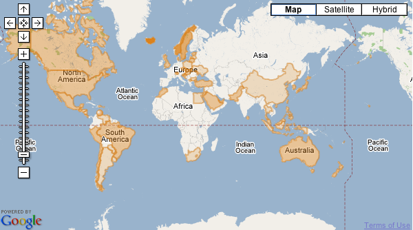
, to see how they did with the same Big Mac data I visualized on Many Eyes. Swivel uses a Google Maps interface with an overlay:
[](http://www.swivel.com/graphs/map/5065231 "Big Mac Map (Swivel)")
It looks nice, but it was incredibly slow when I tried to zoom in or browse the map. Actually, not just the map was slow, but the whole page. Maybe some caching issues? Exploratory graphics isn’t really Swivel’s high point at the moment. I also find it a little strange that the overlay is the same color as that of the maps on Many Eyes.
### Related
* [Swivel Gets a Data Guy](https://flowingdata.com/2007/10/03/swivel-gets-a-data-guy/ "Swivel Gets a Data Guy")
* [Making Public Data Public](https://flowingdata.com/2007/07/11/making-public-data-public/ "Making Public Data Public")
* [Cotton Picking Correlates to President Picking](https://flowingdata.com/2008/11/19/cotton-picking-correlates-to-president-picking/ "Cotton Picking Correlates to President Picking")
---
# FlowingData - Data Visualization and Statistics
* [Four stages of tariff progressions](https://flowingdata.com/2025/03/26/four-stages-of-tariff-progressions/)
=============================================================================================================
[March 26, 2025](https://flowingdata.com/2025/03/26/four-stages-of-tariff-progressions/)
### Topic
**[Infographics](https://flowingdata.com/category/visualization/infographics/)
** / [tariff](https://flowingdata.com/tag/tariff/)
, [Washington Post](https://flowingdata.com/tag/washington-post/)
[](https://flowingdata.com/2025/03/26/four-stages-of-tariff-progressions/)
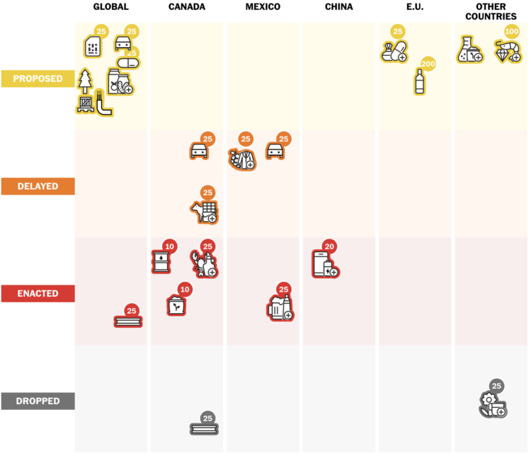
Tariff announcements seem to waver in tone and finality depending on the day. It’s hard to keep track of what might happen and what is actually happening. For the Washington Post, Alyssa Fowers, Leslie Shapiro, and Amaya Verde provide a scrolling timeline to show [where we’ve been and where things are at](https://www.nytimes.com/interactive/2025/03/15/business/economy/tariffs-trump-maps-voters.html?unlocked_article_code=1.604.e9_X.zJFE-wqSJnYC&smid=url-share)
.
The icons, with tariff percentages attached, move between four stages: proposed, delayed, enacted, and dropped. There seems to be a lot of switching.
* [Turn map locations to slide puzzles](https://flowingdata.com/2025/03/26/turn-map-locations-to-slide-puzzles/)
===============================================================================================================
[March 26, 2025](https://flowingdata.com/2025/03/26/turn-map-locations-to-slide-puzzles/)
### Topic
**[Maps](https://flowingdata.com/category/visualization/mapping/)
** / [Ahmad Barclay](https://flowingdata.com/tag/ahmad-barclay/)
, [OpenStreetMap](https://flowingdata.com/tag/openstreetmap/)
, [puzzle](https://flowingdata.com/tag/puzzle/)
[](https://flowingdata.com/2025/03/26/turn-map-locations-to-slide-puzzles/)
[Any Map Puzzle](https://bothness.github.io/anymap/)
by Ahmad Barclay lets you search for a location and play the location as a slide puzzle. Choose the map tiles (Stamen Watercolor, OpenStreetMap, and ESRI World Imagery) and grid size and puzzle away.
* [](https://flowingdata.com/2025/03/25/aggregating-time-use-microdata/)
[Aggregating Time Use Microdata](https://flowingdata.com/2025/03/25/aggregating-time-use-microdata/)
=====================================================================================================
Being able to work with microdata from the American Time Use Survey, via IPUMS, means you can subset, filter, and categorize how you want. This makes it easier to explore questions.
* [Improved Relative Time, a comparison to many more things in the timeline](https://flowingdata.com/2025/03/25/improved-relative-time-a-comparison-to-many-more-things-in-the-timeline/)
========================================================================================================================================================================================
[March 25, 2025](https://flowingdata.com/2025/03/25/improved-relative-time-a-comparison-to-many-more-things-in-the-timeline/)
### Topic
**[Infographics](https://flowingdata.com/category/visualization/infographics/)
** / [baseline](https://flowingdata.com/tag/baseline/)
, [Jonny Thaw](https://flowingdata.com/tag/jonny-thaw/)
, [time](https://flowingdata.com/tag/time/)
[](https://flowingdata.com/2025/03/25/improved-relative-time-a-comparison-to-many-more-things-in-the-timeline/)
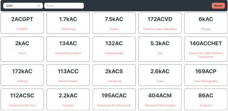
You’re familiar with AD and BC, but you probably haven’t heard of AiP for after iphone or ATP for after toilet paper. Jonny Thaw made a fun interactive that shows a given year [compared against a lot of other things in history](https://relative-time.jthaw.club)
. So dumb, yet so informative.
* [23andMe files for bankruptcy](https://flowingdata.com/2025/03/24/23andme-files-for-bankruptcy/)
=================================================================================================
[March 24, 2025](https://flowingdata.com/2025/03/24/23andme-files-for-bankruptcy/)
### Topic
**[Data Sharing](https://flowingdata.com/category/statistics/data-sharing/)
** / [23andMe](https://flowingdata.com/tag/23andme/)
, [ethics](https://flowingdata.com/tag/ethics/)
, [privacy](https://flowingdata.com/tag/privacy/)
23andMe, the business predicated on people sending cheek swabs to have their DNA analyzed, exposed the personal data of half of customers in a data breach a couple years ago. The company filed for bankruptcy. [Lily Jamali for BBC reports](https://www.bbc.com/news/articles/c9q4r9xy9wro)
:
> Founded in 2006, the company went public in 2021 but has never turned a profit.
>
> In September, the firm settled a lawsuit alleging that it failed to protect the privacy of nearly seven million customers whose personal information was exposed in a 2023 data breach.
>
> In some cases, hackers gained access to family trees, birth years and geographic locations, by using customers’ old passwords. The data stolen did not include DNA records, according to the company.
If you used the service, maybe keep an eye on what happens to your data if the company goes under or is sold off. The California attorney general issued a [customer alert with instructions](https://oag.ca.gov/news/press-releases/attorney-general-bonta-urgently-issues-consumer-alert-23andme-customers)
on how delete your data, destroy your sample, and revoke data permissions.
* [Map of daylight gained in spring](https://flowingdata.com/2025/03/24/map-of-daylight-gained-in-spring/)
=========================================================================================================
[March 24, 2025](https://flowingdata.com/2025/03/24/map-of-daylight-gained-in-spring/)
### Topic
**[Maps](https://flowingdata.com/category/visualization/mapping/)
** / [Axios](https://flowingdata.com/tag/axios/)
, [daylight](https://flowingdata.com/tag/daylight/)
, [spring](https://flowingdata.com/tag/spring/)
[](https://flowingdata.com/2025/03/24/map-of-daylight-gained-in-spring/)
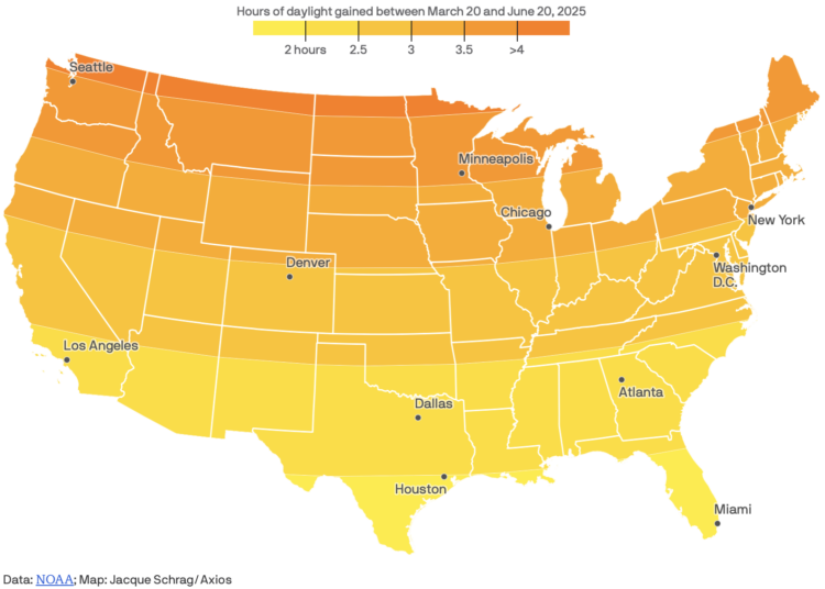
Spring officially started last week here in the Northern Hemisphere. For Axios, Jacque Schrag [mapped the hours of daylight gained](https://www.axios.com/2025/03/18/daylight-gain-spring-equinox-us)
in between the spring equinox on March 20, 2025 and summer solstice on June 20, 2025.
This is based on [sunrise and sunset times from NOAA](https://gml.noaa.gov/grad/solcalc/)
.
I started spring this weekend with yard work in a warm but not too hot low 70s. Not too shabby.
* [Classic arcade game powered by Wikipedia edits](https://flowingdata.com/2025/03/21/classic-arcade-game-powered-by-wikipedia-edits/)
=====================================================================================================================================
[March 21, 2025](https://flowingdata.com/2025/03/21/classic-arcade-game-powered-by-wikipedia-edits/)
### Topic
**[Infographics](https://flowingdata.com/category/visualization/infographics/)
** / [game](https://flowingdata.com/tag/game/)
, [Kevin Payravi](https://flowingdata.com/tag/kevin-payravi/)
, [Wikipedia](https://flowingdata.com/tag/wikipedia/)
[](https://flowingdata.com/2025/03/21/classic-arcade-game-powered-by-wikipedia-edits/)
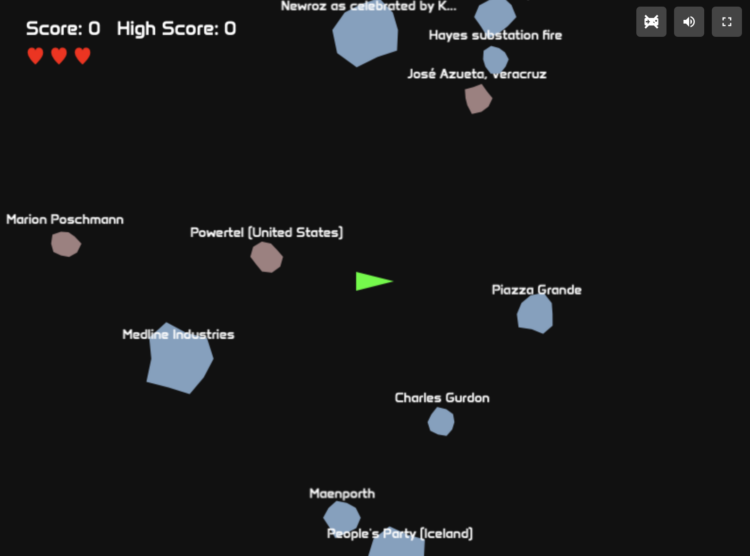
What if the game Asteroids used Wikipedia edits to drive the volume and size of the objects hurling towards your ship? Kevin Payravi makes [your dreams into reality with WikiAsteroids](https://diff.wikimedia.org/2025/03/18/wikiasteroids-bringing-wikipedia-to-life-in-an-arcade-cabinet/)
:
> I recently launched WikiAsteroids ([asteroids.wiki](https://asteroids.wiki/)
> ), a browser game that takes the [classic arcade space shooter](https://en.wikipedia.org/wiki/Asteroids_(video_game))
> concept and adds a Wikipedia twist: each time someone makes an edit on Wikipedia, a new asteroid spawns. The size of the asteroid corresponds to the size of the edit. Blue asteroids represent edits with a net increase in content, while red ones indicate a net decrease. A new article creation spawns an extra life, and new user registrations spawn one of several possible power-ups (such as a shield, faster shooting, or slow-motion).
* [Student basketball transfers are really common](https://flowingdata.com/2025/03/21/student-basketball-transfers-are-really-common/)
=====================================================================================================================================
[March 21, 2025](https://flowingdata.com/2025/03/21/student-basketball-transfers-are-really-common/)
### Topic
**[Statistical Visualization](https://flowingdata.com/category/visualization/statistical-visualization/)
** / [basketball](https://flowingdata.com/tag/basketball/)
, [college](https://flowingdata.com/tag/college/)
, [transfer](https://flowingdata.com/tag/transfer/)
, [Washington Post](https://flowingdata.com/tag/washington-post/)
[](https://flowingdata.com/2025/03/21/student-basketball-transfers-are-really-common/)
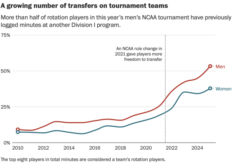
For the Washington Post, Emily Giambalvo, Kati Perry, and Jesse Dougherty analyze the [playing time for players who transferred from another program](https://www.washingtonpost.com/sports/interactive/2025/transfers-march-madness-ncaa-tournament/?pwapi_token=eyJ0eXAiOiJKV1QiLCJhbGciOiJIUzI1NiJ9.eyJyZWFzb24iOiJnaWZ0IiwibmJmIjoxNzQyNTI5NjAwLCJpc3MiOiJzdWJzY3JpcHRpb25zIiwiZXhwIjoxNzQzOTExOTk5LCJpYXQiOjE3NDI1Mjk2MDAsImp0aSI6ImI3NGVjNzlmLTQ5NGYtNGJmYy1hYTg3LTgyMjk1N2YwYjJlZCIsInVybCI6Imh0dHBzOi8vd3d3Lndhc2hpbmd0b25wb3N0LmNvbS9zcG9ydHMvaW50ZXJhY3RpdmUvMjAyNS90cmFuc2ZlcnMtbWFyY2gtbWFkbmVzcy1uY2FhLXRvdXJuYW1lbnQvIn0.-KWbCmVISgDYNvcdh4A1gi5Pb1xLdZ2_srwwIAAxiRQ&itid=gfta)
.
> To understand the phenomenon and its impact, look no further than the men’s and women’s NCAA tournament fields. On the men’s side, 53 percent of all rotation players previously logged minutes at another Division I school, according to a Washington Post analysis. Roughly one-third of these key contributors — the top eight players in total minutes on each roster — played for another D-I program just last season.
Now I want an analysis for academics and research prowess. “I will be taking my statistical talents to the University of California, Berkeley this semester.”
* Members Only
[Making of: When You Will Die](https://flowingdata.com/2025/03/20/making-of-when-you-will-die/)
================================================================================================
[March 20, 2025](https://flowingdata.com/2025/03/20/making-of-when-you-will-die/)
### Topic
**[The Process](https://flowingdata.com/category/the-process/)
** / [behind the scenes](https://flowingdata.com/tag/behind-the-scenes/)
, [mortality](https://flowingdata.com/tag/mortality/)
, [simulation](https://flowingdata.com/tag/simulation/)
[](https://flowingdata.com/2025/03/20/making-of-when-you-will-die/)
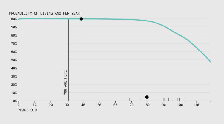
This is how the mortality simulation machine gets made.
* **[Data Underload](https://flowingdata.com/category/projects/data-underload/)
** / [mortality](https://flowingdata.com/tag/mortality/)
, [simulation](https://flowingdata.com/tag/simulation/)
[When You Will Die](https://flowingdata.com/projects/2025/when-die/)
=====================================================================
[](https://flowingdata.com/projects/2025/when-die/)
With absolute certainty, you will die. When will it happen? That is a trickier question. But we can run simulations to explore the possibilities.
[Read More](https://flowingdata.com/projects/2025/when-die/)
* [National history archived through chopstick sleeve designs](https://flowingdata.com/2025/03/20/chopstick-sleeves-design/)
===========================================================================================================================
[March 20, 2025](https://flowingdata.com/2025/03/20/chopstick-sleeves-design/)
### Topic
**[Design](https://flowingdata.com/category/design/)
** / [Angie Wang](https://flowingdata.com/tag/angie-wang/)
, [chopsticks](https://flowingdata.com/tag/chopsticks/)
, [history](https://flowingdata.com/tag/history/)
, [Japan](https://flowingdata.com/tag/japan/)
, [Letterform Archive](https://flowingdata.com/tag/letterform-archive/)
[](https://flowingdata.com/2025/03/20/chopstick-sleeves-design/)
For Letterform Archive, designer Angie Wang examines a [collection of chopstick sleeves as it relates to Japan](https://letterformarchive.org/news/this-just-in-chopstick-sleeves-as-emissaries-of-japanese-typography-and-culture/)
:
> Paper chopstick sleeves emerged at the turn of the 20th century when disposable chopsticks and packaged meals gained popularity with the advent of train travel. In addition to ensuring cleanliness, printed paper chopstick sleeves became vernacular advertisements for shops and restaurants.
>
> The latest addition to the Archive’s holdings of Asian ephemera is the hashibukuro collection of Mr. Susumu Kitagawa of Fuji City, Japan. While individually modest in their design and messaging, when considered as a whole the sleeves that comprise this collection map a singular history of Japanese ideology and aesthetics.
* [Animal sounds in different languages](https://flowingdata.com/2025/03/19/animal-sounds-languages/)
====================================================================================================
[March 19, 2025](https://flowingdata.com/2025/03/19/animal-sounds-languages/)
### Topic
**[Infographics](https://flowingdata.com/category/visualization/infographics/)
** / [animals](https://flowingdata.com/tag/animals/)
, [Pudding](https://flowingdata.com/tag/pudding/)
, [sound](https://flowingdata.com/tag/sound/)
, [Vivian Li](https://flowingdata.com/tag/vivian-li/)
[](https://flowingdata.com/2025/03/19/animal-sounds-languages/)
The purpose of onomatopoeia is to imitate sounds with words, so you might expect the words for animal sounds to be similar across languages. For the Pudding, Vivian Li shows that [this is not always the case](https://pudding.cool/2025/03/language/)
.
> Onomatopoeia offers a fascinating glimpse into the interaction between sound and language. The way humans mimic animal sounds reflects not only shared biological instincts but also distinct cultural filters. Although onomatopoeia intends to imitate faithfully, its differences are ultimately far from arbitrary. In trying to capture the same auditory essence, English interprets a pig’s sound as \[ojŋk\], yet Hungarian hears \[røf\], and Vietnamese hears \[ʔut it\]. Even among the three animals discussed, cats are more consistent in their sound interpretation, while pigs are more variable — whether because pigs’ vocalizations are innately more complex, or because they call upon different phonotactic rules.
All the words are clickable so that you can hear pronunciations for different languages. Colors indicate phone groups, such as nasal consonants and mid central vowels.
* [Top car brands in China, by market share](https://flowingdata.com/2025/03/18/top-car-brands-in-china-by-market-share/)
========================================================================================================================
[March 18, 2025](https://flowingdata.com/2025/03/18/top-car-brands-in-china-by-market-share/)
### Topic
**[Statistical Visualization](https://flowingdata.com/category/visualization/statistical-visualization/)
** / [Bloomberg](https://flowingdata.com/tag/bloomberg/)
, [BYD](https://flowingdata.com/tag/byd/)
, [China](https://flowingdata.com/tag/china/)
, [market share](https://flowingdata.com/tag/market-share/)
, [Tesla](https://flowingdata.com/tag/tesla/)
[](https://flowingdata.com/2025/03/18/top-car-brands-in-china-by-market-share/)
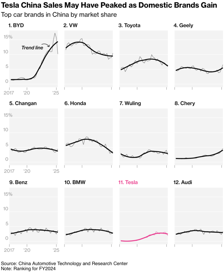
I like this [chart set from Bloomberg that shows the top brands](https://www.bloomberg.com/news/articles/2025-03-17/byd-unveils-battery-system-that-charges-an-ev-in-five-minutes?accessToken=eyJhbGciOiJIUzI1NiIsInR5cCI6IkpXVCJ9.eyJzb3VyY2UiOiJTdWJzY3JpYmVyR2lmdGVkQXJ0aWNsZSIsImlhdCI6MTc0MjMxNTcyNSwiZXhwIjoxNzQyOTIwNTI1LCJhcnRpY2xlSWQiOiJTVDlDMEVUMEFGQjQwMCIsImJjb25uZWN0SWQiOiIzRDhGMEEzMTc2MDc0NUM5OTg4NkFCNzA1NDk2RUNEQSJ9.zAeUHTDk879dHmgdzVXyozg0jf_KIloOZcqERGjL-8E)
, ranked by market share in 2024. Faded lines show true estimates, and thicker lines in the foreground provide the trends. Tick labels are limited to the first column on the left to avoid busyness. Straightforward but effective.
In the U.S., we usually see BYD, an electric vehicle car brand, mentioned in the context of Tesla as the competition. But it doesn’t look like much of a competition. BYD has rapidly gained market share in China over the last five years.
* [New York Times fills poll tracking gap left by FiveThirtyEight shutdown](https://flowingdata.com/2025/03/18/new-york-times-fills-poll-tracking-gap-left-by-fivethirtyeight-shutdown/)
=======================================================================================================================================================================================
[March 18, 2025](https://flowingdata.com/2025/03/18/new-york-times-fills-poll-tracking-gap-left-by-fivethirtyeight-shutdown/)
### Topic
**[Data Sources](https://flowingdata.com/category/statistics/data-sources/)
** / [data journalism](https://flowingdata.com/tag/data-journalism/)
, [FiveThirtyEight](https://flowingdata.com/tag/fivethirtyeight/)
, [New York Times](https://flowingdata.com/tag/new-york-times/)
, [polling](https://flowingdata.com/tag/polling/)
FiveThirtyEight [is gone](https://flowingdata.com/2025/03/05/fivethirtyeight-is-shutting-down-completely/)
, and along with its [visualization-centric projects](https://flowingdata.com/tag/fivethirtyeight/)
, so is their poll tracking that they and others used to analyze public sentiment. [The New York Times is picking up the baton](https://www.nytimes.com/2025/03/17/polls/donald-trump-approval-poll-tracker.html)
:
> As one half of the Times/Siena College poll, which has been recognized as one of the country’s premier pollsters, we believe there’s value in an individual poll. But we also think aggregating polls and providing analysis of them collectively, as we did during last year’s election, is a service worth preserving — one that may be needed even more today with the profusion of polling, contradictory findings and loud partisan voices.
>
> We’re building on the work of the politics website 538, which for several years released this data as a public service until it was shuttered by ABC News this month, and which itself followed in the path of Pollster.com at The Huffington Post. Our goal is to ensure that this resource, which is a foundational tool for many journalists and researchers, remains updated long-term. The data will be made available free for anybody to use as they wish, so long as they provide attribution to The Times. (If you’re still using data collected by 538, you may still need to give it attribution as well.)
They’re starting with presidential approval ratings.
* [Projections for NCAA basketball tournament, winning chances for each team](https://flowingdata.com/2025/03/17/projections-for-ncaa-basketball-tournament-winning-chances-for-each-team/)
==========================================================================================================================================================================================
[March 17, 2025](https://flowingdata.com/2025/03/17/projections-for-ncaa-basketball-tournament-winning-chances-for-each-team/)
### Topic
**[Infographics](https://flowingdata.com/category/visualization/infographics/)
** / [Athletic](https://flowingdata.com/tag/athletic/)
, [basketball](https://flowingdata.com/tag/basketball/)
, [NCAA](https://flowingdata.com/tag/ncaa/)
, [projections](https://flowingdata.com/tag/projections/)
, [tournament](https://flowingdata.com/tag/tournament/)
[](https://flowingdata.com/2025/03/17/projections-for-ncaa-basketball-tournament-winning-chances-for-each-team/)
Leading up to the NCAA Men’s basketball tournament, the Athletic has a [bracket with projections expressed as win probabilities in each round](https://www.nytimes.com/athletic/6198047/2025/03/16/mens-march-madness-projections-2025-full-ncaa-tournament-bracket-odds/)
. Surprise, Duke is heavily favored to win, which can only mean everyone’s brackets will be ruined early.
On methodology:
> We create an offensive and defensive projection for every college basketball team using various box score metrics. These projections estimate how many points a team would score and allow in a game against an average opponent on a neutral court. We then assign a probability of how likely a team is to win a given game by adjusting for opponent, location and team health. Taking into account the bracket, we use the projections to simulate the tournament 200,000 times.
>
> After those 200,000 simulations, we calculate how often a team is to make each round of the tournament and win the championship. For example, if a team has a 10 percent chance of making the Final Four, that means that they’ve made the Final Four in 10 percent of the simulations run.
* [Testing citation skills and overconfidence of AI chatbots](https://flowingdata.com/2025/03/17/testing-citation-skills-and-overconfidence-of-ai-chatbots/)
===========================================================================================================================================================
[March 17, 2025](https://flowingdata.com/2025/03/17/testing-citation-skills-and-overconfidence-of-ai-chatbots/)
### Topic
**[Artificial Intelligence](https://flowingdata.com/category/statistics/artificial-intelligence/)
** / [accuracy](https://flowingdata.com/tag/accuracy/)
, [chatbot](https://flowingdata.com/tag/chatbot/)
, [citations](https://flowingdata.com/tag/citations/)
, [Columbia Journalism Review](https://flowingdata.com/tag/columbia-journalism-review/)
[](https://flowingdata.com/2025/03/17/testing-citation-skills-and-overconfidence-of-ai-chatbots/)
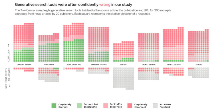
When you enter a query in traditional search engines, you get a list of results. They are possible answers to your question, and you decide what resources you want to trust. On the other hand, when you query via AI chatbot, you get a limited number of answers, as a sentence, that appear confident in the context.
For Columbia Journalism Review, Klaudia Jaźwińska and Aisvarya Chandrasekar [tested this accuracy and confidence by using several chatbots to cite articles](https://www.cjr.org/tow_center/we-compared-eight-ai-search-engines-theyre-all-bad-at-citing-news.php)
:
> Overall, the chatbots often failed to retrieve the correct articles. Collectively, they provided incorrect answers to more than 60 percent of queries. Across different platforms, the level of inaccuracy varied, with Perplexity answering 37 percent of the queries incorrectly, while Grok 3 had a much higher error rate, answering 94 percent of the queries incorrectly.
So not great.
I am sure someone is working on improving that accuracy, but we’ll have to develop our own skills in separating truth from junk, just like we have with past online things. Going forward, maybe keep an eye out for the younger and older generations who tend to accept online things as automatic truth. Things could get dicey.
* [Wall of receipts is wall of inconsistent records](https://flowingdata.com/2025/03/17/wall-of-receipts-is-wall-of-inconsistent-records/)
=========================================================================================================================================
[March 17, 2025](https://flowingdata.com/2025/03/17/wall-of-receipts-is-wall-of-inconsistent-records/)
### Topic
**[Mistaken Data](https://flowingdata.com/category/statistics/mistaken-data/)
** / [DOGE](https://flowingdata.com/tag/doge/)
, [government](https://flowingdata.com/tag/government/)
, [spending](https://flowingdata.com/tag/spending/)
, [Upshot](https://flowingdata.com/tag/upshot/)
[](https://flowingdata.com/2025/03/17/wall-of-receipts-is-wall-of-inconsistent-records/)
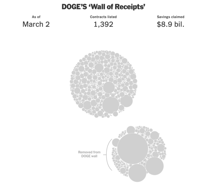
The “Department of Government Efficiency” keeps a “Wall of Receipts” to signal transparency in how they are “saving” money. However, it’s difficult to take it seriously when the data keeps changing, disappearing, and reappearing. Ethan Singer and Emily Badger, for NYT’s the Upshot, go with the [clustered bubbles to show the edits since Feburary 16, 2025](https://www.nytimes.com/2025/03/13/upshot/musk-doge-changes-deletions.html?unlocked_article_code=1.4k4.jS91.0ip-Y5-Nyy17&smid=url-share)
.
I’ll be the first one to tell you that working with data is tricky and that there are bound to be mistakes. But it’s in everyone’s best interest to find the mistakes first instead of making life-changing decisions and then finding out what breaks after.
* [Living 82-year-old Social Security recipient erroneously marked as dead](https://flowingdata.com/2025/03/17/living-82-year-old-social-security-recipient-erroneously-marked-as-dead/)
=======================================================================================================================================================================================
[March 17, 2025](https://flowingdata.com/2025/03/17/living-82-year-old-social-security-recipient-erroneously-marked-as-dead/)
### Topic
**[Mistaken Data](https://flowingdata.com/category/statistics/mistaken-data/)
** / [death](https://flowingdata.com/tag/death/)
, [Seattle Times](https://flowingdata.com/tag/seattle-times/)
, [Social Security](https://flowingdata.com/tag/social-security/)
Pam Johnson got an email from her bank about her husband’s death. The Social Security Administration deducted funds from their account. The problem: her husband, Ned Johnson, is still alive. [From Danny Westneat for the Seattle Times](https://www.seattletimes.com/seattle-news/politics/heres-a-dead-person-on-social-security-in-seattle-with-plenty-to-say/)
:
> “We recently received notification of LEONARD A. JOHNSON’s passing,” it began. “We offer our sincerest condolences …”
>
> At first she figured it was a scam — her husband, after all, was sitting right there. But then the bank got to the point.
>
> “We know this is a difficult time, and we’re here to help,” the bank wrote. “We received a request from Social Security Administration to return benefits paid to LEONARD A. JOHNSON’s account after their passing.”
>
> “There’s nothing you need to do — we’ve deducted the funds from LEONARD A. JOHNSON’s account.”
>
> Uh oh. It itemized how $5,201 had been stricken from their bank account, on the grounds that Ned wasn’t justified to get those benefits — because he was dead. That was for payments he’d received in December and January.
After several weeks, they were able to get Johnson revived in the SSA database, but they still don’t know why he was marked dead to begin with. Whatever the reason, it should be obvious why it’s important to measure twice and cut once.
* [Three-decades-old risk assessment used to decide prison release](https://flowingdata.com/2025/03/14/three-decades-old-risk-assessment-used-decide-prison-release/)
====================================================================================================================================================================
[March 14, 2025](https://flowingdata.com/2025/03/14/three-decades-old-risk-assessment-used-decide-prison-release/)
### Topic
**[Infographics](https://flowingdata.com/category/visualization/infographics/)
** / [Civio](https://flowingdata.com/tag/civio/)
, [crime](https://flowingdata.com/tag/crime/)
, [prison](https://flowingdata.com/tag/prison/)
, [risk](https://flowingdata.com/tag/risk/)
[](https://flowingdata.com/2025/03/14/three-decades-old-risk-assessment-used-decide-prison-release/)
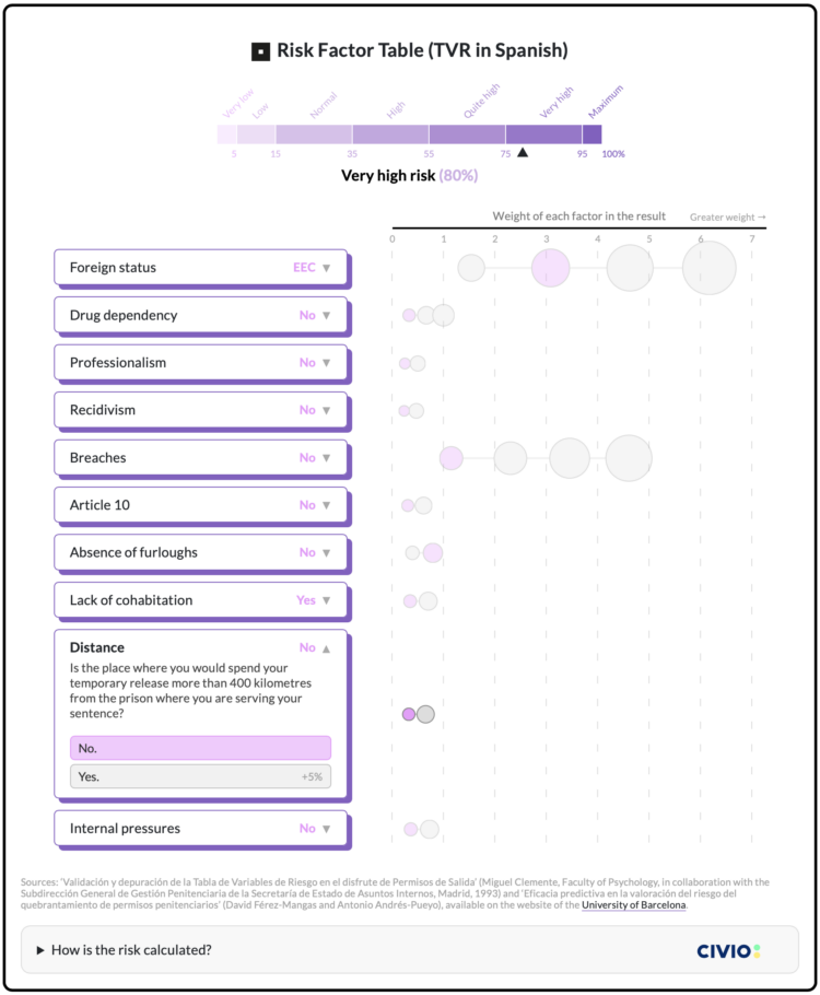
In efforts to reduce repeat offenses in Spain thirty years ago, researchers developed a formula that assigned a risk score to individuals. The score was used to decide if prisons should grant a prisoner temporary release, and the formula still factors into decision-making today. [Civio describes the current downsides of using the scores](https://civio.es/justicia/2025/03/12/spanish-prisons-use-a-30-year-old-algorithm-to-decide-on-temporary-releases/)
, which are based on a relatively small sample of prisoners from the 1990s.
An interactive graphic, shown above, illustrates the system and how a score goes up and down as you change variables in the drop-down menus. Foreign status increases the risk score the most, even more so than if a prisoner tried to escape.
* [AI system to revoke student visas](https://flowingdata.com/2025/03/14/ai-system-to-revoke-student-visas/)
===========================================================================================================
[March 14, 2025](https://flowingdata.com/2025/03/14/ai-system-to-revoke-student-visas/)
### Topic
**[Artificial Intelligence](https://flowingdata.com/category/statistics/artificial-intelligence/)
** / [Axios](https://flowingdata.com/tag/axios/)
, [ethics](https://flowingdata.com/tag/ethics/)
, [students](https://flowingdata.com/tag/students/)
, [visa](https://flowingdata.com/tag/visa/)
For Axios, [Marc Caputo reports](https://www.axios.com/2025/03/06/state-department-ai-revoke-foreign-student-visas-hamas)
:
> Secretary of State Marco Rubio is launching an AI-fueled “Catch and Revoke” effort to cancel the visas of foreign nationals who appear to support Hamas or other designated terror groups, senior State Department officials tell Axios.
>
> Why it matters: The effort — which includes AI-assisted reviews of tens of thousands of student visa holders’ social media accounts — marks a dramatic escalation in the U.S. government’s policing of foreign nationals’ conduct and speech.
Something tells me that the view into the system’s usage, classification process, and underlying data will be quite fuzzy.
* Page 1 of 388
* [1](https://flowingdata.com/)
* [2](https://flowingdata.com/page/2/)
* [3](https://flowingdata.com/page/3/)
* [4](https://flowingdata.com/page/4/)
* [5](https://flowingdata.com/page/5/)
* [6](https://flowingdata.com/page/6/)
* ...
* [388](https://flowingdata.com/page/388/)
* [\>](https://flowingdata.com/page/2/)
---
# Weekend Minis – Government, Environment & Angry Employee – FlowingData
Weekend Minis – Government, Environment & Angry Employee
========================================================
[February 2, 2008](https://flowingdata.com/2008/02/02/weekend-minis-government-environment-angry-employee/)
### Topic
**[Data Sources](https://flowingdata.com/category/statistics/data-sources/)
**
**[FedStats](http://www.fedstats.gov/)
** – Provides access to the full range of official statistical information produced by the Federal Government, including population, eduction, crime, and health care.
**[MAPLight](http://www.maplight.org/)
** – A detailed database that brings together information on campaign contributions and votes in the California legislature. Check out the video tour.
**[EarthTrends](http://earthtrends.wri.org/index.php)
** – A collection of information regarding the environmental, social, and economic trends that shape our world.
**[Angry Employee Deletes All of Company’s Data](http://www.foxnews.com/story/0,2933,325285,00.html)
** – A woman about to “lose” her job goes to the office at night and deletes 7 years’ worth of data. Can we say backup, please?
### Related
* [A Future Without Key Social and Economic Statistics for the Country](https://flowingdata.com/2012/05/13/a-future-without-key-social-and-economic-statistics-for-the-country/ "A Future Without Key Social and Economic Statistics for the Country")
* [More friendships between rich and poor might mean less poverty](https://flowingdata.com/2022/08/03/more-friendships-between-rich-and-poor-might-mean-less-poverty/ "More friendships between rich and poor might mean less poverty")
* [Angry Birds productivity tracker](https://flowingdata.com/2012/01/03/angry-birds-productivity-tracker/ "Angry Birds productivity tracker")
---
# Creating Effective Visualization – FlowingData
Creating Effective Visualization
================================
[June 25, 2007](https://flowingdata.com/2007/06/25/creating-effective-visualization/)
### Topic
**[Design](https://flowingdata.com/category/design/)
**
What makes a visualization good? It allows people to see what they never would have seen otherwise? It’s pretty? The visualization is interactive? Simple? Probably all of the above, and yeah, it’s probably common sense, but… why is there so much bad viz out there?
Perhaps people don’t have the skills to create effective visualization. I, myself, don’t yet possess the necessary skills to create great viz, so that’s definitely a limiting factor. Whether it’s in Flash, Processing, or whatever, honed skills is essential.
In my eyes, the more serious problem, is that some don’t have the eye or logic for good viz. It’s great when the user can interact with the data, but if the user interface sucks, then the viz fails. Viz can easily get very complicated as we build, add more features, and eventually forget what our primary goal was in the first place.
When the user has a viz tool she can use, then it’s at this point, the viz should show the user something they never expected (or confirms a suspicion — although I like the idea of surprise). From here, the user can decide what she wants to do, but it’s my hope that anything I create will make people aware of their surroundings and motivate change in a positive direction.
I feel like I’m rambling…
So yeah, um, effective visualization — expertise, simplicity, mind-blowing factor.
### Related
* [Why Isn’t Data Visualization More Popular?](https://flowingdata.com/2008/05/14/why-isnt-data-visualization-more-popular/ "Why Isn’t Data Visualization More Popular?")
* [What to expect at data visualization job interviews](https://flowingdata.com/2019/06/04/what-to-expect-data-visualization-job-interviews/ "What to expect at data visualization job interviews")
* [Not the Best List of Visualization Tools – The Process 164](https://flowingdata.com/2021/11/04/process-164-not-the-best/ "Not the Best List of Visualization Tools – The Process 164")
### 2 Comments
* Pingback: [Happy One-Year Birthday, FlowingData! | FlowingData](https://flowingdata.com/2008/06/25/happy-one-year-birthday-flowingdata/)
* [Noah Iliinsky](http://ComplexDiagrams.com)
— [June 25, 2008 at 5:48 am](https://flowingdata.com/2007/06/25/creating-effective-visualization/#comment-49661)
Happy Birthday indeed!
If you haven’t checked it out yet, my master’s thesis is all about this exact question: how do you design effective visualizations. It’s primarily oriented at qualitative visualizations, but the rules all apply to quantitative visualizations as well.
[http://tinyurl.com/ys6sf9](http://tinyurl.com/ys6sf9)
Best, Noah
---
# About Nathan – FlowingData
About Nathan
============
My name is Nathan Yau, and I’m the one writing for FlowingData. I have a PhD in statistics from UCLA, and I’m a statistician. My focus:
1. Data for non-professionals
2. Information design
3. Self-surveillance
In a nutshell, I want to make data available and useful to those who are and aren’t necessarily data experts; I think visualization plays a major role in this.
Here are some of my [random experiments](https://flowingdata.com/category/projects/)
with both print and interactive stuff. I’ve also written [a couple of books](https://flowingdata.com/books/ "Books by Nathan Yau")
.
When I’m not playing with data, I’m usually cooking, eating, brewing beer, cycling, watching basketball, or hanging out with my wife and son.
---
# Motivation to Change Behavior – FlowingData
Motivation to Change Behavior
=============================
[June 28, 2007](https://flowingdata.com/2007/06/28/motivation-to-change-behavior/)
### Topic
**[Miscellaneous](https://flowingdata.com/category/miscellaneous-data/)
**
My mom recently, um, as in yesterday, got in a car accident. She was making a left turn at a light, and someone coming from the opposite direction decided to run a red light, sending my mom’s car in a 90-degree turn. Fortunately, my mom only suffered minor burns from the airbag deployment; however, the car was totaled. The first thing that my mom did today — the day after this major accident — she went to work.
This got me to thinking, what is enough to motivate someone to change her behavior? For some, when something really drastic happens, like a car accident, they gain a new outlook on life and vow to “live life to the fullest” or “value every moment”. Then there are others, like my mom, who move along, because all they want is for their lives to be normal again.
I wish I knew where to look for related research, but a quick search on Google Scholar didn’t give me a whole lot.
Let’s see here… what motivates people to change their behaviors?
* A significant, personal event
* Change in surroundings
* Coercion
Surely, there’s more. I’m going to dwell on this some more.
### Related
* [What Facebook and Google know about you](https://flowingdata.com/2018/03/29/what-facebook-and-google-know-about-you/ "What Facebook and Google know about you")
* [US road fatalities mapped, 9 years](https://flowingdata.com/2011/11/29/us-road-fatalities-mapped-9-years/ "US road fatalities mapped, 9 years")
* [Funes, thet Memorious: It’s Possible to Remember Too Much](https://flowingdata.com/2007/07/31/funes-thet-memorious-its-possible-to-remember-too-much/ "Funes, thet Memorious: It’s Possible to Remember Too Much")
### 1 Comment
* [Joe](http://none)
— [October 31, 2008 at 4:46 pm](https://flowingdata.com/2007/06/28/motivation-to-change-behavior/#comment-17261)
I contracted full-blown Type 1 diabetes out of the blue. My lifestyle changed a lot. Huge motivation to change. Like change or die…
Get used to giving yourself shots 5 or more times per day.
Drastic change in diet.
Adopt rigorous record-keeping and health changes in order to stay healthy.
Realize I have to do this every day for the rest of my life.
Death, when on your horizon every damn day, is a real motivator.
Joe
---
# Time Series Tool Like Google Finance – FlowingData
Time Series Tool Like Google Finance
====================================
[July 1, 2007](https://flowingdata.com/2007/07/01/time-series-tool-like-google-finance-sort-of/)
### Topic
**[Apps](https://flowingdata.com/category/software/online-apps/)
**
[Chronoscope](http://timepedia.org/)
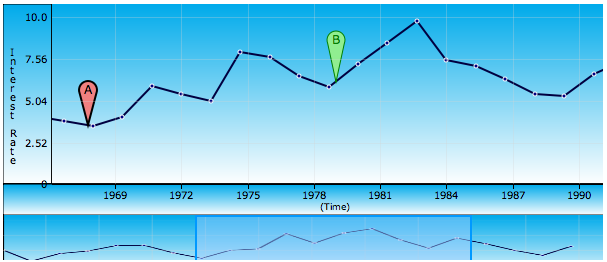
is a work-in-progress time series visualization tool that lets you explore data similar to that of Google Finance. It’s written in Java, unlike Finance, which uses Flash/Javascript, and uses the Google Web Toolkit as the hook. After a quick look-see, it’s certainly still in alpha, and I’m not quite sure when beta will be available to the public. The browsing is pretty nifty though. I wonder how hard it’d be to do it Flash?
### Related
* [Searchable campaign finance data from the FEC](https://flowingdata.com/2016/07/27/searchable-campaign-finance-data-from-the-fec/ "Searchable campaign finance data from the FEC")
* [Google Visualization API Opens Up](https://flowingdata.com/2008/11/04/google-visualization-api-opens-up/ "Google Visualization API Opens Up")
* [Nebul.us Shows You Your Activity on the Web](https://flowingdata.com/2009/12/08/nebul-us-shows-you-your-activity-on-the-web/ "Nebul.us Shows You Your Activity on the Web")
---
# Proof is in the Picture of Data – FlowingData
Proof is in the Picture of Data
===============================
[July 2, 2007](https://flowingdata.com/2007/07/02/proof-is-in-the-picture-of-data/)
### Topic
**[Maps](https://flowingdata.com/category/visualization/mapping/)
**
[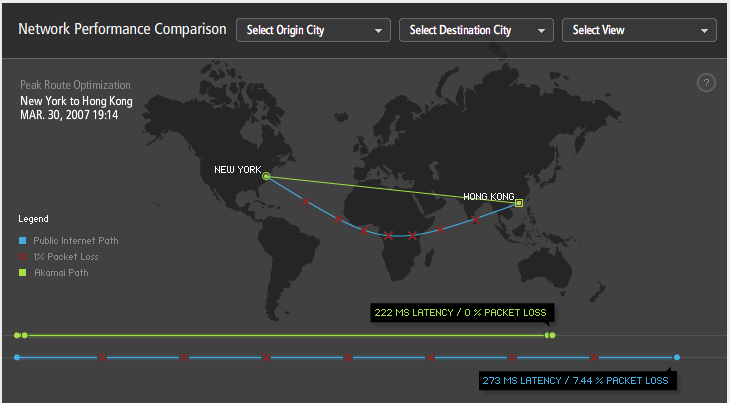](http://www.akamai.com/html/technology/dataviz1.html)
Akamai is a technology company that deals with routing and online business. They optimize routing over the Internet using the data they collect from servers setup in 71 countries. Or I guess, in their words
> Akamai’s technology – at its core, applied mathematics and algorithms – has transformed the chaos of the Internet into a predictable, scalable, and secure platform for business and entertainment. The Akamai EdgePlatform comprises 20,000 servers deployed in 71 countries that continually monitor the Internet – traffic, trouble spots and overall conditions. We use that information to intelligently optimize routes and replicate content for faster, more reliable delivery. As Akamai handles 20% of total Internet traffic today, our view of the Internet is the most comprehensive and dynamic collected anywhere.
Wait, that’s not the good part. They use Flash-based visualization to display how good they really are. I did a network performance comparision for a route from New York to Hong Kong, and in turn, the viz showed the public internet path and a much-improved Akamai path. Less packet loss and lower latency for Akamai. It’d be interesting to know how those routes are depicted, because I imagine, the routes aren’t really always straight line vs parabola, Akamai vs public internet. Very pretty though.
### Related
* [Quietest highway route in each state](https://flowingdata.com/2019/11/21/quiet-drive/ "Quietest highway route in each state")
* [Data is Going to Change How and Where You Drive – Dash GPS Navigation](https://flowingdata.com/2008/03/24/data-is-going-to-change-how-and-where-you-drive-dash-gps-navigation/ "Data is Going to Change How and Where You Drive – Dash GPS Navigation")
* [How Facebook disappeared from the internet](https://flowingdata.com/2021/10/04/how-facebook-disappeared-from-the-internet/ "How Facebook disappeared from the internet")
### 1 Comment
* Pingback: [FlowingData Readers’ Favorite Visualizations | FlowingData](https://flowingdata.com/2008/06/18/flowingdata-readers-favorite-visualizations/)
---
# About – FlowingData
FlowingData explores how we use analysis and visualization to understand data and ourselves.
[The blog](https://flowingdata.com)
— a combination of highlighting others’ work, [my own projects](https://flowingdata.com/category/projects/)
, and [visualization guides](https://flowingdata.com/category/guides/)
— is a free resource for everyone. It’s completely [supported by members](https://flowingdata.com/membership/)
, who get access to [courses](https://flowingdata.com/courses/)
, [tutorials](https://flowingdata.com/category/tutorials/)
, and [The Process](https://flowingdata.com/category/the-process/)
.
I’m Nathan Yau. I run FlowingData.
I have a PhD in statistics from UCLA, with a focus on visualization for presenting data to everyone. I want as many people as possible to understand data, and I think visualization — from statistical charts to infographics to data art — is the best way to get there.
I’ve been visualizing data for over a decade. I’ve written [books](https://flowingdata.com/books/)
. I make [a lot of charts](https://flowingdata.com/category/projects/)
.
I was a winner of a [FastCompany Innovation by Design Award](https://flowingdata.com/2016/09/12/innovation-by-design-awards/)
for Graphic Design & Data Visualization; I’ve won Information is Beautiful awards; and I was featured in [The Best American Infographics](https://twitter.com/flowingdata/status/784492808044417025)
. I’ve worked as a researcher and for mainstream publications. My work leans towards practical but has also reached millions of people.
I like to [cook](https://flowingdata.com/2018/09/18/cuisine-ingredients/)
. I like to [brew beer](https://flowingdata.com/2015/05/20/brewing-multivariate-beer/)
. [I’m an introvert](https://flowingdata.com/2019/09/06/quiet-observer/)
. I feel uncomfortable talking about myself.
My work is based on these experiences.
You can follow FlowingData via [email](https://flowingdata.com/newsletter)
, [Bluesky](https://bsky.app/profile/flowingdata.com)
, [LinkedIn](https://www.linkedin.com/company/flowingdata)
, [Instagram](https://www.instagram.com/flowingdata/)
, and good old [RSS](https://flowingdata.com/feed)
.
---
# Cost of Big Macs Worldwide – FlowingData
Cost of Big Macs Worldwide
==========================
[June 28, 2007](https://flowingdata.com/2007/06/28/cost-of-big-macs-worldwide/)
### Topic
**[Apps](https://flowingdata.com/category/software/online-apps/)
**

I was playing around at [Many Eyes](http://many-eyes.com)
, and it was amazingly easy to map some data on the Big Mac. The data set was simply two columns: country name and the cost of the Big Mac in that country. I chose the mapping visualization option, and voila, data was mapped. Awesome.
### Related
* [Maps of natural disasters and extreme weather](https://flowingdata.com/2019/04/26/maps-of-natural-disasters-and-extreme-weather/ "Maps of natural disasters and extreme weather")
* [The Cost of Getting Sick](https://flowingdata.com/2009/11/23/the-cost-of-getting-sick/ "The Cost of Getting Sick")
* [Many Eyes Now Has Better Mapping Visualization](https://flowingdata.com/2007/11/12/many-eyes-now-has-better-mapping-visualization/ "Many Eyes Now Has Better Mapping Visualization")
---
# Macromedia Flash: First Impressions – FlowingData
Macromedia Flash: First Impressions
===================================
[June 28, 2007](https://flowingdata.com/2007/06/28/macromedia-flash-first-impressions/)
### Topic
**[Software](https://flowingdata.com/category/software/)
**
Flash or Processing? For now, Flash.
For quite a while now, I’ve been back on forth on my data viz weapon of choice — Flash or Processing. With Processing free and designed for artist, I naturally started here. There were some drawbacks of course like non-extensive (just decent) documentation, and it was a lot of learn by example. There were a lot of examples that were just chunks of code that I had to interpret. Also, written in Java, Processing applets were often slow to load in the browser, and there often seemed to be compatibility issues.
SO, I’ve set Processing aside, and enter Flash.
I’ve been playing around with a few examples from [Flash Kit](http://www.flashkit.com/tutorials/)
and [Entheos](http://www.entheosweb.com/Flash/default.asp)
, and to be quite honest, it’s pretty fun. I like the interface, (I’m still getting used to it) and although I haven’t used much ActionScript yet, I’m looking forward to learning it. Still waiting on my Flash book from Amazon, **Macromedia Flash Professional 8 Hands-On Training**, which is taking forever to get here.
I’ll just have to go through more tutorials until the darned thing arrives.
### Related
* [What is the Best Way to Learn Flash & Actionscript for Visualization?](https://flowingdata.com/2007/10/19/what-is-the-best-way-to-learn-flashactionscript-for-data-visualization/ "What is the Best Way to Learn Flash & Actionscript for Visualization?")
* [How to Learn Actionscript (Flash) for Data Visualization](https://flowingdata.com/2008/04/21/how-to-learn-actionscript-flash-for-data-visualization/ "How to Learn Actionscript (Flash) for Data Visualization")
* [What Do You Primarily Use to Analyze and/or Visualize Data? \[POLL\]](https://flowingdata.com/2008/05/19/what-do-you-primarily-use-to-analyze-andor-visualize-data-poll/ "What Do You Primarily Use to Analyze and/or Visualize Data? [POLL]")
---
# CitiStat: Injured on Duty “Data” – FlowingData
CitiStat: Injured on Duty “Data”
================================
[July 2, 2007](https://flowingdata.com/2007/07/02/citistat-injured-on-duty-data/)
### Topic
**[Data Sharing](https://flowingdata.com/category/statistics/data-sharing/)
**

I was flipping through the channels the other night and came across a televised [CitiStat](http://www.city-buffalo.com/Home/Leadership/Mayor/CitiStat_Buffalo "CitiStat Buffalo")
meeting for June 1. A bit of a coincidence since I happened to be looking at the CitiStat website earlier that day. What’s CitiStat, you ask? Well it’s like a spin-off of [CompStat](http://www.nyc.gov/html/nypd/html/chfdept/compstat-process.html "CompStat in NYC")
, a program in NYC and LA, that makes police officials accountable for their actions by looking at data — number of homicides, where they happened, what’s being done, etc. CitiStat, in Buffalo, is the same thing, but for the Police, Fire Department, and whatever else they can think of, and seemingly not quite as reputable.
Anyways, they were talking to some city official about fire department employees that were IOD, um, that’s injured on duty (but I must’ve heard IOD like a billion times). There was some discrepancy on the definition of IOD. As a result, the data was **worthless**. The police commissioner spoke as well with his own IOD numbers. After that, there was a lot of arguing and as a result, a meeting was agreed upon. Well, not really. They agreed that they would schedule some meeting, but it’s been a year of “What is an IOD?” Pretty sure that won’t be settled for a while.
They were also able to agree that the number of IODs was somewhere between 50 and 200. Yay.
So despite the fact that the CitiStat program is two years old, there’s still lots to be done. Officials aren’t used to recording and looking at data, and it’s clear, few even had any notion that data could be useful. However, I am glad that they’re making the effort — even if all of the data is stored on a bunch of inconsistent Excel spreadsheets :P.
### Related
* [Stop-and-frisk hotspots mapped →](http://www.wnyc.org/articles/wnyc-news/2012/jul/16/wnyc-map-police-find-guns-where-they-stop-and-frisk-less/ "Stop-and-frisk hotspots mapped →")
* [Download comprehensive police shootings data](https://flowingdata.com/2017/12/11/download-comprehensive-police-shootings-data/ "Download comprehensive police shootings data")
* [Incomplete crime data](https://flowingdata.com/2022/08/24/incomplete-crime-data/ "Incomplete crime data")
---
# Focus Cloud: Tag Cloud with a Twist – FlowingData
Focus Cloud: Tag Cloud with a Twist
===================================
[July 1, 2007](https://flowingdata.com/2007/07/01/focus-cloud-tag-cloud-with-a-twist/)
### Topic
**[Statistical Visualization](https://flowingdata.com/category/visualization/statistical-visualization/)
**

Everyone’s familiar with tag clouds, but Aaron Bassett put a slight twist to the now commonplace clouds. Aaron calls them [Focus Clouds](http://foobr.co.uk/2007/06/focus_cloud_concept/)
. Basically, they’re still tag clouds, but instead of weighting tags by number of times used, there’s some weight given to how recent a tag is. There’s also some simple highlighting going on with related tags.
The idea is that the focus cloud then gives you an idea of what is _currently_ of interest. Aaron’s code is available on his blog. The code is a bit buggy, but interesting nevertheless.
### Related
* [Interactive and animated word cloud](https://flowingdata.com/2012/02/14/interactive-and-animated-word-cloud/ "Interactive and animated word cloud")
* [A year of global cloud coverage →](http://www.nytimes.com/interactive/2012/05/01/science/earth/0501-clouds.html "A year of global cloud coverage →")
* [Word clouds cause death… or something](https://flowingdata.com/2011/10/18/word-clouds-cause-death-or-something/ "Word clouds cause death… or something")
---
# Access Restrictions on the Release of Gun Sales Data – FlowingData
Access Restrictions on the Release of Gun Sales Data
====================================================
[October 24, 2007](https://flowingdata.com/2007/10/24/no-access-to-gun-sales-data/)
### Topic
**[Data Sharing](https://flowingdata.com/category/statistics/data-sharing/)
**
_I just found this in my draft folder from a while back. It’s kind of old news, but I think it’s still worth mentioning._
[Gun control advocates failed](http://www.washingtonpost.com/wp-dyn/content/article/2007/07/12/AR2007071201290.html)
to gain local government and law enforcement agencies’ access to gun sales data.
> The House Appropriations Committee defeated two attempts by gun control advocates to strip four-year-old restrictions on the use of information from Bureau of Alcohol, Tobacco, Firearms and Explosives tracing gun sales. The votes were a victory for the National Rifle Association and came despite the Democratic takeover of Congress in January.
One side argues that gun sales data will help law enforcement agencies track gun dealers who sell guns illegally. The other side argues that there’s privacy at stake, and there’s a chance that police officers’ identities could be inferred. A big victory for gun rights advocates, or so the the article might suggest.
**My opinion** — even if gun sales data were given to law enforcement, how could anyone guarantee data integrity? I think it’s fair to say that dealers selling guns illegally aren’t going to provide accurate reports. Sell a gun under the table with cash, don’t report it, and the data doesn’t reveal much. Am I missing something here?
### Related
* [U.S. military buys location data from apps](https://flowingdata.com/2020/11/17/u-s-military-buys-location-data-from-apps/ "U.S. military buys location data from apps")
* [Iowa liquor sales data, 3m rows](https://flowingdata.com/2015/06/05/iowa-liquor-sales-data-3m-rows/ "Iowa liquor sales data, 3m rows")
* [Amazon Rekognition for government surveillance](https://flowingdata.com/2018/05/23/amazon-rekognition-for-government-surveillance/ "Amazon Rekognition for government surveillance")
### 4 Comments
* Aron Pilhofer — [October 24, 2007 at 6:39 am](https://flowingdata.com/2007/10/24/no-access-to-gun-sales-data/#comment-80)
Yes, you’re missing a lot. This data used to be available not only to local governments, but also to the news media. It was used to report on things like — surplus guns sold by police departments used in crimes, gun dealers selling to felons, etc. I guess I believe these kinds of stories were important.
* [Nathan Yau](https://flowingdata.com)
— [October 24, 2007 at 3:04 pm](https://flowingdata.com/2007/10/24/no-access-to-gun-sales-data/#comment-49663)
Oh, yeah, for sure. Those stories ARE important, but I guess I’m just a bit skeptical about how accurate that type of data is going to be.
Surplus guns sold by police departments…I think I’d trust that data, but data that relies on gun dealers to fill out paperwork… how reliable is that data and how much under the table stuff is going on? I don’t know. Maybe I’ve just seen one too many crime dramas.
* [Brad](https://flowingdata.com/2007/10/24/no-access-to-gun-sales-data/)
— [October 28, 2008 at 6:20 pm](https://flowingdata.com/2007/10/24/no-access-to-gun-sales-data/#comment-49664)
Noticed a story in the news today about the surge in gun sales recently. I imagine gun advocates are afraid of more Democrat control. Not to mention these difficult economic times will bring more and more crime.
I was searching the internet to see if I could find statistics on gun sales over time. I would be interested to see if gun sales always go up at around election time.
In my cynicism, I wonder what the relationship is between the motivations for the NRA to scare Americans about losing their guns whenever a Democrat might win; and the money flowing from the gun lobby, gun manufacturers and sellers.
Any idea of where I can find statistics on gun sales over a time period of say decades?
* [Brad](https://flowingdata.com/2007/10/24/no-access-to-gun-sales-data/)
— [October 28, 2008 at 2:20 pm](https://flowingdata.com/2007/10/24/no-access-to-gun-sales-data/#comment-17040)
Noticed a story in the news today about the surge in gun sales recently. I imagine gun advocates are afraid of more Democrat control. Not to mention these difficult economic times will bring more and more crime.
I was searching the internet to see if I could find statistics on gun sales over time. I would be interested to see if gun sales always go up at around election time.
In my cynicism, I wonder what the relationship is between the motivations for the NRA to scare Americans about losing their guns whenever a Democrat might win; and the money flowing from the gun lobby, gun manufacturers and sellers.
Any idea of where I can find statistics on gun sales over a time period of say decades?
---
# Diet and Weight Loss Tracking with Viz – FlowingData
Diet and Weight Loss Tracking with Viz
======================================
[July 2, 2007](https://flowingdata.com/2007/07/02/diet-and-weight-loss-tracking-with-viz/)
### Topic
**[Apps](https://flowingdata.com/category/software/online-apps/)
**
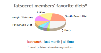
Weight loss is a difficult task for many, further complicated with so many diets — Atkins, Jenny Craig, etc — and lack of motivation. [Fatsecret](http://fatsecret.com)
aims to make weight loss easier by providing the tools to track your weight loss, write about it, see what others are doing, and share your progress.
There’s a couple of graphs (built by Flash) on the homepage. The first, a pie chart, shows the proportions of fatsecret users on certain types of diets. You can see the proportions for this week, this month, or all time.
Then towards the bottom — a bar chart showing the average weight loss of fatsecret users for specified diets. Again, you can see for this week, this month, and all time.
[](https://flowingdata.com/2007/07/01/time-series-tool-like-google-finance-sort-of/chronoscope-2/ "fatsecret: avg weight loss")
Every user has her own homepage which shows a line graph of her progress as well as the average weight loss of fatsecret members on the user’s same diet.
Fatsecret seems like quite of an active site with plenty of posting, tips, and member interactions, which makes me pretty happy. Next step: interactive tools.
### Related
* [The Geography of Job Loss](https://flowingdata.com/2009/10/09/the-geography-of-job-loss/ "The Geography of Job Loss")
* [Datylon Graph is a visualization extension for Illustrator](https://flowingdata.com/2020/02/18/datylon-graph-is-a-visualization-extension-for-illustrator/ "Datylon Graph is a visualization extension for Illustrator")
* [Scammed out of life savings, a line chart](https://flowingdata.com/2024/08/26/scammed-out-of-life-savings-line-chart/ "Scammed out of life savings, a line chart")
### 2 Comments
* [Jon Peltier](http://peltiertech.com/WordPress/)
— [May 16, 2008 at 7:59 am](https://flowingdata.com/2007/07/02/diet-and-weight-loss-tracking-with-viz/#comment-4495)
Dieters are trying to watch their consumption, and you’re tempting them with pie (charts)? Another reason not to use this chart type.
* [Nathan Yau](https://flowingdata.com/about-nathan)
— [May 16, 2008 at 1:45 pm](https://flowingdata.com/2007/07/02/diet-and-weight-loss-tracking-with-viz/#comment-49668)
or could it be that the pie chart is so ugly that it turns people off of real pie?
---
# Hans Rosling: Providing Data, Inspiring Change – FlowingData
Hans Rosling: Providing Data, Inspiring Change
==============================================
[July 6, 2007](https://flowingdata.com/2007/07/06/hans-rosling-providing-data-inspiring-change/)
### Topic
**[Apps](https://flowingdata.com/category/software/online-apps/)
**
Okay, so this video has been posted probably on thousands of blogs already, but you know what, I don’t care. Hans Rosling gives an **amazing** talk on poverty and life around the world, and he uses his interactive exploratory tool, [Trendalyzer](http://tools.google.com/gapminder/)
(acquired by Google), to show the different levels of health, education, and money around the world. Trendalzyer: useful, yes, but not the main point of the talk. Watch Rosling’s talk all the way through. You won’t be disappointed.
### Related
* [Google Adds Search to Public Data](https://flowingdata.com/2009/04/28/google-adds-search-to-public-data/ "Google Adds Search to Public Data")
* [The Joy of Stats with Hans Rosling](https://flowingdata.com/2010/11/30/the-joy-of-stats-with-hans-rosling/ "The Joy of Stats with Hans Rosling")
* [A thorough Facebook analysis by Stephen Wolfram](https://flowingdata.com/2013/04/25/a-thorough-facebook-analysis-by-stephen-wolfram/ "A thorough Facebook analysis by Stephen Wolfram")
---
# Difficulty Visualizing Social Networks – FlowingData
Difficulty Visualizing Social Networks
======================================
[July 3, 2007](https://flowingdata.com/2007/07/03/difficulty-visualizing-social-networks/)
### Topic
**[Network Visualization](https://flowingdata.com/category/visualization/network-visualization/)
**
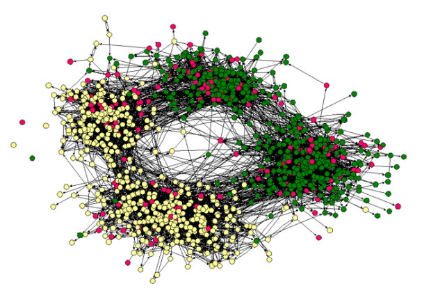
We need to interact with others. We crave connections with friends and strangers. Something inside makes us need to converse with others so that we don’t go crazy. As I work from home, I’ve begun to understand this a bit more, and I’ve found myself checking [Facebook](http://facebook.com)
and [Twittering](http://twitter.com/ncy111)
perhaps just a little too much. I think that it’s these connections is what has made social networks so popular.
How can we visualize these ever so important connections. An obvious option is with, well, lines.
Pretty, yes. Useful? Umm, hmm, not really. The number nodes grows to greater than 20, and it becomes this cloud/blob-type thing. What meaning can we take away from visualization like this other than, there’s a lot of nodes and links, and they’re all interconnected (other than a few outsiders)?
Okay, so here’s another option — instead of using lines to show connections between nodes, we can use clustering. Nodes that are similar, appear closer together.
[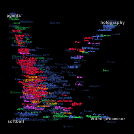](http://smg.media.mit.edu/people/Judith/VisualWho/VisualWho.html)
We can see some patterns now with the clustering and coloring, but when the network groes to thousands, it’s easy to see how things can get kinda gross. I think the natural next step here is to sample, provide an overview, and if the user wants to go deeper, sample some more.
The big question: how do we know what to sample? What weight can we give each sample? How can we get a sample that properly represents the entire network (or a small, specific part of it)?
### Related
* [Network visualization shows transitions between states](https://flowingdata.com/2016/05/23/network-visualization-shows-transitions-between-states/ "Network visualization shows transitions between states")
* [Why network visualization is useful](https://flowingdata.com/2010/11/17/why-network-visualization-is-useful/ "Why network visualization is useful")
* [Character social networks in movies](https://flowingdata.com/2012/08/17/character-social-networks-in-movies/ "Character social networks in movies")
### 1 Comment
* Ryan — [November 22, 2007 at 11:07 pm](https://flowingdata.com/2007/07/03/difficulty-visualizing-social-networks/#comment-49669)
I am struggling with this exact problem right now. Have you tried drawing social networks in R? When N is large, they look terrible and take days to do!
If you’re interested, check out the NetworkX package in Python. It produces some pretty nice visualizations. So does Rgraphviz. Of course, as you mentioned, the graph doesn’t tell you much.
Regarding sampling social networks…I am considering that for a thesis… ;-)
---
# Social Data Analysis by the Swarm – FlowingData
Social Data Analysis by the Swarm
=================================
[July 4, 2007](https://flowingdata.com/2007/07/04/social-data-analysis-by-the-swarm/)
### Topic
**[Social Data Analysis](https://flowingdata.com/category/statistics/social-data-analysis/)
**

[Swarm Theory](http://www7.nationalgeographic.com/ngm/0707/feature5/index.html)
, by Peter Miller, talks about how some animals, as individuals, aren’t smart, but as a group or a swarm, they can do amazing things. The above is a flock of starlings that can change shapes even though no single bird is the leader.
Can we apply swarm theory to social data analysis? As individuals, we might not be able to hold onto or understand a dataset, but as a group, we can come at a dataset from different perspectives, look at very small parts, and then as an end result — extract real, worthwhile meaning.
> That’s how swarm intelligence works: simple creatures following simple rules, each one acting on local information. No ant sees the big picture. No ant tells any other ant what to do. Some ant species may go about this with more sophistication than others. (Temnothorax albipennis, for example, can rate the quality of a potential nest site using multiple criteria.) But the bottom line, says Iain Couzin, a biologist at Oxford and Princeton Universities, is that no leadership is required. “Even complex behavior may be coordinated by relatively simple interactions,” he says.
It reminds me of that common saying, or maybe it’s a quote, about how if you put a bunch of monkeys in a room with typewriters, you’ll eventually get the works of Shakespeare via the magic of probability. While the whole monkey thing is a bit far-fetched, swarm theory is certainly worth my attention.
### Related
* [Maps of land required to get to net-zero emissions](https://flowingdata.com/2021/04/29/maps-of-land-required-to-get-to-net-zero-emissions/ "Maps of land required to get to net-zero emissions")
* [Facebook debunks Princeton study](https://flowingdata.com/2014/01/24/facebook-debunks-princeton-study/ "Facebook debunks Princeton study")
* [Where wind and solar needs to grow by 2050](https://flowingdata.com/2021/05/28/where-wind-and-solar-needs-to-grow-by-2050/ "Where wind and solar needs to grow by 2050")
---
# Twittervision Adds a Third Dimension – FlowingData
Twittervision Adds a Third Dimension
====================================
[July 4, 2007](https://flowingdata.com/2007/07/04/twittervision-adds-a-third-dimension/)
### Topic
**[Maps](https://flowingdata.com/category/visualization/mapping/)
**
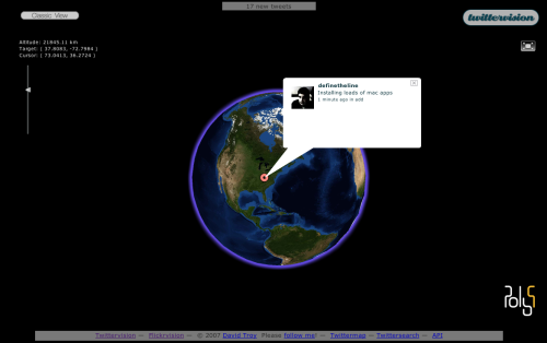
Twittervision is a Google Maps mashup using the Twitter RSS feed. As people post to Twitter, you see the map move from location to location all around the world. It’s really simple, but there’s something entertaining about it that I can’t quite put my finger on. Maybe we just like to peak into other people’s lives. Anyways, I don’t know how recent this is, but Twittervision now has a [third dimension](http://twittervision.com/maps/show_3d)
which is equally as entertaining as the original.
### Related
* [Watching Our Twitter World – twittervision Redux](https://flowingdata.com/2008/07/28/welcome-to-twitter-world-twittervision-redux/ "Watching Our Twitter World – twittervision Redux")
* [Google Map Maker edits in real-time](https://flowingdata.com/2011/08/16/google-map-maker-edits-in-real-time/ "Google Map Maker edits in real-time")
* [Zappos Maps Sales in Real-time](https://flowingdata.com/2009/04/09/zappos-maps-sales-in-real-time/ "Zappos Maps Sales in Real-time")
---
# Immigration Data Available from Homeland Security – FlowingData
Immigration Data Available from Homeland Security
=================================================
[July 5, 2007](https://flowingdata.com/2007/07/05/immigration-data-available-from-homeland-security/)
### Topic
**[Data Sharing](https://flowingdata.com/category/statistics/data-sharing/)
**
There was a [Sharp Rise Seen in Applications for Citizenship](http://www.nytimes.com/2007/07/05/us/05citizenship.html?_r=1&hp&oref=slogin)
, as reported in The Times today, and of course there was a graphic to complement that article that showed the rise in applications over the years as well as a by-country breakdown for 2006.
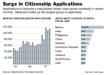
Graphics in The Times always site the source, which was Department of Homeland Security in this case. I thought, “Do they have some kind of source who they actually call to get this data?” Thinking such a thing, I feel pretty dumb now. In fact, I always see that source on all of the graphics, and have just assumed that there was some connection between The Times and the source.
**Wrong.**
So lazy me finally decided to look into things, and you know what, the Department of Homeland Security has a whole section on their website for [Immigration Statistics](http://www.dhs.gov/ximgtn/statistics/dtadefstd.shtm)
. There are freely available spreadsheets, reports, publications, and even a little something on data standards and definitions, prepared by none other than the — Office of Immigration Statistics. Very pleased.
It’s kind of sad that this is just now news to me, but better now than never, eh?
### Related
* [US surveillance flight paths for the FBI and Homeland Security](https://flowingdata.com/2016/04/08/us-surveillance-flight-paths-for-the-fbi-and-homeland-security/ "US surveillance flight paths for the FBI and Homeland Security")
* [Machine learning to find spy planes](https://flowingdata.com/2017/08/11/machine-learning-to-find-spy-planes/ "Machine learning to find spy planes")
* [Where immigrants in the U.S. came from](https://flowingdata.com/2024/07/18/where-immigrants-in-the-u-s-came-from/ "Where immigrants in the U.S. came from")
---
# History Over Space and Time – FlowingData
History Over Space and Time
===========================
[July 6, 2007](https://flowingdata.com/2007/07/06/history-over-space-and-time/)
### Topic
**[Maps](https://flowingdata.com/category/visualization/mapping/)
**
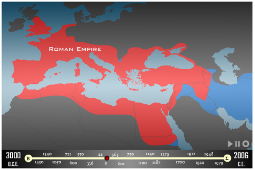
As a representation of history over time and space, [Maps of War](http://mapsofwar.com)
does a pretty good job of displaying the information in the form Flash animations. It’s quite simple really. The animation starts centuries back (e.g. 2000BC) and moves to geographic regions. In the above map, I watched who has controlled the middle east, beginning 3000BC up through 2006.
### Related
* [Mapping the boundaries of history](https://flowingdata.com/2022/06/22/mapping-the-boundaries-of-history/ "Mapping the boundaries of history")
* [Visualizing Twitter as Barack Obama Became the 44th President](https://flowingdata.com/2009/01/22/visualizing-twitter-as-barack-obama-became-the-44th-president/ "Visualizing Twitter as Barack Obama Became the 44th President")
* [Visualizing the History of Everything](https://flowingdata.com/2012/03/19/visualizing-the-history-of-everything/ "Visualizing the History of Everything")
---
# Juice TESTING in Competitive Sports – FlowingData
Juice TESTING in Competitive Sports
===================================
[July 8, 2007](https://flowingdata.com/2007/07/08/juice-testing-in-competitive-sports/)
### Topic
**[Mistaken Data](https://flowingdata.com/category/statistics/mistaken-data/)
**
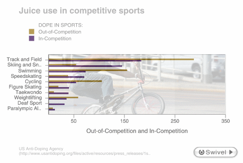
It’s easy to see how Statistics got this bad wrap because it’s so easy to lie with data, charts, and graphs. Sometimes it’s on purpose — someone might try to present “good” results that actually suck. Sometimes it’s accidental — someone might have misread or didn’t read the documentation that came with the data. In the case of Swivel’s [most recently featured graph](http://www.swivel.com/graphs/show/19762032)
, it was the latter. A case of mistaken identity so to speak.
The data about doping tests in sports came from [here](http://www.usantidoping.org/files/active/resources/press_releases/1st%20Quarter%202007%20Testing%20Numbers.pdf)
. Now the graph on Swivel would have you believe that the data represent the number of doping cases found in each sports; however, according to the USADA report, the data is actually the number of tests the association conducted inside and outside competition during the first quarter of this year. The report contains no data on the USADA’s findings.
What We Learn
-------------
What can we learn from this? It’s great to visualize data, but you have to be careful. Read the documentation. Find out what the data is about, because without context, the visualization or any findings are practically useless. Statistics isn’t to lie. In fact, it’s the exact opposite. Statistics came about and exists today to reveal the truth.
### Related
* [Journal of Quantitative Analysis in Sports is Live](https://flowingdata.com/2008/01/30/journal-of-quantitative-analysis-in-sports-is-live/ "Journal of Quantitative Analysis in Sports is Live")
* [Flexible data](https://flowingdata.com/2013/04/17/flexible-data/ "Flexible data")
* [Excel spreadsheet limit leads to 16,000 Covid-19 cases left off daily count](https://flowingdata.com/2020/10/05/excel-spreadsheet-limit-leads-to-16000-covid-19-cases-left-off-daily-count/ "Excel spreadsheet limit leads to 16,000 Covid-19 cases left off daily count")
### 1 Comment
* Pingback: [FlowingData / Why I Do Not Swivel Data](https://flowingdata.com/2007/08/31/why-i-do-not-swivel-data/)
---
# Visualization of Taste Explosions from Ratatouille – FlowingData
Visualization of Taste Explosions from Ratatouille
==================================================
[July 11, 2007](https://flowingdata.com/2007/07/11/visualization-of-taste-explosions-from-ratatouille/)
### Topic
**[Data Art](https://flowingdata.com/category/visualization/artistic-visualization/)
**

By now, I’m sure everyone has heard of Pixar’s most recent movie, [Ratatouille](http://ratatouille.com)
. If you haven’t seen it, I HIGHLY recommend it. Not only is it beautiful animation and a nice story, but it’s about food. I love Pixar. There are a few scenes in the movie when the main character, Remy, and his brother, Emile, are eating and experiencing the taste of some exquisite cheese.
There was pretty taste visualization going on done by [Michel Gagne](http://www.gagneint.com/Final%20site/Animation/Pixar/Ratatouille.htm)
.
> Around 1400 drawings were created for the animation. Each one was scanned, painted and composited using two softwares: Animo and Photoshop.
That’s a lot of hand drawings, but quite nice results. Good job, Michel.
### Related
* [Visions penned by the 18th century king of Prussia](https://flowingdata.com/2016/10/18/visions-penned-by-the-18th-century-king-of-prussia/ "Visions penned by the 18th century king of Prussia")
* [Analysis of Bob Ross paintings](https://flowingdata.com/2014/04/17/analysis-of-bob-ross-paintings/ "Analysis of Bob Ross paintings")
* [How Do You Visualize Time in a Drawing?](https://flowingdata.com/2007/10/18/how-do-you-visualize-time-in-a-drawing/ "How Do You Visualize Time in a Drawing?")
---
# Grab Data with templatemaker – FlowingData
Grab Data with templatemaker
============================
[July 7, 2007](https://flowingdata.com/2007/07/07/grab-data-with-templatemaker/)
### Topic
**[Software](https://flowingdata.com/category/software/)
**
Adrian Holovaty released [templatemaker](http://www.holovaty.com/blog/archive/2007/07/06/0128)
yesterday. Adrian is probably best known as the guy, featured on YouTube, who played the MacGyver theme song. So clearly, he is a man a many talents.
Anyways, templatemaker is a Python script to extract data from text, um, HTML. For example, you could pass a review page from a site like Yelp, or several pages, and the script will “learn” the template. Once a template is established, you can extract the stuff that changes (e.g. ratings, restaurant name). Here, in Adrian’s words:
> You can give templatemaker an arbitrary number of HTML files, and it will create the “template” that was used to create those files. (“Template,” in this case, means a string with a number of “holes” in it, where the holes represent the parts of the page that change.) Once you’ve got the template, you can then give it any HTML file that uses that same template, and it will give you the raw data: “The value for hole 1 is ‘July 6, 2007’, the value for hole 2 is ‘blue’,” etc.
It’s under the BSD license, so all the more reason to use it. I haven’t used it yet, but looking forward to it.
### Related
* [Visualization of flying into a black hole](https://flowingdata.com/2024/05/20/visualization-of-flying-into-a-black-hole/ "Visualization of flying into a black hole")
* [Extract data from PDF files and export to CSV](https://flowingdata.com/2015/08/07/extract-data-from-pdf-files-and-export-to-csv/ "Extract data from PDF files and export to CSV")
* [Twitter bot generates biographies via Census data](https://flowingdata.com/2015/07/27/twitter-bot-generates-biographies-via-census-data/ "Twitter bot generates biographies via Census data")
---
# Xtimeline to Explore and Create Timelines – FlowingData
Xtimeline to Explore and Create Timelines
=========================================
[July 7, 2007](https://flowingdata.com/2007/07/07/xtimeline-to-explore-and-createtimelines/)
### Topic
**[Apps](https://flowingdata.com/category/software/online-apps/)
**
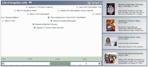
[Xtimeline](http://xtimeline.com)
allows you to explore all sorts of user-created timelines from the US war in Iraq to the life of Angelina Jolie to the history of pornography. I think the site is still pretty new since the most viewed timelines for the month, past 3 months, and year are still all the same, but nevertheless, from the looks of things, a nice community seems to be developing over there.
The timelines are (I think) in javascript and what you see is a timeline of user-entered events. As you click and drag through time, events are displayed on the right. You can click on the events for more details where events can be anything from text, a picture, or a Flash-embedded video.
One suggestion — it looks like timelines can only be ended by a single user. It would be cool if multiple users could contribute to a single timeline, because I think it’s hard to remember all the dates (especially the months) for certain events. We can’t all be like Victor, who seems to know an awful lot about [Britney Spears](http://www.xtimeline.com/biography/The-Life-of-Britney-Spears)
.
\*UPDATE\* I just read the [xtimeline blog](http://blog.xtimeline.com)
. Yup, xtimeline did in fact, just open up to the public July 1.
### Related
* [Create, Share, and Embed Custom Timelines with circaVie](https://flowingdata.com/2007/10/25/create-share-and-embed-custom-timelines-with-circavie/ "Create, Share, and Embed Custom Timelines with circaVie")
* [Tell Stories With Interactive Timelines from Dipity](https://flowingdata.com/2008/08/18/tell-stories-with-interactive-timelines-from-dipity/ "Tell Stories With Interactive Timelines from Dipity")
* [Evaluating timeline layouts](https://flowingdata.com/2020/05/11/evaluating-timeline-layouts/ "Evaluating timeline layouts")
### 1 Comment
* Pingback: [Create, Share, and Embed Custom Timelines with circaVie](https://flowingdata.com/2007/10/25/create-share-and-embed-custom-timelines-with-circavie/)
---
# Finding Weirdness in Temperature Data – FlowingData
Finding Weirdness in Temperature Data
=====================================
[July 9, 2007](https://flowingdata.com/2007/07/09/finding-weirdness-in-temperature-data/)
### Topic
**[Mistaken Data](https://flowingdata.com/category/statistics/mistaken-data/)
**

After parsing [Weather Underground](http://wunderground.com)
pages to [grab temperature data](https://flowingdata.com/2007/07/09/grabbing-weather-underground-data-with-beautifulsoup/)
, it’s time to look at the data. Can’t download all that data and not do anything with it!
First off, in my initial pass of my parsing script, I accidentally cut the month range short, so I didn’t get any data for December from 1980 to 2005. It should be noted that these plots don’t show this missing data. Um, there’s no axes or labels either. Sorry, I got a little lazy, but that’s not the point now anyways.
Notice anything weird about the above plot? There’s some unusually smooth data in the middle. Here’s a zoom in:

If we look at the data between 1994 and 1997, there’s oddly a lot of smoothness… hmm… HMMM.
It looks like between that time, there was some interpolation going on. I mean, if that’s all you got, that’s all you got, but I wish WU would at least make note of it or provide some annotation.
Anyways, just another example of data posing to be something else. In my opinion, all data sucks until proven worthwhile.
### Related
* [Searchable campaign finance data from the FEC](https://flowingdata.com/2016/07/27/searchable-campaign-finance-data-from-the-fec/ "Searchable campaign finance data from the FEC")
* [Imported World Cup players](https://flowingdata.com/2010/06/29/imported-world-cup-players/ "Imported World Cup players")
* [The Moon in 4k resolution](https://flowingdata.com/2018/04/10/the-moon-in-4k-resolution/ "The Moon in 4k resolution")
### 1 Comment
* Pingback: [Flowing Data / Proving the Non-experts Wrong](https://flowingdata.com/2007/08/07/proving-the-non-experts-wrong/)
---
# Internship at the New York Times Tomorrow – FlowingData
Internship at the New York Times Tomorrow
=========================================
[July 15, 2007](https://flowingdata.com/2007/07/15/internship-at-the-new-york-times-tomorrow/)
### Topic
**[The Times](https://flowingdata.com/category/the-times/)
**
Two months flew by in a hurry in between Spring quarter ending and my [New York Times](http://nytimes.com)
internship beginning. I arrived in New York City today and I’m starting at the times tomorrow. For the next 10 weeks, I’m going to be working in the graphics department, and I anticipate it’s going to have to be a pretty steep learning curve.
I don’t really know what I’m going to be doing yet, so I’ve familiarized myself with Adobe Illustrator and Flash and tried to pick up a few more skills in [R](http://r-project.org)
. Originally, I was thought I was going to become some kind of expert in Illustrator and/or Flash, but after some time with the books, I’ve got a long a road ahead. Not being so hot in either Illustrator or Flash, I’m a little nervous, but I guess I’ll just wait and see.
Updates on my first day tomorrow.
### Related
* [What is the Best Way to Learn Flash & Actionscript for Visualization?](https://flowingdata.com/2007/10/19/what-is-the-best-way-to-learn-flashactionscript-for-data-visualization/ "What is the Best Way to Learn Flash & Actionscript for Visualization?")
* [Chance of rain and election turnout](https://flowingdata.com/2022/11/07/chance-of-rain-and-election-turnout/ "Chance of rain and election turnout")
* [The safest time to drive](https://flowingdata.com/2013/11/08/the-safest-time-to-drive/ "The safest time to drive")
### 1 Comment
* [Cedric](http://www.karizmatic.fr)
— [October 13, 2008 at 5:02 am](https://flowingdata.com/2007/07/15/internship-at-the-new-york-times-tomorrow/#comment-15749)
Hi,
I’m working on User Experience and I really like NY times job on Data visualization especially interactive ones.
Do you have an idea how I could apply to a job there ? Can’t find anything on their Web site and I was thinking that maybe you had a contact or something.
Thank you,
---
# Second Day at The Times – FlowingData
Second Day at The Times
=======================
[July 17, 2007](https://flowingdata.com/2007/07/17/second-day-at-the-times/)
### Topic
**[The Times](https://flowingdata.com/category/the-times/)
**
Ok, so I said I would update after my first day, but I got home around 8p, and was just too tired to do anything. I forgot what it’s like to continuously work for 8 hours a day. It’s 9:30p right now, and honestly, I’m ready to pass out.
My first two days have been interesting, and it’s very clear that I have a lot to learn, in terms of visualizing graphics. I have yet to create an actual graphic. Rather I’ve been sifting through Iraq data, looking for stuff that’s interesting, and then putting it in a spreadsheet. I was also given an article to read that could possibly benefit from a graphic, but it turns out that the writer already got some amazing photos and a small map, so that was a no-go.
I think my strength is R, so I’m going to try to improve (um, learn) mapping in R. I think if I can do that, I will be of much more help. I was asked today if I could do maps, but unfortunately, I’ve only done very basic things, and the task was time-sensitive. Sigh.
Am I rambling? I feel like I’m rambling. I need to sleep. But I need to learn R. Alright then.
On a completely random note, I was able to see [Matthew Carter](http://en.wikipedia.org/wiki/Matthew_Carter)
, a master font designer, who has designed fonts like Georgia and Verdana, speak today. I never really put much thought into type faces, but wow, there’s a whole lot that goes into it. A lot of subtleties that involve making more text fit on a page without cluttering or techniques to make text easier to read on a newspaper or from a magazine.
Oh yeah, I also saw my idols — the [IBM Visual Communications lab](http://www.research.ibm.com/visual/)
. I didn’t get a chance to talk to them though, but they looked like a friendly bunch.
### Related
* [Chernoff Faces to Display Baseball Managers From 2007 MLB Season](https://flowingdata.com/2008/04/04/chernoff-faces-to-display-baseball-managers-from-2007-mlb-season/ "Chernoff Faces to Display Baseball Managers From 2007 MLB Season")
* [New Lessons Every Day](https://flowingdata.com/2007/07/20/new-lessons-every-day/ "New Lessons Every Day")
* [Fake faces created by AI and where this might be headed](https://flowingdata.com/2020/11/24/fake-faces-created-by-ai-and-where-this-might-be-headed/ "Fake faces created by AI and where this might be headed")
---
# Grabbing Weather Underground Data with BeautifulSoup – FlowingData
Grabbing Weather Underground Data with BeautifulSoup
====================================================
[July 9, 2007](https://flowingdata.com/2007/07/09/grabbing-weather-underground-data-with-beautifulsoup/)
### Topic
**[Tutorials](https://flowingdata.com/category/tutorials/)
**
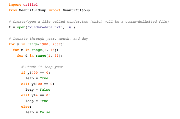
[Weather Underground](http://wunderground.com)
is a useful site and a fun place for weather enthusiasts. WU has a bunch of weather data (current and historical) from established weather stations, like at airports, and home stations setup by hobbyists. One problem: most of the data is in HTML tables instead of the CSV format that we like. I say _most_ because you can download hourly data from a single day in CSV, but if you want say, temperature data over the past 5 years, you’re kind of at a loss.
But wait, there’s a solution. That solution is [BeautifulSoup](http://www.crummy.com/software/BeautifulSoup/)
, an XML/HTML parser written in Python. Um, parse… what does that mean? Basically, the Python script will go through, or look at, a document extracting certain information from that document.
Back to WU. Like I said, there’s historical data in HTML tables [like this](http://www.wunderground.com/history/airport/KBUF/2007/7/9/DailyHistory.html?req_city=NA&req_state=NA&req_statename=NA)
. I just want the actual mean temperature in Fahrenheit for the past five years or so. I could go to every single page manually and record the temperature in Excel, but why do that when I can make the computer do it for me?
I’m not going to get into all of the details, but here’s the Python script I used to grab mean temperature from WU using BeautifulSoup.
import urllib2
from BeautifulSoup import BeautifulSoup
# Create/open a file called wunder.txt (which will be a comma-delimited file)
f = open('wunder-data.txt', 'w')
# Iterate through year, month, and day
for y in range(1980, 2007):
for m in range(1, 13):
for d in range(1, 32):
# Check if leap year
if y%400 == 0:
leap = True
elif y%100 == 0:
leap = False
elif y%4 == 0:
leap = True
else:
leap = False
# Check if already gone through month
if (m == 2 and leap and d > 29):
continue
elif (m == 2 and d > 28):
continue
elif (m in \[4, 6, 9, 10\] and d > 30):
continue
# Open wunderground.com url
url = "http://www.wunderground.com/history/airport/KBUF/"+str(y)+ "/" + str(m) + "/" + str(d) + "/DailyHistory.html"
page = urllib2.urlopen(url)
# Get temperature from page
soup = BeautifulSoup(page)
dayTemp = soup.body.nobr.b.string
# Format month for timestamp
if len(str(m)) < 2:
mStamp = '0' + str(m)
else:
mStamp = str(m)
# Format day for timestamp
if len(str(d)) < 2:
dStamp = '0' + str(d)
else:
dStamp = str(d)
# Build timestamp
timestamp = str(y) + mStamp + dStamp
# Write timestamp and temperature to file
f.write(timestamp + ',' + dayTemp + '\\n')
# Done getting data! Close file.
f.close()
The script goes through each day of the year from 1980 through 2007, parses the corresponding WU page, and stores the temperature data in **wunder-data.txt**, and there you go. Keep in mind, this was really just a proof of concept, and the script can be modified quite a bit to fit your needs.
The Main Point
--------------
Just because data isn’t in CSV format, doesn’t mean it’s unavailable. If it’s on the Web, it’s up for grabs.
### Related
* [rvest: R package to scrape web data](https://flowingdata.com/2015/03/02/rvest-an-r-package-to-scrape-web-data/ "rvest: R package to scrape web data")
* [Finding Weirdness in Temperature Data](https://flowingdata.com/2007/07/09/finding-weirdness-in-temperature-data/ "Finding Weirdness in Temperature Data")
* [How to Make a US County Thematic Map Using Free Tools](https://flowingdata.com/2009/11/12/how-to-make-a-us-county-thematic-map-using-free-tools/ "How to Make a US County Thematic Map Using Free Tools")
### 3 Comments
* Pingback: [Flowing Data / Finding Weirdness in Temperature Data](https://flowingdata.com/2007/07/09/finding-weirdness-in-temperature-data/)
* [Brendan Tompkins](http://codebetter.com)
— [June 20, 2008 at 1:28 pm](https://flowingdata.com/2007/07/09/grabbing-weather-underground-data-with-beautifulsoup/#comment-49671)
This is exactly what I needed. Thank you!
* Pingback: [Spatial Data « Flirting with Data](http://blairchristian.wordpress.com/2008/10/09/spatial-data/)
---
# 10,000 (Literal) Steps to Healthier Living – FlowingData
10,000 (Literal) Steps to Healthier Living
==========================================
[July 10, 2007](https://flowingdata.com/2007/07/10/10000-literal-steps-to-healthier-living/)
### Topic
**[Self-surveillance](https://flowingdata.com/category/self-surveillance/)
**
It’s really easy to be lazy when you work from home. I can tell you this first-hand.
Twenty-six steps from my bedroom to the kitchen; 6 steps from bedroom to study room; 29 steps from study room to kitchen; 24 steps from kitchen to bathroom. Do some back and forth, go through the rotation a few times, and that’s my day. I can easily go a whole day walking (or dragging my feet) only 300 steps. That’s sad.
Just how sad is it? [The Walking Site](http://www.thewalkingsite.com/)
(um, yes, there really is a walking site :) recommends 10,000 steps per day. Wow, only 9,700 steps away! I’m pretty sure I’m slowly getting fatter due to my sloth-like behavior.
In efforts to avoid the gut, I’ll be wearing my trusty pedometer to shoot for 10,000 steps per day. Of course I’ll be logging this data online, and we can all see how un-lazy I can become. Who knows?
I can tell you this though. I used to wear this nifty step counter a few months back, and it certainly made me more aware of my laziness. I started walking more and took the long route, around campus, from my office to the car. Sometimes, we just need to see proof to change. As if a pot belly and excessive sweating wasn’t enough.
### Related
* [Walker Tracker – A Community Site for Pedometer Fans](https://flowingdata.com/2008/01/23/walker-tracker-a-community-site-for-pedometer-fans/ "Walker Tracker – A Community Site for Pedometer Fans")
* [My Mission is to Collect Basic Data](https://flowingdata.com/2007/08/13/my-mission-is-to-collect-basic-data/ "My Mission is to Collect Basic Data")
* [Personal Visualization for the Obsessive Compulsive](https://flowingdata.com/2008/06/11/personal-visualization-for-the-obsessive-compulsive/ "Personal Visualization for the Obsessive Compulsive")
### 2 Comments
* Pingback: [Flowing Data / New Lessons Every Day](http://life.flowingdata.com/2007/07/20/new-lessons-every-day/)
* Pingback: [FlowingData / My Mission is to Collect Basic Data](https://flowingdata.com/2007/08/13/my-mission-is-to-collect-basic-data/)
---
# Browser Statistics Firefox Add-on – FlowingData
Browser Statistics Firefox Add-on
=================================
[July 9, 2007](https://flowingdata.com/2007/07/09/browser-statistics-firefox-add-on/)
### Topic
**[Software](https://flowingdata.com/category/software/)
**

I just added the [Browser Statistics add-on](https://addons.mozilla.org/en-US/firefox/addon/4427)
to my Firefox browser. On the bottom left corner, it shows the number of kilobytes downloaded for the current page, total number of kilobytes downloaded since the last start of the browser, and number of pages loaded. I’m going to try to log these numbers each day and try to make use of the data (uh, if laziness doesn’t get the best of me). If only there were some automated data logging.
### Related
* [Length of the average dissertation](https://flowingdata.com/2013/05/08/length-of-the-average-dissertation/ "Length of the average dissertation")
* [your.flowingdata Update: Share Data and Set Reminders](https://flowingdata.com/2009/08/07/your-flowingdata-update-share-data-and-set-reminders/ "your.flowingdata Update: Share Data and Set Reminders")
* [Census data downloader to reformat for humans](https://flowingdata.com/2019/04/03/census-data-downloader-to-reformat-for-humans/ "Census data downloader to reformat for humans")
---
# Gas Prices Over Time, 2000-2006 – FlowingData
Gas Prices Over Time, 2000-2006
===============================
[July 12, 2007](https://flowingdata.com/2007/07/12/gas-prices-over-time-2000-2006/)
### Topic
**[Statistical Visualization](https://flowingdata.com/category/visualization/statistical-visualization/)
**
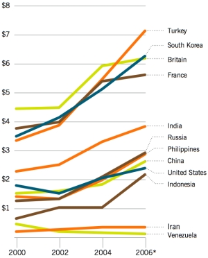While on the subject of gas prices, [Foreign Policy](http://www.foreignpolicy.com/story/cms.php?story_id=3862)
has a graph of the prices per gallon of gasoline from 2000 to 2006. With the US at the lower tier, I feel like a bit of a whiner (“Waa waa waa, it costs 30 dollars to fill my tank”). At the lower end, it seems Venezuela seems the place to be, with some major government subsidizing going on.
### Related
* [Are gas prices really that high?](https://flowingdata.com/2011/03/22/are-gas-prices-really-that-high/ "Are gas prices really that high?")
* [America Wins in Petrol Consumption per Day](https://flowingdata.com/2007/07/12/american-wins-in-petrol-consumption-per-day/ "America Wins in Petrol Consumption per Day")
* [Watch the Rise of Gasoline Retail Prices, 1993 – 2008](https://flowingdata.com/2008/08/08/watch-the-rise-of-gasoline-retails-prices-1993-2008/ "Watch the Rise of Gasoline Retail Prices, 1993 – 2008")
---
# Making Public Data Public – FlowingData
Making Public Data Public
=========================
[July 11, 2007](https://flowingdata.com/2007/07/11/making-public-data-public/)
### Topic
**[Data Sources](https://flowingdata.com/category/statistics/data-sources/)
**
As [Jon Udell](http://blog.jonudell.net/2007/07/05/show-me-the-data/)
has mentioned, there’s a ton of data online, but it’s not often we can find it, often hidden in the deep, dark basement of some website. He has proposed that people book mark public datasets on [del.icio.us](http://del.icio.us)
under the tag “publicdata”. I think this is a great idea. In turn, you can subscribe to the feed with the url http://del.icio.us/tag/publicdata.
I’ve been doing this already for a while, but I had been just tagging with “data”. So I’m going to join in on the party and start tagging with publicdata, and I hope others will too. Until sites like [Many Eyes](http://many-eyes.com)
and [Swivel](http://swivel.com)
get more wind beneath their wings, I think it’s necessary.
### Related
* [Europe’s energy targets in perspective](https://flowingdata.com/2011/02/08/europes-energy-targets-in-perspective/ "Europe’s energy targets in perspective")
* [Google opens up Public Data Explorer to your data](https://flowingdata.com/2011/02/17/google-opens-up-public-data-explorer-to-your-data/ "Google opens up Public Data Explorer to your data")
* [your.flowingdata Gets an Upgrade + Free iPhone App](https://flowingdata.com/2009/08/27/your-flowingdata-gets-an-upgrade-free-iphone-app/ "your.flowingdata Gets an Upgrade + Free iPhone App")
---
# America Wins in Petrol Consumption per Day – FlowingData
America Wins in Petrol Consumption per Day
==========================================
[July 12, 2007](https://flowingdata.com/2007/07/12/american-wins-in-petrol-consumption-per-day/)
### Topic
**[Statistical Visualization](https://flowingdata.com/category/visualization/statistical-visualization/)
**
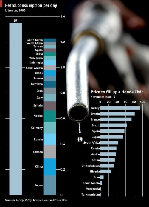
A very simple graph from [The Economist](http://www.economist.com/daily/chartgallery/displaystory.cfm?story_id=9430924)
(spiced up a bit with a picture of a delicious gasoline droplet) that quickly gets its point across. The United States uses a lot of petrol compared to other countries, while at the same time, it costs less to fill up a Honda Civic in the US than most other places.
However, the left graph is based on 2003 data. I wonder what the graph looks like now? Similar, I’m sure, but still something to look at.
Anyways, something really interesting here — even though Venezuela has crazy low gas prices, the average petrol consumption per day over there is still quite low. Whether this is a cultural thing or just some weird supply and demand thing (that I have no clue about) might be worth some investigating.
In any case, just because we have lower gas prices (that we still complain about) than a lot of the world, we’re still consuming a lot. What’s our excuse?
### Related
* [Are gas prices really that high?](https://flowingdata.com/2011/03/22/are-gas-prices-really-that-high/ "Are gas prices really that high?")
* [Gas Prices Over Time, 2000-2006](https://flowingdata.com/2007/07/12/gas-prices-over-time-2000-2006/ "Gas Prices Over Time, 2000-2006")
* [Rising prices of everything](https://flowingdata.com/2021/11/05/rising-prices-of-everything/ "Rising prices of everything")
### 1 Comment
* tony — [June 2, 2008 at 9:34 pm](https://flowingdata.com/2007/07/12/american-wins-in-petrol-consumption-per-day/#comment-49672)
holy f\*ck
---
# Timelines to Show Changes Over Time – FlowingData
Timelines to Show Changes Over Time
===================================
[August 5, 2007](https://flowingdata.com/2007/08/05/timelines-to-show-changes-over-time/)
### Topic
**[The Times](https://flowingdata.com/category/the-times/)
**
[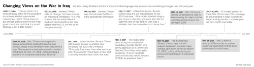](http://www.nytimes.com/2007/08/04/us/politics/04clinton.html?ref=politics)
I recently put together a timeline for Senator Hillary Rodham Clinton’s [changing views](http://www.nytimes.com/2007/08/04/us/politics/04clinton.html?ref=politics)
on the Iraq war. In 2002, she voted in support of the war. In 2006, her language was a bit non-committal, as far as setting a deadline to get troops out of Iraq. Now, in 2007, she’s firmly set on getting troops out of Iraq by some deadline. The goal of the timeline is to show this change.
Here’s the important lesson I learned during this task — even though it’s easy to put a timeline together, it still has to tell a story. Think about the purpose of the timeline. Usually, you want to show some change or progression over time. The tinting on the above timeline is for events during which Senator Clinton shows a definite change in her stance. The hope is that the reader keeps going left to right.
If you don’t keep the story in mind, the timeline is no longer as useful. It’s just a bunch of text arranged in time order, which is sort of what the above timeline looked like after my first jab at it. I put tinting on the events i.e. the things that weren’t quotes from Mrs. Clinton. In retrospect, such tinting plainly defeats the purpose of this particular timeline, which went with a story that discussed the change. Duh.
### Related
* [Xtimeline to Explore and Create Timelines](https://flowingdata.com/2007/07/07/xtimeline-to-explore-and-createtimelines/ "Xtimeline to Explore and Create Timelines")
* [More Research than Anything Else](https://flowingdata.com/2007/09/07/more-research-than-anything-else/ "More Research than Anything Else")
* [Futures in literature from the past →](http://www.brainpickings.org/index.php/2012/11/21/giorgia-lupi-future-timeline/ "Futures in literature from the past →")
### 1 Comment
* [Mike Love](http://mikelove.wordpress.com)
— [August 5, 2007 at 8:42 pm](https://flowingdata.com/2007/08/05/timelines-to-show-changes-over-time/#comment-49679)
Must be fun to make graphics for the Times! Nice work.
---
# More Mapping from amMap Offering Flexibility – FlowingData
More Mapping from amMap Offering Flexibility
============================================
[July 13, 2007](https://flowingdata.com/2007/07/13/more-mapping-from-ammap-offering-flexibility/)
### Topic
**[Apps](https://flowingdata.com/category/software/online-apps/)
, [Maps](https://flowingdata.com/category/visualization/mapping/)
**
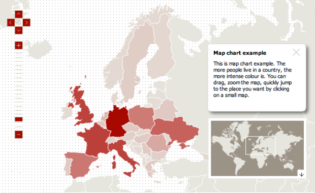
Yes, more mapping. Map, map, map. [amMap](http://ammap.com)
offers a Flash-based mapping tool that you can download and customize to your liking.
> Ammap is an interactive flash map creation software. Use this tool to show locations of your offices, routes of your journeys, create your distributor map. Photos or illustrations can be used instead of maps, so you can make different presentations, e-learning tools and more.
There’s some smooth browsing and zooming, and it’s pretty sleek. Those who appreciate simplicity will appreciate amMap. Plus, it’s free :)
I think the custom area option is particularly sexy. This means that instead of browsing countries, you can create areas in the shape of people and then display that in the same way, like below:

### Related
* [Time Series Tool Like Google Finance](https://flowingdata.com/2007/07/01/time-series-tool-like-google-finance-sort-of/ "Time Series Tool Like Google Finance")
* [Firefox 4 downloads in real-time](https://flowingdata.com/2011/03/22/firefox-4-downloads-in-real-time/ "Firefox 4 downloads in real-time")
* [Creating Effective Visualization](https://flowingdata.com/2007/06/25/creating-effective-visualization/ "Creating Effective Visualization")
---
# New Lessons Every Day – FlowingData
New Lessons Every Day
=====================
[July 20, 2007](https://flowingdata.com/2007/07/20/new-lessons-every-day/)
### Topic
**[Miscellaneous](https://flowingdata.com/category/miscellaneous-data/)
, [The Times](https://flowingdata.com/category/the-times/)
**
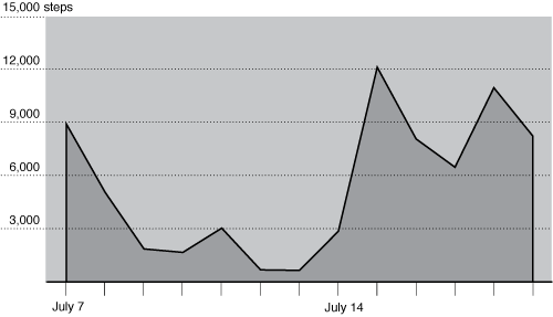
Every day I learn a lot, and every day I get better. For most of the day today, I worked on a single graphic (that hopefully runs in the paper). I gave it to the person in charged, and oh man, there was a lot to change. Fonts, labels, fill colors, bar widths, spacing, layer orientation, size… on and on and on. I think it might have been faster for him to make the graphic himself than it was for him to fix mine.
Sigh. Gotta practice.
The graphic above is the number of daily steps I’ve taken since [I started wearing a pedometer](http://life.flowingdata.com/2007/07/10/10000-literal-steps-to-healthier-living/)
. Can you tell when I moved to the city and was forced to walk to the subway and work?
### Related
* [10,000 (Literal) Steps to Healthier Living](https://flowingdata.com/2007/07/10/10000-literal-steps-to-healthier-living/ "10,000 (Literal) Steps to Healthier Living")
* [Chart Practice: Mimicking Others](https://flowingdata.com/2023/05/11/process-238-mimic/ "Chart Practice: Mimicking Others")
* [Data Collection With USB Pedometer. Weight No More!](https://flowingdata.com/2007/09/18/data-collection-with-usb-pedometer-weight-no-more/ "Data Collection With USB Pedometer. Weight No More!")
---
# TED Talk: What do we really know about the spread of AIDS? – FlowingData
TED Talk: What do we really know about the spread of AIDS?
==========================================================
[July 13, 2007](https://flowingdata.com/2007/07/13/ted-talk-what-do-we-really-know-about-the-spread-of-aids/)
### Topic
**[Statistics](https://flowingdata.com/category/statistics/)
**
In her TED talk, [Emily Oster](http://www.ted.com/speakers/view/id/126)
challenges our conception of AIDS and suggests other covariates that we need to look at (e.g. export volumes of coffee). Until we get out of the mindset that poverty and health care are the only causes/predictors of AIDS, we won’t be able to find the best way to fight the disease. Another great use of data.
I do have one small itch to scratch though. Emily had a line plot that shows export volumes and another line, on the same grid, of HIV infections, both over time. It reminds me of the plots that Al Gore uses with carbon dioxide levels and temperature. Anyways, using the plot, Emily suggests a very tight relationship between export volumes and HIV infections. Isn’t export volume pretty tightly knit to poverty? I don’t know. She’s the economist, so she would know (A LOT) better than me. I guess I just wish she talked a little bit about the new and different data she has that compels us to change our conceptions.
### Related
* [Seeing CO2 is a playable data visualization](https://flowingdata.com/2021/03/11/seeing-co2-is-a-playable-data-visualization/ "Seeing CO2 is a playable data visualization")
* [Tracking the spread of AIDS →](http://www.npr.org/blogs/health/2012/07/25/156991065/track-the-spread-of-aids-across-the-globe "Tracking the spread of AIDS →")
* [Map of global carbon emissions](https://flowingdata.com/2015/04/01/map-of-global-carbon-emissions/ "Map of global carbon emissions")
---
# Where’s the Local Big Mac Price Data? – FlowingData
Where’s the Local Big Mac Price Data?
=====================================
[August 16, 2007](https://flowingdata.com/2007/08/16/wheres-the-local-big-mac-price-data/)
### Topic
**[Miscellaneous](https://flowingdata.com/category/miscellaneous-data/)
**
Every now and then I indulge in a Big Mac meal from McDonald’s. I feel satisfied while I eat the burger and fries and suck down my diet soda, but afterwards I feel sleepy, sluggish, and fat. Today was one of those days.
As I ate my my satisfying-not-so-satisfying meal, I wondered what the Big Mac price differences from state to state or even city to city. I know that there’s data going around about Big Mac prices in different countries, but I’m pretty sure it varies quite a bit in the U.S. alone. I don’t remember paying over $6 for the number 1 in California. What a jip (and yet I’ve been to the golden arches at least three times in the past month).
### Related
* [Where State Farm Insurance is dropping home policies](https://flowingdata.com/2024/06/21/where-state-farm-insurance-is-dropping-home-policies/ "Where State Farm Insurance is dropping home policies")
* [Are gas prices really that high?](https://flowingdata.com/2011/03/22/are-gas-prices-really-that-high/ "Are gas prices really that high?")
* [Analysis of baseball ticket pricing](https://flowingdata.com/2013/04/10/analysis-of-baseball-ticket-pricing/ "Analysis of baseball ticket pricing")
---
# Manhattan Inventory, Newark Killings, and Health Insurance – FlowingData
Manhattan Inventory, Newark Killings, and Health Insurance
==========================================================
[August 23, 2007](https://flowingdata.com/2007/08/23/manhattan-inventory-newark-killings-and-health-insurance/)
### Topic
**[The Times](https://flowingdata.com/category/the-times/)
**
Unbelievably, I’m already in my sixth week, with this week practically over. I create graphics more efficiently (although I’m still constantly learning) than I did in my first week and have gotten a better idea of The Times style and the process of how a graphic gets put into the paper. Here’s my last three graphics that have run in the paper.
Convincing Data, sort of
------------------------
This past Sunday, the Real Estate section had a story on the [rising Manhattan apartment prices](http://www.nytimes.com/2007/08/19/realestate/19cov.html?_r=1&ref=realestate)
and the declining apartment inventory. The Manhattan trends were then compared to national housing inventory, which shows (somewhat) of an _increase_, opposite that of Manhattan.
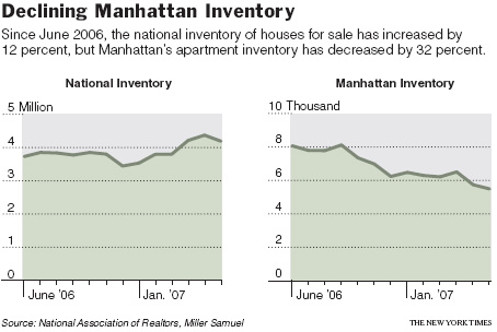
I wasn’t especially excited about graphing this data, because I wasn’t sure how confident I was in the national inventory estimates. Is national housing inventory really increasing? On the order of millions, a small move up or down in the order of thousands could drastically change how that line looks. I had Manhattan inventory data though, and it at least looks like something is going on there.
Timeline of Mean Men
--------------------
If you read the news at least a little, you’ve most likely heard of the horrible [Newark killings](http://www.nytimes.com/2007/08/21/us/politics/21newark.html?ex=1345435200&en=91601d8c3c7953b3&ei=5124)
on August 4. There were three men and three boys who are (were) a small a gang, and they killed three and wounded one. This worthless-to-society suspects lined up the victims against a wall and shot them in the back of the head, execution-style. Un-fricken-believable.

You would think a timeline would be super-simple to make, but I’ve actually found them the most difficult. First there’s research to find the dates and make sure I got accurate information. Then I had to organize everything in a way that was readable and looked decent. Finally, I had to find pictures (that I was allowed to use), get them toned by the art department for the paper and the web, and then let the copy editors reword everything so that it all sounds better. It’s quite the process, and there’s clearly a lot of style issues. At least with graphs, there’s some familiarity there.
Percentages Instead of Counts
-----------------------------
Stacked bar charts are a little tricky. They’re not always especially easy to read if you’re interested in showing information from all categories. It’s especially difficult to see changes when the height of each complete bar is changing. However, when the focus is on a specific category and all the bars are the same height (e.g. each group of stacked bars add up to 100), then I think it’s OK.
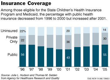
In the above graph, I think it’s easy to see the changes in [public health insurance](http://www.nytimes.com/2007/08/22/health/policy/22insure.html?ref=us)
, and with some careful labeling, it’s not too hard to make out the changes across the other two categories.
So yeah, really varied topics, which is good for my short attention span. I’m still waiting on a call to do a sport graphic though. The Times doesn’t seem to have a whole lot of graphics in its Sports section. I find that a bit odd. I would think that sports would naturally lend itself to graphics with all the statistics getting logged every day. Maybe the sports audience doesn’t want to see stuff like that?
### Related
* [Mapping Manhattan’s Skyscraper Districts Through Time](https://flowingdata.com/2008/02/14/mapping-manhattans-skyscraper-districts-through-time/ "Mapping Manhattan’s Skyscraper Districts Through Time")
* [Here & There: Horizonless Perspective of Manhattan](https://flowingdata.com/2009/05/05/here-there-horizonless-perspective-of-manhattan/ "Here & There: Horizonless Perspective of Manhattan")
* [Facebook still allowed race exclusion for housing advertisers](https://flowingdata.com/2017/11/22/facebook-still-allowed-race-exclusion-for-housing-advertisers/ "Facebook still allowed race exclusion for housing advertisers")
---
# The Times: Wealthiest Americans Ever – FlowingData
The Times: Wealthiest Americans Ever
====================================
[July 15, 2007](https://flowingdata.com/2007/07/15/the-times-wealthiest-americans-ever/)
### Topic
**[Statistical Visualization](https://flowingdata.com/category/visualization/statistical-visualization/)
**
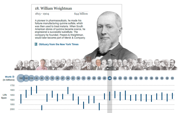
In honor of my New York Times induction day, a visualization of [The Wealthiest Americans Ever](http://www.nytimes.com/ref/business/20070715_GILDED_GRAPHIC.html#)
. You think good ol’ Billy would be there at the top of the list, worth $82 billion, there have been a few who have preceded the software giant e.g. John D. Rockefeller worth a crazy $192 billion. Just think how many Jack in the Box tacos you could buy with that kind of money.
### Related
* [When data guys triumph](https://flowingdata.com/2011/10/12/when-data-guys-triumph/ "When data guys triumph")
* [Misleading Map of Buffalo Snow](https://flowingdata.com/2007/09/27/misleading-map-of-buffalo-snow/ "Misleading Map of Buffalo Snow")
* [Twitter parade in your honor](https://flowingdata.com/2010/06/11/twitter-parade-in-your-honor/ "Twitter parade in your honor")
---
# Many Eyes on The Times U.S. Open Blog – FlowingData
Many Eyes on The Times U.S. Open Blog
=====================================
[August 27, 2007](https://flowingdata.com/2007/08/27/many-eyes-on-the-times-us-open-blog/)
### Topic
**[Apps](https://flowingdata.com/category/software/online-apps/)
**
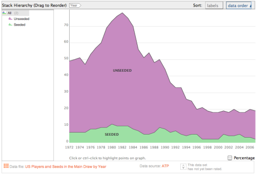
There was a post on The Times U.S. Open blog debating on the [state of American tennis](http://usopen.blogs.nytimes.com/2007/08/26/is-the-us-behind-or-has-the-world-caught-up/)
compared to the rest of the world. Right in the middle of the post, what do we see? It’s a [Many Eyes](http://many-eyes.com)
thumbnail!
There was some discussion on the the decreasing trend shown in the graph, but as the graph only shows American tennis data, the obvious next step would be to show what the rest of the tennis population (i.e. Europe, etc) would look like.
In any case, it’s nice to see Many Eyes creeping into popular media.
### Related
* [Decline of U.S. Men’s Tennis](https://flowingdata.com/2007/09/04/decline-of-us-mens-tennis/ "Decline of U.S. Men’s Tennis")
* [New York Times Visualization Lab – Collaboration with Many Eyes](https://flowingdata.com/2008/10/28/new-york-times-visualization-lab-collaboration-with-many-eyes/ "New York Times Visualization Lab – Collaboration with Many Eyes")
* [Wimbledon grass patterns](https://flowingdata.com/2023/07/10/wimbledon-grass-patterns/ "Wimbledon grass patterns")
### 3 Comments
* [Aron Pilhofer](http://www.nytimes.com)
— [August 27, 2007 at 7:37 am](https://flowingdata.com/2007/08/27/many-eyes-on-the-times-us-open-blog/#comment-18)
I’m hoping to post part II today… stay tuned!
* [Nathan](https://flowingdata.com)
— [August 27, 2007 at 12:15 pm](https://flowingdata.com/2007/08/27/many-eyes-on-the-times-us-open-blog/#comment-19)
Here’s to looking forward to more computer assisted reporting.
* Pingback: [FlowingData / Decline of U.S. Men's Tennis](https://flowingdata.com/2007/09/04/decline-of-us-mens-tennis/)
---
# More About the Style, Less About How – FlowingData
More About the Style, Less About How
====================================
[July 24, 2007](https://flowingdata.com/2007/07/24/more-about-the-style-less-about-how/)
### Topic
**[The Times](https://flowingdata.com/category/the-times/)
**
It’s six days in, and I’m starting to get used to Adobe Illustrator. It’s one honker of a program, so I’m picking up things as I go along, but on the upside, I’m really glad I went through some of Illustrator lessons to at least familiarize myself with layers, etc.
I think I’m getting closer to the point where it’s less about “How do I do this?” and more about “What am I going to show?” Don’t get me wrong. There’s A LOT I still don’t know how to do, but at least I know enough to figure out a good amount on my own. Just a lot to figure out about The Times graphics style — font, sizes, color, etc.
The administrative stuff is the hardest part of all though. While I’m working on a graphic I have to keep all the necessary people updated i.e. the reporter of the story of whom I am making the graphic for. I got scolded today, because a reporter didn’t know that her story was put on hold. I didn’t know that I was her only contact link. Lesson learned. I’m just going to contact everyone from now on. Better to provide too much information than too little (in this case, at least).
Once a graphic is completed, I have to print out five copies or so and hand them out to all of the necessary people. Next, update the graphic schedule, and then place it in the active list. It’s strange that even though we’re all equipped with these super awesome computers that I still have to walk upstairs and hand-deliver copies of a graphic. I guess nothing can replace human contact.
### Related
* [Don’t want to share our data / OK, what’re you hiding?](https://flowingdata.com/2007/08/20/dont-want-to-share-our-data-ok-whatre-you-hiding/ "Don’t want to share our data / OK, what’re you hiding?")
* [My First Graphic, Getting There](https://flowingdata.com/2007/07/18/my-first-graphic-getting-there/ "My First Graphic, Getting There")
* [Flocking Up the National Nine News](https://flowingdata.com/2008/05/13/flocking-up-the-national-nine-news/ "Flocking Up the National Nine News")
---
# More Research than Anything Else – FlowingData
More Research than Anything Else
================================
[September 7, 2007](https://flowingdata.com/2007/09/07/more-research-than-anything-else/)
### Topic
**[The Times](https://flowingdata.com/category/the-times/)
**
[](http://www.nytimes.com/2007/09/06/washington/06cong.html)
For what seems like forever, Democrats have been trying to [get Republicans to agree](http://www.nytimes.com/2007/09/06/washington/06cong.html)
to some kind of timeline to pull troops out of Iraq.
On the surface, the graphic seems pretty straightforward, but the research took me forever. I had to look through past Times articles to find suitable lead ups to the actual bill being proposed. We were looking for something specific like another version of the proposed bill. In retrospect, I’m not quite sure why it took so long. Maybe because it took me a while to pin down just exactly what direction I wanted to take it. Anyways, once I got the background info, it was just a short time of the boss whizzing through Illustrator hot keys and tada, we had our graphic.
### Related
* [Spending bill in a treemap box](https://flowingdata.com/2021/10/22/spending-bill-in-a-treemap-box/ "Spending bill in a treemap box")
* [Electricity bill redesigned](https://flowingdata.com/2012/07/02/electricity-bill-redesigned/ "Electricity bill redesigned")
* [A short film on giving up privacy, for better or worse](https://flowingdata.com/2021/05/27/a-short-film-on-giving-up-privacy-for-better-or-worse/ "A short film on giving up privacy, for better or worse")
---
# Showing Large Numbers to Scale – FlowingData
Showing Large Numbers to Scale
==============================
[September 10, 2007](https://flowingdata.com/2007/09/10/showing-large-numbers-to-scale/)
### Topic
**[Data Art](https://flowingdata.com/category/visualization/artistic-visualization/)
** / [big numbers](https://flowingdata.com/tag/big-numbers/)

Chris Jordan’s series, [Running the Numbers: An American Portrait](http://www.chrisjordan.com/current_set2.php)
, just opened this weekend in Los Angeles at the [Paul Kepeikin Gallery](http://www.paulkopeikingallery.com/)
. Chris depicts large numbers in a way that we can see, because oftentimes, big numbers are hard to imagine. For example, he recreates Georges Seurat’s famous painting, A Sunday Afternoon on the Island of La Grande Jatte, in the form of 106,000 aluminum cans — the number used in the US every thirty seconds. There are others like the number of plastic bags used every three seconds (60,000) and the number of brown paper supermarket bags used every hour (1.14 million).
If you’re in the area, it should definitely be worth going. I wish I could. As Chris notes, it’s one of those series that you have to see in person to get the full effect. The shear size of each piece allows you to feel the largeness of it all.
### Related
* [All of the plastic bottles purchased in a day, Eiffel Tower for scale](https://flowingdata.com/2019/09/10/plastic-bottles-purchased-in-a-day-eiffel-tower-for-scale/ "All of the plastic bottles purchased in a day, Eiffel Tower for scale")
* [Decision-making with big numbers we can’t really see](https://flowingdata.com/2016/09/20/decision-making-with-big-numbers-we-cant-really-see/ "Decision-making with big numbers we can’t really see")
* [Minimum Wage Machine pays in pennies](https://flowingdata.com/2015/08/28/minimum-wage-machine-pays-in-pennies/ "Minimum Wage Machine pays in pennies")
---
# My First Graphic, Getting There – FlowingData
My First Graphic, Getting There
===============================
[July 18, 2007](https://flowingdata.com/2007/07/18/my-first-graphic-getting-there/)
### Topic
**[The Times](https://flowingdata.com/category/the-times/)
**
So I started on a graphic today, and it might actually be in the paper. I’m pretty excited to see my first graphic published. I won’t say what it is or when until I actually find out _if_ it gets published to save myself from any embarrassment, but nevertheless, cool to think about.
In other news, I got to see a coworker do his stuff with some mapping and what not, whizzing through Adobe Illustrator like it was part of him. His attention to detail and his ability to do it quickly were what impressed me the most. I have a lot to learn and a lot to do.
It’s also comforting to know that previous interns didn’t know any Adobe Illustrator either, so I don’t feel as dumb anymore.
### Related
* [Chart Practice: Mimicking Others](https://flowingdata.com/2023/05/11/process-238-mimic/ "Chart Practice: Mimicking Others")
* [More About the Style, Less About How](https://flowingdata.com/2007/07/24/more-about-the-style-less-about-how/ "More About the Style, Less About How")
* [Just Enough Chart (The Process #71)](https://flowingdata.com/2020/01/09/process-71-ad-hoc/ "Just Enough Chart (The Process #71)")
---
# Evaluating New York Subway Report Card – FlowingData
Evaluating New York Subway Report Card
======================================
[July 26, 2007](https://flowingdata.com/2007/07/26/evaluating-new-york-subway-report-card/)
### Topic
**[Miscellaneous](https://flowingdata.com/category/miscellaneous-data/)
, [The Times](https://flowingdata.com/category/the-times/)
**
I had a chance to browse through some of my subscribed feeds today, and I saw a post called [Noisy Subways](http://junkcharts.typepad.com/junk_charts/2007/07/noisy-subways.html)
by Kaiser over at Junk Charts blog. So I clicked, since it isn’t one of those full feeds, and then I saw The New York subway report card. I smiled, because, well, **I made that [chart](https://flowingdata.com/2007/07/25/annual-new-york-subway-report-card/)
just a few days ago!**
Just a disclaimer: The Times chart was just The New York Times version of the original [Straphangers report](http://www.straphangers.org/statesub07/SOS07.pdf)
:
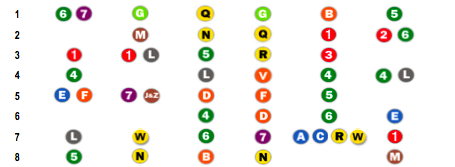
Anyways, there was bit of a discussion, which again, I found very amusing. I felt kind of special in a way.
There were two main points to the post – 1. Noisy data; and 2. Chart is hard to read. I’m very tired right now, so I’ll just say a few things.
Yes, the data is really noisy, but why shouldn’t it be? We shouldn’t assume that all six variables are positively correlated. It’s very possible for a line to be very reliable, but have no seats. One could argue that the lines with more people HAVE to be more reliable, because if something goes wrong, more people are going to get screwed.
Secondly – sure, the chart is a bit hard to read at a glance, but who’s the audience? New Yorkers are the audience, and the first thing that they’re going to do is look for their subway line. That’s what I did. With the audience in mind, I think the chart serves its purpose.
Most of the commenters provided decent ideas for alternative graphics. My opinion is that with this kind of data, it’s up for grabs. Audience is key though for charts, graphs, plots, maps, etc in a newspaper. Spiders and whiskers won’t make sense to many people. You’d be amazed of how many people don’t know how to read a scatter plot. The public is getting better though. They’ll get there.
As for the person who left the comment about the gaps in the chart. I’m going to assume that was in haste. Some lines are tied, hence some blanks spaces.
Welp, that was fun. Yawwwwn. Time for bed.
### Related
* [Annual New York Subway Report Card](https://flowingdata.com/2007/07/25/annual-new-york-subway-report-card/ "Annual New York Subway Report Card")
* [Subway delays visually explained](https://flowingdata.com/2018/05/15/subway-delays-visually-explained/ "Subway delays visually explained")
* [How air spreads on a subway train](https://flowingdata.com/2020/08/10/how-air-spreads-on-a-subway-train/ "How air spreads on a subway train")
---
# Wise Words from John Tukey – FlowingData
Wise Words from John Tukey
==========================
[September 14, 2007](https://flowingdata.com/2007/09/14/wise-words-from-john-tukey/)
### Topic
**[Quotes](https://flowingdata.com/category/quotes/)
** / [exploration](https://flowingdata.com/tag/exploration/)
, [John Tukey](https://flowingdata.com/tag/john-tukey/)
> The greatest value of a picture is when it forces us to notice what we never expected to see.
>
> — John W. Tukey. [Exploratory Data Analysis](http://www.amazon.com/Exploratory-Data-Analysis-Wilder-Tukey/dp/0201076160/ref=pd_bbs_sr_2/103-4466654-5303007?ie=UTF8&s=books&qid=1189739816&sr=8-2)
> . 1977.
Love it. Great words from the father of exploratory data analysis. Have an excellent weekend.
### Related
* [Not just one chart](https://flowingdata.com/2015/02/13/not-just-one-chart/ "Not just one chart")
* [John Tukey and the Beginning of Interactive Graphics](https://flowingdata.com/2008/01/01/john-tukey-and-the-beginning-of-interactive-graphics/ "John Tukey and the Beginning of Interactive Graphics")
* [Q. How did your love of infographics begin?](https://flowingdata.com/2010/10/03/q-how-did-your-love-of-infographics-begin/ "Q. How did your love of infographics begin?")
---
# Annual New York Subway Report Card – FlowingData
Annual New York Subway Report Card
==================================
[July 25, 2007](https://flowingdata.com/2007/07/25/annual-new-york-subway-report-card/)
### Topic
**[The Times](https://flowingdata.com/category/the-times/)
**

My second graphic was in The Times Metro section [today](http://www.nytimes.com/2007/07/24/nyregion/24subway.html?bl=&_r=1&ei=5087%250A&en=978813ecc5b84a95&ex=1185422400&adxnnl=1&oref=login&adxnnlx=1185336462-43JGldEh5tS/Xghl7erZ0w)
(Tuesday, July 24, pg B2). It’s an annual report card compiled by the [Straphangers Campaign](http://www.straphangers.org/)
for every New York subway line. The No. 1 line was coincidentally ranked best while the C and the W (one of the lines I take) were near the bottom.
### Related
* [Evaluating New York Subway Report Card](https://flowingdata.com/2007/07/26/evaluating-new-york-subway-report-card/ "Evaluating New York Subway Report Card")
* [The 2009 Feltron Annual Report – OCD Made Sexy](https://flowingdata.com/2010/01/26/the-2009-feltron-annual-report-ocd-made-sexy/ "The 2009 Feltron Annual Report – OCD Made Sexy")
* [Subway delays visually explained](https://flowingdata.com/2018/05/15/subway-delays-visually-explained/ "Subway delays visually explained")
### 1 Comment
* Pingback: [Flowing Data / Evaluating New York Subway Report Card](https://flowingdata.com/2007/07/26/evaluating-new-york-subway-report-card/)
---
# Deaths While Crossing the Border – FlowingData
Deaths While Crossing the Border
================================
[September 16, 2007](https://flowingdata.com/2007/09/16/deaths-while-crossing-the-border/)
### Topic
**[The Times](https://flowingdata.com/category/the-times/)
**
With a stricter border patrol, more Mexican illegal immigrants are taking dangerous routes to get into the United States. As a result, treks through the dehydrating Arizona desert have caused a significant number of [deaths](http://www.nytimes.com/2007/09/15/us/15border.html?hp)
. Most likely there are more deaths than this graph indicates because the data was only for deaths reported by the Border Patrol. There could very well be cases the Border Patrol did not handle or knew about.
This graph was straightforward, mainly a waiting game for data from first, the Government Accountability Office and then the Border Safety Initiative. Take a look at the [GAO report](http://www.gao.gov/docsearch/abstract.php?rptno=GAO-06-770)
done last year, reporting a double in border-crossing deaths from 1995 to 2005. It’s a little odd though that they use numbers from two different sources, so take it with a grain of salt.
### Related
* [Unreliable FBI crime data](https://flowingdata.com/2022/06/15/unreliable-fbi-crime-data/ "Unreliable FBI crime data")
* [Traffic fatalities data for 2015 released](https://flowingdata.com/2016/09/30/traffic-fatalities-data-for-2015-released/ "Traffic fatalities data for 2015 released")
* [Missing deaths](https://flowingdata.com/2020/04/21/missing-deaths/ "Missing deaths")
---
# My Last Graphic at The Times – FlowingData
My Last Graphic at The Times
============================
[September 24, 2007](https://flowingdata.com/2007/09/24/my-last-graphic-at-the-times/)
### Topic
**[The Times](https://flowingdata.com/category/the-times/)
**

Friday was my last day at The Times, and this past Sunday, my last graphic ran in the paper. The story discussed [Judge Michael Mukasey’s past rulings](http://www.nytimes.com/2007/09/23/us/23mukasey.html)
and experience. Who’s Michael Mukasey? He’s up for the spot of the new attorney general of course.
Anyways, I got to look through a lot of cool data on past rulings and busted out [R](http://r-project.org)
for some statistical fun. This brought me to my last graphic. It compared Mukasey to his New York Southern District peers. You can see he’s been more strict overall but less strict in immigration cases. Unfortunately some spacing between each bar was lost in the web version; it looks much better in the actual paper.
That’s not the most exciting part though.
The Name Credit
---------------

When I opened up the early edition Saturday night, there it was — my name at the bottom of the graphic! What a great going away present.
### Related
* [Where immigrants in the U.S. came from](https://flowingdata.com/2024/07/18/where-immigrants-in-the-u-s-came-from/ "Where immigrants in the U.S. came from")
* [My First Graphic in The Times](https://flowingdata.com/2007/07/21/my-first-graphic-in-the-times/ "My First Graphic in The Times")
* [New Lessons Every Day](https://flowingdata.com/2007/07/20/new-lessons-every-day/ "New Lessons Every Day")
### 2 Comments
* [Mike Love](http://mikelove.wordpress.com)
— [September 30, 2007 at 2:16 pm](https://flowingdata.com/2007/09/24/my-last-graphic-at-the-times/#comment-38)
It’s kind of alarming to see so much sentencing variation between judges. What would you say was the median number of cases tried by judges?
* [Nathan](https://flowingdata.com)
— [October 1, 2007 at 4:28 am](https://flowingdata.com/2007/09/24/my-last-graphic-at-the-times/#comment-49692)
Pretty interesting, eh? I don’t have the data with me, but I do remember seeing a lot of triple digits and high double digits for the cases in categories. For _all_ cases, the numbers were in the hundreds and thousands (since the data is almost over 2 decades).
It’s probably also worth noting that only judges who had at least 20 cases in a given category are shown in the histogram while the overall medians include all judges for all the cases in the respective category.
---
# Difficulty Keeping Up with the Feeds – FlowingData
Difficulty Keeping Up with the Feeds
====================================
[July 24, 2007](https://flowingdata.com/2007/07/24/difficulty-keeping-up-with-the-feeds/)
### Topic
**[Miscellaneous](https://flowingdata.com/category/miscellaneous-data/)
**
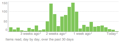
This is just really amusing to me. Above is a bar plot, from [Google Reader](http://reader.google.com)
, of the number of items I’ve read in the past 30 days, with each bar representing a day. Quite easy to see when I had a little bit too much time on my hands. Right when the internship starts, the number of items read plummets. I miss my subscribed feeds =(.
### Related
* [Explore Your Feeds in a Cloud of Posts – RSS Voyage](https://flowingdata.com/2008/11/26/explore-your-feeds-in-a-cloud-of-posts-rss-voyage/ "Explore Your Feeds in a Cloud of Posts – RSS Voyage")
* [Evaluating New York Subway Report Card](https://flowingdata.com/2007/07/26/evaluating-new-york-subway-report-card/ "Evaluating New York Subway Report Card")
* [Twitter’s Creative Director on Why He Left Google](https://flowingdata.com/2009/04/25/twitters-creative-director-on-why-he-left-google/ "Twitter’s Creative Director on Why He Left Google")
---
# My First Graphic in The Times – FlowingData
My First Graphic in The Times
=============================
[July 21, 2007](https://flowingdata.com/2007/07/21/my-first-graphic-in-the-times/)
### Topic
**[The Times](https://flowingdata.com/category/the-times/)
**
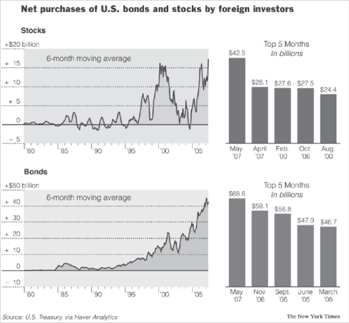
and here it is. Floyd Norris has a weekly editorial called _Off the Charts_. This week’s was titled _A Blockbuster Seller Overseas: Stakes in Corporate America_. It’s about the increase in the amount of money foreign investors are putting into American businesses. Check out the Business section in The New York Times! There’s also an [online version](http://www.nytimes.com/2007/07/21/business/21charts.html?ref=business)
.
It was ridiculous how many changes had to be made to my first pass at the graphic. I suck (but I’m getting better, really!). Color, bar width, grid style, font size, axis size, alignment, plus and minus signs, spacing, and area fill.
While writing statistical reports for class, I think it was easy to get away with so-so graphics. Just plug some data into [R](http://www.r-project.org)
, use the plot function, and ta-da. I’ll never look at charts and graphs the same way again.
### Related
* [Chart Practice: Mimicking Others](https://flowingdata.com/2023/05/11/process-238-mimic/ "Chart Practice: Mimicking Others")
* [Shifts in Job Distribution](https://flowingdata.com/2019/12/11/how-job-groups-changed-over-the-past-seven-decades/ "Shifts in Job Distribution")
* [Happiness and Health](https://flowingdata.com/2019/03/27/happiness-and-health/ "Happiness and Health")
---
# Find a Replacement for this Ugly Venn Diagram – FlowingData
Find a Replacement for this Ugly Venn Diagram
=============================================
[October 1, 2007](https://flowingdata.com/2007/10/01/find-a-replacement-for-this-ugly-venn-diagram/)
### Topic
**[Ugly Charts](https://flowingdata.com/category/visualization/ugly-visualization/)
**
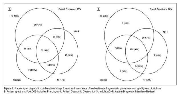
This venn diagram showing results from tests for Autism really seems to be making its rounds lately. It began with Igor Carron asking on his blog if there was a [better way](http://nuit-blanche.blogspot.com/2007/09/on-difficulty-of-autism-diagnosis-can.html)
to display the data. Then Andrew Gelman put something of a [redesign challenge](http://www.stat.columbia.edu/~cook/movabletype/archives/2007/09/redoing_venn_di.html)
up on his blog, and after Andrew, the challenge headed on over to [Junk Charts](http://junkcharts.typepad.com/junk_charts/2007/09/a-challenge.html)
. [Redesigns](http://www.stat.columbia.edu/~cook/movabletype/archives/2007/09/antony_unwins_g.html)
[are](http://www.murphypatrick.com/images/webreference/chart%20-%20autism%20version%205.gif)
[flying](https://i146.photobucket.com/albums/r264/del_c/infographics/Autism1a.png)
[off](http://www.stat.columbia.edu/~cook/movabletype/archives/2007/09/another_try_at.html)
the [wall](http://eagereyes.org/Applications/AutismDiagnosisAccuracy.html)
! From bar, to mosaic, to tornado charts, there’s clearly _many_ ways to represent data.
_**Which one is the best?**_ It’s hard to say, because they all have advantages and disadvantages and the answer really depends on what point you’re trying to drive home.
However, I can find one advantage that the original venn diagram has over its redesigns — it’s intuitive for many people. John Venn introduced his diagram in 1881, over a century ago. That’s a long time for people to adjust. People understand it. It makes sense. Yes, this particular venn is really ugly and probably didn’t belong in a Powerpoint presentation, but doesn’t it say something that re-designers were able to read it and use the data it provided? I think so.
So in the spirit of [Indexed](http://indexed.blogspot.com/)
, here’s to you Mr. Venn.
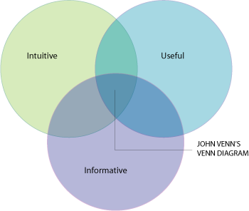
### Related
* [Google Doodle Venn diagram →](http://www.google.com/doodles/john-venns-180th-birthday "Google Doodle Venn diagram →")
* [Venn pie-agrams](https://flowingdata.com/2012/05/23/venn-pie-agrams/ "Venn pie-agrams")
* [Unintentional Venn diagram suggests opposite meaning](https://flowingdata.com/2014/08/19/unintentional-venn-diagram-suggests-opposite-meaning/ "Unintentional Venn diagram suggests opposite meaning")
### 1 Comment
* [MattG](http://graphic.org)
— [March 20, 2008 at 12:10 am](https://flowingdata.com/2007/10/01/find-a-replacement-for-this-ugly-venn-diagram/#comment-49694)
Great article. [Venn diagrams](http://www.graphic.org/venexp.html)
have really become an important tool for displaying data over the years, and it is pretty impressive to see how people are using them. I would agree with you that the top diagram is not very attractive, but if others were able to understand it I guess it served its purpose.
---
# Visualization of US Flight Patterns – FlowingData
Visualization of US Flight Patterns
===================================
[September 23, 2007](https://flowingdata.com/2007/09/23/visualization-of-us-flight-patterns/)
### Topic
**[Maps](https://flowingdata.com/category/visualization/mapping/)
**
When I think airplanes and data visualization, I think of Aaron Koblin’s [Flight Patterns](http://users.design.ucla.edu/~akoblin/work/faa/)
. Aaron uses data from the Federal Aviation Administration to show flights all across the United States, including Hawaii and Alaska. Even without the presence of an actual map, you can see a basic geography and where lots of flights are going and coming from. Flight Patterns is an oldie, but still a goodie. Here’s a video:
Speaking of flights, I’m currently waiting for my twice-delayed flight back to Buffalo. Thank goodness for free WiFi. Although it still doesn’t make up for the delays. I hereby shake my mental fist of rage at you, Jet Blue.
### Related
* [Contrailz: Detailed flight patterns at major airports](https://flowingdata.com/2013/06/24/contrailz-detailed-flight-patterns-at-major-airports/ "Contrailz: Detailed flight patterns at major airports")
* [A century of passenger air travel →](http://www.theguardian.com/world/ng-interactive/2014/aviation-100-years "A century of passenger air travel →")
* [MiseryMap of current flight delays and cancelations](https://flowingdata.com/2013/12/03/miserymap-of-current-flight-delays-and-cancelations/ "MiseryMap of current flight delays and cancelations")
### 5 Comments
* [Steamy Kitchen](http://www.steamykitchen.com)
— [September 24, 2007 at 2:22 pm](https://flowingdata.com/2007/09/23/visualization-of-us-flight-patterns/#comment-49689)
that is so beautiful…in a weird way. because i generally don’t consider airplanes or anything gas guzzling very appealing.
* Pingback: [Links « Plustien’s Weblog](http://plustien.wordpress.com/2007/11/21/links/)
* Ryan — [November 22, 2007 at 9:32 pm](https://flowingdata.com/2007/09/23/visualization-of-us-flight-patterns/#comment-49690)
I figured you would catch this one! Haha. I just sent this out to stat-compute because it made the front page of Yahoo! And the producer is apparently from UCLA…what a small world!
* Pingback: [World Internet City-to-City Connections and Density Maps | FlowingData](https://flowingdata.com/2008/04/01/world-internet-city-to-city-connections-and-density-maps/)
* Pingback: [All 26 Million Road Segments in Continental United States | FlowingData](https://flowingdata.com/2008/04/28/all-26-million-road-segments-in-continental-united-states/)
---
# Appeal of Visualizing My Life in Data – FlowingData
Appeal of Visualizing My Life in Data
=====================================
[July 30, 2007](https://flowingdata.com/2007/07/30/appeal-of-visualizing-my-life-in-data/)
### Topic
**[Self-surveillance](https://flowingdata.com/category/self-surveillance/)
**
Admittedly, ever since the Spring quarter ended, I’ve either been preparing for my internship at The Times or have been occupied by the internship. I haven’t given much thought to my dissertation topic, which in the most vaguest of terms will somehow encompass three things:
* Social Data Visualization
* Eco-Visualization
* Visualization of my Life
I have yet to figure out how to tie the three together in a worthwhile way or even whether I will include all three. Wrapped around the three will be data sharing. I got to thinking a little bit about visualizing my life in data today.
My adviser forwarded me this info design [piece](http://www.deviantart.com/deviation/59770086/)
, by Gregory Dizzia (which was apparently also featured on [infosthetics](http://infosthetics.com/archives/2007/07/intimate_relationship_chart.html)
):

First off, this is a cool piece. If you haven’t seen it, go to the site and download the pdf. It’s a simple idea. Document past relationships — how they began, how they ended, what happened in between. The information is organized very well. At a glance, you can see how many relationships Greg has had in his life and all the one night stands he had after his mid-life, long-term relationship. The design is attractive and I could relate to the information, so I was drawn in to look more.
Dig a little deeper, and you’ll see that there’s not just one engagement ring during that long-term relationship with Sarah. There’s a second one during his _very first_ girlfriend, Megan. Although, I’m a little wary of calling Megan a girlfriend since it was during Greg’s tender years at age 9 to 11. Stuff like that makes me want to know more.
Was he really engaged? Was it an arranged marriage or something? What do those breakup symbols **really** mean?
Life Visualization Appeal
-------------------------
Right off, Greg’s piece drew me in, because (1) it was pretty, and (2) I could relate to the data, and (3) there was a very human factor. This could probably be generalized to all types of successful visualization, but (2) and (3) are, I think, synonymous with life viz. That’s two out of three things that are automatic. Plus, as the visualiz_er_ I have a very strong emotional attachment to the data.
NOW, what happens when we have 100 people’s relationships to visualize? 1000? That’s when it gets really interesting and social data visualization makes its way into the picture. Well, something to think about.
### Related
* [The Many Words for Visualization](https://flowingdata.com/2011/09/29/the-many-words-for-visualization/ "The Many Words for Visualization")
* [Four Cs of data and design](https://flowingdata.com/2019/06/24/four-cs-of-data-and-design/ "Four Cs of data and design")
* [Texting history after the first swipe](https://flowingdata.com/2019/04/01/texting-history-after-the-first-swipe/ "Texting history after the first swipe")
### 1 Comment
* Pingback: [Data Visualization Gets Personal - Putting Data Into Your Hands \[PROJECT\] | FlowingData](https://flowingdata.com/2008/06/03/data-visualization-gets-personal-putting-data-into-your-hands-project/)
---
# Use Mint to Manage Your Finances – FlowingData
Use Mint to Manage Your Finances
================================
[September 26, 2007](https://flowingdata.com/2007/09/26/use-mint-to-manage-your-finances/)
### Topic
**[Apps](https://flowingdata.com/category/software/online-apps/)
**
[Mint](http://mint.com)
was released last week. It’s an online application that brings financial data from all of your credit card and bank accounts into one place. Think Quicken online and free.
It’s super easy (only takes a few seconds) to add your financial accounts, and you only have to do it once. After you’ve added your accounts, Mint will update your data every night and compile them into useful reports. You’ll get an overview of spending trends, transactions, and even ways you can save money based on your current credit cards’ interest rates.
So far I’ve found it useful simply because all of my data is one place. As I’ve made my way into adulthood, I’ve slowly accumulated more and more credit cards to the point where it’s kind of annoying to login to every account to see how much debt I have.
One Small Annoyance
-------------------
My one gripe about Mint is that the spending trends and savings features haven’t been that informative, but I imagine will get better once more data comes in and Mint continues to tweak the system. My highest hope is that they do something about the dreaded 3-d pie chart…
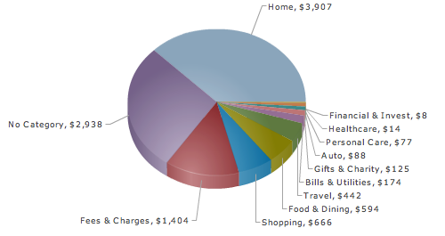
Overall though, I’m looking forward to seeing Mint grow and develop into an extremely useful tool that brings all of your data into one place and represents it in a way that’s understandable and interesting.
### Related
* [How people in your area spend money](https://flowingdata.com/2010/10/28/how-people-in-your-area-spend-money/ "How people in your area spend money")
* [Visual Guide to the Financial Crisis](https://flowingdata.com/2008/11/25/visual-guide-to-the-financial-crisis/ "Visual Guide to the Financial Crisis")
* [Banking Execs Flee with Millions of Dollars in Golden Parachute](https://flowingdata.com/2009/02/27/banking-execs-flee-with-millions-of-dollars-in-golden-parachute/ "Banking Execs Flee with Millions of Dollars in Golden Parachute")
### 1 Comment
* [David Michaels](http://www.mint.com)
— [July 3, 2008 at 1:26 am](https://flowingdata.com/2007/09/26/use-mint-to-manage-your-finances/#comment-49693)
Thanks Nathan. In the months since we launched, we have signed up over 300,000 users, and the pie chart has been revamped and improved. You can also compare your spending against the others in our community and much more. Hope you are still enjoying the service!
David (VP Engineering, MInt.com)
---
# CUNY Raising SAT Math Score Cutoff – FlowingData
CUNY Raising SAT Math Score Cutoff
==================================
[July 28, 2007](https://flowingdata.com/2007/07/28/cuny-raising-sat-math-score-cutoff/)
### Topic
**[The Times](https://flowingdata.com/category/the-times/)
**
Tired of looking at my New York Times graphics yet? Too bad. Here’s another one for ~my~ your viewing pleasure.
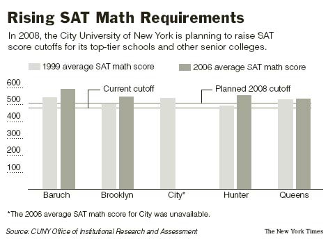
CUNY schools are planning to raise their SAT math scores to 510 for their top-tier schools and to 500 for the rest. Believe it or not, the current cutoff for all schools is 480. Some say the increase in standards is good for the school to improve reputability. Others argue that the new cutoffs single out a lot of minorities since the high school education system is uneven.
Currently, lots of students are coming into CUNY schools unprepared to take college-level math courses, and the _college_ ends up teaching remedial courses like pre-algebra. That’s just SAD. It’s probably more important to focus on improving the high school education system than it is to try to get unqualified students into college.
### Related
* [Low Income Hinders College Attendance, Even for Top Students](https://flowingdata.com/2009/09/01/low-income-hinders-college-attendance-even-for-top-students/ "Low Income Hinders College Attendance, Even for Top Students")
* [Access to education where you live](https://flowingdata.com/2011/07/06/access-to-education-where-you-live/ "Access to education where you live")
* [Teaching math with context and applications](https://flowingdata.com/2011/09/01/teaching-math-with-context-and-applications/ "Teaching math with context and applications")
### 6 Comments
* anon. — [August 13, 2007 at 5:26 am](https://flowingdata.com/2007/07/28/cuny-raising-sat-math-score-cutoff/#comment-49674)
Shouldn’t you show distributions, not averages? And why a bar chart? I don’t think there’s even a 100 on the SATs, let alone a 0.
* [Nathan](https://flowingdata.com)
— [August 13, 2007 at 9:12 pm](https://flowingdata.com/2007/07/28/cuny-raising-sat-math-score-cutoff/#comment-49675)
Good question. In many cases, we have to make graphics with the data that is given to us or with what we can find. With this graphic, all we had were averages.
About 0 and 100, yeah, you’re right. The lowest score you can get on the SAT is 200, and I should have made that evident on the y-axis.
Finally, why the choice of the bar chart? You’re pretty much going to find only line, bar, and bubble in The Times (from what I’ve seen so far), so I went with bar :P
* [Neil](http://www.ThirdRailMag.com)
— [December 16, 2007 at 9:50 pm](https://flowingdata.com/2007/07/28/cuny-raising-sat-math-score-cutoff/#comment-49676)
This would all make sense IF the SAT actually measured something . . . but studies show that it doesn’t measure or assess much of anything. For instance, the College Board claims that the SAT predicts the performance of college freshman. Yet studies show that female college freshman receive higher grades in math courses than male freshman. The SAT, however, predicts male freshman will receive higher grades in freshman math classes over female freshman (males score higher on the math section of the SAT). In other words – the SAT doesn’t seem to be a good predictor of freshman performance (its stated purpose). So the SAT should be abandoned.
* [Neil](http://www.ThirdRailMag.com)
— [December 16, 2007 at 4:50 pm](https://flowingdata.com/2007/07/28/cuny-raising-sat-math-score-cutoff/#comment-844)
This would all make sense IF the SAT actually measured something . . . but studies show that it doesn’t measure or assess much of anything. For instance, the College Board claims that the SAT predicts the performance of college freshman. Yet studies show that female college freshman receive higher grades in math courses than male freshman. The SAT, however, predicts male freshman will receive higher grades in freshman math classes over female freshman (males score higher on the math section of the SAT). In other words – the SAT doesn’t seem to be a good predictor of freshman performance (its stated purpose). So the SAT should be abandoned.
* Rob T. — [March 20, 2008 at 4:06 pm](https://flowingdata.com/2007/07/28/cuny-raising-sat-math-score-cutoff/#comment-49677)
Neil is right. This sort of over-emphasis on the SAT’s is ridiculous.
Thirty years ago, I applied to an couple of Ivy league schools, even though I had only a 450 Math SAT. Despite this fact, I was admitted to one of them, and I was graduated in the top quarter of my class, something that my SAT’s would \*never\* have predicted. I am glad that that particular admissions committee looked at my overall application, including creative work that I submitted, and did not instead mechanically rely upon test scores and other simplistic formulas.
* Rob T. — [March 20, 2008 at 12:06 pm](https://flowingdata.com/2007/07/28/cuny-raising-sat-math-score-cutoff/#comment-2453)
Neil is right. This sort of over-emphasis on the SAT’s is ridiculous.
Thirty years ago, I applied to an couple of Ivy league schools, even though I had only a 450 Math SAT. Despite this fact, I was admitted to one of them, and I was graduated in the top quarter of my class, something that my SAT’s would \*never\* have predicted. I am glad that that particular admissions committee looked at my overall application, including creative work that I submitted, and did not instead mechanically rely upon test scores and other simplistic formulas.
---
# Is My Interest in Data Obsessive? – FlowingData
Is My Interest in Data Obsessive?
=================================
[October 4, 2007](https://flowingdata.com/2007/10/04/is-my-interest-in-data-obsessive/)
### Topic
**[Miscellaneous](https://flowingdata.com/category/miscellaneous-data/)
**
I just saw [Stranger than Fiction](http://www.imdb.com/title/tt0420223/)
. The main character, Harold Crick, spends much of his life counting. He counts the number of steps it takes for him to walk from his home to the bus stop; he brushes his teeth 76 times every morning; he takes a 45.7-minute lunch break and a 4.3-minute coffee break.
So much counting and tracking. Sounds kind of familiar. Maybe a little too familiar? Nah.
71 words. 320 characters. Nine sentences. Wait, now ten. Eleven. Err, twelve…
### Related
* [Share your traces with a stranger](https://flowingdata.com/2014/05/14/share-your-traces-with-a-stranger/ "Share your traces with a stranger")
* [Sentence gradients to see the space between two sentences](https://flowingdata.com/2018/03/02/sentence-gradients-to-see-the-space-between-two-sentences/ "Sentence gradients to see the space between two sentences")
* [UP Coffee app helps you track and understand caffeine consumption](https://flowingdata.com/2014/03/10/up-coffee-app-helps-you-track-and-understand-caffeine-consumption/ "UP Coffee app helps you track and understand caffeine consumption")
---
# Gazing Deeply Into Your Many Eyes – FlowingData
Gazing Deeply Into Your Many Eyes
=================================
[October 7, 2007](https://flowingdata.com/2007/10/07/gazing-deeply-into-your-many-eyes/)
### Topic
**[Apps](https://flowingdata.com/category/software/online-apps/)
**
Dear **[Many Eyes](http://many-eyes.com)
**,
From the moment I stared into your thousands of solid black eyes, I knew we had something special. Since the day we met you’ve shown me the silver lining in my data and pointed out details that I never would have found on my own. You’re never pushy or arrogant about it; you always let me learn for myself. You believe in my natural pattern-finding ability the same way I believe in your big, beautiful exploratory tools.
Many Eyes, I want to tell you something. I just want to, well, let you know why you’re so high up on my bookmark list. You should also know there’s some ways that you can improve, but please don’t take it personally. I just want you to be all that you can be.
Sincerely,
Nathan
Most likely you’ve heard of Many Eyes, the online application by the [IBM Visual Communication Lab](http://www.research.ibm.com/visual/)
, for shared visualization and discovery. Many Eyes offers a wide variety of useful visualization tools that let you explore your data in a very interactive way. This, Many Eyes’ focus, is why I like the application so much. At the same time, there are of course plenty of spots for improvement.
The Pros
--------
### User Responsibility
Data always have a story to tell us. The story might be something simple like an increasing trend, or the story might be complicated like multiple correlations to several variables. In either case, Many Eyes lets the data talk thru interactive visualizations. No assumptions are made about the data. Instead, the assumptions are left to the user.
The user also decides what type of visualization to use for her data. She has a choice among sixteen visualization options divided into six categories:
* See the world
* Track rises and falls over time
* Compare a set of values
* See relationships among data points
* See the parts of a whole
* Look for common words in a text
It often seems like more than sixteen options because with every option, the user can still explore her data from different angles (e.g. focus on different variables).
### Social Data Analysis
As far as I know, _social data analysis_ was coined by Martin Wattenberg, the IBM Visual Communication Lab group’s research manager. In a nutshell it’s “collective analysis of data supported by social interaction,” or in other words, it’s the idea of a bunch of people getting together (in person, via Internet, etc) around some data and then talking about the data. The hope is that even with everyone’s varying views, the group can come to some kind of intelligent consensus.
Many Eyes allows users to not only interact with data, but converse/argue/discuss about the data with others, and the visualization remains the center of attention. Two things about Many Eyes make this happen:
1. Topic hubs
2. Bookmarkable visualization
_Topic Hubs_
Topic hubs are essentially groups. Users can join a hub and then discuss and add data and visualizations to the hub. For example, I’m part of the “good data gone bad” hub. This hub focuses on misinterpreted or mishandled data. This allows people with a common goal or interest (e.g. economics, politics) to get together and give a go at some data.
_Bookmarkable Visualization_
The second factor, bookmarkable visualizations, I think is the most useful and important part that contributes to the socialization of data. A difficulty with interactive visualization is that asynchronous collaboration can be difficult. Say you’re exploring your data and you find something interesting. If you later want to show that to someone else, you don’t want to have to tell them to click this, then that, then go there, and then, uh, oh wait, go back, now forward… On Many Eyes, you can take a snapshot. Someone can click on that bookmark, shooting her straight to what you were looking at.
The Cons
--------
### Data Reliability
As with other applications of its ilk, Many Eyes still has some work to do on data reliability. However, I get the impression (please correct me if I’m wrong) that Many Eyes isn’t trying to be a data archive. They mostly focus on visualization. I mean they _just recently_ put in a data editing feature, which seems like it would be a top priority for an application trying to be a data warehouse. No?
If I were a new user though, it’s possible I could be coming to Many Eyes only for data since data sets are tagged and listed right under visualizations. They can also be saved as tab-delimited plain text files. Interactive viz relieves some of this burden as it allows users to see possible kinks in the data, but surely there is more that can be done in the background to assure legitimate data sets.
### Data Uploading
Along the same lines, data upload needs improvement. I like Many Eyes’ instant feedback feature when I cut and paste a properly formatted tab-delimited text file to the text field. Cut and paste is fine (sort of) for small data sets, but for large data sets, it could be problematic. There’s a lot of things that could and will go wrong as the data makes its way from a spreadsheet to the browser. A user might accidentally not copy all of the data, some points might get entered incorrectly, etc. Hence, I think users should be able to upload their data as files. An acceptance of other data formats would be useful as well but probably not as urgent.
### Minor Gripes
The user interface is still a bit clunky and the look and feel could improve. The **links**, which seem to make up a lot of the text, is a bright orange that can be hard to read. Perhaps darker, bolder colors might work better. **Browsing** could also use some work. Visualization and data sets are only shown as a bunch of thumbnails or lists, respectively. Surely, a visualization application can come up with something better. Something that displays by popularity? Maybe a mosaic?
Anyways, now I’m just nitpicking. If you’re still reading, I thank you for making it this far down the post. I’ll stop for now.
Many Eyes is an excellent application, but I think it can and should aim to be more than a collection of exploratory tools. I’m looking forward to seeing Many Eyes develop, and if you haven’t explored Many Eyes yet, I encourage you to do so.
### Related
* [New York Times Visualization Lab – Collaboration with Many Eyes](https://flowingdata.com/2008/10/28/new-york-times-visualization-lab-collaboration-with-many-eyes/ "New York Times Visualization Lab – Collaboration with Many Eyes")
* [Many Eyes Has Embeddable Visualization](https://flowingdata.com/2007/12/13/many-eyes-has-embeddable-visualization/ "Many Eyes Has Embeddable Visualization")
* [Many Eyes Adds Wordle to its Extensive Visualization Toolbox](https://flowingdata.com/2008/08/13/many-eyes-adds-wordle-to-its-visualization-toolbox/ "Many Eyes Adds Wordle to its Extensive Visualization Toolbox")
### 1 Comment
* Pingback: [Data Visualization: Seeing Is Believing - The Visible Enterprise](http://www.itbusinessedge.com/blogs/tve/?p=229)
---
# Freakonomics Blog Moves to The Times – FlowingData
Freakonomics Blog Moves to The Times
====================================
[August 8, 2007](https://flowingdata.com/2007/08/08/freakonomics-blog-moves-to-the-times/)
### Topic
**[Economics](https://flowingdata.com/category/economics/)
**

If you subscribe to [Freakonomics](http://freakonomics.blogs.nytimes.com/)
, you probably already know that it’s moved to the NYTimes domain. Stephen J. Dubner and Steven D. Levitt are the blog authors, who co-wrote the book that goes along with the blog. I read the book, which dug into data and revealed a lot of interesting things like sumo wrestlers cheating and race/career correlations. Admittedly though, I totally forgot that there was a blog until I saw the ad on the NYTimes site.
I think this’ll be great to promote data awareness just as the book has. Of course, now on NYTimes, a lot more people are going to be reading the blog.
One downside though, being on the NYTimes site, it’s a limited feed, and that’s just kind of annoying. Wah, wah, wah. Yes, I like to complain sometimes.
### Related
* [Making Public Data Public](https://flowingdata.com/2007/07/11/making-public-data-public/ "Making Public Data Public")
* [Why I blog](https://flowingdata.com/2010/09/26/why-i-blog/ "Why I blog")
* [Breast cancer conversations](https://flowingdata.com/2011/09/14/breast-cancer-conversations/ "Breast cancer conversations")
---
# Big Happy Republican Family – FlowingData
Big Happy Republican Family
===========================
[August 11, 2007](https://flowingdata.com/2007/08/11/big-happy-republican-family/)
### Topic
**[The Times](https://flowingdata.com/category/the-times/)
**
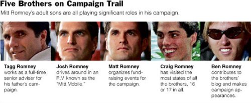
As you might know (or don’t know), Mitt Romney is vying for the Republican presidential nomination. His five sons have all lent [a helping hand](http://www.nytimes.com/2007/08/11/us/politics/11family.html?_r=1&ref=politics&oref=slogin)
to the campaign.
This graphic is _really_ basic, but sadly, it took me quite a while to finish. I thought I had finished it efficiently, but there were a bunch of style things I had to change e.g. how I cropped the mugshots. On my first pass, I had cropped the pictures in a way so that there was white space in between each brother. Of course, as I know now, that was a waste of precious space, and it looks a whole lot better this way.
### Related
* [Mitt Romney losing likes on Facebook, in real-time](https://flowingdata.com/2012/11/12/mitt-romney-losing-likes-on-facebook-in-real-time/ "Mitt Romney losing likes on Facebook, in real-time")
* [Illustrated guide to a PhD](https://flowingdata.com/2010/08/17/illustrated-guide-to-a-phd/ "Illustrated guide to a PhD")
* [Where the tourists really flock](https://flowingdata.com/2010/06/08/where-the-tourists-really-flock/ "Where the tourists really flock")
---
# Funes, thet Memorious: It’s Possible to Remember Too Much – FlowingData
Funes, thet Memorious: It’s Possible to Remember Too Much
=========================================================
[July 31, 2007](https://flowingdata.com/2007/07/31/funes-thet-memorious-its-possible-to-remember-too-much/)
### Topic
**[Miscellaneous](https://flowingdata.com/category/miscellaneous-data/)
**
Jorge Luis Borges wrote this really good fictional short story in 1944 called Funes, the Memorious. It’s about a boy, Funes, who isn’t incredibly bright until one day he falls off his horse and hits his head. After the accident Funes has finds that he suddenly has an amazing memory with which he remembers every single detail of every moment in his life.
His memory is so vivid that at one point he sees a dog, and a moment later the dog seems different. Funes remembers the way each hair stood on the the dog’s back, the direction of the breeze, what direction the dog’s tail was pointed, the perspiration on his own body, where everyone else was, etc. That dog could not possibly be the same dog that he saw a moment ago.
> Funes not only remembered every leaf on every tree of every wood, but even every one of the times he had perceived or imagined it. He determined to reduce all of his past experience to some seventy thousand recollections, which he would later define numerically. **Two considerations dissuaded him: the thought that the task as interminable and the thought that it was useless.**
Trying to Remember Too Much
---------------------------
At this day and age, when so much of everything is stored in database and everything is logged, is it possible to remember too much? Technology has enabled us to surveil others, video tape every moment of our life, store every email, take a seemingly endless river of pictures, record conversations, and log data out the wazoo.
Sure, it’s great to have it, but what use can you make of a year’s worth of data? What about ten years? Or dare I say, a century’s worth of data?
This is when visualization becomes important. It’s our duty to make the ocean of data available without letting the ocean’s never-ending vastness overwhelm the data explorers. Otherwise, our technological memory becomes like that of Funes’, and all is lost. OK, cue the dramatic music… now.
### Related
* [Interactive comic to remember things better](https://flowingdata.com/2018/10/29/interactive-comic-to-remember-things-better/ "Interactive comic to remember things better")
* [Life Expectancy of Pets](https://flowingdata.com/2023/09/19/life-expectancy-of-pets/ "Life Expectancy of Pets")
* [Data.](https://flowingdata.com/2009/04/01/data/ "Data.")
### 1 Comment
* [Tal Galili](http://www.biostatistics.co.il)
— [September 12, 2007 at 11:32 am](https://flowingdata.com/2007/07/31/funes-thet-memorious-its-possible-to-remember-too-much/#comment-49678)
Hi you (I don’t know your name, so can use it yet)
Thanks for the reference to the story, You put forth a good subject. to which I would like to contribute four small notes.
One is that I took a course with a great lecturer (let’s just call him Isaco). In his lecture, Isaco gave a brief explanation of how to use a neural network to “remember” a bunch of images, and then – when given one of these images – but ditorted, the network-machine could spit out the original image.
Then I asked him, what would happen if we put allot more pictures to the network-machine. his reply was very interesting, he said that on some point, the machine would start spitting out combinations of the images you gave her (in reply to some distorted image input). in his words the machine would start to “hallucinate”.
That simple example showed me very clearly, that too much info (on a very simple net) – could just give out bad output.
The second note to make is to mention the great importance some therapists put on forgetting – as means for healing (like richard bundler, from NLP)
The third point to make is of other methods for time managment techniques (like GTD or zen-to-do), which put allot of importence on freeing “mental RAM”, as they call it, in order to be able to cope well in the world.
The fourth thing is I wish to agree with you fully, that statistics had to concern itself with “insights from data†issues. and probably before the need rise to rescale it from a selected few statisticians, to whole populations (of web users, for example).
---
# What is the Best Way to Learn Flash & Actionscript for Visualization? – FlowingData
What is the Best Way to Learn Flash & Actionscript for Visualization?
=====================================================================
[October 19, 2007](https://flowingdata.com/2007/10/19/what-is-the-best-way-to-learn-flashactionscript-for-data-visualization/)
### Topic
**[Software](https://flowingdata.com/category/software/)
** / [actionscript](https://flowingdata.com/tag/actionscript/)
, [data visualization](https://flowingdata.com/tag/data-visualization/)
, [flash](https://flowingdata.com/tag/flash/)
Maybe someone can help me with this. I’m shifting focus from static graphics (with Adobe Illustrator) and moving onto dynamic data visualization with Flash and Actionscript. **Does anyone have any book or site suggestions that you’ve found particularly helpful in data visualization?**
I have three books sitting in front of me right now:
1. _Hands-on Training for Macromedia Flash Professional 8_ from Lynda
2. _Essential Actionscript 2.0_ from O’Reilly
3. _Macromedia Flash 8 @work_ from Sams
I started going through _Essential_, and I’ve clearly forgotten what a chore it is to learn a new programming language in the early beginnings. To read books about code is particularly boring to me. Although I suppose it’s necessary. I’ve also read a lot of the _Hands-on_ book, which wasn’t exactly my cup of tea either. Going through the tutorials reminded me a lot of the ArcGIS crash course I took earlier this year. “Click this to do that, and click that to do this. Click this and that to do that and this. After you’re done, voila. You get this…and that.”
For an idea of what I can do already: I mainly have R, PHP, and some Processing behind me, and then there’s the computer science courses I took in undergrad at Berkeley, which I guess has been about four years ago now.
**
So if anyone has any ideas or suggestions on what books to read, online resources to check out, or aspects of Actionscript and/or Flash I should focus on, please, I am all ears.**
### Related
* [How to Learn Actionscript (Flash) for Data Visualization](https://flowingdata.com/2008/04/21/how-to-learn-actionscript-flash-for-data-visualization/ "How to Learn Actionscript (Flash) for Data Visualization")
* [Macromedia Flash: First Impressions](https://flowingdata.com/2007/06/28/macromedia-flash-first-impressions/ "Macromedia Flash: First Impressions")
* [New Version of Flare Visualization Toolkit Released](https://flowingdata.com/2008/07/31/new-version-of-flare-visualization-toolkit-released/ "New Version of Flare Visualization Toolkit Released")
### 4 Comments
* [Hadley Wickham](http://had.co.nz)
— [October 20, 2007 at 12:01 am](https://flowingdata.com/2007/10/19/what-is-the-best-way-to-learn-flashactionscript-for-data-visualization/#comment-49714)
Have you considered processing ([http://www.processing.org/](http://www.processing.org/)
) instead? Or maybe prefuse ([http://prefuse.org/](http://prefuse.org/)
)? (They’re both java based).
If you don’t want something web based, you could try experimenting with R based interactive graphics – maybe GGobi ([http://www.ggobi.org](http://www.ggobi.org)
) or iplots ([http://rosuda.org/iplots/](http://rosuda.org/iplots/)
).
What sort of interactions do you want to enable?
* [Tom Carden](http://www.stamen.com)
— [October 20, 2007 at 1:47 am](https://flowingdata.com/2007/10/19/what-is-the-best-way-to-learn-flashactionscript-for-data-visualization/#comment-60)
The best way I found, with a similar background to yours as you describe it, was to start working on a project at Stamen Design :)
If that’s not available, the answer depends on whether you intend to use the Flash program itself or develop software that runs in the Flash environment. For the latter you can use Flex Builder (not free, but worth it in my experience) and pick up a book about Actionscript 3 development (e.g. Colin Moock’s new book [http://www.amazon.com/Essential-ActionScript-3-0-Colin-Moock/](http://www.amazon.com/Essential-ActionScript-3-0-Colin-Moock/)
).
Avoid books on Flex/MXML unless you want to get into the Adobe brand of ‘RIA’ development, which judging from your blog you probably want to avoid in favour of total control over the design.
This tutorial has a few distracting elements, but is really the best I’ve seen at covering the initial ‘getting started’ phase. [http://www.senocular.com/flash/tutorials/as3withmxmlc/](http://www.senocular.com/flash/tutorials/as3withmxmlc/)
There’s nothing like actually building something though… good luck!
* [Tom Carden](http://www.stamen.com)
— [October 20, 2007 at 7:50 am](https://flowingdata.com/2007/10/19/what-is-the-best-way-to-learn-flashactionscript-for-data-visualization/#comment-49716)
Just to clarify: if you’re learning this stuff now then unless there’s a really good reason you should skip Flash 8 and Actionscript 2 in favour of Flash 9 and Actionscript 3. There are fewer great tutorials so far but the language is so much cleaner, especially if you have a CS background and if you’re familiar with Java or Javascript.
* [Andrew](http://atomboy.isa-geek.com/plone)
— [January 9, 2008 at 6:20 pm](https://flowingdata.com/2007/10/19/what-is-the-best-way-to-learn-flashactionscript-for-data-visualization/#comment-1128)
Prefuse just came out in an ActionScript flavor called Flare:
[http://flare.prefuse.org/](http://flare.prefuse.org/)
There’s a tutorial to get you started with AS and Flare along with pointers to other AS resources.
---
# Lisa Jevbratt on the Sublime in Data Visualization – FlowingData
Lisa Jevbratt on the Sublime in Data Visualization
==================================================
[October 17, 2007](https://flowingdata.com/2007/10/17/lisa-jevbratt-on-the-sublime-in-data-visualization/)
### Topic
**[Quotes](https://flowingdata.com/category/quotes/)
**
> We look up at the starry sky and we sense a fear of not comprehending and being engulfed, a fear of the unknown, and simultaneously we experience a longing for the inaccessible, impenetrable darkness.
>
> — **Lisa Jevbratt.** _The Prospect of the Sublime in Data Visualization._ 2004.
### Related
* [Steps for getting started with data visualization](https://flowingdata.com/2023/12/06/steps-for-getting-started-with-data-visualization/ "Steps for getting started with data visualization")
* [Super detailed map of the skies](https://flowingdata.com/2011/05/19/super-detailed-map-of-the-skies/ "Super detailed map of the skies")
* [Data visualization crossword puzzle](https://flowingdata.com/2021/02/12/data-visualization-crossword-puzzle/ "Data visualization crossword puzzle")
### 1 Comment
* [miked](http://visualmethods.blogspot.com)
— [October 24, 2007 at 9:03 pm](https://flowingdata.com/2007/10/17/lisa-jevbratt-on-the-sublime-in-data-visualization/#comment-49707)
Hi Nathan,
You may have seen it already, but Warren Sack’s essay “Aesthetics of Information Visualization” discusses the sublime (and uncanny) in infovis as well.
Cheers,
\-mike
---
# All Linkin Park Songs Look the Same? Maybe Not. – FlowingData
All Linkin Park Songs Look the Same? Maybe Not.
===============================================
[October 29, 2007](https://flowingdata.com/2007/10/29/all-linkin-park-songs-look-the-same-maybe-not/)
### Topic
**[Mistaken Data](https://flowingdata.com/category/statistics/mistaken-data/)
**
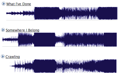
On Last.fm, someone took snapshots of [some Linkin Park songs](http://www.last.fm/user/Babs_05/journal/2007/08/12/498485/)
, compared them, and concluded that all Linkin Park songs ~look~ are the same. I guess at a glance, the songs might appear the same because of the dark chunk towards middle left, but it kind of stops there. Sure, there’s some loud to soft and soft to loud alternation, but who likes songs who are loud (or soft) throughout?
The beginning of the post:
> Each image above shows the audio level in (roughly) the first 90 seconds of a Linkin Park song. The tempo has been adjusted for a few tracks for better visual alignment.
Wait a minute. The tempo was adjusted for better visual alignment? If you’re adjusting the tempo, then really, all songs can be made to look the same. On top of that, we don’t know the x-axis or y-axis units. Finally, there’s a lot more to a song other than dynamics — such as key, tempo, rhythm, and lyrics.
Another Look at the Music Data
------------------------------
The skeptic that I am, I put the songs through [AudioXplorer](http://www.curvuspro.ch/audioxplorer/)
and created some sonograms for the songs in question.
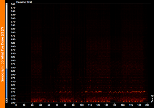
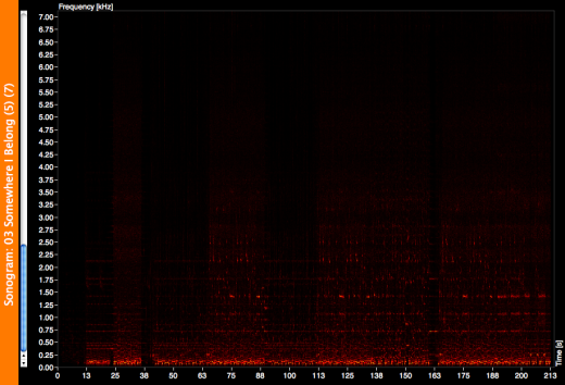
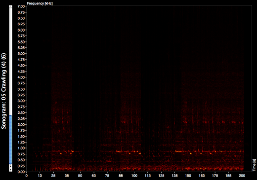
The charts are on the same scale, and it’s a bit easier to see some differences (sorry the screenshots don’t have the greatest contrast). While _What I’ve done_ and _Crawling_ looked pretty similar in the first pictures, we can now see more differences like in dynamics and key. Secondly, as someone commented on Last.fm, “comparing all the songs that sounds similar, of course it’ll look similar.” I’m sure different results would show with different songs.
Anyways, my laptop needs to rest after AudioXplorer sucked out its life force for a bit too long. Just remember — you can use your data to prove a point, but don’t let your point change your data. Cheesy? Yes.
### Related
* [Galaxy of cover songs](https://flowingdata.com/2016/02/08/galaxy-of-cover-songs/ "Galaxy of cover songs")
* [Interactive: Common chord progressions in 1,300 songs](https://flowingdata.com/2013/03/21/interactive-common-chord-progressions-in-1300-songs/ "Interactive: Common chord progressions in 1,300 songs")
* [Infinite Jukebox plays your favorite songs forever](https://flowingdata.com/2012/11/19/infinite-jukebox-plays-your-favorite-songs-forever/ "Infinite Jukebox plays your favorite songs forever")
---
# A Magazine Dedicated Entirely to Visualizing Something Useful – FlowingData
A Magazine Dedicated Entirely to Visualizing Something Useful
=============================================================
[October 19, 2007](https://flowingdata.com/2007/10/19/a-magazine-dedicated-entirely-to-visualizing-something-useful/)
### Topic
**[Statistical Visualization](https://flowingdata.com/category/visualization/statistical-visualization/)
**
[GOOD Magazine](http://www.goodmagazine.com/section/Transparency/Advertising)
is “media for people who give a damn.”
> While so much of today’s media is taking up our space, dumbing us down, and impeding our productivity, GOOD exists to add value. Through a print magazine, feature and documentary films, original multimedia content and local events, GOOD is providing a platform for the ideas, people, and businesses that are driving change in the world.
My favorite part of the magazine is the _transparency section_, which is a series of graphics displaying data in one way or another. The graphic (or video, I guess) above shows what companies are paying to advertise in New York City. The [Walmart graphic](https://flowingdata.com/2007/10/16/cover-manhattan-and-then-some-with-all-the-worlds-walmarts/)
I talked about earlier is in the most recent GOOD.
What if…
--------
What if instead of just a section, there was an entire magazine that was a transparency section? Now that would be awesome. It could be a mix of the media & design in GOOD with some real statistical graphics. It would be a complete visual experience with of course a short blurb on each, but the magazine would focus on the graphics to inspire change and improve awareness. (Picture good. Words…. baaaad.)
Each issue would hover around a specific theme like the environment or economics; or even better, each issue could be more specific covering U.S. pollution or the decline of toy sales. I wonder how hard it would be to start something like that. Online first, print second? Is there a magazine already like this? If there isn’t, there needs to be.
### Related
* [A collection of Charles-Joseph Minard’s statistical graphics](https://flowingdata.com/2018/11/09/a-collection-of-charles-joseph-minards-statistical-graphics/ "A collection of Charles-Joseph Minard’s statistical graphics")
* [How data changes the design process at every stage](https://flowingdata.com/2019/10/22/how-data-changes-the-design-process-at-every-stage/ "How data changes the design process at every stage")
* [What Drugs Pose the Greatest Danger?](https://flowingdata.com/2009/05/01/what-drugs-post-the-greatest-danger/ "What Drugs Pose the Greatest Danger?")
---
# Deadliest Explosions in Iraq Since Februrary – FlowingData
Deadliest Explosions in Iraq Since Februrary
============================================
[August 17, 2007](https://flowingdata.com/2007/08/17/deadliest-explosions-in-iraq-since-februrary/)
### Topic
**[The Times](https://flowingdata.com/category/the-times/)
**

Two hundred and fifty people died a couple of days ago in the [deadliest attack](http://www.nytimes.com/2007/08/16/world/middleeast/16iraq.html?ref=world)
deadliest attack of the war. We compiled a list of the most deadly attacks since February and then mapped them out. It was a team (and by team, I mean two) effort — I collected the data and a co-worker mapped it out.
In this case, I went through old Times stories and took note of attacks that killed 20 or more people. It was really depressing reading all that stuff, but I’m definitely better for it. Without a doubt, I know more now than I ever have about what’s going on in the world.
As you can see, my co-worker went with the old bubble map standby. I wish we could show the data differently than the usual map, but what type of visualization would that be?
### Related
* [Digital attack map](https://flowingdata.com/2013/10/25/digital-attack-map/ "Digital attack map")
* [Facebook status updates: young people are self-centered and old ramble](https://flowingdata.com/2010/12/23/facebook-status-updates-young-people-are-self-centered-and-old-ramble/ "Facebook status updates: young people are self-centered and old ramble")
* [Afghanistan war logs revealed and mapped](https://flowingdata.com/2010/07/27/afghanistan-war-logs-revealed-and-mapped/ "Afghanistan war logs revealed and mapped")
---
# ArcGIS and Excel are Worthwhile – FlowingData
ArcGIS and Excel are Worthwhile
===============================
[August 9, 2007](https://flowingdata.com/2007/08/09/arcgis-and-excel-are-worthwhile/)
### Topic
**[The Times](https://flowingdata.com/category/the-times/)
**
If I’ve learned anything in my first month at The Times, it’s that ArcGIS and Microsoft Excel are not worthless.
For a while now, since I started grad school, I had this beef against Microsoft Excel. I hated how everyone used it and how I didn’t have the money to buy the Office suite or even cared enough to want to buy it. It seemed so limited in what it could do compared to a quickly setup MySQL database.
Then last year, I took this crash course on ArcGIS. It was four days, eight hours a day of mapping. I hated ArcGIS after that workshop. The whole software suite seemed sluggish, bloated, and so not worth my time.
Today I saw some ArcGIS and Excel proficiency I had never seen before. My co-worker flew through giant spreadsheets, punched in formulas, and joined columns left and right. It was quite the scene. Once the data were prepared in Excel, she shot it over to ArcGIS. She quickly loaded a shape file for all counties in the Tri-state region, changed some limits, and voila, a few seconds later we had the map we needed. Put in some labeling, some numbers, and the graphic was complete.
Yes, ArcGIS and Excel are **worthwhile**.
I have so much to learn.
[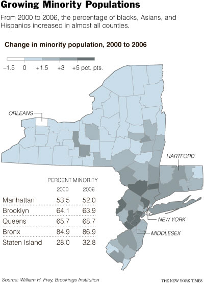](http://www.nytimes.com/2007/08/09/nyregion/09york.html?_r=1&ref=nyregion&oref=slogin)
### Related
* [Python is coming to Excel](https://flowingdata.com/2023/08/23/python-is-coming-to-excel/ "Python is coming to Excel")
* [Excel spreadsheet limit leads to 16,000 Covid-19 cases left off daily count](https://flowingdata.com/2020/10/05/excel-spreadsheet-limit-leads-to-16000-covid-19-cases-left-off-daily-count/ "Excel spreadsheet limit leads to 16,000 Covid-19 cases left off daily count")
* [My Love-hate Relationship with ArcGIS](https://flowingdata.com/2007/09/13/my-love-hate-relationship-with-arcgis/ "My Love-hate Relationship with ArcGIS")
### 2 Comments
* Eve — [August 18, 2007 at 11:16 pm](https://flowingdata.com/2007/08/09/arcgis-and-excel-are-worthwhile/#comment-16)
hi nice post, i enjoyed it
* Pingback: [Excel in ArcGIS Desktop : GIS Pathway…](http://gispathway.com/2008/12/07/excel-in-arcgis-desktop/)
---
# Use Flare Visualization Toolkit to Build Interactive Viz for the Web – FlowingData
Use Flare Visualization Toolkit to Build Interactive Viz for the Web
====================================================================
[October 30, 2007](https://flowingdata.com/2007/10/30/use-flare-visualization-toolkit-to-build-interactive-viz-for-the-web/)
### Topic
**[Software](https://flowingdata.com/category/software/)
**
 [Tom](http://www.tom-carden.co.uk/)
from [Stamen Design](http://stamen.com)
and [Hadley](http://had.co.nz/)
from the [GGobi](http://www.ggobi.org/)
group kindly pointed me to the recently ported [Flare visualization toolkit](http://flare.prefuse.org/)
. Developed by Berkeley’s Jeffrey Heer, Flare looks extremely useful for anyone who is interested in developing interactive visualizations (e.g. time series, stacked bar, pie charts, graph) for the Web that run in the Adobe Flash player.
There’s a pretty good tutorial that I, as a beginner, found straightforward. I ran into some problems when I was trying to “import a library into another project,” but per Jeffrey’s suggestion, I upgraded to Adobe Flex 3 beta (currently a free download). That cured my problems. Adobe Flex is apparently still a little rough around the edges. Oh right, and the tutorial provides instructions on how to develop with Flare in the Flex Builder environment.
I’m currently going through the demos to gain a better understanding of both Flare and Actionscript, and it looks very promising. I’m pretty excited about what I can do once I’ve improved my Actionscript programming skills.
Check out some screenshots from the Flare demo reel after the jump.
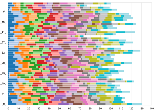
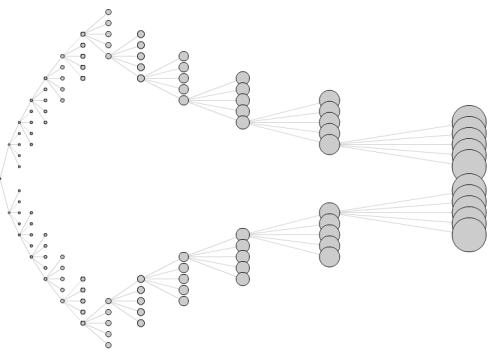
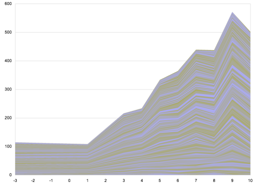
### Related
* [New Version of Flare Visualization Toolkit Released](https://flowingdata.com/2008/07/31/new-version-of-flare-visualization-toolkit-released/ "New Version of Flare Visualization Toolkit Released")
* [How to Learn Actionscript (Flash) for Data Visualization](https://flowingdata.com/2008/04/21/how-to-learn-actionscript-flash-for-data-visualization/ "How to Learn Actionscript (Flash) for Data Visualization")
* [How to Make an Interactive Area Graph with Flare](https://flowingdata.com/2009/12/09/how-to-make-an-interactive-area-graph/ "How to Make an Interactive Area Graph with Flare")
### 9 Comments
* daniel — [November 2, 2007 at 12:46 pm](https://flowingdata.com/2007/10/30/use-flare-visualization-toolkit-to-build-interactive-viz-for-the-web/#comment-49721)
Here is the [hyperlink](http://flare.prefuse.org)
.
* [Nathan Yau](https://flowingdata.com)
— [November 3, 2007 at 5:57 am](https://flowingdata.com/2007/10/30/use-flare-visualization-toolkit-to-build-interactive-viz-for-the-web/#comment-49722)
I can’t believe I missed the link. Updated. Thanks, Daniel.
* [mikele](http://www.kmi.open.ac.uk/people/mikele/)
— [February 7, 2008 at 5:43 pm](https://flowingdata.com/2007/10/30/use-flare-visualization-toolkit-to-build-interactive-viz-for-the-web/#comment-49723)
I’ve had the same issue with the tutorial on Flex2, so I downloaded Flex3. But the code highlighting and the eclipse panel graphics are all messed up… did u have the same problem? Tx
* [Nathan Yau](https://flowingdata.com/about-nathan)
— [February 8, 2008 at 6:44 am](https://flowingdata.com/2007/10/30/use-flare-visualization-toolkit-to-build-interactive-viz-for-the-web/#comment-49724)
When I upgraded I had some weird problems, so I uninstalled Flex2 and Flex3 and then re-installed Flex3. That seemed to do the trick.
* [mikele](http://www.kmi.open.ac.uk/people/mikele/)
— [February 20, 2008 at 12:37 pm](https://flowingdata.com/2007/10/30/use-flare-visualization-toolkit-to-build-interactive-viz-for-the-web/#comment-49725)
thanks very much – that worked for me too! xxx
* [Fernanda Gomez](http://www.adsmap.net)
— [June 25, 2008 at 5:11 am](https://flowingdata.com/2007/10/30/use-flare-visualization-toolkit-to-build-interactive-viz-for-the-web/#comment-49726)
Thanks so much, hopefully I can use it in my site
* [Fernanda Gomez](http://www.adsmap.net)
— [June 25, 2008 at 1:11 am](https://flowingdata.com/2007/10/30/use-flare-visualization-toolkit-to-build-interactive-viz-for-the-web/#comment-6596)
Thanks so much, hopefully I can use it in my site
* Thy Vu — [July 7, 2008 at 6:56 am](https://flowingdata.com/2007/10/30/use-flare-visualization-toolkit-to-build-interactive-viz-for-the-web/#comment-49727)
Sound very interesting… downloading….
This should be helped a lot for my concept course :)
* Thy Vu — [July 7, 2008 at 2:56 am](https://flowingdata.com/2007/10/30/use-flare-visualization-toolkit-to-build-interactive-viz-for-the-web/#comment-7835)
Sound very interesting… downloading….
This should be helped a lot for my concept course :)
---
# Proving the Non-experts Wrong – FlowingData
Proving the Non-experts Wrong
=============================
[August 7, 2007](https://flowingdata.com/2007/08/07/proving-the-non-experts-wrong/)
### Topic
**[Statistics](https://flowingdata.com/category/statistics/)
**
_UPDATE: I found the essay! [Programmers Need To Learn Statistics Or I Will Kill Them All](http://zedshaw.com/archive/programmers-need-to-learn-statistics-or-i-will-kill-them-all/)
by Mr. Zed Shaw_
There was this online essay that I read by a guy in the computer science/electrical engineering field who totally loves statistics. He read text books, and truly spoke like someone who respects data. I thought I bookmarked it, but now have no clue where the heck it is. Argh :(. If anyone knows who I’m talking about, please tell me!
He worked with a company where everyone thought they “knew” statistics. Automated reports would give them numbers, and they’d fully trust them. That was statistics to the computer engineers. Crunch some numbers and see what the software gives me. As a result, these engineer-types really pissed off the author of the article.
The author went on to rant about his crappy days at the office when he would post figures and then told by the know-it-all computer scientists that his numbers couldn’t be correct. As I read, and somewhat amusingly identified with the author, I thought, **“With all my hopes for public data and accessibility for non-experts via visualization, how can we make sure the system doesn’t get abused?”**
### Same Old Story
Visualization can be really powerful, but just like Statistics, it can be easily abused or misunderstood. For example, the data could be spotty (i.e. missing data) or have some kind of [weirdness](https://flowingdata.com/2007/07/09/finding-weirdness-in-temperature-data/)
to it, but someone who is careless (or just not in the know) might disregard that and plot out the data as good old, clean, and processed data. With his pretty plot, he can now go gallivanting around town claiming whatever he wants. Blah, blah, yeah, we’ve heard this story before.
### Two Types of Data Misrepresenters
Ok, so there’s two types of people who misrepresent data. The first kind is just evil — those who purposely misrepresent to make themselves or someone else look good. It’s lying, and well, good riddance to that type of misrepresenter. There’s not much hope for those liars, and if you are one of those people, I and my fellow data scientists are going to find you and your crummy reports and expose you for the crudiness you’ve brought to the world and those around you.
The **second type** are those who just don’t know any better. These people know that the data in their Excel spreadsheet (sigh) can be put to use, so they graph it, plot it, draw it, or whatever else they can do to make those numbers make a picture. Then they present it, and bless their hearts, but they don’t quite know what they’re showing.
Back to Essay I Cannot Remember
-------------------------------
Those engineers… I think they’re in the second group. Those engineers, I guess, are just a bit arrogant, thinking they know everything about Statistics just because their software graphs tell them so. From my experience though, as a former electrical engineering student, I honestly do believe that they mean well. Engineers generally want absolute truth, just the facts, and do their best to resist the fluff.
### What I can Learn From Unknown Essay and Unknown Author
Somewhere in the education system, for those engineers, the importance of Statistics got lost in a graph, a mean, or a median. Variance became meaningless. As I build visualization tools, I can’t forget about such important properties and have to remember that not everything (in fact, most things) are not normally distributed. With that in mind, there’s still hope for that second type of _mis_representer to become a proper representer.
\*I’ve also learned to bookmark things in del.icio.us immediately, because my memory stinks. Sorry unknown author man.
### Related
* [Symbiosis of Engineering, Statistics, Design and Data Visualization](https://flowingdata.com/2008/01/04/symbiosis-of-engineering-statistics-design-and-data-visualization/ "Symbiosis of Engineering, Statistics, Design and Data Visualization")
* [This is Statistics](https://flowingdata.com/2014/07/31/this-is-statistics/ "This is Statistics")
* [Showing This Many Per Second – Data Humanized](https://flowingdata.com/2008/11/03/showing-this-many-per-second-data-humanized/ "Showing This Many Per Second – Data Humanized")
---
# Many Eyes Now Has Better Mapping Visualization – FlowingData
Many Eyes Now Has Better Mapping Visualization
==============================================
[November 12, 2007](https://flowingdata.com/2007/11/12/many-eyes-now-has-better-mapping-visualization/)
### Topic
**[Maps](https://flowingdata.com/category/visualization/mapping/)
**
Many Eyes now has more detailed mapping functionality with the help of ESRI data. It was really only a matter of time before this happened. It’s come to the point where I almost instantly think ESRI when I think maps–that and The Times maps department (who frequently uses ESRI data :). Anyways, this is pretty nice looking stuff. They’ve got bubbles, color coding, and multiple maps in matrix form (to compare).
I didn’t get a chance to look at the maps in depth, but one thing that I noticed is that the region bubbles are only labeled if they’re at least a certain size. If they’re smaller than that threshold, then it’s just the bubble. I’m not sure what the threshold is, but I feel that it could be a bit lower so that more labeling can happen.
There’s also (of course) zoom-in, zoom-out, and panning– features we have come to expect from online mapping applications. Zoom and pan gets a little sluggish when there are multiple maps, but the feature still feels pretty useful.
\[via [Many Eyes](http://blog.many-eyes.com/2007/11/09/maps-20/)\
\]
### Related
* [Responsible mapping](https://flowingdata.com/2020/03/06/responsible-mapping/ "Responsible mapping")
* [Bars as an Alternative to Bubble Charts](https://flowingdata.com/2007/10/22/bars-as-an-alternative-to-bubble-charts/ "Bars as an Alternative to Bubble Charts")
* [Lessons learned from mapping millions of dots](https://flowingdata.com/2013/07/25/lessons-learned-from-mapping-millions-of-dots/ "Lessons learned from mapping millions of dots")
---
# A Few More Days Left at Visualizar – FlowingData
A Few More Days Left at Visualizar
==================================
[November 26, 2007](https://flowingdata.com/2007/11/26/a-few-more-days-left-at-visualizar/)
### Topic
**[Site News](https://flowingdata.com/category/announcements/)
**
I feel like it’s been forever since my last post, so I just wanted to let everyone know that I am not dead.
It’s the last few days here at Visualizar so I’ve got a couple of late nights ahead to make sure we get our project done, and on Wednesday, we set things up for the one-month exhibition. That should be fun. It’ll be especially nice to see everyone else’s work out on display.
The most interesting part about this workshop has probably been working and talking to designers about data visualization. I’m a statistician. Everyone else is a designer of some sort. With a statistics background and just coming off my New York Times internship, it felt really strange for the first week to go from the very literal and straightforward representation of data to the artsy, metaphorical data visualizations.
The defining moment — when I saw a huge difference between designers and statisticians’ views on visualization — was what followed after a talk from someone from the GapMinder foundation.
I’ll get into all of this stuff I’ve learned once I return to the lovely United States of America. In the meantime though, there was short blurb [about the Visualizar workshop](http://www.we-make-money-not-art.com/archives/009835.php)
on We Make Money Not Art. There’s a picture of my back. I’m famous.
Oh, and if you’re really bored, the MediaLab has a [Flickr stream](http://flickr.com/photos/medialab-prado/)
. They’ve been taking tons of photos.
### Related
* [Spamology From Visualizar is Available for Exploration](https://flowingdata.com/2008/02/13/spamology-from-visualizar-is-available-for-exploration/ "Spamology From Visualizar is Available for Exploration")
* [Beginner’s guide to visualization literacy](https://flowingdata.com/2018/02/23/beginners-guide-to-visualization-literacy/ "Beginner’s guide to visualization literacy")
* [Visualization Workshop in Madrid – Database City](https://flowingdata.com/2008/09/24/visualization-workshop-in-madrid-database-city/ "Visualization Workshop in Madrid – Database City")
---
# My First Couple of Days in Madrid – FlowingData
My First Couple of Days in Madrid
=================================
[November 16, 2007](https://flowingdata.com/2007/11/16/my-first-couple-of-days-in-madrid/)
### Topic
**[Site News](https://flowingdata.com/category/announcements/)
**
It’s been a couple of days here in Madrid. It’s about 6:00am in the morning and I really should get back to bed. I’m incredibly jet lagged though, so that’s not really an option. The past couple of nights I’ve woken up at 4:30am and have had trouble falling back asleep. Anyone who knows me, knows that I’m very much a night person and always wake up late, so obviously, I’ve been feeling a little off the past couple of days.
Anyways, the past couple of days have been interesting. I flew in on Wednesday, and was extremely tired. I only slept maybe an hour on the plane. Once I came in, I got lost for several hours looking for the hostel and then the Medialab. That was fun.
I’ve joined this group of three graphic designers / media artists. We’re dealing with a good bit of migration data in a project now known as Humanflows, and a good bit of data means a lot of Statistics fun.
…
Um…
Loopdee loo…
OK, I’m finding myself in a bit of a daze at the moment, so I think I’ll pause it here, and resume a coherent thought later…
Have a good weekend :)
On a completely unrelated note, I just had real hot chocolate for the first time. I mean, it was like melted chocolate with cream. **Delicious.**
### Related
* [Human Flows Protoype is Online Now](https://flowingdata.com/2007/12/05/human-flows-protoype-is-online-now/ "Human Flows Protoype is Online Now")
* [Offline For a Couple of Days](https://flowingdata.com/2009/05/18/offline-for-a-couple-of-days/ "Offline For a Couple of Days")
* [Social media app preferences of young teenagers](https://flowingdata.com/2025/01/08/social-media-app-preferences-of-young-teenagers/ "Social media app preferences of young teenagers")
### 2 Comments
* bea — [November 19, 2007 at 12:57 am](https://flowingdata.com/2007/11/16/my-first-couple-of-days-in-madrid/#comment-49732)
i could go for some hot chocolate
* Ryan — [November 22, 2007 at 2:38 pm](https://flowingdata.com/2007/11/16/my-first-couple-of-days-in-madrid/#comment-448)
It takes a while to get used to the time difference. I am so jealous…Spain is AWESOME!! I have some family somewhere over there that I haven’t met lol.
---
# Sharing Personal Data to Push Social Data Analysis – FlowingData
Sharing Personal Data to Push Social Data Analysis
==================================================
[November 19, 2007](https://flowingdata.com/2007/11/19/sharing-personal-data-to-push-social-data-analysis/)
### Topic
**[Social Data Analysis](https://flowingdata.com/category/statistics/social-data-analysis/)
**
I’m staying in a hostel here in Madrid and am currently in the “Internet Room.” I’m on my laptop, but there are six desktop computers in front of me, all of which are occupied. Three of the six people have Facebook open plus myself. It’s come to the point that Facebook has so many ways to share information, that almost everyone can find some use for it. _Is there some way to share data in some similar social way?_
I know there’s some data blogging available and a few social data sites, but they don’t have the same feel as Facebook. I think the main reason people like Facebook (other than an entertaining way to waste a few hours) is because they personally relate to the information displayed and there’s some kind of connection between friends and strangers.
Something Social Data Analysis Needs
------------------------------------
For social data analysis to work, designers will have to take a few pointers from the popular social network. The current approach seems to be throw as many data sets at the user and hope that something sticks. It doesn’t seem to be working. It’s been written in some papers that people are greater intrigued when there’s a personal connection (Jeffrey Heer’s paper is the first that comes to mind right now…_Socializing Visualization_…I think that’s it). I can see how data can be completely disconnected from the user if s/he hasn’t actually collected it or is directly related to someone s/he knows. I, myself, feel that disconnection all the time. It always take some effort (or a good shove) to get into it.
Personalizing Data
------------------
It’s really easy to say, “Oh, improve social data analysis results just by making the data more personal.” In practice, it’s hard. In my efforts to collect [data about myself](https://flowingdata.com/2007/08/13/my-mission-is-to-collect-basic-data/)
, I fell pretty short. I always forgot to record and would lose numbers; things just seemed to always get in the way, and that was with me — someone who actually cared.
However, with the rise in mobile technology (who wants to buy me an iPhone?) and sites like [Twitter](http://twitter.com)
, there seems to be some light. People are posting extremely frequently on whatever is going on at the time, what they’re feeling, thinking, etc. I can imagine some kind of data collection or recording with a Twitter feel to it.
The forever continuing project in the UK, [Mass Observation](http://www.massobs.org.uk/index.htm)
, gives me some hope. If people are willing to write about daily life in Britain or count odd things like the number of people who wear hats, then clearly there has to be a small, medium, or large group of people who could do something special with data sharing. It could be a neighborhood, a group of friends, a family, a class, or a university. There’s a niche for everything.
I’m not sure what avenue would allow and inspire people to engage in that type of data sharing. Is it something like Twitter, Facebook, some combination of the two, or something that hasn’t been created yet? Nobody knows for sure yet.
However, once that outlet for personal data sharing becomes available, I think social data analysis will develop into something really successful. People will be analyzing data that they care about. Until then, it looks like real, in-depth results won’t result unless a group of statistically-minded individuals are involved, because nobody else cares.
### Related
* [Twitter vs. Facebook: What people share →](http://blog.echen.me/2011/07/28/tweets-vs-likes-what-gets-shared-on-twitter-vs-facebook/ "Twitter vs. Facebook: What people share →")
* [What Interests Do Your Facebook Friends Have in Common?](https://flowingdata.com/2008/03/31/what-interests-do-your-facebook-friends-in-common/ "What Interests Do Your Facebook Friends Have in Common?")
* [Taking a Look at Facebook Statistics from All Facebook](https://flowingdata.com/2009/03/24/taking-a-look-at-facebook-statistics-from-all-facebook/ "Taking a Look at Facebook Statistics from All Facebook")
### 1 Comment
* m — [November 23, 2007 at 9:21 am](https://flowingdata.com/2007/11/19/sharing-personal-data-to-push-social-data-analysis/#comment-468)
formats/standards. i think open formats are a big impediment to really sharing. anyone who has assembled a data set from a group of disparate sources knows that data prep is 95% of the job.
---
# Netflix Prize Dataset Visualization – FlowingData
Netflix Prize Dataset Visualization
===================================
[December 11, 2007](https://flowingdata.com/2007/12/11/netflix-prize-dataset-visualization/)
### Topic
**[Exploratory Data Analysis](https://flowingdata.com/category/statistics/exploratory-data-analysis/)
**

Most are familiar with the [Netflix Prize](http://netflixprize.com)
. If you’re not, Netflix has offered a one million dollar prize to whoever improves their movie recommendation by a certain amount. It’s been going on for a little over a year with still no grand prize winner. The dataset is 100 million ratings.
The above is a [visualization of the Netflix dataset](http://abeautifulwww.com/2007/04/03/an-interactive-visualization-of-the-netflix-prize-dataset/)
. Each dot represents a movie, and the closer two dots are the more similar the two corresponding movies are based on Netflix ratings. I’m guessing the orientation of the dots was decided by some variant of multidimensional scaling.
It’s kind of fun to scroll over the clusters. Like in the bottom right we see Babylon 5, Buffy the Vampire Slayer, Alias, and Battlestar Galactica clumped together. The giant blob in the middle, however, is pretty useless; it’d probably benefit from some zoom functionality.
The Need to Explore
-------------------
I’m kind of surprised that I haven’t seen more Netflix visualizations like this (or ones better than this), because I’m pretty sure it would help see some relationships that typical analysis won’t provide. I was browsing the forum and saw someone ask if others had had success loading the 100 million observation dataset into [R](http://r-project.org)
. Silly undergrad.
A computer scientist, designer, and statistician walk into a bar; they discuss how they would boost the Netflix recommendation system. The punchline is that they win a million dollars, but I’m not sure what happens in between.
### Related
* [Why $1m Netflix algorithm never went to production](https://flowingdata.com/2012/04/17/why-1m-netflix-algorithm-never-went-to-production/ "Why $1m Netflix algorithm never went to production")
* [Behind the Netflix recommendation system](https://flowingdata.com/2013/08/08/behind-the-netflix-recommendation-system/ "Behind the Netflix recommendation system")
* [How Netflix creates movie micro-genres](https://flowingdata.com/2014/01/03/how-netflix-creates-movie-micro-genres/ "How Netflix creates movie micro-genres")
### 1 Comment
* Ryan — [December 14, 2007 at 12:44 am](https://flowingdata.com/2007/12/11/netflix-prize-dataset-visualization/#comment-795)
That’s awesome! I wonder what software they used to do that…
It may be MDS, but it might also be a graph representation using weighted (different length) edges and a particular vertex ordering.
---
# Second Day of New York Taxi Strikes – FlowingData
Second Day of New York Taxi Strikes
===================================
[September 6, 2007](https://flowingdata.com/2007/09/06/second-day-of-new-york-taxi-strikes/)
### Topic
**[Data Sharing](https://flowingdata.com/category/statistics/data-sharing/)
**
As the second day of the [New York taxi strike](http://www.nytimes.com/2007/09/06/nyregion/06taxi.html?ref=nyregion)
begins over GPS and credit card technology, I’m left wondering what taxi drivers are making such a big fuss over. First, drivers are complaining that GPS is an invasion of privacy, and second, they argue that credit card transactions will cause a decrease in profits due to credit card fees.
Starting with the credit card transactions, I’m about 80% sure that drivers don’t have any actual data to back up their claims that they’re going to start making less money. Non-strikers say that the credit card capability will not only help business (by bringing in those with corporate credit cards), but also increase tips. This information comes from cabs that are already equipped with the proper gizmos.
What are taxi drivers trying to hide? What is this invasion of privacy talk? These drivers are working for a large company. I repeat, they’re _working_. I don’t demand a private office when I’m at work, and I don’t see much reason drivers should care a whole lot. If someone is slacking, taking shady routes, or just plain doing something they’re not supposed to do, then they should be held accountable. Unless I’m mistaken, I don’t recall a whole lot of whining when San Francisco cabs had similar equipment installed.
So stop the fuss, and just mondernize up to the proper century, New York cab drivers. I’m sure [Stamen Design](http://www.stamen.com/)
and [Cabspotting](http://cabspotting.org/)
\* would greatly appreciate it.
\*I am not associated to either.
### Related
* [Taxi ride volume during Super Bowl key moments](https://flowingdata.com/2016/02/05/taxi-ride-volume-during-super-bowl-key-moments/ "Taxi ride volume during Super Bowl key moments")
* [New York City taxi trips mapped](https://flowingdata.com/2014/06/23/new-york-city-taxi-trips-mapped/ "New York City taxi trips mapped")
* [Change in consumer spending since the virus](https://flowingdata.com/2020/04/12/change-in-consumer-spending-since-the-virus/ "Change in consumer spending since the virus")
---
# The World Needs Statisticians – FlowingData
The World Needs Statisticians
=============================
[August 9, 2007](https://flowingdata.com/2007/08/09/the-world-needs-statisticians/)
### Topic
**[Statistics](https://flowingdata.com/category/statistics/)
**
While doing research on the process of rebuilding New Orleans after Hurricane Katrina and the U.S. Army Corps of Engineers, I’ve run across a frequent ~critic~ close and knowledgeable watcher of the New Orleans rebuild: [Robert Bea](http://www.ce.berkeley.edu/~bea/index.html)
. I don’t know much about him except that he seems like a very nice man. I found this on his Berkeley homepage:
> The world needs engineers who….
>
> * whose truth cannot be bought,
> * whose word is their bond,
> * who put character and honesty above wealth,
> * who do not hesitate to take chances,
> * who will not lose their identity in a crowd,
> * who will be as honest in small things as in great things,
> * who will make no compromise with wrong,
> * whose ambitions are not confined to their own selfish desires,
> * who will not say they do it “because everybody else does it,”
> * who are true to their friends through good report and evil report, in adversity as well as in prosperity,
> * who do not believe that shrewdness and cunning are the best qualities for winning success,
> * who are not ashamed to stand for the truth when it is unpopular, and · who have integrity and wisdom in addition to knowledge.
>
> Please help me to be this kind of engineer.
>
> Bob Bea
This can certainly be applied to statisticians as well. Please help me be that kind of statistician.
UPDATE: Just did some back and forth email with Professor Bea. He IS a nice man.
### Related
* [Analyze your Facebook profile with Wolfram|Alpha](https://flowingdata.com/2012/09/03/analyze-your-facebook-profile-with-wolframalpha/ "Analyze your Facebook profile with Wolfram|Alpha")
* [Proving the Non-experts Wrong](https://flowingdata.com/2007/08/07/proving-the-non-experts-wrong/ "Proving the Non-experts Wrong")
* [Dopplr Presents Personal Travel Report to All Users](https://flowingdata.com/2009/01/16/dopplr-presents-personal-travel-report-to-all-users/ "Dopplr Presents Personal Travel Report to All Users")
---
# Stamen Design Puts Out Another Good One in Digg Pics – FlowingData
Stamen Design Puts Out Another Good One in Digg Pics
====================================================
[January 8, 2008](https://flowingdata.com/2008/01/08/stamen-design-puts-out-another-good-one-in-digg-pics/)
### Topic
**[Apps](https://flowingdata.com/category/software/online-apps/)
** / [Stamen](https://flowingdata.com/tag/stamen/)

In the usual fashion that we’ve come to expect from Stamen Design, [Digg Pics](http://labs.digg.com/pics/)
shows us what pictures are being dugg as well as provides an opportunity to discover new pictures. As with its Digg Labs siblings, Digg Pics offers three streams — popular, newly submitted, and all activity.
I always like to read posts that discuss the experimental phases and how a viz came to whatever it is; it’s kind of like when you know the history of a piece of art, you can appreciate it more. Eric goes into the [design process](http://content.stamen.com/digg_pics_is_live)
at the Stamen blog. There’s screenshots of Stamen’s experimental layouts, and from what I see on Digg, I’d say everything came together quite nicely.
The picture streams are split up into Digg categories where the number of times a picture is repeated represents the number of times the picture was recently dugg. The display is clean and smooth, and of course the interaction is quite nice (and useful).
Another good one, Stamen!
### Related
* [Wanna Work For Stamen Design?](https://flowingdata.com/2008/11/11/wanna-work-for-stamen-design/ "Wanna Work For Stamen Design?")
* [Explore Flickr Videos On Flickr Clock by Stamen Design](https://flowingdata.com/2009/03/05/explore-flickr-videos-on-flickr-clock-by-stamen-design/ "Explore Flickr Videos On Flickr Clock by Stamen Design")
* [Open Thread: What the \*\*\*\* is Visualization Anyways?](https://flowingdata.com/2009/10/21/open-thread-what-the-is-visualization-anyways/ "Open Thread: What the **** is Visualization Anyways?")
### 1 Comment
* Pingback: [Think Stick! » Wanna Work For Stamen Design?](http://thinkstick.dreamhosters.com/?p=62)
---
# Contact – FlowingData
Contact
=======
Send all post suggestions to the first address below. I usually don’t reply, but you can be sure I’ll see your email. Suggestions sent to any other address won’t be read. Please don’t send emails with giant image attachments.

For anything else — membership questions, visualization questions, collaboration inquiries — email me at this address:

You can also [find me on Twitter](https://twitter.com/flowingdata)
sometimes.
[](#)
[](#)
---
# Peru Earthquake Map Graphic – FlowingData
Peru Earthquake Map Graphic
===========================
[August 17, 2007](https://flowingdata.com/2007/08/17/peru-earthquake-graphic/)
### Topic
**[The Times](https://flowingdata.com/category/the-times/)
**
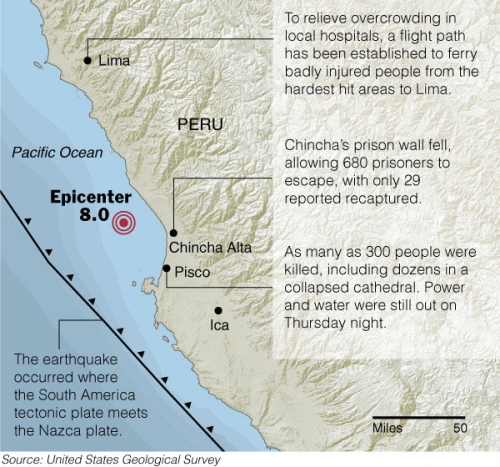
A huge 8.0 [earthquake](http://www.nytimes.com/2007/08/17/world/americas/17cnd-peru.html?_r=1&hp&oref=slogin)
shook Peru a few days ago killing at least 510 people. Homes and buildings were destroyed and many people’s lives were changed forever. I’m ashamed to admit that if it weren’t for my internship, I probably would have never even known about the quake. I hope a lot of help is headed towards Peru.
This map graphic was a bit tricky because it was made for color in the paper. That means the color layer and text layer had to be split and sent separately to the printers. It’s this odd process, that I’m afraid I don’t quite understand, but the color printers are in a different place than the black and whites. The color part gets printed, and since the text and color is separated, there’s still time to make any last minute changes to the black and white. Uh, scratch that. That’s probably wrong.
One of the map people provided me with the base map and then I filled in the blanks i.e. everything that isn’t land and water, and after about one billion back and forths I finally set it and was able to leave a couple hours later than usual. To top things off, some of the text was different in the paper today than I had put in.
### Related
* [Masterful design of the everyday baggage tag](https://flowingdata.com/2012/10/18/masterful-design-of-the-everyday-baggage-tag/ "Masterful design of the everyday baggage tag")
* [Far fewer black men than black women](https://flowingdata.com/2015/04/21/more-black-women-than-black-men/ "Far fewer black men than black women")
* [Clothing color palette](https://flowingdata.com/2010/04/20/clothing-color-palette/ "Clothing color palette")
---
# A Chat with The New York Times on Making Data More Engaging – FlowingData
A Chat with The New York Times on Making Data More Engaging
===========================================================
[January 29, 2008](https://flowingdata.com/2008/01/29/a-chat-with-the-new-york-times-on-making-data-more-engaging/)
### Topic
**[Design](https://flowingdata.com/category/design/)
**
Jared Pool [had a chat](http://www.uie.com/brainsparks/2008/01/10/spoolcast-making-data-engaging-a-talk-with-the-new-york-times-interactive-design-team/)
with Andrew (multimedia) and Steve (graphics) at The New York Times. I’m sure you’re familiar with their work. They chat about the design process of the interactive pieces on The Times site like the [transcript analyzer](https://flowingdata.com/2007/12/04/transcript-analyzer-for-republican-debate/)
, the [home run chart](http://www.nytimes.com/ref/sports/20070731_BONDS_GRAPHIC.html?th&emc=th)
, and plenty of other specific examples. They also go into a bit about where they get inspiration from (e.g. old Fortune magazines, photographs, advertisements) as well as how they go about creating their more innovative pieces.
Keep in mind it’s on the User Interface Engineering blog, so it’s mostly focused on, well, the user interaction and design and less on where data comes from, the journalistic process, etc, but still, it’s a pretty good listen.
\[via [Visual Methods](http://visualmethods.blogspot.com/2008/01/more-on-nyt-graphics.html)\
\]
### Related
* [An interactive guide to color and contrast](https://flowingdata.com/2023/06/22/an-interactive-guide-to-color-and-contrast/ "An interactive guide to color and contrast")
* [New York Times Rolls Out Campaign Finance API](https://flowingdata.com/2008/10/16/new-york-times-rolls-out-campaign-finance-api/ "New York Times Rolls Out Campaign Finance API")
* [How data changes the design process at every stage](https://flowingdata.com/2019/10/22/how-data-changes-the-design-process-at-every-stage/ "How data changes the design process at every stage")
### 3 Comments
* Ryan — [January 30, 2008 at 5:49 am](https://flowingdata.com/2008/01/29/a-chat-with-the-new-york-times-on-making-data-more-engaging/#comment-49762)
I thought you might like this:
[http://www.insidefacebook.com/2008/01/25/graphing-social-patterns-comes-to-san-diego-in-march/](http://www.insidefacebook.com/2008/01/25/graphing-social-patterns-comes-to-san-diego-in-march/)
Seems pretty interesting. I am thinking about going.
“Books that make you dumb” is now taped to my office door :-)
* Ryan — [January 30, 2008 at 12:49 am](https://flowingdata.com/2008/01/29/a-chat-with-the-new-york-times-on-making-data-more-engaging/#comment-1389)
I thought you might like this:
[http://www.insidefacebook.com/2008/01/25/graphing-social-patterns-comes-to-san-diego-in-march/](http://www.insidefacebook.com/2008/01/25/graphing-social-patterns-comes-to-san-diego-in-march/)
Seems pretty interesting. I am thinking about going.
“Books that make you dumb” is now taped to my office door :-)
* [Nathan Yau](https://flowingdata.com/about-nathan)
— [February 2, 2008 at 10:44 pm](https://flowingdata.com/2008/01/29/a-chat-with-the-new-york-times-on-making-data-more-engaging/#comment-49763)
Ah, it sounds like it could be worth while. With your interest, you’d probably enjoy it.
---
# Speed Dating Data – Attractiveness, Sincerity, Intelligence, Hobbies – FlowingData
Speed Dating Data – Attractiveness, Sincerity, Intelligence, Hobbies
====================================================================
[February 6, 2008](https://flowingdata.com/2008/02/06/speed-dating-data-attractiveness-sincerity-intelligence-hobbies/)
### Topic
**[Data Sources](https://flowingdata.com/category/statistics/data-sources/)
**
In their paper [Gender Differences in Mate Selection: Evidence from a Speed Dating Experiment](http://www2.gsb.columbia.edu/faculty/rfisman/datingFULL-EK1.pdf)
, Fisman et al. had a bit of fun with a [speed dating dataset](http://www.stat.columbia.edu/~gelman/arm/examples/speed.dating/)
. Here’s what they found:
> Women put greater weight on the intelligence and the race of partner, while men respond more to physical attractiveness. Moreover, men do not value women’s intelligence or ambition when it exceeds their own. Also, we find that women exhibit a preference for men who grew up in afflÂuent neighborhoods. Finally, male selectivity is invariant to group size, while female selectivity is strongly increasing in group size.
The dataset is substantial with over 8,000 observations for answers to twenty something survey questions. With questions like _How do you measure up?_ and _What do you look for in the opposite sex?_, this dataset is definitely high on human element and should be fun to play with.
\[via [Statistical Modeling](http://www.stat.columbia.edu/~cook/movabletype/archives/2008/01/the_speeddating_1.html)\
\]
### Related
* [What the Sexes Want, in Speed Dating](https://flowingdata.com/2013/06/12/what-the-sexes-want-in-speed-dating/ "What the Sexes Want, in Speed Dating")
* [Computed screen time for men and women](https://flowingdata.com/2016/09/19/computed-screen-time-for-men-and-women/ "Computed screen time for men and women")
* [Using data to find a girlfriend](https://flowingdata.com/2014/01/23/using-data-to-find-a-girlfriend/ "Using data to find a girlfriend")
### 1 Comment
* Ryan — [February 7, 2008 at 6:19 am](https://flowingdata.com/2008/02/06/speed-dating-data-attractiveness-sincerity-intelligence-hobbies/#comment-49776)
Did you hear about the MySpace private photos leak? It is a huge data ethics blunder. There is a torrent file of 17GB in size containing all the pictures as well as an HTML file with the captions and basic statistics (number of pics, number private for each user etc.). Sounds like an interesting dataset…except for the pictures part.
---
# Books that Make You Dumb (Not Really) – FlowingData
Books that Make You Dumb (Not Really)
=====================================
[January 26, 2008](https://flowingdata.com/2008/01/26/books-that-make-you-dumb-not-really/)
### Topic
**[Ugly Charts](https://flowingdata.com/category/visualization/ugly-visualization/)
**
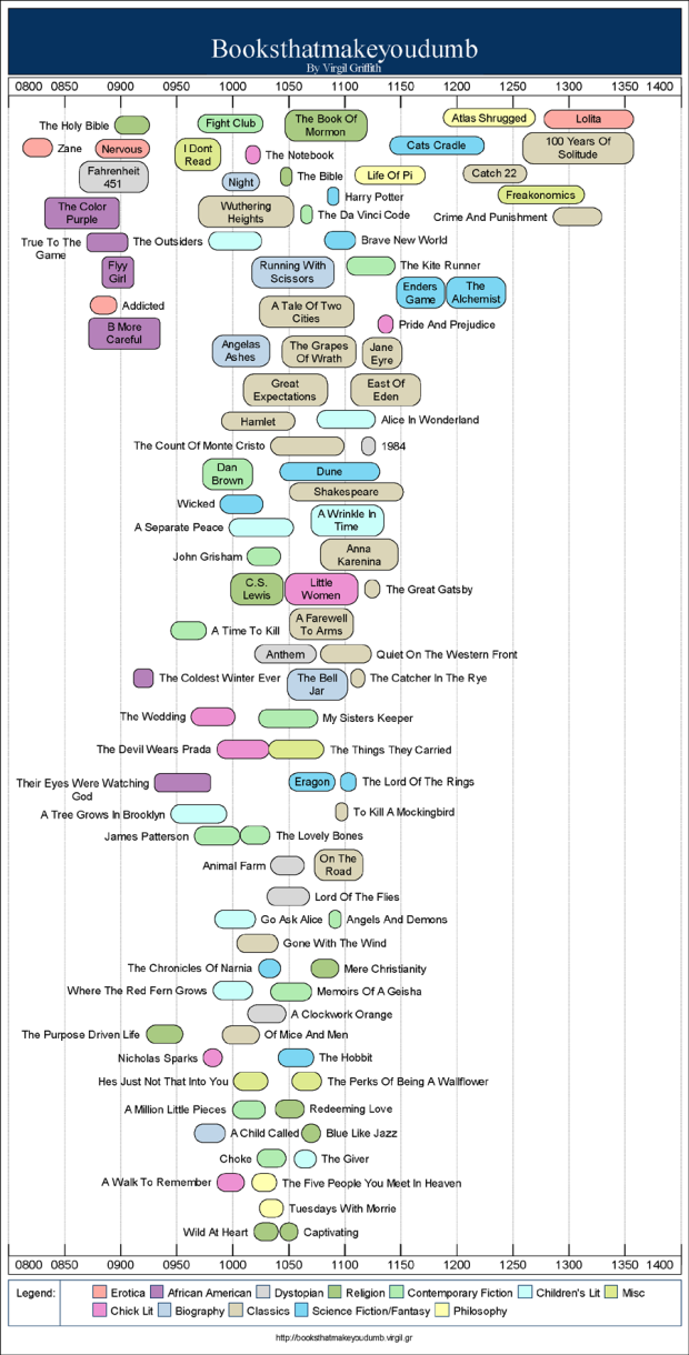
Virgil Griffith has created a series of graphs called [Books that Make You Dumb](http://booksthatmakeyoudumb.virgil.gr/)
. He correlates top books on FaceBook by school and the corresponding schools’ average SAT scores. Notice [Freakonomics](http://www.amazon.com/gp/product/0061234001?ie=UTF8&tag=flowingdata-20&linkCode=as2&camp=1789&creative=9325&creativeASIN=0061234001)
 is pretty far to the right. Nice.
The graphs are of course aren’t really that statistical nor are they especially beautiful, but hey, just take it for what is it, and it’s kind of amusing. Plus, it’s a good example of how you can use data from different sources to find something interesting.
### Related
* [Music That Makes You Dumb](https://flowingdata.com/2009/04/03/music-that-makes-you-dumb/ "Music That Makes You Dumb")
* [Freakonomics Blog Moves to The Times](https://flowingdata.com/2007/08/08/freakonomics-blog-moves-to-the-times/ "Freakonomics Blog Moves to The Times")
* [Beautiful News, a book charting the good things in the world](https://flowingdata.com/2021/09/16/beautiful-news-a-book-charting-the-good-things-in-the-world/ "Beautiful News, a book charting the good things in the world")
---
# Is an Animated Transition From a Scatter Plot to a Bar Graph Effective? – FlowingData
Is an Animated Transition From a Scatter Plot to a Bar Graph Effective?
=======================================================================
[February 20, 2008](https://flowingdata.com/2008/02/20/is-an-animated-transition-from-a-scatter-plot-to-a-bar-graph-effective/)
### Topic
**[Statistical Visualization](https://flowingdata.com/category/visualization/statistical-visualization/)
**
Statistical graphics are kind of stuck in a static funk where you create a plot in [R](http://r-project.org)
, Excel, or whatever, and you can’t really interact with it. If you want another graphic, you manually create it. Hence, Jeffrey Heer and George G. Robertson investigated the benefits of using **[animation in statistical graphics](http://vis.berkeley.edu/papers/animated_transitions/)
**.
Transition Challenges
---------------------
They experimented with several kinds of animated transitions like sorting, filtering, visualization change, and scaling. In the case of visualization transitions (e.g. scatter plot to bar graph), the designer has to make sure each visual cue correctly transitions to the new symbol of comparison. If there’s an incorrect transition, someone using the tool could (and will) mistakenly perceive a **non-existent correlation**. Yuck.
Their Results
-------------
A tool called DynaVis was designed to experiment on 26 users. Enthusiasm and usability notes were positive while the most convincing of the results was probably the measure of memory. The comparison of static graphics to animated produced interesting results shown in this chart:
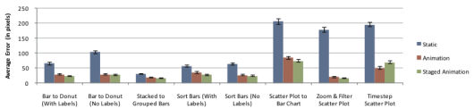
The main thing to note here is that the error rate with static graphics (in blue) was way higher than for the animated graphics.
More Complexity
---------------
> \[W\]e belive our results provide compelling evidence for the use of animated transitions in data graphics and that the presented design principles can be fruitfully applied in crafting additional effective animations.
This challenge of course gets even harder as you bring in more (complicated) data and more complex visualization techniques. What design considerations are there for a transition from one _animated_ visualization to another animated visualization; or static to animated? I sense interesting answers ahead.
### Related
* [Understanding animated transitions in data visualization](https://flowingdata.com/2018/04/02/understanding-animated-transitions-in-data-visualization/ "Understanding animated transitions in data visualization")
* [Letting the Data Play Through](https://flowingdata.com/2024/04/04/process-283-play/ "Letting the Data Play Through")
* [Learning R Versus d3.js for Visualization](https://flowingdata.com/2016/10/07/learning-r-versus-d3-js-for-visualization/ "Learning R Versus d3.js for Visualization")
---
# My Mission is to Collect Basic Data – FlowingData
My Mission is to Collect Basic Data
===================================
[August 13, 2007](https://flowingdata.com/2007/08/13/my-mission-is-to-collect-basic-data/)
### Topic
**[Data Sharing](https://flowingdata.com/category/statistics/data-sharing/)
**
I began my path of higher education at Berkeley as an Electrical Engineering and Computer Science student. As a stat graduate student, it’s hard to remember sitting in all of those (boring) engineering classes.
If I learned anything though, it was from the painful computer science projects. No matter how big the project, I would start by breaking it up into lots of mini-tasks and work my way up to the final solution. I think this has helped me a lot not only in grad school, but solving problems in my life. Hence, my first attempt at continuous data collection has started at a very basic level — my pedometer.
My Big Problem: Advanced Data Sharing
-------------------------------------
For the past year, I’ve been a part of the [Center for Embedded Networked Sensing](http://research.cens.ucla.edu/)
. It’s a very cool, very large research group centered at UCLA with groups at UCR, USC, UCM, and Cal Tech. There’s also a super-techy test bed up in the San Jacinto Mountains.
In a nutshell, we have tons of small sensors that collect environmental data that go straight to our database application, [SensorBase](http://sensorbase.org)
. The data is coming in about every five minutes. Then from another angle — the urban angle — we have networks of mobile phones that collect data in the form of audio, images, and GPS coordinates.
As you can imagine, there’s a lot to think about, starting at the hardware and working on up to the data. I focus on the data (naturally). The database is populated with millions of rows of data and is continuously growing. How can we visualize it? How can we be sure it’s reliable? Is the data secure? Can we search through the multi-formed data?
My Mini-task: Basic Data Collection
-----------------------------------
OK. “BREATHE,” I tell myself. Big problem. Break. Into. Small. Pieces.
So taking a step back from the fancy sensors and Python-enhanced Nokia N80’s, I’ve turned to my super-simple pedometer. It only collects the number of steps I take and it only has one button — the reset button. I’ve been [wearing](https://flowingdata.com/2007/07/10/10000-literal-steps-to-healthier-living/)
the thing on and off for about a month and to be honest, I’m surprised about how much I’ve learned about data collection and sharing.
Collecting My Daily Steps
-------------------------
Here was my simple plan. I would clip my $5 pedometer, which is amazingly accurate, to my waist every morning. That’s it. It seems easy enough, but there would always be days I forgot to wear it even though I put it right next to my wallet. I forgot to wear it a lot especially at the beginning of my task.
Another problem was that I usually didn’t put on the pedometer until I left the house. Some days, I didn’t get a move along until mid-afternoon or even the evening, so I missed all the steps I took from the living room to the bathroom and then back to the living room and then to the study.
Logging My Daily Steps
----------------------
At the end of each day, I would log the number of steps in Excel. Easy enough. However sometimes I didn’t have access to my computer, so I would write down on a piece of paper. Man, I can’t even count how many times that piece of paper got thrown away. Then there would be days, I would forget to log the number of steps.
To combat the first problem, I decided to use Google spreadsheets to log my steps. That way, I could use any computer, but then some days I wouldn’t have internet, and the numbers would get lost like before.
Where to Go From Here
---------------------
Data sharing is great, but when the data is [crummy and inaccurate](https://flowingdata.com/category/mistaken-data/)
, there’s really no point. Good data sharing starts with good data collection.
In my pedometer experience it seems the main problem is consistency. I kept forgetting, so my data is spotty and well, it sucks. That makes me not want to share my data, which is bad. It could also be bad if I did share my data. It could get mistaken for clean data somewhere along the telephone line, which is a problem with a lot of the data that’s out there.
We have to improve our data collection and logging _somehow_, but how? Is it possible for any citizen scientist, Joe Schmoe, collect good, wholesome data? I’m not so sure, at least not yet.
### Related
* [Data Collection With USB Pedometer. Weight No More!](https://flowingdata.com/2007/09/18/data-collection-with-usb-pedometer-weight-no-more/ "Data Collection With USB Pedometer. Weight No More!")
* [10,000 (Literal) Steps to Healthier Living](https://flowingdata.com/2007/07/10/10000-literal-steps-to-healthier-living/ "10,000 (Literal) Steps to Healthier Living")
* [Walker Tracker – A Community Site for Pedometer Fans](https://flowingdata.com/2008/01/23/walker-tracker-a-community-site-for-pedometer-fans/ "Walker Tracker – A Community Site for Pedometer Fans")
---
# How to Read and Use a Box-and-Whisker Plot – FlowingData
How to Read and Use a Box-and-Whisker Plot
==========================================
[February 15, 2008](https://flowingdata.com/2008/02/15/how-to-read-and-use-a-box-and-whisker-plot/)
### Topic
**[Guides](https://flowingdata.com/category/projects/guides/)
** / [box-and-whisker](https://flowingdata.com/tag/box-and-whisker/)
The box-and-whisker plot is an exploratory graphic, created by [John W. Tukey](https://flowingdata.com/2008/01/01/john-tukey-and-the-beginning-of-interactive-graphics/)
, used to show the distribution of a dataset (at a glance). Think of the type of data you might use a histogram with, and the box-and-whisker (or box plot, for short) could probably be useful.
The box plot, although very useful, seems to get lost in areas outside of Statistics, but I’m not sure why. It could be that people don’t know about it or maybe are clueless on how to interpret it. In any case, here’s how you read a box plot.
Reading a Box-and-Whisker Plot
------------------------------
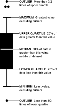Let’s say we ask 2,852 people (and they miraculously all respond) how many hamburgers they’ve consumed in the past week. We’ll sort those responses from least to greatest and then graph them with our box-and-whisker.
Take the top 50% of the group (1,426) who ate more hamburgers; they are represented by everything above the median (the white line). Those in the top 25% of hamburger eating (713) are shown by the top “whisker” and dots. Dots represent those who ate a lot more than normal or a lot less than normal (outliers). If more than one outlier ate the same number of hamburgers, dots are placed side by side.
Find Skews in the Data
----------------------
The box-and-whisker of course shows you more than just four split groups. You can also see which way the data sways. For example, if there are more people who eat a lot of burgers than eat a few, the median is going to be higher or the top whisker could be longer than the bottom one. Basically, it gives you a good overview of the data’s distribution.
That’s all there is to it, so the next time you’re thinking of making a bar graph or a histogram, think about using Tukey’s beloved box-and-whisker plot too.
Want to learn more about making data graphics? [Become a member](https://flowingdata.com/membership/)
.
### Related
* [How to Visualize and Compare Distributions in R](https://flowingdata.com/2012/05/15/how-to-visualize-and-compare-distributions/ "How to Visualize and Compare Distributions in R")
* [How Histograms Work](https://flowingdata.com/2017/06/07/how-histograms-work/ "How Histograms Work")
* [How to Read and Use Histograms in R](https://flowingdata.com/2014/02/27/how-to-read-histograms-and-use-them-in-r/ "How to Read and Use Histograms in R")
### Chart Type Used
[](https://flowingdata.com/charttype/box-plot/)
### 13 Comments
* [Hadley](http://had.co.nz)
— [February 15, 2008 at 12:46 pm](https://flowingdata.com/2008/02/15/how-to-read-and-use-a-box-and-whisker-plot/#comment-1702)
It’s probably better to call the “maximum” and “minimum” upper and lower fences!
* [Fabian](http://informationandvisualization.de/)
— [February 15, 2008 at 1:50 pm](https://flowingdata.com/2008/02/15/how-to-read-and-use-a-box-and-whisker-plot/#comment-1703)
Nice! ;o) Another fan of the box plot.
Two weeks ago I wrote a similar article on
[http://informationandvisualization.de/blog/box-plot](http://informationandvisualization.de/blog/box-plot)
Let’s put the box plot back on the map!
* [Nathan Yau](https://flowingdata.com/about-nathan)
— [February 16, 2008 at 12:24 am](https://flowingdata.com/2008/02/15/how-to-read-and-use-a-box-and-whisker-plot/#comment-49790)
oh, alright, fine. maximum = upper fence. minimum = lower fence :)
* [Jon Peltier](http://peltiertech.com)
— [February 16, 2008 at 6:24 pm](https://flowingdata.com/2008/02/15/how-to-read-and-use-a-box-and-whisker-plot/#comment-49791)
There are techniques for drawing box and whisker plots in Excel. Most provide pretty good charts, and I think my technique is among the best:
[http://peltiertech.com/Excel/Charts/BoxWhisker.html](http://peltiertech.com/Excel/Charts/BoxWhisker.html)
I’ve been working on a utility that a user will be able to point at their data, and it will generate a box and whisker plot. The boxes and whiskers are pretty easy, but efficient treatment of the outliers is rather complixated. I have an earlier attempt available for testing:
[http://peltiertech.com/Excel/Zips/PTS\_Box\_Charter\_Setup.zip](http://peltiertech.com/Excel/Zips/PTS_Box_Charter_Setup.zip)
I thought I’d solved the outlier problem with this version, but after a rather small number of observations it breaks down (and slows down, especially in Excel 2007). I’ve been working on this and hope to have a robust new version available soon.
Jon Peltier
* [Jon Peltier](http://peltiertech.com)
— [February 16, 2008 at 1:24 pm](https://flowingdata.com/2008/02/15/how-to-read-and-use-a-box-and-whisker-plot/#comment-1715)
There are techniques for drawing box and whisker plots in Excel. Most provide pretty good charts, and I think my technique is among the best:
[http://peltiertech.com/Excel/Charts/BoxWhisker.html](http://peltiertech.com/Excel/Charts/BoxWhisker.html)
I’ve been working on a utility that a user will be able to point at their data, and it will generate a box and whisker plot. The boxes and whiskers are pretty easy, but efficient treatment of the outliers is rather complixated. I have an earlier attempt available for testing:
[http://peltiertech.com/Excel/Zips/PTS\_Box\_Charter\_Setup.zip](http://peltiertech.com/Excel/Zips/PTS_Box_Charter_Setup.zip)
I thought I’d solved the outlier problem with this version, but after a rather small number of observations it breaks down (and slows down, especially in Excel 2007). I’ve been working on this and hope to have a robust new version available soon.
Jon Peltier
* Dylan — [February 16, 2008 at 11:46 pm](https://flowingdata.com/2008/02/15/how-to-read-and-use-a-box-and-whisker-plot/#comment-1721)
Nice summary article. I honestly don’t know why more people don’t use box-and-whisker plots. Many of my colleagues insist on using the [sinister dynamite plot](http://biostat.mc.vanderbilt.edu/twiki/bin/view/Main/DynamitePlots)
to show mean/variation around the mean. In most cases they should be replaced with either a dot plot or boxplot.
I think that there is a simple explanation: Excel.
The simple solution: R.
* [Nathan Yau](https://flowingdata.com/about-nathan)
— [February 17, 2008 at 5:09 am](https://flowingdata.com/2008/02/15/how-to-read-and-use-a-box-and-whisker-plot/#comment-49793)
@Dylan: Haha, those are some, uh, excellent examples. I’m sure the dynamite plot could be good for something… maybe. But the hatch patterns – that’s just uncalled for.
* [Dylan](http://casoilresource.lawr.ucdavis.edu/)
— [February 17, 2008 at 5:28 am](https://flowingdata.com/2008/02/15/how-to-read-and-use-a-box-and-whisker-plot/#comment-49794)
@Nathan: Re: dynamite plots. I suppose they are good for blowing up your hard work by bungling the presentation.
Nice website by the way– fun reading! You have to watch out for that Hadley character though! hehe, just kidding!
* [Le Guen Monique](http://matisse.univ-paris1.fr/leguen)
— [February 18, 2008 at 10:40 am](https://flowingdata.com/2008/02/15/how-to-read-and-use-a-box-and-whisker-plot/#comment-49795)
Comment on How to Read (and Use) a Box-and-Whisker Plot
Here is a link for the francophone community
[http://matisse.univ-paris1.fr/leguen/leguen2001b.pdf](http://matisse.univ-paris1.fr/leguen/leguen2001b.pdf)
Le Guen M. (2001), La boîte à moustaches de Tukey, un outil pour initier à la Statistique, Statistiquement Vôtre, n° 4, 14 pages.
* [grossu](http://grossu.ru)
— [February 18, 2008 at 3:19 pm](https://flowingdata.com/2008/02/15/how-to-read-and-use-a-box-and-whisker-plot/#comment-49796)
Hi Nathan. It’s very useful and well-made post. May I translate it into Russian for my blog? Of course with link to you.
* [Nathan Yau](https://flowingdata.com/about-nathan)
— [February 18, 2008 at 7:59 pm](https://flowingdata.com/2008/02/15/how-to-read-and-use-a-box-and-whisker-plot/#comment-49797)
@grossu: sure, go for it. and thanks for asking :)
* Doug — [March 1, 2008 at 5:22 am](https://flowingdata.com/2008/02/15/how-to-read-and-use-a-box-and-whisker-plot/#comment-49798)
Nathan & Hadley,
Actually, the maximum/minimum whiskers are not equivalent to the upper/lower fences. The whiskers go out to the maximum values WITHIN the fences. This is a subtle point, but an important one if you’re constructing your own box-plots.
Box-plots are my favorite graphics, so I loved coming across this blog post!
* [Nathan Yau](https://flowingdata.com/about-nathan)
— [March 1, 2008 at 2:19 pm](https://flowingdata.com/2008/02/15/how-to-read-and-use-a-box-and-whisker-plot/#comment-49799)
@doug: point taken :)
---
# Don’t want to share our data / OK, what’re you hiding? – FlowingData
Don’t want to share our data / OK, what’re you hiding?
======================================================
[August 20, 2007](https://flowingdata.com/2007/08/20/dont-want-to-share-our-data-ok-whatre-you-hiding/)
### Topic
**[Data Sharing](https://flowingdata.com/category/statistics/data-sharing/)
**
I don’t want my credit card numbers floating around, because then I’d be screwed. That kind of data needs to be locked up tight behind a billion firewalls, a lock safe, five armed guards, and another locked safe and then one more guard plus another safe. However, there are lots of other kinds of data that should be online and publicly available or at least accessible via a phone call.
As a student, I’ve always received data from the prof or from some magical place called data land. It’s not that easy in the real world, and as an intern, I’m beginning to see a trend — if you’re not willing to give me your data or some tiny subset of your data, then you’re probably hiding something.
I recently did a whole lot of back and forth for two weeks trying to get some data from a group that will go unnamed. Without getting into too many details, I wanted data that showed the group’s progress — what they’ve accomplished over _X_ number of months. You should probably also know that this group has taken a lot of heat lately for their slow pace and shotty labor.
Here’s how it went.
Day 1-3
-------
“Nathan, can you contact so and so and ask them for this and this data or see what they have?” Sure, no problem. I emailed the reporter’s contact, who happened to be a contractor for the big group I was trying to get data from. We exchanged some emails, and it turned out that the contractor was working with the data that was _exactly_ what we wanted. Um, gimme.
Day 4-8
-------
The contractor had to get approval from the “chief of staff.” Unfortunately the chief of staff was out for the week, so he had to go through some other people. Contractor gets distracted, and I get forwarded to public affairs. “Oh great, this will be fun,” I thought. Of course, this is when it got especially painful. After some misunderstandings and 11 emails later, it was back to the contractor. Same old story. Need approval, yada yada. Keep in mind that during all of this, my co-worker is putting together a graphic.
Day 9-13
--------
It was just all waiting now. They had the data and were waiting to get the sign off. I called one or two times a day and sent an email to both the contractor and public affairs guy once a day. There was lots of fluffy, meaningless talk during this phase.
Day 14
------
At the end of Day 14, I got the phone call. “Nathan, we have some data that we’re ready to send your way. Your patience has been rewarded.” I can’t believe he actually said that. My patience had been rewarded with nothing. Too bad the graphic was already entering its final editing stages without their data.
The data wasn’t really worth the effort.
Hence, the Difficulty
---------------------
So here we stand with this great idea of sharing data. So wonderful and marvelous, we can’t even fathom how we can benefit. However, data can be very revealing, and there are many groups, people, and organizations who aren’t ready to show what they have. Either they’re afraid of sharing data for security reasons (which is understandable), or they’re afraid because they’re worried about what they’re handing over. In both cases, it’s a huge blockade that I don’t see us getting through any time soon.
### Related
* [Seeing the Dust (The Process 092)](https://flowingdata.com/2020/06/04/process-092-dust/ "Seeing the Dust (The Process 092)")
* [Share your traces with a stranger](https://flowingdata.com/2014/05/14/share-your-traces-with-a-stranger/ "Share your traces with a stranger")
* [Diagrams Galore in Diagram Diaries Flickr Group](https://flowingdata.com/2008/11/07/diagrams-galore-in-diagram-diaries-flickr-group/ "Diagrams Galore in Diagram Diaries Flickr Group")
---
# Visualization of Smiling Faces – Microsoft Live / Operation Smile – FlowingData
Visualization of Smiling Faces – Microsoft Live / Operation Smile
=================================================================
[January 28, 2008](https://flowingdata.com/2008/01/28/visualization-of-smiling-faces-microsoft-live-operation-smile/)
### Topic
**[Data Art](https://flowingdata.com/category/visualization/artistic-visualization/)
**
For the re-launch of the Microsoft Windows Live platform, [Firstborn](http://www.firstbornmultimedia.com/)
created a generative [art installation](http://www.firstbornmultimedia.com/#/our-portfolio/1007/)
taking thousands of smiling faces and placing them into a 3-D world. It was an outdoor installation (done in [Processing](http://processing.org)
) projected on a seven-story sphere, and I am sure it wowed a whole lot of people. It’s definitely amazing me, and all I’m seeing are screenshots and a [demo](http://www.firstbornmultimedia.com/gallery/player.asp?title=Digital%20Kitchen&stitle=Processing%20Demo&file=video&width=640&height=363)
.



I have one word for this — gorgeous. The screenshots don’t do it justice, so make sure you check out the demo.
### Related
* [Story formats for data](https://flowingdata.com/2019/06/17/story-formats-for-data/ "Story formats for data")
* [One million screenshots of the web’s homepages in a single layout](https://flowingdata.com/2024/08/16/one-million-screenshots/ "One million screenshots of the web’s homepages in a single layout")
* [Words that do not appear in literature](https://flowingdata.com/2024/12/10/words-that-do-not-appear-in-literature/ "Words that do not appear in literature")
### 5 Comments
* [Mike](http://mikelove.wordpress.com)
— [January 28, 2008 at 5:18 pm](https://flowingdata.com/2008/01/28/visualization-of-smiling-faces-microsoft-live-operation-smile/#comment-1371)
Jealousy. They should rent out their graph visualization sphere for parties.
* Pingback: [rascunho » Blog Archive » links for 2008-01-31](http://blog.bruno.locaweb.com.br/2008/01/31/links-for-2008-01-31/)
* Duder — [February 6, 2008 at 5:52 am](https://flowingdata.com/2008/01/28/visualization-of-smiling-faces-microsoft-live-operation-smile/#comment-49779)
Does any body know the the music in the other demo:
[http://www.firstbornmultimedia.com/gallery/player.asp?title=Digital%20Kitchen&stitle=Microsoft%20Live&file=dk\_fb&width=480&height=270](http://www.firstbornmultimedia.com/gallery/player.asp?title=Digital%20Kitchen&stitle=Microsoft%20Live&file=dk_fb&width=480&height=270)
* [Nathan Yau](https://flowingdata.com/about-nathan)
— [February 8, 2008 at 6:42 am](https://flowingdata.com/2008/01/28/visualization-of-smiling-faces-microsoft-live-operation-smile/#comment-49780)
@duder: I emailed the the guys at firstborn, but no luck…
* [Martin Plant](http://www.plantcph.dk/blog)
— [June 19, 2008 at 10:46 am](https://flowingdata.com/2008/01/28/visualization-of-smiling-faces-microsoft-live-operation-smile/#comment-49781)
Modeselektor f. Thom Yorke – The White Flash
---
# U.S. News & World Report College Rankings are Now Available – FlowingData
U.S. News & World Report College Rankings are Now Available
===========================================================
[August 17, 2007](https://flowingdata.com/2007/08/17/us-news-world-report-college-rankings-are-now-available/)
### Topic
**[Data Sources](https://flowingdata.com/category/statistics/data-sources/)
**
The well-known [college rankings](http://colleges.usnews.rankingsandreviews.com/usnews/edu/college/rankings/rankindex_brief.php)
are now available for your viewing pleasure. Whether the ranking system is legit or not, I’ll let you be the judge, but I think everyone should take note that UC Berkeley was again the number one ranked public national university and UCLA was ranked number three. Go Calee-forn-ee-ah! In a nutshell, here’s what U.S. News ranks the universities:
* Peer Assessment – 25%
* Retention – 20% in national universities and liberal arts colleges and 25% in master’s and baccalaureate colleges
* Faculty Resources – 20%
* Student Selectivity – 15%
* Financial Resources – 10%
* Graduate Rate Performance – 5%; only in national universities and liberal arts colleges
* Alumni giving rate 5%
I wonder how much bias is in peer assessment.
### Related
* [Various ways to rate a college](https://flowingdata.com/2010/09/08/various-ways-to-rate-a-college/ "Various ways to rate a college")
* [App shows what the Internet looks like](https://flowingdata.com/2013/03/15/app-shows-what-the-internet-looks-like/ "App shows what the Internet looks like")
* [Changing Difficulty of Getting Into Your College, Past Two Decades](https://flowingdata.com/2024/07/16/more-or-less-college-admissions-time/ "Changing Difficulty of Getting Into Your College, Past Two Decades")
---
# Rambo Kill Counts From Parts I, II, III, and IV – FlowingData
Rambo Kill Counts From Parts I, II, III, and IV
===============================================
[February 22, 2008](https://flowingdata.com/2008/02/22/rambo-kill-counts-from-parts-i-ii-iii-and-iv/)
### Topic
**[Data Sources](https://flowingdata.com/category/statistics/data-sources/)
**
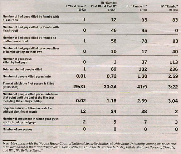
I don’t think I’ve seen a single Rambo all the way through nor do I remember the premise of any of the movies, but I still found these kill counts amusing. Notice the near doubling of deaths each sequel. _Yo, Adrian!!!_ Yeah, I know, wrong movie, but come on, is there really a difference?
Here’s a graph showing kill counts (mostly for my own entertainment):
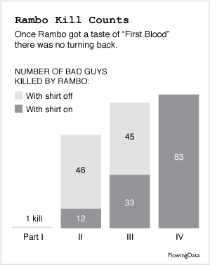
Mr. Rambo may have gotten more violent in the latest installment, but it looks like he also grew more modest.
\[via [Geekstir](http://www.geekstir.com/movies/rambos-kill-count/)\
\]
### Related
* [More infographic software](https://flowingdata.com/2012/05/25/more-infographic-software/ "More infographic software")
* [Slowing down the rate of deaths, aka breaking the wave](https://flowingdata.com/2020/04/09/slowing-down-the-rate-of-deaths-aka-breaking-the-wave/ "Slowing down the rate of deaths, aka breaking the wave")
* [Mapping Google Access Data from (suit)men](https://flowingdata.com/2008/01/18/mapping-google-access-data-from-suitmen/ "Mapping Google Access Data from (suit)men")
### 10 Comments
* [Iman](http://pleasetakenote.com)
— [February 22, 2008 at 11:22 am](https://flowingdata.com/2008/02/22/rambo-kill-counts-from-parts-i-ii-iii-and-iv/#comment-49903)
haha.
* [Jon Peltier](http://peltiertech.com)
— [February 22, 2008 at 3:39 pm](https://flowingdata.com/2008/02/22/rambo-kill-counts-from-parts-i-ii-iii-and-iv/#comment-49904)
More modest? Rambo’s gotten old, so maybe he can’t show off his abs any more.
* [Nathan Yau](https://flowingdata.com/about-nathan)
— [February 22, 2008 at 10:43 am](https://flowingdata.com/2008/02/22/rambo-kill-counts-from-parts-i-ii-iii-and-iv/#comment-1806)
Ah, but all the HGH has allowed him to beat old age.
* [Tony](http://www.supportanalytics.com/blog)
— [February 22, 2008 at 12:07 pm](https://flowingdata.com/2008/02/22/rambo-kill-counts-from-parts-i-ii-iii-and-iv/#comment-1808)
He isn’t on HGH is he??? All this time I thought he was natural. That’s hilarious about kills with shirt on/off…
I heard it was pretty good.
* [Jon Peltier](http://peltiertech.com)
— [February 22, 2008 at 12:16 pm](https://flowingdata.com/2008/02/22/rambo-kill-counts-from-parts-i-ii-iii-and-iv/#comment-1809)
Nathan –
Have you seen the guy? He didn’t start doping until it was too late.
* [Nathan Yau](https://flowingdata.com/about-nathan)
— [February 22, 2008 at 5:44 pm](https://flowingdata.com/2008/02/22/rambo-kill-counts-from-parts-i-ii-iii-and-iv/#comment-49908)
I saw him on NBC’s the contender a couple of years ago, and he was in good shape… although I guess a lot can happen in two years.
* [Sicko van Dijk](http://sicut.nl/blog/)
— [February 26, 2008 at 10:44 pm](https://flowingdata.com/2008/02/22/rambo-kill-counts-from-parts-i-ii-iii-and-iv/#comment-49909)
Extrapolating from this, we will see Sylvester Stallone at it again for the 8th time in 2035 at the tender age of 89. He will terminate just over 200 bad guys, but will have to watch his kill-balance, because his accomplices will be catching up with him. Team work is required though with a brisk killing pace of seven lethalities per minute (roughly one every ten seconds) after the first shot has been fired. No wonder the killing will have to start ten minutes before the movie starts, making the killing into an industrial process reminiscent of the Great War.
* [Nathan Yau](https://flowingdata.com/about-nathan)
— [February 26, 2008 at 5:49 pm](https://flowingdata.com/2008/02/22/rambo-kill-counts-from-parts-i-ii-iii-and-iv/#comment-1879)
Yes, and Rocky will also come back out of retirement for the 100th time to fight the android that everyone thought could not be beat. Think again.
* [Lordello](http://mainframecorp.blogspot.com/)
— [March 20, 2008 at 5:04 pm](https://flowingdata.com/2008/02/22/rambo-kill-counts-from-parts-i-ii-iii-and-iv/#comment-49911)
Maybe he’s old and without shirt he could get a flu…
* Pingback: [Os Crássicos» Arquivo do Blog » John Rambo - O cara!](http://www.oscrassicos.net/?p=75)
---
# What Impact Does Our Country Have on Climate Change? – FlowingData
What Impact Does Our Country Have on Climate Change?
====================================================
[February 21, 2008](https://flowingdata.com/2008/02/21/what-impact-does-our-country-have-on-climate-change/)
### Topic
**[Maps](https://flowingdata.com/category/visualization/mapping/)
**
[BreathingEarth](http://www.breathingearth.net/)
is an animated map that represents death rate data from September 2005 and birth rate data from August 2006 compiled by the [World Factbook](https://www.cia.gov/library/publications/the-world-factbook/)
and 2002 carbon dioxide emission rates from the [United Nations](http://unstats.un.org/unsd/cdb/cdb_help/cdb_quick_start.asp)
. The frying sound is kind of a nice touch.
Pretty But Not Very Useful
--------------------------
I think that BreathingEarth, like [many](https://flowingdata.com/2008/01/18/mapping-google-access-data-from-suitmen/)
[maps](https://flowingdata.com/2007/07/04/twittervision-adds-a-third-dimension/)
[before](https://flowingdata.com/2007/07/02/proof-is-in-the-picture-of-data/)
[it](http://twittervision.com/)
, communicates an important point (in this case, CO2 emissions), but doesn’t particularly do a good job of showing it. I watched BreathingEarth for a few minutes, but I didn’t get much of a sense of what country had more deaths, had more births, or created more CO2 emissions. It’s one those projects when a statistician could have lent a useful hand.
So to answer the question – _What Impact Does Our Country Have on Climate Change?_ – I’m not sure. It is a pretty map though.
### Related
* [Climate change postcards from every country](https://flowingdata.com/2021/12/14/climate-change-postcards-from-every-country/ "Climate change postcards from every country")
* [Carbon emissions goals vs. current paths](https://flowingdata.com/2017/11/06/carbon-emissions-goals-vs-current-paths/ "Carbon emissions goals vs. current paths")
* [Climate Change Coloring Book](https://flowingdata.com/2017/04/13/climate-change-coloring-book/ "Climate Change Coloring Book")
### 4 Comments
* [tom](http://www.sunnyblue.net/mm/)
— [February 21, 2008 at 10:59 am](https://flowingdata.com/2008/02/21/what-impact-does-our-country-have-on-climate-change/#comment-49811)
I think the problem here and with quite a few time based visualisations is that people don’t readily remember visual information over time. Vison is mainly space based coding with a relatively small time element, hearing is predominantly time based with some spatial coding. I think this is why music is so concerned with patterns over time. maybe some kind of sound visualisation (sonofication?) might be more appropriate for conveying this information…
* [Nathan Yau](https://flowingdata.com/about-nathan)
— [February 21, 2008 at 10:55 pm](https://flowingdata.com/2008/02/21/what-impact-does-our-country-have-on-climate-change/#comment-49812)
@tom: an interesting comment about people not remembering visual information over time. maybe to improve this viz is to have some viz that shows what has passed already so that whatever appears doesn’t become a fleeting memory?
* [Jon Peltier](http://peltiertech.com)
— [February 22, 2008 at 10:43 am](https://flowingdata.com/2008/02/21/what-impact-does-our-country-have-on-climate-change/#comment-1805)
Tom’s observation may explain why some animation is very successful. A recent post (forget where) described improved comprehension between two displays by animating the change from scatter to bar charts.
A better example is the awesome TED seminars by Hans Rosling.
* [Nathan Yau](https://flowingdata.com/about-nathan)
— [February 22, 2008 at 10:52 am](https://flowingdata.com/2008/02/21/what-impact-does-our-country-have-on-climate-change/#comment-1807)
@Jon: That “recent post” would be on this blog [https://flowingdata.com/2008/02/20/is-an-animated-transition-from-a-scatter-plot-to-a-bar-graph-effective/](https://flowingdata.com/2008/02/20/is-an-animated-transition-from-a-scatter-plot-to-a-bar-graph-effective/)
:)
---
# Exploring Twitter with Blocks – FlowingData
Exploring Twitter with Blocks
=============================
[September 2, 2007](https://flowingdata.com/2007/09/02/exploring-twitter-with-blocks/)
### Topic
**[Exploratory Data Analysis](https://flowingdata.com/category/statistics/exploratory-data-analysis/)
**

On their new [exploration section](http://explore.twitter.com/)
, Twitter blocks is available for viewing and use. The viz is in Flash and is supposed to allow you to explore your neighbors as well as your neighbors’ neighbors. I think the higher up the blocks are, the more recent. It’s kind of hard to say. Other than that, I’m actually not really sure what I’m looking at. I thought it might be because I’m not following that many people, but I viewed the blocks for the public timeline and still had trouble deciphering. Maybe others will have better luck.
**Update:** Michal [posted on the feedback](http://mike.teczno.com/notes/uselessness.html)
they’ve been getting on Twitter Blocks that’s certainly worth reading:
> So we get this a lot: “Beautiful! But useless!”. We’ve heard it in response to most projects we’ve done over the past few years (one exception has been Oakland Crimespotting, whose stock yokel response is: “no way am I moving to Oakland!”).
This kinda surprises me. I think their other projects are pretty useful and informative.
### Related
* [17 Ways to Visualize the Twitter Universe](https://flowingdata.com/2008/03/12/17-ways-to-visualize-the-twitter-universe/ "17 Ways to Visualize the Twitter Universe")
* [Understand Your Behaviors with Twitter – Testers Needed](https://flowingdata.com/2008/12/03/understand-your-behaviors-with-twitter-testers-needed/ "Understand Your Behaviors with Twitter – Testers Needed")
* [Twitter parade in your honor](https://flowingdata.com/2010/06/11/twitter-parade-in-your-honor/ "Twitter parade in your honor")
### 1 Comment
* Pingback: [17 Ways to Visualize the Twitter Universe | FlowingData](https://flowingdata.com/2008/03/12/17-ways-to-visualize-the-twitter-universe/)
---
# Database Error
Error establishing a database connection
========================================
---
# Database Error
Error establishing a database connection
========================================
---
# Database Error
Error establishing a database connection
========================================
---
# Breaking Up the Face into Elements – FlowingData
Breaking Up the Face into Elements
==================================
[August 29, 2007](https://flowingdata.com/2007/08/29/breaking-up-the-face-into-elements/)
### Topic
**[Statistics](https://flowingdata.com/category/statistics/)
**
I’m not even going to pretend I know anything about how Statistics and vision go together. That’s not to say that they don’t go together, because they do. Otherwise there wouldn’t be a whole center at UCLA, the [Center for Image and Vision Science](http://www.civs.ucla.edu/)
, a group of statisticians, computer scientists, and psychologists. Lots of modeling involved, lots of data, and lots of applications from security to medical imaging to assisting the visually impaired.
With that being said, I came across [Face of the Future](http://www.faceofthefuture.org.uk/)
, which was setup by a computer science group at the University of St. Andrews. They have a face transformer, averager, morpher, and detection. You can upload your own images for the transformer and averager. (The averager wasn’t working when I tried it.) The transformer will do some image processing on your face, and from there you can see what you might look like as a baby, teenager, old adult, and different races. Fun stuff. I would show all the pictures from my little experiment, but they’re kind of creepy.
On a somewhat related note: have you ever wondered what you look like as a Simpsons character? Well now you can [see for yourself](http://simpsonizeme.com)
. Burger King and The Simpsons have joined forces to provide you with the Simpsonizer. Undoubtedly, there’s some image processing and statistics flowing around in that black box. My Simpsons character actually looks quite a bit like me.
### Related
* [A New Way to Search Images With Google Image Swirl](https://flowingdata.com/2009/11/30/a-new-way-to-search-images-with-google-image-swirl/ "A New Way to Search Images With Google Image Swirl")
* [POLL RESULTS: What Data-related Area Are You Most Interested In?](https://flowingdata.com/2009/05/22/poll-results-what-data-related-area-are-you-most-interested-in/ "POLL RESULTS: What Data-related Area Are You Most Interested In?")
* [Analyzing the topics of cable TV news](https://flowingdata.com/2020/08/21/analyzing-the-topics-of-cable-tv-news/ "Analyzing the topics of cable TV news")
---
# Database Error
Error establishing a database connection
========================================
---
# Talk to the New York Times Graphics Director, Steve Duenes – FlowingData
Talk to the New York Times Graphics Director, Steve Duenes
==========================================================
[February 26, 2008](https://flowingdata.com/2008/02/26/talk-to-the-new-york-times-graphics-director-steve-duenes/)
### Topic
**[Site News](https://flowingdata.com/category/announcements/)
**
Everyone knows that The New York Times produces great graphics. I bet you’re interested in how those graphics get made. What’s the process of making a graphic? What makes a good visual journalist? What’s a day in the life of a New York Times graphics editor? Now you can find out.
From February 25 (um, yesterday) until this Friday, you can [talk to The New York Times graphics director, Steve Duenes](http://www.nytimes.com/2008/02/25/business/media/25asktheeditors.html)
. Go ahead. I know you want to.
Looking very dashing in that picture there, Steve.
### Related
* [New York Times on how they design their graphics](https://flowingdata.com/2010/08/05/new-york-times-on-how-they-design-their-graphics/ "New York Times on how they design their graphics")
* [Evolving graphics department at the New York Times](https://flowingdata.com/2016/03/11/evolving-graphics-department-at-the-new-york-times/ "Evolving graphics department at the New York Times")
* [Steve Jobs patents](https://flowingdata.com/2011/08/25/steve-jobs-patents/ "Steve Jobs patents")
---
# Database Error
Error establishing a database connection
========================================
---
# Database Error
Error establishing a database connection
========================================
---
# Database Error
Error establishing a database connection
========================================
---
# Welcome to FlowingData, Boing Boing Readers – FlowingData
Welcome to FlowingData, Boing Boing Readers
===========================================
[February 25, 2008](https://flowingdata.com/2008/02/25/welcome-to-flowingdata-boing-boing-readers/)
### Topic
**[Site News](https://flowingdata.com/category/announcements/)
**
Welcome, Boing Boing readers. If you’re new to FlowingData, you might want to read the [about page](https://flowingdata.com/about)
to find out what FlowingData is all about. Essentially, I like to cover how people from different fields — statistics, computer science, design, etc — are using data to explore ourselves and the environment around us, mainly with data visualization.
Oftentimes, data (or information) just gets overlooked or misinterpreted. We should work on changing that, and I think that data visualization is the way to make people see.
Feel free to take a look at [the archive](https://flowingdata.com/archive/)
or some of the more popular posts listed on the sidebar, and of course, if you like what you see, you can stay updated by [subscribing to the feed](http://feeds.feedburner.com/FlowingData)
.
Thanks to [Boing Boing](http://www.boingboing.net/2008/02/25/visualization-movie.html)
for linking [here](https://flowingdata.com/2008/02/25/ebb-and-flow-of-box-office-receipts-over-past-20-years/)
and to [Mike](http://mikelove.wordpress.com/)
for making the suggestion!
### Related
* [More Google Reader Stats When ‘show details’](https://flowingdata.com/2008/10/28/more-google-reader-stats-when-show-details/ "More Google Reader Stats When ‘show details’")
* [Beginner’s Guide to FlowingData – A Guided Tour](https://flowingdata.com/2008/08/04/beginners-guide-to-flowingdata-a-guided-tour/ "Beginner’s Guide to FlowingData – A Guided Tour")
* [10 Largest Data Breaches Since 2000 – Millions Affected](https://flowingdata.com/2008/03/14/10-largest-data-breaches-since-2000-millions-affected/ "10 Largest Data Breaches Since 2000 – Millions Affected")
---
# Hope Floats in Online Dating – I Want You to Want Me By Harris and Kamvar – FlowingData
Hope Floats in Online Dating – I Want You to Want Me By Harris and Kamvar
=========================================================================
[February 29, 2008](https://flowingdata.com/2008/02/29/hope-floats-in-online-dating-i-want-you-to-want-me-by-harris-and-kamvar/)
### Topic
**[Data Art](https://flowingdata.com/category/visualization/artistic-visualization/)
**
[Jonathan Harris](http://www.number27.org/)
and [Sep Kamvar](http://www.kamvar.org/)
collaborated again in their featured piece at New York Museum of Modern Art’s [Design of the Elastic Mind](https://flowingdata.com/2008/02/26/ibm-visual-communications-lab-and-stamen-design-are-at-the-nyc-moma/)
exhibit. Similar in flavor to their [previous](http://www.wefeelfine.org/)
[work](http://www.love-lines.com/)
, [I Want You to Want Me](http://iwantyoutowantme.org/index.html)
explores the search for love and for self in the online dating world i.e. data collected from various online dating sites every few hours.
> I Want You To Want Me chronicles the world’s long-term relationship with romance, across all ages, genders, and sexualities, gathering new data from a variety of online dating sites every few hours. The system searches these sites for certain phrases, which it then collects and stores in a database. These phrases, taken out of context, provide partial glimpses into people’s private lives. Simultaneously, the system forms an evolving zeitgeist of dating, tracking the most popular first dates, turn-ons, desires, self-descriptions and interests.
Each balloon represents a single dating profile with one of 500 video silhouettes of people doing yoga, nose-picking, jumping jacks, etc. The weather background can be controlled by a viewer and each balloon, when touched, will show a snippet sentence from the personal life of that profile. Did I mention this installation is fully interactive on a 56-inch touch screen?

**Gorgeous.** IWYWM is a beautiful collaboration of computer science, math, and art that uses data to evoke a viewers’ emotions at a very personal level.
Here are some more shots:

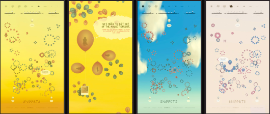
### Related
* [Online Dating Service Analyzes Intro Messages – How to Get a Response](https://flowingdata.com/2009/09/24/online-dating-service-analyzes-intro-messages-how-to-get-a-response/ "Online Dating Service Analyzes Intro Messages – How to Get a Response")
* [Lies people tell in online dating](https://flowingdata.com/2010/08/05/lies-people-tell-in-online-dating/ "Lies people tell in online dating")
* [How we describe ourselves, according to online dating profiles](https://flowingdata.com/2011/06/02/how-we-describe-ourselves-according-to-online-dating-profiles/ "How we describe ourselves, according to online dating profiles")
---
# Database Error
Error establishing a database connection
========================================
---
# Why Does Data Matter to Google? – FlowingData
Why Does Data Matter to Google?
===============================
[March 5, 2008](https://flowingdata.com/2008/03/05/why-does-data-matter-to-google/)
### Topic
**[Miscellaneous](https://flowingdata.com/category/miscellaneous-data/)
**
Data is absolutely vital to Google’s success; without data, Google is pretty much useless when it comes to search. Hal Varian explains on the [official Google blog](http://googleblog.blogspot.com/2008/03/why-data-matters.html)
:
> Over the years, Google has continued to invest in making search better. Our information retrieval experts have added more than 200 additional signals to the algorithms that determine the relevance of websites to a user’s query.
>
> So where did those other 200 signals come from? What’s the next stage of search, and what do we need to do to find even more relevant information online?
What an interesting question. I wonder what the answer is. Oh, here it is:
> Storing and analyzing logs of user searches is how Google’s algorithm learns to give you more useful results. Just as data availability has driven progress of search in the past, the data in our search logs will certainly be a critical component of future breakthroughs.
Cashing In On Data
------------------
That’s right. Without data, who knows where search could be now. AOL might still be prosperous. There’s also this funny bit about how Larry and Sergey initially tried to license their algorithm to new, already existing search engines, but no one bit, and so they made their own. You gotta respect the data!
_For more on the importance of data, you might also be interested in the ever-going series on FlowingData on [why data matters](https://flowingdata.com/2008/02/04/what-is-data-and-why-do-we-care-about-it-so-much/)
._
### Related
* [Google Decides to Host a Whole Lot of Scientific Data – Palimpsest Project](https://flowingdata.com/2008/01/21/google-decides-to-host-a-whole-lot-of-scientific-data-palimpsest-project/ "Google Decides to Host a Whole Lot of Scientific Data – Palimpsest Project")
* [Google Releases Insights for Search – India Likes Data](https://flowingdata.com/2008/08/06/google-releases-insights-for-search-india-likes-data/ "Google Releases Insights for Search – India Likes Data")
* [Google Dataset Search now in public beta](https://flowingdata.com/2018/09/06/google-dataset-search-now-in-public-beta/ "Google Dataset Search now in public beta")
---
# Database Error
Error establishing a database connection
========================================
---
# 4 Data Visualizations That Inspired Me to Learn More – FlowingData
4 Data Visualizations That Inspired Me to Learn More
====================================================
[March 11, 2008](https://flowingdata.com/2008/03/11/4-data-visualizations-that-inspired-me-to-learn-more/)
### Topic
**[Data Art](https://flowingdata.com/category/visualization/artistic-visualization/)
**
I’ve dabbled quite a bit throughout my academic career. I started in computer science, then electrical engineering, and then statistics. I also considered a future in business, environmental science, civil engineering, and urban planning, but I’ve finally settled on a combination of statistics and design — data visualization.
Here are the 4 visualizations that got me interested and left me wanting more.
TextArc by Bradford Paley
-------------------------
I vividly remember sitting in the back of class during my first quarter as a graduate student. My professor now adviser was giving a giving a presentation that was (sort of) on data visualization. There it was – [TextArc](http://www.textarc.org/)
– up on the screen.
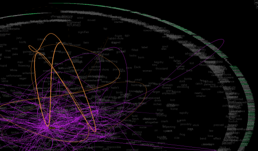
It was a visualization of Alice in Wonderland that displayed data in a way I had never seen before. It wasn’t a chart or graph. Rather it was an interactive piece that drew you into the story and encouraged you to explore.
I was really impressed but still wondered why a professor of statistics was talking about this in a _statistics_ course. Then I realized why after I saw the second piece.
Listening Post by Mark Hansen and Ben Rubin
-------------------------------------------

[Listening Post](http://www.earstudio.com/projects/listeningpost.html)
is a collaboration between artist and statistician that “culls text fragments in real time from thousands of unrestricted Internet chat rooms, bulletin boards and other public forums.” That’s when a little light in my head went on and I realized that this is something that I would enjoy and do for a living. I went home and looked for more.
We Feel Fine by Jonathan Harris and Sep Kamvar
----------------------------------------------

[We Feel Fine](http://www.wefeelfine.org/index.html)
is an “exploration of human emotion” that periodically grabs blog entries looking for statements of how people feel. What you end up with is a flurry of emotion from happy to sad to angry. It’s all interactive and again encourages exploration.
The Dumpster by Golan Levin
---------------------------
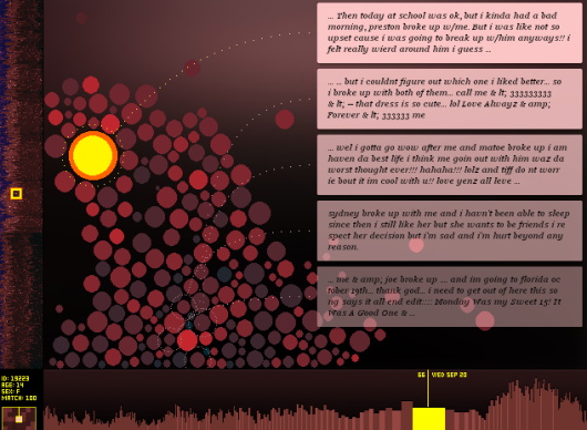
[The Dumpster](http://artport.whitney.org/commissions/thedumpster/index.html)
shows human emotion from a different angle – relationship break ups. Again, data is grabbed from blogs, but this time the parser looks for instances when the writer has broken up with someone or has been broken up with. There are several ways to explore the data by clicking specific instances or browsing the “zoomed out” views on the side panel and bottom.
Now I’m Hooked
--------------
After I saw these four pieces, I was pretty much hooked. They are all art pieces but with science behind it, and I think that’s what I enjoy the most. Sometimes it’s the science behind the beauty that makes a piece an experience while other times it’s the display of science through beautiful art. I can’t imagine pursuing any other field.
### Related
* [Switching from Python to R](https://flowingdata.com/2023/06/21/switching-from-python-to-r/ "Switching from Python to R")
* [Data Science is catching on](https://flowingdata.com/2010/06/02/data-science-is-catching-on/ "Data Science is catching on")
* [Swivel Gets a Data Guy](https://flowingdata.com/2007/10/03/swivel-gets-a-data-guy/ "Swivel Gets a Data Guy")
### 1 Comment
* Pingback: [4 Data Visualizations That Inspired Me to Learn More | FlowingData |](http://www.pixelpod.co.uk/blog/2008/03/15/4-data-visualizations-that-inspired-me-to-learn-more-flowingdata/)
---
# Database Error
Error establishing a database connection
========================================
---
# Database Error
Error establishing a database connection
========================================
---
# Database Error
Error establishing a database connection
========================================
---
# Area Codes in Which Ludacris Claims to Have Hoes – FlowingData
**[Maps](https://flowingdata.com/category/visualization/mapping/)
** / [area code](https://flowingdata.com/tag/area-code/)
, [Ludacris](https://flowingdata.com/tag/ludacris/)
Area Codes in Which Ludacris Claims to Have Hoes
================================================
Mar 10, 2008

I thought this map was amusing. As you can see, Mr. Bridges prefers those in the southeast and northeast according to his 2001 hit single, _Area Codes_ in which he raps about all the female friends he has made.
This is yet another example of the ubiquity of data. If you can find hoe data in Ludacris’ _Area Codes_, you can find data anywhere. Here’s the [large version](https://flowingdata.com/2008/03/10/area-codes-in-which-ludacris-claims-to-have-hoes/ludacris-hoe-map/ "Ludacris Hoe Map")
of the above map. By the way, I’m sorry if I’ve offended anyone with this hoe data. Hoe data.
\[via [Strange Maps](http://strangemaps.wordpress.com/2008/03/09/254-ludacris-rap-map-of-us-area-codes/)\
\]
### Related
* [Everywhere Jonny Cash went, man](https://flowingdata.com/2014/08/20/everywhere-jonny-cash-went-man/ "Everywhere Jonny Cash went, man")
* [Rappers’ claimed wealth versus actual wealth](https://flowingdata.com/2013/07/19/rappers-claimed-wealth-versus-actual-wealth/ "Rappers’ claimed wealth versus actual wealth")
* [Rapper travels and a robot arm](https://flowingdata.com/2015/01/06/rapper-travels-and-a-robot-arm/ "Rapper travels and a robot arm")
### 7 Comments
* [mike anderson](http://waywardstats.spaces.live.com/)
— [March 10, 2008 at 11:38 am](https://flowingdata.com/2008/03/10/area-codes-in-which-ludacris-claims-to-have-hoes/#comment-49872)
Could you overlay this with some data on drive-by shootings, crack use, births out of wedlock, or STDs? Might as well do the whole gansta rap.
* [Nathan Yau](https://flowingdata.com/about-nathan)
— [March 10, 2008 at 5:02 pm](https://flowingdata.com/2008/03/10/area-codes-in-which-ludacris-claims-to-have-hoes/#comment-49873)
that might be a fun contest, eh?
* [rahulb](http://www.instituteofthefuture.org)
— [March 11, 2008 at 7:40 am](https://flowingdata.com/2008/03/10/area-codes-in-which-ludacris-claims-to-have-hoes/#comment-2112)
Can I assume that you’ve seen this even less safe for work teasure trove?
[http://jamphat.com/rap/](http://jamphat.com/rap/)
* [Gregory](http://goettalife.com)
— [March 16, 2008 at 1:54 am](https://flowingdata.com/2008/03/10/area-codes-in-which-ludacris-claims-to-have-hoes/#comment-49875)
Nice. I was going to recommend this to [Strange Maps](http://strangemaps.wordpress.com/)
, but someone beat me to it.
I’ve been listening to Ludacris since he was merely Rediculis.
* wittyadlibs — [May 8, 2008 at 10:36 pm](https://flowingdata.com/2008/03/10/area-codes-in-which-ludacris-claims-to-have-hoes/#comment-49876)
@mikeanderson Ludacris isn’t a “gangster” rapper. There are a multitude of differences within Hip-Hop that you white folks refuse to acknowledge.
* Mel — [June 11, 2008 at 8:35 pm](https://flowingdata.com/2008/03/10/area-codes-in-which-ludacris-claims-to-have-hoes/#comment-49877)
Somehow, my mind wanders to the great Wilt Chamberlain. Now, his girlfriend map would be much more difficult.
* [Nathan Yau](https://flowingdata.com/about-nathan)
— [June 11, 2008 at 10:43 pm](https://flowingdata.com/2008/03/10/area-codes-in-which-ludacris-claims-to-have-hoes/#comment-49878)
Mel – or it might be easier. just make a map that’s all red, and that should do it.
**Become a member.** Support an independent site. Make great charts.
[See What You Get](https://flowingdata.com/membership/)
### Favorites
[\
\
#### How to Spot Visualization Lies\
\
Many charts don’t tell the truth. This is a simple guide to spotting them.](https://flowingdata.com/2017/02/09/how-to-spot-visualization-lies/)
[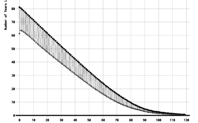\
\
#### Redefining Old Age\
\
What is old? When it comes to subjects like health care and retirement, we often think of old in fixed terms. But as people live longer, it’s worth changing the definition.](https://flowingdata.com/2020/08/26/redefining-old-age/)
[\
\
#### All the Household Types in the U.S.\
\
No need to restrict ourselves to the most common types. There are thousands. Let’s look at all of them.](https://flowingdata.com/2023/05/23/all-the-household-types-in-the-u-s/)
[\
\
#### Visualizing the Uncertainty in Data\
\
Data is an abstraction, and it’s impossible to encapsulate everything it represents in real life. So there is uncertainty. Here are ways to visualize the uncertainty.](https://flowingdata.com/2018/01/08/visualizing-the-uncertainty-in-data/)
---
# Presidential Campaign, Five Graphics – FlowingData
Presidential Campaign, Five Graphics
====================================
[September 2, 2007](https://flowingdata.com/2007/09/02/presidential-campaign-five-graphics/)
### Topic
**[The Times](https://flowingdata.com/category/the-times/)
**
Five of my graphics ran in the paper today in a special labor day weekend segment, [What to Expect When You’re Electing](http://politics.nytimes.com/election-guide/2008/crucialdates/)
. The past few days, I and those I talked to have been referring to them as the labor day graphics, so I was surprised to see them go today. Nice Sunday treat.
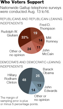The first graphic changed form a few times. It began as a bubble chart to a stacked bar and then to the pies. An editor quickly pointed out that the bubble chart indicated that the percentages were separate, but they should be represented as a whole. Good point, so I toyed around with a stacked bar chart, but it just didn’t look right, given the alloted space. Hence, the pie charts. I’m not a big pie chart fan, but this one seems to work for me.
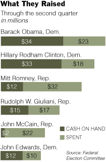A graphic about the amount of money candidates have spent, have, and raised, this graphic’s stacked bar chart base was fairly straightforward. However, it’s the styling and organization that took the most time, as is often the case. I’ve come to learn that it’s very easy to make a graph, but it’s the styling and organization that really makes a graphic worthy of being in the paper.
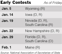Other than the fact that the calendar is changing from day to day and the whole primary versus caucus stuff is kind of confusing, this graphic was pretty straightforward. I put in shades of gray to make things more readable.
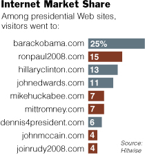I thought this [presidential Web site data](http://hitwise.com/political-data-center/)
from Hitwise was pretty interesting. Based on estimates, we can see what presidential Web sites are getting the most traffic. The tricky part was getting the wording right for the headline and lead-in so that readers would know what the percentages meant.
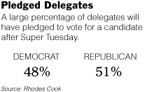Clearly very straightforward, Pledged Delegates, on the contrary, took the most time out of all five graphics. The construction was simple, but finding the correct numbers took time. Schedules are changing, the definition of a pledged delegate is different by state, and the whole nomination process is fuzzy. Nevertheless, towards the end of Friday, some somewhat reliable numbers came in.
That’s all. It was fun putting this group of graphics together. I got to learn about the nomination process and most importantly, learned more about style and organization. Good stuff.
As I sat at my desk this week, working on these things (and one other coming soon), I thought to myself, “I can’t believe I’m getting paid to do this. This is too entertaining.” You know, this whole internship has never really felt like work, which I think is a good sign that I’m headed in the right direction towards data visualization.
### Related
* [Impact of Best Picture Oscar nomination on profit](https://flowingdata.com/2016/03/01/impact-of-best-picture-oscar-nomination-on-profit/ "Impact of Best Picture Oscar nomination on profit")
* [Review: The Wall Street Journal Guide to Information Graphics](https://flowingdata.com/2010/02/18/review-the-wall-street-journal-guide-to-information-graphics/ "Review: The Wall Street Journal Guide to Information Graphics")
* [Voting Breakdown for Democratic Presidential Primaries](https://flowingdata.com/2008/06/05/voting-breakdown-for-democratic-presidential-primaries/ "Voting Breakdown for Democratic Presidential Primaries")
---
# How to Stop Procrastinating So that I Am Not a Bum – A Self-experiment – FlowingData
How to Stop Procrastinating So that I Am Not a Bum – A Self-experiment
======================================================================
[March 3, 2008](https://flowingdata.com/2008/03/03/how-to-stop-procrastinating-so-that-i-am-not-a-bum-a-self-experiment/)
### Topic
**[Self-surveillance](https://flowingdata.com/category/self-surveillance/)
**
[](http://flickr.com/photos/tonivc/)
I waste way too much time doing completely useless stuff when I should be working on my dissertation, reading papers, writing papers, and learning things that will bring me closer to my degree. I’m ready to stop procrastinating.
How I Will Become More Productive
---------------------------------
In an attempt to work more efficiently, I am going to take up Seth’s [self-experimentation offer](http://www.blog.sethroberts.net/2008/02/20/want-to-self-experiment-a-special-offer/)
that I found via [Andrew’s post](http://www.stat.columbia.edu/~cook/movabletype/archives/2008/02/collecting_data.html)
. I am going to self-experiment; I am going to collect data about myself; and I am going to find out if my two-pronged method to stop procrastination works. Here’s my plan:
1. I will make a to-do list every night to lay out what will get done the next day
2. I will enable the [Greasemonkey](https://addons.mozilla.org/en-US/firefox/addon/748)
script – [Invisibility Cloak](http://lifehacker.com/software/feature/geek-to-live-ban-timewasting-web-sites-146448.php)
– which will block all the sites that I waste too much time on except during lunch and on the weekend
How I Will Judge Improvement
----------------------------
To measure my progress, I will make use of two Firefox plugins – [Browser Statistics](https://addons.mozilla.org/en-US/firefox/addon/4427)
and [TimeTracker](https://addons.mozilla.org/en-US/firefox/addon/1887)
. The former keeps track of the amount I’ve downloaded (in megabytes) while the latter is a timer for time spent browsing the Web.
Luckily I’ve had these two plugins enabled for a little over a month, so at the end of this month, there will be something to compare to. From January 27 to March 2, I downloaded 23,524.73 megabytes and spent a whopping 364 hours browsing. That’s about 653 megabytes and a little over 10 hours per day. OK, that’s embarrassing.
Join Me In This Self-experiment
-------------------------------
I’ll do this for one month with a midway report on March 17 and a final report on March 31. You can [subscribe to the feed](http://feeds.feedburner.com/FlowingData)
to stay updated, and if anyone wants to join me on this, all the better. Just leave a comment below so that we can keep track of results.
Procrastination-free days start now.
### Related
* [How to Stop Procrastinating – One Month Report](https://flowingdata.com/2008/04/14/how-to-stop-procrastinating-one-month-report/ "How to Stop Procrastinating – One Month Report")
* [A Self-experiment – My Mid-month Report](https://flowingdata.com/2008/03/17/a-self-experiment-my-mid-month-report/ "A Self-experiment – My Mid-month Report")
* [How Much Time Do You Waste on Your Computer?](https://flowingdata.com/2008/06/16/how-much-time-do-you-waste-on-your-computer/ "How Much Time Do You Waste on Your Computer?")
### 9 Comments
* Pingback: [Seth’s blog » Blog Archive » Self-Experiment on Procrastination](http://www.blog.sethroberts.net/2008/03/02/self-experiment-on-procrastination/)
* [lia](http://www.stop-procrastination.org)
— [March 4, 2008 at 6:05 am](https://flowingdata.com/2008/03/03/how-to-stop-procrastinating-so-that-i-am-not-a-bum-a-self-experiment/#comment-49852)
Definitely a well-written post. \*applause\* I agree with you about the need to stop procrastination. I’ve found help at [http://www.stop-procrastination.org](http://www.stop-procrastination.org)
and that website has a variety of ways to stop procrastination. I’ve tried and i can already see an improvement in my condition. should try.
* Beth — [March 4, 2008 at 3:53 pm](https://flowingdata.com/2008/03/03/how-to-stop-procrastinating-so-that-i-am-not-a-bum-a-self-experiment/#comment-49853)
So glad I saw this on Seth’s blog. Surfing is a big, big time waster for me. Once I get going I just can’t seem to stop, and it’s really keeping me from doing things I care a lot about.
I’ll be following along and hope this will motivate me to get my constant browsing under control as well.
Great tips on the plugins – I will definitely check them out.
* [Nathan Yau](https://flowingdata.com/about-nathan)
— [March 4, 2008 at 5:26 pm](https://flowingdata.com/2008/03/03/how-to-stop-procrastinating-so-that-i-am-not-a-bum-a-self-experiment/#comment-49854)
@Beth: Seriously. I get started on a few sites, and all of a sudden a few hours have passed. I don’t know where all the time goes. It’s my second day implementing my plan and I’m already feeling more productive. It’s my “12-1 lunch break” now.
* miked98 — [March 4, 2008 at 7:53 pm](https://flowingdata.com/2008/03/03/how-to-stop-procrastinating-so-that-i-am-not-a-bum-a-self-experiment/#comment-49855)
Nathan,
You certainly have the right audience here ;) — all of us blog readers are guilty as charged on the procrastination front. I will check out these tools, hopefully transparency on my time-utilization will shame me into being more productive.
Mike
p.s. Stay away from Scrabulous!
* [bek](http://www.bruceandmo.com/b/efficiency)
— [March 4, 2008 at 9:12 pm](https://flowingdata.com/2008/03/03/how-to-stop-procrastinating-so-that-i-am-not-a-bum-a-self-experiment/#comment-49856)
This is related. I wanted to do some better analysis of where my time was spent. I came up with screenshots and movies. I have a friend that did window handles and Google Charts. You can see some of the results here [http://www.bruceandmo.com/b/efficiency](http://www.bruceandmo.com/b/efficiency)
* [Nathan Yau](https://flowingdata.com/about-nathan)
— [March 4, 2008 at 9:23 pm](https://flowingdata.com/2008/03/03/how-to-stop-procrastinating-so-that-i-am-not-a-bum-a-self-experiment/#comment-49857)
interesting. web worker daily just posted a few days ago about three programs that you can use to record your actions:
[http://webworkerdaily.com/2008/03/03/3-ways-to-automatically-track-your-time/](http://webworkerdaily.com/2008/03/03/3-ways-to-automatically-track-your-time/)
* Pingback: [A Self-experiment - My Mid-month Report | FlowingData](https://flowingdata.com/2008/03/17/a-self-experiment-my-mid-month-report/)
* Pingback: [How to Stop Procrastinating - One Month Report | FlowingData](https://flowingdata.com/2008/04/14/how-to-stop-procrastinating-one-month-report/)
---
# 10 Largest Data Breaches Since 2000 – Millions Affected – FlowingData
**[Data Underload](https://flowingdata.com/category/projects/data-underload/)
** / [breaches](https://flowingdata.com/tag/breaches/)
10 Largest Data Breaches Since 2000 – Millions Affected
=======================================================
By **[Nathan Yau](https://flowingdata.com/about "Visit Nathan Yau’s website")
**
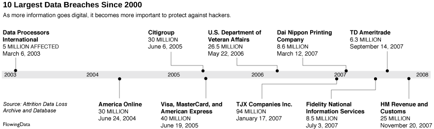
In light of the [MySpace photo breach](http://www.wired.com/politics/security/news/2008/01/myspace)
(due to their negligence) a couple of months ago, I got to wondering about other recent data breaches. It turns out Attrition.org keeps a [Data Loss Archive and Database](http://attrition.org/dataloss/)
that contains known data breaches since 2000. Records include date, number affected, groups involved, summaries, and links to reported stories and updates. It’s surprisingly detailed and even better, it’s all available for download.
The [above graphic](https://flowingdata.com/2008/03/14/10-largest-data-breaches-since-2000-millions-affected/10-largest-data-breaches-since-2000/ "10 Largest Data Breaches Since 2000")
shows the 10 largest data breaches which affected millions. I thought the 800,000 records [thieved from UCLA](http://www.cbsnews.com/stories/2006/12/12/tech/main2249716.shtml)
a couple of years ago (that my information was unfortunately a part of) was a lot. That’s nothing compared to these.
Notice the higher frequency as we get closer to the present?
\[Thanks Ryan | [Welcome, Boing Boing readers](https://flowingdata.com/2008/03/15/hello-boing-boing-readers-welcome-to-flowingdata/)\
\]
### Related
* [Health data breaches and fines](https://flowingdata.com/2015/03/12/health-data-breaches-and-fines/ "Health data breaches and fines")
* [Largest data breaches of all time](https://flowingdata.com/2011/06/13/largest-data-breaches-of-all-time/ "Largest data breaches of all time")
* [A portrait of your stolen identity in data breaches](https://flowingdata.com/2023/05/23/a-portrait-of-your-stolen-identity-in-data-breaches/ "A portrait of your stolen identity in data breaches")
### 15 Comments
* Taxman — [March 14, 2008 at 4:10 am](https://flowingdata.com/2008/03/14/10-largest-data-breaches-since-2000-millions-affected/#comment-2200)
2008: German Secret Service buys a CD-ROM containing customer data stolen from a Liechtenstein private bank; the data is then passed on to the Ministry of Finance which is using the stolen material to indict hundreds of citizens of tax evasion.
* [Nathan Yau](https://flowingdata.com/about-nathan)
— [March 15, 2008 at 12:43 am](https://flowingdata.com/2008/03/14/10-largest-data-breaches-since-2000-millions-affected/#comment-49880)
it’s really interesting to see where data goes after the breach. i wonder where the above 10 ended up.
* Pingback: [links for 2008-03-15 « Dark Corner of the Empty Head](http://silas216.wordpress.com/2008/03/15/links-for-2008-03-15/)
* Pingback: [Ten Largest Data Breaches Since 2000](http://www.impactlab.com/2008/03/15/ten-largest-data-breaches-since-2000/)
* Pingback: [10 LARGEST DATA BREACHES SINCE 2000 « The Catskill Commentator](http://catskillcommentator.com/2008/03/16/10-largest-data-breaches-since-2000/)
* Pingback: [From the Pipeline - 3.16.08 | WinExtra](http://www.winextra.com/2008/03/16/from-the-pipeline-31608/)
* Pingback: [ResourceShelf » Lists & Rankings: 10 Largest Data Breaches Since 2000 - Millions Affected](http://www.resourceshelf.com/2008/03/19/lists-rankings-10-largest-data-breaches-since-2000-millions-affected/)
* Pingback: [My Place in the Crowd » Blog Archive » Yet another data breach](http://blog.myplaceinthecrowd.org/2008/03/20/yet-another-data-breach/)
* Pingback: [Facebook Security Upgrade Rendered Useless - Private Photos Leaked | FlowingData](https://flowingdata.com/2008/03/25/facebook-security-upgrade-rendered-useless-private-photos-leaked/)
* Pingback: [KWTL - Keeping Within The Law: 10 largest data breaches](http://informationlaw.blogspot.com/2008/03/10-largest-data-breaches.html)
* Anthony — [March 25, 2008 at 2:07 pm](https://flowingdata.com/2008/03/14/10-largest-data-breaches-since-2000-millions-affected/#comment-49882)
About 20 years ago I worked for a bank as a software developer and we had to ask for, prove why and show before and after results of data access against a customer database. We had to present all of that information, in a binder, to an auditor and we’d receive a “yes/no” response within a DAY.
Nowadays people want everything without even considering the ramifications. Perhaps they do consider the ramifications, but without any consequences the ramifications, any notion to be cautious have become side-thoughts.
All its going to take, to tighten up security, is for one precedent setting lawsuit to occur. Some really pissed off citizen and one very enterprising attorney…
* [Nathan Yau](https://flowingdata.com/about-nathan)
— [March 25, 2008 at 3:51 pm](https://flowingdata.com/2008/03/14/10-largest-data-breaches-since-2000-millions-affected/#comment-49883)
@Anthony: I know what you mean. It’s always about more, more, more data, and sometimes it feels like it’s just so that someone can say we have this amount of data stored in our database. So now they have it, they don’t know what to do with it nor how to protect it.
* Pingback: [ADM 316 - Workshop 2 Postscript « Russ Ray’s Indiana Wesleyan Classroom Blog](http://iwuruss.wordpress.com/2008/04/07/adm-316-workshop-2-postscript/)
* Pingback: [10 Largest Data Breaches Since 2000 - Laptop Security Blog](http://blog.absolute.com/10-largest-data-breaches-since-2000/)
* Pingback: [From the Pipeline - 3.16.08 — Shooting at Bubbles](http://www.shootingatbubbles.com/index.php/2008/03/16/from-the-pipeline-31608/)
**Become a member.** Support an independent site. Make great charts.
[See What You Get](https://flowingdata.com/membership/)
### Favorites
[\
\
#### The Most Gender-Switched Names in US History\
\
We use some names mostly for boys and some mostly for girls, but then there is a small percentage that, over time, switched from one gender to another. Which names made the biggest switch?](https://flowingdata.com/2019/08/28/gender-switched-names/)
[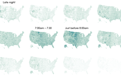\
\
#### Interactive: When Do Americans Leave For Work?\
\
We don’t all start our work days at the same time, despite what morning rush hour might have you think.](https://flowingdata.com/2015/02/04/when-do-americans-leave-for-work/)
[\
\
#### Toilet Paper Calculator\
\
Maybe you’re starting to run low. Here’s how much you’ll need when you go to restock.](https://flowingdata.com/2020/03/29/toilet-paper-calculator/)
[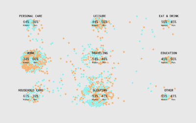\
\
#### A Day in the Life: Women and Men\
\
Using the past couple of years of data from the American Time Use Survey, I simulated a working day for men and women to see how schedules differ. Watch it play out in this animation.](https://flowingdata.com/2019/03/06/women-men-timeuse/)
---
# Not so Hot Graphs in Academic Papers – FlowingData
Not so Hot Graphs in Academic Papers
====================================
[September 3, 2007](https://flowingdata.com/2007/09/03/not-so-hot-graphs-in-academic-papers/)
### Topic
**[Ugly Charts](https://flowingdata.com/category/visualization/ugly-visualization/)
**
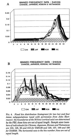Karl Broman has an amusing list of the [top ten worst graphs](http://www.biostat.wisc.edu/~kbroman/topten_worstgraphs/)
found in academic papers.
One of them, very sadly, was actually from the **[Journal of the American Statistical Association](http://www.amstat.org/publications/jasa/index.cfm?fuseaction=main)
**, a very prominent statistical journal. It just goes to show that some have an eye for data, and others might have an eye for visualization, but one doesn’t necessarily lead to the other. Don’t forget to read the discussion on _why_ the graphs are um, not so good, so that we can all learn from the mistakes of those before us.
My personal favorite is the 3-d ribbon graph, because it’s just so ugly. Why would anyone use that? Too many shades of gray mixing, too many lines crossing, too many dimensions. Brain overload.
I guess the graph was made in 1994, so I _could_ cut the authors some slack….
No, they’re just bad. I was making way better graphs in Excel by that time for my seventh grade science fair project — _What Cereal do Red Flour Beatles (Tribolium castaneum) Prefer?_
Look what you’ve done Microsoft Excel. Apologize for what you’ve done this very minute.
Oh, and they preferred Cheerios and stayed away from the Grape Nuts.
### Related
* [A fill-in-the-blank book to journal your life in graphs](https://flowingdata.com/2013/02/11/a-fill-in-the-blank-book-to-journal-your-life-in-graphs/ "A fill-in-the-blank book to journal your life in graphs")
* [Published Data and Results Not Always Legit](https://flowingdata.com/2007/09/15/published-data-and-results-not-always-legit/ "Published Data and Results Not Always Legit")
* [Open thread: Can you spot the wrongness in this tax graph?](https://flowingdata.com/2011/05/17/open-thread-can-you-spot-the-wrongness-in-this-tax-graph/ "Open thread: Can you spot the wrongness in this tax graph?")
---
# Decline of U.S. Men’s Tennis – FlowingData
Decline of U.S. Men’s Tennis
============================
[September 4, 2007](https://flowingdata.com/2007/09/04/decline-of-us-mens-tennis/)
### Topic
**[Statistics](https://flowingdata.com/category/statistics/)
**
With more Many Eyes fun, Aron Pilhofer put in [part 2](http://usopen.blogs.nytimes.com/2007/09/03/mens-tennis-as-a-world-sport/#more-200)
of his [original post](https://flowingdata.com/2007/08/27/many-eyes-on-the-times-us-open-blog/)
. I was pleased to see the first post get 56 comments, but I think part 2 might have gotten lost due to the high post frequency, with the U.S. Open fully on. Still worth a look though.
[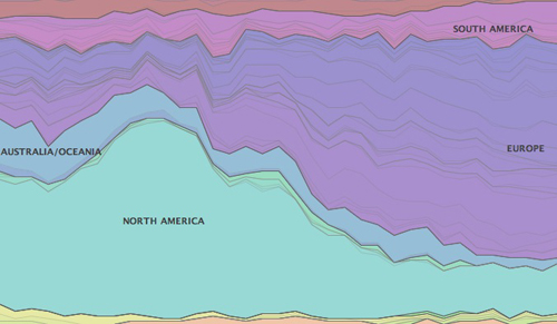](http://services.alphaworks.ibm.com/manyeyes/view/SIk76IsOtha65QmxwXeeI2-)
Aron goes a little deeper, looking at the number of competitors from other countries from 1972 through this year. We again see a similar story that we saw in the first post — a decrease in U.S. competitors and an increase from the rest of the world. I’m still kind of wondering what happened. Did the rest of the world decide that tennis is a fun sport to play at some point? Did prize money increase? Did Americans grow less interested? I don’t know. Something happened in the early ’80s, but we don’t have enough context to make a definite conclusion.
I suppose the next step would be to take a look at how the [ATP rankings](http://www.atptennis.com/3/en/rankings/entrysystem/default.asp)
have changed over time. With rankings, we’d not only see the U.S. Open story, but more an international story. A (very) cursory inspection showed something similar to the U.S. Open story. In 1973, there were 20+ Americans in the top 100. As of today, there are only 9.
### Related
* [Many Eyes on The Times U.S. Open Blog](https://flowingdata.com/2007/08/27/many-eyes-on-the-times-us-open-blog/ "Many Eyes on The Times U.S. Open Blog")
* [Change in Google searches since the virus](https://flowingdata.com/2020/04/20/change-in-google-searches-since-the-virus/ "Change in Google searches since the virus")
* [Super ZIP codes →](http://www.washingtonpost.com/sf/local/2013/11/09/washington-a-world-apart/ "Super ZIP codes →")
---
# Not Enough Lifeguards and Prison Libraries – FlowingData
Not Enough Lifeguards and Prison Libraries
==========================================
[September 11, 2007](https://flowingdata.com/2007/09/11/not-enough-lifeguards-and-prison-libraries/)
### Topic
**[The Times](https://flowingdata.com/category/the-times/)
**
Two more graphics — one ran on Sunday with a story investigating [lifeguard competence](http://www.nytimes.com/2007/09/09/nyregion/09lifeguards.html)
and the other went yesterday with a story on religious books (or lack thereof) in [prison libraries](http://www.nytimes.com/2007/09/10/us/10prison.html?ref=us)
. Probably the most challenging part of both graphics was figuring out what to show; there wasn’t exactly a ton of data to choose from.
Less than Satisfactory Lifeguarding
-----------------------------------
I knew this was running on Sunday, but when I checked online, I didn’t see it. I was a little disappointed, because it kind of sucks to make a graphic and then find out it was grilled. Luckily, that hasn’t happened to me yet. Knock on wood. My lifeguard graphic wasn’t on the Web, but it was in the paper.
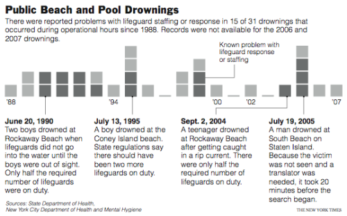
The graphic started as just small squares, but the results looked like they were missing something. It just looked like 32 tiny, shaded squares. They needed more context, so I highlighted incidents in which there were some serious lifeguard screw-ups. I think the excerpts make the graph a lot more human. What do you think?
Religious Reading in Prison
---------------------------
This one was purely informational. I was provided with a list of authors and books. They, um, as in the National news desk, not the universal “they,” also gave me a list of religions that the Bureau of Prisons had made allowed-lists for.
Are you confused? Yeah, I was too. To clarify, the Bureau of Prisons put together lists of allowed books for major religions.
From what I gleaned from the list, no major religions were left out. Not incredibly interesting, so I dumped that and was left with authors and their books. Hence the graphic. Voila.
Looks simple, yeah? Trust me, after eight weeks at The Times, I can think of about a million and four ways to crappy-fy the graphic. Oh yes, I’ve learned a lot, but oh yes, there’s still so much more for me to absorb these next two weeks.
### Related
* [Prisoners Getting Shipped to Other States](https://flowingdata.com/2007/07/31/prisoners-getting-shipped-to-other-states/ "Prisoners Getting Shipped to Other States")
* [List of visualization best-of-year lists, 2018](https://flowingdata.com/2019/01/04/list-of-visualization-best-of-year-lists-2018/ "List of visualization best-of-year lists, 2018")
* [Rise in prison death rates during the pandemic](https://flowingdata.com/2024/04/25/rise-in-prison-death-rates-during-the-pandemic/ "Rise in prison death rates during the pandemic")
---
# Database Error
Error establishing a database connection
========================================
---
# Database Error
Error establishing a database connection
========================================
---
# John Snow’s Famous Cholera Map – FlowingData
John Snow’s Famous Cholera Map
==============================
[September 12, 2007](https://flowingdata.com/2007/09/12/john-snows-famous-cholera-map/)
### Topic
**[Maps](https://flowingdata.com/category/visualization/mapping/)
**
If you’ve read any books on visualization, without a doubt, you’ve seen John Snow’s now famous cholera map. In 1854, people were dying in large numbers and high frequency, but nobody knew what was going on. John Snow [solved the mystery](http://en.wikipedia.org/wiki/John_Snow_(physician)#Cholera)
with his map.
It’s crazy to imagine a time when people didn’t think to map data, especially now as mapping data has become second nature for some. Steven Johnson, author of _[Ghost Map](http://www.amazon.com/Ghost-Map-Steven-Johnson/dp/1594489254)
_, goes into depth on the Cholera outbreak in London in his book and [TED talk](http://www.ted.com/index.php/talks/view/id/61)
earlier this year.
I’d embed it, but I can’t find the link anywhere on the TED page. They probably had to make it less obvious after [Hans Rosling’s talk](https://flowingdata.com/2007/07/06/hans-rosling-providing-data-inspiring-change/)
spread at the speed of Cholera in London in 1854. London hasn’t had another outbreak since Snow’s simple (for this day and age) but effective visualization.
_**UPDATE:** Here’s Steven Johnson’s TED talk_
### Related
* [3-D print of John Snow cholera map](https://flowingdata.com/2024/11/26/3-d-print-of-john-snow-cholera-map/ "3-D print of John Snow cholera map")
* [Charting cholera, beyond John Snow](https://flowingdata.com/2019/03/05/charting-cholera-beyond-john-snow/ "Charting cholera, beyond John Snow")
* [A Primer on Information and Data Visualization](https://flowingdata.com/2008/01/14/a-primer-on-information-and-data-visualization/ "A Primer on Information and Data Visualization")
### 3 Comments
* [Tal Galili](http://www.biostatistics.co.il)
— [September 12, 2007 at 10:36 am](https://flowingdata.com/2007/09/12/john-snows-famous-cholera-map/#comment-49680)
Hi. 2 things:
1) you can embed this video from here:
2) any chance to see you on face book ?
Tal.
* [Nathan](https://flowingdata.com)
— [September 12, 2007 at 11:11 am](https://flowingdata.com/2007/09/12/john-snows-famous-cholera-map/#comment-29)
Thanks for the link, and yup, I’m on Facebook. You just have to know where to look.
* Pingback: [A Primer on Information and Data Visualization](https://flowingdata.com/2008/01/14/a-primer-on-information-and-data-visualization/)
---
# Why I Do Not Swivel Data – FlowingData
Why I Do Not Swivel Data
========================
[August 31, 2007](https://flowingdata.com/2007/08/31/why-i-do-not-swivel-data/)
### Topic
**[Apps](https://flowingdata.com/category/software/online-apps/)
**
I’ve been back and forth on whether or not I wanted to post about this. Two reasons: I feel blasphemous feeling this way; and I’m not sure if I’m working for or against my hopes for data awareness. I also think I might be getting some mild form of carpal tunnel. Ow.
I’m a graduate student in Statistics, and I don’t like Swivel. Why? How is that even possible? All of my work encircles data, I blog about flowing data, and I read about data. So why can’t I force myself to enjoy the “tasty data treats for data geeks” offered by Swivel?
People (Not) Part of the Team
-----------------------------
There are smart people behind Swivel. That’s clear. However, there seems to be some missing pieces.
The company’s founders have backgrounds in physics (and apparently computer science), and there are three main advisers — two of which, I’m guessing, are very computer science oriented while the third has business in mind.
Let’s think about this for a second.
Swivel is a data store that houses lots of different types of data from various sources. Data is then visualized with some graph/plot/map thing and correlated with other data sets that already exist in the database.
I’m going to pause it right there.
There should really be a data/information visualization expert advising Swivel, because they are clearly lacking one from the looks of their graphs (which I will get to soon). Secondly, they’re trying to do some serious correlations between multiple-type data sets. For this part in the data chain, Swivel needs to up their statistical expertise. Yes, we all took or will take that introduction to statistics course in undergrad; however, that’s not enough. Reliability gets much more complicated for real-world data.
If there’s already a stat and/or visualization expert on the job then please forgive my ignorance.
Visualization Needs Improvement
-------------------------------
I think the type of visualization Swivel offers is an indication of who Swivel caters to and the type of data they plan to focus on. What do those visualizations remind you of? They remind me of Powerpoint, and when I think of Powerpoint, I think of boring talks and silly graphs. Why must people put background images on their graphs? The only purpose those pictures serve is distraction from what should be the focus — the data.
There’s also the interaction problem. Outside of scrolling over a bar or point to see the value, there isn’t much else. Well, I take that back. You can click on spots that will take you to a data table, but in turn, you’re taken away from the viz, and you’re just back at where you started.
I’m Not Sure About the Statistical Validity
-------------------------------------------
There are “correlations” for each graph, but what do they mean? I’m looking at the [Hurricane Katrina graph](http://www.swivel.com/graphs/show/23065554)
, and I see that White and Black are 97% correlated. I’m sure they’re plugging into some formula, but what assumptions are being made about the data? How do people use these numbers if they don’t understand correlation?
Swivel also has a comparison feature to place one data set against another. Finally we can compare our sales data to the weather, Swivel tells me. I don’t know about this one. Again, I’m not sure what they’re doing or what assumptions are being made about the data. Honestly, I haven’t been able to make any successful comparisons using the weird user interface.
Maybe I’m just dumb.
Needs Better Data Quality Control
---------------------------------
I previously [pointed to a Swivel graph](https://flowingdata.com/2007/07/08/juice-testing-in-competitive-sports/)
that showed use of steroids and performance enhancing drugs. The only problem was that the data was for testing — not use. That’s a big difference, yes?
This wasn’t just some random graph that I dug up in the depths of some deep, dark abyss, hidden away for no one to see. It was a featured graph on the Swivel homepage. Shouldn’t someone be checking this stuff? Of course this was just one incident. I don’t investigate every featured graph nor do I go sleuthing through the archives, but who knows what other weirdness is lurking in the dark.
It’s nice to think that we can rely on users completely to decipher what data is good and what data is bad, but there should still be someone looking out for weird kinks. For example, in blogs, you’ll find that the first few commenters for an entry can influence how future commenters will react. If we think of each graph as a blog entry… well, what if the discussion starts off on something that isn’t there?
I can also see someone grabbing data from some site, mucking around with the data set in Excel and then uploading their finished result to Swivel. There are plenty of things that could go wrong there like a mislabeled column, typos, or something simple, but serious like changing null values to zeros.
There are books written about this subject — statistical quality control — that the Swivel people should probably read. Have they? Are they aware of it?
Swivel is a Business
--------------------
Finally, at the end of the day, Swivel is a business. [Minor Ventures](http://minorventures.com/)
didn’t invest to _not_ make money, and as two of the three main Swivel advisers are entrepreneurs, they’re certainly going to move in the direction that leads them to money. I’m not saying that all Swivelers care about is cold, hard cash, because I’m quite sure (sort of) that there’s an interest in data. What I’m saying is that certain motivations are going to push development in certain directions.
With that in mind, something doesn’t feel quite right. Even though I know my data will always be free, it’s possible that users with private accounts are using my data for something, but at the same time I don’t get to see what they’re doing or what data they have. I guess I’m selfish.
Okay, there I said it. I’m glad I got that off of my chest, but at the same time I feel wrong and dirty for saying it. I am sorry. I want to like Swivel. I really do. However, until some changes are made, I’m going to have to pass.
### Related
* [Swivel Gets a Data Guy](https://flowingdata.com/2007/10/03/swivel-gets-a-data-guy/ "Swivel Gets a Data Guy")
* [Same Big Mac Data, Different Platform](https://flowingdata.com/2007/06/30/same-big-mac-data-different-platform/ "Same Big Mac Data, Different Platform")
* [Why Swivel shut down](https://flowingdata.com/2010/10/19/why-swivel-shut-down/ "Why Swivel shut down")
### 9 Comments
* [Brian Mulloy](http://www.swivel.com)
— [August 31, 2007 at 8:27 pm](https://flowingdata.com/2007/08/31/why-i-do-not-swivel-data/#comment-21)
Thanks for your very thoughtful post about Swivel. We whole-heartedly agree with your concerns about visualization, data quality and statistical validity.
Swivel has been alive for less than 9 months and we really see ourselves as approaching the start line not the finish line. We hope to address many of your concerns over the coming months.
We are a business and it is our deeply held belief that we will do well by doing good. Creating a Web site that allows people to engage with data in a meaningful way is the key to enabling great decisions and improving people’s lives both in the private sector and the public sector.
Brian Mulloy
CEO & Co-founder
Swivel
[\[email protected\]](/cdn-cgi/l/email-protection#51332338303f1122263827343d7f323e3c)
415.680.3641
* [Tom Paper](http://www.data360.org)
— [September 1, 2007 at 2:17 am](https://flowingdata.com/2007/08/31/why-i-do-not-swivel-data/#comment-22)
Nathan, Swivel has a lot going for it and, as you pointed out, it also has challenges. All the data visualization sites are in the early stages, so each one has ability to respond to feedback. Data360 is website where people can find, analyze and present data. We see ourselves as more serious than Swivel and we think that our analytical, presentation and reporting features are more robust, as well as more dependent upon the judgment of the person posting the data. My background is business finance and strategy. I would be grateful for your review of our site, which can be found at [http://www.data360.org](http://www.data360.org)
. Best regards, Tom Paper
* [Nathan](https://flowingdata.com)
— [September 1, 2007 at 5:10 pm](https://flowingdata.com/2007/08/31/why-i-do-not-swivel-data/#comment-23)
@Brian: Thanks for hearing me out. I know it might seem like I’m completely against you and Swivel, but you should know that I’m rooting for Swivel’s success. I just hope that it’s success for all the right reasons.
@Tom: Data360 (among others) have been in my field of vision for a while now, so a review of some sort is definitely on my todo list.
* [vozome](http://www.oecd.org)
— [September 7, 2007 at 12:38 pm](https://flowingdata.com/2007/08/31/why-i-do-not-swivel-data/#comment-24)
Hi Nathan,
I work at the OECD. In 3 words my job there is to publish official data.
Early on at the OECD we have been interested in working with Swivel as we like their approach.
Traditionally, we publish large & complex datasets complete with detailed source & methods documentation. Obviously we are going to continue doing that but we feel that people outside of statistical offices, central banks and research labs should also get access to numbers from the OECD that they can comprehend.
Enter swivel. As you can guess when I first tried it I had a number of gripes. obviously the data visualization tools were not as powerful as what we have inhouse. plus it seemed much easier to build a completely irrelevant graph than something meaningful. Yet there’re quite a few things that swivel did very well: allow us to add extra information to our heart’s contents, tags, interact with users via comments, etc. So while I was less than thrilled by the content we could post I was quite excited by how it could be published.
After a while Swivel and us started talking. We were so concerned that people could produce junk graphs out of our content which would still bear our brand, that together we came up with the concept of “official source”, which they implemented in a couple of days. Then, each time we provided feedback on content & how to do stuff better on the purely statistical front they listened to us and we saw the application evolve very rapidly. We still talk and exchange ideas. Furthermore, ever since we started exploring swivel, quite a few other data-oriented IGO’s and official data providers have been curious. We talk together, they talk to swivel, who proves to be very receptive. Swivel are working on quite a few ideas which I believe would dramatically improve the site & the service and some of these ideas and suggestion come from veteran statisticians all around.
Eventually, swivel caters to a wide audience, so they’ll focus on the kind of data that’s understandable by many, rather than on expert analysis. You’ll still see fun graphs put forward which may hurt the credibility of more relevant data. Yet I believe that it has a role to play. At the very least it challenges the way we “official” data people consider publishing data, which is already quite an accomplishment!!!
* [Nathan](https://flowingdata.com)
— [September 7, 2007 at 7:18 pm](https://flowingdata.com/2007/08/31/why-i-do-not-swivel-data/#comment-25)
@vozome: You bring up some excellent points and it’s GREAT that the OECD is aiming to make their data more available. I agree that Swivel is playing a good role in changing the way people consider publishing data.
As strictly a data store, Swivel is on the right track, but is this what Swivel aims to be? I don’t think it is. Swivel markets itself as an application to upload _and_ explore data.
With that in mind, how many people in Swivel’s wide audience will download the data and explore with their desktop tools? That’s when all the Swivel graphs start to trouble me, because, as you noted, they’re not especially useful and many (or most) are useless. Then the trouble begins when people start “interpreting” the graphs, perhaps seeing something that isn’t really there.
* [Tal Galili](http://www.biostatistics.co.il)
— [September 12, 2007 at 6:32 am](https://flowingdata.com/2007/08/31/why-i-do-not-swivel-data/#comment-26)
I have nothing much to add to the discussion, besides mentioning it is very interesting to read – thank you for your post.
* Pingback: [FlowingData / Swivel Gets a Data Guy](https://flowingdata.com/2007/10/03/swivel-gets-a-data-guy/)
* Pingback: [inquisant » Blog Archive » Whats wrong with Swivel?](http://inquisant.com/?p=4)
* Pingback: [8 Reasons Why I Do Not Like Data360](https://flowingdata.com/2008/01/10/8-reasons-why-i-do-not-like-data360/)
---
# 17 Ways to Visualize the Twitter Universe – FlowingData
17 Ways to Visualize the Twitter Universe
=========================================
[March 12, 2008](https://flowingdata.com/2008/03/12/17-ways-to-visualize-the-twitter-universe/)
### Topic
**[Maps](https://flowingdata.com/category/visualization/mapping/)
, [Network Visualization](https://flowingdata.com/category/visualization/network-visualization/)
, [Statistical Visualization](https://flowingdata.com/category/visualization/statistical-visualization/)
**
I just created [a new Twitter account](http://twitter.com/flowingdata)
, and it got me to thinking about all the data visualization I’ve seen for Twitter tweets. I felt like I’d seen a lot, and it turns out there are quite a few. Here they are grouped into four categories – **network diagrams, maps, analytics, and abstract**.
Network Diagrams
----------------
Twitter is a social network with friends (and strangers) linking up with each other and sharing tweets aplenty. These network diagrams attempt to show the relationships that exist among users.
### Twitter Browser
[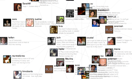](http://www.neuroproductions.be/twitter_friends_network_browser/)
### Twitter Social Network Analysis
The ebiquity group did some cluster analysis and managed to group tweets by topic.
[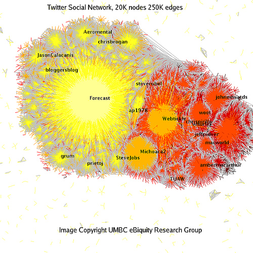](http://ebiquity.umbc.edu/blogger/2007/04/19/twitter-social-network-analysis/)
### Twitter Vrienden
[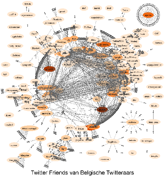](http://bvlg.blogspot.com/2007/04/twitter-vrienden.html)
### Twitter in Red
I’m not completely sure how to read this one. I looks like it starts from a single user and then shoots out into the network.
[](http://flickr.com/photos/ross/426740099/sizes/o/)
### Twitter Network
[](http://yoan.dosimple.ch/blog/2007/05/17/)
Maps
----
When you create a Twitter account, you can enter where you are located, so in my case, I put New York. Because Tweets often have location attached to them, maps naturally lend themselves to tweet visualization.
### TwiterVision
Yeah, it’s a Google Maps mashup, but a bit better than what you’re used to seeing.
[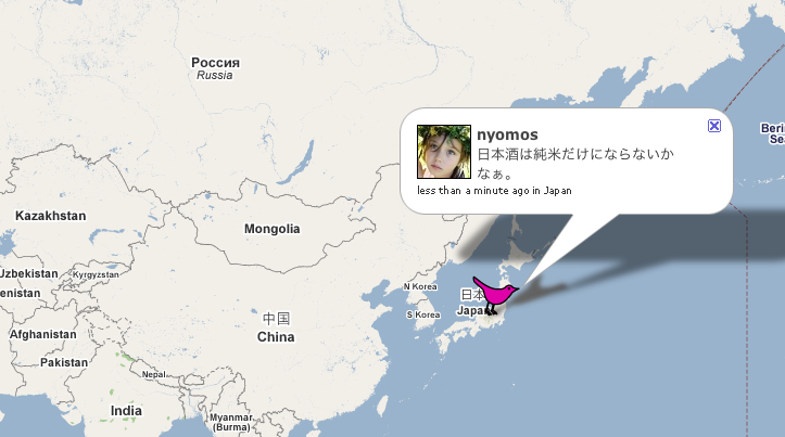](http://twittervision.com)
### TwitterVision3d
It’s TwitterVision taken to the next dimension.
[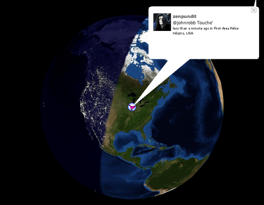](http://twittervision.com/maps/show_3d)
Analytics
---------
Maybe you don’t care so much about the relationships or locations, but what you’re really after is what everyone is Twittering about. These analytic visualization serve as a Twitter zeitgeist.
### TweetStat
[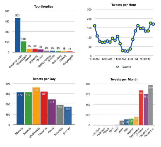](http://dcortesi.com/2007/12/27/twitter-stats/)
### TweetVolume
[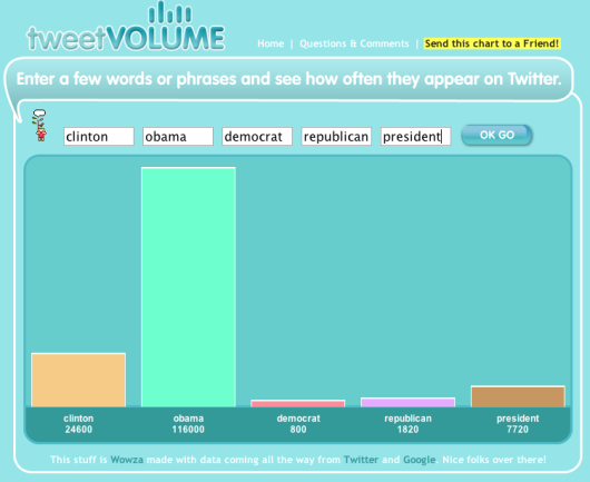](http://www.tweetvolume.com/)
### TwitStat
[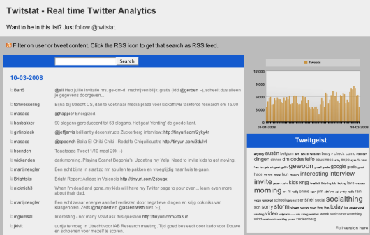](http://www.twitstat.com/)
### TwitterMeter
[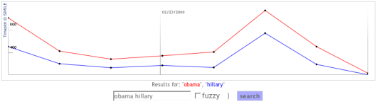](http://twittermeter.com/)
Abstract
--------
They’re not quite maps, not quite network diagrams, and not quite analytic tools. Rather they all follow some metaphor and encourage exploration.
### 24 o’clocks
Is it just me, or does this sound like a really good name for a band?
[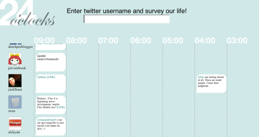](http://24oclocks.com/)
### TweetPad
Created at the [Visualizar workshop](https://flowingdata.com/2007/12/10/visualizar-showcase-officially-opened-at-medialab/)
, it’s actually more than just curves. In fact the blobbies are meant more for background while the main event is playing with the tweets.
[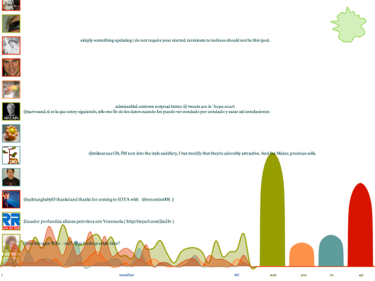](http://silentlycrashing.net/tweetpad/)
### Twitter Fountain
[](http://twitterfountain.nl/)
### Twitter Blocks
Created by the folks at Stamen. I [posted about Blocks](https://flowingdata.com/2007/09/02/exploring-twitter-with-blocks/)
when it came out.
[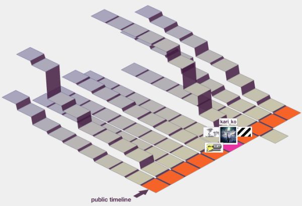](http://explore.twitter.com/blocks/)
### TwitterPoster
[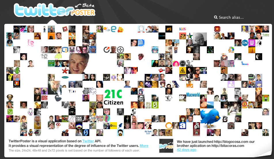](http://twitterposter.com/)
### TwitterVerse
[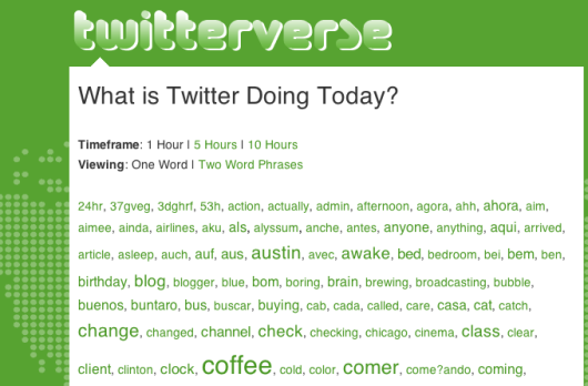](http://www.twitterverse.com/)
A lot, huh? All of these were made possible by the [Twitter API](http://twitter.com/help/api)
that allows developers to access Twitter data for free. Did I miss any other Twitter visualizations? Please leave the link in the comments below.
Follow Me On Twitter
--------------------
So now that you know what Twitter looks like, you can head on over and [“follow” me](http://twitter.com/flowingdata)
; or if you don’t have an account yet, you can [create one](https://twitter.com/signup)
in a few seconds.
If you don’t know what Twitter is or wondering what the point is, here’s a short video explaining Twitter in “plain English.”
### Related
* [Deleting your tweets with R](https://flowingdata.com/2022/11/11/deleting-your-tweets-with-r/ "Deleting your tweets with R")
* [Twitter Political Index measures feelings towards candidates](https://flowingdata.com/2012/08/01/twitter-political-index-measures-feelings-towards-candidates/ "Twitter Political Index measures feelings towards candidates")
* [Talking Ferguson on Twitter and localness](https://flowingdata.com/2014/08/18/talking-ferguson-on-twitter-and-localness/ "Talking Ferguson on Twitter and localness")
### 93 Comments
* Pingback: [Holy Moly » Blog Archive » Twitter Linklist 17 Ways to Visualize the Twitter Universe](http://www.konterfai.com/?p=335)
* Pingback: [links for 2008-03-13 :](http://ciberjornalismo.com/pontomedia/?p=2529)
* [whitneymcn](http://smr.absono.us)
— [March 13, 2008 at 5:22 pm](https://flowingdata.com/2008/03/12/17-ways-to-visualize-the-twitter-universe/#comment-49884)
Nice collection! On a peripherally related note, it looks like nobody has yet collected the data that I’m currently obsessing over: I want to figure out the largest set of Twitterers you can create such that all members of the set follow all other members of the set. (Note that that’s not the largest set that \*only\* follows one another, necessarily.)
It’d actually make for a beautiful visualization, too…
* [whitneymcn](http://smr.absono.us)
— [March 13, 2008 at 12:22 pm](https://flowingdata.com/2008/03/12/17-ways-to-visualize-the-twitter-universe/#comment-2170)
Nice collection! On a peripherally related note, it looks like nobody has yet collected the data that I’m currently obsessing over: I want to figure out the largest set of Twitterers you can create such that all members of the set follow all other members of the set. (Note that that’s not the largest set that \*only\* follows one another, necessarily.)
It’d actually make for a beautiful visualization, too…
* Pingback: [17 meios de visualizar o twitter | GOMA DE MASCAR | Quando explode faz pop!](http://goma.blogsome.com/2008/03/13/17-meios-de-visualizar-o-twitter/)
* [Nathan Yau](https://flowingdata.com/about-nathan)
— [March 13, 2008 at 8:23 pm](https://flowingdata.com/2008/03/12/17-ways-to-visualize-the-twitter-universe/#comment-49885)
@whitney: hmm, that would be interesting to see. time to start linking up and following like a mad man.
* Pingback: [17 modi per visualizzare Twitter : Catepol 3.0](http://www.catepol.net/2008/03/13/17-modi-per-visualizzare-twitter/)
* Pingback: [17 formas de visualizar tu universo Twitter | Bitperbit](http://www.bitperbit.com/2008/marcadores-sociales/17-formas-de-visualizar-tu-universo-twitter/)
* Pingback: [Hello. My name is … » Archive » links for 2008-03-14](http://www.imeldabettinger.com/blog/2008/03/13/links-for-2008-03-14/)
* Pingback: [Magnetbox - links for 2008-03-14](http://www.magnetbox.com/?p=2841)
* Pingback: [17款Twitter相关数æ®å¯è§†åŒ–的工具 | å¸•å…°æ˜ åƒ](http://parandroid.com/17-twitter-related-data-visualization-tool/)
* Pingback: [links for 2008-03-14 « Mandarine](http://mandarine.wordpress.com/2008/03/14/links-for-2008-03-14/)
* Pingback: [adaptive path » blog » Peter Merholz » Conversation with Julie Peters, Brand Manager, Virgin USA](http://www.adaptivepath.com/blog/2008/03/13/conversation-with-julie-peters-brand-manager-virgin-usa/)
* Pingback: [AlanLe.net » links for 2008-03-14](http://alanle.net/blog/?p=62)
* Pingback: [Visualising Twitter | Ugh!!'s Greymatter Honeypot](http://www.u-g-h.com/index.php/2008/03/14/visualising-twitter/)
* Pingback: [le blog à Ollie » Liens du jour](http://b-spirit.com/blogollie/?p=2393)
* Pingback: [Better Communication Results » links for 2008-03-14](http://leehopkins.net/2008/03/14/links-for-2008-03-14/)
* Pingback: [links for 2008-03-14 | mad dog in the fog](http://www.mdoeff.com/blog/2008/03/14/links-for-2008-03-14/)
* Pingback: [“17 Ways to Visualize the Twitter Universe” « Graduation project Jori de Goede 2008](http://gpjdg.wordpress.com/2008/03/14/17-ways-to-visualize-the-twitter-universe/)
* Pingback: [17 frenéticas formas de ver Twitter » Esquizopedia](http://www.esquizopedia.com/2008/03/14/17-freneticas-formas-de-ver-twitter/)
* Pingback: [Web 2.0: 17 formas distinas de explorar Twitter - Bitelia](http://bitelia.com/2008/03/14/17-formas-distinas-de-explorar-twitter/)
* Pingback: [Wayne State Web Communications Blog » Blog Archive » \[Friday Links\] The PI Day Edition](http://wcs.wayne.edu/blog/2008/03/14/friday-links-the-pi-date-edition/)
* Pingback: [beyond tellerrand » Vizualizing Twitter](http://blog.multivisio.org/?p=151)
* Pingback: [Daily Links | Akkam's Razor](http://www.akkamsrazor.com/2008/03/14/daily-links-504/)
* Pingback: [rascunho » Blog Archive » links for 2008-03-14](http://blog.bruno.locaweb.com.br/2008/03/14/links-for-2008-03-14/)
* Pingback: [17 Ways to Visualize the Twitter Universe](http://www.listropolis.com/?p=28)
* Pingback: [links for 2008-03-14 « lieblinks](http://lieblinks.wordpress.com/2008/03/14/links-for-2008-03-14/)
* Pingback: [17 ways to visualize Twitter and its Tweets | money news blog](http://moneyinformant.com/2008/03/14/17-ways-to-visualize-twitter-and-its-tweets/)
* Pingback: [Twitterati: Get Yer Analytics Here!](http://www.nsiweblog.com/2008/03/twitterati-get-yer-analytics-here)
* Pingback: [Sean’s Mental Walkabout » Blog Archive » links for 2008-03-15](http://dague.net/2008/03/15/links-for-2008-03-15/)
* Pingback: [Dancing Monkey Mania » Blog Archive » links for 2008-03-15](http://community.uaf.edu/~fncll/blog/2008/03/14/links-for-2008-03-15/)
* Pingback: [Visualize the Web - Nerdcore](http://www.nerdcore.de/wp/2008/03/15/visualize-the-web/)
* Pingback: [Explore formas de visualizar a informação através do Twitter » em\_Face :: botando a cara na web](http://emface.comopiniao.com/2008/03/15/explore-formas-de-visualizar-a-informacao-atraves-do-twitter/)
* Pingback: [links for 2008-03-15 | Moewes.com](http://www.moewes.com/2008/03/15/links-for-2008-03-15/)
* [Douglas Karr](http://www.douglaskarr.com)
— [March 15, 2008 at 9:09 am](https://flowingdata.com/2008/03/12/17-ways-to-visualize-the-twitter-universe/#comment-2264)
Another up and coming is Hashtags: [http://hashtags.org/](http://hashtags.org/)
* Pingback: [TISCAR :: Periodismo -:- Blogs -:- Educación » Formas de visualizar Twitter](http://tiscar.com/2008/03/15/formas-de-visualizar-twitter/)
* Pingback: [17 Ways to Visualize the Twitter Universe |](http://www.pixelpod.co.uk/blog/2008/03/15/17-ways-to-visualize-the-twitter-universe/)
* Pingback: [17 maneras de visualizar Twitter - esTwitter.com](http://estwitter.com/2008/03/16/17-maneras-de-visualizar-twitter/)
* Pingback: [Delicious Links - 20 links - tools, gamers, workhacks, code, links « // Internet Duct Tape](http://internetducttape.com/2008/03/16/delicious-links-20-links-tools-gamers-workhacks-code-links/)
* Pingback: [QuickLinks vom 13. März bis zum 14. März — instant-thinking.de](http://instant-thinking.de/2008/03/15/quicklinks-vom-13-mrz-bis-zum-14-mrz/)
* Pingback: [Visualisez votre réseau Twitter ! | Another Pinky Punky](http://www.nolifeclub.org/web/visualisez-votre-reseau-twitter/)
* Pingback: [Sunday links « Then again, I might be wrong](http://thenagainimightbewrong.com/2008/03/16/sunday-links-4/)
* [Benny](http://www.geekblogger.net)
— [March 16, 2008 at 4:19 pm](https://flowingdata.com/2008/03/12/17-ways-to-visualize-the-twitter-universe/#comment-49887)
Can I say “Awesome List!” Really nice post you got here. Keep up the good work mate.
* Pingback: [17 Ways to Visualize Twitter « En el Medio](http://r0mina.wordpress.com/2008/03/16/17-ways-to-visualize-twitter/)
* Pingback: [Tracking the Buzz: How to Monitor your Brand Effectively | Social Media Trader](http://socialmediatrader.com/tracking-the-buzz-tools-to-monitor-your-brand-effectively/)
* Pingback: [Twitter-Visualisierungen at franztoo](http://www.franztoo.de/?p=801)
* Pingback: [frEdSCAPEs 3.0 » Blog Archive » TouchGraph | Products: Google Browser](http://fredscapes.nl/index.php/2008/03/17/touchgraph-products-google-browser/)
* Pingback: [BLADDA » Blog Archive » Twitter in beeld gebracht.](http://www.ladda.be/bladda/?p=256)
* Pingback: [Stilgherrian · links for 2008-03-17](http://stilgherrian.com/daily_links/links-for-2008-03-17/)
* Pingback: [Ambiome\[Dot\]Net » Les liens du jour : CSS, twitter, RSS et vie priv](http://ambiome.net/blog/?p=1938)
* [kimi wei](http://blog.kim.thewei.com)
— [March 18, 2008 at 12:38 pm](https://flowingdata.com/2008/03/12/17-ways-to-visualize-the-twitter-universe/#comment-49888)
Yeah, cool visualizations.
* [kimi wei](http://blog.kim.thewei.com)
— [March 18, 2008 at 7:38 am](https://flowingdata.com/2008/03/12/17-ways-to-visualize-the-twitter-universe/#comment-2360)
Yeah, cool visualizations.
* Pingback: [Easy way to let people Twitter your blog posts - TinyURL plugin](http://www.askowlbert.com/about-the-topic/easy-way-to-let-people-twitter-your-blog-posts-tinyurl-plugin/)
* Pingback: [Easy way to let people Twitter your blog posts - TinyURL plugin usable for tweets!](http://www.askowlbert.com/about-the-topic/easy-way-to-let-people-twitter-your-blog-posts-tinyurl-plugin-usable-for-tweets/)
* cnansen — [March 18, 2008 at 6:11 pm](https://flowingdata.com/2008/03/12/17-ways-to-visualize-the-twitter-universe/#comment-49889)
Another interesting Tweet Map – [http://www.mytweetmap.com](http://www.mytweetmap.com)
* cnansen — [March 18, 2008 at 1:11 pm](https://flowingdata.com/2008/03/12/17-ways-to-visualize-the-twitter-universe/#comment-2377)
Another interesting Tweet Map – [http://www.mytweetmap.com](http://www.mytweetmap.com)
* Pingback: [MacroHW » Blog Archive » 17 frenéticas formas de ver Twitter](http://www.macrohw.com/blog/?p=782)
* Pingback: [Visualizing Twitter « Charlotte-Anne Lucas](http://charlotteanne.wordpress.com/2008/03/18/visualizing-twitter/)
* Pingback: [links for 2008-03-18 | Chris Dalby Untangles Networks](http://www.yellowpark.net/cdalby/index.php/2008/03/18/links-for-2008-03-18/)
* Pingback: [AKA Riptide Furse » Krossbow’s del.icio.us bookmarks for March 18th - Add me to your del.icio.us network!](http://blog.discoveryeducation.com/fred_delventhal1/2008/03/18/krossbows-delicious-bookmarks-for-march-18th-add-me-to-your-delicious-network/)
* Pingback: [links for 2008-03-19](http://www.samiviitamaki.com/2008/03/19/links-for-2008-03-19/)
* Pingback: [17 Ways to Visualize the Twitter Universe | David Bisset: Web Designer, Coder, Wordpress Guru](http://www.davidbisset.com/2008/03/19/17-ways-to-visualize-the-twitter-universe/)
* Pingback: [links for 2008-03-19](http://www.lcslimited.co.uk/dcampbell/index.php/2008/03/19/links-for-2008-03-19/)
* Pingback: [FutureGov » Useful links » links for 2008-03-19](http://www.futuregovconsultancy.com/index.php/2008/03/19/links-for-2008-03-19/)
* Pingback: [links for 2008-03-20 « daizhixin’s blog](http://daizhixin.wordpress.com/2008/03/20/links-for-2008-03-20/)
* Pingback: [Weekly Points of Interest 2008-03-20 at Experience Matters](http://experiencematters.criticalmass.com/2008/03/20/weekly-points-of-interest-2008-03-20/)
* Pingback: [Bookmarks for March 19th through March 20th | dois pontos, barra barra](http://tharso.com/blog/2008/03/20/bookmarks-for-march-19th-through-march-20th/)
* Pingback: [Icio Week 12(b) - Twitter Posts « Unique-Frequency](http://uniquefrequency.wordpress.com/2008/03/23/icio-week-12b-twitter-posts/)
* Pingback: [grockwel: Research Notes » Blog Archive » FlowingData: 17 Ways to Visualize the Twitter Universe](http://www.philosophi.ca/theoreti/?p=2035)
* Pingback: [The Best Tools for Visualization](http://www.learnbydoing.org/?p=121)
* Pingback: [17 formas distintas de explorar Twitter - ¿Que miras?](http://www.quemiras.es/internet/17-formas-distintas-de-explorar-twitter.htm)
* Pingback: [InternalComms · Twitter, como un telegrama](http://internalcomms.com.ar/?p=49)
* Pingback: [rob zand » Blog Archive » links for 2008-03-29](http://www.robzand.com/blog/links-for-2008-03-29)
* Pingback: [Darren Herman - Marketing, Advertising, Media and Technology Blog » Blog Archive » links for 2008-03-30](http://www.darrenherman.com/2008/03/30/links-for-2008-03-30/)
* Pingback: [This Month In SEO - 3/08 - TheVanBlog](http://www.yellowhousehosting.com/resources/?p=527)
* Pingback: [Twitter - An Upcoming BIG Player in Social Media « SEO Ahmedabad: A place to learn & share all about SEO](http://keshwani.wordpress.com/2008/04/03/twitter-an-upcoming-big-player-in-social-media/)
* Pingback: [Brian Griffin - Twitter Visualization](http://briangriffin.org/blog/2008/03/13/twitter-visualization/)
* Pingback: [MKTG2032 Links Post 11: Analytics, SEO, Semantic Web patterns « Mktg2032’s Weblog](http://mktg2032.wordpress.com/2008/04/04/mktg2032-links-post-11-analytics-seo-semantic-web-patterns/)
* Pingback: [Utilidades para Twitter III at Pisito en Madrid](http://www.pisitoenmadrid.com/blog/2008/04/utilidades-para-twitter-iii/)
* Pingback: [Twitter: Redes, Video e Sondagens | Networks, Video and Polls « O Lago | The Lake](http://olago.wordpress.com/2008/04/14/twitterredesvideoesondagens/)
* Pingback: [Trabajando con la API de Twitter desde PHP](http://www.maestrosdelweb.com/editorial/trabajando-con-la-api-de-twitter-desde-php/)
* Pingback: [Blog Clippings » eCuaderno](http://www.ecuaderno.com/2008/04/24/blog-clippings-33/)
* Pingback: [rein:MEOW » Blog Archive » èª å¥½ç‰©-twitter週邊æœå‹™ 20+](http://rein.murmur.in/?p=426)
* Pingback: [Love, Hate, Think, Believe, Feel and Wish on Twitter | FlowingData](https://flowingdata.com/2008/04/30/love-hate-think-believe-feel-and-wish-on-twitter/)
* Pingback: [Simone Brunozzi » Blog Archive » Twitter Power!](http://www.brunozzi.com/en/2008/05/01/twitter-power/)
* [Jeremy](http://acid.net.au)
— [May 9, 2008 at 1:40 am](https://flowingdata.com/2008/03/12/17-ways-to-visualize-the-twitter-universe/#comment-49890)
hey – you can also add [http://dipity.com](http://dipity.com)
too – they have some cool timelines that can mash up your twitter feed with your flicker feed (among others)
* [Lykle](http://www.twitterfountain.nl)
— [May 14, 2008 at 6:52 am](https://flowingdata.com/2008/03/12/17-ways-to-visualize-the-twitter-universe/#comment-49891)
Thanks for including Twitterfountain in your list. Perhaps a little explanation might help make it even more interesting: Twitterfountain allows you to visualise Tweets that contain any keyword you choose, and shows Flickr-images in the background, based on any keyword you select. It is easily embeddable as well.
* [Valdis Krebs](http://www.thenetworkthinker.com)
— [July 29, 2008 at 9:44 pm](https://flowingdata.com/2008/03/12/17-ways-to-visualize-the-twitter-universe/#comment-49892)
Here is 18, 19, and 20…
[http://www.thenetworkthinker.com/2008/07/twitter-maps.html](http://www.thenetworkthinker.com/2008/07/twitter-maps.html)
Enjoy!
* [Valdis Krebs](http://www.thenetworkthinker.com)
— [July 29, 2008 at 5:44 pm](https://flowingdata.com/2008/03/12/17-ways-to-visualize-the-twitter-universe/#comment-11929)
Here is 18, 19, and 20…
[http://www.thenetworkthinker.com/2008/07/twitter-maps.html](http://www.thenetworkthinker.com/2008/07/twitter-maps.html)
Enjoy!
* [Omar Chapa](http://www.rioserver.com)
— [August 6, 2008 at 8:28 pm](https://flowingdata.com/2008/03/12/17-ways-to-visualize-the-twitter-universe/#comment-49893)
Wow great visualizations some day ill do one :)
* [Omar Chapa](http://www.rioserver.com)
— [August 6, 2008 at 4:28 pm](https://flowingdata.com/2008/03/12/17-ways-to-visualize-the-twitter-universe/#comment-13256)
Wow great visualizations some day ill do one :)
---
# 360 Variables Describing the United States – FlowingData
360 Variables Describing the United States
==========================================
[September 5, 2007](https://flowingdata.com/2007/09/05/360-variables-describing-the-united-states/)
### Topic
**[Data Sources](https://flowingdata.com/category/statistics/data-sources/)
**
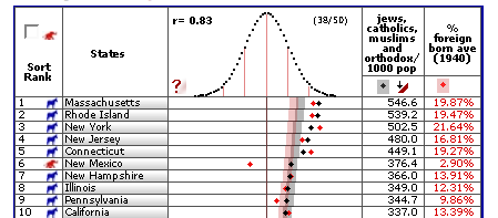
[Order From Randomness](http://www.orderfromrandomness.com)
has an extensive data collection featuring 360 variables describing all 50 states. The indicators are placed in 25 groups including birth rates, death rates, disease, environment, energy, nutrition, and education.
Most of the data seems to range somewhere between 1999 and 2005, and I believe there’s four variables to 2007. There’s also a simple data browser featuring a distribution curve and some summary statistics. Generally, students seem to like the extensive set of variables, says one of my professors.
### Related
* [Education Statistics Free, Available, and Waiting for You](https://flowingdata.com/2007/10/15/education-statistics-free-available-and-waiting-for-you/ "Education Statistics Free, Available, and Waiting for You")
* [Abortion Rates in the United States, 1970-2005](https://flowingdata.com/2009/06/12/abortion-rates-in-the-united-states-1970-2005/ "Abortion Rates in the United States, 1970-2005")
* [Statistics vs. Stories](https://flowingdata.com/2010/11/29/statistics-vs-stories/ "Statistics vs. Stories")
---
# Published Data and Results Not Always Legit – FlowingData
Published Data and Results Not Always Legit
===========================================
[September 15, 2007](https://flowingdata.com/2007/09/15/published-data-and-results-not-always-legit/)
### Topic
**[Statistics](https://flowingdata.com/category/statistics/)
**
In a previous life, I thought anything published in an academic journal was legit, but as a stat student, the story is quite the opposite. Whenever I hear results or see data from some study, I become an instant skeptic.
_Were there really that many deaths from 1998 to 2007? Did housing prices really increase that much over the past decade? Do that many people really support that presidential candidate?_
Whether my skepticism is a good thing, that’s still up for debate. However, the article, [Most Science Studies Appear to Be Tainted By Sloppy Analysis](http://online.wsj.com/article/SB118972683557627104.html?mod=todays_us_no)
, in the Wall Street Journal says I should question.
> We all make mistakes and, if you believe medical scholar John Ioannidis, scientists make more than their fair share. By his calculations, most published research findings are wrong.
>
> …
>
> Statistically speaking, science suffers from an excess of significance. Overeager researchers often tinker too much with the statistical variables of their analysis to coax any meaningful insight from their data sets. “People are messing around with the data to find anything that seems significant, to show they have found something that is new and unusual,” Dr. Ioannidis said.
Not That Surprised
------------------
One of the assignments on my qualifying exam was to look at data from an article that had been published in _Science_ (a very prominent academic journal). The final results of the authors’ “analysis” were that wide-ranging animals should not be placed in captivity, because it is poor for their health. The recommendation was to either provide more space in zoos or to only house animals that are not wide-ranging. The authors made a bunch of assumptions about the data, like independence and causality, that weren’t warranted, and carried out a very poor analysis leading to biased conclusions.
The article on wide-ranging animals was clearly chosen by my professor because the results blatantly sucked, but I can only imagine how many other pseudo-results are out there that aren’t as obvious. Is it fair to say that _most_ science studies are sketchy? That might be a slight exaggeration, but probably not too far off.
\[via [Statistical Modeling, Causal Inference, and Social Science](http://www.stat.columbia.edu/~cook/movabletype/archives/2007/09/most_science_st.html)\
\]
### Related
* [Not so Hot Graphs in Academic Papers](https://flowingdata.com/2007/09/03/not-so-hot-graphs-in-academic-papers/ "Not so Hot Graphs in Academic Papers")
* [Women as academic authors over the years →](http://chronicle.com/article/Woman-as-Academic-Authors/135192/ "Women as academic authors over the years →")
* [High-resolution maps of science](https://flowingdata.com/2012/01/02/high-resolution-maps-of-science/ "High-resolution maps of science")
---
# Overgeneralizing on Chinese Takeout – FlowingData
Overgeneralizing on Chinese Takeout
===================================
[September 20, 2007](https://flowingdata.com/2007/09/20/overgeneralizing-on-chinese-takeout/)
### Topic
**[Miscellaneous](https://flowingdata.com/category/miscellaneous-data/)
**
My roommate pointed out a couple of weeks ago that I always get Chinese takeout for dinner; however, we never get home at the same time, and most days, she’s not even in the apartment when I arrive. How could she, a very bright and educated individual, come to such a conclusion after seeing so little data?
In fact, by my count, she only saw me bring home Chinese takeout twice before she decided that yes, I do in fact eat Chinese every single day of the week. In reality I rotate through four choices — sandwiches, Japanese, pizza, or Chinese with a few ventures out every now and then. This week I’ve had Japanese, hot dogs, Mediterranean twice, sandwich, burger, and Chinese.
This is one of the reasons we need Statistics. What we perceive isn’t always the truth. I might have had Chinese takeout on Monday and Friday, but do you know what I had on the days in between? If no, can you make an educated guess?
### Related
* [Where restaurants serve Asian cuisines in the U.S.](https://flowingdata.com/2024/01/18/where-restaurants-serve-asian-food-in-the-u-s/ "Where restaurants serve Asian cuisines in the U.S.")
* [Why you should buy the bigger pizza](https://flowingdata.com/2014/02/28/why-you-should-buy-the-bigger-pizza/ "Why you should buy the bigger pizza")
* [Looking for the best pizza for different styles in different places](https://flowingdata.com/2023/09/05/looking-for-the-best-pizza-for-different-styles/ "Looking for the best pizza for different styles in different places")
### 1 Comment
* Pingback: [FlowingData / Sifting Through My Mobile Phone Logs](https://flowingdata.com/2007/10/09/sifting-through-my-mobile-phone-logs/)
---
# Prisoners Getting Shipped to Other States – FlowingData
Prisoners Getting Shipped to Other States
=========================================
[July 31, 2007](https://flowingdata.com/2007/07/31/prisoners-getting-shipped-to-other-states/)
### Topic
**[The Times](https://flowingdata.com/category/the-times/)
**
I made this graphic early last week, or actually, maybe it was during my first week. In any case, they finally ran the story, and my graphic is on the front page of The Times Online (as of 1:39am Eastern time).

You can read the [article](http://www.nytimes.com/2007/07/31/us/31prisons.html?hp)
. It’s pretty interesting. In a nutshell, prisons are getting crowded, so states are shipping inmates to out-of-state private prisons. For example, California is sending prisoners all the way to Wheelright, Kentucky.
### Related
* [Coronavirus cases rising in prisons](https://flowingdata.com/2020/11/13/coronavirus-cases-in-prisons/ "Coronavirus cases rising in prisons")
* [1 in 5 prisoners had Covid-19, a grid map](https://flowingdata.com/2020/12/18/1-in-5-prisoners-had-covid-19-a-grid-map/ "1 in 5 prisoners had Covid-19, a grid map")
* [Cost of a Big Mac at every McDonald’s in the United States](https://flowingdata.com/2024/01/29/cost-of-a-big-mac-at-every-mcdonalds-in-the-united-states/ "Cost of a Big Mac at every McDonald’s in the United States")
---
# A Repetitive Hate for Statistics – FlowingData
A Repetitive Hate for Statistics
================================
[September 17, 2007](https://flowingdata.com/2007/09/17/a-repetitive-hate-for-statistics/)
### Topic
**[Statistics](https://flowingdata.com/category/statistics/)
**
When I tell people that I’m a graduate student in Statistics, there are two responses that I get more than any others. The most popular of the two usually goes something like this.
> Oh man, I hated statistics in college. The professor totally sucked and I never knew what was going on. All I remember is mean and some… curve thing? I don’t know. What’s standard deviation anyways?
I threw that standard deviation bit in for effect. No one actually asks about it, and I’m pretty sure most people don’t even remember ever hearing about it. It’s that whole selective memory thing — blocking out the bad and remembering only the happies.
So anyways, every time someone tells me they absolutely hated statistics in college, I die a little inside and start bawling like a two-year-old whose lost her bottle. No, no, I’m kidding, but the first thing I think is, “Gee, thanks for letting me know that! Like I really wanted to know that you hate what I study. You know what? I think I hate you a little bit now.” I’m exaggerating a tad, but it’s slightly frustrating after hearing it so many times.
But why do so many people hate statistics?
Bad Teachers
------------
If the person went to [Berkeley](http://www.stat.berkeley.edu/)
or [UCLA](http://www.stat.ucla.edu)
, I immediately ask him who his professor was for introduction to stat. Sometimes, after I find out the _who_, I understand the _why_. I’ve had my share of bad professors (particularly in electrical engineering) who are great researchers, but poor teachers. Some just don’t care. Others don’t know how to communicate.
Good Teachers
-------------
So how can we improve the bad teacher situation? There are [plenty](http://www.stat.auckland.ac.nz/~iase/publications.php?show=serj)
of [journals](http://www.amstat.org/publications/jse/)
dedicated to answering this question, but two professors come to mind.
There are two professors who have helped me appreciate statistics, have influenced the way I think about data, and most importantly, make me want to learn more. One professor was always super-prepared. He had clearly gone through his notes the night before and really didn’t even need his notes while he taught. The other professor was almost never prepared and had clearly just finished typing up his notes before getting to class.
That’s how they were different, but it’s their similarities that made them good teachers. They both knew the material they were teaching really well; they both were always excited to spread their knowledge; and they both knew down to their very soul that the stuff they were teaching was worth learning. There were also really pertinent and current projects that students could really sink their teeth into.
I think a lot of people are served their first taste of statistics by poor teachers, and so after that intro course, they never want to try it again. If you got served nasty canned spinach as a child, you’re probably going to have a strong aversion to spinach even if it is fresh and oh so tasty.
Hence, improve the intro teaching and less people will hate. I know, it’s very very much easier said than done, but I can hope, right? Then maybe one day I’ll tell someone I’m a graduate student in statistics, and they’ll reply, “Oh wow, that’s awesome.” Or even better, “Yeah? Me too.”
Any guesses on the second most common response?
### Related
* [Position Available for Professor of Statistics at UCLA](https://flowingdata.com/2008/03/26/position-available-for-professor-of-statistics-at-ucla/ "Position Available for Professor of Statistics at UCLA")
* [Harassment in the Statistics field](https://flowingdata.com/2017/12/14/harassement-in-the-statistics-field/ "Harassment in the Statistics field")
* [Do You Hate Statistics as Much as Everyone Else?](https://flowingdata.com/2008/12/15/do-you-hate-statistics-as-much-as-everyone-else/ "Do You Hate Statistics as Much as Everyone Else?")
### 3 Comments
* bea — [September 19, 2007 at 7:57 pm](https://flowingdata.com/2007/09/17/a-repetitive-hate-for-statistics/#comment-33)
response #2: show me the money
* [Nathan](https://flowingdata.com)
— [October 1, 2007 at 12:32 am](https://flowingdata.com/2007/09/17/a-repetitive-hate-for-statistics/#comment-34)
@bea: That would be response #3 :)
Response #2: Statistics… so what do you do with that?
* Ryan — [November 22, 2007 at 9:35 pm](https://flowingdata.com/2007/09/17/a-repetitive-hate-for-statistics/#comment-49687)
You’re a Statistics grad student? “Yeah? me too.” ;-)
---
# iPod Design and Apple Stock Over the Years – FlowingData
iPod Design and Apple Stock Over the Years
==========================================
[September 9, 2007](https://flowingdata.com/2007/09/09/ipod-design-and-apple-stock-over-the-years/)
### Topic
**[Statistical Visualization](https://flowingdata.com/category/visualization/statistical-visualization/)
**
Wall Street Journal put up a nice little graphic showing the [evolution of the iPod](http://online.wsj.com/public/resources/documents/info-ipod0709.html)
along with Apple’s stock price. Semi-informative, I guess. Probably more of a fun graphic than anything else. I think it’s slightly misleading, suggesting the iPod was the only reason Apple’s stock changed. Let’s not forget about the iBook, iMac, Macbook, etc releases. Nevertheless, it’s cool to see Apple’s sexy design over the years.
\[link via [Core77](http://www.core77.com/blog/business/visual_history_of_the_ipod__7405.asp)\
\]
### Related
* [Stock trading game](https://flowingdata.com/2015/10/20/stock-trading-game/ "Stock trading game")
* [What Do You Think of This Evolution Graphic?](https://flowingdata.com/2009/03/11/what-do-you-think-of-this-evolution-graphic/ "What Do You Think of This Evolution Graphic?")
* [Multiplayer stock market game with real money](https://flowingdata.com/2017/05/30/multiplayer-stock-market-game-with-real-money/ "Multiplayer stock market game with real money")
---
# Displaying Data as Efficiently as Possible – FlowingData
Displaying Data as Efficiently as Possible
==========================================
[September 12, 2007](https://flowingdata.com/2007/09/12/displaying-data-as-efficiently-as-possible/)
### Topic
**[Design](https://flowingdata.com/category/design/)
**

The above picture isn’t totally related, but I just had to put it up. It’s so amusing. A family of five plus groceries on one motorcycle! I think there’s room for one more on the handle bars.
So in efforts to make the above picture relevant…
If I’ve learned anything during my internship, it’s how to display as much information as possible in a small amount of space. Two things have helped me in trying to achieve New York Times graphics department worthiness:
* Decide what data / information is important
* K.I.S.S. — Keep it simple, stupid. ([The Office](http://www.nbc.com/The_Office/)
, Thursdays on NBC)
Decide What Data is Important
-----------------------------
When you get a large data set, your first impulse might be to show all of it. For some cases, like exploratory data analysis (EDA), this is what you want. However, when you’re trying to show off results or display some kind of idea, then you might not need to point to all 100,000 values in your data set. Instead, evaluate all the data you have and then ask yourself what interesting thing in the data you’re trying to show.
Keep it Simple
--------------
Once you’ve established what the point is, make sure your graphic draws attention to that point. Don’t clutter with giant labels or overly bright colors that overpower your graphic’s main idea. For example, if you look at a bar graph, I don’t think the labels should be the first thing you notice. Rather, you should notice the bars, the real meat of the graphic, first and then recognize the labels second.
Oh, and don’t forget about white space.
Super busy graphics are just plain hard to read. Let the data breathe.
I guess my main point is that you can try to display as much information as possible in a small amount of space, but if you’re not careful and put too much, your motorcycle will tip over. See what I did there the whole motorcycle idea? You know, full circle. Circle of life. Hakuna matata. Oh forget it.
### Related
* [5 misconceptions about visualization](https://flowingdata.com/2011/09/23/5-misconceptions-about-visualization/ "5 misconceptions about visualization")
* [Seeing the Dust (The Process 092)](https://flowingdata.com/2020/06/04/process-092-dust/ "Seeing the Dust (The Process 092)")
* [Making annotation easier with d3.js](https://flowingdata.com/2017/03/06/making-annotation-easier-with-d3-js/ "Making annotation easier with d3.js")
---
# West Coast Stata Users Group, Oct. 25 – FlowingData
West Coast Stata Users Group, Oct. 25
=====================================
[September 17, 2007](https://flowingdata.com/2007/09/17/west-coast-stata-users-group-oct-25/)
### Topic
**[Site News](https://flowingdata.com/category/announcements/)
**
For those interested in or who already use [Stata](http://stata.com)
, the first [Stata users group on the west coast](http://www.stata.com/meeting/wcsug07/)
is coming up on October 25-26. It’s $150 for both days and of course students get a good discount at only $50. I’m an [R](http://r-project.org)
user myself, but to each his own.
> Stata Users Group meetings started in Britain in 1995 and have spread to Italy, Sweden, Germany, The Netherlands, Spain, Australia, and the East Coast. Talks are intended to be accessible to a general audience with mixed levels of expertise in Stata and statistics. Stata developers will also attend, both to present new Stata features and to take notes during the popular “Wishes and grumbles†session. We hope you will consider joining the meeting as a presenter or an attendee.
### Related
* [Accessible visualization with Olli JavaScript library](https://flowingdata.com/2022/10/04/accessible-visualization-with-olli-javascript-library/ "Accessible visualization with Olli JavaScript library")
* [Barely a map of the west coast](https://flowingdata.com/2023/01/19/barely-a-map-of-the-west-coast/ "Barely a map of the west coast")
* [What Field of Expertise Do You Study or Work In? \[POLL RESULTS\]](https://flowingdata.com/2008/05/07/what-field-of-expertise-do-you-study-or-work-in-poll-results/ "What Field of Expertise Do You Study or Work In? [POLL RESULTS]")
---
# Social Data Analysis Workshop – FlowingData
Social Data Analysis Workshop
=============================
[October 12, 2007](https://flowingdata.com/2007/10/12/social-data-analysis-workshop/)
### Topic
**[Site News](https://flowingdata.com/category/announcements/)
**
I stumbled across the [Social Data Analysis workshop](http://researchweb.watson.ibm.com/visual/social_data_analysis_workshop/)
, happening as part of [CHI 2008](http://www.chi2008.org/)
. It is being organized by none other than IBM Visual Communication Lab’s Martin Wattenberg and Fernanda Viégas in addition to UC Berkeley’s Jeffrey Heer and Maneesh Agrawala.
> The goals of this workshop are to:
>
> * Bring together, for the first time, the social data analysis community
> * Examine the design of social data analysis sites today
> * Discuss the role that visualizations play in social data analysis
> * Explore how users are utilizing the various sites that allow them to exchange data-based insights
>
> We seek researchers and practitioners whose work explores social data analysis and/or social uses of visualizations. We hope for a lively mix of people actively involved in building sites and academics who study the dynamics of social software.
The workshop happens during CHI, April 5-10, and you need to submit a 2-4 page position paper by October 31, 2007. Oh and by the way, it’s in Florence, Italy. Not too shabby.
### Related
* [Sharing Personal Data to Push Social Data Analysis](https://flowingdata.com/2007/11/19/sharing-personal-data-to-push-social-data-analysis/ "Sharing Personal Data to Push Social Data Analysis")
* [Issues Democratic hopefuls are talking about on social media](https://flowingdata.com/2019/04/09/issues-democratic-hopefuls-are-talking-about-on-social-media/ "Issues Democratic hopefuls are talking about on social media")
* [Decline in data for AI bots to scrape](https://flowingdata.com/2024/08/01/decline-in-data-for-ai-bots-to-scrape/ "Decline in data for AI bots to scrape")
---
# Useful Stat Resources for R and GRASS – FlowingData
Useful Stat Resources for R and GRASS
=====================================
[October 1, 2007](https://flowingdata.com/2007/10/01/useful-stat-resources-for-r-and-grass/)
### Topic
**[Software](https://flowingdata.com/category/software/)
**
UCLA Statistics has a pretty extensive [list of resources](http://info.stat.ucla.edu/grad/)
on how to use R and GRASS. For those unfamiliar, R is a programming language and environment for statistical computing and graphics. GRASS is an open source geographic information system (GIS). And of course, both are completely free and completely useful.
### Related
* [Learn R interactively with the swirl package](https://flowingdata.com/2014/01/29/learn-r-interactively-with-the-swirl-package/ "Learn R interactively with the swirl package")
* [What is R, what it was, and what it will become](https://flowingdata.com/2019/07/05/what-is-r-what-it-was-and-what-it-will-become/ "What is R, what it was, and what it will become")
* [Book: The Art of R Programming](https://flowingdata.com/2011/11/16/book-the-art-of-r-programming/ "Book: The Art of R Programming")
### 1 Comment
* [Ryan](http://info.stat.ucla.edu/grad)
— [November 22, 2007 at 4:26 pm](https://flowingdata.com/2007/10/01/useful-stat-resources-for-r-and-grass/#comment-454)
Thanks Nathan! I appreciate the addition. There is also a section on LaTeX now and I will be adding Python over Winter Break.
Due to classes, I’ve fallen behind on making sure all of the links are still functioning, but a couple of scripts will take care of that. It is still an infant, but I am hoping to incorporate it in a potentially larger project that will have a better URL :-)
---
# John Maeda Speaks About Simplicity – FlowingData
John Maeda Speaks About Simplicity
==================================
[September 22, 2007](https://flowingdata.com/2007/09/22/john-maeda-speaks-about-simplicity/)
### Topic
**[Design](https://flowingdata.com/category/design/)
**
John Maeda, a professor in the [MIT Media Lab](http://www.media.mit.edu/)
, gives his talk on simplicity and how it plays a role in his position between technology and art. I read John’s book, _[The Laws of Simplicity](http://lawsofsimplicity.com/)
_, a few months ago, and yes, as many will tell you, it’s a pretty simple book. There are ten laws of simplicity that boil down to the main point — get rid of everything that’s unnecessary and nothing more. Although nothing earth-shattering, John’s book makes some good points and has some interesting anecdotes from his many trips to Japan and family life; it’s a nice read for some lazy Sunday. He’s also a pretty entertaining speaker, so sit back, relax, and enjoy yet another TED talk.
### Related
* [Naked Statistics](https://flowingdata.com/2014/05/08/naked-statistics/ "Naked Statistics")
* [Plant life cycle shows a breathing Earth](https://flowingdata.com/2015/12/08/plant-life-cycle-shows-a-breathing-earth/ "Plant life cycle shows a breathing Earth")
* [Breathing Earth](https://flowingdata.com/2013/08/01/breathing-earth/ "Breathing Earth")
---
# Misleading Map of Buffalo Snow – FlowingData
Misleading Map of Buffalo Snow
==============================
[September 27, 2007](https://flowingdata.com/2007/09/27/misleading-map-of-buffalo-snow/)
### Topic
**[Maps](https://flowingdata.com/category/visualization/mapping/)
, [Mistaken Data](https://flowingdata.com/category/statistics/mistaken-data/)
**
[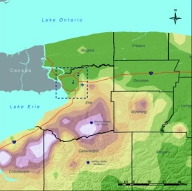](http://www.cas.buffalo.edu/commentary/buffalo-weather.html)
I saw this map of the average snow levels in Buffalo. I think I just glanced at it and that was about it. When you first look at the map, what do you make of the colors? When I see green for snow levels, I think _no snow_. Am I crazy? What do you think?
So the image was kind of in my head all this summer while I was in NYC. When I told people that I was going back to Buffalo after my internship, they always gave this look that said, “Ha, have fun during the winter,” and then they would actually say it and then go into how they measure the snow level by comparing it against a giant pole.
Smart guy that I am, I thought to myself, “Can’t be that bad. The map that I saw on the University of Buffalo page showed the winter wasn’t really that bad.”
I went back to the map just now, preparing to compare Buffalo weather data to New York city data. I was going to prove once and for all that the Buffalo winters weren’t really that bad, and that people were just casting it in a bad light. It was going to be awesome.
Then I looked at the legend.
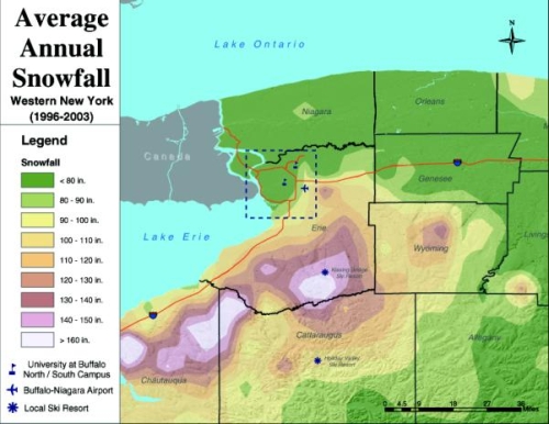
All of the colors represent 10-degree increments except for the extremes. Green represents average snowfall less than 80 inches. What? Darn. A quick look at the data shows that yes, Buffalo _does_ get quite a bit more snow than NYC.
**The lesson of the day:** pick those colors carefully, because wrong colors just could be showing something that shouldn’t be shown.
### Related
* [Counting the Christmas days with snow](https://flowingdata.com/2024/12/20/counting-the-christmas-days-with-snow/ "Counting the Christmas days with snow")
* [Amount of snow to cancel school](https://flowingdata.com/2014/01/31/amount-of-snow-to-cancel-school/ "Amount of snow to cancel school")
* [When cities last saw snow on Christmas](https://flowingdata.com/2024/12/23/when-cities-last-saw-snow-on-christmas/ "When cities last saw snow on Christmas")
---
# New York Mets Not Looking So Good – FlowingData
New York Mets Not Looking So Good
=================================
[September 28, 2007](https://flowingdata.com/2007/09/28/new-york-mets-not-looking-so-good/)
### Topic
**[Statistics](https://flowingdata.com/category/statistics/)
**
[](https://flowingdata.com/wp-content/uploads/2007/09/nymets-wins1200.gif)
I’ve never really been interested in baseball. I’ve always been more of a basketball and football fan. However, my summer roommate was a die hard baseball fan, and I’m convinced that he brainwashed me into rooting for the New York Mets. Just a couple of weeks ago, someone told me he was a Phillies fan, and I let out a blech of disgust without even thinking about it.
So with the Mets’ [most recent loss](http://www.nytimes.com/2007/09/28/sports/baseball/28mets.html)
, I’m a bit disgruntled, and I’m sure my old roommate is pissed as can be. The Mets are no longer leading the Phillies for the number one spot in the NL east.
What better way to see how poorly the Mets are playing than with a **[graphic](https://flowingdata.com/wp-content/uploads/2007/09/nymets-wins1200.gif)
**? I decided to compare this year’s Met season with the 1986 Met World Series winning season, because that should probably be what they’re shooting for. As my roommate would angrily exclaim, “If they can’t get their #%&$ act together, they don’t serve to go to the playoffs!”
### Related
* [The Pitching Dominance of Mariano Rivera](https://flowingdata.com/2009/11/11/the-pitching-dominance-of-mariano-rivera/ "The Pitching Dominance of Mariano Rivera")
* [Detailed map of baseball fandom →](http://www.nytimes.com/interactive/2014/04/23/upshot/24-upshot-baseball.html "Detailed map of baseball fandom →")
* [Shortening baseball games](https://flowingdata.com/2023/05/30/shortening-baseball-games/ "Shortening baseball games")
---
# Presidential Election Voting by the Young People of America – FlowingData
Presidential Election Voting by the Young People of America
===========================================================
[September 15, 2007](https://flowingdata.com/2007/09/15/presidential-election-voting-by-the-young-people-of-america/)
### Topic
**[The Times](https://flowingdata.com/category/the-times/)
**
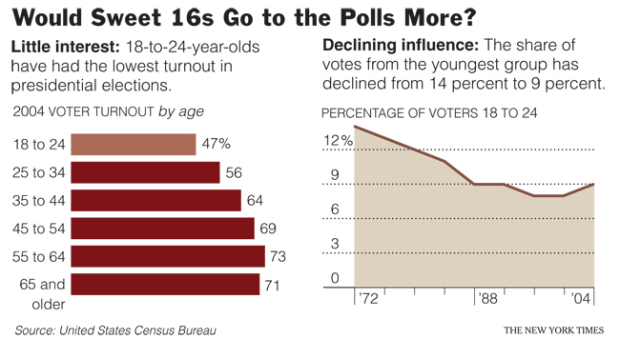
I actually did this graphic some time last month for the [Week in Review](http://www.nytimes.com/2007/08/26/weekinreview/26belluck.html?ref=weekinreview)
. Slipped through the cracks somehow. It was a slightly different experience doing a graphic for this desk, because, well, I guess they don’t request graphics very often.
As an aside, I just realized that old Times links are behind that silly TimesSelect thing, which kind of sucks. I hear [TimesSelect is going to be free](http://www.contentmatters.info/content_matters/2007/08/ny-times-to-mak.html)
sometime in the near future though. Good.
### Related
* [Compare your commute time to others](https://flowingdata.com/2017/03/30/compare-your-commute-time-to-others/ "Compare your commute time to others")
* [Voting Breakdown for Democratic Presidential Primaries](https://flowingdata.com/2008/06/05/voting-breakdown-for-democratic-presidential-primaries/ "Voting Breakdown for Democratic Presidential Primaries")
* [Not Enough Lifeguards and Prison Libraries](https://flowingdata.com/2007/09/11/not-enough-lifeguards-and-prison-libraries/ "Not Enough Lifeguards and Prison Libraries")
---
# My Love-hate Relationship with ArcGIS – FlowingData
My Love-hate Relationship with ArcGIS
=====================================
[September 13, 2007](https://flowingdata.com/2007/09/13/my-love-hate-relationship-with-arcgis/)
### Topic
**[Software](https://flowingdata.com/category/software/)
**
[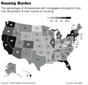](http://www.nytimes.com/2007/09/12/us/12housing.html?ref=us)
ArcGIS can do a lot for you in terms of speeding up the mapping process, which is great, but here’s my dilemma: do I really want to put in all the time to figure out how to use the software?
I think the basics is good enough for me and any further than that, I’ll let a mapping expert take over. However, I know that spatial analysis is something I’m going to pursue, so… I’m really back and forth.
On the one hand, ArcGIS has a lot of functions, but on the other hand, it’s not especially easy to use all those functions. For example, I was doing a join between two data tables, but it wasn’t working at first because the column on one table didn’t have leading zeros (e.g. 1 instead of 01). By “not working” I don’t mean that columns weren’t joining. I mean that I couldn’t select this column and that column to join by, so I couldn’t even get to the step where I knew I had to change something. It’s little things like that that bug me and make me think that ArcGIS is inflexible.
Plus, it sure does like to crash.
I don’t know.
I probably just need more experience. How about this. I’ll just learn what I have to, but I’m not going to go out of my way to become an ArcMap expert. Yeah, that sounds OK to me.
And on that note, here’s the map I made. Color scale was the main thing I had to fuss with. Too many shades of gray lead to a muddled graphic in the paper even if it looks fine on screen. The map shows the percentage of people who spend 30% or more of their household income on housing. Of course, California leads the way.
### Related
* [ArcGIS and Excel are Worthwhile](https://flowingdata.com/2007/08/09/arcgis-and-excel-are-worthwhile/ "ArcGIS and Excel are Worthwhile")
* [Responsible mapping](https://flowingdata.com/2020/03/06/responsible-mapping/ "Responsible mapping")
* [Inside out map of the Grand Canyon](https://flowingdata.com/2019/01/17/inside-out-map-of-the-grand-canyon/ "Inside out map of the Grand Canyon")
### 3 Comments
* [Paul](http://insightbydesign.blogspot.com)
— [September 13, 2007 at 7:50 am](https://flowingdata.com/2007/09/13/my-love-hate-relationship-with-arcgis/#comment-32)
Hang in there man. I spent 3 years trying to learn that program (a long time ago). Very frustrating. But in the end, when you know it well, pretty cool (and powerful).
I ended up using ArcInfo a lot as well. Sort of a cut-down version with a more intuitive interface.
* anon. — [September 13, 2007 at 12:55 pm](https://flowingdata.com/2007/09/13/my-love-hate-relationship-with-arcgis/#comment-49682)
Just curious: is this a general design hint for choropleth maps, that you need just a few different colors for print, but you can have more on screen? I’d never heard that before (though it sounds plausible).
* [Nathan](https://flowingdata.com)
— [September 13, 2007 at 4:57 pm](https://flowingdata.com/2007/09/13/my-love-hate-relationship-with-arcgis/#comment-49683)
Yeah, I guess the rule could be generalized. I mean in either case — paper or print — you won’t want to use too many shades since the eye can only see so much, you know? Although, admittedly, I’m just going off what my editor told me.
From a quick Google, there seems to be a lot of theory on the topic of color picking… [http://tinyurl.com/yw3j89](http://tinyurl.com/yw3j89)
---
# My Last Day as a New York Times Graphics Editor Intern – FlowingData
My Last Day as a New York Times Graphics Editor Intern
======================================================
[September 21, 2007](https://flowingdata.com/2007/09/21/my-last-day-as-a-new-york-times-graphics-intern/)
### Topic
**[The Times](https://flowingdata.com/category/the-times/)
**
Today is my last day at The New York Times. Ten weeks and twenty something graphics later, I’m leaving NYC much more knowledgeable about data visualization and journalism and how they can make a powerful pair. It’s a bittersweet ending today.
On the one hand, it’s been amazing working for such a prominent newspaper, but on the other, I’m also looking forward to taking a few days off doing nothing and then moving forward towards finishing, err, starting my dissertation. Do I know my topic? No, not really, but one thing’s for sure. Data visualization is what I want to do and I’ve been extremely fortunate to have learned from some of the best this summer.
Onward ho.
### Related
* [New York Times Visualization Lab – Collaboration with Many Eyes](https://flowingdata.com/2008/10/28/new-york-times-visualization-lab-collaboration-with-many-eyes/ "New York Times Visualization Lab – Collaboration with Many Eyes")
* [Amanda Cox promoted to New York Times data editor](https://flowingdata.com/2019/01/15/amanda-cox-promoted-to-new-york-times-data-editor/ "Amanda Cox promoted to New York Times data editor")
* [New York Times on how they design their graphics](https://flowingdata.com/2010/08/05/new-york-times-on-how-they-design-their-graphics/ "New York Times on how they design their graphics")
### 1 Comment
* [Steamy Kitchen](http://www.steamykitchen.com)
— [September 24, 2007 at 2:24 pm](https://flowingdata.com/2007/09/21/my-last-day-as-a-new-york-times-graphics-intern/#comment-49688)
Good luck on your next adventure!
---
# StatGrad Discussion Board Now Open – FlowingData
StatGrad Discussion Board Now Open
==================================
[October 1, 2007](https://flowingdata.com/2007/10/01/statgrad-discussion-board-now-open/)
### Topic
**[Site News](https://flowingdata.com/category/announcements/)
**
The **[StatGrad discussion board](http://statgrad.com)
** is now online — a place where stat students can hang out.
One of the things I miss most about going to school is hanging out with my cohort. I work from home in Buffalo, and I get bored and restless pretty easily. When I was at school and feeling restless, I could just go down to the stat lounge, sit on the ridiculous-looking Ikea couch, and relax with some classmates. We never sat around and talked about probability theory or the law of large numbers (ok, maybe we did sometimes), but because we were all stat students, we all had this data-ish way of thinking. Know what I mean?
That’s what I’m hoping for StatGrad. I’m not interested in finding help for specific stat problems or trying to answer R questions. There are plenty of books and online resources for that type of stuff. I’m just hoping that StatGrad can become a place where stat grad students can hang out when they’re bored. Complain about undergrads, discuss anything interesting happening in our field, look for job opportunities, and stay up to date on calls for papers.
**[Join StatGrad now](http://statgrad.com/people.php?PostBackAction=ApplyForm)
**. I know you want to. Please? Come on, I’m bored.
### Related
* [What Are You Going to Do With Your PhD in Statistics?](https://flowingdata.com/2008/03/26/what-are-you-going-to-do-with-your-phd-in-statistics/ "What Are You Going to Do With Your PhD in Statistics?")
* [Visualization for One](https://flowingdata.com/2022/08/18/process-202-for-one/ "Visualization for One")
* [Undergraduate Summer Program for Statistics](https://flowingdata.com/2010/02/05/undergraduate-summer-program-for-statistics/ "Undergraduate Summer Program for Statistics")
---
# Bars as an Alternative to Bubble Charts – FlowingData
Bars as an Alternative to Bubble Charts
=======================================
[October 22, 2007](https://flowingdata.com/2007/10/22/bars-as-an-alternative-to-bubble-charts/)
### Topic
**[Design](https://flowingdata.com/category/design/)
**
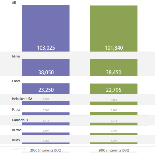
Are bubble charts effective? This seems to be a recurring question. Some say people suck at comparing areas in the form of bubbles, or rather, people are horrible with areas, period. Others argue that it just takes some getting used to; the eye has to be trained, and once that’s done, the bubbles are good to go.
In any case, here is an [alternative to the bubbles](http://services.alphaworks.ibm.com/manyeyes/view/Sm4H4JsOtha64CVkqMpFJ2-)
— bars. The beer data from a [previous post](https://flowingdata.com/2007/10/02/americans-prefer-watered-down-beer/)
are charted (2006 shipments on the left, and 2005 shipments on the right). The advantage of bars over bubbles is that users only have to compare heights; however, numbers are going to clutter quickly as more observations are added.
People should just train their eyes. Bubbles are so much more fun. They’re bubbly.
### Related
* [Americans Prefer Watered Down Beer](https://flowingdata.com/2007/10/02/americans-prefer-watered-down-beer/ "Americans Prefer Watered Down Beer")
* [Right versus wrong bubble size](https://flowingdata.com/2010/12/17/right-versus-wrong-bubble-size/ "Right versus wrong bubble size")
* [How to Make Bubble Charts](https://flowingdata.com/2010/11/23/how-to-make-bubble-charts/ "How to Make Bubble Charts")
### 7 Comments
* [Hadley Wickham](http://had.co.nz)
— [October 22, 2007 at 12:51 pm](https://flowingdata.com/2007/10/22/bars-as-an-alternative-to-bubble-charts/#comment-49708)
You should probably also read up on fluctuation diagrams and mosaic plots, which can be more informative for this type of data.
* [Nathan Yau](https://flowingdata.com)
— [October 22, 2007 at 2:16 pm](https://flowingdata.com/2007/10/22/bars-as-an-alternative-to-bubble-charts/#comment-49709)
I was just talking about a direct alternative to a bubble chart in a table layout, but yeah, for sure, mosaic plots are great for this type of categorical data. I’m not a huge fan of fluctuation diagrams however. They often seem to be really sparse.
* [Hadley Wickham](http://had.co.nz)
— [October 22, 2007 at 10:53 pm](https://flowingdata.com/2007/10/22/bars-as-an-alternative-to-bubble-charts/#comment-49710)
They can’t be any more sparse than the equivalent bubble chart, can they?
* [Jon Peltier](http://peltiertech.com)
— [February 11, 2008 at 12:48 pm](https://flowingdata.com/2007/10/22/bars-as-an-alternative-to-bubble-charts/#comment-49711)
The modified bar chart almost works. I find that the width of the bars is somewhat distracting, and the gap between the columns of bars makes it hard to compare their relative heights (unless there is a large difference). I think a clustered bar or column chart would be at least as effective as this chart (and well beyond the bubble chart in the first article, which was absolutely the wrong type to use).
* [Jon Peltier](http://peltiertech.com/WordPress)
— [March 7, 2008 at 12:56 am](https://flowingdata.com/2007/10/22/bars-as-an-alternative-to-bubble-charts/#comment-49712)
Hi Nathan –
I finally got around to making an alternative chart to your floating stacked bar chart above, which is simpler, easier to interpret, and easier to produce:
[http://peltiertech.com/WordPress/2008/03/06/clustered-bars-as-an-alternative-to-stacked-bars-or-bubbles/](http://peltiertech.com/WordPress/2008/03/06/clustered-bars-as-an-alternative-to-stacked-bars-or-bubbles/)
Let me know what you think.
* Bonnie Jean — [April 19, 2010 at 7:57 pm](https://flowingdata.com/2007/10/22/bars-as-an-alternative-to-bubble-charts/#comment-49713)
Bars vs bubble charts? Bars serve beer. Beer has bubbles. What are you charting? How bubbly is your beer or how many bars can you get the bubble beer at?
* Bonnie Jean — [April 19, 2010 at 3:57 pm](https://flowingdata.com/2007/10/22/bars-as-an-alternative-to-bubble-charts/#comment-42368)
Bars vs bubble charts? Bars serve beer. Beer has bubbles. What are you charting? How bubbly is your beer or how many bars can you get the bubble beer at?
---
# Data Collection With USB Pedometer. Weight No More! – FlowingData
Data Collection With USB Pedometer. Weight No More!
===================================================
[September 18, 2007](https://flowingdata.com/2007/09/18/data-collection-with-usb-pedometer-weight-no-more/)
### Topic
**[Self-surveillance](https://flowingdata.com/category/self-surveillance/)
**
I’m thinking it might be time to revive my step count data collection with a nifty [USB pedometer](http://usb.brando.com.hk/prod_detail.php?prod_id=00349)
from Brando.
> This Pedometer can store 3 days of step data and upload the data to your PC via USB! Through your data, the software can chart your outcome, view the calories burned and details on your daily activies. You can get easily to control your weight by this Pedometer and no over weight anymore!
If I had this, it wouldn’t be such a big deal if I forgot to record a couple of days. As I noted in a [previous post](https://flowingdata.com/2007/08/13/my-mission-is-to-collect-basic-data/)
, one of the difficulties of getting good step data was simply getting it into the spreadsheet. This bad boy records 3 days worth of data. Plus the USB and software, I imagine, could make record-keeping a lot smoother. Plus no over weight anymore!
Worth investigating, I think? The release date is somewhere November 2007. I’m about 1 percent positive that this could very well be as popular as the iPhone.
\[via [Gizmodo](http://gizmodo.com/gadgets/target-practice/brando-usb-pedometer-good-for-walkers-rabbits-us-presidents-299537.php)\
\]
### Related
* [Walker Tracker – A Community Site for Pedometer Fans](https://flowingdata.com/2008/01/23/walker-tracker-a-community-site-for-pedometer-fans/ "Walker Tracker – A Community Site for Pedometer Fans")
* [Map your location – that your iPhone secretly records](https://flowingdata.com/2011/04/20/map-your-location-that-your-iphone-records-without-permission/ "Map your location – that your iPhone secretly records")
* [Imagining alternative iPhone power sources](https://flowingdata.com/2015/10/05/imagining-alternative-iphone-power-sources/ "Imagining alternative iPhone power sources")
---
# Cover Manhattan and Then Some With All the World’s Walmarts – FlowingData
Cover Manhattan and Then Some With All the World’s Walmarts
===========================================================
[October 16, 2007](https://flowingdata.com/2007/10/16/cover-manhattan-and-then-some-with-all-the-worlds-walmarts/)
### Topic
**[Economics](https://flowingdata.com/category/economics/)
**
[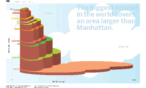](http://awesome.goodmagazine.com/transparency/007/trans007storespace.html)
[Speaking of Walmart](https://flowingdata.com/2007/10/10/walmart-spreads-like-a-virus/)
, if we took all of the Walmarts in the world and clumped them all together, they’d cover Manhattan (with some stores sinking in the water). Walmart is the bottom bubbles; McDonald’s is represented by the second from the bottom set.
I’m slightly surprised that McDonald’s doesn’t cover more. Although, I guess Walmart stores _are_ pretty big compared to McDonald’s restaurants. I’m not really surprised that Walmart area is greater than Manhattan area though. In fact, I thought it would have been more with all the Walmarts in the world. Hmmm…
Into the Artistic Section
-------------------------
As for this graphic, well, if it were supposed to be statistical, I’d say I didn’t I like it. It’s not meant to be statistical though. The goal is to show that Walmart is humungo. I get the graphic’s main point, which is… the point. To that end, I couldn’t care less about proper scales, utility, and what not. Take it for what it is and enjoy.
This Walmart graphic goes in the artistic section of viz, opposed to the pragmatic side (as [Robert explains](http://eagereyes.org/Theory/TaleOfTwoTypes.html)
). There are [three other graphics](http://www.goodmagazine.com/user/futurefarmers)
similar in feel to this one that cover sugar consumption, student debt, and solar power.
### Related
* [Code For Walmart Growth Visualization Now Available](https://flowingdata.com/2008/10/21/code-for-walmart-growth-visualization-now-available/ "Code For Walmart Growth Visualization Now Available")
* [A Magazine Dedicated Entirely to Visualizing Something Useful](https://flowingdata.com/2007/10/19/a-magazine-dedicated-entirely-to-visualizing-something-useful/ "A Magazine Dedicated Entirely to Visualizing Something Useful")
* [Walmart Spreads Like a Virus](https://flowingdata.com/2007/10/10/walmart-spreads-like-a-virus/ "Walmart Spreads Like a Virus")
### 1 Comment
* Pingback: [A Magazine Dedicated Entirely to Visualizing Something Useful](https://flowingdata.com/2007/10/19/a-magazine-dedicated-entirely-to-visualizing-something-useful/)
---
# Walmart Spreads Like a Virus – FlowingData
Walmart Spreads Like a Virus
============================
[October 10, 2007](https://flowingdata.com/2007/10/10/walmart-spreads-like-a-virus/)
### Topic
**[Economics](https://flowingdata.com/category/economics/)
**
Watch Walmart quickly expand like a deadly virus from the movie _Outbreak_. It’s particularly interesting to see Walmart “infect” an entire small region with multiple new stores opening at the same time in one area. There looks to be somewhere around 30 stores opening per year (rough guess) across the country, so I wonder what the map looks like now. It’s probably all blue except in those deserted Midwest regions. I wonder what the _world map_ looks like.
Random quote:
> When I lived in Maine, there wasn’t much to do, so when we were bored on a Friday night, we’d go hang out at Walmart.
That’s kind of sad, but uh, if that’s your thing, well, no, still sad.
### Related
* [Watching the Growth of Walmart Across America, Interactive Edition](https://flowingdata.com/2008/07/10/watching-the-growth-of-walmart-across-america-interactive-edition/ "Watching the Growth of Walmart Across America, Interactive Edition")
* [Mapping and Animating Growth of Target Across United States](https://flowingdata.com/2009/01/30/mapping-and-animating-growth-of-target-across-us/ "Mapping and Animating Growth of Target Across United States")
* [Cover Manhattan and Then Some With All the World’s Walmarts](https://flowingdata.com/2007/10/16/cover-manhattan-and-then-some-with-all-the-worlds-walmarts/ "Cover Manhattan and Then Some With All the World’s Walmarts")
### 1 Comment
* Pingback: [Cover Manhattan and Then Some With All the World's Walmarts](https://flowingdata.com/2007/10/16/cover-manhattan-and-then-some-with-all-the-worlds-walmarts/)
---
# ProBlogger Birthday Bash Giveaway – FlowingData
ProBlogger Birthday Bash Giveaway
=================================
[October 3, 2007](https://flowingdata.com/2007/10/03/problogger-birthday-bash-giveaway/)
### Topic
**[Contests](https://flowingdata.com/category/announcements/contest/)
**
If you have a blog, I’m sure you’ve heard of the the ever so popular ProBlogger blog. To celebrate, Darren is giving away [$54,000 worth of prizes](http://www.problogger.net/archives/2007/10/02/54000-worth-of-prizes-on-offer-in-the-problogger-birthday-bash-competitions/)
! The current giveaway is for **two 20-inch USB monitors**, and all you have to do is post about the giveaway (hence this post :). They’re going to have a random drawing some time Friday night. If you don’t need the monitor, there’s a whole lot of other cool stuff being given away in the next few days.
At the Times, I got used to using a super sexy Apple high resolution wide screen to create graphics, but back at home I’ve just been using my laptop and a not-so-hot 1280p 19-inch LCD screen. It’s true what they say about productivity and screen real estate — especially with visualization. I sure wouldn’t mind having these [two 20-inch monitors](http://www.problogger.net/archives/2007/10/03/win-two-lg-usb-monitors-from-displaylink-giveaway/)
.
### Related
* [iPod Design and Apple Stock Over the Years](https://flowingdata.com/2007/09/09/ipod-design-and-apple-stock-over-the-years/ "iPod Design and Apple Stock Over the Years")
* [Ford Turns to Design and Data Visualization to Boost Sales](https://flowingdata.com/2009/01/13/ford-turns-to-design-and-data-visualization-to-boost-sales/ "Ford Turns to Design and Data Visualization to Boost Sales")
* [Apple’s global suppliers](https://flowingdata.com/2023/08/29/apples-global-suppliers/ "Apple’s global suppliers")
---
# Swivel Gets a Data Guy – FlowingData
Swivel Gets a Data Guy
======================
[October 3, 2007](https://flowingdata.com/2007/10/03/swivel-gets-a-data-guy/)
### Topic
**[Apps](https://flowingdata.com/category/software/online-apps/)
**
What the heck’s a data guy? According to [Gerard](http://blog.swivel.com/weblog/2007/09/data-guy.html)
, who studied computer science and economics in college
> It means that I’m the type of person who, instead of planning for a vacation like a normal person, will write a script to pull down airline data for all possible destinations and routes, load the data into R and perform a regression analysis to find the best time to buy.
Oh, so that’s what a data guy is. I guess that makes me a data guy.
This should be good for Swivel, who has seemed to be [missing the “data guy”](https://flowingdata.com/2007/08/31/why-i-do-not-swivel-data/)
piece of the puzzle. Will Swivel’s visualization tools improve? Will data become more reliable on Swivel? I don’t know. It’s possible. There’s definitely a lot of work to be done, so one person won’t be enough, but hey, it’s a start. It’s not often that I see a computer science / economics person. I’m an electrical engineering and computer science / statistics person myself, and I like to see people with dual backgrounds (even if they did go to the other school across the bay).
That being said, applications like Swivel, Many Eyes, and Data360 make me wonder where all the statisticians are. I see mathematicians, designers, economists, and businessmen. Come on statisticians. Show yourselves. The world needs you.
### Related
* [Data Science is catching on](https://flowingdata.com/2010/06/02/data-science-is-catching-on/ "Data Science is catching on")
* [Why I Do Not Swivel Data](https://flowingdata.com/2007/08/31/why-i-do-not-swivel-data/ "Why I Do Not Swivel Data")
* [Same Big Mac Data, Different Platform](https://flowingdata.com/2007/06/30/same-big-mac-data-different-platform/ "Same Big Mac Data, Different Platform")
### 2 Comments
* Gerad — [October 3, 2007 at 4:08 pm](https://flowingdata.com/2007/10/03/swivel-gets-a-data-guy/#comment-49698)
Thanks for the nice post. It’s always great to hear from another data guy!
I couldn’t agree with you more about statisticians. They’re out there (I’ve worked with them at Apple and Cornerstone) and I, like you, hope they continue to get more engaged with the new wealth of data that is opening up on the Web.
(And while I’m not a statistician, I learned more than the basics in college, and have taken a couple PhD level Stats courses subsequent to graduation, so at least there’s a bit of exposure at Swivel).
While we work together to get statisticians more engaged, there’s a lot of work that can be done on tools and data.
My experience is that 80-95% of the time spent doing statistical analysis is spent collecting and preparing the data. If Swivel can help move that ratio down to 50% or even 10%, then the amount of value that statisticians can provide the world is going to increase by an order of magnitude, and that’s a powerful thing.
* [Michal Migurski](http://mike.teczno.com)
— [October 3, 2007 at 5:18 pm](https://flowingdata.com/2007/10/03/swivel-gets-a-data-guy/#comment-49697)
“Data Guy” – love the term.
---
# Americans Prefer Watered Down Beer – FlowingData
Americans Prefer Watered Down Beer
==================================
[October 2, 2007](https://flowingdata.com/2007/10/02/americans-prefer-watered-down-beer/)
### Topic
**[Economics](https://flowingdata.com/category/economics/)
**
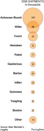Anheuser-Busch (Budweiser), Miller, and Coors lead the way in beer. Albeit, this is shipment data, not sales data, so take the numbers with a grain of salt.
The extreme dominance of the top three American beers was somewhat surprising to me, because I never see people order any of those three at restaurants. However, I gave it a few more seconds of thought. I’m thinking parties, sporting events, and drunken nights. The American beers go down easier (because they’re like water), so it’s easier to get drunk. To get drunk, people drink more. So I guess the watery dominance isn’t that surprising. I guess when people buy beer for taste at restaurants, they look to different brands.
Anyhow, I’m really starting to become a fan of these bubble charts. They’re really easy to read and can quickly spruce up a hard-to-read table of numbers. They also seem to scale decently. By well, I don’t mean in like the thousands, but in the tens, I think the bubbles can hold their own.
What kind of beer do you prefer?
### Related
* [Beer Mapper: An experimental app to find the right beer for you](https://flowingdata.com/2013/04/30/beer-mapper-an-experimental-app-to-find-the-right-beer-for-you/ "Beer Mapper: An experimental app to find the right beer for you")
* [Beer recommendation system in R](https://flowingdata.com/2013/06/21/beer-recommendation-system-in-r/ "Beer recommendation system in R")
* [Regional macrobrews](https://flowingdata.com/2014/04/07/regional-macrobrews/ "Regional macrobrews")
### 2 Comments
* [Paul](http://insightbydesign.blogspot.com)
— [October 2, 2007 at 2:07 pm](https://flowingdata.com/2007/10/02/americans-prefer-watered-down-beer/#comment-49696)
Not too sure if I like the bubble charts. The problem with that one is that if you just glance at the top two bubbles, it looks the the top one is about twice as large as the second one. When in fact the number is three times as large (about). I think humans have a problem comparing the relative sizes of areas versus the length of lines – I read that somewhere, where escapes me atm.
* Pingback: [Bars as an Alternative to Bubble Charts](https://flowingdata.com/2007/10/22/bars-as-an-alternative-to-bubble-charts/)
---
# Education Statistics Free, Available, and Waiting for You – FlowingData
Education Statistics Free, Available, and Waiting for You
=========================================================
[October 15, 2007](https://flowingdata.com/2007/10/15/education-statistics-free-available-and-waiting-for-you/)
### Topic
**[Data Sources](https://flowingdata.com/category/statistics/data-sources/)
**
Raw, fine-grain data is still a bit hard to come by. Summary statistics (i.e. data that came from some analysis), on the other hand, are often easy to find. A lot of the time the data is already online or just a simple phone call away.
The [National Center for Education Statistics](http://nces.ed.gov/)
, a part of the U.S. Department of Education, offers a bunch of data including, but not at all limited to, poverty and math achievement, average science scores overall and by grade level, and quantitative literacy.
So if you’re interested in education or just looking for some data to mess around with some for viz practice, NCES is a good place to start. I randomly came across some high school dropout data:
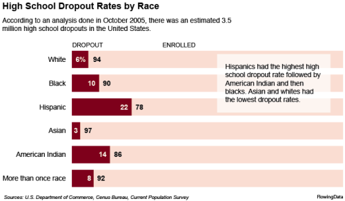
Does anyone else find it interesting that the dropout rate for those of mixed descent is in the middle? Although, I guess a few margin of error percentage points could easily change that…
### Related
* [High school statistics class builds election prediction model](https://flowingdata.com/2018/10/23/high-school-statistics-class-builds-election-prediction-model/ "High school statistics class builds election prediction model")
* [A visualization game to understand education and school segregation](https://flowingdata.com/2018/05/17/a-visualization-game-to-understand-education-and-school-segregation/ "A visualization game to understand education and school segregation")
* [Private school demographics](https://flowingdata.com/2025/01/24/private-school-demographics/ "Private school demographics")
---
# Ho, ho, ho, Meeerrrrry Christmas! – FlowingData
Ho, ho, ho, Meeerrrrry Christmas!
=================================
[December 24, 2007](https://flowingdata.com/2007/12/24/ho-ho-ho-meeerrrrry-christmas/)
### Topic
**[Site News](https://flowingdata.com/category/announcements/)
**
Merry Christmas Bedford Falls! Merry Christmas you old Savings and Loan! Merry Christmas Mr. Potter! Merry Christmas! Gosh, I love that movie. I watch it every year, and it never gets old. That scene where he comes home so happy to be alive, his children are hanging off of him, and he’s embracing his wife… wonderful.
On that note, posts here on FlowingData will be sparse through January 1 as I buckle down and focus on relaxing and having fun. I can’t wait to see what Santa brings me. I am going to make sure I leave him extra cookies and a big glass of milk. I suggest you do the same. Santa wasn’t so nice last year. He gave me a pair of used socks, a half-eaten candy cane, and a note that asked, “Where are my cookies and milk?” I am sorry Santa. It will never happen again.
Merry Christmas and have a happy new year!
### Related
* [Christmas Movies as Charts](https://flowingdata.com/2016/12/22/christmas-charts/ "Christmas Movies as Charts")
* [Cookie ingredient variants](https://flowingdata.com/2014/12/24/cookie-ingredient-variants/ "Cookie ingredient variants")
* [When cities last saw snow on Christmas](https://flowingdata.com/2024/12/23/when-cities-last-saw-snow-on-christmas/ "When cities last saw snow on Christmas")
---
# Sit Back and Relax with Casual Information Visualization – FlowingData
Sit Back and Relax with Casual Information Visualization
========================================================
[December 28, 2007](https://flowingdata.com/2007/12/28/sit-back-and-relax-with-casual-information-visualization/)
### Topic
**[Data Art](https://flowingdata.com/category/visualization/artistic-visualization/)
**
Zachary Pousman et al. write in their paper [Casual Information Visualization: Depictions of Data in Everyday Life](http://www.cc.gatech.edu/~john.stasko/papers/infovis07-casual.pdf)
> Information visualization has often focused on providing deep insight for expert user populations and on techniques for amplifying cognition through complicated interactive visual models. This paper proposes a new subdomain for infovis research that complements the focus on analytic tasks and expert use. Instead of work-related and analytically driven infovis, we propose Casual Information Visualization (or Casual Infovis) as a complement to more traditional infovis domains. Traditional infovis systems, techniques, and methods do not easily lend themselves to the broad range of user populations, from expert to novices, or from work tasks to more everyday situations.


At the paper’s roots, it goes onto cover the edge cases in infovis — ambient, social, and artistic infovis. The three are perhaps not what we consider traditional infovis in that we’re not going to sit down with them for a couple of hours to gain some kind of insight. Instead, ambient, social, and artistic viz are displayed constantly and the casual observer gets something other than analytic insight. Causual infovis draws upon awareness, social, and reflective insight. I won’t go into the details of each type of insight. You can just read the paper.
Catering to a Wider Audience
----------------------------
This paper brings up some good points about traditional information visualization and how the edge cases of infovis (ambient, social, and artistic) pose different design problems — mostly which come from trying to display information in a way that _everyone_ can understand.
My one criticism is that the authors don’t seem to place much faith in the user. The authors mention that users may not be experts in understanding complicated graphs and charts (which is kind of true), so casual infovis can only show a small number of attributes. I like to think though that instead of dumbing down the vis, we should work on improving data literacy and in turn, should expect the user to grow more accustomed to more complex visualization.
### Related
* [The Many Words for Visualization](https://flowingdata.com/2011/09/29/the-many-words-for-visualization/ "The Many Words for Visualization")
* [Going Beyond Collaborative Visual Analytics with Statistics](https://flowingdata.com/2008/01/15/going-beyond-collaborative-visual-analytics-with-statistics/ "Going Beyond Collaborative Visual Analytics with Statistics")
* [Statistical Graphics and Information Visualization](https://flowingdata.com/2011/08/15/statistical-graphics-and-information-visualization/ "Statistical Graphics and Information Visualization")
### 2 Comments
* [Zach Pousman](http://www.thinky.org)
— [February 23, 2008 at 2:25 pm](https://flowingdata.com/2007/12/28/sit-back-and-relax-with-casual-information-visualization/#comment-1819)
Thanks for mentioning my paper! I hadn’t see this so I’ll just leave a quick comment for posterity _(yeah right, posterity on the web)._
Just as a side note, I totally agree with Nathan that designers should be striving not just to present data in a simple way, but also to raise the level of infographic literacy (graphicacy) amongst the general populace. Both approaches are valuable and needed. I’d point the interested reader or infographics activist to projects like [World Visualization Day](http://worldvisualizationday.org/)
, which aims to bring visualization to the masses and to show people the power of understanding data through (interactive) visualizations.
* [Nathan Yau](https://flowingdata.com/about-nathan)
— [February 23, 2008 at 4:11 pm](https://flowingdata.com/2007/12/28/sit-back-and-relax-with-casual-information-visualization/#comment-1820)
I’m always happy to mention things that are interesting.
---
# Presidential Nomination Polls With Smoothers – FlowingData
Presidential Nomination Polls With Smoothers
============================================
[October 11, 2007](https://flowingdata.com/2007/10/11/presidential-nomination-polls-with-smoothers/)
### Topic
**[Statistical Visualization](https://flowingdata.com/category/visualization/statistical-visualization/)
**
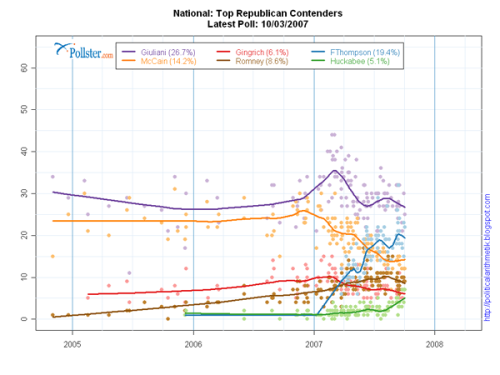
It almost feels like I see a new poll every day for who’s leading in the presidential race. There’s usually a good amount of fluctuation within a single poll with sampling margin of error and then of course the numbers vary across multiple polls. This can be confusing at times, so [Pollster](http://www.pollster.com/08presidentialprimary.php)
put all the results in one scatter plot. Then they stuck a smoother through all the points (for each candidate), and just like that, the viewer gets a general sense of how each candidate has been doing.
Keep in mind that the amount of noise (or bumps in the curve) is going to vary depending on the type of estimation you use, so I wouldn’t place the smaller curves under too much scrutiny. I’m not sure what method Pollster is using, but it’s interesting to see the overall trends. Could we be looking at a double New Yorker election?
Pollster also offers the raw poll data, so in case you want to have some of your own fun, there’s data waiting for you.
\[via [Mike Love](http://mikelove.wordpress.com/2007/10/08/averaging-polling-trends/)\
\]
### Related
* [Simulation shows why polls don’t always match future results](https://flowingdata.com/2016/03/14/simulation-shows-why-polls-dont-always-match-future-results/ "Simulation shows why polls don’t always match future results")
* [What Kind of Information is Hidden in Barcodes?](https://flowingdata.com/2008/07/29/what-kind-of-information-is-hidden-in-barcodes/ "What Kind of Information is Hidden in Barcodes?")
* [Visual explainer for hierarchical modeling](https://flowingdata.com/2017/10/31/visual-explainer-for-hierarchical-modeling/ "Visual explainer for hierarchical modeling")
---
# 100 Reasons You Should Be Interested in, Want to Share, and Get Excited About Data – FlowingData
100 Reasons You Should Be Interested in, Want to Share, and Get Excited About Data
==================================================================================
[November 7, 2007](https://flowingdata.com/2007/11/07/100-reasons-you-should-be-interested-in-want-to-share-and-get-excited-about-data/)
### Topic
**[Data Sharing](https://flowingdata.com/category/statistics/data-sharing/)
**
When I talk about data, people often zone out or don’t really see the interest. Why does this happen? People just don’t understand the wonder that is data and how much of their life is led by data. With that in mind, why would people share their data? You can’t share something you don’t know exists. Off the top of my head, here’s 100 reasons to be interested in, want to share, and get excited about data.
1. Be completely transparent to build trust
2. It won’t seem like you’re hiding something
3. Understand impact on the environment
4. Get opinions from other people/experts
5. Increase awareness of neighborhood
6. Truth in numbers
7. Provide better examples to argue a point
8. Wisdom of crowds
9. Pretty pictures
10. Beautiful dynamic data visualization
11. Proof in the data
12. Understanding of the world
13. Understanding of yourself
14. Understanding of your neighborhood
15. Understanding of your city
16. Understanding of your county
17. Understanding of your state
18. Earn the one million dollar Netflix prize
19. Appreciate sports on a different level
20. Data is cool
21. Save money on utilities
22. Data-driven art
23. Overcoming unwarranted biases
24. Avoid jumping to conclusions
25. Understand confusing politics
26. Make educated election votes
27. Enjoy a new way of programming
28. Find and see trends over time
29. Find and see themes over geographical regions
30. Watch changes over space and time
31. Explore relationships between network nodes
32. Know what crime-ridden areas to stay away from
33. Check up on proper news reporting
34. Watchdog on scientific research results
35. Work for a cool newspaper like the New York Times
36. Improve network protocols
37. Optimize traffic flows
38. Minimize the amount you spend on flights
39. Find ideal products based on what you’ve already purchased
40. User-specific book recommendations
41. User-specific movie recommendations
42. Image and vision sciences
44. Statistical computing
45. Produce real research results
46. Find drugs that actually help and don’t harm
47. Deciphering genetic code
48. Cryptography
49. Understand dorky math dramas
50. Spam protection
51. Improve business
52. Earn big money in Black Jack
53. Increase sales
54. Earn more money from advertising
55. Gain an appreciation of numbers
56. Online and public databases
57. Lose weight
58. Gain weight
59. Improve workout routine
60. Industrial engineering
61. Understand government policy
62. Get an ‘A’ in statistics
63. Data visualization is gaining momentum
64. Amount of data is growing constantly
65. Make a more tasty wine
66. Find out the public opinion
67. Save money while surveying the public
68. Win in Yahtzee
69. Game theory
70. Law of Large Numbers
71. Central Limit Theorem
72. Weather forecasting
73. Financial forecasting
74. Know what stocks to invest in
75. Figure out where to put your extra cash
76. Market research
77. Learn to release profitable movies
78. Accountability
79. Accounting
80. See from a different angle
81. Identify the best in a large group
82. Identify the worst in a large group
83. Discover who is cheating on tests
84. Research why crime is on the rise
85. Make your arguments more credible
86. Identify who is making up results
87. Sharing is caring
88. Data from many often provides more than data from one
89. Natural language processing
90. Face identification in a crowd
91. Save the whales
92. Improve computer performance
93. Find cures for diseases
94. Appreciate cool Stamen Design projects
95. Optimize crop growth
96. Compare and contrast profiles
97. Enroll in a great statistics graduate program like UCLA
98. Detect major changes in climate
99. Detect small changes in micro-climates
100. Data is fun
What did I miss?
### Related
* [Understanding data and statistics in the medical literature](https://flowingdata.com/2020/03/18/understanding-data-and-statistics-in-the-medical-literature/ "Understanding data and statistics in the medical literature")
* [The Data Detective](https://flowingdata.com/2021/02/01/the-data-detective/ "The Data Detective")
* [Johns Hopkins providing course on using epidemiology to understand the Covid-19 numbers](https://flowingdata.com/2020/03/26/johns-hopkins-providing-course-on-using-epidemiology-to-understand-the-covid-19-numbers/ "Johns Hopkins providing course on using epidemiology to understand the Covid-19 numbers")
### 2 Comments
* [Jorge Camoes](http://charts.jorgecamoes.com)
— [November 10, 2007 at 1:36 am](https://flowingdata.com/2007/11/07/100-reasons-you-should-be-interested-in-want-to-share-and-get-excited-about-data/#comment-49728)
101\. Make sense of lists
103\. Find missing data
1054\. Find outliers
1055\. Decide what to do with them
pi. Understand the limits
\-1. Impose limits
0\. achieve nirvana
* [Nathan Yau](https://flowingdata.com)
— [December 3, 2007 at 1:07 am](https://flowingdata.com/2007/11/07/100-reasons-you-should-be-interested-in-want-to-share-and-get-excited-about-data/#comment-49729)
@Jorge: hehe. love it.
---
# Using Many Eyes to Visualize Text – FlowingData
Using Many Eyes to Visualize Text
=================================
[September 29, 2007](https://flowingdata.com/2007/09/29/using-many-eyes-to-visualize-text/)
### Topic
**[Apps](https://flowingdata.com/category/software/online-apps/)
**
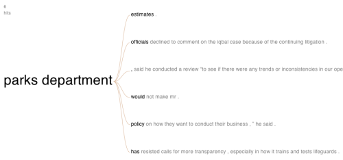
Some time last month, Many Eyes introduced their text visualization, [the word tree](http://blog.many-eyes.com/2007/08/31/new-visualization-a-tree-of-words/)
. The user starts from a word or phrase, which is the root (or the trunk?) of the tree and then the branches are the continuation of the sentence in which the word appeared. The advantage over the word tree is that the order of words stays the same, as opposed to a jumbled tag cloud:
[](http://services.alphaworks.ibm.com/manyeyes/view/Sm4H4JsOtha6HCFEfepFJ2-)
Hence, the word tree allows the user to gain a better understanding of text flow and writing patterns than she would with a cloud.
I found that it was very easy to create a word tree with some text that I had uploaded, but while starting exploration, I was unsure about what words to begin with. The word tree interface is similar to Martin Wattenberg’s earlier [Baby Name Wizard](http://www.babynamewizard.com/namevoyager/lnv0105.html)
. The user naturally has some ideas on what to start with since it’s an exploration of names. However, with the word tree, it’s not as obvious, because the user might be exploring a body of text she’s unfamiliar with.
So instead I began sifting with a word cloud, which gave me an idea of some important words and phrases used in the text. Then it was simple to move from the word cloud to the word tree. The two viz tools — cloud and tree — go together quite nicely as the cloud kind of works as a suggestion box for the tree. As a standalone, the word tree is off to a good start.
### Related
* [Words that do not appear in literature](https://flowingdata.com/2024/12/10/words-that-do-not-appear-in-literature/ "Words that do not appear in literature")
* [Interactive and animated word cloud](https://flowingdata.com/2012/02/14/interactive-and-animated-word-cloud/ "Interactive and animated word cloud")
* [Your street name across the country](https://flowingdata.com/2015/02/02/your-street-name-across-the-country/ "Your street name across the country")
---
# World Visualization Day (Really) – FlowingData
World Visualization Day (Really)
================================
[October 23, 2007](https://flowingdata.com/2007/10/23/world-visualization-day-really/)
### Topic
**[Site News](https://flowingdata.com/category/announcements/)
**
I thought Robert was just thinking out loud when he wrote [his post](http://eagereyes.org/blog/we-need-a-world-visualization-day.html)
on World Visualization Day, but I was apparently wrong. There’s now a simple [World Visualization Day site](http://worldvisualizationday.org/)
, a World Visualization Day Facebook group, and a first pass at a logo.
> World Visualization Day aims to take visualization out of the ivory tower of academia and bring it to the people. On one day of the year (which still needs to be decided), there will be events throughout the world for the general public to become aware of the power and usefulness of visualization, and to learn how to use it.
I think this is an excellent idea. Nobody outside of the field seems to have a clue about what visualization is. It’s always funny to talk to my mom about what I do. Despite all the nodding and mm hmm-ing, I know it’s all completely over her head.
It gets even worse when I start talking to people about **Statistics**. The eyes glaze over, and I just know they’re not even listening. Nobody seems to know what Statistics is outside of sports figures and standard deviation. “If I were doing what you were doing, I’d be a sports statistician.” Sure that’d be cool, but you know, there’s more to Statistics than the number of touchdowns Randy Moss has scored this season (It’s 10 by the way. He’s my top fantasy football player :).
What about a World Statistics Day?
----------------------------------
I’m tempted to ask for a World Statistics Day, but what would that even involve? A bunch of results from analyses? Theory? Algorithms? It would probably end up looking a lot like a World Visualization Day. Statistics results always seem to be more compelling when accompanied by some sexy visualization.
Nevermind. I’m getting off-topic. So yeah, World Visualization Day, check it out. It’d be fun to see all of the world’s top information and data visualists (?) putting together pieces to show everyone what visualization really is.
### Related
* [Fantasy football draft rankings, with weekly projections](https://flowingdata.com/2019/08/20/fantasy-football-draft-rankings-with-weekly-projections/ "Fantasy football draft rankings, with weekly projections")
* [How well players drafted in fantasy football](https://flowingdata.com/2019/09/19/how-well-players-drafted-in-fantasy-football/ "How well players drafted in fantasy football")
* [Bayesian fantasy football 101](https://flowingdata.com/2015/09/04/bayesian-fantasy-football-101/ "Bayesian fantasy football 101")
### 3 Comments
* [Robert Kosara](http://eagereyes.org/)
— [October 25, 2007 at 9:35 am](https://flowingdata.com/2007/10/23/world-visualization-day-really/#comment-49719)
There is no reason why you can’t use World Visualization to have your own World Statistics Day! ;) You can (and probably should) use graphs and visualizations to get the concepts across. There are many different types of visualization, and also areas that are bordering visualization like statistical graphics, information graphics, etc., I don’t see why we would need to draw a line between those. As long as it’s visual and based on data or information, it can fit under the visualization umbrella.
* Alan — [February 24, 2008 at 11:19 pm](https://flowingdata.com/2007/10/23/world-visualization-day-really/#comment-49720)
This sounds like a great venue to use visualization to emphasize the differences between practical and statistical significance. I think the results mentioned in the post “Does Your Name Affect How You Perform in Life?” might accomplish this.
* Alan — [February 24, 2008 at 6:19 pm](https://flowingdata.com/2007/10/23/world-visualization-day-really/#comment-1840)
This sounds like a great venue to use visualization to emphasize the differences between practical and statistical significance. I think the results mentioned in the post “Does Your Name Affect How You Perform in Life?” might accomplish this.
---
# Competitive Edge Explorer to Display Demographics – FlowingData
Competitive Edge Explorer to Display Demographics
=================================================
[October 26, 2007](https://flowingdata.com/2007/10/26/competitive-edge-explorer-to-display-demographics/)
### Topic
**[Maps](https://flowingdata.com/category/visualization/mapping/)
**
The [Competitive Edge Explorer](http://mobilab.mit.edu/mashup/futureboston/)
is a mapping project from the MIT Laboratory for Mobile Learning. It’s not just some hodge podge Google Maps mashup. The Explorer was written in [Processing](http://processing.org)
and has an intuitive and responsive user interface. As the user switches through datasets or zooms in and out, the map changes instantly. A total of eight datasets, including education, income levels, and housing costs, are available and can be selected at the same time to compare different areas according to different variables. The Explorer is yet another example for how maps offer the user a familiar visualization (just like timelines) for data.
It would be especially cool if the Explorer was not just for Boston, but for the entire U.S. or even better, the world. Of course, finding that much data seems impossible now, but hey, it doesn’t hurt to hope.
### Related
* [US Demographics Visualizer Using Virtual Earth](https://flowingdata.com/2007/11/06/us-demographics-visualizer-using-virtual-earth/ "US Demographics Visualizer Using Virtual Earth")
* [Xtimeline to Explore and Create Timelines](https://flowingdata.com/2007/07/07/xtimeline-to-explore-and-createtimelines/ "Xtimeline to Explore and Create Timelines")
* [World Freedom Atlas](https://flowingdata.com/2007/10/05/world-freedom-atlas/ "World Freedom Atlas")
### 2 Comments
* [Bernd](http://www.quantisozblog.de/)
— [October 26, 2007 at 10:05 pm](https://flowingdata.com/2007/10/26/competitive-edge-explorer-to-display-demographics/#comment-89)
This is a very impressive tool. Thanks for the hint!
* Pingback: [US Demographics Visualizer Using Virtual Earth](https://flowingdata.com/2007/11/06/us-demographics-visualizer-using-virtual-earth/)
---
# New Journal: Technology Innovations in Statistics Education – FlowingData
New Journal: Technology Innovations in Statistics Education
===========================================================
[October 16, 2007](https://flowingdata.com/2007/10/16/new-journal-technology-innovations-in-statistics-education/)
### Topic
**[Statistics](https://flowingdata.com/category/statistics/)
**
Technology Innovations in Statistics Education (TISE) is a new e-journal that was just announced yesterday. The use of technology (e.g. data visualization) has become extremely important in teaching statistical concepts to newbies, and so this new journal will be really useful; computers have allowed students to explore and experiment in ways students couldn’t do with just paper and pencil. TISE explores these alternatives.
> Technology Innovations in Statistics Education (TISE) publishes scholarhip on the intersection between technology and statistics education. The current issue includes papers by George Cobb (who challenges the introductory statistics curriculum to radically innovate to adapt to new technology), Beth Chance et. al, (who provide an overview of the use of technology to improve student learning), Wlliam Finzer, et.al, (who describe software innovations for improving student access to data), Dani Ben-Zvi, (preliminary research results on using Wiki in statistics teaching), Daniel Kaplan (on the role of computation in introductory statistics), and Andee Rubin (an historical overview of technology in statistics education.)
>
> These papers can be read at [http://tise.stat.ucla.edu](http://tise.stat.ucla.edu)
> . Please click on the “subscribe button” to join the mailing list to be informed of future released.
>
> TISE is seeking scholarly papers for Volume 2 that address any of these themes:
>
> * Designing technology to improve statistics education
> * Using technology to develop conceptual understanding
> * Teaching the use of technology to gain insight into and access to data
The [first issue](http://repositories.cdlib.org/uclastat/cts/tise/vol1/iss1/)
is already online. Take a look. I’ve had the opportunity to work with some of the knowledgeable and active members of the editorial board, so TISE looks to be very promising.
### Related
* [An open-access journal for visualization research](https://flowingdata.com/2023/06/02/an-open-access-journal-for-visualization-research/ "An open-access journal for visualization research")
* [What Can You Do With a Degree In Statistics? – A Follow Up](https://flowingdata.com/2008/04/09/what-can-you-do-with-a-degree-in-statistics-a-follow-up/ "What Can You Do With a Degree In Statistics? – A Follow Up")
* [A Repetitive Hate for Statistics](https://flowingdata.com/2007/09/17/a-repetitive-hate-for-statistics/ "A Repetitive Hate for Statistics")
### 2 Comments
* Ryan — [November 22, 2007 at 9:18 pm](https://flowingdata.com/2007/10/16/new-journal-technology-innovations-in-statistics-education/#comment-49705)
Awesome! I didn’t even know this existed!!
* bea — [November 22, 2007 at 9:21 pm](https://flowingdata.com/2007/10/16/new-journal-technology-innovations-in-statistics-education/#comment-49706)
neither did i!
---
# World Freedom Atlas – FlowingData
World Freedom Atlas
===================
[October 5, 2007](https://flowingdata.com/2007/10/05/world-freedom-atlas/)
### Topic
**[Apps](https://flowingdata.com/category/software/online-apps/)
, [Maps](https://flowingdata.com/category/visualization/mapping/)
**
[World Freedom Atlas](http://freedom.indiemaps.com/)
is an online geo-visualization tool that shows a number of freedom indicators so to speak. For example, you can map by a number of indexes such as raw political rights score, civil liberties, political imprisonment, freedom of religion, freedom of speech, or torture. If I’ve counted correctly the data comes from 42 datasets divided into three categories:
1. What It Is
2. How To Get It
3. What You Get
_What It Is_ covers data such as political rights and civil liberties while _How To Get It_ is data on government structure and education system. I’m not really sure _What You Get_ is though. There’s GDP and some economic indexes, so it could be something like quality of life. Maybe someone can explain it better?
The mapping and plots are pretty standard, but what stands out is the number of datasets that have been formatted in such a way the user is able to map things quickly and easily. It would be really cool if the data was explained a little better, so that I could “browse” the data a bit more efficiently, and even better, if there were some way to compare indicators against each other. Nevertheless, worth exploring a bit.
### Related
* [Check if your school district or college was investigated for civil rights violations](https://flowingdata.com/2018/06/25/check-if-your-school-district-or-college-was-investigated-for-civil-rights-violations/ "Check if your school district or college was investigated for civil rights violations")
* [Indicators for a recession](https://flowingdata.com/2022/08/09/indicators-for-a-recession/ "Indicators for a recession")
* [Abortion policies, over time and by state](https://flowingdata.com/2015/03/18/abortion-policies-over-time-and-by-state/ "Abortion policies, over time and by state")
### 3 Comments
* [Mike Love](http://mikelove.wordpress.com)
— [October 8, 2007 at 6:52 pm](https://flowingdata.com/2007/10/05/world-freedom-atlas/#comment-49699)
very cool. the interface is pretty intuitive as well. i like to see flash becoming more low impact.
* Dave Williams — [April 24, 2008 at 4:26 pm](https://flowingdata.com/2007/10/05/world-freedom-atlas/#comment-49700)
Simple, powerful and scary. Especially useful to see your own weighting of factors rather than some source with an agenda. Should be the bacdrop for every international news story on TV and every civics class (in the few places that still teach that subject).
* [Zachary Johnson](http://indiemaps.com/blog)
— [June 11, 2008 at 11:51 pm](https://flowingdata.com/2007/10/05/world-freedom-atlas/#comment-49701)
Hello. There is a way to compare indicators, though admittedly it’s not that obvious or intuitive. Switch to a bivariate view by hitting “bi” on the toolbar above the histogram. This switches to a bivariate choropleth with other options and mouseovers.
---
# Visualizar Showcase Officially Opened at Medialab – FlowingData
Visualizar Showcase Officially Opened at Medialab
=================================================
[December 10, 2007](https://flowingdata.com/2007/12/10/visualizar-showcase-officially-opened-at-medialab/)
### Topic
**[Site News](https://flowingdata.com/category/announcements/)
**
The Visualizar Showcase is officially open and ready for public viewing, so if you’re in Madrid (and I’m about 80% sure you will be) from now until January 5, 2008 check out the projects spawned from two weeks of hard work. You can find a complete list of the projects at the [Visualizar website](http://visualizar.org)
, but here are a few of my favorites in no particular order.
Mail Garden
-----------
[](http://flickr.com/photos/medialab-prado/2086767694/)
Mail Garden, from Kjen Wilkens, explores emails under a garden metaphor with the implication that our email is in someway living (like all data). In the visualization, emails exist as plants and as you scroll over you can read each email. The best part of of Mail Garden though is probably when you’re _not_ using it. When the system is idle, you can watch your plants (your emails) gently sway back and forth in the wind.
TweetPad
--------
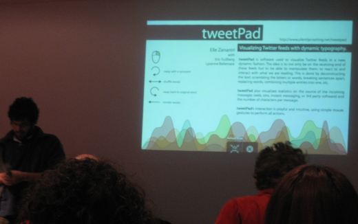
As if [Twitter](http://twitter.com)
weren’t playful enough, [TweetPad](http://silentlycrashing.net/tweetpad/)
, by Elie Zananiri, is a visualization that lets you playfully explore the live Twitter feed. Elie’s main interest was in word interaction, and you can see that clearly in the TweetPad. Move the cursor clockwise for synonyms, back and forth to shuffle words, and counter clockwise to revert back to the original tweet all the while the Twitter feed is coming at you live.
Spamology
---------

This visualization, as you might have guessed, explores one of the most popular canned meats in the world. No, just kidding. Spamology, by Irad Lee, explores email spam. The visualization is nice as you explore the small and giant buildings of spam, but it’s the sound accompaniment that really makes it. Sound corresponds to the height of each spam building. Usually, pieces like this end up sounding like noise, but this was more like beautiful music.
Now before I cover every work, which I’m a little tempted to do, I’ll stop here. If you happen to be in Madrid, Spain, go check it out. If you read this blog, you’re more than likely to enjoy the projects on display at the Medialab… or you can watch it on the news. Visualizar was also featured on some [news show](http://www.rtve.es/page?CA_HOME&tipoVideo=HOME_ULTIMO)
in Madrid. Be patient. The segment on the workshop comes some time around ten and a half minutes.
### Related
* [Spamology From Visualizar is Available for Exploration](https://flowingdata.com/2008/02/13/spamology-from-visualizar-is-available-for-exploration/ "Spamology From Visualizar is Available for Exploration")
* [21 Ways to Visualize and Explore Your Email Inbox](https://flowingdata.com/2008/03/19/21-ways-to-visualize-and-explore-your-email-inbox/ "21 Ways to Visualize and Explore Your Email Inbox")
* [Visualization Workshop in Madrid – Database City](https://flowingdata.com/2008/09/24/visualization-workshop-in-madrid-database-city/ "Visualization Workshop in Madrid – Database City")
---
# Create, Share, and Embed Custom Timelines with circaVie – FlowingData
Create, Share, and Embed Custom Timelines with circaVie
=======================================================
[October 25, 2007](https://flowingdata.com/2007/10/25/create-share-and-embed-custom-timelines-with-circavie/)
### Topic
**[Apps](https://flowingdata.com/category/software/online-apps/)
** / [timeline](https://flowingdata.com/tag/timeline/)
Part of the AIM network, it’s another online application to create and share timelines. As I’ve said before, timelines are very intuitive in displaying both data and information, so it’s not surprising that these applications are springing up. The [circaVie](http://www.circavie.com/)
user interface feels a bit easier than [xtimeline](https://flowingdata.com/2007/07/07/xtimeline-to-explore-and-createtimelines/)
, and I like circaVie’s style and design a lot more too. In particular I like the timeline scrolling; it feels a lot like the iPhone interface. Try it out for yourself using your AIM screenname.
### Related
* [Xtimeline to Explore and Create Timelines](https://flowingdata.com/2007/07/07/xtimeline-to-explore-and-createtimelines/ "Xtimeline to Explore and Create Timelines")
* [Tell Stories With Interactive Timelines from Dipity](https://flowingdata.com/2008/08/18/tell-stories-with-interactive-timelines-from-dipity/ "Tell Stories With Interactive Timelines from Dipity")
* [Evaluating timeline layouts](https://flowingdata.com/2020/05/11/evaluating-timeline-layouts/ "Evaluating timeline layouts")
---
# Google Decides to Host a Whole Lot of Scientific Data – Palimpsest Project – FlowingData
Google Decides to Host a Whole Lot of Scientific Data – Palimpsest Project
==========================================================================
[January 21, 2008](https://flowingdata.com/2008/01/21/google-decides-to-host-a-whole-lot-of-scientific-data-palimpsest-project/)
### Topic
**[Data Sources](https://flowingdata.com/category/statistics/data-sources/)
**
In its continued efforts for absolute power over all information ever created in the world, Google will be hosting open-source scientific datasets at its [research section](http://research.google.com)
. Here are the presentation slides from Google’s Jon Trowbridge.
In the next few weeks, terabytes of data will be made available to the public. For example, all 120 terabytes of Hubble Space Telescope data is going to be online. That’s kind of cool but kind of scary too. Such a large amount of data is bound to affect lots of people on many different levels.
For scientists, data will be available for deeper research. For the scientists who generated the data, their research could be placed under more critical scrutiny. Existing data applications might be eclipsed by the data giant, or it could go the other way such that the general public grows more aware of data-type things. Mashups will in turn spring up as well as more visualization, I am sure.
### All of this Doesn’t Matter If…
Of course, all of this depends on what data end up on the Google servers and how easily accessible the data are. Knowing Google, I don’t think accessibility will be a problem. _Getting_ data will be the super hard part. Who will be willing to contribute their data? What type of data will get contributed? Will it be the good, raw data or more cleaned and processed data? Do researchers even want to share their data with the rest of the world?
It’s going to be interesting to see what goes up on Google Research in these coming weeks.
\[via [Wired](http://blog.wired.com/wiredscience/2008/01/google-to-provi.html)\
and [Pimm](http://pimm.wordpress.com/2007/09/25/googles-palimpsest-project-promiscuous-distribution-of-all-science-data-sets/)\
\]
### Related
* [Google Adds Search to Public Data](https://flowingdata.com/2009/04/28/google-adds-search-to-public-data/ "Google Adds Search to Public Data")
* [Is the New Google Visualization API Going to Limit Our Data Imagination?](https://flowingdata.com/2008/03/21/is-the-new-google-visualization-api-going-to-limit-our-data-imagination/ "Is the New Google Visualization API Going to Limit Our Data Imagination?")
* [Conflicting views: Public versus scientists](https://flowingdata.com/2015/02/02/conflicting-views-public-versus-scientists/ "Conflicting views: Public versus scientists")
### 1 Comment
* Pingback: [michaelgalloy.com » Google hosting scientific data](http://michaelgalloy.com/2008/02/14/google-hosting-scientific-data.html)
---
# Watch the Money Clock to See What You’ve Earned – FlowingData
Watch the Money Clock to See What You’ve Earned
===============================================
[October 31, 2007](https://flowingdata.com/2007/10/31/watch-the-money-clock-to-see-what-youve-earned/)
### Topic
**[Ugly Charts](https://flowingdata.com/category/visualization/ugly-visualization/)
**

Despite being surrounded with ads, this [money clock](http://www.cashto.net/)
was kind of, um, interesting. Put in how much you earn hourly, monthly, or annually, and it displays a running clock of dollars and cents for how much you’ve earned while watching the clock. It was amusing at first, and then kind of depressing after a few seconds.
P.S. Happy Halloween!
### Related
* [Minimum Wage Machine pays in pennies](https://flowingdata.com/2015/08/28/minimum-wage-machine-pays-in-pennies/ "Minimum Wage Machine pays in pennies")
* [Shifts in time on the Doomsday Clock](https://flowingdata.com/2023/02/01/shifts-in-time-on-the-doomsday-clock/ "Shifts in time on the Doomsday Clock")
* [Clock plays a song with the current time in its title](https://flowingdata.com/2023/09/01/clock-plays-a-song-with-the-current-time-in-its-title/ "Clock plays a song with the current time in its title")
---
# Yahoo Charts Control Library Now Available – FlowingData
Yahoo Charts Control Library Now Available
==========================================
[December 6, 2007](https://flowingdata.com/2007/12/06/yahoo-charts-control-library-now-available/)
### Topic
**[Apps](https://flowingdata.com/category/software/online-apps/)
**
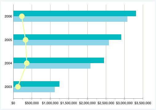
Yahoo User Interface 2.4.0 was [recently released](http://yuiblog.com/blog/2007/12/04/yuii-240/)
which includes the new [YUI Charts Control](http://developer.yahoo.com/yui/charts/)
.
> Josh Tynjala of the Yahoo! Flash Platform team contributes the new YUI Charts Control, a hybrid JavaScript/Flash component that supports bar, line, and pie charts. The Charts Control draws data from the same DataSource Utility that underpins the YUI DataTable Control, making it possible to do combined chart/table visualizations. The Charts Control accepts CSS style information, allowing you to skin the chart itself without touching the underlying .swf file. But if you do want to dig into the Flash side of this project, you can get full access to those assets on the ASTRA site.
What does this mean? It means that we’re probably going to see a lot more hack-ish looking charts online (example above); but we might also see some nice-looking charts since it seems like they’re potentially customizable. In any case, it’s good to see this. There’s some cruddy Flash-based chart libraries that people are actually charging money for. This free and open library should have some positive effects.
### Related
* [Google Has a Charting API Too Now](https://flowingdata.com/2007/12/07/google-has-a-charting-api-too-now/ "Google Has a Charting API Too Now")
* [Visualizing popularity of Yahoo homepage stories](https://flowingdata.com/2012/01/30/visualizing-popularity-of-yahoo-homepage-stories/ "Visualizing popularity of Yahoo homepage stories")
* [Visual history of Yahoo Pipes](https://flowingdata.com/2023/12/20/visual-history-of-yahoo-pipes/ "Visual history of Yahoo Pipes")
### 1 Comment
* [grossu](http://grossu.ru)
— [December 6, 2007 at 8:46 am](https://flowingdata.com/2007/12/06/yahoo-charts-control-library-now-available/#comment-691)
It’s seemed to me they are too raw. I would prefer Open-flash-chart if we speak about free flash charts.
---
# How Do You Visualize Time in a Drawing? – FlowingData
How Do You Visualize Time in a Drawing?
=======================================
[October 18, 2007](https://flowingdata.com/2007/10/18/how-do-you-visualize-time-in-a-drawing/)
### Topic
**[Data Art](https://flowingdata.com/category/visualization/artistic-visualization/)
**
Icastic has a fun (and growing) collection of (currently) 247 hand-drawings from contributors who have shown [how they see time](http://www.icastic.com/time/visualize.php)
. Some are very detailed works of art while others are concise sketches. From words, objects, to people, the collection is a nice spectrum of imagination.
### Related
* [Visions penned by the 18th century king of Prussia](https://flowingdata.com/2016/10/18/visions-penned-by-the-18th-century-king-of-prussia/ "Visions penned by the 18th century king of Prussia")
* [Visualization of Taste Explosions from Ratatouille](https://flowingdata.com/2007/07/11/visualization-of-taste-explosions-from-ratatouille/ "Visualization of Taste Explosions from Ratatouille")
* [Blockchain visually explained](https://flowingdata.com/2018/06/18/blockchain-visually-explained/ "Blockchain visually explained")
---
# YouTube Releases Visualization for Related Videos – FlowingData
YouTube Releases Visualization for Related Videos
=================================================
[December 18, 2007](https://flowingdata.com/2007/12/18/youtube-releases-visualization-for-related-videos/)
### Topic
**[Apps](https://flowingdata.com/category/software/online-apps/)
**
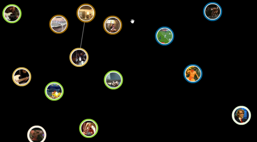
YouTube (or should I say Google), released their visualization for related videos. It’s essentially a ball and stick graph without the sticks. The above is a screenshot of the videos related to [Marty McFly playing Johnny B. Goode](http://youtube.com/watch?v=01aN4AEB6GE)
in Back to the Future, the greatest movie of all time.
Some of the video bubbles that circle around the Marty clip are the same as those in the “Related Videos” section of the usual page while others are not. Place the cursor over a bubble for about two seconds, and related videos for the one you have your mouse over will bubble up.
I’m not sure if the distance between the bubbles have to do with similarity level. So far it seems not, because I’ve refreshed the Marty visualization a few times and the bubbles’ initial positions have always been different.
Take a Look for Yourself
------------------------
If you want to see the bubbles for yourself, go to some YouTube video and go full screen. Look for this ball and stick button next to the play button:

It’s not available for all videos yet, so you’ll have to look a little.
What I Think
------------
It’s good that Google is trying to get into some visualization. When Google starts doing something, you know others will follow. When others follow, visualization will popularize and as a result, I will be in higher demand when I graduate. That’s in the grand scheme of things though :).
The YouTube visualization itself — I’m not all that impressed. It’s kind of sluggish, it’s not very attractive, and it gets pretty confusing a few seconds in. However, when we think visualization, we always have to think context. When I think of the type of people who are going to be using the tool (if you want to call it that), it’ll probably achieve its goal — get people to watch more videos and stay on YouTube longer.
\[via [ReadWriteWeb](http://www.readwriteweb.com/archives/youtube-swarm.php)\
\]
### Related
* [What YouTube recommendations look like for others](https://flowingdata.com/2020/07/30/what-youtube-recommendations-look-like-for-others/ "What YouTube recommendations look like for others")
* [Introduction to R, a video series by Google](https://flowingdata.com/2013/08/13/introduction-to-r-a-video-series-by-google/ "Introduction to R, a video series by Google")
* [Interactive Graph Visualization System – Skyrails](https://flowingdata.com/2008/09/08/interactive-graph-visualization-system-skyrails/ "Interactive Graph Visualization System – Skyrails")
---
# 25 Highest Grossing Films of All Time (Wallpaper) – FlowingData
25 Highest Grossing Films of All Time (Wallpaper)
=================================================
[January 2, 2008](https://flowingdata.com/2008/01/02/25-highest-grossing-films-of-all-time-wallpaper/)
### Topic
**[Data Sources](https://flowingdata.com/category/statistics/data-sources/)
**
I love to look at how the current week’s movies are doing at the [box office](http://www.boxofficemojo.com/)
. I’m not really sure what it is. I think it’s kind of like a gauge for what good movies are out; or maybe I’m just constantly amazed by the millions of dollars that movies make; or I think it could be my addiction to numbers?
Something that always strikes me as interesting is how movies are always breaking records at the box office. So and so movie just broke the record for most money made over a single weekend or a month or a long holiday weekend or for a Thursday when there was at least 2 inches of rain and a dog skateboarded two miles.
I took a look at the 25 highest grossing American films, adjusted for inflation. I’m so tired of hearing statistics for money comparisons over time that don’t adjust for inflation. Wow, gasoline prices are at an all time high. Well guess what — so are milk, bread, burgers, televisions, light bulbs, paper, cars, and everything else on the planet. Sorry, slight tangent.
Download the Wallpaper
----------------------
As an early birthday gift to you, here are my results in wallpaper form:
[1024 x 768](https://flowingdata.com/wp-content/uploads/2007/12/01xx-boxoffice1024.gif "Grossing Films Wallpaper 1024 x 768")
[1280 x 1024](https://flowingdata.com/wp-content/uploads/2007/12/01xx-boxoffice1280.gif "Highest Grossing Films 1280 x 1024")
[1440 x 900](https://flowingdata.com/wp-content/uploads/2007/12/01xx-boxoffice.gif "Highest Grossing Films 1440 x 900")
The movie titles are color coded for genre and the higher grossing films are in a larger font. Drama and action/adventure clearly dominate — The hills are alive. Luke, I am your father. Phone home. I’ll never go hungry again.
Surprisingly (at least to me), only 7 of the top 25 films won the Oscar for best picture and of the top 50, only 9 won best picture.
### Related
* [Award-nominated movies vs. highest grossing](https://flowingdata.com/2011/06/22/award-nominated-movies-vs-highest-grossing/ "Award-nominated movies vs. highest grossing")
* [Dropping movie ratings from the past six decades](https://flowingdata.com/2011/04/19/dropping-movie-ratings-from-the-past-six-decades/ "Dropping movie ratings from the past six decades")
* [Best Picture vs. most popular – Oscar statistics](https://flowingdata.com/2011/02/26/best-picture-vs-most-popular-oscar-statistics/ "Best Picture vs. most popular – Oscar statistics")
---
# US Demographics Visualizer Using Virtual Earth – FlowingData
US Demographics Visualizer Using Virtual Earth
==============================================
[November 6, 2007](https://flowingdata.com/2007/11/06/us-demographics-visualizer-using-virtual-earth/)
### Topic
**[Maps](https://flowingdata.com/category/visualization/mapping/)
**
While on the topic of maps here’s a Microsoft Virtual Earth mashup — [US Demographics Visualizer](http://demo.idvsolutions.com/apps/censusdemo/flash/map.html)
. It allows the user to map US census data by county. Map population, age, ethnicity, election results, and income. It’s not quite as responsive as the [Competitive Edge Explorer](https://flowingdata.com/2007/10/26/competitive-edge-explorer-to-display-demographics/)
, but if you’re looking to explore country-wide census data, then it’s worth taking a look at.
### Related
* [Competitive Edge Explorer to Display Demographics](https://flowingdata.com/2007/10/26/competitive-edge-explorer-to-display-demographics/ "Competitive Edge Explorer to Display Demographics")
* [Mapping demographics of every block and city in America](https://flowingdata.com/2010/12/16/mapping-demographics-of-every-block-and-city-in-america/ "Mapping demographics of every block and city in America")
* [Evolution of race categories in U.S. Census forms](https://flowingdata.com/2023/10/20/evolution-of-race-categories-in-u-s-census-forms/ "Evolution of race categories in U.S. Census forms")
---
# Using Data to Find Likely Crime Spots – FlowingData
Using Data to Find Likely Crime Spots
=====================================
[December 27, 2007](https://flowingdata.com/2007/12/27/using-data-to-find-likely-crime-spots/)
### Topic
**[Statistics](https://flowingdata.com/category/statistics/)
**
I stumbled across [this article](http://www.csulb.edu/misc/inside/archives/v59n10/stories/1.htm)
about Aili Malm, a GIS specialist (I think) who uses social network analysis to find the most probably locations of organized crime.
> “I look at where organized crime groups are located and I study how these groups are linked to one another,” she explained. “I can chart their cell phone use or e-mail communication or with whom they co-offend. Based on these connections, I try to isolate the important players. Then I take the social and make it spatial. I look at individuals important to the criminal network and map where they live and where they commit their crimes.”
It’s just like that show Numb3rs on CBS. Albeit, math and statistics is a bit glorified on the show, but hey, at least it’s loosely based on reality.
### Related
* [Bias built in to crime prediction](https://flowingdata.com/2016/05/27/bias-built-in-to-crime-prediction/ "Bias built in to crime prediction")
* [Flawed hate crime data collection](https://flowingdata.com/2017/12/05/flawed-hate-crime-data-collection/ "Flawed hate crime data collection")
* [The different trends in American crime](https://flowingdata.com/2016/08/19/the-different-trends-in-american-crime/ "The different trends in American crime")
### 2 Comments
* Ryan — [December 28, 2007 at 4:11 am](https://flowingdata.com/2007/12/27/using-data-to-find-likely-crime-spots/#comment-984)
There are actually several papers about how social network analysis is being used to find OBL and how to explain the key players during 9/11.
The biggest source of the exaggeration on Numb3rs involves small sample sizes.
* [Nathan Yau](https://flowingdata.com)
— [December 28, 2007 at 4:35 pm](https://flowingdata.com/2007/12/27/using-data-to-find-likely-crime-spots/#comment-49784)
oh for sure. I don’t doubt that there’s hundreds of papers about using statistics to find, understand, and fight crime. It’s always nice to see Stat in any kind of news form though :)
---