# Table of Contents
- [Documentation - Materialize](#documentation-materialize)
- [About - Materialize](#about-materialize)
- [Badges - Materialize](#badges-materialize)
- [Getting Started - Materialize](#getting-started-materialize)
- [Sass - Materialize](#sass-materialize)
- [Parallax - Materialize](#parallax-materialize)
- [Collapsible - Materialize](#collapsible-materialize)
- [Starter Template - Materialize](#starter-template-materialize)
- [Parallax Template - Materialize](#parallax-template-materialize)
- [Parallax - Materialize](#parallax-materialize)
- [Color - Materialize](#color-materialize)
- [Helpers - Materialize](#helpers-materialize)
- [Grid - Materialize](#grid-materialize)
- [Media CSS - Materialize](#media-css-materialize)
- [Pulse - Materialize](#pulse-materialize)
- [Table - Materialize](#table-materialize)
- [Shadow - Materialize](#shadow-materialize)
- [CSS Transitions - Materialize](#css-transitions-materialize)
- [Typography - Materialize](#typography-materialize)
- [Buttons - Materialize](#buttons-materialize)
- [Breadcrumbs - Materialize](#breadcrumbs-materialize)
- [Collections - Materialize](#collections-materialize)
- [Cards - Materialize](#cards-materialize)
- [Footer - Materialize](#footer-materialize)
- [Floating Action Button - Materialize](#floating-action-button-materialize)
- [Pagination - Materialize](#pagination-materialize)
- [Navbar - Materialize](#navbar-materialize)
- [Auto Init - Materialize](#auto-init-materialize)
- [Preloader - Materialize](#preloader-materialize)
- [FeatureDiscovery - Materialize](#featurediscovery-materialize)
- [Dropdown - Materialize](#dropdown-materialize)
- [Carousel - Materialize](#carousel-materialize)
- [Icons - Materialize](#icons-materialize)
- [Modals - Materialize](#modals-materialize)
- [Scrollspy - Materialize](#scrollspy-materialize)
- [Sidenav - Materialize](#sidenav-materialize)
- [Toasts - Materialize](#toasts-materialize)
- [Tooltips - Materialize](#tooltips-materialize)
- [Waves - Materialize](#waves-materialize)
- [Tabs - Materialize](#tabs-materialize)
- [Checkboxes - Materialize](#checkboxes-materialize)
- [Switches - Materialize](#switches-materialize)
- [Autocomplete - Materialize](#autocomplete-materialize)
- [Chips - Materialize](#chips-materialize)
- [Mobile - Materialize](#mobile-materialize)
- [Showcase - Materialize](#showcase-materialize)
- [Range - Materialize](#range-materialize)
- [Radio Buttons - Materialize](#radio-buttons-materialize)
- [Pickers - Materialize](#pickers-materialize)
- [Media - Materialize](#media-materialize)
- [Text Inputs - Materialize](#text-inputs-materialize)
- [Select - Materialize](#select-materialize)
- [Themes - Materialize](#themes-materialize)
- [Support Us - Materialize](#support-us-materialize)
- [Pushpin - Materialize](#pushpin-materialize)
- [Fullscreen Slider - Materialize](#fullscreen-slider-materialize)
- [Pushpin Demo - Materialize](#pushpin-demo-materialize)
---
# Documentation - Materialize
#### A modern responsive front-end framework based on Material Design
[Get Started](http://materializecss.com/getting-started.html)
[Upgrade from 0.100.2](https://github.com/Dogfalo/materialize/blob/v1-dev/v1-upgrade-guide.md)
[Release: 1.0.0](https://github.com/Dogfalo/materialize)
[](https://srv.carbonads.net/ads/click/x/GTND427NC6AILKQLCWBLYKQUCY7DVKJYCAYDCZ3JCASD62QNC67IP53KC6SDL23YCYBDK5QYCAAIL5QJCAAI6K3WHEYI52JJF6SIK53ECTNCYBZ52K)
[Don’t lose sleep over downtime. Hop on Bunny for reliable sites that stay up.](https://srv.carbonads.net/ads/click/x/GTND427NC6AILKQLCWBLYKQUCY7DVKJYCAYDCZ3JCASD62QNC67IP53KC6SDL23YCYBDK5QYCAAIL5QJCAAI6K3WHEYI52JJF6SIK53ECTNCYBZ52K) [ads via Carbon](http://carbonads.net/?utm_source=materializecss&utm_medium=ad_via_link&utm_campaign=in_unit&utm_term=carbon)
Latest Commit on Github: [](https://materializecss.com/)
[Github](https://github.com/Dogfalo/materialize)
_flash\_on_
Speeds up development
We did most of the heavy lifting for you to provide a default stylings that incorporate our custom components. Additionally, we refined animations and transitions to provide a smoother experience for developers.
_group_
User Experience Focused
By utilizing elements and principles of Material Design, we were able to create a framework that incorporates components and animations that provide more feedback to users. Additionally, a single underlying responsive system across all platforms allow for a more unified user experience.
_settings_
Easy to work with
We have provided detailed documentation as well as specific code examples to help new users get started. We are also always open to feedback and can answer any questions a user may have about Materialize.
Checkout what people are creating with Materialize. Get inspired by these beautiful sites and you can even submit your own website to be showcased here.
[Explore our Showcase](http://materializecss.com/showcase.html)
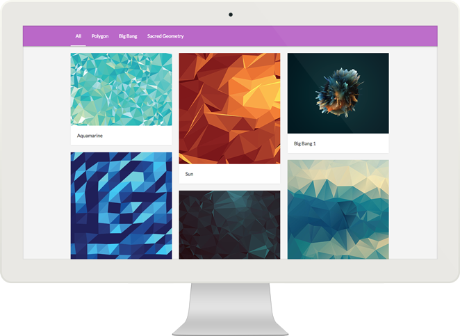
Take a look at our official themes for Materialize.
[Explore our Themes](http://materializecss.com/themes.html)
---
# About - Materialize
#### Learn about Material Design and our Project Team.
[](https://srv.carbonads.net/ads/click/x/GTND427NC6AILKQLCWBLYKQUCY7DVKJYC6YILZ3JCASD62JJCEADL27KCA7IP53NC67DCKQNCASIE2QUC6BDLKJKC6SIKKQ7CASDEK3EHJNCLSIZ)
[Design and Development tips in your inbox. Every weekday.](https://srv.carbonads.net/ads/click/x/GTND427NC6AILKQLCWBLYKQUCY7DVKJYC6YILZ3JCASD62JJCEADL27KCA7IP53NC67DCKQNCASIE2QUC6BDLKJKC6SIKKQ7CASDEK3EHJNCLSIZ) [ads via Carbon](http://carbonads.net/?utm_source=materializecss&utm_medium=ad_via_link&utm_campaign=in_unit&utm_term=carbon)
Created and designed by Google, Material Design is a design language that combines the classic principles of successful design along with innovation and technology. Google's goal is to develop a system of design that allows for a unified user experience across all their products on any platform.

#### Material is the metaphor
The metaphor of material defines the relationship between space and motion. The idea is that the technology is inspired by paper and ink and is utilized to facilitate creativity and innovation. Surfaces and edges provide familiar visual cues that allow users to quickly understand the technology beyond the physical world.

#### Bold, graphic, intentional
Elements and components such as grids, typography, color, and imagery are not only visually pleasing, but also create a sense of hierarchy, meaning, and focus. Emphasis on different actions and components create a visual guide for users.

#### Motion provides meaning
Motion allows the user to draw a parallel between what they see on the screen and in real life. By providing both feedback and familiarity, this allows the user to fully immerse him or herself into unfamiliar technology. Motion contains consistency and continuity in addition to giving users additional subconscious information about objects and transformations.
We are a team of students from Carnegie Mellon University.


#### Alvin Wang
Alvin is an Information Systems and Human Computer Interaction Major. He worked as a Software Engineer at Fidelity Investments this past summer.

#### Alan Chang
Alan is an Information Systems major with a minor in computer science. He worked at as a Front End Developer at Shift Collaborative this past summer.

#### Alex Mark
Alex is an Information Systems major with a minor in Human Computer Interaction. He worked as a software developer for Intuit this past summer.

#### Kevin Louie
Kevin is an Information Systems major with a minor in Human Computer Interaction. This past summer, he worked as a technology analyst at PPG Industries.
* [Material Design](http://materializecss.com/about.html#materialdesign)
* [Meet the Team](http://materializecss.com/about.html#team)
---
# Badges - Materialize
Badges can notify you that there are new or unread messages or notifications. Add the `new` class to the badge to give it the background.
[1Alan](http://materializecss.com/badges.html#!)
[4Alan](http://materializecss.com/badges.html#!)
[Alan](http://materializecss.com/badges.html#!)
[14Alan](http://materializecss.com/badges.html#!)
Dropdownarrow_drop_down
* _filter\_drama_First4
Lorem ipsum dolor sit amet.
* _place_Second1
Lorem ipsum dolor sit amet.
filter_drama
First
4
Lorem ipsum dolor sit amet.
place
Second
1
Lorem ipsum dolor sit amet.
You can customize captions in many ways.
##### Custom Caption
[Custom Badge Captions4](http://materializecss.com/badges.html#!)
[Custom Badge Captions4](http://materializecss.com/badges.html#!)
You can explicitly set the caption in a badge using the `data-badge-caption` attribute.
44
##### Colors
[Red4](http://materializecss.com/badges.html#!)
[Blue4](http://materializecss.com/badges.html#!)
You can use our color classes to set the background-color of the badge.
44
[](https://srv.carbonads.net/ads/click/x/GTND427NC6AILKQLCWBLYKQUCY7DV2QJCYSI4Z3JCASD62QNCTADP27KC6SD653IFTBD5K7MF6AIVK3YFTBI62JIHEYI52JJF6SIK53ECTNCYBZ52K)
[Review requests, book clients, and get paid with Squarespace.](https://srv.carbonads.net/ads/click/x/GTND427NC6AILKQLCWBLYKQUCY7DV2QJCYSI4Z3JCASD62QNCTADP27KC6SD653IFTBD5K7MF6AIVK3YFTBI62JIHEYI52JJF6SIK53ECTNCYBZ52K) [ads via Carbon](http://carbonads.net/?utm_source=materializecss&utm_medium=ad_via_link&utm_campaign=in_unit&utm_term=carbon)

* [Collections](http://materializecss.com/badges.html#collections)
* [Dropdown](http://materializecss.com/badges.html#dropdown)
* [Navbar](http://materializecss.com/badges.html#navbar)
* [Collapsible](http://materializecss.com/badges.html#collapsible)
* [Options](http://materializecss.com/badges.html#options)
---
# Getting Started - Materialize
#### Learn how to easily start using Materialize in your website.
[](https://srv.carbonads.net/ads/click/x/GTND427NC6AILKQLCWBLYKQUCY7DVK7WCYBD5Z3JCASD62QMF67I4K3KFTBDE53LCEYDE2QICW7DTKQNCEAITK7KC6SIKKQ7CASDEK3EHJNCLSIZ)
[Get the Drop. Weekly front-end tools, tips, and resources. Plus a free icon pack to get you started.](https://srv.carbonads.net/ads/click/x/GTND427NC6AILKQLCWBLYKQUCY7DVK7WCYBD5Z3JCASD62QMF67I4K3KFTBDE53LCEYDE2QICW7DTKQNCEAITK7KC6SIKKQ7CASDEK3EHJNCLSIZ) [ads via Carbon](http://carbonads.net/?utm_source=materializecss&utm_medium=ad_via_link&utm_campaign=in_unit&utm_term=carbon)
Materialize comes in two different forms. You can select which version you want depending on your preference and expertise. To start using Materialize, all you have to do is download one of the options below.
##### Materialize
This is the standard version that comes with both the minified and unminified CSS and JavaScript files. This option requires little to no setup. Use this if you are unfamiliar with Sass.
[Materialize_file\_download_](https://github.com/Dogfalo/materialize/releases/download/1.0.0/materialize-v1.0.0.zip)
##### Sass
This version contains the source SCSS files. By choosing this version you have more control over which components to include. You will need a Sass compiler if you choose this option.
[Source_file\_download_](https://github.com/Dogfalo/materialize/releases/download/1.0.0/materialize-src-v1.0.0.zip)
##### CDN
You can find all the versions of the CDN at [cdnjs](https://cdnjs.com/libraries/materialize)
.
##### NPM
You can also get the latest release using NPM. This release contains source files as well as the compiled CSS and JavaScript files.
npm install materialize-css@next
##### Bower
You can also get the latest release using bower. This release contains source files as well as the compiled CSS and JavaScript files. **([bower is deprecated](http://bower.io/blog/2017/how-to-migrate-away-from-bower/)
.)**
bower install materialize
We hope you find Materialize useful in your next project. We would appreciate if you helped us spread the word about Materialize on our Social Media. Also if you want to support the development, you can donate to us.
Donate Now
##### Project Structure
After downloading, extract the files into the directory where your website is located. Your directory will look something like this.
You'll notice that there are two sets of the files. The `min` means that the file is "compressed" to reduce load times. These minified files are usually used in production while it is better to use the unminified files during development.
MyWebsite/
|--css/
| |--materialize.css
|
|--fonts/
| |--roboto/
|
|--js/
| |--materialize.js
|
|--index.html
##### HTML Setup
Next you just have to make sure you link the files properly in your webpage. Generally it is wise to import javascript files at the end of the body to reduce page load time. Follow the example below on how to import Materialize into your webpage.
We have created some starter templates so you can easily start designing your website with minimal setup up time. Browse through our collection and download your best fit.
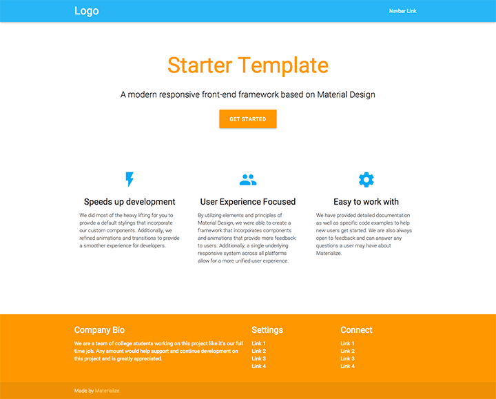
##### Starter Template
[](http://materializecss.com/templates/starter-template/preview.html)
This is the simplest starter page with a Header, Call-to-Action, and Icon Features.
[Demo_search_](http://materializecss.com/templates/starter-template/preview.html)
[Download_file\_download_](http://materializecss.com/templates/starter-template.zip)
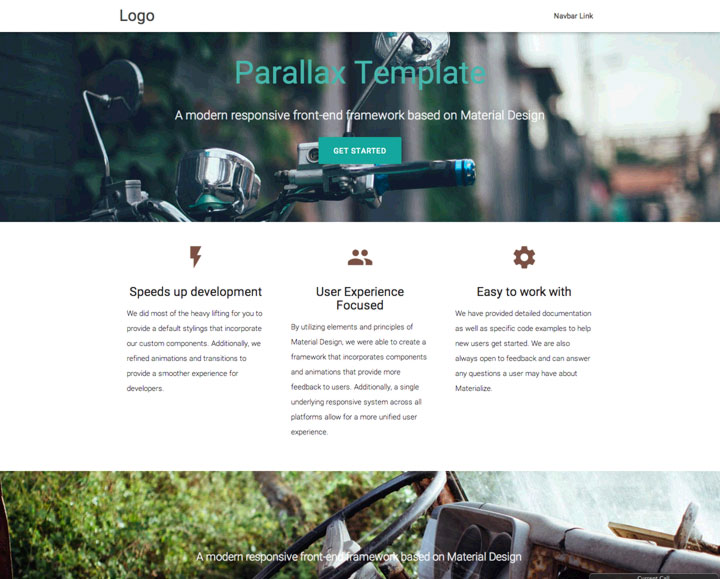
##### Parallax Template
[](http://materializecss.com/templates/parallax-template/preview.html)
This is the simplest starter page with a Header, Call-to-Action, and Icon Features.
[Demo_search_](http://materializecss.com/templates/parallax-template/preview.html)
[Download_file\_download_](http://materializecss.com/templates/parallax-template.zip)
There are a few community-made options for you to easily include Materialize in your project. Keep in mind these are untested and may be out-of-date.
##### Ruby Gem
See [here](https://github.com/mkhairi/materialize-sass)
for documentation on this gem.
gem 'materialize-sass'
##### Meteor Package
meteor add materialize:materialize
##### Ember Package
# install via npm
$ npm install ember-cli-materialize --save-dev
# make ember-cli fetch internal dependencies
$ ember g ember-cli-materialize
This section is only relevant if you chose to download the Sass version of Materialize.
##### Compiling Sass
Instead of having a css folder, you will find that the download instead contains many .scss files which contain the styles of individual components. Unfortunately, the browser cannot interpret Sass, so you must have your Sass compiler compile the scss/materialize.scss into a regular CSS file. At this point you can link this newly outputted file in your HTML page.
MyWebsite/
|--css/
| |--materialize.css <-- compiled from scss/materialize.scss
|
|--js/
| |--materialize.js
|
|--scss/
| |--materialize.scss
| |--components/
|
|--index.html
* [Download](http://materializecss.com/getting-started.html#download)
* [Setup](http://materializecss.com/getting-started.html#setup)
* [Templates](http://materializecss.com/getting-started.html#templates)
* [Third-party Options](http://materializecss.com/getting-started.html#third-party-options)
* [Sass](http://materializecss.com/getting-started.html#sass)
---
# Sass - Materialize
When using Sass, you can change the color scheme of your site extremely quickly. Below is a very small sample of what you can change through sass in [\_variables.scss](https://github.com/Dogfalo/materialize/blob/master/sass/components/_variables.scss)
.
$primary-color: color("materialize-red", "lighten-2") !default;
$primary-color-light: false !default;
$primary-color-dark: false !default;
@if not $primary-color-light {
$primary-color-light: lighten($primary-color, 15%);
}
@if not $primary-color-dark {
$primary-color-dark: darken($primary-color, 15%);
}
$secondary-color: color("teal", "lighten-1") !default;
$success-color: color("green", "base") !default;
$error-color: color("red", "base") !default;
$link-color: color("light-blue", "darken-1") !default;
/*** More variables not shown here.. ***/
We have 3 media queries for the 3 standard screen sizes you can use in your custom Sass files. This also includes media query variables that will define the range.
Small screens are defined as having a max-width of 600px
Medium screens are defined as having a max-width of 992px
Large screen are defined as having a min-width of 993px
Extra Large screen are defined as having a min-width of 1200px
##### CSS
/* These classes can be added to HTML Elements
* to affect visibility on certain displays.
*/
.hide-on-small-only
.hide-on-small-and-down
.hide-on-med-and-down
.hide-on-med-and-up
.hide-on-med-only
.hide-on-large-only
.show-on-large
.show-on-medium
.show-on-small
.show-on-medium-and-up
.show-on-medium-and-down
##### Sass
@media #{$small-and-down} {
// styles for small screens and down
}
@media #{$medium-and-up} {
// styles for medium screens and larger
}
@media #{$medium-and-down} {
// styles for medium screens and down
}
@media #{$large-and-up} {
// styles for large screens and up
}
@media #{$extra-large-and-up} {
// styles for extra large screens and up
}
[](https://srv.carbonads.net/ads/click/x/GTND427NC6AILKQLCWBLYKQUCY7DVK7LCESILZ3JCASD62QMF6SDPKQKC6YI65QNCEAD5KQIFTYDTK3UCYSIT5QLHEYI52JJF6SIK53ECTNCYBZ52K)
[Affordable VPS hosting from IONOS — America’s #1 price leader. Save at least 50% on every plan.](https://srv.carbonads.net/ads/click/x/GTND427NC6AILKQLCWBLYKQUCY7DVK7LCESILZ3JCASD62QMF6SDPKQKC6YI65QNCEAD5KQIFTYDTK3UCYSIT5QLHEYI52JJF6SIK53ECTNCYBZ52K) [ads via Carbon](http://carbonads.net/?utm_source=materializecss&utm_medium=ad_via_link&utm_campaign=in_unit&utm_term=carbon)

* [Variables](http://materializecss.com/sass.html#variables)
* [Media Queries](http://materializecss.com/sass.html#media)
---
# Parallax - Materialize
Parallax is an effect where the background content or image in this case, is moved at a different speed than the foreground content while scrolling. Check out the demo to get a better idea of it.
[Open Demo](http://materializecss.com/parallax-demo.html)
document.addEventListener('DOMContentLoaded', function() {
var elems = document.querySelectorAll('.parallax');
var instances = M.Parallax.init(elems, options);
});
// Or with jQuery
$(document).ready(function(){
$('.parallax').parallax();
});
| Name | Type | Default | Description |
| --- | --- | --- | --- |
| responsiveThreshold | Number | 0 | The minimum width of the screen, in pixels, where the parallax functionality starts working. |
> Because jQuery is no longer a dependency, all the methods are called on the plugin instance. You can get the plugin instance like this:
>
>
> var instance = M.Parallax.getInstance(elem);
>
> /* jQuery Method Calls
> You can still use the old jQuery plugin method calls.
> But you won't be able to access instance properties.
>
> $('.parallax').parallax('methodName');
> $('.parallax').parallax('methodName', paramName);
> */
>
##### .destroy();
Destroy plugin instance and teardown
instance.destroy();
| Name | Type | Description |
| --- | --- | --- |
| el | Element | The DOM element the plugin was initialized with. |
| options | Object | The options the instance was initialized with. |
The parallax container height is what defines how much of the image can be seen. This is set to a default of 500px. You can add your own style to override this.
.parallax-container {
height: "your height here";
}
[](https://srv.carbonads.net/ads/click/x/GTND427NC6AILKQLCWBLYKQUCY7DV23EF6BICZ3JCASD62QNCTYD5KJKC6SIVK7ICAYICK7WFTSIVK7UCEYI5KQNHEYI52JJF6SIK53ECTNCYBZ52K)
[Explore security tools built for AWS. Free trials, instant deployment, pay-as-you-go pricing.](https://srv.carbonads.net/ads/click/x/GTND427NC6AILKQLCWBLYKQUCY7DV23EF6BICZ3JCASD62QNCTYD5KJKC6SIVK7ICAYICK7WFTSIVK7UCEYI5KQNHEYI52JJF6SIK53ECTNCYBZ52K) [ads via Carbon](http://carbonads.net/?utm_source=materializecss&utm_medium=ad_via_link&utm_campaign=in_unit&utm_term=carbon)
* [Introduction](http://materializecss.com/parallax.html#introduction)
* [Intialization](http://materializecss.com/parallax.html#initialization)
* [Options](http://materializecss.com/parallax.html#options)
* [Methods](http://materializecss.com/parallax.html#methods)
* [Properties](http://materializecss.com/parallax.html#properites)
* [Customization](http://materializecss.com/parallax.html#customization)
---
# Collapsible - Materialize
Collapsibles are accordion elements that expand when clicked on. They allow you to hide content that is not immediately relevant to the user.
* _filter\_drama_First
Lorem ipsum dolor sit amet, consectetur adipiscing elit, sed do eiusmod tempor incididunt ut labore et dolore magna aliqua. Ut enim ad minim veniam, quis nostrud exercitation ullamco laboris nisi ut aliquip ex ea commodo consequat. Lorem ipsum dolor sit amet, consectetur adipiscing elit, sed do eiusmod tempor incididunt ut labore et dolore magna aliqua. Ut enim ad minim veniam, quis nostrud exercitation ullamco laboris nisi ut aliquip ex ea commodo consequat. Lorem ipsum dolor sit amet, consectetur adipiscing elit, sed do eiusmod tempor incididunt ut labore et dolore magna aliqua. Ut enim ad minim veniam, quis nostrud exercitation ullamco laboris nisi ut aliquip ex ea commodo consequat.
* _place_Second
Lorem ipsum dolor sit amet, consectetur adipiscing elit, sed do eiusmod tempor incididunt ut labore et dolore magna aliqua. Ut enim ad minim veniam, quis nostrud exercitation ullamco laboris nisi ut aliquip ex ea commodo consequat.
* _whatshot_Third
Lorem ipsum dolor sit amet, consectetur adipiscing elit, sed do eiusmod tempor incididunt ut labore et dolore magna aliqua. Ut enim ad minim veniam, quis nostrud exercitation ullamco laboris nisi ut aliquip ex ea commodo consequat.
filter_dramaFirst
Lorem ipsum dolor sit amet.
placeSecond
Lorem ipsum dolor sit amet.
whatshotThird
Lorem ipsum dolor sit amet.
document.addEventListener('DOMContentLoaded', function() {
var elems = document.querySelectorAll('.collapsible');
var instances = M.Collapsible.init(elems, options);
});
// Or with jQuery
$(document).ready(function(){
$('.collapsible').collapsible();
});
##### Preselected Section
If you want a collapsible with a preopened section just add the `active` class to the collapsible-header.
* _filter\_drama_First
Lorem ipsum dolor sit amet, consectetur adipiscing elit, sed do eiusmod tempor incididunt ut labore et dolore magna aliqua. Ut enim ad minim veniam, quis nostrud exercitation ullamco laboris nisi ut aliquip ex ea commodo consequat. Lorem ipsum dolor sit amet, consectetur adipiscing elit, sed do eiusmod tempor incididunt ut labore et dolore magna aliqua. Ut enim ad minim veniam, quis nostrud exercitation ullamco laboris nisi ut aliquip ex ea commodo consequat. Lorem ipsum dolor sit amet, consectetur adipiscing elit, sed do eiusmod tempor incididunt ut labore et dolore magna aliqua. Ut enim ad minim veniam, quis nostrud exercitation ullamco laboris nisi ut aliquip ex ea commodo consequat.
* _place_Second
Lorem ipsum dolor sit amet, consectetur adipiscing elit, sed do eiusmod tempor incididunt ut labore et dolore magna aliqua. Ut enim ad minim veniam, quis nostrud exercitation ullamco laboris nisi ut aliquip ex ea commodo consequat.
* _whatshot_Third
Lorem ipsum dolor sit amet, consectetur adipiscing elit, sed do eiusmod tempor incididunt ut labore et dolore magna aliqua. Ut enim ad minim veniam, quis nostrud exercitation ullamco laboris nisi ut aliquip ex ea commodo consequat.
placeSecond
You can customize the behavior of each collapsible using these options. For example, you can call a custom function to run when a collapsbile is opened or closed. The function passes the li element that was opened or closed as an argument.
| Name | Type | Default | Description |
| --- | --- | --- | --- |
| accordion | Boolean | true | If accordion versus collapsible. |
| onOpenStart | Function | null | Callback function called before collapsible is opened. |
| onOpenEnd | Function | null | Callback function called after collapsible is opened. |
| onCloseStart | Function | null | Callback function called before collapsible is closed. |
| onCloseEnd | Function | null | Callback function called after collapsible is closed. |
| inDuration | Number | 300 | Transition in duration in milliseconds. |
| outDuration | Number | 300 | Transition out duration in milliseconds.. |
You can programmatically open and close collapsibles through these methods. The second parameter is the 0-based index of the collapsible you want to open.
> Because jQuery is no longer a dependency, all the methods are called on the plugin instance. You can get the plugin instance like this:
>
>
> var instance = M.Collapsible.getInstance(elem);
>
> /* jQuery Method Calls
> You can still use the old jQuery plugin method calls.
> But you won't be able to access instance properties.
>
> $('.collapsible').collapsible('methodName');
> $('.collapsible').collapsible('methodName', paramName);
> */
>
##### .open();
Open collapsible section.
###### Arguments
**Integer:** Nth section to open.
instance.open(3);
##### .close();
Close collapsible section.
###### Arguments
**Integer:** Nth section to close.
instance.close(3);
##### .destroy();
Destroy plugin instance and teardown
instance.destroy();
| Name | Type | Description |
| --- | --- | --- |
| el | Element | The DOM element the plugin was initialized with. |
| options | Object | The options the instance was initialized with. |
There are two ways a collapsible can behave. It can either allow multiple sections to stay open, or it can only allow one section to stay open at a time, which is called an accordion. See below for a demo of each type.
##### Accordion
* _filter\_drama_First
Lorem ipsum dolor sit amet, consectetur adipiscing elit, sed do eiusmod tempor incididunt ut labore et dolore magna aliqua. Ut enim ad minim veniam, quis nostrud exercitation ullamco laboris nisi ut aliquip ex ea commodo consequat.
* _place_Second
Lorem ipsum dolor sit amet, consectetur adipiscing elit, sed do eiusmod tempor incididunt ut labore et dolore magna aliqua. Ut enim ad minim veniam, quis nostrud exercitation ullamco laboris nisi ut aliquip ex ea commodo consequat.
* _whatshot_Third
Lorem ipsum dolor sit amet, consectetur adipiscing elit, sed do eiusmod tempor incididunt ut labore et dolore magna aliqua. Ut enim ad minim veniam, quis nostrud exercitation ullamco laboris nisi ut aliquip ex ea commodo consequat.
This is default behavior.
##### Expandable
* _filter\_drama_First
Lorem ipsum dolor sit amet, consectetur adipiscing elit, sed do eiusmod tempor incididunt ut labore et dolore magna aliqua. Ut enim ad minim veniam, quis nostrud exercitation ullamco laboris nisi ut aliquip ex ea commodo consequat.
* _place_Second
Lorem ipsum dolor sit amet, consectetur adipiscing elit, sed do eiusmod tempor incididunt ut labore et dolore magna aliqua. Ut enim ad minim veniam, quis nostrud exercitation ullamco laboris nisi ut aliquip ex ea commodo consequat.
* _whatshot_Third
Lorem ipsum dolor sit amet, consectetur adipiscing elit, sed do eiusmod tempor incididunt ut labore et dolore magna aliqua. Ut enim ad minim veniam, quis nostrud exercitation ullamco laboris nisi ut aliquip ex ea commodo consequat.
var elem = document.querySelector('.collapsible.expandable');
var instance = M.Collapsible.init(elem, {
accordion: false
});
##### Popout
* _filter\_drama_First
Lorem ipsum dolor sit amet, consectetur adipiscing elit, sed do eiusmod tempor incididunt ut labore et dolore magna aliqua. Ut enim ad minim veniam, quis nostrud exercitation ullamco laboris nisi ut aliquip ex ea commodo consequat.
* _place_Second
Lorem ipsum dolor sit amet, consectetur adipiscing elit, sed do eiusmod tempor incididunt ut labore et dolore magna aliqua. Ut enim ad minim veniam, quis nostrud exercitation ullamco laboris nisi ut aliquip ex ea commodo consequat.
* _whatshot_Third
Lorem ipsum dolor sit amet, consectetur adipiscing elit, sed do eiusmod tempor incididunt ut labore et dolore magna aliqua. Ut enim ad minim veniam, quis nostrud exercitation ullamco laboris nisi ut aliquip ex ea commodo consequat.
[](https://srv.carbonads.net/ads/click/x/GTND427NC6AILKQLCWBLYKQUCY7DV2QJCYSI4Z3JCASD62QNCTADPK7KC6SI52QNCYBDLKJWCY7D523LFT7IV2JKC6SIKKQ7CASDEK3EHJNCLSIZ)
[Squarespace tools make it easy to create a beautiful and unique website.](https://srv.carbonads.net/ads/click/x/GTND427NC6AILKQLCWBLYKQUCY7DV2QJCYSI4Z3JCASD62QNCTADPK7KC6SI52QNCYBDLKJWCY7D523LFT7IV2JKC6SIKKQ7CASDEK3EHJNCLSIZ) [ads via Carbon](http://carbonads.net/?utm_source=materializecss&utm_medium=ad_via_link&utm_campaign=in_unit&utm_term=carbon)

* [Introduction](http://materializecss.com/collapsible.html#introduction)
* [Initialization](http://materializecss.com/collapsible.html#intialization)
* [Options](http://materializecss.com/collapsible.html#options)
* [Methods](http://materializecss.com/collapsible.html#methods)
* [Properties](http://materializecss.com/collapsible.html#properties)
* [Accordion](http://materializecss.com/collapsible.html#accordion)
* [Expandable](http://materializecss.com/collapsible.html#expandable)
* [Popout](http://materializecss.com/collapsible.html#popout)
---
# Starter Template - Materialize
[Get Started](http://materializecss.com/getting-started.html)
_flash\_on_
-----------
##### Speeds up development
We did most of the heavy lifting for you to provide a default stylings that incorporate our custom components. Additionally, we refined animations and transitions to provide a smoother experience for developers.
_group_
-------
##### User Experience Focused
By utilizing elements and principles of Material Design, we were able to create a framework that incorporates components and animations that provide more feedback to users. Additionally, a single underlying responsive system across all platforms allow for a more unified user experience.
_settings_
----------
##### Easy to work with
We have provided detailed documentation as well as specific code examples to help new users get started. We are also always open to feedback and can answer any questions a user may have about Materialize.
---
# Parallax Template - Materialize
[Get Started](http://materializecss.com/getting-started.html)

_flash\_on_
-----------
##### Speeds up development
We did most of the heavy lifting for you to provide a default stylings that incorporate our custom components. Additionally, we refined animations and transitions to provide a smoother experience for developers.
_group_
-------
##### User Experience Focused
By utilizing elements and principles of Material Design, we were able to create a framework that incorporates components and animations that provide more feedback to users. Additionally, a single underlying responsive system across all platforms allow for a more unified user experience.
_settings_
----------
##### Easy to work with
We have provided detailed documentation as well as specific code examples to help new users get started. We are also always open to feedback and can answer any questions a user may have about Materialize.

#### Contact Us
Lorem ipsum dolor sit amet, consectetur adipiscing elit. Nullam scelerisque id nunc nec volutpat. Etiam pellentesque tristique arcu, non consequat magna fermentum ac. Cras ut ultricies eros. Maecenas eros justo, ullamcorper a sapien id, viverra ultrices eros. Morbi sem neque, posuere et pretium eget, bibendum sollicitudin lacus. Aliquam eleifend sollicitudin diam, eu mattis nisl maximus sed. Nulla imperdiet semper molestie. Morbi massa odio, condimentum sed ipsum ac, gravida ultrices erat. Nullam eget dignissim mauris, non tristique erat. Vestibulum ante ipsum primis in faucibus orci luctus et ultrices posuere cubilia Curae;

---
# Parallax - Materialize

Parallax is an effect where the background content or image in this case, is moved at a different speed than the foreground content while scrolling.
#### Parallax Demo HTML
Parallax
Parallax is an effect where the background content or image in this case, is moved at a different speed than the foreground content while scrolling.

[_close_](https://materializecss.com/parallax-demo.html#!)
---
# Color - Materialize
Here is a color palette based on the material design base colors. Each of these colors is defined with a base color class and an optional lighten or darken class.
##### Background Color
To apply a background color, just add the color name and light/darkness as a class to the element.
This is a card panel with a teal lighten-2 class
This is a card panel with a teal lighten-2 class
##### Text Color
To apply a text color, just append `-text` to the color class like this:
This is a card panel with dark blue text
This is a card panel with dark blue text
For background colors, you can apply the color simply by extending the classes like the example below.
.ilike-blue-container {
@extend .blue, .lighten-4;
}
For changing text color, you can apply the color simply by extending the classes like the example below.
.ilike-blue-container {
@extend .blue-text, .text-lighten-4;
}
* [Usage](https://materializecss.com/color.html#color-usage)
* [Sass](https://materializecss.com/color.html#sass)
* [Color Palette](https://materializecss.com/color.html#palette)
---
# Helpers - Materialize
We have easy to use classes to help you align your content.
##### Vertical Align
You can easily vertically center things by adding the class `valign-wrapper` to the container holding the items you want to vertically align.
##### This should be vertically aligned
This should be vertically aligned
##### Text Align
These classes are for horizontally aligning content: `.left-align`, `.right-align` and `.center-align`.
##### This should be left aligned
##### This should be right aligned
##### This should be center aligned
This should be left aligned
This should be right aligned
This should be center aligned
##### Quick Floats
Quickly float things by adding the class `left` or `right` to the element. `!important` is used to avoid specificity issues.
...
...
We provide easy to use classes to hide/show content on specific screen sizes.
| Class | Screen Range |
| --- | --- |
| `**.hide**` | Hidden for all Devices |
| `**.hide-on-small-only**` | Hidden for Mobile Only |
| `**.hide-on-med-only**` | Hidden for Tablet Only |
| `**.hide-on-med-and-down**` | Hidden for Tablet and Below |
| `**.hide-on-med-and-up**` | Hidden for Tablet and Above |
| `**.hide-on-large-only**` | Hidden for Desktop Only |
| `**.show-on-small**` | Show for Mobile Only |
| `**.show-on-medium**` | Show for Tablet Only |
| `**.show-on-large**` | Show for Desktop Only |
| `**.show-on-medium-and-up**` | Show for Tablet and Above |
| `**.show-on-medium-and-down**` | Show for Tablet and Below |
##### Usage
These classes help format various content on your site.
##### Truncation
To truncate long lines of text in an ellipsis, add the class `truncate` to the tag which contains the text. See an example below of a header being truncated inside a card.
#### This is an extremely long title that will be truncated
This is an extremely long title that will be truncated
##### Hover
The `hoverable` is a hover class that adds an animation for box shadow as seen below. It can be used on most elements, but meant for use on cards.
 Card Title
I am a very simple card. I am good at containing small bits of information. I am convenient because I require little markup to use effectively.
[This is a link](https://materializecss.com/helpers.html#)
Hoverable Card Panel
Because we override many of the default browser styles and elements, we provide the `.browser-default` class to revert these elements to their original state.
| Name of Element | Reverted Style |
| --- | --- |
| UL | Bullet points |
| SELECT | Browser default select element |
| INPUT | Browser default input |
* [Alignment](https://materializecss.com/helpers.html#valign)
* [Hiding/Showing Content](https://materializecss.com/helpers.html#hiding)
* [Formatting](https://materializecss.com/helpers.html#formatting)
* [Browser Defaults](https://materializecss.com/helpers.html#browser-default)
---
# Grid - Materialize
We are using a standard 12 column fluid responsive grid system. The grid helps you layout your page in an ordered, easy fashion.
The container class is not strictly part of the grid but is important in laying out content. It allows you to center your page content. The `container` class is set to ~70% of the window width. It helps you center and contain your page content. We use the container to contain our body content.
##### Demo
Try the button below to see what the page looks like without containers.
Turn off Containers
To add a container just put your content inside a `
` tag with a `container` class. Here's an example of how your page might be set up.
Take a look at this section to quickly understand how the grid works!
##### 12 Columns
Our standard grid has 12 columns. No matter the size of the browser, each of these columns will always have an equal width.
1
2
3
4
5
6
7
8
9
10
11
12
To get a feel of how the grid is used in HTML, take a look at the code below which will produce a similar result to the one above.
1
2
3
4
5
6
7
8
9
10
11
12
Note: For now, just know that the `s1` stands for small-1 which in plain English means "1 column on small screens".
##### Columns live inside Rows
Remember when you are creating your layout that all columns must be contained inside a row and that you must add the `col` class to your inner divs to make them into columns
This div is 12-columns wide on all screen sizes
6-columns (one-half)
6-columns (one-half)
This div is 12-columns wide on all screen sizes
6-columns (one-half)
6-columns (one-half)
To offset, simply add `offset-s2` to the class where `s` signifies the screen class-prefix (s = small, m = medium, l = large) and the number after is the number of columns you want to offset by.
This div is 12-columns wide on all screen sizes
6-columns (offset-by-6)
This div is 12-columns wide on all screen sizes
6-columns (offset-by-6)
You can easily change the order of your columns with push and pull. Simply add `push-s2` or `pull-s2` to the class where `s` signifies the screen class-prefix (s = small, m = medium, l = large) and the number after is the number of columns you want to push or pull by.
This div is 7-columns wide on pushed to the right by 5-columns.
5-columns wide pulled to the left by 7-columns.
This div is 7-columns wide on pushed to the right by 5-columns.
5-columns wide pulled to the left by 7-columns.
Here we will show you how to create some commonly used layouts with our grid system. Hopefully these will get you more comfortable with laying out elements. To keep these demos simple, the ones here will not be responsive.
##### Section
The section class is used for simple top and bottom padding. Just add the `section` class to your div's containing large blocks of content.
##### Divider
Dividers are 1 pixel lines that help break up your content. Just add the `divider` to a div in between your content.
##### Example Sections and Dividers
##### Section 1
Stuff
##### Section 2
Stuff
##### Section 3
Stuff
Section 1
Stuff
Section 2
Stuff
Section 3
Stuff
##### Example Promotion Table
If we want 3 divs that are equal size, we define the divs with a width of 4-columns, as 4+4+4 nicely adds up to 12. Inside those divs, we can put our content. Take our front page content for example. We've modified it slightly for the sake of this example.
_flash\_on_
Speeds up development
We did most of the heavy lifting for you to provide a default stylings that incorporate our custom components.
_group_
User Experience Focused
By utilizing elements and principles of Material Design, we were able to create a framework that focuses on User Experience.
_settings_
Easy to work with
We have provided detailed documentation as well as specific code examples to help new users get started.
##### Example Side Navigation Layout
You can see how easy it is to create layouts using the grid system. Just remember to make sure your column numbers add up to 12 for an even layout.
Above we showed you how to layout elements using our grid system. Now we'll show you how to design your layouts so that they look great on all screen sizes.
##### Screen Sizes
| | Mobile Devices <= 600px | Tablet Devices \> 600px | Desktop Devices \> 992px | Large Desktop Devices \> 1200px |
| --- | --- | --- | --- | --- |
| **Class Prefix** | `.s` | `.m` | `.l` | `.xl` |
| **Container Width** | 90% | 85% | 70% | 70% |
| **Number of Columns** | 12 | 12 | 12 | 12 |
##### Adding Responsiveness
In the previous examples, we only defined the size for small screens using `"col s12"`. This is fine if we want a fixed layout since the rules propagate upwards. By just saying s12, we are essentially saying `"col s12 m12 l12"`. But by explicitly defining the size we can make our website more responsive.
I am always full-width (col s12)
I am full-width on mobile (col s12 m6)
I am always full-width (col s12)
I am full-width on mobile (col s12 m6)
##### Responsive Side Navigation Layout
In this example below, we take the same layout from above, but we make it responsive by defining how many columns the div should take up on each screen size. Try resizing your browser and watch the layout change below.
* [Container](https://materializecss.com/grid.html#grid-container)
* [Introduction](https://materializecss.com/grid.html#grid-intro)
* [Offsets](https://materializecss.com/grid.html#grid-offsets)
* [Push and Pull](https://materializecss.com/grid.html#grid-push)
* [Creating Layouts](https://materializecss.com/grid.html#grid-layouts)
* [Responsive Layouts](https://materializecss.com/grid.html#grid-responsive)
---
# Media CSS - Materialize
Images can be styled in different ways using Materialize
##### Responsive Images
To make images resize responsively to page width, you can add the class `responsive-img` to your image tag. It will now have a `max-width: 100%` and `height:auto`.
##### Circular images

This is a square image. Add the "circle" class to it to make it appear circular.
To make images appear circular, simply add `class="circle"` to them
This is a square image. Add the "circle" class to it to make it appear circular.
We provide a container for Embedded Videos that resizes them responsively.
##### Responsive Embeds
To make your embeds responsive, merely wrap them with a containing div which has the class `video-container`
##### Responsive Videos
To make your HTML5 Videos responsive just add the class `responsive-video` to the video tag.
* [Images](https://materializecss.com/media-css.html#images)
* [Videos](https://materializecss.com/media-css.html#videos)
---
# Pulse - Materialize
Draw attention to your buttons with this subtle but captivating effect. Just add the class `pulse` to your button. Note: This is meant for floating buttons, so it may not work perfectly with every component.
_menu_ _cloud_ _edit_
##### Pulse HTML Structure
menucloudedit
* [Pulse](https://materializecss.com/pulse.html#pulse)
---
# Table - Materialize
Tables are a nice way to organize a lot of data. We provide a few utility classes to help you style your table as easily as possible. In addition, to improve mobile experience, all tables on mobile-screen widths are centered automatically.
| Name | Item Name | Item Price |
| --- | --- | --- |
| Alvin | Eclair | $0.87 |
| Alan | Jellybean | $3.76 |
| Jonathan | Lollipop | $7.00 |
| Shannon | KitKat | $9.99 |
Name
Item Name
Item Price
Alvin
Eclair
$0.87
Alan
Jellybean
$3.76
Jonathan
Lollipop
$7.00
Add `class="striped"` to the table tag for a striped table
| Name | Item Name | Item Price |
| --- | --- | --- |
| Alvin | Eclair | $0.87 |
| Alan | Jellybean | $3.76 |
| Jonathan | Lollipop | $7.00 |
| Shannon | KitKat | $9.99 |
Add `class="highlight"` to the table tag for a highlight table.
| Name | Item Name | Item Price |
| --- | --- | --- |
| Alvin | Eclair | $0.87 |
| Alan | Jellybean | $3.76 |
| Jonathan | Lollipop | $7.00 |
| Shannon | KitKat | $9.99 |
Add `class="centered"` to the table tag to center align all the text in the table
| Name | Item Name | Item Price |
| --- | --- | --- |
| Alvin | Eclair | $0.87 |
| Alan | Jellybean | $3.76 |
| Jonathan | Lollipop | $7.00 |
| Shannon | KitKat | $9.99 |
Add `class="responsive-table"` to the table tag to make the table horizontally scrollable on smaller screen widths.
| Name | Item Name | Item Price |
| --- | --- | --- |
| Alvin | Eclair | $0.87 |
| Alan | Jellybean | $3.76 |
| Jonathan | Lollipop | $7.00 |
| Shannon | KitKat | $9.99 |
* [Introduction](https://materializecss.com/table.html#introduction)
* [Striped](https://materializecss.com/table.html#striped)
* [Highlight](https://materializecss.com/table.html#highlight)
* [Centered](https://materializecss.com/table.html#centered)
* [Responsive](https://materializecss.com/table.html#responsive)
---
# Shadow - Materialize
In material design, everything should have a certain z-depth that determines how far raised or close to the page the element is.
You can easily apply this shadow effect by adding a `class="z-depth-2"` to an HTML tag. Alternatively you can extend any of these shadows with Sass using `@extend .z-depth-2`. A `z-depth-0` can be used to remove shadows from elements that have z-depths by default.
z-depth-1
z-depth-2
z-depth-3
z-depth-4
z-depth-5
* [Shadows](https://materializecss.com/shadow.html#shadow)
---
# CSS Transitions - Materialize
We've made some custom animation classes that will transition your content with only CSS. Each CSS transition consists of a base class that applies the necessary styles and additional classes that control the state of the transition.
##### Scale
Use this scale in and out elements. Make sure to add the base transition class `scale-transition`. Then add the class `scale-out` to scale the element down until it is hidden. To start something as hidden, add the class `scale-out` first, and then add the class `scale-in` to scale the element up until it is shown.
[_add_](https://materializecss.com/css-transitions.html#!)
[Toggle Scale](https://materializecss.com/css-transitions.html#!)
addadd
* [Scale](https://materializecss.com/css-transitions.html#scale)
---
# Typography - Materialize
We provide some basic styling on header tags. In the example, you can see the the 6 header tags' different sizes.
Heading h1
==========
Heading h2
----------
### Heading h3
#### Heading h4
##### Heading h5
###### Heading h6
Blockquotes are mainly used to give emphasis to a quote or citation. You can also use these for some extra text hierarchy and emphasis.
> This is an example quotation that uses the blockquote tag.
> Here is another line to make it look bigger.
This is an example quotation that uses the blockquote tag.
Toggle flow-text
One common flaw we've seen in many frameworks is a lack of support for truly responsive text. While elements on the page resize fluidly, text still resizes on a fixed basis. To ameliorate this problem, for text heavy pages, we've created a class that fluidly scales text size and line-height to optimize readability for the user. Line length stays between 45-80 characters and line height scales to be larger on smaller screens.
To see Flow Text in action, slowly resize your browser and watch the size of this text body change! Use the button above to toggle off/on flow-text to see the difference!
To use flow-text on a body of text, simply just add the class `flow-text` to a tag, see the code below.
I am Flow Text
* [Headers](https://materializecss.com/typography.html#headers)
* [Blockquotes](https://materializecss.com/typography.html#blockquote)
* [Flow Text](https://materializecss.com/typography.html#flow)
---
# Buttons - Materialize
There are 3 main button types described in material design. The raised button is a standard button that signify actions and seek to give depth to a mostly flat page. The floating circular action button is meant for very important functions. Flat buttons are usually used within elements that already have depth like cards or modals.
button _cloud_button _cloud_button
buttoncloudbuttoncloudbutton
_add_
add
##### Floating Action Button
See the documentation on [this page](https://materializecss.com/floating-action-button.html)
Flat buttons are used to reduce excessive layering. For example, flat buttons are usually used for actions within a card or modal so there aren't too many overlapping shadows.
Button
Button
When you use a button to submit a form, instead of using a input tag, use a button tag with a type submit
Submit_send_
This button has a larger height for buttons that need more attention.
Button _cloud_button _cloud_button
Buttoncloudbuttoncloudbutton
When mouse and keyboard are the primary input methods, this smaller button is useful for denser UI layouts.
Button _cloud_button _cloud_button
Buttoncloudbuttoncloudbutton
This style can be applied to all button types
Button Button Button _add_
ButtonButtonButtonadd
* [Raised](https://materializecss.com/buttons.html#raised)
* [Floating](https://materializecss.com/buttons.html#floating)
* [Flat](https://materializecss.com/buttons.html#flat)
* [Submit](https://materializecss.com/buttons.html#submit)
* [Large](https://materializecss.com/buttons.html#large)
* [Small](https://materializecss.com/buttons.html#small)
* [Disabled](https://materializecss.com/buttons.html#disabled)
---
# Breadcrumbs - Materialize
Breadcrumbs are a good way to display your current location. This is usually used when you have multiple layers of content.
* [Basic](https://materializecss.com/breadcrumbs.html#basic)
---
# Collections - Materialize
Collections allow you to group list objects together.
* Alvin
* Alvin
* Alvin
* Alvin
*  Title
First Line
Second Line
[_grade_](https://materializecss.com/collections.html#!)
* _folder_ Title
First Line
Second Line
[_grade_](https://materializecss.com/collections.html#!)
* _insert\_chart_ Title
First Line
Second Line
[_grade_](https://materializecss.com/collections.html#!)
* _play\_arrow_ Title
First Line
Second Line
[_grade_](https://materializecss.com/collections.html#!)
* [Basic](https://materializecss.com/collections.html#basic)
* [Links](https://materializecss.com/collections.html#links)
* [Headers](https://materializecss.com/collections.html#headers)
* [Secondary Content](https://materializecss.com/collections.html#secondary)
* [Avatar Content](https://materializecss.com/collections.html#circle)
---
# Cards - Materialize
Cards are a convenient means of displaying content composed of different types of objects. They’re also well-suited for presenting similar objects whose size or supported actions can vary considerably, like photos with captions of variable length.
Card Title
I am a very simple card. I am good at containing small bits of information. I am convenient because I require little markup to use effectively.
[This is a link](https://materializecss.com/cards.html#)
[This is a link](https://materializecss.com/cards.html#)
Card Title
I am a very simple card. I am good at containing small bits of information.
I am convenient because I require little markup to use effectively.
 Card Title
I am a very simple card. I am good at containing small bits of information. I am convenient because I require little markup to use effectively.
[This is a link](https://materializecss.com/cards.html#)
Here is the standard card with an image thumbnail.
Card Title
I am a very simple card. I am good at containing small bits of information.
I am convenient because I require little markup to use effectively.
 Card Title _add_
I am a very simple card. I am good at containing small bits of information. I am convenient because I require little markup to use effectively.
Here is an image card with a Floating Action Button.
 _add_
Card Title
I am a very simple card. I am good at containing small bits of information. I am convenient because I require little markup to use effectively.
Here is an image card with a large Floating Action Button.
I am a very simple card. I am good at containing small bits of information. I am convenient because I require little markup to use effectively.

I am a very simple card. I am good at containing small bits of information.
[This is a link](https://materializecss.com/cards.html#)
Here is the standard card with a horizontal image.
Horizontal Card
I am a very simple card. I am good at containing small bits of information.

Card Title_more\_vert_
[This is a link](https://materializecss.com/cards.html#!)
Card Title_close_
Here is some more information about this product that is only revealed once clicked on.
Here you can add a card that reveals more information once clicked. Just add the `card-reveal` div with a `span.card-title` inside to make this work. Add the class `activator` to an element inside the card to allow it to open the card reveal.
Here is some more information about this product that is only revealed once clicked on.
##### Card Action Options

Card Title_more\_vert_
[This is a link](https://materializecss.com/cards.html#!)
Card Title_close_
Here is some more information about this product that is only revealed once clicked on.
[This is a link](https://materializecss.com/cards.html#)
[This is a link](https://materializecss.com/cards.html#)
The default state is having the card-reveal go over the card-action.

Card Title_more\_vert_
[This is a link](https://materializecss.com/cards.html#!)
[This is a link](https://materializecss.com/cards.html#)
[This is a link](https://materializecss.com/cards.html#)
Card Title_close_
Here is some more information about this product that is only revealed once clicked on.
You can make your card-action always visible by adding the class `sticky-action` to the overall card.
...
...
...
You can add tabs to your cards by adding a dividing `cards-tabs` div inbetween your header content and your tab content.
I am a very simple card. I am good at containing small bits of information. I am convenient because I require little markup to use effectively.
##### White
I am a very simple card. I am good at containing small bits of information. I am convenient because I require little markup to use effectively.
* [Test 1](https://materializecss.com/cards.html#test4)
* [Test 2](https://materializecss.com/cards.html#test5)
* [Test 3](https://materializecss.com/cards.html#test6)
Test 1
Test 2
Test 3
Basic white background card with tabs.
##### Colored
I am a very simple card. I am good at containing small bits of information. I am convenient because I require little markup to use effectively.
* [Test 1](https://materializecss.com/cards.html#test1)
* [Test 2](https://materializecss.com/cards.html#test2)
* [Test 3](https://materializecss.com/cards.html#test3)
Test 1
Test 2
Test 3
Colored or dark background card with tabs.
If you want to have uniformly sized cards, you can use our premade size classes. Just add the size class in addition to the card class.
##### Small
 Card Title
I am a very simple card. I am good at containing small bits of information. I am convenient because I require little markup to use effectively.
[This is a link](https://materializecss.com/cards.html#)
[This is a link](https://materializecss.com/cards.html#)
The Small Card limits the height of the card to 300px.
##### Medium
 Card Title
I am a very simple card. I am good at containing small bits of information. I am convenient because I require little markup to use effectively.
[This is a link](https://materializecss.com/cards.html#)
[This is a link](https://materializecss.com/cards.html#)
The Medium Card limits the height of the card to 400px.
##### Large
 Card Title
I am a very simple card. I am good at containing small bits of information. I am convenient because I require little markup to use effectively.
[This is a link](https://materializecss.com/cards.html#)
[This is a link](https://materializecss.com/cards.html#)
The Large Card limits the height of the card to 500px.
I am a very simple card. I am good at containing small bits of information. I am convenient because I require little markup to use effectively. I am similar to what is called a panel in other frameworks.
For a simpler card with less markup, try using a card panel which just has padding and a shadow effect
I am a very simple card. I am good at containing small bits of information.
I am convenient because I require little markup to use effectively. I am similar to what is called a panel in other frameworks.
* [Basic Card](https://materializecss.com/cards.html#basic)
* [Image Card](https://materializecss.com/cards.html#image)
* [FABs in Cards](https://materializecss.com/cards.html#fab)
* [Horizontal Card](https://materializecss.com/cards.html#horizontal)
* [Card Reveal](https://materializecss.com/cards.html#reveal)
* [Tabs in Cards](https://materializecss.com/cards.html#tabs)
* [Card Sizes](https://materializecss.com/cards.html#sizes)
* [Card Panel](https://materializecss.com/cards.html#panel)
---
# Footer - Materialize
A sticky footer always stays on the bottom of the page regardless of how little content is on the page. However, this footer will be pushed down if there is a lot of content, so it is different from a fixed footer. Add the following code to your CSS file.
Note: This may cause issues in Internet Explorer which has weak support for flexbox.
body {
display: flex;
min-height: 100vh;
flex-direction: column;
}
main {
flex: 1 0 auto;
}
* [Footer](https://materializecss.com/footer.html#footer)
* [Sticky Footer](https://materializecss.com/footer.html#sticky-footer)
---
# Floating Action Button - Materialize
If you want a fixed floating action button, you can add multiple actions that will appear on hover. Our demo is in the bottom righthand corner of the page.
document.addEventListener('DOMContentLoaded', function() {
var elems = document.querySelectorAll('.fixed-action-btn');
var instances = M.FloatingActionButton.init(elems, options);
});
// Or with jQuery
$(document).ready(function(){
$('.fixed-action-btn').floatingActionButton();
});
| Name | Type | Default | Description |
| --- | --- | --- | --- |
| direction | String | 'top' | Direction FAB menu opens. Can be 'top', 'right', 'buttom', 'left' |
| hoverEnabled | Boolean | true | If true, FAB menu will open on hover instead of click |
| toolbarEnabled | Boolean | false | Enable transit the FAB into a toolbar on click |
##### Methods
> Because jQuery is no longer a dependency, all the methods are called on the plugin instance. You can get the plugin instance like this:
>
>
> var instance = M.FloatingActionButton.getInstance(elem);
>
> /* jQuery Method Calls
> You can still use the old jQuery plugin method calls.
> But you won't be able to access instance properties.
>
> $('.fixed-action-btn').floatingActionButton('methodName');
> $('.fixed-action-btn').floatingActionButton('methodName', paramName);
> */
>
##### .open();
Opens FAB.
instance.open();
##### .close();
Closes FAB.
instance.close();
##### .destroy();
Destroy plugin instance and teardown
instance.destroy();
| Name | Type | Description |
| --- | --- | --- |
| el | Element | The DOM element the plugin was initialized with. |
| options | Object | The options the instance was initialized with. |
| isOpen | Boolean | Describes open/close state of the FAB. |
Creating a horizontal FAB is easy! Just set the direction option.
_mode\_edit_
* _insert\_chart_
* _format\_quote_
* _publish_
* _attach\_file_
document.addEventListener('DOMContentLoaded', function() {
var elems = document.querySelectorAll('.fixed-action-btn');
var instances = M.FloatingActionButton.init(elems, {
direction: 'left'
});
});
_mode\_edit_
* _insert\_chart_
* _format\_quote_
* _publish_
* _attach\_file_
If you want to disable the hover behaviour, and instead toggle the FAB menu when the user clicks on the large button (works great on mobile!), just add the `click-to-toggle` class to the FAB.
_menu_
* _insert\_chart_
* _format\_quote_
* _publish_
* _attach\_file_
document.addEventListener('DOMContentLoaded', function() {
var elems = document.querySelectorAll('.fixed-action-btn');
var instances = M.FloatingActionButton.init(elems, {
direction: 'left',
hoverEnabled: false
});
});
Instead of displaying individual button options, you can transition your FAB into a toolbar on click. Just add the `toolbar` class to the FAB.
document.addEventListener('DOMContentLoaded', function() {
var elems = document.querySelectorAll('.fixed-action-btn');
var instances = M.FloatingActionButton.init(elems, {
toolbarEnabled: true
});
});
// Or with jQuery
$('.fixed-action-btn').floatingActionButton({
toolbarEnabled: true
});
* [Introduction](https://materializecss.com/floating-action-button.html#introduction)
* [Intialization](https://materializecss.com/floating-action-button.html#initialization)
* [Options](https://materializecss.com/floating-action-button.html#options)
* [Methods](https://materializecss.com/floating-action-button.html#methods)
* [Properties](https://materializecss.com/floating-action-button.html#properties)
* [Horizontal](https://materializecss.com/floating-action-button.html#horizontal)
* [Click Only FAB](https://materializecss.com/floating-action-button.html#click-only)
* [FAB to Toolbar](https://materializecss.com/floating-action-button.html#toolbar)
---
# Pagination - Materialize
Add pagination links to help split up your long content into shorter, easier to understand blocks.
* [_chevron\_left_](https://materializecss.com/pagination.html#!)
* [1](https://materializecss.com/pagination.html#!)
* [2](https://materializecss.com/pagination.html#!)
* [3](https://materializecss.com/pagination.html#!)
* [4](https://materializecss.com/pagination.html#!)
* [5](https://materializecss.com/pagination.html#!)
* [6](https://materializecss.com/pagination.html#!)
* [7](https://materializecss.com/pagination.html#!)
* [8](https://materializecss.com/pagination.html#!)
* [9](https://materializecss.com/pagination.html#!)
* [_chevron\_right_](https://materializecss.com/pagination.html#!)
* [Basic](https://materializecss.com/pagination.html#basic)
---
# Navbar - Materialize
The navbar is fully contained by an HTML5 Nav tag. Inside a recommended container div, there are 2 main parts of the navbar. A logo or brand link, and the navigations links. You can align these links to the left or right.
To right align your navbar links, just add a `right` class to your `
` that contains them.
To left align your navbar links, just add a `left` class to your `
To make the navbar fixed, you have to add an outer wrapping div with the class `navbar-fixed`. This will offset your other content while making your nav fixed. You can adjust the height of this outer div to change how much offset is on your content.
To add a navbar dropdown menu, add the `ul` dropdown structure into the page. Then, add an element to trigger the dropdown menu. Make sure to supply the id of the dropdown structure to the `data-target` attribute of the dropdown trigger.
* [one](https://materializecss.com/navbar.html#!)
* [two](https://materializecss.com/navbar.html#!)
* [three](https://materializecss.com/navbar.html#!)
To activate the dropdown menu, insert this line of code into your JavaScript file, within the `$( document ).ready(function)` block
$(".dropdown-trigger").dropdown();
##### Trigger dropdown menu on click
By default, the dropdown menu is activated by hovering over the dropdown trigger. To activate the dropdown menu on click, pass `{ hover: false }` into the above `dropdown()` function
You can add icons into links. For icon only links you don't need any additional class. Just pop the `i` tag in and it will work.
For adding an icon to a text link you need to add either a `left` or `right` class to the icon depending on where you want the icon to be.
You can add buttons into links. For buttons you don't need any additional class. Just pop the `.btn` class on the `a` tag.
##### Halfway FAB in Extended Navbar
Add a halfway FAB to your extended navbar.
You can add a search form in the navbar.
* [Sass](https://materializecss.com/sass.html)
* [Components](https://materializecss.com/badges.html)
* [Javascript](https://materializecss.com/collapsible.html)
* [Mobile](https://materializecss.com/mobile.html)
* [Buttons](https://materializecss.com/buttons.html)
When your nav bar is resized, you will see that the links on the right turn into a hamburger icon _menu_. Take a look at the example below to get this functionality. Add the entire `sidenav-trigger` line to your `nav`.
##### Initialization
After including the sidenav-trigger line into your navbar, all you have to do now initialize the plugin. This example below assumes you have not modified the classes in the above example. In the case that you have, just change the selector in the line below to match it.
document.addEventListener('DOMContentLoaded', function() {
var elems = document.querySelectorAll('.sidenav');
var instances = M.Sidenav.init(elems, options);
});
// Or with jQuery
$(document).ready(function(){
$('.sidenav').sidenav();
});
* [Right Aligned](https://materializecss.com/navbar.html#right)
* [Left Aligned](https://materializecss.com/navbar.html#left)
* [Center Logo](https://materializecss.com/navbar.html#center)
* [Active Items](https://materializecss.com/navbar.html#active-label)
* [Navbar with Tabs](https://materializecss.com/navbar.html#navbar-tabs)
* [Fixed Navbar](https://materializecss.com/navbar.html#navbar-fixed)
* [Dropdown Menu](https://materializecss.com/navbar.html#navbar-dropdown)
* [Icon Links](https://materializecss.com/navbar.html#icons)
* [Buttons](https://materializecss.com/navbar.html#buttons)
* [Search Bar](https://materializecss.com/navbar.html#search-docs)
* [Mobile Collapse](https://materializecss.com/navbar.html#mobile-collapse)
---
# Auto Init - Materialize
Auto Init allows you to initialize all of the Materialize Components with a single function call. It is important to note that you cannot pass in options using this method.
M.AutoInit();
| Name | Type | Default | Description |
| --- | --- | --- | --- |
| context | Element | document.body | DOM Element to search within for components. |
If you want `M.AutoInit()` to ignore a certain element, you can add the class `.no-autoinit` to the element and it will not be initialized by autoinit.
* [Introduction](https://materializecss.com/auto-init.html#introduction)
* [Initialization](https://materializecss.com/auto-init.html#initialization)
* [Options](https://materializecss.com/auto-init.html#options)
* [Ignoring Elements](https://materializecss.com/auto-init.html#ignoring)
---
# Preloader - Materialize
If you have content that will take a long time to load, you should give the user feedback. For this reason we provide a number activity + progress indicators.
There are a couple different types of linear progress bars.
##### Determinate
##### Indeterminate
There are 4 colors and 3 sizes of circular spinners. The spinner should be nested in a `preloader-wrapper` div. The default size is medium, but you can add the classes `big` or `small` to adjust the size accordingly. You can add the classes `spinner-red-only`, `spinner-blue-only`, `spinner-yellow-only` and `spinner-green-only`. You can also leave this class as just `spinner-layer` and it will be set to the `$spinner-default-color` variable in our variables.scss file.
##### Colors
* [Linear](https://materializecss.com/preloader.html#linear)
* [Circular](https://materializecss.com/preloader.html#circular)
* [Circular Flashing Colors](https://materializecss.com/preloader.html#circular-color)
---
# FeatureDiscovery - Materialize
Provide value and encourage return visits by introducing users to new features and functionality at contextually relevant moments.
Feature discovery prompts have more impact when they are presented to the right users at contextually relevant moments. When presented to the wrong user at the wrong time, they can be intrusive and annoying.
Open tap target Close tap target
_menu_
##### I am here
Provide value and encourage return visits by introducing users to new features and functionality at contextually relevant moments.
menu
Title
A bunch of text
document.addEventListener('DOMContentLoaded', function() {
var elems = document.querySelectorAll('.tap-target');
var instances = M.TapTarget.init(elems, options);
});
// Or with jQuery
$(document).ready(function(){
$('.tap-target').tapTarget();
});
| Name | Type | Default | Description |
| --- | --- | --- | --- |
| onOpen | Function | null | Callback function called when Tap Target is opened. |
| onClose | Function | null | Callback function called when Tap Target is closed. |
> Because jQuery is no longer a dependency, all the methods are called on the plugin instance. You can get the plugin instance like this:
>
>
> var instance = M.TapTarget.getInstance(elem);
>
> /* jQuery Method Calls
> You can still use the old jQuery plugin method calls.
> But you won't be able to access instance properties.
>
> $('.tap-target').tapTarget('methodName');
> $('.tap-target').tapTarget('methodName', paramName);
> */
>
##### .open();
Open Tap Target
instance.next();
instance.next(3); // Move next n times.
##### .close();
Close Tap Target
instance.close();
##### .destroy();
Destroy plugin instance and teardown
instance.destroy();
| Name | Type | Description |
| --- | --- | --- |
| el | Element | The DOM element the plugin was initialized with. |
| options | Object | The options the instance was initialized with. |
| isOpen | Boolean | If the tap target is open. |
* [Introduction](https://materializecss.com/feature-discovery.html#introduction)
* [Initialization](https://materializecss.com/feature-discovery.html#initialization)
* [Options](https://materializecss.com/feature-discovery.html#options)
* [Methods](https://materializecss.com/feature-discovery.html#methods)
* [Properties](https://materializecss.com/feature-discovery.html#properties)
---
# Dropdown - Materialize
Add a dropdown list to any button. Make sure that the `data-target` attribute matches the id in the `
` tag. You can add a divider with the `` tag. You can also add icons. Just add the icon inside the `anchor` tag.
[Drop Me!](https://materializecss.com/dropdown.html#)
* [one](https://materializecss.com/dropdown.html#!)
* [two](https://materializecss.com/dropdown.html#!)
* [three](https://materializecss.com/dropdown.html#!)
* [_view\_module_four](https://materializecss.com/dropdown.html#!)
* [_cloud_five](https://materializecss.com/dropdown.html#!)
Drop Me!
document.addEventListener('DOMContentLoaded', function() {
var elems = document.querySelectorAll('.dropdown-trigger');
var instances = M.Dropdown.init(elems, options);
});
// Or with jQuery
$('.dropdown-trigger').dropdown();
| Name | Type | Default | Description |
| --- | --- | --- | --- |
| alignment | String | 'left' | Defines the edge the menu is aligned to. |
| autoTrigger | Boolean | true | If true, automatically focus dropdown el for keyboard. |
| constrainWidth | Boolean | true | If true, constrainWidth to the size of the dropdown activator. |
| container | Element | null | Provide an element that will be the bounding container of the dropdown. |
| coverTrigger | Boolean | true | If false, the dropdown will show below the trigger. |
| closeOnClick | Boolean | true | If true, close dropdown on item click. |
| hover | Boolean | false | If true, the dropdown will open on hover. |
| inDuration | Number | 150 | The duration of the transition enter in milliseconds. |
| outDuration | Number | 250 | The duration of the transition out in milliseconds. |
| onOpenStart | Function | null | Function called when dropdown starts entering. |
| onOpenEnd | Function | null | Function called when dropdown finishes entering. |
| onCloseStart | Function | null | Function called when dropdown starts exiting. |
| onCloseEnd | Function | null | Function called when dropdown finishes exiting. |
> Because jQuery is no longer a dependency, all the methods are called on the plugin instance. You can get the plugin instance like this:
>
>
> var instance = M.Dropdown.getInstance(elem);
>
> /* jQuery Method Calls
> You can still use the old jQuery plugin method calls.
> But you won't be able to access instance properties.
>
> $('.dropdown-trigger').dropdown('methodName');
> $('.dropdown-trigger').dropdown('methodName', paramName);
> */
>
##### .open();
Open dropdown.
instance.open();
##### .close();
Close dropdown.
instance.close();
##### .recalculateDimensions();
While dropdown is open, you can recalculate its dimensions if its contents have changed.
instance.recalculateDimensions();
##### .destroy();
Destroy plugin instance and teardown
instance.destroy();
| Name | Type | Description |
| --- | --- | --- |
| el | Element | The DOM element the plugin was initialized with. |
| options | Object | The options the instance was initialized with. |
| id | String | ID of the dropdown element. |
| dropdownEl | Element | The DOM element of the dropdown. |
| isOpen | Boolean | If the dropdown is open. |
| isScrollable | Boolean | If the dropdown content is scrollable. |
| focusedIndex | Number | The index of the item focused. |
* [Introduction](https://materializecss.com/dropdown.html#introduction)
* [Initialization](https://materializecss.com/dropdown.html#initialization)
* [Options](https://materializecss.com/dropdown.html#options)
* [Methods](https://materializecss.com/dropdown.html#methods)
* [Properties](https://materializecss.com/dropdown.html#properties)
---
# Carousel - Materialize
Our Carousel is a robust and versatile component that can be an image slider, to an item carousel, to an onboarding experience. It is touch enabled making it especially smooth to use on mobile.
Note: This is also touch compatible! Try swiping with your finger to scroll through the carousel.
[](https://materializecss.com/carousel.html#one!)
[](https://materializecss.com/carousel.html#two!)
[](https://materializecss.com/carousel.html#three!)
[](https://materializecss.com/carousel.html#four!)
[](https://materializecss.com/carousel.html#five!)
document.addEventListener('DOMContentLoaded', function() {
var elems = document.querySelectorAll('.carousel');
var instances = M.Carousel.init(elems, options);
});
// Or with jQuery
$(document).ready(function(){
$('.carousel').carousel();
});
| Name | Type | Default | Description |
| --- | --- | --- | --- |
| duration | Number | 200 | Transition duration in milliseconds. |
| dist | Number | \-100 | Perspective zoom. If 0, all items are the same size. |
| shift | Number | 0 | Set the spacing of the center item. |
| padding | Number | 0 | Set the padding between non center items. |
| numVisible | Number | 5 | Set the number of visible items. |
| fullWidth | Boolean | false | Make the carousel a full width slider like the second example. |
| indicators | Boolean | false | Set to true to show indicators. |
| noWrap | Boolean | false | Don't wrap around and cycle through items. |
| onCycleTo | Function | null | Callback for when a new slide is cycled to. |
> Because jQuery is no longer a dependency, all the methods are called on the plugin instance. You can get the plugin instance like this:
>
>
> var instance = M.Carousel.getInstance(elem);
>
> /* jQuery Method Calls
> You can still use the old jQuery plugin method calls.
> But you won't be able to access instance properties.
>
> $('.carousel').carousel('methodName');
> $('.carousel').carousel('methodName', paramName);
> */
>
##### .next();
Move carousel to next slide or go forward a given amount of slides.
###### Arguments
**Integer (optional):** How many times the carousel slides.
instance.next();
instance.next(3); // Move next n times.
##### .prev();
Move carousel to previous slide or go back a given amount of slides.
###### Arguments
**Integer (optional):** How many times the carousel slides.
instance.prev();
instance.prev(3); // Move previous n times.
##### .set();
Move carousel to nth slide
###### Arguments
**Integer:** Index of slide.
instance.set();
instance.set(3); // Set to nth slide.
##### .destroy();
Destroy plugin instance and teardown
instance.destroy();
| Name | Type | Description |
| --- | --- | --- |
| el | Element | The DOM element the plugin was initialized with. |
| options | Object | The options the instance was initialized with. |
| pressed | Boolean | If the carousel is being clicked or tapped. |
| dragged | Boolean | If the carousel is currently being dragged. |
| center | Number | The index of the center carousel item. |
Our carousel has a full width option that makes it into a simple and elegant image carousel. You can also have indicators that show up on the bottom of the slider.
Note: This is also touch compatible! Try swiping with your finger to scroll through the carousel.
[](https://materializecss.com/carousel.html#one!)
[](https://materializecss.com/carousel.html#two!)
[](https://materializecss.com/carousel.html#three!)
[](https://materializecss.com/carousel.html#four!)
var instance = M.Carousel.init({
fullWidth: true
});
// Or with jQuery
$('.carousel.carousel-slider').carousel({
fullWidth: true
});
The carousel doesn't only support images but also allows you to make content carousels. You can add fixed items to your carousel by adding a div with the class `carousel-fixed-item` and adding your fixed content in there.
Note: This is also touch compatible! Try swiping with your finger to scroll through the carousel.
button
First Panel
-----------
This is your first panel
Second Panel
------------
This is your second panel
Third Panel
-----------
This is your third panel
Fourth Panel
------------
This is your fourth panel
If you prefer to use a button to open a modal specify the Modal ID in `data-target` rather than the href attribute.
To open a modal using a trigger:
document.addEventListener('DOMContentLoaded', function() {
var elems = document.querySelectorAll('.modal');
var instances = M.Modal.init(elems, options);
});
// Or with jQuery
$(document).ready(function(){
$('.modal').modal();
});
You can customize the behavior of each modal using these options. For example, you can call a custom function to run when a modal is dismissed. To do this, just place your function in the intialization code as shown below.
| Name | Type | Default | Description |
| --- | --- | --- | --- |
| opacity | Number | 0.5 | Opacity of the modal overlay. |
| inDuration | Number | 250 | Transition in duration in milliseconds. |
| outDuration | Number | 250 | Transition out duration in milliseconds. |
| onOpenStart | Function | null | Callback function called before modal is opened. |
| onOpenEnd | Function | null | Callback function called after modal is opened. |
| onCloseStart | Function | null | Callback function called before modal is closed. |
| onCloseEnd | Function | null | Callback function called after modal is closed. |
| preventScrolling | Boolean | true | Prevent page from scrolling while modal is open. |
| dismissible | Boolean | true | Allow modal to be dismissed by keyboard or overlay click. |
| startingTop | String | '4%' | Starting top offset |
| endingTop | String | '10%' | Ending top offset |
> Because jQuery is no longer a dependency, all the methods are called on the plugin instance. You can get the plugin instance like this:
>
>
> var instance = M.Modal.getInstance(elem);
>
> /* jQuery Method Calls
> You can still use the old jQuery plugin method calls.
> But you won't be able to access instance properties.
>
> $('.modal').modal('methodName');
> $('.modal').modal('methodName', paramName);
> */
>
##### .open();
Open modal
instance.open();
##### .close();
Close modal
instance.close();
##### .destroy();
Destroy plugin instance and teardown
instance.destroy();
| Name | Type | Description |
| --- | --- | --- |
| el | Element | The DOM element the plugin was initialized with. |
| options | Object | The options the instance was initialized with. |
| isOpen | Boolean | If the modal is open. |
| id | string | ID of the modal element |
[Modal With Fixed Footer](https://materializecss.com/modals.html#modal2)
If you have content that is very long and you want the action buttons to be visible all the time, you can add the `modal-fixed-footer` class to the modal.
Modal
Modal Header
A bunch of text
[Modal Bottom Sheet Style](https://materializecss.com/modals.html#modal3)
Bottom Sheet Modals are good for displaying actions to the user on the bottom of a screen. They still act the same as regular modals.
Modal
Modal Header
A bunch of text
* [Introduction](https://materializecss.com/modals.html#introduction)
* [Button Trigger](https://materializecss.com/modals.html#button-trigger)
* [Intialization](https://materializecss.com/modals.html#initialization)
* [Options](https://materializecss.com/modals.html#options)
* [Methods](https://materializecss.com/modals.html#methods)
* [Properties](https://materializecss.com/modals.html#properties)
* [Fixed Footer](https://materializecss.com/modals.html#fixed-footer)
* [Bottom Sheet](https://materializecss.com/modals.html#bottom-sheet)
---
# Scrollspy - Materialize
Scrollspy is a jQuery plugin that tracks certain elements and which element the user's screen is currently centered on. Our main demo of this is our table of contents on every documentation page to the right. Clicking on these links will also scroll the page to that element.
document.addEventListener('DOMContentLoaded', function() {
var elems = document.querySelectorAll('.scrollspy');
var instances = M.ScrollSpy.init(elems, options);
});
// Or with jQuery
$(document).ready(function(){
$('.scrollspy').scrollSpy();
});
| Name | Type | Default | Description |
| --- | --- | --- | --- |
| throttle | Number | 100 | Throttle of scroll handler. |
| scrollOffset | Number | 200 | Offset for centering element when scrolled to. |
| activeClass | String | 'active' | Class applied to active elements. |
| getActiveElement | Function | | Used to find active element. |
##### getActiveElement
This is the default function used for finding the active element where id is the id of the scrollspy element. It returns a CSS selector of the element you want marked active.
function(id) {
return 'a[href="#' + id + '"]';
}
> Because jQuery is no longer a dependency, all the methods are called on the plugin instance. You can get the plugin instance like this:
>
>
> var instance = M.ScrollSpy.getInstance(elem);
>
> /* jQuery Method Calls
> You can still use the old jQuery plugin method calls.
> But you won't be able to access instance properties.
>
> $('.scrollspy').scrollSpy('methodName');
> */
>
##### .destroy();
Destroy plugin instance and teardown
instance.destroy();
| Name | Type | Description |
| --- | --- | --- |
| el | Element | The DOM element the plugin was initialized with. |
| options | Object | The options the instance was initialized with. |
* [Introduction](https://materializecss.com/scrollspy.html#introduction)
* [Intialization](https://materializecss.com/scrollspy.html#initialization)
* [Options](https://materializecss.com/scrollspy.html#options)
* [Methods](https://materializecss.com/scrollspy.html#methods)
* [Properties](https://materializecss.com/scrollspy.html#properties)
---
# Sidenav - Materialize
This is a slide out menu. You can add a dropdown to your sidebar by using our collapsible component. If you want to see a demo, our sidebar will use this on smaller screens. To use this in conjunction with a fullscreen navigation, you have to use two copies of the same UL.
**Please note that the sidenav HTML should not be contained within the navbar HTML.**
[Side nav demo](https://materializecss.com/sidenav.html#)
* 
[](https://materializecss.com/sidenav.html#user)
[John Doe](https://materializecss.com/sidenav.html#name)
[jdandturk@gmail.com](https://materializecss.com/sidenav.html#email)
* [_cloud_First Link With Icon](https://materializecss.com/sidenav.html#!)
* [Second Link](https://materializecss.com/sidenav.html#!)
* Subheader
* [Third Link With Waves](https://materializecss.com/sidenav.html#!)
menu
document.addEventListener('DOMContentLoaded', function() {
var elems = document.querySelectorAll('.sidenav');
var instances = M.Sidenav.init(elems, options);
});
// Initialize collapsible (uncomment the lines below if you use the dropdown variation)
// var collapsibleElem = document.querySelector('.collapsible');
// var collapsibleInstance = M.Collapsible.init(collapsibleElem, options);
// Or with jQuery
$(document).ready(function(){
$('.sidenav').sidenav();
});
| Name | Type | Default | Description |
| --- | --- | --- | --- |
| edge | String | 'left' | Side of screen on which Sidenav appears. |
| draggable | Boolean | true | Allow swipe gestures to open/close Sidenav. |
| inDuration | Number | 250 | Length in ms of enter transition. |
| outDuration | Number | 200 | Length in ms of exit transition. |
| onOpenStart | Function | null | Function called when sidenav starts entering. |
| onOpenEnd | Function | null | Function called when sidenav finishes entering. |
| onCloseStart | Function | null | Function called when sidenav starts exiting. |
| onCloseEnd | Function | null | Function called when sidenav finishes exiting. |
| preventScrolling | Boolean | true | Prevent page from scrolling while sidenav is open. |
> Because jQuery is no longer a dependency, all the methods are called on the plugin instance. You can get the plugin instance like this:
>
>
> var instance = M.Sidenav.getInstance(elem);
>
> /* jQuery Method Calls
> You can still use the old jQuery plugin method calls.
> But you won't be able to access instance properties.
>
> $('.sidenav').sidenav('methodName');
> $('.sidenav').sidenav('methodName', paramName);
> */
>
##### .open();
Opens Sidenav.
instance.open();
##### .close();
Closes Sidenav.
instance.close();
##### .destroy();
Destroy plugin instance and teardown
instance.destroy();
| Name | Type | Description |
| --- | --- | --- |
| el | Element | The DOM element the plugin was initialized with. |
| options | Object | The options the instance was initialized with. |
| isOpen | Boolean | Describes open/close state of Sidenav. |
| isFixed | Boolean | Describes if sidenav is fixed. |
| isDragged | Boolean | Describes if Sidenav is being dragged. |
Add the class `.sidenav-close` to an element inside the sidenav and any click event on that element will cause the sidenav to close. This is useful in Single Page Apps where the page does not refresh on link clicks.
menu
Here are some useful variations and additional elements you can add to your sidebar.
#### Dropdown HTML Structure
Add collapsible menus to your sidebar.
menu
#### Fullscreen HTML Structure
If you want the menu to be accessible on all screensizes you just have to add a simple helper class `show-on-large` to the `.sidenav-trigger`.
menu
#### Fixed HTML Structure
Add the class `sidenav-fixed` to have the sidenav be fixed and open on large screens and hides to the regular functionality on smaller screens. Our sidenav on the left is an example of this.
menu
If you are planning on using this you will have to offset your content by the width of the side menu. Place the padding on where the offset content will be, which in our case is in header, main and footer.
header, main, footer {
padding-left: 300px;
}
@media only screen and (max-width : 992px) {
header, main, footer {
padding-left: 0;
}
}
* [Structure](https://materializecss.com/sidenav.html#structure)
* [Intialization](https://materializecss.com/sidenav.html#initialization)
* [Options](https://materializecss.com/sidenav.html#options)
* [Methods](https://materializecss.com/sidenav.html#methods)
* [Properties](https://materializecss.com/sidenav.html#properties)
* [Close Trigger](https://materializecss.com/sidenav.html#close-trigger)
* [Variations](https://materializecss.com/sidenav.html#variations)
---
# Toasts - Materialize
Materialize provides an easy way for you to send unobtrusive alerts to your users through toasts. These toasts are also placed and sized responsively, try it out by clicking the button below on different device sizes.
Toast!
To do this, call the M.toast() function programatically in JavaScript.
M.toast({html: 'I am a toast!'})
One way to add this into your application is to add this as an onclick event to a button.
Toast!
You can customize the behavior of each Toast using these options.
| Name | Type | Default | Description |
| --- | --- | --- | --- |
| html | String | '' | The HTML content of the Toast. |
| displayLength | Number | 4000 | Length in ms the Toast stays before dismissal. |
| inDuration | Number | 300 | Transition in duration in milliseconds. |
| outDuration | Number | 375 | Transition out duration in milliseconds. |
| classes | String | '' | Classes to be added to the toast element. |
| completeCallback | Function | null | Callback function called when toast is dismissed. |
| activationPercent | Number | 0.8 | The percentage of the toast's width it takes for a drag to dismiss a Toast. |
| Name | Type | Description |
| --- | --- | --- |
| el | Element | The toast element. |
| options | Object | The options the instance was initialized with. |
| panning | Boolean | Describes the current pan state of the Toast. |
| timeRemaining | Number | The remaining amount of time in ms that the toast will stay before dismissal. |
You can pass in an HTML String as the first argument as well. Take a look at the example below, where we pass in text as well as a flat button. If you call an external function instead of in-line JavaScript, you will not need to escape quotation marks.
Toast with Action
var toastHTML = 'I am toast content';
M.toast({html: toastHTML});
You can have the toast callback a function when it has been dismissed.
Toast!
Toast!
We've added the ability to customize your toasts easily. You can pass in classes as an optional parameter into the toast function. We've added a rounded class for you, but you can create your own CSS classes and apply them to toasts. Checkout out our full example below.
Round Toast!
// 'rounded' is the class I'm applying to the toast
M.toast({html: 'I am a toast!', classes: 'rounded'});
To remove a specific toast using JavaScript, access the `M_Toast` toast HTML element and call the dismiss function
// Get toast DOM Element, get instance, then call dismiss function
var toastElement = document.querySelector('.toast');
var toastInstance = M.Toast.getInstance(toastElement);
toastInstance.dismiss();
##### Dismiss all Toasts
M.Toast.dismissAll();
* [Introduction](https://materializecss.com/toasts.html#introduction)
* [Options](https://materializecss.com/toasts.html#options)
* [Properties](https://materializecss.com/toasts.html#properties)
* [Custom HTML](https://materializecss.com/toasts.html#custom-html)
* [Callback](https://materializecss.com/toasts.html#callback)
* [Styling Toasts](https://materializecss.com/toasts.html#styling)
* [Dismissing Toasts](https://materializecss.com/toasts.html#dismissal)
---
# Tooltips - Materialize
Tooltips are small, interactive, textual hints for mainly graphical elements. When using icons for actions you can use a tooltip to give people clarification on its function.
[Bottom](https://materializecss.com/tooltips.html#!)
[Top](https://materializecss.com/tooltips.html#!)
[Left](https://materializecss.com/tooltips.html#!)
[Right](https://materializecss.com/tooltips.html#!)
Add the Tooltipped class to your element and add either top, bottom, left, right on data-tooltip to control the position.
Hover me!
document.addEventListener('DOMContentLoaded', function() {
var elems = document.querySelectorAll('.tooltipped');
var instances = M.Tooltip.init(elems, options);
});
// Or with jQuery
$(document).ready(function(){
$('.tooltipped').tooltip();
});
| Name | Type | Default | Description |
| --- | --- | --- | --- |
| exitDelay | Number | 0 | Delay time before tooltip disappears. |
| enterDelay | Number | 200 | Delay time before tooltip appears. |
| html | String | null | Can take regular text or HTML strings. |
| margin | Number | 5 | Set distance tooltip appears away from its activator excluding transitionMovement. |
| inDuration | Number | 300 | Enter transition duration. |
| outDuration | Number | 250 | Exit transition duration. |
| position | String | 'bottom' | Set the direction of the tooltip. 'top', 'right', 'bottom', 'left'. |
| transitionMovement | Number | 10 | Amount in px that the tooltip moves during its transition. |
> Because jQuery is no longer a dependency, all the methods are called on the plugin instance. You can get the plugin instance like this:
>
>
> var instance = M.Tooltip.getInstance(elem);
>
> /* jQuery Method Calls
> You can still use the old jQuery plugin method calls.
> But you won't be able to access instance properties.
>
> $('.tooltip').tooltip('methodName');
> $('.tooltip').tooltip('methodName', paramName);
> */
>
##### .open();
Show tooltip.
instance.open();
##### .close();
Hide tooltip.
instance.close();
##### .destroy();
Destroy plugin instance and teardown
instance.destroy();
| Name | Type | Description |
| --- | --- | --- |
| el | Element | The DOM element the plugin was initialized with. |
| options | Object | The options the instance was initialized with. |
| isOpen | Boolean | If tooltip is open. |
| isHovered | Boolean | If tooltip is hovered. |
* [Introduction](https://materializecss.com/tooltips.html#introduction)
* [Initialization](https://materializecss.com/tooltips.html#initialization)
* [Options](https://materializecss.com/tooltips.html#options)
* [Methods](https://materializecss.com/tooltips.html#methods)
* [Properties](https://materializecss.com/tooltips.html#properties)
---
# Waves - Materialize
#### Introduction
Waves is an external library that we've included in Materialize to allow us to create the ink effect outlined in Material Design.
[Wave](https://materializecss.com/waves.html#!)
#### Applying Waves
The waves effect can be applied to any element. To put the waves effect on buttons, you just have to put the class `waves-effect` on to the buttons. If you want the waves effect to be white instead, add both `waves-effect waves-light` as classes.
Wave
#### Customization
There are several ways to customize waves, you can either use pre-created classes, or you can define your own color by creating a new class.
##### Available Colors
To use these, just add the corresponding class to your button. Play around with changing the background color of butons and the waves effect to create something cool!
Send
Default[Send](https://materializecss.com/waves.html#!)
`waves-light`[Send](https://materializecss.com/waves.html#!)
`waves-red`[Send](https://materializecss.com/waves.html#!)
`waves-yellow`[Send](https://materializecss.com/waves.html#!)
`waves-orange`[Send](https://materializecss.com/waves.html#!)
`waves-purple`[Send](https://materializecss.com/waves.html#!)
`waves-green`[Send](https://materializecss.com/waves.html#!)
`waves-teal`[Send](https://materializecss.com/waves.html#!)
##### Custom Colors
If the color you want is not already available, you can easily make your own waves color by creating a custom CSS class. Take a look at the example below where we add a waves brown effect.
/*
When creating your CSS selector,
change "brown" to something of your choosing
*/
.waves-effect.waves-brown .waves-ripple {
/* The alpha value allows the text and background color
of the button to still show through. */
background-color: rgba(121, 85, 72, 0.65);
}
#### Circle
If you want waves to form to a non rectangular shape, there is an option for circular waves. Just add the `waves-circle` in addition to `waves-effect`.
##### HTML Markup
add
Default[_add_](https://materializecss.com/waves.html#!)
`waves-light`[_add_](https://materializecss.com/waves.html#!)
* [Introduction](https://materializecss.com/waves.html#introduction)
* [Applying Waves](https://materializecss.com/waves.html#applying-waves)
* [Customization](https://materializecss.com/waves.html#customization)
* [Circle Waves](https://materializecss.com/waves.html#circle)
---
# Tabs - Materialize
The tabs structure consists of an unordered list of tabs that have hashes corresponding to tab ids. Then when you click on each tab, only the container with the corresponding tab id will become visible. You can add the class `.disabled` to make a tab inaccessible.
* [Test 1](https://materializecss.com/tabs.html#test16)
* [Another Tab](https://materializecss.com/tabs.html#test17)
* [Test 3](https://materializecss.com/tabs.html#test18)
* [Test 4](https://materializecss.com/tabs.html#test19)
Test 1
Another Tab content
Test 3
Test 4
Tabs automatically become scrollable when there are too many to fit on screen
* [Test 1](https://materializecss.com/tabs.html#test5)
* [Test 2](https://materializecss.com/tabs.html#test6)
* [Test 3](https://materializecss.com/tabs.html#test7)
* [Test 4](https://materializecss.com/tabs.html#test8)
* [Test 5](https://materializecss.com/tabs.html#test9)
* [Disabled Tab](https://materializecss.com/tabs.html#test10)
* [Test 7](https://materializecss.com/tabs.html#test11)
* [Test 8](https://materializecss.com/tabs.html#test12)
* [Test 9](https://materializecss.com/tabs.html#test13)
* [Disabled Tab](https://materializecss.com/tabs.html#test14)
* [Test 11](https://materializecss.com/tabs.html#test15)
Test 1
Test 2
Test 3
Test 4
Test 5
Test 6
Test 7
Test 8
Test 9
Test 10
Test 11
var instance = M.Tabs.init(el, options);
// Or with jQuery
$(document).ready(function(){
$('.tabs').tabs();
});
| Name | Type | Default | Description |
| --- | --- | --- | --- |
| duration | Number | 300 | Transition duration in milliseconds. |
| onShow | Function | null | Callback for when a new tab content is shown. |
| swipeable | Boolean | false | Set to true to enable swipeable tabs. This also uses the responsiveThreshold option. |
| responsiveThreshold | Number | Infinity | The maximum width of the screen, in pixels, where the swipeable functionality initializes. |
> Because jQuery is no longer a dependency, all the methods are called on the plugin instance. You can get the plugin instance like this:
>
>
> var instance = M.Tabs.getInstance(elem);
>
> /* jQuery Method Calls
> You can still use the old jQuery plugin method calls.
> But you won't be able to access instance properties.
>
> $('.tabs').tabs('methodName');
> $('.tabs').tabs('methodName', paramName);
> */
>
##### .select();
Show tab content that corresponds to the tab with the id
###### Arguments
**String:** The id of the tab that you want to switch to
instance.select('tab_id');
##### .updateTabIndicator();
Recalculate tab indicator position. This is useful when the indicator position is not correct.
instance.updateTabIndicator();
##### .destroy();
Destroy plugin instance and teardown
instance.destroy();
| Name | Type | Description |
| --- | --- | --- |
| el | Element | The DOM element the plugin was initialized with. |
| options | Object | The options the instance was initalized with. |
| index | Number | The index of tab that is currently shown. |
By default, the first tab is selected. But if this is not what you want, you can preselect a tab by either passing in the hash in the url ex:`#test2`. Or you can add the class `active` to the `a` tag.
By default, Materialize tabs will ignore their default anchor behaviour. To force a tab to behave as a regular hyperlink, just specify the `target` property of that link! A list of `target` values may be [found here](https://www.w3schools.com/tags/att_a_target.asp)
.
By setting the `swipeable` option to `true`, you can enable tabs where you can swipe on touch enabled devices to switch tabs. Make sure you keep the tab content divs in the same wrapping container. You can also set the `responsiveThreshold` option to a screen width in pixels where the swipeable functionality will activate.
Note: This is also touch compatible! Try swiping with your finger to scroll through the carousel.
* [Test 1](https://materializecss.com/tabs.html#test-swipe-1)
* [Test 2](https://materializecss.com/tabs.html#test-swipe-2)
* [Test 3](https://materializecss.com/tabs.html#test-swipe-3)
Test 1
Test 2
Test 3
Add the `.tabs-fixed-width` class to the tabs container
* [Test 1](https://materializecss.com/tabs.html#test1)
* [Test 2](https://materializecss.com/tabs.html#test2)
* [Disabled Tab](https://materializecss.com/tabs.html#test3)
* [Test 4](https://materializecss.com/tabs.html#test4)
* [Test 5](https://materializecss.com/tabs.html#test0)
Test 1
Test 2
Test 3
Test 4
Test 5
* [Introduction](https://materializecss.com/tabs.html#introduction)
* [Structure](https://materializecss.com/tabs.html#structure)
* [Intialization](https://materializecss.com/tabs.html#initialization)
* [Methods](https://materializecss.com/tabs.html#method)
* [Options](https://materializecss.com/tabs.html#options)
* [Properties](https://materializecss.com/tabs.html#properties)
* [Preselecting](https://materializecss.com/tabs.html#preselecting)
* [External Links](https://materializecss.com/tabs.html#external)
* [Swipeable Tabs](https://materializecss.com/tabs.html#swipeable)
* [Fixed Width Tabs](https://materializecss.com/tabs.html#fixed-width)
---
# Checkboxes - Materialize
Use checkboxes when looking for yes or no answers. The `for` attribute is necessary to bind our custom checkbox with the input. Add the input's `id` as the value of the `for` attribute of the label.
Red
Yellow
Filled in
Indeterminate Style
Green
Brown
* [Checkboxes](https://materializecss.com/checkboxes.html#checkbox)
---
# Switches - Materialize
Switches are special checkboxes used for binary states such as on / off
Off On
Off On
* [Switches](https://materializecss.com/switches.html#switches)
---
# Autocomplete - Materialize
Add an autocomplete dropdown below your input to suggest possible values in your form. You can populate the list of autocomplete options dynamically as well.
_textsms_ Autocomplete
textsms
The data is a json object where the key is the matching string and the value is an optional image url.
document.addEventListener('DOMContentLoaded', function() {
var elems = document.querySelectorAll('.autocomplete');
var instances = M.Autocomplete.init(elems, options);
});
// Or with jQuery
$(document).ready(function(){
$('input.autocomplete').autocomplete({
data: {
"Apple": null,
"Microsoft": null,
"Google": 'https://placehold.it/250x250'
},
});
});
| Name | Type | Default | Description |
| --- | --- | --- | --- |
| data | Object | {} | Data object defining autocomplete options with optional icon strings. |
| limit | Number | Infinity | Limit of results the autocomplete shows. |
| onAutocomplete | Function | null | Callback for when autocompleted. |
| minLength | Number | 1 | Minimum number of characters before autocomplete starts. |
| sortFunction | Function | | Sort function that defines the order of the list of autocomplete options. |
##### sortFunction
This is the default compareFunction. You can write your own compareFunction by passing in a function with these same 3 parameters. You can read more about how a compareFunction works [here](https://developer.mozilla.org/en-US/docs/Web/JavaScript/Reference/Global_Objects/Array/sort)
.
// Sort function for sorting autocomplete results
function (a, b, inputString) {
return a.indexOf(inputString) - b.indexOf(inputString);
}
To disable sorting and use the values as they appear in the data object, use a falsy value.
> Because jQuery is no longer a dependency, all the methods are called on the plugin instance. You can get the plugin instance like this:
>
>
> var instance = M.Autocomplete.getInstance(elem);
>
> /* jQuery Method Calls
> You can still use the old jQuery plugin method calls.
> But you won't be able to access instance properties.
>
> $('.autocomplete').autocomplete('methodName');
> $('.autocomplete').autocomplete('methodName', paramName);
> */
>
##### .open();
Open autocomplete dropdown.
instance.open();
##### .close();
Close autocomplete dropdown.
instance.close();
##### .selectOption();
Select a specific autocomplete options.
###### Arguments
**Element:** Element of the autocomplete option.
instance.selectOption(el);
##### .updateData();
Update autocomplete options data.
###### Arguments
**Object:** Autocomplete options data object.
instance.updateData({
"Apple": null,
"Microsoft": null,
"Google": 'https://placehold.it/250x250'
});
##### .destroy();
Destroy plugin instance and teardown
instance.destroy();
| Name | Type | Description |
| --- | --- | --- |
| el | Element | The DOM element the plugin was initialized with. |
| options | Object | The options the instance was initialized with. |
| isOpen | Boolean | If the autocomplete is open. |
| count | Number | Number of matching autocomplete options. |
| activeIndex | Integer | Index of the current selected option. |
| dropdown | Dropdown | Instance of the dropdown plugin for this autocomplete. |
* [Introduction](https://materializecss.com/autocomplete.html#introduction)
* [Initialization](https://materializecss.com/autocomplete.html#initialization)
* [Options](https://materializecss.com/autocomplete.html#options)
* [Methods](https://materializecss.com/autocomplete.html#methods)
* [Properties](https://materializecss.com/autocomplete.html#properties)
---
# Chips - Materialize
Chips can be used to represent small blocks of information. They are most commonly used either for contacts or for tags.
 Jane Doe
Tag _close_
To create a contact chip just add an img inside.
Jane Doe
To create a tag chip just add a close icon inside with the class `close`.
Tag
close
To add tags, just enter your tag text and press enter. You can delete them by clicking on the close icon or by using your delete button.
Set initial tags.
Use placeholders and override hint texts.
Use autocomplete with chips.
document.addEventListener('DOMContentLoaded', function() {
var elems = document.querySelectorAll('.chips');
var instances = M.Chips.init(elems, options);
});
// Or with jQuery
$('.chips').chips();
$('.chips-initial').chips({
data: [{\
tag: 'Apple',\
}, {\
tag: 'Microsoft',\
}, {\
tag: 'Google',\
}],
});
$('.chips-placeholder').chips({
placeholder: 'Enter a tag',
secondaryPlaceholder: '+Tag',
});
$('.chips-autocomplete').chips({
autocompleteOptions: {
data: {
'Apple': null,
'Microsoft': null,
'Google': null
},
limit: Infinity,
minLength: 1
}
});
Chip data object
var chip = {
tag: 'chip content',
image: '', //optional
};
| Name | Type | Default | Description |
| --- | --- | --- | --- |
| data | Array | \[\] | Set the chip data (look at the Chip data object) |
| placeholder | String | '' | Set first placeholder when there are no tags. |
| secondaryPlaceholder | String | '' | Set second placeholder when adding additional tags. |
| autocompleteOptions | Object | {} | Set autocomplete options. |
| limit | Integer | Infinity | Set chips limit. |
| onChipAdd | Function | null | Callback for chip add. |
| onChipSelect | Function | null | Callback for chip select. |
| onChipDelete | Function | null | Callback for chip delete. |
Use these methods to interact with chips.
> Because jQuery is no longer a dependency, all the methods are called on the plugin instance. You can get the plugin instance like this:
>
>
> var instance = M.Chips.getInstance(elem);
>
> /* jQuery Method Calls
> You can still use the old jQuery plugin method calls.
> But you won't be able to access instance properties.
>
> $('.chips').chips('methodName');
> $('.chips').chips('methodName', paramName);
> */
>
##### .addChip();
Add chip to input.
###### Arguments
**Chip:** Chip data object.
instance.addChip({
tag: 'chip content',
image: '', // optional
});
##### .deleteChip();
Delete nth chip.
###### Arguments
**Integer:** Index of chip.
instance.deleteChip(3); // Delete 3rd chip.
##### .selectChip();
Select nth chip.
###### Arguments
**Integer:** Index of chip.
instance.selectChip(2); // Select 2nd chip
| Name | Type | Description |
| --- | --- | --- |
| el | Element | The DOM element the plugin was initialized with. |
| options | Object | The options the instance was initialized with. |
| chipsData | Array | Array of the current chips data. |
| hasAutocomplete | Boolean | If the chips has autocomplete enabled. |
| autocomplete | Object | [Autocomplete](https://materializecss.com/autocomplete.html) instance, if any. |
* [Contacts](https://materializecss.com/chips.html#contact)
* [Tags](https://materializecss.com/chips.html#tag)
* [Plugin](https://materializecss.com/chips.html#basic)
* [Options](https://materializecss.com/chips.html#options)
* [Methods](https://materializecss.com/chips.html#methods)
* [Properties](https://materializecss.com/chips.html#properties)
---
# Mobile - Materialize
The navbar is fully contained by an HTML5 Nav tag. Inside a recommended container div, there are 2 main parts of the navbar. A logo or brand link, and the navigations links. You can align these links to the left or right.
#### Drag Out Menu
This plugin includes several options for customizing the menu. See [Plugin Options](https://materializecss.com/sidenav.html#options)
for details.
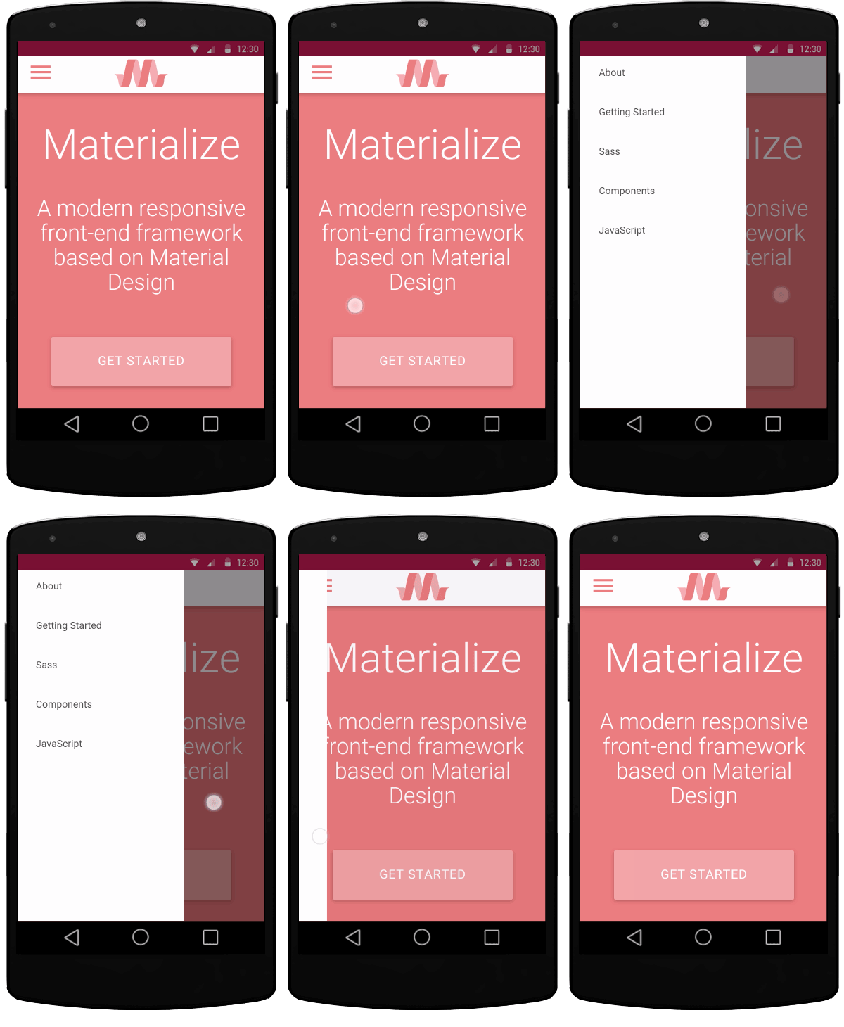
#### Swipe to Dismiss
On all devices, you can swipe to dismiss toasts.
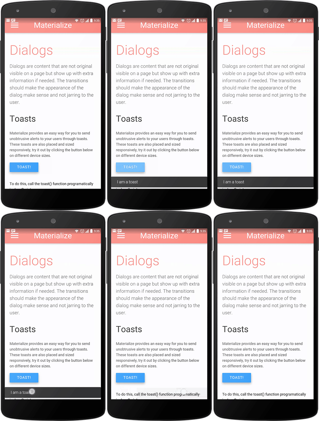
* [Sidebar](https://materializecss.com/mobile.html#right)
* [Toast](https://materializecss.com/mobile.html#toast-mobile)
---
# Showcase - Materialize
[Submit your site](mailto:materializeframework@gmail.com?subject=showcase)
##### [Close Heat](http://closeheat.com/)
##### [Kiosk Browser](http://www.android-kiosk.com/)
##### [Stephanie Jagiello](http://stephaniejagiello.com/)
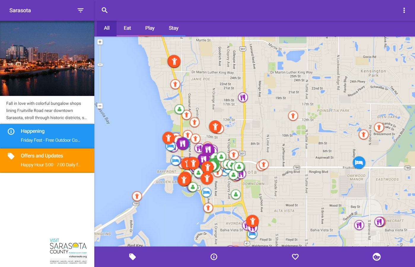
##### [Visit Sarasota](http://explore.visitsarasota.org/visitsarasota)

##### [Varun Malhotra](http://softvar.github.io/)
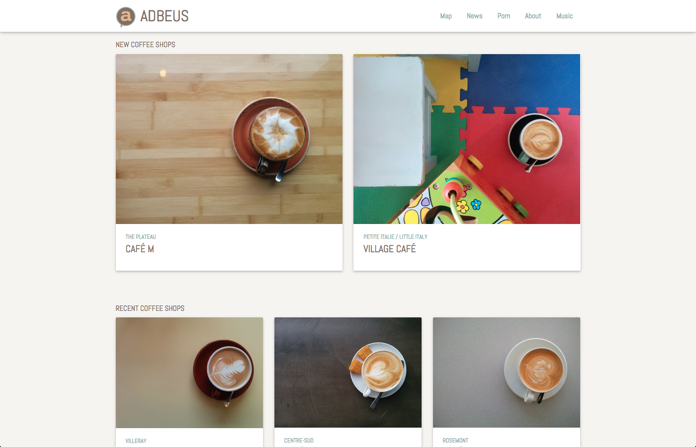
##### [Adbeus](http://adbeus.com/)
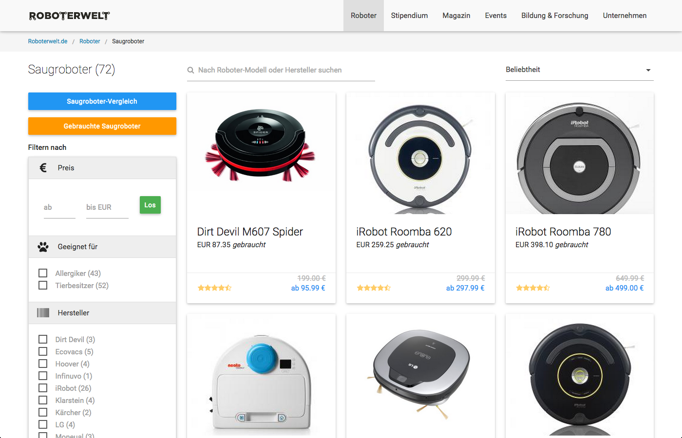
##### [Roboterwelt](http://www.roboterwelt.de/suche/filter?filter=1&term=&used=&minp=&maxp=&term=&sort=sort_ratings)

##### [Joel Cox](http://joelcox.io/)
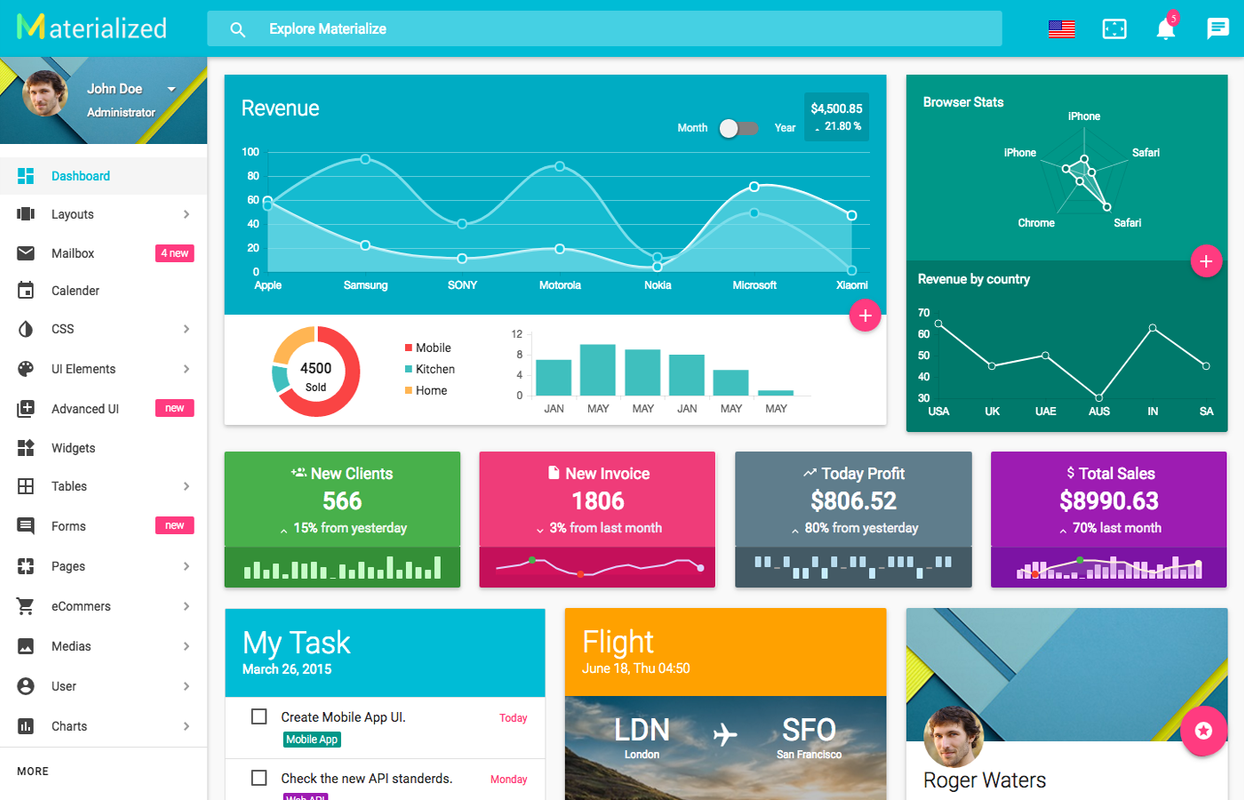
##### [Material Admin Template](http://demo.geekslabs.com/materialize/v3.1/)

##### [eadBox](http://eadbox.com/)

##### [Webonise](http://webonise.co.uk/)
---
# Range - Materialize
Add a range slider for values with a wide range. This one is set to be a number between 0 and 100. We have two different types of sliders. nouiSlider is a 3rd party plugin which we've modified. To use the noUiSlider, you will have to manually link the `nouislider.css` and `nouislider.js` files located in the extras folder.
See noUiSlider's official documentation [here](https://refreshless.com/nouislider/)
to see a variety of slider options
var slider = document.getElementById('test-slider');
noUiSlider.create(slider, {
start: [20, 80],
connect: true,
step: 1,
orientation: 'horizontal', // 'horizontal' or 'vertical'
range: {
'min': 0,
'max': 100
},
format: wNumb({
decimals: 0
})
});
* [noUiSlider](https://materializecss.com/range.html#range)
* [HTML5 Range](https://materializecss.com/range.html#html5)
---
# Radio Buttons - Materialize
Radio Buttons are used when the user must make only one selection out of a group of items. The `for` attribute is necessary to bind our custom radio button with the input. Add the input's `id` as the value of the `for` attribute of the label.
Add radio buttons to a group by adding the name attribute along with the same corresponding value for each of the radio buttons in the group. Create disabled radio buttons by adding the disabled attribute as shown below.
Red
Yellow
Green
Brown
To create a radio button with a gap, add `class="with-gap"` to your input. See the example below.
Red
* [Radio Buttons](https://materializecss.com/radio-buttons.html#radio)
* [With Gap](https://materializecss.com/radio-buttons.html#gap)
---
# Pickers - Materialize
The datepicker allows users to select a date from an interactive calendar.
Birthdate
##### Initialization
document.addEventListener('DOMContentLoaded', function() {
var elems = document.querySelectorAll('.datepicker');
var instances = M.Datepicker.init(elems, options);
});
// Or with jQuery
$(document).ready(function(){
$('.datepicker').datepicker();
});
##### Options
| Name | Type | Default | Description |
| --- | --- | --- | --- |
| autoClose | Boolean | false | Automatically close picker when date is selected. |
| format | String | 'mmm dd, yyyy' | The date output format for the input field value. |
| parse | Function | null | Used to create date object from current input string. |
| defaultDate | Date | null | The initial date to view when first opened. |
| setDefaultDate | Boolean | false | Make the defaultDate the initial selected value. |
| disableWeekends | Boolean | false | Prevent selection of any date on the weekend. |
| disableDayFn | Function | null | Custom function to disable certain days. |
| firstDay | Number | 0 | First day of week (0: Sunday, 1: Monday etc). |
| minDate | Date | null | The earliest date that can be selected. |
| maxDate | Date | null | The latest date that can be selected. |
| yearRange | Number \| Array | 10 | Number of years either side, or array of upper/lower range. |
| isRTL | Boolean | false | Changes Datepicker to RTL. |
| showMonthAfterYear | Boolean | false | Show month after year in Datepicker title. |
| showDaysInNextAndPreviousMonths | Boolean | false | Render days of the calendar grid that fall in the next or previous month. |
| container | Element | null | Specify a DOM element to render the calendar in, by default it will be placed before the input. |
| showClearBtn | Boolean | false | Show the clear button in the datepicker. |
| i18n | Object | See i18n documentation. | Internationalization options. |
| events | Array | \[\] | An array of string returned by \`Date.toDateString()\`, indicating there are events in the specified days. |
| onSelect | Function | null | Callback function when date is selected, first parameter is the newly selected date. |
| onOpen | Function | null | Callback function when Datepicker is opened. |
| onClose | Function | null | Callback function when Datepicker is closed. |
| onDraw | Function | null | Callback function when Datepicker HTML is refreshed. |
##### Date format options
Use these in the format option to customize your date string.
| Key | Description | Output |
| --- | --- | --- |
| d | Date of the month. | 1-31 |
| dd | Date of the month (2 digits). | 01-31 |
| ddd | Day of the week in short form set by the i18n option. | Sun-Sat |
| dddd | Day of the week in full form set by the i18n option. | Sunday-Saturday |
| m | Month of the year. | 1-12 |
| mm | Month of the year (2 digits). | 01-12 |
| mmm | Month of the year in short form set by the i18n option. | Jan-Dec |
| mmmm | Month of the year in full form set by the i18n option. | January-December |
| yy | 2-digit year. | 17 |
| yyyy | 4-digit year. | 2017 |
##### Datepicker Internationalization options
Use these in the i18n option to localize the datepicker.
| Key | Text |
| --- | --- |
| cancel | 'Cancel' |
| clear | 'Clear' |
| done | 'Ok' |
| previousMonth | '‹' |
| nextMonth | '›' |
| months | \[ 'January', 'February', 'March', 'April', 'May', 'June', 'July', 'August', 'September', 'October', 'November', 'December' \] |
| monthsShort | \[ 'Jan', 'Feb', 'Mar', 'Apr', 'May', 'Jun', 'Jul', 'Aug', 'Sep', 'Oct', 'Nov', 'Dec' \] |
| weekdays | \[ 'Sunday', 'Monday', 'Tuesday', 'Wednesday', 'Thursday', 'Friday', 'Saturday' \] |
| weekdaysShort | \[ 'Sun', 'Mon', 'Tue', 'Wed', 'Thu', 'Fri', 'Sat' \] |
| weekdaysAbbrev | \['S','M','T','W','T','F','S'\] |
##### Properties
| Name | Type | Description |
| --- | --- | --- |
| el | Element | The input element the plugin was initialized with. |
| options | Object | The options the instance was initialized with. |
| isOpen | Boolean | If the picker is open. |
| date | Date | The selected Date. |
##### Methods
> Because jQuery is no longer a dependency, all the methods are called on the plugin instance. You can get the plugin instance like this:
>
>
> var instance = M.Datepicker.getInstance(elem);
>
> /* jQuery Method Calls
> You can still use the old jQuery plugin method calls.
> But you won't be able to access instance properties.
>
> $('.datepicker').datepicker('methodName');
> $('.datepicker').datepicker('methodName', paramName);
> */
>
##### .open();
Open datepicker
instance.open();
##### .close();
Close datepicker
instance.close();
##### .toString();
Gets a string representation of the selected date
instance.toString();
##### .setDate();
Set a date on the datepicker
###### Arguments
**Date (optional):** Date to set on the datepicker.
instance.setDate(new Date());
##### .gotoDate();
Change date view to a specific date on the datepicker
###### Arguments
**Date:** Date to show on the datepicker.
instance.gotoDate(new Date());
##### .destroy();
Destroy plugin instance and teardown
instance.destroy();
The timepicker allows users to select a date from an interactive clock.
Lunchtime
##### Initialization
document.addEventListener('DOMContentLoaded', function() {
var elems = document.querySelectorAll('.timepicker');
var instances = M.Timepicker.init(elems, options);
});
// Or with jQuery
$(document).ready(function(){
$('.timepicker').timepicker();
});
##### Options
| Name | Type | Default | Description |
| --- | --- | --- | --- |
| duration | Number | 350 | Duration of the transition from/to the hours/minutes view. |
| container | String | null | Specify a selector for a DOM element to render the calendar in, by default it will be placed before the input. |
| showClearBtn | Boolean | false | Show the clear button in the Timepicker. |
| defaultTime | String | 'now' | Default time to set on the timepicker 'now' or '13:14' |
| fromNow | Number | 0 | Millisecond offset from the defaultTime. |
| i18n | Object | See i18n documentation. | Internationalization options. |
| autoClose | Boolean | false | Automatically close picker when minute is selected. |
| twelveHour | Boolean | true | Use 12 hour AM/PM clock instead of 24 hour clock. |
| vibrate | Boolean | true | Vibrate device when dragging clock hand. |
| onOpenStart | Function | null | Callback function called before modal is opened. |
| onOpenEnd | Function | null | Callback function called after modal is opened. |
| onCloseStart | Function | null | Callback function called before modal is closed. |
| onCloseEnd | Function | null | Callback function called after modal is closed. |
| onSelect | Function | null | Callback function when a time is selected, first parameter is the hour and the second is the minute. |
##### Timepicker Internationalization options
Use these in the i18n option to localize the timepicker.
| Key | Text |
| --- | --- |
| cancel | 'Cancel' |
| clear | 'Clear' |
| done | 'Ok' |
##### Properties
| Name | Type | Description |
| --- | --- | --- |
| el | Element | The input element the plugin was initialized with. |
| options | Object | The options the instance was initialized with. |
| isOpen | Boolean | If the picker is open. |
| time | String | The selected time. |
##### Methods
> Because jQuery is no longer a dependency, all the methods are called on the plugin instance. You can get the plugin instance like this:
>
>
> var instance = M.Timepicker.getInstance(elem);
>
> /* jQuery Method Calls
> You can still use the old jQuery plugin method calls.
> But you won't be able to access instance properties.
>
> $('.timepicker').timepicker('methodName');
> $('.timepicker').timepicker('methodName', paramName);
> */
>
##### .open();
Open timepicker
instance.open();
##### .close();
Close timepicker
instance.close();
##### .showView();
Show hours or minutes view on timepicker
###### Arguments
**String:** The name of the view you want to switch to, 'hours' or 'minutes'.
instance.showView('hours');
##### .destroy();
Destroy plugin instance and teardown
instance.destroy();
* [Date Picker](https://materializecss.com/pickers.html#date-picker)
* [Time Picker](https://materializecss.com/pickers.html#time-picker)
---
# Media - Materialize
Media components include things that have to do with large media objects like Images, Video, Audio, etc.
Material box is a material design implementation of the Lightbox plugin. When a user clicks on an image that can be enlarged, Material box centers the image and enlarges it in a smooth, non-jarring manner. To dismiss the image, the user can either click on the image again, scroll away, or press the ESC key.

Creating the above image with the effect is as simple as adding a `materialboxed` class to the image tag.
#### Initialization
document.addEventListener('DOMContentLoaded', function() {
var elems = document.querySelectorAll('.materialboxed');
var instances = M.Materialbox.init(elems, options);
});
// Or with jQuery
$(document).ready(function(){
$('.materialboxed').materialbox();
});
#### Options
| Name | Type | Default | Description |
| --- | --- | --- | --- |
| inDuration | Number | 275 | Transition in duration in milliseconds. |
| outDuration | Number | 200 | Transition out duration in milliseconds. |
| onOpenStart | Function | null | Callback function called before materialbox is opened. |
| onOpenEnd | Function | null | Callback function called after materialbox is opened. |
| onCloseStart | Function | null | Callback function called before materialbox is closed. |
| onCloseEnd | Function | null | Callback function called after materialbox is closed. |
#### Methods
> Because jQuery is no longer a dependency, all the methods are called on the plugin instance. You can get the plugin instance like this:
>
>
> var instance = M.Materialbox.getInstance(elem);
>
> /* jQuery Method Calls
> You can still use the old jQuery plugin method calls.
> But you won't be able to access instance properties.
>
> $('.materialboxed').materialbox('methodName');
> $('.materialboxed').materialbox('methodName', paramName);
> */
>
##### .open();
Open materialbox
instance.open();
##### .close();
Close materialbox
instance.close();
##### .destroy();
Destroy plugin instance and teardown
instance.destroy();
#### Properties
| Name | Type | Description |
| --- | --- | --- |
| el | Element | The DOM element the plugin was initialized with. |
| options | Object | The options the instance was initialized with. |
| overlayActive | Boolean | If the materialbox overlay is showing. |
| doneAnimating | Boolean | If the carousel is no longer being animated. |
| caption | String | Caption if specified. |
| originalWidth | Number | Original width of image. |
| originalHeight | Number | Original height of image. |
#### Captions
It is very easy to add a short caption to your photo. Just add the caption as a `data-caption` attribute.

Our slider is a simple and elegant image carousel. You can also have captions that will be transitioned on their own depending on their alignment. You can also have indicators that show up on the bottom of the slider.
* 
### This is our big Tagline!
##### Here's our small slogan.
* 
### Left Aligned Caption
##### Here's our small slogan.
* 
### Right Aligned Caption
##### Here's our small slogan.
* 
### This is our big Tagline!
##### Here's our small slogan.
This is our big Tagline!
Here's our small slogan.
Left Aligned Caption
Here's our small slogan.
Right Aligned Caption
Here's our small slogan.
This is our big Tagline!
Here's our small slogan.
#### Initialization
document.addEventListener('DOMContentLoaded', function() {
var elems = document.querySelectorAll('.slider');
var instances = M.Slider.init(elems, options);
});
// Or with jQuery
$(document).ready(function(){
$('.slider').slider();
});
#### Options
| Name | Type | Default | Description |
| --- | --- | --- | --- |
| indicators | Boolean | true | Set to false to hide slide indicators. |
| height | Number | 400 | Set height of slider. |
| duration | Number | 500 | Set the duration of the transition animation in ms. |
| interval | Number | 6000 | Set the duration between transitions in ms. |
#### Methods
We have methods to pause, start, move to next and move to previous slide.
> Because jQuery is no longer a dependency, all the methods are called on the plugin instance. You can get the plugin instance like this:
>
>
> var instance = M.Slider.getInstance(elem);
>
> /* jQuery Method Calls
> You can still use the old jQuery plugin method calls.
> But you won't be able to access instance properties.
>
> $('.slider').slider('methodName');
> $('.slider').slider('methodName', paramName);
> */
>
##### .pause();
Pause slider autoslide
instance.pause();
##### .start();
Start slider autoslide
instance.start();
##### .next();
Move to next slider
instance.next();
##### .prev();
Move to prev slider
instance.prev();
##### .destroy();
Destroy plugin instance and teardown
instance.destroy();
#### Properties
| Name | Type | Description |
| --- | --- | --- |
| el | Element | The DOM element the plugin was initialized with. |
| options | Object | The options the instance was initialized with. |
| activeIndex | Number | Index of current slide. |
#### Fullscreen Slider
You can easliy make this slider a fullscreen slider by adding the class `fullscreen` to the slider div. Here's a quick demo.
[Open Demo](https://materializecss.com/fullscreen-slider-demo.html)
* [Material Box](https://materializecss.com/media.html#materialbox)
* [Slider](https://materializecss.com/media.html#slider)
---
# Text Inputs - Materialize
Forms are the standard way to receive user inputted data. The transitions and smoothness of these elements are very important because of the inherent user interaction associated with forms.
Text fields allow user input. The border should light up simply and clearly indicating which field the user is currently editing. You must have a `.input-field` div wrapping your input and label. This is only used in our Input and Textarea form elements.
The validate class leverages HTML5 validation and will add a `valid` and `invalid` class accordingly. If you don't want the Green and Red validation states, just remove the `validate` class from your inputs.
First Name
Last Name
Disabled
Password
Email Helper text
This is an inline input field:
Email
##### Prefilling Text Inputs
If you are having trouble with the labels overlapping prefilled content, Try adding `class="active"` to the label.
You can also call the function `M.updateTextFields();` to reinitialize all the Materialize labels on the page if you are dynamically adding inputs.
First Name
$(document).ready(function() {
M.updateTextFields();
});
##### Icon Prefixes
You can add an icon prefix to make the form input label even more clear. Just add an icon with the class `prefix` before the input and label.
_account\_circle_ First Name
_phone_ Telephone
##### Custom Error or Success Messages
You can add custom validation messages by adding either `data-error` or `data-success` attributes to your helper text element.
Email Helper text
##### Changing colors
Here is a CSS template for modifying input fields in CSS. With Sass, you can achieve this by just changing a variable. The CSS shown below is unprefixed. Depending on what you use, you may have to change the type attribute selector.
/* label color */
.input-field label {
color: #000;
}
/* label focus color */
.input-field input[type=text]:focus + label {
color: #000;
}
/* label underline focus color */
.input-field input[type=text]:focus {
border-bottom: 1px solid #000;
box-shadow: 0 1px 0 0 #000;
}
/* valid color */
.input-field input[type=text].valid {
border-bottom: 1px solid #000;
box-shadow: 0 1px 0 0 #000;
}
/* invalid color */
.input-field input[type=text].invalid {
border-bottom: 1px solid #000;
box-shadow: 0 1px 0 0 #000;
}
/* icon prefix focus color */
.input-field .prefix.active {
color: #000;
}
Textareas allow larger expandable user input. The border should light up simply and clearly indicating which field the user is currently editing. You must have a `.input-field` div wrapping your input and label. This is only used in our Input and Textarea form elements.
**Textareas will auto resize to the text inside.**
Textarea
advanced note: When dynamically changing the value of a textarea with methods like jQuery's `.val()`, you must trigger an autoresize on it afterwords because .val() does not automatically trigger the events we've binded to the textarea.
$('#textarea1').val('New Text');
M.textareaAutoResize($('#textarea1'));
##### Icon Prefixes
You can add an icon prefix to make the form input label even more clear. Just add an icon with the class `prefix` before the input and label.
_mode\_edit_ Message
If you want to style an input button with a path input we provide this structure.
File
You can also use the `multiple` attribute to allow multiple file uploads.
File
Use a character counter in fields where a character restriction is in place.
Input text
Textarea
##### Initialization
There are no options for this plugin, but if you are adding these dynamically, you can use this to initialize them.
$(document).ready(function() {
$('input#input_text, textarea#textarea2').characterCounter();
});
* [Input Fields](https://materializecss.com/text-inputs.html#input)
* [Textareas](https://materializecss.com/text-inputs.html#textarea)
* [File Input Button](https://materializecss.com/text-inputs.html#file)
* [Character Counter](https://materializecss.com/text-inputs.html#character-counter)
---
# Select - Materialize
Select allows user input through specified options. Make sure you wrap it in a `.input-field` for proper alignment with other text fields. Remember that this is a jQuery plugin so make sure you [initialize](https://materializecss.com/select.html#initialization)
this in your document ready.
Choose your option Option 1 Option 2 Option 3 Materialize Select
You can add the property `multiple` to get the multiple select and select several options.
Choose your option Option 1 Option 2 Option 3 Materialize Multiple Select
We also support optgroups in our selects.
Option 1 Option 2 Option 3 Option 4 Optgroups
You can add icons to your options in any type of select. In the option you add the image source with the `data-icon` attribute.
Choose your option example 1 example 2 example 3 Images in select
Choose your option example 1 example 2 example 3 Images in select
You can add the class `browser-default` to get the browser default.
Browser Select Choose your option Option 1 Option 2 Option 3
You must initialize the select element as shown below. In addition, you will need a separate call for any dynamically generated select elements your page generates.
document.addEventListener('DOMContentLoaded', function() {
var elems = document.querySelectorAll('select');
var instances = M.FormSelect.init(elems, options);
});
// Or with jQuery
$(document).ready(function(){
$('select').formSelect();
});
| Name | Type | Default | Description |
| --- | --- | --- | --- |
| classes | String | '' | Classes to be added to the select wrapper element. |
| dropdownOptions | Object | {} | Pass options object to select dropdown initialization. |
> Because jQuery is no longer a dependency, all the methods are called on the plugin instance. You can get the plugin instance like this:
>
>
> var instance = M.FormSelect.getInstance(elem);
>
> /* jQuery Method Calls
> You can still use the old jQuery plugin method calls.
> But you won't be able to access instance properties.
>
> $('select').formSelect('methodName');
> $('select').formSelect('methodName', paramName);
> */
>
##### .getSelectedValues();
Get selected values in an array.
###### Return Value
**Array:** Array of selected values.
instance.getSelectedValues();
##### .destroy();
Destroy plugin instance and teardown
instance.destroy();
| Name | Type | Description |
| --- | --- | --- |
| el | Element | The DOM element the plugin was initialized with. |
| options | Object | The options the instance was initialized with. |
| isMultiple | Boolean | If this is a multiple select. |
| wrapper | Element | The select wrapper element. |
| dropdownOptions | Element | Dropdown UL element. |
| input | Element | Text input that shows current selected option. |
| dropdown | Dropdown | Instance of the dropdown plugin for this select. |
You can also add `disabled` to the select element to make the whole thing disabled. Or if you add `disabled` to the options, the individual options will be unselectable.
Choose your option Option 1 Option 2 Option 3 Materialize Disabled
Browser Disabled Choose your option Option 1 Option 2 Option 3
* [Introduction](https://materializecss.com/select.html#introduction)
* [Initialization](https://materializecss.com/select.html#initialization)
* [Options](https://materializecss.com/select.html#options)
* [Methods](https://materializecss.com/select.html#methods)
* [Properties](https://materializecss.com/select.html#properties)
* [Disabled Styles](https://materializecss.com/select.html#disabled)
---
# Themes - Materialize
#### Now Updated to Materialize 1.0.0
[](https://materialize-themes.myshopify.com/cart/16686185447513:1?channel=buy_button)
#### Admin
Admin is a great template for your app's dashboards, analytics and data visualizations. It comes with custom styles for many plugins like Chart.js, jqvmap, FullCalendar, and DataTables.
**Note: This is a static HTML template**
[DEMO](https://themes.materializecss.com/pages/admin-dashboard.html)
#### Startup
Startup is a perfect theme for showcasing your new app, company or project. With the help of GSAP and ScrollMagic, create unique scrolling experiences that will keep users engaged.
**Note: This is a static HTML template**
[DEMO](https://themes.materializecss.com/pages/startup-horizontal-half.html)
#### Gallery
This theme is perfect for Portfolio, Blogs, and Stores with its Google Play Store inspired content transition. This theme is in active development and will have more features and styles added to it in the future.
**Note: This is a static HTML template**
[DEMO](https://themes.materializecss.com/pages/demo)

#### Gallery Shopify Theme
Make your products pop with this Shopify Theme and its Google Play Store inspired content transition. Have a more seamless store experience with this powerful ecommerce platform. This theme is in active development and will be maintained.
**Note: This is a theme made for the Shopify Ecommerce Platform**
[DEMO](https://materialize-shopify-themes.myshopify.com/)

All themes come with active support. Send your questions and concerns to [MaterializeThemes](mailto:materializethemes@gmail.com?Subject=Theme%20support)
All themes are under the Personal Use License meaning you can use and modify these themes for personal and client projects. You cannot redistribute or resell these themes in any way.
---
# Support Us - Materialize
Materialize is an open source project that is completely free to use. We hope you have enjoyed using Materialize and if you feel like it has helped you out and want to support the team you can help us by donating or backing us on Patreon. Any amount would help support and continue development on this project and is greatly appreciated.
The simplest way to support us is with a one-time donation through paypal.
Donate Now
Back us on patreon and get access to reward tiers including things like having your name on this page, access to early versions of future features, and even advertising space on our website.
[Become a Patron](https://www.patreon.com/bePatron?u=8327028)
##### Patrons
Thanks to all our backers!
* Alex Green
* Fire Stick Tricks
* MonoVM
* Clay
* One Compare
* Robert Bolder
* CodeFirst
* Luca
* DontPayFull
* Paul Greenhalgh
* CryptAPI
* Arni Johannesson
* John Persano
* Ronan MINGON
* TypeStack
* Gertjan Ekkel
* Ali Jaffar
* Ivan Braun
* Stevijn de Jong
* Simon Hutton
* Jonathan Crossland
* Sergei Miami
* Andrey Bichkevsky
* Leland Elie
* Luis J. Albizu
* Neil Hanson
* Daniel-Pascal Engelschalk
* HoliThemes
* Wherrelz Corporation
* Gabriel Hug
* Guilherme Camacho
* Alberto Zanatta
* Samiah Zabel
* Big Skapinsky
* Emerson Salmeron Rubio
* Andrew Leung
* Luke Welton
* XSAMA
* Scott Hoch
* Kgothatso Ngako
* Stefan Stahl
* Coded Creations
* Cesar Oniel Azpilcueta Najera
* Imaizumi Ryohei
* M A
* [Donate](https://materializecss.com/support-us.html#donate)
* [Patreon](https://materializecss.com/support-us.html#patreon)
---
# Pushpin - Materialize
Pushpin is our fixed positioning plugin. Use this to pin elements to your page during specific scroll ranges. You can check out our live example: the fixed table of contents on the right.
[Open Demo](https://materializecss.com/pushpin-demo.html)
##### Demo Code
$('.pushpin-demo-nav').each(function() {
var $this = $(this);
var $target = $('#' + $(this).attr('data-target'));
$this.pushpin({
top: $target.offset().top,
bottom: $target.offset().top + $target.outerHeight() - $this.height()
});
});
// Only necessary for window height sized blocks.
html, body {
height: 100%;
}
Here is a sample initialization of pushpin. Take a look at what the options are and customize them to your needs.
document.addEventListener('DOMContentLoaded', function() {
var elems = document.querySelectorAll('.pushpin');
var instances = M.Pushpin.init(elems, options);
});
// Or with jQuery
$(document).ready(function(){
$('.pushpin').pushpin();
});
| Name | Type | Default | Description |
| --- | --- | --- | --- |
| top | Number | 0 | The distance in pixels from the top of the page where the element becomes fixed. |
| bottom | Number | Infinity | The distance in pixels from the top of the page where the elements stops being fixed. |
| offset | Number | 0 | The offset from the top the element will be fixed at. |
| onPositionChange | Function | null | Callback function called when pushpin position changes. You are provided with a position string. |
> Because jQuery is no longer a dependency, all the methods are called on the plugin instance. You can get the plugin instance like this:
>
>
> var instance = M.Pushpin.getInstance(elem);
>
> /* jQuery Method Calls
> You can still use the old jQuery plugin method calls.
> But you won't be able to access instance properties.
>
> $('.target').pushpin('methodName');
> $('.target').pushpin('methodName', paramName);
> */
>
##### .destroy();
Destroy plugin instance and teardown
instance.destroy();
| Name | Type | Description |
| --- | --- | --- |
| el | Element | The DOM element the plugin was initialized with. |
| options | Object | The options the instance was initialized with. |
| originalOffset | Number | Original offsetTop of element. |
A pushpinned element has 3 states. One above and below the scrolling threshold, and the pinned state where the element becomes fixed. Because pushpin changes positioning, chances are your element will look different when the states change. Use these css classes to correctly style your 3 states.
// Class for when element is above threshold
.pin-top {
position: relative;
}
// Class for when element is below threshold
.pin-bottom {
position: relative;
}
// Class for when element is pinned
.pinned {
position: fixed !important;
}
* [Introduction](https://materializecss.com/pushpin.html#introduction)
* [Initialization](https://materializecss.com/pushpin.html#initialization)
* [Options](https://materializecss.com/pushpin.html#options)
* [Methods](https://materializecss.com/pushpin.html#methods)
* [Properties](https://materializecss.com/pushpin.html#properties)
* [CSS classes](https://materializecss.com/pushpin.html#classes)
---
# Fullscreen Slider - Materialize
* 
### This is our big Tagline!
##### Here's our small slogan.
* 
### Left Aligned Caption
##### Here's our small slogan.
* 
### Right Aligned Caption
##### Here's our small slogan.
[_close_](https://materializecss.com/fullscreen-slider-demo.html#!)
---
# Pushpin Demo - Materialize
[_close_](https://materializecss.com/pushpin-demo.html#!)
---


 ##### Circular images

This is a square image. Add the "circle" class to it to make it appear circular.
To make images appear circular, simply add `class="circle"` to them
##### Circular images

This is a square image. Add the "circle" class to it to make it appear circular.
To make images appear circular, simply add `class="circle"` to them

 Card Title
